10,000 search results
(0.019 seconds)
- Dayana by Stefani Letter,
$14.00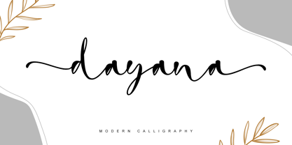 dayana is a lovely and delicate handwritten font. It looks gorgeous on wedding invitations, thank you cards, quotes, greeting cards, logos, business cards, and every other design which needs a handwritten touch, and much more! It features a varying baseline, smooth lines, gorgeous glyphs, and stunning alternates.
 - Bella Notes by Attype Studio,
$14.00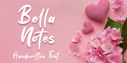 Bella Notes is lovely Handwritten font, including ligatures that perfect for any combination for your design. Bella Notes perfectly macth for design with valentine theme, any product like book cover, t-shirt, branding, promotion, social media post, quotes, wedding, photography and more. What's included: - Ligatures - Multilingual Support
 - Elite Resort JNL by Jeff Levine,
$29.00 A 1940s sheet music edition of an early 1900s song entitled "You Taught Me How to Love You, Now Teach Me to Forget" was set in a popular metal type slab serif face. It is presented digitally as Elite Resort JNL, in both regular and oblique versions.
 - Demillina by AEN Creative Studio,
$12.00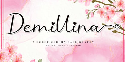 Demillina is a lovely and delicate script font that exudes elegance and class. This font was particularly crafted for those who need a beautiful and refreshing look to their designs. Demillina is PUA encoded which means you can access all of the glyphs and swashes with ease!
 - Emitha by Supfonts,
$20.00 Meet my new font Emitha DUO! Emitha includes full set of lovely uppercase and lowercase letters, multilingual symbols, numerals, punctuation and ligatures. Also it includes: large set of Swashes and Strokes. This is so perfect for invitations, monograms etc Check out my blog: www.instagram.com/dmitriychirkov pinterest.com/dmitriychirkov7
 - Pinktart by Yumna Type,
$16.00 Pinktart is a lovely handwritten font with a natural and unique design will make your project more beautiful. The font is suitable for your branding project, printing, logos dan wedding. Included: Pinktart (OTF) Features: Beautiful Ligatures Alternate Multilingual Support PUA encoded Numeral and Punctuation by Yumnatype
 - Pretty Queen by Din Studio,
$29.00 Pretty Queen is a beautiful brush signature font. Made for any professional project branding. Every letter has a unique and beautiful touch. Made from our talented designer. Love swash will make your design more beautiful. Features: 52 Stylistic set Ligatures Uppercase Alternates Multilingual Support PUA encoded
 - Arcano by Resistenza,
$39.00 After four long months of work, Arcano Type has finally been released. It was completely designed by hand, letter by letter, using Chinese ink on Japanese calligraphy paper. Arcano is inspired by nature, symbols, icons, jewels, hand-drawn designs and much more... Modern Love Slanted-Turquoise-Nautica
 - Girl Mermaid by Ake,
$12.00 Girl is a cool, incredibly detailed and chic duo font (script and dingbats). This font is PUA encoded which means you can access all of the glyphs and swashes with ease! Fall in love with its incredibly versatile style and use it to create spectacular designs!
 - Roller Poster by HiH,
$12.00 Roller Poster is named after Alfred Roller. In 1902, Roller created a poster to advertise the 16th exhibit of Austrian Artists and Sculptures Association, representing the Vienna Secession movement. The exhibit was to take place in Vienna during January & February 1903. The location is not mentioned because everyone in Vienna knew it would be held at the exhibit hall in the Secession Building at Friedrichstraþe 12, a few blocks south of the Opernring, near the Naschmarkt. Designed by Joseph Maria Olbrich in 1897, the buiilding has been restored and stands today as one finest of the many fine examples of Art Nouveau architecture in Vienna (see vienna_secession_bldg.jpg). Because of its dome, it is called “the golden cabbage.” The poster itself is unique. The word “secession” is in one type style and takes up two-thirds of the elongated poster. At the bottom of the poster are the details in a different lettering style. It is this second style at the bottom that is the basis for the font Roller Poster. In keeping with our regular naming conventions, we were going to call it Roller Gezeichnete (hand-drawn), but the wonderful play on both words and the shape of the three S’s in secession was too compelling. In November 1965 there was an exhibit of Jugendstil and Expressionist art at the University of California. Alfred Roller’s Secession Poster was part of that exhibit. Wes Wilson was designing promotional material at Contact Printing in San Francisco. Among their clients was a rock promoter named Bill Graham, staging dance-concerts at Fillmore Auditorium. Wilson saw the catalog from the UC exhibit and Roller’s lettering. Wilson adapted Roller’s letter forms to his own fluid style. The result was the poster for the August 12-13, 1966 Jefferson Airplane/Grateful Dead concert at Fillmore put on by Graham (BG23-1). Wilson continued to use Roller’s letter forms on most of the posters he did for Graham through May 1967, when he stopped working for Graham. The posters were extremely successful and the lettering style along with Roller’s letter forms were picked up by other artists, including Bonnie MacLean, Clifford Charles Seeley, James Gardner, and others. The Secession poster and the Fillmore posters have inspired a number of fonts in addition to ours. Among them are JONAH BLACK (& WHITE) by Rececca Alaccari, LOVE SOLID by Leslie Carbarga and MOJO by Jim Parkinson. Each is different and yet each clearly shows its bloodlines. Our font differs in two ways: 1) the general differences in the interpretation of the letter forms and 2) the modification of the basic letter form to incorporate the diacriticals within the implied frame of the letter, after the manner of the original design by Roller. We borrowed Carbarga’s solution to the slashed O and used it, in a modified form, for other characters as well to accomplish the same purpose. We recommend that you buy ours and at least one of the other three. According to Alaccari, a version called URBAN was released by Franklin Lettering in the 70’s (and is shown on page 51 of The Solotype Catalog). For comparison of our font to original design, see image files roller_poster_2s.jpg of original poster and roller_poster_2sx.jpg showing reconstruction using our font for the lower portion (recontructed area indicated by blue bar). Please note the consistency of character width. In the lower case, 23 of the basic 26 letters are 1/2 EM Square wide. The ‘i’ is an eighth narrower, while the ‘m’& ‘w’ are one quarter wider. All the Upper Case letters are 1/8 EM wider than the lower case. This is to make it easier to fill a geometrical shape like a rectangle, allowing you to capture a little of the flavor of Wes Wilson’s Fillmore West poster using only a word processor. We have also included a number of shapes for use as spacers and endcaps. If you have a drawing program that allows you to edit an ‘envelope’ around the letters to distort their shape, you can really get creative. I used Corel Draw for the gallary images, but there are other programs that can accomplish the same thing. The image file “roller_poster_keys.jpg” shows the complete character set with the keystrokes required for each character (see “HiH_Font_readme.txt” for instruction on inserting the non-keyboard characters). The file “roller_poster_widths.jpg” shows the exact width of each character in EM units (based on 1000 units per EM square). You will notice that the font is set wide for readability. However, most programs will allow you to tighten up on the character spacing after the manner of Roller & Wilson. In MS Word, for example, go to the FORMAT menu > FONT > CHARACTER SPACING. Go to the second Drop-Down Menu, labeled ‘Spacing’ and select "condensed' and then set the amount that you want to condense ‘by’ (key on the little arrows); two points (2.0) is a godd place to start. Let your motto be EXPLORE & EXPERIMENT. Art Nouveau has always been one of my favorite movements in art -- I grew up in a home with a couple of Mucha prints hanging on the living room wall. Perhaps because of that and because I lived through the sixties, I have enjoyed researching and designing this font more than any other I have worked on. Let’s face it (pardon the pun), Roller Poster is a FUN font. You owe it to yourself to have fun using it.
 - Konstantin by Wiescher Design,
$39.50 My son Konstantin wants to become a cook. So I thought it would be a nice idea if I designed a script for his fabulous future menus as a gift for him. I think he will become a great cook. The three Konstantin cuts can be mixed. The A cut has the most straightforward letterforms, the B cut has more swashes in the capitals and swinging descenders and last but not least, the C cut gives you some fancy lowercase letters. All three cuts have different numerals. If you mix the fonts be careful not to overdo things, mostly - even with scripts - less is more. Your family designer Gert
 - Pucky by Just My Type,
$25.00 When teaching font-making at the Art Institute of Tucson, I give my students plenty of lab time to come up with design ideas. I designed Pucky while one class created their fonts. It came about through an idea for a capital A: sort of a triangle with two round sides and a crossbar formed by a circle falling out. (You can see it here.) In drawing that, I hit upon the idea of making the tops of the alphabet sharp and square and the bottoms rounded. (See the whole alphabet here.) Pucky suggests both circus and psychedelia. Hmmmm, does anybody have an “in” at Cirque du Soleil?
 - Corpesh by Typotheticals,
$4.00 Corpesh was drawn in Adobe Illustrator during the wee hours of the night. It is a single weight set of fonts, no bold version. As is/was much of what I have done over the last year, it was created purely to pass time. As a self taught amateur in this field, I only do this for the enjoyment it brings me. This typeface is being released early, at the same time as 'Brainstroke', for exactly the same reason that typeface is, that being a health crisis. I know this typeface is not complete, with, as mentioned, no bold version, and probably never will have.
 - Lilette by Elyas Beria,
$5.00 This elegant typeface came out of a quick, back-of-the-napkin, sketch I did for a different typeface. After toiling on that typeface I looked back at the sketch and realized that I had lost some of the elegance and playful character of my original sketch. So, it was back to the drawing board and Lilette was born. Lilette is fun but also serious. Playful but elegant. Personal yet also industrial. That’s the power of a slab serif. Perfect for magazine headlines, wedding invitations, signs, posters, slides, promotions, product design, branding, logos, and so much more. Make this versatile typeface with 10 styles yours.
 - Blacketor by Courtney Rhodes,
$20.00 Blacketor came about from hand lettering I had done for my own personal use several years ago. It remained unfinished until now. I was going for a more traditional serif font but in the process of play various versions came about while playing with the serifs, in an attempt to be slightly different. Many versions fell to the wayside as I learned more about what didn’t work than what did. What came about was a clean font with large open counters and short ascenders for an easy read. All caps works well for a bold but not shouty statement. A good font for Headlines and callouts as well as logotypes.
 - Dudu by Borutta Group,
$10.00Dudu is a font which I made mainly for my own purposes. A lot of times in many projects I was looking for elegant vertical and modular typeface. There is a lot of fonts that overall look good but if You take a closer look, You can clearly see they have mistakes. That's why I made Dudu. Dudu is a font designed with a highest attention to the detail. Each Dudu glyph has the same modular construction. Dudu Font contains over 400 glyphs ready to use in various languages. I'm also working on a cyrillic version of a Dudu Font which soon is going to be published. - Boondoggle by Wilton Foundry,
$29.00I created this font to capture the innocence and playfulness of doodle lettering that is created in schools everywhere. Typographic rules are non-existent and the characters are sometimes oddly and incorrectly shaped but that's exactly what gives it charm. What really got me started was Napoleon Dynamite, his drawings and "typography". This font does not mimic what you see in the movie at all, but it attempts to capture the same spirit of high school "doodle typography". My favorite line: "I am pretty much the best artist I know". The font was named after Boondoggle keychains, the other craft most scholars acquire at some point in their school careers. - Grafika by Alphabet Soup,
$45.00 Grafika is a completely original design, done in an “Art Deco” spirit reminiscent of the 1920s and ‘30s. I designed Grafika many years ago to be typeset for title cards, and both opening and end credits for the Merchant/Ivory feature film “Savages”. After the film, the design languished in my archives until I rediscovered it. I have digitally redrawn Grafika, completing it with all the alternates, ligatures, math, foreign accented characters and punctuation that weren’t required of the original design for film. Grafika is strongest when set in upper and lowercase—its unique caps extending below the baseline—although all caps settings are encouraged as well.
 - Marons by Alit Design,
$16.00 Marons is my first font release of 2020. I created Marons from the initial sketch to the digital process and until it was released it took less than 2 months after I launched Black Quality. Marons is an elegant font that I combined from script and serif fonts, thus creating a unique and bold impression. Each Marons letter also has an additional alternate glyph and many variations of swash options, so you can use this font to create logo designs, header texts, t-shirt designs, YouTube cover texts, wedding designs, and others. With its many glyphs, Marons is indeed worthy of being called a collection of fonts in early 2020.
 - Legestue by Bogstav,
$16.00 Legestue is danish and means playroom. But perhaps that translation is too direct. Legestue is a place where you can come with your kids and play with other kids. Kinda like a kindergarten, but in much smaller scale. I attended a Legestue when my kids were like 2 years old. But that's a looong time ago! I like the idea of just dropping by and see who's playing and who's around. And the same goes for this font - each letter is off and different, and quite playful. Also, the letters has a crunchy outline, which made me think of some of the cookies I ate at the Legestue :)
 - Oronteus Finaeus by Type Innovations,
$39.00 The Oronteus Finaeus map, published in 1531, shows Antarctica before it was "discovered" and how it looked ice-free. There is still much controversy about the validity of the map, but I was intrigued by the letter forms which appeared on the map itself. I used the typeface appearing on the map as a visual guide in developing my design for Oronteus Finaeus regular and old style figures. I liked that it reminded me of old maps, exploring and adventure. Definitely oldish and roughish in character. This new font is perfect for all those old style and antique applications, or for that vintage typography look.
 - New Lanzelott by Otto Maurer,
$12.00 The New Lanzelott is a brand new Version of an old Font of me called Lanzelott. The new Version get more curves and round Glyphes, it get more Soul. The Serif - Versions are shorter but more exactly. Every Font comes with many Open-type-features and Handmade Kerning. I like the old Version but this much better, much beautyfuller. All Fonts come with the German new big sharp S and a smaler sharp S and the normal sharp S. I you Write SS and want the big sharp S, you have only to make it with the Ligatur-Feature I hope you ll like it...
 - Weights And Measures by melifonts,
$5.00 Weights and Measures is a great title font that is simple and elegant. It is bold without being overpowering. This style was a favorite for me as I made posters for school projects, wrote notes to friends, and made decorative labels. This font fully supports the following languages: Bulgarian, Danish, Dutch, English, Estonian, Finnish, French, German, Icelandic, Italian, Norwegian, Portuguese, Russian, Spanish, Swedish. If your language is not listed, or if I've missed a character in a language I claim to support, please contact me! I will be happy to add characters as needed, and will consider supporting more languages if there is interest.
 - Tola by Agnieszka Ewa Olszewska,
$18.00 Tola is a modern, reversed-weight, experimental display font with a spirit of the 70s. Looks better in large sizes but in smaller thanks to the thick bottom makes also interesting effect. It’s based on my letter shape experiment. I was drawing one single letter in the hope to find interesting results. I started Tola font with the letter “G” and based on that shape I created the rest of the alphabet. Tola looks good in modern graphics. It contains uppercase, numbers, and some punctuation signs, and is multilingual. Perfect for logos, posters, and social media graphics that need a super superhero with a sentimental touch.
 - Origami Incised by ArtyType,
$29.00 Once I set on the concept for this ‘Origami’ inspired font, I used an imaginary strip of folded paper as the basis for each character, the folded effect being realized fully by incorporating an incised line. Of course the folded paper aspect is just a two dimensional illusion but subconsciously, will automatically be interpreted three dimensionally. There are numerous options for creating alternative characters following this logic, as the centuries-old Origami tradition itself illustrates quite clearly, but I wanted to maintain an ordered sense of style and balance throughout the full character set, so avoided any unnecessary flourishes, staying true to the Japanese ethos and spirit.
 - Coo Coo by chicken,
$23.00 So I made five rather odd characters for a logo for a friend… Then I thought I'd fill a couple of spare hours expanding it to a single alphabet… And some considerable time later I ended up with a whole font with full punctuation, a bunch of alternates, pretty broad international support and some OpenType features to keep things varied… There are elements of Art Deco, Art Nouveau, Lego, circuit boards and Ceefax, Memphis lamps and lab clamps, hieroglyphs, googly eyes and who knows what else… Intricate, insane, highly irregular, but somehow it hangs together… Throw down a few letters nice and big when the fancy takes you…
 - Tournedos by Hanoded,
$10.00 The other day, I was cooking a curry and I suddenly realised that we, as a family, eat a lot of meat. At home we do like meat, but given the state our world is in right now, we cannot continue eating meat like there is no tomorrow. As a result, I am hunting the internet right now for good vegetarian recipes (if you have one you’d like to share, then please contact me!). Tournedos is a beefy font family: a chunky all caps set of fonts - and a leaner set to counter and complement this rather heavy dish. And do eat your greens!
 - Red Tape by Wiescher Design,
$39.50 Red Tape is three fonts that were designed by sticking letters together with red tape. It makes for a wonderful makeshift set of fonts. And I really enjoyed sticking those letters together. Of course I did it on screen using bits and pieces of scanned red tape. Just use it as you like, I won't give you any red tape in how to use the fonts. »Red Tape« is since February 2012 on permanent display in the »German National Library« – next to the likes of »Bodoni«, »Garamond« and »Helvetica« – being part of the exhibition about type through the ages. Your (now a little famous) unproblematic type designer, Gert.
 - Picture Yourself by Linotype,
$29.99Create your own world with the Picture Yourself collection! Picture Yourself is a graphic image collection, which functions a font family instead of hundreds of EPS files. The family is made up of 24 different symbol typefaces. Designed by the collaborative effort of Karin and Peter Huschka, both living in Germany, Picture Yourself was a winner in the 2003 International Type Design Contest, sponsored by Linotype GmbH. The symbol library found in Picture Yourself offers an astounding array of high-contrast, simple forms, which may be used happily either separately or together in your layouts. Just as the fonts themselves stem from two designers working in collaboration, the imagery of the collection itself stems from two different influences. In large part, the font family was inspired by work displayed in the Frankfurt-based German Architecture Museum's 2003 Oscar Niemeyer exhibition. The photographs and sketches that were displays there inspired the first ideas for the Picture Yourself world of images. More of the typeface's design, as well as its name, were inspired by the underlying philosophy of the Beatles' music, especially the classic song from Lennon and McCartney, "Lucy In The Sky With Diamonds." In comparison with other large pictographic type collections, all of the characters in Picture Yourself fonts share the same horizon. The glyphs themselves are also drawn so that many of them can be combined with one another, creating tall or wide decorative compositions. Additionally, the proportions of the forms of the pictographs are aligned with various industry standards, in order to harmonize workflow. Picture Yourself Portraits (3:4), Landscapes (6:4), Cinema (9:4), and Panorama (12:4) each adhere to one of several photo or video formats. The Picture Yourself family of fonts can best be used with graphics applications like Adobe Photoshop or Illustrator, where different characters may be assigned to different layers, each with their own color. - Gelion by Halbfett,
$30.00 Gelion is a large family of geometric sans serif fonts. It ships both as two Variable Fonts or as 16 traditional fonts. Those static fonts span eight different weights, ranging from Extralight to Black. Each has an upright and an italic font on offer. The italics are carefully crafted, with an 8° slope. Gelion is inspired by 20th-century geometric sans serifs and classic neo-grotesque designs from the late 19th century and the middle of the 20th century. Its forms remain true to the gracefully geometric look of its classic predecessors, which will surely tick off any client’s long list of branding requirements. Letters in all of Gelion’s weights are drawn with virtually monolinear strokes. Its lowercase letters have a tall x-height. Yet, that still leaves enough room for the fonts’ diacritical marks. Gelion’s default “a” and “g” each have single-storey forms by default. The dots on the ‘i’, ‘j’, and diacritics are round, as are the punctuation marks. Gelion is an excellent choice for both corporate design and editorial design projects, thanks to its range of weights and its legibility in text. The fonts include a lot of ligatures, some monochromatic emoji, a set of arrows, lovely Roman Numerals, and more. Thanks to Gelion’s stylistic alternates, if a project comes up where you do not need a geometric vibe, you can activate Stylistic Set 1. That will replace many of the fonts’ letters with more humanistic-sans alternates, giving your text the feeling of a whole other type design with just one click. Last but not least, the descending “f” available in Gelion’s italics is a nice typographic trait.
 - CEREAL KILLERZ - Personal use only

- Singela by PintassilgoPrints,
$20.00 A lively and good-humored handwritten typeface, with a twist.
 - Giordano by Stefano Giliberti,
$15.00 Giordano is a font family alternating between rectangular and circular forms. It supports 113 languages, features a total of 483 glyphs and includes an italicized version for each of the 5 weights.
 - Hot Grinches by Beast Designer,
$15.99 Hot Grinches Font exudes playful charm and whimsy, making it an ideal choice for vibrant and lively designs. With its lively characters and distinctive style, this font adds a touch of fun and character to any project. Perfect for conveying a sense of joy, Grinched Font is particularly well-suited for children’s themes and pairs seamlessly with lively color palettes. Elevate your designs with this cheerful and spirited font that brings a dash of personality to any creative endeavor.
 - f1 Secuencia Quad ffp - Personal use only

- Soprani Variable by insigne,
$129.99 "Step into a world where the 1920s meet the future with Soprani—a typeface that seamlessly blends vintage charm and modern sophistication. Drawing inspiration from a distinctive plaque unearthed in New Zealand, Soprani showcases serifs that flare and shimmer, capturing the essence of art nouveau and arts & crafts in a contemporary light. Dive into its rich OpenType features, granting designers unparalleled flexibility to bring their visions to life. Its condensed yet elegant letterforms are the perfect fit for everything from artful table books and stylish menus to dynamic media showcases in TV and film. Spanning from the graceful subtlety of its thin variant to the undeniable boldness of the black, Soprani is diverse and dynamic. Soprani isn't just a typeface—it's a revolution in design. Production assistance by Lucas Azevedo and ikern.
 - Sixties Stencil JNL by Jeff Levine,
$29.00 Probably one of the most unusual applications of a stencil took place in 1964 when Union Carbide [then-owner of the still-new line of "Glad" brand plastic wrap and storage bags] sponsored a $100,000 contest to match up a stencil of their logo in order to win a prize. The magazine ad told of how one thousand lucky participants would win $100 by simply taking a die-cut stencil of the brand name to the store and overlaying it on the logo printed on the food wrap box to see if it aligned perfectly. The hand-lettered title proclaiming "match the stencil and win" was done in a casual sans design and reflected the cheerfulness of many typestyles found in ads during the late 50s and early 60s.
 - Senlot by insigne,
$34.99 Steal the spotlight with Senlot. A high contrast sans serif, Senlot’s figure is perfect for enrapturing your audience. The font shows off a unique calligraphic stress, which--with the contrast--makes the face quite usable in luxury and high quality design work. The gorgeous appearance of Senlot is accompanied by a complete set of small capitals and a true italic. Dress your text in any of nine separate styles from Thin to Bold. Senlot also holds a full set of OpenType features, including titling capitals, superscripts and subscripts, and oldstyle figures and has an extended Latin cover with span for over 72 languages. A special thanks to Lucas Azevedo and ikern for production assistance on Senlot. Let Senlot’s beauty and simplicity carry the stage on your new text or webpage.
 - Tink by Suomi,
$25.00 I was playing around with computer style forms, and suddenly noticed an optical effect in this style. There you go!
 - Meflin Script by GFR Creative,
$24.00 Meflin Script monoline script font I hope this font is interesting to use in your design projects. Thank you GFRcreative

