10,000 search results
(0.037 seconds)
- Sacremende by Lauren Ashpole,
$15.00 Welcome to Sacremende, a chunky, slightly messy display font. As the name implies, this font was inspired by the retro California aesthetic and, in particular, old surf rock posters. To highlight the vintage feel, the font package comes with a distressed option for a well-worn effect. This font is all caps but includes unique styles for upper and lowercase letters. Both versions are available as webfonts but for better performance, I would recommend using the regular option for the web.
 - Yeah Baby by Comicraft,
$29.00Mmm-hmmm! Dig that crazy beat! Following the success of Lilou's GIRLS!GIRLS!GIRLS! font, we couldn't wait to give you More!More!More! Yeah, Baby! It's a font and it's clip art and it's bound to make heads turn and temperatures rise. Get up on the dance floor, girl, and dance the way you've never danced before! - Pancetta Pro by Mint Type,
$- Pancetta Pro is a squarish sans-serif typeface with semi-closed aperture and pillow-shaped terminals. The shape of a pillow is furthermore used to enliven the boring horizontal stems which are very frequent in Cyrillic script, and get rid of the right angles. Also take a look at Pancetta Pro's serif companion – Pancetta Serif Pro
 - Trionik by Josiah Tersieff,
$15.00 Trionik is a monospace experiment in modular, grid-based typography. It is a future-forward take on the computer system typefaces of the mid- to late-20th century—when computers began to rise in usability and integrate into all art forms. Working best as a display font, the Trionik family features 4 separate styles with varying widths.
 - MVB Grenadine by MVB,
$39.00Reminiscent of the hand-lettering found in mid-century children’s books, Akemi Aoki’s MVB Grenadine is a quirky sans, broken free of its geometric roots. Letterforms bounce along the baseline in a jolly dance, yet remain clear and legible, whatever the reader’s age. MVB Grenadine is available in a broad range of six weights, each with italics. - Inters by Piñata,
$9.00Inters is a very strict and rhythmic font, but at the same time very sensual and emotional. Inters — a real typeface for the dreamers. It is very well suited for each design. You can use Inters font for a flower shop or a postcards. But it is also perfect for decoration about the future, interiors or kids products. - Nouveau LX Expanded by Vanarchiv,
$31.00 The original design came from Berthold Herold typeface, designed by Hermann Hoffmann during 1913 (Art Nouveau style) in Germany. This project started from flyer printed during 1947 with movable type, the specimen was scanned as a source to development some of the uppercase letterforms. However the most unusual and tricky element from this sample is the leg from the uppercase (R) which is different from the original Herold design, until now I didn’t found where this version originally came from. This expanded version only contain the bold weight, however there are also stencil (Nouveau LX Stencil) and condensed version (Nouveau LX) available.
 - Nouveau LX by Vanarchiv,
$27.00 The original design came from Berthold Herold typeface, designed by Hermann Hoffmann during 1913 (Art Nouveau style) in Germany. This project started from flyer printed during 1947 with movable type, the specimen was scanned as a source to development some of the uppercase letterforms. However the most unusual and tricky element from this sample is the leg from the uppercase (R) which is different from the original Herold design, until now I didn’t found where this version originally came from. This font family only contain the bold weight, but there are also a stencil and expanded versions available.
 - Xanas Wedding by Pedro Teixeira,
$9.00 This font family has derived from a lettering creation for my wedding stationery. One of the most significant momentos for me and my wife Xana (hence the font name - Xanas Wedding). I hope this typography can give a touch of informal elegance and discreet beauty to your projects. There can be multiple applications, since this font is flexible enough to appear as a custom text or a variable, organic, handwritten work. Designed by Pedro Alexandre Teixeira
 - ITC Bolthole by ITC,
$29.99I fell in love at the age of twelve in Wales, recalls Bernard Philpot. "My father brought me to a small graveyard in the Welsh hills to show me two headstones carved by the great Eric Gill. I instantly fell in love with the beauty of the carving and the perfection of the letterforms. I still go back to marvel at these works of art." However, the ITC Bolthole™ design, Philpot's first commercial typographic endeavor, is quite unlike the works of Eric Gill that first captured his heart. Bolthole is a craggy sans serif with a definite grumpy attitude. It's not terribly legible, and, if more than a few words are set in the design, it's not very readable. To round out its cranky personality, Bolthole does not like to be set in small sizes. Like Cheez Whiz® and bullfights, you either love or hate this typeface. But whichever emotion dominates, there is no denying that Bolthole has a personality to be reckoned with - one with ample magnetism to ensure reader attraction. If used to set brief blocks of display copy, the typeface makes a powerful statement. Bolthole was originally designed to complement a whimsical ad for the Royal Society for the Prevention of Cruelty to Animals. As Philpot recalls, "although the ad didn't win any awards, the type attracted some very positive comments for its original look and feel." Philpot studied graphic design and typography at the London School of Printing, and soon after graduation found himself working in a large advertising agency in London. According to Philpot, "After designing type for everything from packaging to ads, I thought it time to convert one of my designs into a complete font - and Bolthole was born." ITC Bolthole could very well be the Shrek™ of typeface design - which might not be such a bad thing." - Use Your Words by Joanne Marie,
$10.00 Here’s a different kind of font for the hand lettered look! Use Your Words is a catchwords font family consisting of 3 fonts: 1.) Use Your Words Circles 2.) Use Your Words Arrows 3.) Use Your Words Banners It’s all hand drawn and hand lettered in a monoline script font with a shadow effect to boot. This font will be perfect to include on designs such as mugs, t-shirts, bags, notebooks, inspirational quotes for the home and office, and more. There are 215 words (no more than 4 letters per word) in both upper and lowercase, plus numbers, ampersand, question and exclamation marks in all three styles. There are 444 glyphs per font. I love using this font in my hand lettering designs and I hope you will too!
 - Syndrome BRK Pro by CheapProFonts,
$10.00 I just loved the design idea behind this font, but the original font had a lot of ugly artifacts - so I have completely redrawn ALL the letters, before expanding the character set. The lowercase has been redrawn with a higher x-height, making the font even more usable (with more "normal" word shapes). ALL fonts from CheapProFonts have very extensive language support: They contain some unusual diacritic letters (some of which are contained in the Latin Extended-B Unicode block) supporting: Cornish, Filipino (Tagalog), Guarani, Luxembourgian, Malagasy, Romanian, Ulithian and Welsh. They also contain all glyphs in the Latin Extended-A Unicode block (which among others cover the Central European and Baltic areas) supporting: Afrikaans, Belarusian (Lacinka), Bosnian, Catalan, Chichewa, Croatian, Czech, Dutch, Esperanto, Greenlandic, Hungarian, Kashubian, Kurdish (Kurmanji), Latvian, Lithuanian, Maltese, Maori, Polish, Saami (Inari), Saami (North), Serbian (latin), Slovak(ian), Slovene, Sorbian (Lower), Sorbian (Upper), Turkish and Turkmen. And they of course contain all the usual "western" glyphs supporting: Albanian, Basque, Breton, Chamorro, Danish, Estonian, Faroese, Finnish, French, Frisian, Galican, German, Icelandic, Indonesian, Irish (Gaelic), Italian, Northern Sotho, Norwegian, Occitan, Portuguese, Rhaeto-Romance, Sami (Lule), Sami (South), Scots (Gaelic), Spanish, Swedish, Tswana, Walloon and Yapese.
 - Kaviron by Graphicfresh,
$18.00 Kaviron is the name of a street in a Greek city. A city that has many civilizations. This font is designed in a more classic way. So it has its own experience in using it. This font is synonymous with 70s or 80s style design visuals, Bold and strong. I hope you enjoy using this font and can come up with clever and brilliant ideas in your designs.
 - Satinado by AlexBlogoodf,
$6.00 This typeface was designed specifically for your project. No matter what you create, this font is perfect for your design. A magnificent combination of lines and proportions creates a stunning and modern design. Created with passion to deliver the highest quality product. I hope that this font will help you in your work and you will create truly something unique. Latin and Cyrillic alphabets Multilingual Ligatures 555 glyphs
 - Schwabacher by RMU,
$25.00 One of my favorite blackletter fonts - Schwabacher - redrawn and redesigned, whereby I took care to stick to the original forms as close as possible. This font which has its roots in the 15th century represents at the most the uprising humanism in this period. To get access to all ligatures, it is recommended to activate both Standard and Discretionary Ligatures. By using the OT feature Stylistic Alternatives you get the historical German umlauts which are small e above a, o, u, A, O, and U. This font contais also oldstyle figures.
 - Flexi Gloo by Dryy Type,
$14.00 Flexi Gloo Font A display typeface that has a bubble character and graffiti theme font to work with. The Flexi Gloo font is, as the name suggests, a hypebeast and unique display font. This font I've created has been in heavy use this year & is very versatile, goes well with a variety of designs, elevating it to the highest level. Add this font to your favorite creative ideas and see the results! Features: Single Case, alternate, ligature & multilingual There it is! I really hope you enjoy it
 - Trissino DT by DTP Types,
$49.00Named after Gian Giorgio Trissino (1478-1550) the Italian Renaissance humanist, poet, dramatist, diplomat and grammarian who was the first to explicitly distinguish I and J as seperate letter sounds. - Hello Walter by Fonts of Chaos,
$14.00 Hello Walter is a nice and clean typography I made for my little boy Walter. The story behind is I want to create a bold font with less holes and funny shapes. More naive but still serious with a lot of glyphs easy to use in many language cyrilic included. Perfect for web and print, for making logos or children book and app. Have lot of fun.
 - Montello by Hanoded,
$15.00 Montello started out as an Illustrator exercise (a skill I am still learning). I made a couple of glyphs for fun, then realised it would make a nice font. The result is Montello. Montello is a classic connected script font, very neat and (in my humble opinion) not an eye-sore either. Montello comes with a whole bunch of ligatures for letters that just won’t connect nicely.
 - Battle Bingo by Zeenesia Studio,
$15.00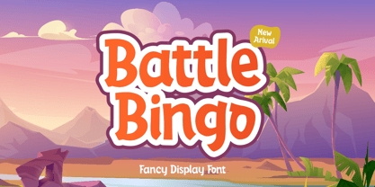 Battle Bingo is Playful and Fancy font. It was created with freehand handwriting style using a marker. It look classy and happiness to all your designs. You can use this font for a logo, kids clothing, invitation, poster, friendly design, fun design, book cover, adventure poster, outbound poster, and any cute and funny typeface needs and more.
 - Sketchy in snow by Abo Daniel,
$13.00 This font "SKETCHY IN SNOW" is so cute and playful. It is great for quotes, logo, branding, packaging, t-shirt design, cover kids book, tote bag design, social media and anything your project Both uppercase and lowercase are match perfectly. You can combined them as you like. Features: Uppercase Lowercase Number & Punctuations International Accent PUA Encoded
 - Kickoff by Din Studio,
$29.00 Introducing Backyard - A Display Font This awesome typeface with amusing style looks very interesting for loads of different projects and promotions. It is perfect to be used on your website, for your social media branding, Pinterest banners, printed products, and more! Features: Multilingual Support PUA Encoded Numerals and Punctuation Thank you for downloading premium fonts from Din Studio
 - Baloon Everyday by Arterfak Project,
$16.00 Baloon every day is a layered font. Consists of 4 elements that you can combine to get a cute & stylish word. There is Regular, Shadow, Emboss, and Glossy. This font set is bold, fatty, rounded and funny and suitable for kids' themes or entertaining design. Equipped with stylistic alternates and multilingual support. Thank you for watching!
 - Freak by Cool Fonts,
$24.00 This is a funky hand lettered font that just begs to be used for coffeehouse promo. It is best when used in sizes above 16 points and is even better when used for posters where it can be printed in giant sizes. It was hand drawn in Fractal Designs Painter with lots of little Doo-Dads.
 - Little Humble by Zeenesia Studio,
$14.00 Introducing Little Humble Font Little Humble is natural kid font. It made based on real handwriting. It can be used for cafe or coffee shop menu lists on board, branding, invitations, watermarks, advertisements, product designs, labels, product packaging, book content, quotes and more. It came with number & punctuation, multilingual support, and PUA encode Hope you like this product.
 - Cheesy Bread by Putracetol,
$24.00 Introducing Cheesy Bread, a super playful bold font. This font is perfect for your projects related to kids, which is playful and fun. This font also has 2 versions, clean and rough. Cheesy Bread also perfect for branding design, posters, apparel, logotype, header, quote, invitation, greeting card, cover, poster, fashion design and any more. Come with lot of ligatures character, its help you to make great lettering. This font is also support multi language.
 - Dizzy Fence by Putracetol,
$22.00 Introducing Dizzy Fence, a quirky and blocky display font. This font is perfect for your projects related to kids, which is playful and fun. This font also has 2 versions, clean and rough. Dizzy Fence also perfect for branding design, posters, apparel, logotype, header, quote, invitation, greeting card, cover, poster, fashion design and any more. Come with lot of ligatures character, its help you to make great lettering. This font is also support multi language.
 - Neuzeit Grotesk by URW Type Foundry,
$39.99 Neuzeit Grotesk was originally designed by Wilhelm Pischner (1904-1989) and was released by the font foundry D. Stempel in 1928-1939. In 1970, the German Standards Committee advised the standard use of Neuzeit-Grotesk for official signage and traffic directional systems, and the abbreviation DIN was added to the name of the font. DIN" stands for Deutsches Institut für Normung (The German Institute for Industrial Standards). Neuzeit Grotesk was also once the standard in the German printing industry. It has been seen as a straightforward and utilitarian typeface, with no unusual or distracting features. Like other typefaces from the 1920s, it reflects the philosophy of those times, "Form is Function." Today, however, because of its familiarity and practicality, Neuzeit™ Grotesk has acquired an almost cheerful and reassuring aura. Try it out for signage, magazine headlines, or flyers. See also Neuzeit S for text weights of Neuzeit Grotesk.
 - Fortuna by Linotype,
$29.99Fortuna has some resemblance with handtexted characters based, loosely, on the classic italic. But, like Ad Hoc, Fortuna is drawn on a monitor in every detail. The name is Latin and means fate, luck. The composer Carl Orff was actual at the time when I worked with Fortuna, because he had been born 100 years earlier. Orff's Carmina Burana were being introduced on the radio when I was wondering what to call my most recent creation. The song cycle begins with a song to Fortuna: a fated choice of name. Fortuna was released in 1995. - Steamship JNL by Jeff Levine,
$29.00 While viewing a YouTube video of film footage in and around New York in the mid-1930s, one scene showed some people “window shopping” by the storefront office of the French Line, an international steamship service. A screen capture allowed the storefront sign to be recreated as the digital typeface Steamship JNL, which is available in both regular and oblique versions.
 - Vintage Rovery by Din Studio,
$29.00 Hi, Everyone! If you’re looking for a cute but elegant font to captivate your audiences or customers then we’ve got the font for you! Introducing Vintage Rovery - A Serif Font This typeface with elegant style looks very interesting for loads of different projects and promotions. It is perfect to be used on your website, for your social media branding, Pinterest banners, printed products, and more! Includes: Vintage Rovery (OTF) Features: Standart Ligatures Alternates Stylistic Set Swashes Multilingual Support PUA Encoded Numerals and Punctuation Thank you for downloading premium fonts from Din Studio
 - Universe by Din Studio,
$29.00 Hi, Everyone! If you’re looking for a modern and futuristic font to captivate your audiences or customers then we’ve got the font for you! Introducing Universe - A Futuristic Display Font This typeface with futuristic style looks very interesting for loads of different projects and promotions. It is perfect to be used on your website, for your social media branding, Pinterest banners, printed products, and more! Includes: Universe (OTF) Features: Alternates Standart Ligatures Multilingual Support PUA Encoded Numerals and Punctuation Thank you for downloading premium fonts from Din Studio
 - Quirky by Scholtz Fonts,
$19.95 The idea for Quirky was born while I was looking at a book of etchings by British artist Graham Clarke. His signature, crawling spider-like across the page, fascinated me with its casual, almost messy, inky dark and light drama. I started scribbling the alphabet as I imagined he would write it, based on his signature, then continued, adding curls, making the characters more angular, and refining the dramatic play between dark and light. Finally, Quirky appeared. Apparently casual, Quirky is, in fact, a true connected script. Quirky is characteristic of contemporary handwriting: It appears loose, angular, unstructured, and free, while maintaining good form and legibility. Its baseline is varied, creating an impression of impatient handwriting, without losing legibility. Quirky comes in five styles: condensed -- the most dramatic form, with great drama between thick and thin condensed black -- as with condensed but allows the user to provide exceptional emphasis wide -- increased readability wide black -- increased readability and emphasis splat -- messy and ink-blotted -- a hint of grunge Use Quirky for advertising, for humorous greeting cards, for a funky fashion look or tongue-in-cheek spooky media. Quirky is a fully professional font with extensive use of OpenType Ligatures. For example: most common double letter combinations such as "ee" are rendered as two, slightly different shaped "e"s. This variation in letter shapes removes the cues by which the reader identifies that he is viewing a FONT and thus conveys a strong sense of hand-lettered text. Language support includes all European character sets and has been designed to be used with the following languages: Afrikaans, Albanian, Basque, Bemba, Cornish, Danish, Dutch, English, Estonian, Faroese, Filipino, Finnish, French, Galician, Ganda, German, Icelandic, Indonesian, Irish, Italian, Kinyarwanda, Luo, Malagasy, Malay, Manx, Morisyen, North Ndebele, Norwegian Bokmål, Norwegian Nynorsk, Nyankole, Oromo, Portuguese, Romansh, Sango, Shona, Somali, Spanish, Swahili, Swedish, Swiss German and Zulu.
 - Fnord by Monotype,
$23.99 Fnord is a contemporary humanist serif typeface, it is ideally suited for display purposes, titling, headline copy and branding. The family has been designed to be highly versatile, containing a total of 23 fonts. Each font features discretionary ligatures, swash alternates and true small caps. The overall design is clean and simple with a little bit of rebelliousness thrown in for good measure – Fnord does not conform to the traditional serif blueprint. Fnord’s design has been strongly influenced by the complex, thought-provoking and mischievous works of authors Robert Anton Wilson and Robert Shea from the 1970s. I was re-reading their work while sketching the initial letterforms and realised that some of the proportions and angles were coinciding with some themes that run through the books – particularly the numbers 5, 17, 23, 40 and 93, which are key to this font family’s spacing and geometry. I found it both very interesting and enjoyable to play with a specific theme and purpose for creating this typeface. I am sure you will enjoy working with it in your own design projects. Key features: • 5 Weights in 4 Styles – Roman, Italic, Condensed and Extended • 3 Additional Display Styles in 1 Weight – Engraved, Inline and Woodcut • Small Caps, Alternates, Swashes and Discretionary Ligatures • Full European character set • 680 glyphs per font.
 - Kurkuma by Hanoded,
$15.00 Kurkuma (Turmeric in Dutch) is a spice I use in all of my curries. And I love curry! It's not more than fair to name a font after my favorite ingredient, so here you have it: Kurkuma. It is a unique and somewhat bizarre font with both an angelic and a diabolical side. I wouldn't set a whole text in it, but it does look great in headlines, posters and websites.
 - Invites by Just My Type,
$20.00 Invites is a digital recreation of a 1920’s mechanical script that has never existed. I designed it for my wedding invitations last year and named it in honor of my (ex)wife. Who said it wasn’t her. And she was right. So now it’s called something different. I wanted a sweet, romantic name ... Iris? Taken. Lily? Taken. Iris Lily? Cumbersome. I wanted something short and inviting. Uh ... hmmm.
 - F2F Mekkaso Tomanik by Linotype,
$29.99The techno sound of the 1990s, a personal computer, font creation software, and some inspiration all came together to inspire the F2F (Face2Face) font series. Alessio Leonardi and his friends had the demand to create new unusual typefaces, which would be used in the leading German techno magazine of the day, Frontpage. Even typeset as small as 6-points, in nearly undecipherable layouts, it was a pleasure for the kids to read and try to decrypt the messages. F2F Mekkaso Tomanik is a font whose letters have had diamond holes punched into them. In fact, so many holes have been punched into the letters that one could ask whether this font is more letterforms, or more holes! - Jeunesse Sans by Monotype,
$29.99The design of the Jeunesse font family derives from a study of primers which the designer undertook earlier in his career. Jeunesse was designed with the intention of combining excellent legibility and character recognition with the ability to create compact, distinctive words and lines while maintaining basic flourishless letterforms. The sans serif style is pre-dominant in this design, but serifs or rather parts have been added where necessary, mostly at the top left hand parts of the characters, to aid readability. Use Jeunesse as a text and display face. There are also fully sans serif and slab serif versions available which can be used on their own or mixed with each other and the parent fonts. - Plinc Banjo by House Industries,
$33.00 When it comes to poster design, the line between wild west and psychedelic can be surprisingly fine. Dave West combined both typographic genres to create his refreshing Banjo. Developed in the late 1960s for Photo-Lettering, Inc., this curvaceous high-contrast sort-of serif might have been born on the nineteenth-century frontier, but it was raised in the counterculture of the mid-twentieth century. Use it wherever the conventional and uncommon collide. Vectorized by Mitja Miklavčič in 2017. Like all good subversives, House Industries hides in plain sight while amplifying the look, feel and style of the world’s most interesting brands, products and people. Based in Delaware, visually influencing the world.
 - Jeunesse Slab by Monotype,
$29.99The design of the Jeunesse font family derives from a study of primers which the designer undertook earlier in his career. Jeunesse was designed with the intention of combining excellent legibility and character recognition with the ability to create compact, distinctive words and lines while maintaining basic flourishless letterforms. The sans serif style is pre-dominant in this design, but serifs or rather parts have been added where necessary, mostly at the top left hand parts of the characters, to aid readability. Use Jeunesse as a text and display face. There are also fully sans serif and slab serif versions available which can be used on their own or mixed with each other and the parent fonts.