10,000 search results
(0.897 seconds)
- Peach Guava by Letterayu Studio,
$19.00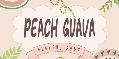 Peach Guava is a Playful Display font that will make your designs look unique and fun. It's perfect for labels, quotes, posters, DIY projects, branding, packaging, greeting cards, websites, photos, photography overlays, signs, window art, scrapbooking, tags and so much more! What's Included : + Standard glyphs + Web Font + Multilingual Accent + Works on PC & Mac + Simple installations Accessible in the Adobe Illustrator, Adobe Photoshop, Adobe InDesign, even work on Microsoft Word. PUA Encoded Characters - Fully accessible without additional design software. Fonts include multilingual support Image used : All photographs/pictures/vector used in the preview are not included, they are intended for illustration purpose only. Thank You
 - Straight Bough by Letterayu Studio,
$19.00 Straight Bough is a Cute Sans Serif font that will make your designs look unique and fun. It's perfect for labels, quotes, posters, DIY projects, branding, packaging, greeting cards, websites, photos, photography overlays, signs, window art, scrapbooking, tags and so much more! What's Included : Standard glyphs Web Font Multilingual Accent Works on PC & Mac Simple installations Accessible in the Adobe Illustrator, Adobe Photoshop, Adobe InDesign, even work on Microsoft Word. PUA Encoded Characters - Fully accessible without additional design software. Fonts include multilingual support Image used : All photographs/pictures/vector used in the preview are not included, they are intended for illustration purpose only. Thank You
 - Hello Friday by Letterayu Studio,
$19.00 **Hello Friday** is a Cute Playful Display font that will make your designs look unique and fun. It's perfect for labels, quotes, posters, DIY projects, branding, packaging, greeting cards, websites, photos, photography overlays, signs, window art, scrapbooking, tags and so much more! **What's Included :** + Standard glyphs + Web Font + Multilingual Accent + Works on PC & Mac + Simple installations Accessible in the Adobe Illustrator, Adobe Photoshop, Adobe InDesign, even work on Microsoft Word. PUA Encoded Characters - Fully accessible without additional design software. Fonts include multilingual support + Image used : All photographs/pictures/vector used in the preview are not included, they are intended for illustration purpose only. _Thank You_
 - Rich Berry by Brothergrounds Studio,
$9.99 Rich Berry is a Playful Display Font that will make your designs look modern, unique and fun with alternate glyphs. It’s perfect for labels, quotes, posters, DIY projects, branding, packaging, greeting cards, websites, photos, photography overlays, signs, window art, scrapbooking, tags and so much more! What's Included : + Standard glyphs + Alternative glyphs + Web Font + Works on PC & Mac + Simple installations\ \ Accessible in the Adobe Illustrator, Adobe Photoshop, Adobe InDesign, even work on Microsoft Word. PUA Encoded Characters - Fully accessible without additional design software. Fonts include multilingual support + Image used : All photographs/pictures/vector used in the preview are not included, they are intended for illustration purpose only. Thank You
 - deccodisco - Personal use only

- Domani CP by CounterPoint Type Studio,
$29.99 Domani from CounterPoint is a faithful digital revival of an old photo-typositing face called ITC Didi. Originally designed by Herb Lubalin and Tom Carnase, Domani brings to life a font that has been somewhat neglected by the digital era until now. Brought to the attention of Jason Walcott by graphic designer Rob King, this font immediately captured Jason with its 1970s high contrast Didone style, typical of that time period. It has some unique design details that set it apart from other didone style typefaces. “Domani” is the Italian word for “tomorrow”. The name was suggested by Rob King, and Jason felt it was perfect for this revitalized design. Walcott has created a professional quality digital version that is both faithful to the original design while expanding the character set to make use of OpenType features. A full set of swash capitals and several swash lowercase, designed by Walcott, has been added, as well as support for Latin-based and Eastern European languages.
 - Possum Saltare NF by Nick's Fonts,
$10.00Lewis F. Day, in his Alphabets Old and New, presented these letters as examples of rustic Roman lettering of the first through third centuries, AD. An uppercase-only typeface, most of the lowercase positions are occupied by letterform variants. It should be noted that the name does not refer to a savory dish made from a nocturnal American marsupial; it’s Latin for “I can dance”. Both versions of the font include 1252 Latin, 1250 CE (with localization for Romanian and Moldovan). - Amberday by Richarts,
$4.99 Amberday is a modern display serif typeface to be used more than just as a header font. When I was creating this typeface my first though was to create a light font but strong enough to stand as a header font. Amberday is a perfect typeface to use for logo design, webdesign, header design, typedesign, posters and many more. Amberday family includes eight weight starting with Thin and ending with a Heavy style. Each style includes kerning, ligatures and alternates.
 - Halau by Vintage Voyage Design Supply,
$7.00 Halau is a clear, elegant and fun upright font for sunny Spring/Summer projects. More fun & sun for your typo- design! I really love this Retro Cartoon style in the 60s and 70s advertising or Hawaii style posters. Combine different width/styles for outstanding typography designs. Some alternates (A, E, K, R, Y, a, g, l, k) will give you more interesting result for your project. Also, you get Hawaii style illustrations set as letters and numerals alternates (36 Total).
 - Sweet Monica by Gatype,
$9.00 Sweet Monica is an elegant script with a creative mood and perfect form, inspired by today's beautiful calligraphy. thick, balanced and varied, born for luxury and beauty. In my example I show how this script can be used. It's great for logotypes, branding, wedding invitations, romantic cards, alcohol labels, packaging, name spelling and more. Sweet Monica comes with beautiful uppercase and lowercase letters, numbers, and punctuation. In addition to the main character set, there are many alternative characters, early and late sweeps.
 - Graceful by Alcode,
$23.00 Graceful is a classic font, I built it with my relaxed hands, designing a classic font with modern elements in it, which makes it particularly suitable for wedding media, book covers, greeting cards, logos, branding, business cards and certificates, in fact for any design work that requires a classic, formal and luxury feel. Try Graceful, enjoy the richness of OpenType features and let her fun and elegant excitement make you happy and enhance your creativity! You can use this font very easily.
 - Malenda by Gold Type,
$12.00 Malenda is my new elegant serif font that will give your projects a touch of luxury and style. It’s perfect for logotypes, branding, monograms and wedding invitations, blog headlines, and more. Browse through all the previews and get as inspired as I was when creating this font. Supported Languages: Armenian, Baltic, Central/Eastern Europe, Cyrillic, Elymaic, English, Ethiopic, Georgian, Old Hungarian, Romanian, Southeast Asia, Western Europe Please contact us if you have any questions, we are happy to help you!
 - Glathen Fantastic by Gold Type,
$12.00 lathen Fantastic is my new elegant serif font that will give your projects a touch of luxury and style. It’s perfect for logotypes, branding, monograms and wedding invitations, blog headlines, and more. Browse through all the previews and get as inspired as I was when creating this font. Supported Languages: Armenian, Baltic, Central/Eastern Europe, Cyrillic, Elymaic, English, Ethiopic, Georgian, Old Hungarian, Romanian, Southeast Asia, Western Europe Please contact us if you have any questions, we are happy to help you!
 - Bromo Plateau by Zeenesia Studio,
$16.00 BROMO PLATEAU - PAIRING FONT DUO Introducing Bromo Plateau Font Duo. The Bromo Plateau is a classy font duo that includes a serif typeface and signature script, suitable for your design project business, like logo branding, wedding invitation, typhography wedding, quotes text, magazine, or anything do you want. I created more than 80 stylistic alternates and much natural ligatures to make this font very classy and look so beauty. Bromo Plateau was built with openType features make your project wil be perfect.
 - Beautiful rain by Sulthan Studio,
$12.00 Beautiful rain made in the rainy season I made an irregular handwritten font at will with beautiful and attractive results full of love and affection in it, making this font very attractive to use in your photos with two words that go hand in hand or also to connect your own name or partner's name because Having a swash heart that can be connected is very suitable for use on greeting cards, wedding invitations, magazines, logos, clothes, stickers, and many more.
 - Long Night by Roland Hüse Design,
$18.00 LONG NIGHT is a a handwriting/signature script with open type ligatures and stylistic alternates. Perfect for titles, headings and logotypes, products packaging or photography watermarks. It includes Western European accented characters. For additional customisations (for logotypes for example) or if you have any further questions, request pleas contact me. Thank you I hope you like this font & good luck with your project! Roland Instagram: @rolandhusedesign Cool background image that inspired the name by my good friend Joshua Guandique https://www.instagram.com/josh_g_art/
 - Areaman OT by AdultHumanMale,
$20.00 Areaman OT is a fun chunky ALL CAPS display font. I wanted it to look blocky and loud, So it can scream from Posters and Headlines. It has over 300 glyphs, several variations on the standard alphabet and all those extra pesky foreign features. It also has various letter pairing with extra ligatures and flourishes available through OpenType or your Glyphs palette. This upgraded version is now coded with OpenType features to create a randomised bespoke look and feel to your copy.
 - Vintage Lander by Din Studio,
$25.00 Have you thought about how you can add that touch of magic to your branding and projects? Want to travel your audience to a world of gorgeous, versatile, but still have the retro touch? Then, here we go. Introducing Vintage Lander- A RetroScript Font This vintage font features thick and angular letters. With its strong outlines and fat strokes, this is the font you need when you want to create that classic bubble font look. This font becomes more special with extruding version option. This font can be used for a host of different content needs and projects. Create gorgeous printed quotes, standout packaging, or beautiful t-shirts! You can even use it to create amazing headings, logos, menus, and social media graphics. Our font always includes Multilingual Support to make your branding reach a global audience. Features: Ligatures Stylistic Set Swashes Multilingual Support PUA Encoded Numerals and Punctuation Thank you for downloading premium fonts from Din Studio
 - moebius - 100% free

- ITC Bodoni Seventytwo by ITC,
$29.99Giambattista Bodoni (1740-1813) was called the King of Printers; he was a prolific type designer, a masterful engraver of punches and the most widely admired printer of his time. His books and typefaces were created during the 45 years he was the director of the fine press and publishing house of the Duke of Parma in Italy. He produced the best of what are known as modern" style types, basing them on the finest writing of his time. Modern types represented the ultimate typographic development of the late eighteenth and early nineteenth centuries. They have characteristics quite different from the types that preceded them; such as extreme vertical stress, fine hairlines contrasted by bold main strokes, and very subtle, almost non-existent bracketing of sharply defined hairline serifs. Bodoni saw this style as beautiful and harmonious-the natural result of writing done with a well-cut pen, and the look was fashionable and admired. Other punchcutters, such as the Didot family (1689-1853) in France, and J. E. Walbaum (1768-1839) in Germany made their own versions of the modern faces. Even though some nineteenth century critics turned up their noses and called such types shattering and chilly, today the Bodoni moderns are seen in much the same light as they were in his own time. When used with care, the Bodoni types are both romantic and elegant, with a presence that adds tasteful sparkle to headlines and advertising. ITC Bodoni™ was designed by a team of four Americans, after studying Bodoni's steel punches at the Museo Bodoniana in Parma, Italy. They also referred to specimens from the "Manuale Tipografico," a monumental collection of Bodoni's work published by his widow in 1818. The designers sought to do a revival that reflected the subtleties of Bodoni's actual work. They produced three size-specific versions; ITC Bodoni Six for captions and footnotes, ITC Bodoni Twelve for text settings, and ITC Bodoni Seventytwo - a display design modeled on Bodoni's 72-point Papale design. ITC Bodoni includes regular, bold, italics, Old style Figures, small caps, and italic swash fonts. Sumner Stone created the ornaments based on those found in the "Manuale Tipografico." These lovely dingbats can be used as Bodoni did, to separate sections of text or simply accent a page layout or graphic design." - ITC Bodoni Twelve by ITC,
$29.99Giambattista Bodoni (1740-1813) was called the King of Printers; he was a prolific type designer, a masterful engraver of punches and the most widely admired printer of his time. His books and typefaces were created during the 45 years he was the director of the fine press and publishing house of the Duke of Parma in Italy. He produced the best of what are known as modern" style types, basing them on the finest writing of his time. Modern types represented the ultimate typographic development of the late eighteenth and early nineteenth centuries. They have characteristics quite different from the types that preceded them; such as extreme vertical stress, fine hairlines contrasted by bold main strokes, and very subtle, almost non-existent bracketing of sharply defined hairline serifs. Bodoni saw this style as beautiful and harmonious-the natural result of writing done with a well-cut pen, and the look was fashionable and admired. Other punchcutters, such as the Didot family (1689-1853) in France, and J. E. Walbaum (1768-1839) in Germany made their own versions of the modern faces. Even though some nineteenth century critics turned up their noses and called such types shattering and chilly, today the Bodoni moderns are seen in much the same light as they were in his own time. When used with care, the Bodoni types are both romantic and elegant, with a presence that adds tasteful sparkle to headlines and advertising. ITC Bodoni™ was designed by a team of four Americans, after studying Bodoni's steel punches at the Museo Bodoniana in Parma, Italy. They also referred to specimens from the "Manuale Tipografico," a monumental collection of Bodoni's work published by his widow in 1818. The designers sought to do a revival that reflected the subtleties of Bodoni's actual work. They produced three size-specific versions; ITC Bodoni Six for captions and footnotes, ITC Bodoni Twelve for text settings, and ITC Bodoni Seventytwo - a display design modeled on Bodoni's 72-point Papale design. ITC Bodoni includes regular, bold, italics, Old style Figures, small caps, and italic swash fonts. Sumner Stone created the ornaments based on those found in the "Manuale Tipografico." These lovely dingbats can be used as Bodoni did, to separate sections of text or simply accent a page layout or graphic design." - ITC Bodoni Ornaments by ITC,
$29.99Giambattista Bodoni (1740-1813) was called the King of Printers; he was a prolific type designer, a masterful engraver of punches and the most widely admired printer of his time. His books and typefaces were created during the 45 years he was the director of the fine press and publishing house of the Duke of Parma in Italy. He produced the best of what are known as modern" style types, basing them on the finest writing of his time. Modern types represented the ultimate typographic development of the late eighteenth and early nineteenth centuries. They have characteristics quite different from the types that preceded them; such as extreme vertical stress, fine hairlines contrasted by bold main strokes, and very subtle, almost non-existent bracketing of sharply defined hairline serifs. Bodoni saw this style as beautiful and harmonious-the natural result of writing done with a well-cut pen, and the look was fashionable and admired. Other punchcutters, such as the Didot family (1689-1853) in France, and J. E. Walbaum (1768-1839) in Germany made their own versions of the modern faces. Even though some nineteenth century critics turned up their noses and called such types shattering and chilly, today the Bodoni moderns are seen in much the same light as they were in his own time. When used with care, the Bodoni types are both romantic and elegant, with a presence that adds tasteful sparkle to headlines and advertising. ITC Bodoni™ was designed by a team of four Americans, after studying Bodoni's steel punches at the Museo Bodoniana in Parma, Italy. They also referred to specimens from the "Manuale Tipografico," a monumental collection of Bodoni's work published by his widow in 1818. The designers sought to do a revival that reflected the subtleties of Bodoni's actual work. They produced three size-specific versions; ITC Bodoni Six for captions and footnotes, ITC Bodoni Twelve for text settings, and ITC Bodoni Seventytwo - a display design modeled on Bodoni's 72-point Papale design. ITC Bodoni includes regular, bold, italics, Old style Figures, small caps, and italic swash fonts. Sumner Stone created the ornaments based on those found in the "Manuale Tipografico." These lovely dingbats can be used as Bodoni did, to separate sections of text or simply accent a page layout or graphic design." - ITC Bodoni Brush by ITC,
$29.99Giambattista Bodoni (1740-1813) was called the King of Printers; he was a prolific type designer, a masterful engraver of punches and the most widely admired printer of his time. His books and typefaces were created during the 45 years he was the director of the fine press and publishing house of the Duke of Parma in Italy. He produced the best of what are known as modern" style types, basing them on the finest writing of his time. Modern types represented the ultimate typographic development of the late eighteenth and early nineteenth centuries. They have characteristics quite different from the types that preceded them; such as extreme vertical stress, fine hairlines contrasted by bold main strokes, and very subtle, almost non-existent bracketing of sharply defined hairline serifs. Bodoni saw this style as beautiful and harmonious-the natural result of writing done with a well-cut pen, and the look was fashionable and admired. Other punchcutters, such as the Didot family (1689-1853) in France, and J. E. Walbaum (1768-1839) in Germany made their own versions of the modern faces. Even though some nineteenth century critics turned up their noses and called such types shattering and chilly, today the Bodoni moderns are seen in much the same light as they were in his own time. When used with care, the Bodoni types are both romantic and elegant, with a presence that adds tasteful sparkle to headlines and advertising. ITC Bodoni™ was designed by a team of four Americans, after studying Bodoni's steel punches at the Museo Bodoniana in Parma, Italy. They also referred to specimens from the "Manuale Tipografico," a monumental collection of Bodoni's work published by his widow in 1818. The designers sought to do a revival that reflected the subtleties of Bodoni's actual work. They produced three size-specific versions; ITC Bodoni Six for captions and footnotes, ITC Bodoni Twelve for text settings, and ITC Bodoni Seventytwo - a display design modeled on Bodoni's 72-point Papale design. ITC Bodoni includes regular, bold, italics, Old style Figures, small caps, and italic swash fonts. Sumner Stone created the ornaments based on those found in the "Manuale Tipografico." These lovely dingbats can be used as Bodoni did, to separate sections of text or simply accent a page layout or graphic design." - ITC Bodoni Six by ITC,
$40.99Giambattista Bodoni (1740-1813) was called the King of Printers; he was a prolific type designer, a masterful engraver of punches and the most widely admired printer of his time. His books and typefaces were created during the 45 years he was the director of the fine press and publishing house of the Duke of Parma in Italy. He produced the best of what are known as modern" style types, basing them on the finest writing of his time. Modern types represented the ultimate typographic development of the late eighteenth and early nineteenth centuries. They have characteristics quite different from the types that preceded them; such as extreme vertical stress, fine hairlines contrasted by bold main strokes, and very subtle, almost non-existent bracketing of sharply defined hairline serifs. Bodoni saw this style as beautiful and harmonious-the natural result of writing done with a well-cut pen, and the look was fashionable and admired. Other punchcutters, such as the Didot family (1689-1853) in France, and J. E. Walbaum (1768-1839) in Germany made their own versions of the modern faces. Even though some nineteenth century critics turned up their noses and called such types shattering and chilly, today the Bodoni moderns are seen in much the same light as they were in his own time. When used with care, the Bodoni types are both romantic and elegant, with a presence that adds tasteful sparkle to headlines and advertising. ITC Bodoni™ was designed by a team of four Americans, after studying Bodoni's steel punches at the Museo Bodoniana in Parma, Italy. They also referred to specimens from the "Manuale Tipografico," a monumental collection of Bodoni's work published by his widow in 1818. The designers sought to do a revival that reflected the subtleties of Bodoni's actual work. They produced three size-specific versions; ITC Bodoni Six for captions and footnotes, ITC Bodoni Twelve for text settings, and ITC Bodoni Seventytwo - a display design modeled on Bodoni's 72-point Papale design. ITC Bodoni includes regular, bold, italics, Old style Figures, small caps, and italic swash fonts. Sumner Stone created the ornaments based on those found in the "Manuale Tipografico." These lovely dingbats can be used as Bodoni did, to separate sections of text or simply accent a page layout or graphic design." - Crackling - Unknown license

- Deco Spring by Ingrimayne Type,
$10.00 DecoSpring is a decorative art-deco family that was inspired by one word in an advertisement in a 1978 edition of my local newspaper. I could not find a typeface that matched it so decided to create one, which became DecoSpring-Regular. It is caps only, with an alternative set of capitals on the lower-case keys. Characters with very thick stems invite interior decoration and I opted for floral decorations. DecoSpring-Flowers can be used alone or it can be layered on top of the regular style to create colored flowers. Changing the width of the bolder stem resulted in two more style, the light and thing styles. Another set of four styles, the Simple set, was formed by eliminating the split in the stems by merging the two parts. All the DecoSpring faces are display faces to be used in small doses, and especially the bolder ones, at large point sizes.
 - Glorisa by Black Studio,
$18.00 Glorisa is a new elegant serif font that will add a touch of luxury and style to your projects. This is a very versatile font that works well in large and small sizes. Perfect for editorial projects, magazine headers, Logo designs, Clothing Branding, product packaging, and showcasing masculine and feminine qualities. Glorisa is equipped with uppercase, lowercase, numbers and full punctuation + Multi language support and PUA-encode. To activate the OpenType Stylistic alternative, you need a program that supports OpenType features such as Adobe Illustrator CS, Adobe Indesign & CorelDraw X6-X7, Microsoft Word 2010 or a later version. Features: 3 Font weight Uppercase & lowercase letters Alternative & Ligature Styles Numbers & Punctuation Characters with accents Supports Multiple Languages This type of family has become a work of true love, making it as easy and enjoyable as possible. I really hope you enjoy it! I can't wait to see what you do with Glorisa! Feel free to use #Black Studio tags and #Glorisa Serif fonts to show what you've been up to.
 - Nakilla by Nurrontype,
$14.00 Hello, i'm Nakilla, a contrast, yet beautiful display serif font. In some vocal both in uppercase and lowercase, my designer made some tweak alternate to give me modern feeling, along with ligature, it would make your next project outstanding. You can see me in action, kindly swipe my preview image. I can be headline, i can be body, my Uppercase lookin cool right ? Modern, classic and minimalist. I'm ready for your next project, buy me now. Peace out!, Nakilla.
 - Nouveau Crayon by Hanoded,
$15.00 Nouveau Crayon is based on Crayon Crumble, a font I made a long time ago. I changed a lot of glyphs and added a whole bunch of new ones. It has become quite a good looking font to be honest: oodles of crayon goodness, heaps of crumbling bits and a lot of expression. Use it for cafe websites, restaurant menus, children’s books, art fair posters and whatever else you fancy. Nouveau Crayon comes with abundant language support.
 - Andrila by Sulthan Studio,
$14.00 Andrila is a brush font that I made using a pen and I bolded it in several parts, making it a beautiful calligraphy styled font, also very sweet and cute. It can be used for various purposes such as titles, logos, wedding invitations, t-shirts, letterheads, signage, labels, news, posters, badges, and more. Andrila is built with OpenType features and includes swashes, ligatures and everything to add touches to your design, as well as support for other languages.
 - Softrobo by Koval TF,
$10.00 Fine-built, straight but not official, with soft corners is suitable for short texts, placards and advertising. It was inspired by 1970s when people were mad about robots, space and so on. I decided to create a font as if it was a progressive font of the 1970s.
 - Mistook by Arendxstudio,
$15.00 Mistook - Street Art Graffiti Font is a free style font that has the characteristics of street art that shows freedom and is filled with unique characters Features : • Character Set A-Z • Numerals & Punctuations (OpenType Standard) • Accents (Multilingual characters) • Ligature • Alternate There it is! I really hope you enjoy it !
 - Gelico Milk by Abo Daniel,
$15.00 introducing GELICO MILK - The Sweetest Script - Gelico Milk is great for t-shirt design, stickers, tote bag design, cards, banners, branding, packaging, quotes, logo, signature, social media, and any projects. Features: - Uppercase - Lowercase - Number & Punctuation - Multilingual - Swash - PUA encoded I hope you love it. regards, Abo Daniel Studio
 - Parkour King by Hatftype,
$15.00 Parkour King - Graffiti Font is a free style font that has the characteristics of street art that shows freedom and is filled with unique characters. Features : • Character Set A-Z • Numerals & Punctuations (OpenType Standard) • Accents (Multilingual characters) • Ligature • Alternate There it is. I really hope you enjoy it.
 - Komica Brought by Figuree Studio,
$18.00 Say hello to Komica Brought font. Made with love and joy. Comic look, so it will make your design more beautiful, cute, fun, and colorful. Features: Uppercase and Lowercase Numerals and Punctuation (OpenType Standard) Accents (Multilingual characters) PUA Encode I hope you can enjoy the font :) Regards Figuree Studio
 - Liquid Embrace by Hanoded,
$15.00 Liquid Embrace is a rough 'n' ready brush font. It was created using a Chinese calligraphy brush and Royal Blue Ink (I had run out of black...). Liquid Embrace is fat and in your face, making your message stand out all the more. Comes with an ocean of diacritics.
 - Bodoni Poster by Linotype,
$29.99 Giambattista Bodoni (1740–1813) was called the King of Printers and the Bodoni font owes its creation in 1767 to his masterful cutting techniques. Predecessors in a similar style were the typefaces of Pierre Simon Fournier (1712–1768) and the Didot family (1689–1836). The Bodoni font distinguishes itself through the strength of its characters and embodies the rational thinking of the Enlightenment. The new typefaces displaced the Old Face and Transitional styles and was the most popular typeface until the mid-19th century. Bodoni’s influence on typography was dominant until the end of the 19th century and even today inspires new creations. Working with this font requires care, as the strong emphasis of the vertical strokes and the marked contrast between the fine and thick lines lessens Bodoni’s legibility, and the font is therefore better in larger print with generous spacing. Chauncey H. Griffith’s Poster Bodoni displays characteristics of the advertisement fonts of the first half of the 20th century. The font was most often used for posters and signs, eventually including neon signs.
 - Cesium by Hoefler & Co.,
$51.99 An inline adaptation of a distinctive slab serif, Cesium is an unusually responsive display face that maintains its high energy across a range of different moods. The Cesium typeface was designed by Jonathan Hoefler in 2020. An energetic inline adaptation of Hoefler’s broad-shouldered Vitesse Black typeface (2000), Cesium is named for the fifty-fifth member of the periodic table of the elements, a volatile liquid metal that presents as a scintillating quicksilver. From the desk of the designer, Jonathan Hoefler: I always felt that our Vitesse typeface, an unusual species of slab serif, would take well to an inline. Vitesse is based not on the circle or the ellipse, but on a less familiar shape that has no common name, a variation on the ‘stadium’ that has two opposing flat edges, and two gently rounded sides. In place of sharp corners, Vitesse uses a continuously flowing stroke to manage the transition between upright and diagonal lines, most apparent on letters like M and N. A year of making this gesture with my wrist, both when drawing letterforms and miming their intentions during design critiques, left me thinking about a reduced version of the typeface, in which letters would be defined not by inside and outside contours, but by a single, fluid raceway. Like most straightforward ideas, this one proved challenging to execute, but its puzzles were immensely satisfying to solve. Adding an inline to a typeface is the quickest way to reveal its secrets. All the furtive adjustments in weight and size that a type designer makes — relieving congestion by thinning the center arm of a bold E, or lightening the intersecting strokes of a W — are instantly exposed with the addition of a centerline. Adapting an existing alphabet to accommodate this inline called for renovating every single character (down to the capital I, the period, and even the space), in some cases making small adjustments to reallocate weight, at other times redesigning whole parts of the character set. The longer we worked on the typeface, the more we discovered opportunities to turn these constraints into advantages, solving stubbornly complex characters like € and § by redefining how an inline should behave, and using these new patterns to reshape the rest of the alphabet. The New Typeface The outcome is a typeface we’re calling Cesium. It shares many of Vitesse’s qualities, its heartbeat an energetic thrum of motorsports and industry, and it will doubtless be welcome in both hardware stores and Hollywood. But we’ve been surprised by Cesium’s more reflective moods, its ability to be alert and softspoken at the same time. Much in the way that vibrant colors can animate a typeface, we’ve found that Cesium’s sensitivity to spacing most effectively changes its voice. Tighter leading and tracking turns up the heat, heightening Cesium’s sporty, high-tech associations, but with the addition of letterspacing it achieves an almost literary repose. This range of voices recommends Cesium not only to logos, book covers, and title sequences, but to projects that regularly must adjust their volume, such as identities, packaging, and editorial design. Read more about how to use Cesium. About the Name Cesium is a chemical element, one of only five metals that’s liquid at room temperature. Resembling quicksilver, cesium is typically stored in a glass ampule, where the tension between a sturdy outer vessel and its volatile contents is scintillating. The Cesium typeface hopes to capture this quality, its bright and insistent inline restrained by a strong and sinuous container. Cesium is one of only three H&Co typefaces whose name comes from the periodic table, a distinction it shares with Mercury and Tungsten. At a time when I considered a more sci-fi name for the typeface, I learned that these three elements have an unusual connection: they’re used together in the propulsion system of nasa’s Deep Space 1, the first interplanetary spacecraft powered by an ion drive. I found the association compelling, and adopted the name at once, with the hope that designers might employ the typeface in the same spirit of discovery, optimism, and invention. —JH Featured in: Best Fonts for Logos
 - Belligan by Orenari,
$16.00 Belligan is rounded sans serif which looks calm, feminine yet elegant. Belligan is perfect for your next project, if your project is decided to be simple, modern, clean, and professional touch. Belligan Features: - All Character A-Z, a-z, numeral & punctuation. - Ligatures (BB, CC, DD, EE, FF, GG, LL, MM, NN, OO, PP, RR, SS, TT, Th, ZZ, bb, cc, dd, ee, ff, fi, gg, ll, mm, nn, oo, pp, rr, ss, tt, ti, zz) - Multilingual Support. Oh, and please don't hesitate to drop me a message if you have any questions or you wanna share some jokes! :) Thank You, Ari
 - Vastine by Din Studio,
$25.00 Hello, Everyone! Ready to make your branding spark? If you need to create a big, bold logo for your business, work on a poster for an event, or whatever your project may be-then this is the perfect font for you. Vastine-A Sans Serif Font Family If we can give you many options then why not? Vastine is a package that will surprise you. With this family you will get many options to maximize your designs with stylish fonts. Vastine is made in uppercase and lowercase that easy on the eyes and nice to look while it’s also easy to read. This font designed to bring your branding to life and add a touch of modernity, fun and style. Perfect to create amazing headings, logos, menus, social media graphics, and many more. Features: Multilingual Support PUA Encoded Numerals and Punctuation Thank you for downloading premium fonts from Din Studio


