10,000 search results
(0.045 seconds)
- Mix Basic by Mix Fonts,
$13.00 Mix Basic is just your basic everyday handwriting. This was written initially on a post-it using a fine tip Frixion pen. The font was then digitized, cleaned up, and converted into a font. Since this is basically your everyday handwriting, it has a multitude of creative applications. Think label design, greeting cards, social media quotes, handwritten notes replication, and more. Use as you please! Mix Basic includes the following characters: ABCDEFGHIJKLMNOPQRSTUVWXYZ abcdefghijklmnopqrstuvwxyz 0123456789 !@$#%^&*()`~•· ÷×+−±≈=≠≥≤[]<>:;’”,.\|/?{}“”‘’-–—_…©®‹›«»°¹²³¡¿₱¢€£¥§† ÁÀÂÄÃÅĂĀĄÆĆĈČÇÐĐÉÈÊËĖĒĘĜĤIÍÌÎÏĪĮĴŁŃÑŇ ÓÒÔÖÕŌŐØŒŔŘŚŜŠȘŤȚÚÙÛÜŮŰŬŪŲẂẀŴÝŶŸŹẐŽŻÞ áàâäãåăāąæćĉčçðđéèêëėēęĝĥıíìîïīįĵłńñň óòôöõōőøœŕřśŝšșťțúùûüůűŭūųẃẁŵýŷÿźẑžżþ Alternates/Ligatures for: & R a e i m o u y ee mm nn oo rr tt
 - Callient by Ergibi Studio,
$20.00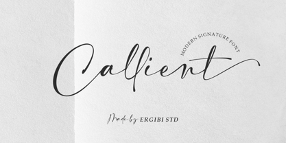 Callient is a Modern signature font presentation from Ergibi Studio. This font includes uppercase, lowercase letters, numbers, punctuation, symbols, binders and multilingual support. Callient is perfect for branding, photography, invitations, quotes, watermarks, advertisements, product designs, social media posts, stationery, labels, and more! I hope you enjoy this font. If you have any questions please don't hesitate to drop me a message :) Thank You, Ergibi Studio
 - Farson Family by Garisman Studio,
$20.00 Proudly Present Farson - Vintage Typeface Farson born from an inspiring vintage display. This font gives a feel of a vintage, classic, old, and based on handmade. Already PUA Encoded and I think this font is perfect for people looking for vintage aesthetic or logo-type. Suitable for any graphic designs such as branding materials, t-shirt, print, business cards, logo, poster, t-shirt, photography, quotes .etc.
 - Kaikoura by Hanoded,
$15.00 Kaikoura is a small town on the east coast of the South Island of New Zealand. It is a very pleasant, laid-back place where the mountains meet the sea. Kaikoura is also the best place in the world to spot sperm whales. Kaikoura font is quite similar in appearance: it is laid-back and beautiful, has sharp peaks and generous curves. I am still trying to find out how to add whale watching to this description… Kaikoura is an all caps font with a lower case alternative for the o and y. It comes with an ocean of diacritics.
 - Ganymede3D - Personal use only

- Dynatype by Alphabet Soup,
$60.00 Suddenly...it’s the World of Tomorrow! With the push of a button Dynatype automates your typesetting experience. Dynatype is actually Two fonts in One–without switching fonts you can instantly change from Dynatype’s “regular” style to its alternate connecting version with the simple push of a button. For more details download “The Dynatype Manual” from the Gallery Section. What is Dynatype? Dynatype is the upright, slightly more formal cousin of Dynascript. It shares many of the characteristics of it’s slightly older relation, but is drawn entirely from scratch and has it’s own unique character. Dynatype may be reminiscent of various mid-century neon signage, and of sign writing, Speedball alphabets and even baseball scripts. Its design also takes some cues from a historical typographic curiosity that began in Germany in the ‘20s and which lasted into the ‘60s—when Photo-Lettering gave it the name "Zip-Top". Basically it was believed to be the wave of the future—that by weighting an alphabet heavier in its top half, one could increase legibility and reading speed. The jury’s still out on whether or not there’s any validity to this notion, but I think you’ll agree that in the context of this design, the heavier weighting at the top of the letters helps to create some uniquely pleasing forms, and a font unlike any other. Typesetters across the planet will also be able to set copy in their language of choice. Dynatype’s 677 glyphs can be used to set copy in: Albanian, Basque, Catalan, Cornish, Croatian, Czech, Danish, Dutch, Esperanto, Estonian, Faroese, Finnish, French, Galician, German, Hungarian, Icelandic, Indonesian, Irish, Italian, Kalaallisut, Latvian, Lithuanian, Malay, Maltese, Manx, Norwegian Bokmål, Norwegian Nynorsk, Oromo, Polish, Portuguese, Slovak, Slovenian, Somali, Spanish, Swahili, Swedish, Turkish, and Welsh—and of course English. Sorry! Off-world languages not yet supported. PLEASE NOTE: When setting Dynatype one should ALWAYS select the “Standard Ligatures” and “Contextual Alternates” buttons in your OpenType palette. See the “Read Me First!” file in the Gallery section.
 - Gibson Serif by Black Studio,
$21.00 Introducing, Gibson Serif is a serif typeface crafted with elegance and luxury, exuding femininity and glamor but also a side of beauty with plenty of alternatives and ties to help you create endless variations for your creative needs. Its striking contrasts and subtle details, along with luxurious strokes and voluptuous curves, create a beautiful and powerful statement for any typographic composition, blending glamor with contemporary aesthetics. Gibson Serif elegant serifs really help you create unlimited variations for your creative needs in creating your project titles: such as fashion, magazines, logos, branding, photography, invitations, wedding invitations, quotes, blog headers, posters, advertisements, postcards, books , websites, etc. Feature • Full set of uppercase, lowercase • 51 Ligatures • 165 Alternatives • Numbers, symbols & punctuation • Characters with accents • Support Multiple Languages • PUA encoded WHAT IS INCLUDED • Gibson Serif – Regular • Gibson Serif – Italic This type of family has become the work of true love, making it as easy and fun as possible. I can't wait to see what you do with the Gibson Serif! Feel free to use the #Black Studio tag and the #Gibson Serif font to show what you've been up to, I really hope you enjoy it! Thank you!
 - Tropic Waters by KA Designs,
$12.00 Tropic Waters is a serif font with chic ligatures. Tropic Waters makes it easy to create stunning logos, advertisements, headlines, social media quotes, branding and more! This font has been carefully created to bring together timeless letterforms with modern ligatures. To take full advantage of this font, you will need to use a design program that supports opentype features - such as photoshop and illustrator. With opentype features enabled, the font will change and interlock as you type. You can easily access the diamond letters by typing in lowercase (a, e, i, o, u). Even without using the interlocking pairs, this font is a clean, chic serif that will bring a lot of interest to your designs!
 - Blackout SCF by Scholtz Fonts,
$21.00 Blackout SCF is a loose and informal grungy font with a modern, electric zappy quality. The font is particularly useable for the promotion of products aimed at young and trendy consumers. It can be used for the design of: CD and DVD covers; clothing advertising and swing tags; magazines and advertising; and cosmetic packaging. It has been carefully letterspaced and kerned. It contains a full character set: all upper and lower case characters, punctuation, numerals and accented characters are present.
 - Samplex by Tipo Pèpel,
$22.00 Neutral and universal are two words that could describe a kind of perfection. The search for neutrality and universality is part of history in type design; it was specially important in the so-called Swiss Style. Samplex is a typeface that joins this particular search. The design gets rid of unnecessary elements and stays away from style conflicts. The large and slightly condensed body of lowercase letters makes Samplex a good choice for long paragraphs, and especially appropriate for screen devices. Letters with a blocky appearance give shape to a text in perfect order, ideal for grid lovers and layouts with a strict structure. The design of Samplex is clean and efficient. The diagonal cuts are reserved to the italic letterforms, setting some distance between the solid upright characters and the dynamic oblique forms.
 - Type Ultimate by VP Creative Shop,
$39.00 Type Ultimate is an exquisite serif font that combines elegance and sophistication. It comes in regular and italic versions, each containing a stunning collection of 383 ligature glyphs and alternate glyphs, as well as 26 swashes for both regular and italic versions. With its extensive character set, Type Ultimate supports a wide range of languages, making it a versatile choice for various projects. This font is perfect for creating a memorable logo, establishing a strong brand identity, and making headlines that stand out. Its timeless and refined design also makes it an excellent choice for elegant wedding invitations and other formal occasions. Overall, Type Ultimate is a font that exudes beauty and refinement, adding a touch of sophistication to any project it's used in. Language Support : Afrikaans, Albanian, Asu, Basque, Bemba, Bena, Breton, Chiga, Colognian, Cornish, Czech, Danish, Dutch, Embu, English, Estonian, Faroese, Filipino, Finnish, French, Friulian, Galician, Ganda, German, Gusi,i Hungarian, Indonesian, Irish, Italian, Jola-Fonyi, Kabuverdianu, Kalenjin, Kamba, Kikuyu, Kinyarwanda, Latvian, Lithuanian, Lower Sorbian, Luo, Luxembourgish, Luyia, Machame, Makhuwa-Meetto, Makonde, Malagasy, Maltese, Manx, Meru, Morisyen, North Ndebele, Norwegian, Bokmål, Norwegian, Nynorsk, Nyankole, Oromo, Polish, Portuguese, Quechua, Romanian, Romansh, Rombo, Rundi, Rwa, Samburu, Sango, Sangu, Scottish, Gaelic, Sena, Shambala, Shona, Slovak, Soga, Somali, Spanish, Swahili, Swedish, Swiss, German, Taita, Teso, Turkish, Upper, Sorbian, Uzbek (Latin), Volapük, Vunjo, Walser, Welsh, Western Frisian, Zulu Ligatures Uppercase - AB,AC,AD,AG,AK,AL,AM,AN,AP,AR,AS,AT,AV,AY,BE,BL,BO,BU,CE,CH,CK,CO,CT,DE,DI,DO,EA,ED, EE,EF,EI,EL,EM,EN,EP,ER,ES,ET,EV,EX,EY,FA,FE,FF,FI,FO,FR,FT,FU,GA,GE,GH,GO,GR,HA,HE,HI, HO,HT,KE,KI,KN,LA,LD,LE,LF,LI,LL,LO,MA,ME,MI,MM,MO,MP,MU,NA,NC,ND,NE,NG,NK,NO,NS,NT, NY,OA,OD,OK,OL,OM,ON,OO,OP,OR,OS,OT,OU,OW,PA,PE,PL,PO,PP,PR,RA,RD,RE,RI,RO,RR,RS,RT, RY,SA,SE,SH,SO,ST,SU,TA,TE,TH,TI,TL,TO,TR,TS,TT,TU,UG,UL,UN,UR,US,UT,VE,VI,WE,WH,WI,WO,YO, YS,MEN,WER,FRO,RON,ROM,THE,AND,ING,HER,HAT,HIS,THA,ERE,FOR,ENT,ION,TER,WAS,YOU,ITH, VER,ALL,THI,TIO,OUL,ULD,IGH,GHT,AVE,HAV,ICH,HIC,HIN,HEY,ATI,EVE,HING,WERE,FROM,THAT,THER, TION,OULD,IGHT,HAVE,THIS,THIN,THEY, ATIO,EVER,MENT Lowercase - ab,ad,ag,ai,ak,al,am,an,ap,as,at,av,ay,ba,be,bl,bo,bu,ca,ce,ch,ck,co,ct,de,di,do,ea,ec,ed,ee,ef,eg,ei,ej,el,en,ep,es,et,ev,ew,ey,fa,fe,fi,fo,fr,fu,ga,ge,gh,gi,gr,ha,he,hi,ho,ht,ic,id,ie,ik,il,im,in,io,ir,is,it,iv,ke,ki,kn,la,ld,le,lf,li,lo,ly,ma,me,mi,na,nc,nd,ne,ng,ni,nk,nl,no,nt,ny,oa,oc,od,of,oi,ok,ol,om,on,oo,op,ot,ou,ov, ow,pa,pe,pi,pl,po,pp,qu,ra,rd,re,ri,rm,rn,ro,rr,rs,rt,ru,ry,sa,se,sh,si,so,sp,ss,st,su,ta,te,th,ti,tl,to,ts,tt, tu,uc,ug,um,un,up,ur,us,ut,va,ve,wa,we,wo,xp,ye,yo,ys,men,wer,fro,rom,ron,the,and,ing,her,hat,tha, ere,for,ent,ion,ter,you,ver,thi,ght,ave,hey How to access alternate glyphs? To access alternate glyphs in Adobe InDesign or Illustrator, choose Window Type & Tables Glyphs In Photoshop, choose Window Glyphs. In the panel that opens, click the Show menu and choose Alternates for Selection. Double-click an alternate's thumbnail to swap them out. Mock ups and backgrounds used are not included. Thank you! Enjoy!
 - Saracen by Hoefler & Co.,
$51.99 Saracen is the Latin (wedge serif) member of The Proteus Project, a collection of four interchangeable type families designed in different nineteenth century styles. The Saracen typeface was designed by Jonathan Hoefler in 1992. Saracen is a design in the ‘latin’ style, characterized by wedge-shaped serifs, a genus of type that emerged in the mid-nineteenth century. A part of The Proteus Project, the typographic theme-and-variations based on related Regency styles, Saracen was created for Rolling Stone, in whose pages the typeface first appeared in 1993 . From the desk of the designer: Though the wedge serif printing type is a nineteenth century innovation, Saracen does not resemble any font from this era. It’s mysterious that typefounders of the Victorian age who sought the extreme and fanciful in their work — exploring all manner of serif treatments, and creating extra-condensed and super-expanded designs — never made a latin font of this straightforward proportion. <
 - Severely - Unknown license

- CrappyJoe by JOEBOB graphics,
$- CrappyJoe got its name because I wrote all characters with a felt-pen with a broken tip. It's still very readable though.
 - Red Letter by Ingrimayne Type,
$9.00 In late 1988 or early 1989 I noticed that the circular form of the sickle and the linear form of the hammer could be used to form all the letters of the alphabet. The result of that realization was RedLetter, a novelty or letterbat font. It is caps-only with the lower-case letters containing smaller versions of upper-case letters.
 - Modar by SAMUEL DESIGN,
$29.00 MODAR means Modern and Artistic. A good font must be enduring and of high quality. This typeface is beautiful and noble, like an elegant sculpture, both historical and modern. This font is great for fashion, magazines, premium services, publishing, and also great for premium brands. MODAR is paired with a sans-serif typeface for a simple yet elegant visual effect. The font is very straight and has high-quality details, combining Eastern and Western aesthetics in one typeface. Designers borrowed classic fonts such as Didot and Canela in this font, combined with the elegant style of personal advocacy, to create 350 characters. I hope this font will help your brand be more visible.
 - Chaotic Neutral by Missy Meyer,
$12.00 I'm letting my inner nerd show through on this one: "Chaotic Neutral" is a Dungeons & Dragons thing. But the name applies to this font, too! Chaotic: This font has all sorts of built-in irregularities. Some variation in letter heights and letter widths, and the stroke widths are all over the place. It's all about the hand-written messiness. Neutral: And yet! I've smoothed the strokes a bit, and gone for as few nodes on each letter as I can (while still keeping a bit of roughness), so this font can be used for any kind of purpose -- not just print, but cutting out as well! Chaotic Neutral also comes with over 300 extended Latin characters for language support, and is fully PUA-encoded for easy access no matter what program you're using.
 - Anisha by 38-lineart,
$13.00 “Anisha”. This font is the Great choice for brand identity, branding and just branding ... we have studied various branding of modern products and we found a very interesting style, which is a combination of "calligraphy signature and clean sans". This is like combining two different elements and together in a composition that is very luxurious and elegant. Anisha calligraphy, bold and thin sans, all of which consist of regular and slant versions, so the number of fonts in this package consists of 6 fonts, the more choices the more design combinations you can make. Anisha is a beautiful high fashion font that makes for gorgeous logos, posters, blog posts, social media, and more! I love using them together with layer masks in Photoshop, so it looks like the script is running through the lines of the sans serif. Anisha Script includes 2 alternates for uppercase and 4-5 alternates for lowercase, and additional ligatures to make everything look totally hand-done.
 - Arbus by Popskraft,
$18.00 When we think of a child's font, random scribbles often come to mind, but I thought, why not make a child's font fun, spontaneous, and at the same time simple and readable. This is how the Arbus font was born. This font is perfect for anyone looking for a light, free-style font that will last a long time. In addition, the font has a number of undeniable advantages: The Arbus font is perfectly balanced, which allows you to use it both in headings and for large amounts of text. Thus, you can completely design your products with one font family. The Arbus font family has nine font weights. The font supports all European languages and of course the Latin alphabet. Works on PC & Mac This beautiful Arbus font can be installed on any operating system, it can also be used in professional programs like Figma or Addobe Crative Cloud, as well as in other simpler software like Canva.
 - Eclectic Two by Altered Ego,
$45.00STF Eclectic Two contains more of the useful and the sublime. Alarm clock time icons and many characters which connect add extra usefulness to this dingbat font. Stuff you'll need someday for a graphic element, bullet or dingbat application. Perfect for website icons! The Eclectic family is legendary, with a cult-like following among the inititated. With over 100 characters in the complete set, you'll find yourself using Eclectic Two almost daily to add spice to your otherwise san-serif typographic existence. This font is essentially a soap opera of typographic image elements, created for projects when I couldn't find the "thingbat" I needed. Almost more of a collection of illustrations, there are many characters which connect to form patterns, and of course it's like a "small neutral European country" army knife for the creative community. EcTwo features an complete architecturally-inspired alphabet, more of those smiley face variations, the eight ball, alarm clocks for the hours, the bouncing ball (with connecting dotted lines!), the paper airplane (flying and crashed!), the work dog, the chainsaw, Dorothy's slippers, the sideways arrows again, a handicapped symbol, chicken feet tracks, male/female symbols, gears, polynesian-inspired ornaments for patterns, a lighthouse, a torch, and more. Sounds twisted, eh? Make your own juxtapositionsof characters for funky borders. Available in Mac and PC formats. License it today! - Correa Script by FadeLine Studio,
$15.00 Introducing Correa Script! This is a modern font script. This font is slanted, luxurious, and elegant. Contains 456 glyphs! Use it freely as you see fit. Please try it out and I hope you enjoy it! With a style like this, this font will be suitable in use for lettering logos, branding projects, homeware designs, product packaging, mugs, quotes, posters, shopping bags, t-shirts, book covers, name card, invitation cards, greeting cards, and all your other lovely projects.
 - Merciful Heart by Sronstudio,
$16.00 Merciful Heart - A lovely Calligraphy Font with lovely alternate swashes and doodle heart bonus. I made this font especially for you craft designer, this font will perfect for adding a lovely touch to your design and with a pretty good thickness, this font will be great for those of you who use Cricut or Silhouette. How To Access Alternate Swashes? You can read this article: https://helpx.adobe.com/illustrator/using/special-characters.html Follow Instagram: @sronstudio Thank You!
 - Cabrito Sans by insigne,
$24.99 It's time to kick off your shoes and feel the "sans" between your toes. Like Cabrito Inverto , its stress-reversing cousin, the new Cabrito Sans serves up something nice and cool in the heat of the project. A quick recap: the original Cabrito is an insigne Design slab serif produced for the kid's book The Clothes Letters Wear. It's been pretty well-received--even more than I expected. I promised to grow the family with a free-standing inverted style that could pair well with Cabrito. (See Cabrito Inverto.) Now, I'm rounding out the family with this well-crafted sans. And so now, Sans is where it's at. Strip away the serifs of Cabrito, and you have a laid back, rounded sans serif alternative served up over easy. This handwriting-inspired creation--like its relatives--is definitely not uptight about its forms (though not afraid to show them off a little). Cabrito Sans' whole pack of alternates is accessible in any OpenType-enabled program. This kiddo consists of a workforce of alternates, swashes, and alternate titling caps to give the font a little extra sweetener to its flavor. Also bundled are swash alternates, old style figures, and compact caps. Check out the interactive PDF brochure to test out each these options. This font family members also consists of the glyphs for 72 various languages. Cabrito Inverto and Cabrito do pair nicely with Cabrito Sans (in case you doubted). Use Sans--or all three of these amigos--to express friendliness on just about anything: food, candy, toys, cars (if you're feeling bold). Don't wait, though. Purchase Cabrito Sans today, and bring a one-of-a-kind look to whatever your computer's next design party is.
 - Beat Fool by PizzaDude.dk,
$15.00 Beat Fool is my latest layered font. I love making layered fonts, because the possibilities are almost endless! Play around with transparency and your favourite colorschemes and patterns to create awesome effects! Beat Fool comes in two layers that plays well together. One layer is solid and can be used for shadow, fill, texture or other creative parts of your design. The second layer is the "Regular" one - the outline that made the basis for the font. I wanted the handmade and handwritten brushstrokes visible, to keep the flaws which makes the look more authentic. Every letter has 4 different versions, again to make things more natural and kind of random! Both layers can be used alone or as described, together - and since it has multilingual support, you can be creative in all kinds of languages! :)
 - Marzo by Sudtipos,
$39.00 Marzo is a monoline, minimalist, modern typeface, that tries to take its forms to a state of natural purity, definitively elegant. Designed by Ariel Di Lisio and digitized by Alejandro Paul.
 - WolfieBoy - Unknown license

- ITC Johnston by ITC,
$29.00ITC Johnston is the result of the combined talents of Dave Farey and Richard Dawson, based on the work of Edward Johnston. In developing ITC Johnston, says London type designer Dave Farey, he did “lots of research on not only the face but the man.” Edward Johnston was something of an eccentric, “famous for sitting in a deck chair and carrying toast in his pockets.” (The deck chair was his preferred furniture in his own living room; the toast was so that he’d always have sustenance near at hand.) Johnston was also almost single-handedly responsible, early in this century, for the revival in Britain of the Renaissance calligraphic tradition of the chancery italic. His book Writing & Illuminating, & Lettering (with its peculiar extraneous comma in the title) is a classic on its subject, and his influence on his contemporaries was tremendous. He is perhaps best remembered, however, for the alphabet that he designed in 1916 for the London Underground Railway (now London Transport), which was based on his original “block letter” model. Johnston’s letters were constructed very carefully, based on his study of historical writing techniques at the British Museum. His capital letters took their form from the best classical Roman inscriptions. “He had serious rules for his sans serif style,” says Farey, “particularly the height-to-weight ratio of 1:7 for the construction of line weight, and therefore horizontals and verticals were to be the same thickness. Johnston’s O’s and C’s and G’s and even his S’s were constructions of perfect circles. This was a bit of a problem as far as text sizes were concerned, or in reality sizes smaller than half an inch. It also precluded any other weight but medium ‘ any weight lighter or heavier than his 1:7 relationship.” Johnston was famously slow at any project he undertook, says Farey. “He did eventually, under protest, create a bolder weight, in capitals only ‘ which took twenty years to complete.” Farey and his colleague Richard Dawson have based ITC Johnston on Edward Johnston’s original block letters, expanding them into a three-weight type family. Johnston himself never called his Underground lettering a typeface, according to Farey. It was an alphabet meant for signage and other display purposes, designed to be legible at a glance rather than readable in passages of text. Farey and Dawson’s adaptation retains the sparkling starkness of Johnston’s letters while combining comfortably into text. Johnston’s block letter bears an obvious resemblance to Gill Sans, the highly successful type family developed by Monotype in the 1920s. The young Eric Gill had studied under Johnston at the London College of Printing, worked on the Underground project with him, and followed many of the same principles in developing his own sans serif typeface. The Johnston letters gave a characteristic look to London’s transport system after the First World War, but it was Gill Sans that became the emblematic letter form of British graphic design for decades. (Johnston’s sans serif continued in use in the Underground until the early ‘80s, when a revised and modernized version, with a tighter fit and a larger x-height, was designed by the London design firm Banks and Miles.) Farey and Dawson, working from their studio in London’s Clerkenwell, wanted to create a type family that was neither a museum piece nor a bastardization, and that would “provide an alternative of the same school” to the omnipresent Gill Sans. “These alphabets,” says Farey, referring to the Johnston letters, “have never been developed as contemporary styles.” He and Dawson not only devised three weights of ITC Johnston but gave it a full set of small capitals in each weight ‘ something that neither the original Johnston face nor the Gill faces have ‘ as well as old-style figures and several alternate characters. - Eleusis by TEKNIKE,
$55.00 Eleusis is a sans serif monospace display font. The typeface has a distinct style inspired by a combination of Naval, Industrial, Mid-Century Modern and ancient sacred geometry, designed to be bold and easy to read. The Eleusis name is derived from the legendary town (Ancient Greek: Ἐλευσίς), home of the Eleusinian Mysteries and birthplace of the great tragedian Aeschylus for its past and present. Contemporary Eleusis is one of the main industrial centers of Greece with refineries and shipbuilding. Eleusis is great for display work, quotes, invitations, posters, titles and headings.
 - Straider by Hikhcreative,
$23.00 Specialized for the "speed typeface" and "adrenaline seeker" soul, we got you packed up. A nitro boost for your visual needs. Please welcome, STRAIDER. The racing typeface. Inspired by the mid era of vintage and modern automotive visual branding. We build the bold and strong font with total aim to the speed, cars, vehicles, and automotive vibes. Will be a perfect match for the automotive events, branding, logo, cars and motorcycle posters, advertising, anytime you want some more "speed" in your visual project. FEATURES : Uppercase & Lowercase letters Numbers & Punctuation Ligatures Multilanguage Support Thank you.
 - Aprex Sans by S6 Foundry,
$20.00 Aprex Sans perfectly balances the minimalist quality associated with contemporary sans with flair within the width of the counters and comfortable, breathable apertures. — Throughout weights and sizes, the typeface has great legibility and good contrast between positive and negative space, making it stunningly versatile. — With a seamless combination of contemporary details and classic styles, Aprex Sans draws inspiration from the mid-century humanist and grotesque typefaces, and its solid and straightforward structure is characterized by angular connections between curves and stems. Aprex Sans is geometric in nature with humanist qualities rooted in the Swiss tradition.
 - Something Fishy by Kate Brankin,
$17.00 A recent walk down memory lane through old college sketchbooks revealed a collection of caricature fish doodles. Then the sketches were discovered by my son who, being a marine life enthusiast, promptly demanded that I draw more fish. Thus, a collection of 71 fish-inspired drawings and bubbly numbers was born. There is even a lemon, since no fish is really complete without one.
 - Viking Initials by Wiescher Design,
$19.50 Viking Initials are pure brute-force blackletter initials of the time just before the Nazis started to rule, somehow these initials are typical for that period. I made one alphabeth-set with rough edges on the uppercase keys and a second set with sharp edges on the lowercase keys. For you to choose. Your historical designer Gert Wiescher
 - Brumers by Trustha,
$17.00 Brumers is a fun sans serif font. Inspired by the curves of a bear. The basic concept is actually hand-drawn. Then, I developed and improved it in the next process. It comes in six styles, which makes it easy to choose according to the project you are working on. Brumers is perfect for headlines, branding, and many more.
 - Ancora by FAEL,
$20.00 I’m happy to announce the complete version of Ancora, a typeface I designed back in 2013. Ancora is a sans serif typeface with a distinctive style, inspired by the imagery in the production of the famous Port wine, such as boats, barrels, grapes, and bottle labels. Use Ancora for magazines, packaging, posters, stamps, brands and logos a new taste.
 - Soda Syrup by Kitchen Table Type Foundry,
$10.00 At home, we don’t drink soft drinks at all. Maybe sometimes, when one of the kids has a birthday party, but we normally don’t have a stash of the stuff. We have cordial, or, as wel call it in Holland: limonadesiroop (‘Lemonade Syrup’). There you go, another font name xplained! Today Syrup was made with a marker pen and a lot of paper! It comes with a frizzy, sticky goodness to give your designs that extra kick.
 - Stonecrop by Andrew Harper Fonts,
$5.00 Stonecrop is a font unified by bold, imposing lines as well as its use of rounded rectangles as the central stylistic shape. Stonecrop loosely conforms to the monospaced font style, with near-equal widths for all letters and numbers (but not all symbols/punctuation), however it does incorporate kerning for all types of glyphs where appropriate to aid in legibility. A perfect font for usages that demand consistency and precision, while still maintaining a quirky and stylized handwritten effect.
 - Freezetide by Tanincreate,
$18.00 Freezetide is a handwritten font with alternates, ligatures, OpenType features which give your design a natural handwriting feel with personality. Freezetide comes with 299 glyphs including multilingual characters, standard numbers, lowercase stylistic and standard alternates, discretionary ligatures for variety. Letters have jagged edges imitating dip pen writing. Using these ligatures allows you to give a realistic somewhat quirky hand-lettered look to your typography. Write the same word differently by combining the default set, alternates, standard and discretionary ligatures.
 - Shapiro by OGJ Type Design,
$175.00 A neogrotesque with a distinct mid-century feel. Shapiro’s multi-axis Variable Font comprises of 8 text weights, from Light to Black. Three additional sizes, “Headline”, “Display” and “Max” supply another 8 weights that are spaced for larger applications. To top off the package, 8 Wide styles are ready for that extra punch. Choose Shapiro for any job that calls for a restrained but confident voice. Give your design that professional look in the blink of an eye.
 - Rip TAPE by TypoGraphicDesign,
$19.00 CONCEPT/CHARACTERISTICS The handmade, dirty and yet modern character of the font was designed with analog tape on paper and later digitized. The motto is sticky, wrinkled and rough APPLICATION AREA The dirty, rough and fancy font „rip TAPE“ would look good at display size for poster, flyer, comics and graphic novel lettering and logos. Headlines in magazines or websites, packaging, music covers or webbanner etc. TECHNICAL SPECIFICATIONS Headline Font | Display Font | Grunge/DIY Font „rip TAPE“ OpenType Font with & 78 glyphs & 2 styles (regular, fixed).
 - Whittington by George Tulloch,
$21.00 Whittington is a revival of a congenial ‘modern’ typeface of the mid nineteenth century, unassuming and businesslike with an even colour that reads comfortably over long stretches. It is intended primarily for use in running text. Whittington provides wide support for west, central, and east European languages that use the roman alphabet. Among its OpenType features are ligatures, small caps, several sets of numerals, contextual alternates, intelligent implementation of long ‘s’, and fractions. For more detail, please see the pdf available in the Gallery.


