10,000 search results
(0.028 seconds)
- Janda Closer To Free by Kimberly Geswein,
$5.00 This chunky serif handwriting is fun but still completely legible for children.
 - Brashee by Gerald Gallo,
$20.00 Brashee is a serif font with characters made up of straight lines.
 - Red Border Labels JNL by Jeff Levine,
$29.00 In the pre-computer, pre self-adhesive label era of office supplies a number of companies (including Dennison, Maco and Denny-Reyburn) manufactured a wide variety of gummed labels for just about any use or purpose. Blank labels, specialty labels and decorative holiday seals were just a part of this line. One popular style was that of labels with parallel thick-and-thin borders of red lines and corners chamfered, rounded or straight cut. Occasionally, one could find similar labels with blue, green or gold borders but red was the mainstay, hence naming this typeface Red Border Labels JNL. Presented in this font is a collection of twenty-six standard and specialty shape label borders on the capital (A-Z keys) and twenty-six solid panel versions on the lower case (a-z) keys which can be used as backfills for the borders or as stand-alone labels.
 - Urbane Condensed by Device,
$39.00 Urbane Condensed is an addition to the popular Urbane series, a versatile all-purpose sans-serif family of six weights plus italics. Perfect for headlines and running text, it is clear, classic and authoritative. It explores the same idea-space as early geometric modernist sans such as Futura, Erbar, Spartan and Elegant Sans, with a single-story a, a contemporary high x-height and very slightly condensed bowls. Unusually for a geometric moderne sans, letter-widths are optically balanced, giving an even colour in setting. Includes a full international character set, lining, tabular and old-style numerals.
 - Guapa by Type-Ø-Tones,
$50.00 Guapa was first born from a personal experiment: transforming a geometric sans serif 'à la Futura' into a charming postmodern deco design. It was applied in a poster specially designed for a typography exhibition called 'Pimp the type'. Later it became a well-suited typeface for the word: from titles for magazines to book & record covers and packaging. The family consists in one single weight, which is provided with Discretionary ligatures, Alternative characters, Swashes forms, Initials and some Stylistic Sets. The Ornaments Series will be designed in the future, as well as a Cyrillic update. Guapa is fancy, delicious & fresh!
 - Taronge by Sensatype Studio,
$15.00 Taronge - Urban Display Sans Serif that created special for Logo, Title and more stand out typography for sport and action. It's so perfect to add your style and headline overview for sport, technology, actions, and fighting theme. And specially for this font, we crafted for bold action style and modern feels so enjoy to create any project that will show your main idea out. Taronge - Urban Display Sans Seri ready with: Creative characters prepared to get best results Preview as a inspirations that you can do with Taronge font Ready with All Uppercase characters Wish you enjoy our font. :)
 - Areplos by Storm Type Foundry,
$53.00To design a text typeface "at the top with, at the bottom without" serifs was an idea which crossed my mind at the end of the sixties. I started from the fact that what one reads in the Latin alphabet is mainly the upper half of the letters, where good distinguishableness of the individual signs, and therefore, also good legibility, is aided by serifs. The first tests of the design, by which I checked up whether the basic principle could be used also for the then current technology of setting - for double-sign matrices -, were carried out in 1970. During the first half of the seventies I created first the basic design, then also the slanted Roman and the medium types. These drawings were not very successful. My greatest concern during this initial phase was the upper case A. I had to design it in such a way that the basic principle should be adhered to and the new alphabet, at the same time, should not look too complicated. The necessary prerequisite for a design of a new alphabet for double-sign matrices, i.e. to draw each letter of all the three fonts to the same width, did not agree with this typeface. What came to the greatest harm were the two styles used for emphasis: the italics even more than the medium type. That is why I fundamentally remodelled the basic design in 1980. In the course of this work I tried to forget about the previous technological limitations and to respect only the requirements then placed on typefaces intended for photosetting. As a matter of fact, this was not very difficult; this typeface was from the very beginning conceived in such a way as to have a large x-height of lower-case letters and upper serifs that could be joined without any problems in condensed setting. I gave much more thought to the proportional relations of the individual letters, the continuity of their outer and inner silhouettes, than to the requirements of their production. The greatest number of problems arose in the colour balancing of the individual signs, as it was necessary to achieve that the upper half of each letter should have a visual counterbalance in its lower, simpler half. Specifically, this meant to find the correct shape and degree of thickening of the lower parts of the letters. These had to counterbalance the upper parts of the letters emphasized by serifs, yet they should not look too romantic or decorative, for otherwise the typeface might lose its sober character. Also the shape, length and thickness of the upper serifs had to be resolved differently than in the previous design. In the seventies and at the beginning of the eighties a typeface conceived in this way, let alone one intended for setting of common texts in magazines and books, was to all intents and purposes an experiment with an uncertain end. At this time, before typographic postmodernism, it was not the custom to abandon in such typefaces the clear-cut formal categories, let alone to attempt to combine the serif and sans serif principles in a single design. I had already designed the basic, starting, alphabets of lower case and upper case letters with the intention to derive further styles from them, differing in colour and proportions. These fonts were not to serve merely for emphasis in the context of the basic design, but were to function, especially the bold versions, also as independent display alphabets. At this stage of my work it was, for a change, the upper case L that presented the greatest problem. Its lower left part had to counterbalance the symmetrical two-sided serif in the upper half of the letter. The ITC Company submitted this design to text tests, which, in their view, were successful. The director of this company Aaron Burns then invited me to add further styles, in order to create an entire, extensive typeface family. At that time, without the possibility to use a computer and given my other considerable workload, this was a task I could not manage. I tried to come back to this, by then already very large project, several times, but every time some other, at the moment very urgent, work diverted me from it. At the beginning of the nineties several alphabets appeared which were based on the same principle. It seemed to me that to continue working on my semi-finished designs was pointless. They were, therefore, abandoned until the spring of 2005, when František Štorm digitalized the basic design. František gave the typeface the working title Areplos and this name stuck. Then he made me add small capitals and the entire bold type, inducing me at the same time to consider what to do with the italics in order that they might be at least a little italic in character, and not merely slanted Roman alphabets, as was my original intention. In the course of the subsequent summer holidays, when the weather was bad, we met in his little cottage in South Bohemia, between two ponds, and resuscitated this more than twenty-five-years-old typeface. It was like this: We were drinking good tea, František worked on the computer, added accents and some remaining signs, inclined and interpolated, while I was looking over his shoulder. There is hardly any typeface that originated in a more harmonious setting. Solpera, summer 2005 I first encountered this typeface at the exhibition of Contemporary Czech Type Design in 1982. It was there, in the Portheim Summer Palace in Prague, that I, at the age of sixteen, decided to become a typographer. Having no knowledge about the technologies, the rules of construction of an alphabet or about cultural connections, I perceived Jan Solpera's typeface as the acme of excellence. Now, many years after, replete with experience of revitalization of typefaces of both living and deceased Czech type designers, I am able to compare their differing approaches. Jan Solpera put up a fight against the digital technology and exerted creative pressure to counteract my rather loose approach. Jan prepared dozens of fresh pencil drawings on thin sketching paper in which he elaborated in detail all the style-creating elements of the alphabet. I can say with full responsibility that I have never worked on anything as meticulous as the design of the Areplos typeface. I did not invent this name; it is the name of Jan Solpera's miniature publishing house, in which he issued for example an enchanting series of memoirs of a certain shopkeeper of Jindrichuv Hradec. The idea that the publishing house and the typeface might have the same name crossed my mind instinctively as a symbol of the original designation of Areplos - to serve for text setting. What you can see here originated in Trebon and in a cottage outside the village of Domanín - I even wanted to rename my firm to The Trebon Type Foundry. When mists enfold the pond and gloom pervades one's soul, the so-called typographic weather sets in - the time to sit, peer at the monitor and click the mouse, as also our students who were present would attest. Areplos is reminiscent of the essential inspirational period of a whole generation of Czech type designers - of the seventies and eighties, which were, however, at the same time the incubation period of my generation. I believe that this typeface will be received favourably, for it represents the better aspect of the eighties. Today, at the time when the infection by ITC typefaces has not been quite cured yet, it does absolutely no harm to remind ourselves of the high quality and timeless typefaces designed then in this country.In technical terms, this family consists of two times four OpenType designs, with five types of figures, ligatures and small capitals as well as an extensive assortment of both eastern and western diacritics. I can see as a basic text typeface of smaller periodicals and informative job-prints, a typeface usable for posters and programmes of various events, but also for corporate identity. Štorm, summer 2005 - RMU Koralle by RMU,
$25.00 Koralle was an abundant family of grotesque font styles which had been released by Schelter & Giesecke in the first quarter of the previous century. Out of this family four of the most impressive styles were revived, whereby I stuck as close to the original as possible. All styles contain even the weird-looking capitalized German double-s of which I am a strong opponent.
 - Hokkien by AdultHumanMale,
$12.00 HOKKIEN is an all caps sister to my other font Penang. It was inspired by some old pieces of Art Deco signage I had discovered in Penang Malaysia, The font is available in one weight for now. The font is loaded with plenty of foreign extras and currency symbols. I have also included an alternate cap S which works better visually in blocks of copy.
 - Western Deco JNL by Jeff Levine,
$29.00 The cover of the 1938 sheet music for "Treasure Island March" had its title hand lettered in a rough-hewn Western style with overtones of Art Deco influence. All of the characters were "cleaned up" for the digital font, but still retain the basic designs with their irregular, eccentric look. The result is Western Deco JNL, which is available in both regular and oblique versions.
 - Pulp Magazine JNL by Jeff Levine,
$29.00 For a pulp magazine called Spicy Western Stories, it was unusual that the January 01, 1939 issue had its cover title hand lettered in an extra bold Art Deco style rather than Western influenced lettering. This did not stop the lettering from being used as the design model for a digital type revival. Pulp Magazine JNL, is available in both regular and oblique versions.
 - Nouveau Standard JNL by Jeff Levine,
$29.00 The hand lettering found on the cover of the 1912 sheet music for "Somebody Else is Getting It" featured a blockish Art Nouveau style with rounded corners and a very lurid title [although it likely had a more innocent meaning in those days than the casual observer might interpret today]. Now available as Nouveau Standard JNL, it is available in both regular and oblique versions.
 - Alpha by CTR,
$30.00 The initial designs for this font first came from the idea of creating a dynamic and visually appealing typeface just by using squares so throughout the development stages I had restricted myself to just the use of squared paper. The hardest thing that I found was overcoming the problems regarding letter forms that have diagonal lines and therefore defer from the ongoing style of the typeface.
 - Life by Linotype,
$29.99Life was designed in 1964 by W. Bilz and marks the beginning of a new generation of newsprint fonts. The Ionic style had replaced Modern Face and was now replaced by this new innovative style, which mixed elements of Old Face, Transitional and Modern Face forms. Life’s characters are based on the forms of Times and are the result of a time of change and experimentation. - Box Office by Device,
$29.00 Designed originally for the BBC's listings magazine "Radio Times", this dingbat font has been extended to include the US rating as well as the UK ones and a selection of symbols for use on DVD film packaging and satellite listings. The font used is Paralucent, and an ideal accompaniment. Note: the icon for sexual content comes in two versions, one with genitalia and one without.
 - Dive Gear Stencil JNL by Jeff Levine,
$29.00 Some vintage 1960s-era packaging for dive gear (masks, swim fins, etc.) manufactured by the Voit division of AMF had various merchandise boxes hand-lettered [with some variation of design] in an interesting sans stencil. These packages formed the inspiration of Dive Gear Stencil JNL. Thanks once again to Gene Gable, whom on many occasions has provided Jeff Levine material for type design inspiration.
 - Little Boy Blue by Hanoded,
$15.00 I believe it was Picasso who had a Blue Period between 1901 and 1904. It seems that I have one myself - really not comparing myself to Picasso btw… Recently I created Blue Sheep font and now this one: Little Boy Blue. Little Boy Blue is a very legible, easy-on-the-eye font for texts, books, covers and packaging. Comes with 50 shades of diacritics.
 - Wood Gothic JNL by Jeff Levine,
$29.00 One of the classic designs of the wood type era is Hamilton Gothic Bold [from the Hamilton Wood Type Foundry circa 1889]. Clean and timeless, it even had found a resurgence during the rock and roll posters of the 1960s, where vintage wood types and Art Nouveau influences merged with the “Hippie Counterculture”. Wood Gothic JNL is available in both regular and oblique versions.
 - Hadid by Özhan Yurtseven,
$20.00 For the font design project, I had decided to make a typeface which would reflect the style architectural of Zaha Hadid. My purpose was the presentation of a font to her as Zaha Hadid was alive during my project process. But nearly at the end of the project we unfortunately received the death news of her. Her life wasn't long enough to see the project completed.
 - Bocadillo by Hanoded,
$22.00 A Bocadillo is a sandwich. I guess I was craving one when I had to name this font! Bocadillo is a sweet Brush script. It is all caps, but upper and lower case are different and like to mingle. It is an ideal font for product packaging, posters, book covers, postcards and big ‘I love you’ billboards. Comes with a generous helping of diacritics.
 - NoraPen by sugargliderz,
$40.00 This font is influenced by Walbaum. However, I did not just trace the design, but sort of had the image in my head while I drew the letters. This font is balanced by not being entirely Walbaum, but still basically is. I've named it "NoraPen." Nora comes from the name of the main character in Ibsen's "A Doll's House," and Pen means a cage for livestock.
 - Cartage Stencil JNL by Jeff Levine,
$29.00 The sheet music for the title song of the 1960 movie "Exodus" had the name hand lettered in a block stencil style with rounded corners and narrow "rails" [the breaks between the stencil parts]. Loosely based on this design and working from just the six letters of the title, Cartage Stencil JNL is available as a digital font in both regular and oblique versions.
 - Overbyte by Comicraft,
$19.00 This digitally remastered high density lettering has been bitmapped out for you by Comicraft's Eric Eng Wong. Those of you harddriving through cyberspace on the information superhighway had better zap your prams and reboot your hard disk before you're dragged into your system folder while OVERBYTE makes a major withdrawal from your atm. Do not be fooled by the name, there's nothing goofy about this typeface.
 - Chronic by PintassilgoPrints,
$24.00 Chronically strong, yet pacific. Chronically bold, yet friendly. This font was at first inspired by a HAP Grieshaber work and soon incorporated elements from pieces by Willem Sandberg, two astonishing artists who lived through two world wars. They had to struggle for freedom and consistently manifested, with words, works and actions, their absolute love of liberty. Both were chronically free. As this font intends to be.
 - VLNL TpLlum by VetteLetters,
$35.00 TpLlum is a typeface designed by TwoPoints for a festival in Barcelona called ‘Montjuïc de Nit’. Llum means light in Catalan. In the Montjuïc de Nit project the font was used in white over a dark grey background, letting the light of a backlit poster shine through. For this purpose the typeface had to be very bright, which was made possible by its heavy cut.
 - Sign Template JNL by Jeff Levine,
$29.00 Sign Template JNL is based on one of the many plastic lettering guides manufactured by the now-defunct Wright-Regan Instrument Company (also known as WRICO). Aside from their engineering and drafting templates and tools, WRICO had a line of "Sign-Maker" sets which featured various styles of lettering, special ink pens and metal alignment guides to assure clean, crisp lettering with little effort.
 - Amateur Stencil JNL by Jeff Levine,
$29.00With all of the stencil fonts created by Jeff Levine from various vintage sources, you would think everything had already been covered. Not so. Along comes Amateur Stencil JNL. Modeled from a child's stencil set from the late 1950's or early 1960's, it vaguely resembles Futura, but its irregular widths and semi-stencil appearance sets it off greatly from that classic typeface. - Steel Stencil JNL by Jeff Levine,
$29.00 A group of unique metal plates with stencil initials cut into them was spotted while browsing through online auctions for source material. What made these items even more interesting was how some of the stencil letters had been sectionally divided - not vertically or horizontally as in most stencils, but lines cut at angles. This is the basis for Steel Stencil JNL and Steel Stencil Oblique JNL.
 - Minou by Hanoded,
$15.00 Minou is a French cat’s name. There are more: you could name your cat Léo, Fripouille, Orion, Orphée or Tigrou, but I kind of like Minou. Minou font is a very cute, handmade affair, that started from some doodles I had drawn. Use it for children’s book covers, pyjama party posters, toy packaging and inspirational quotes. I am sure it’ll do the job purrfectly!
 - Folio by Linotype,
$29.99Folio was designed by Konrad F. Bauer and Walter Baum and appeared with the Bauer font foundry (Bauersche Gießerei) in 1957. The designers based their ideas on Helvetica but Folio did not turn out to pose the competition they had hoped. The font has the same applications as Helvetica and is an extremely legible font. Folio is particularly good for text and has an objective, neutral character. - Banana Moonpie by Letterhanna Studio,
$19.00 "Banana Moonpie" is a fresh and whimsical addition to the world of fonts. This unique sans serif handwritten font combines the casual charm of handwritten script with the clarity of a sans serif typeface, resulting in a delightful and versatile font that's as fun as its name suggests.
 - Barbar Shop by WAP Type,
$20.00 Something New, a serif blackletter, has been designed with logo designers and typographers firmly in mind. This display font is a perfect addition to your design studio, ready for your next logotype, barber shop, coffe shop label. A modern mix of serif and blackletter with a touch or vintage
 - Eirlys by Typomancer,
$24.00 Eirlys a Gothic serif typeface with a touch of Celtic feeling. A combination of sharp serif and smooth joint gives a sweet & smart characteristic. Font comes with 4 weights: Light, Regular, SemiBold, Bold and suitable Italic, Especially Small Caps, Swash styles and dozen of alternates for your own experiment.
 - Aguero Sans by Craft Supply Co,
$15.00 Aguero Sans – Font Family is a modern serif font family whose design refers us to the style of modern sans serif. The distinctive features of Aguero Sans – Font Family are the relatively low contrast of strokes, the slightly squarish shapes of round characters and the emphasized business like simplicity.
 - Ningrat by Bejeletter,
$20.00 Ningrat is a mix of classic with modern serif font family. It’s weight cover regular. The black weight of Ningrat Display font offers very strong impression. As a great choice for title and headers, it pairs well with most of the popular sans serif fonts for body text.
 - Kinghood by Rockboys Studio,
$19.00 Kinghood is a delicate and elegant serif font. You can use this modern serif font with ligature & stylistic set for fashion, magazines, cooking websites, quotes, social media posts, labels, and many more! Add it confidently to your favorite creations and let yourself be amazed by the outcome generated.
 - Chilia by Craft Supply Co,
$15.00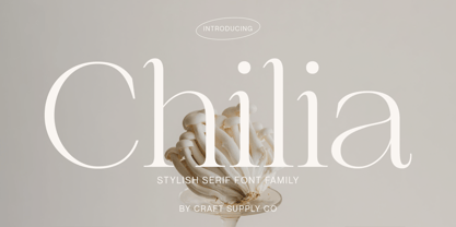 Chilia is a stylish serif font where contemporary upper serifs meet a feminine allure, making it ideal for beauty and display purposes. With its unique blend of modern and elegant features, Chilia adds a touch of sophistication with eye-catching presence that perfect for captivating displays that demand attention.
 - Gloriola by Suitcase Type Foundry,
$75.00 If you really feel that there’s nothing new happening in the sans-serif scene – meet Gloriola. A combination of frugal, unobtrusive uppercase letters with distinctive ascenders, a slightly compressed appearance and an atypical shape, form a sufficiently original contribution to current efforts to bring sans-serifs up to date.
 - Fjørd by Kavoon,
$15.00 Fjørd Serif is a modern classic serif typeface with an individual approach in every single letter. Fjørd will perfect for many projects: fashion, magazines, logo, branding, photography, wedding invitations, quotes, blog header, poster, advertisements, etc. What’s Included? Bruno OTF & TTF Uppercase & lowercase letters, numbers, punctuation European Multilingual support Ligatures.
 - Aranekie by Differentialtype,
$10.00 Aranekie is a modern sans serif font inspired by the bold and thin serif fonts. Aranekie comes in 4 styles, regular and italic styles that are perfect for documents, and Aranekie Dxy which can be used for display fonts such as logos, pamphlets, book covers and many other projects.