10,000 search results
(0.027 seconds)
- Akeila by Slide Shoot,
$17.00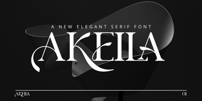 Akeila Serif is a balanced, smooth, elegant and stylish serif font. He has a beautiful character. It fits perfectly with invitation card designs, company logos, movie titles, movie names, business cards, book titles, brand names and various other designs. Akeila Serif is a subtle serif font that exudes sophistication and elegance. Its stylish alternations and ligatures make this font the perfect partner for any project.
 - Brolyn by Slide Shoot,
$15.00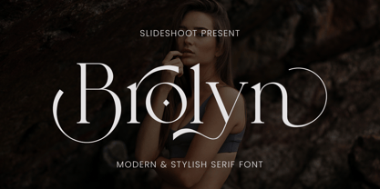 Brolyn Serif is a balanced, smooth, elegant and stylish serif font. He has a beautiful character. It fits perfectly with invitation card designs, company logos, movie titles, movie names, business cards, book titles, brand names and various other designs. Brolyn Serif is a subtle serif font that exudes sophistication and elegance. Its stylish alternations and ligatures make this font the perfect partner for any project.
 - Glaure by Slide Shoot,
$17.00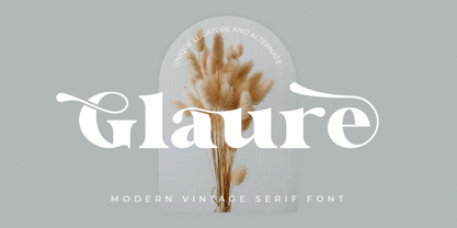 Glaure Vintage Serif is a balanced, smooth, elegant and stylish serif font. He has a beautiful character. It fits perfectly with invitation card designs, company logos, movie titles, movie names, business cards, book titles, brand names and various other designs. Glaure Vintage Serif is a subtle serif font that exudes sophistication and elegance. Its stylish alternations and ligatures make this font the perfect partner for any project.
 - Fartage by Slide Shoot,
$9.00 Fartage Sans Serif is a balanced, smooth, elegant and stylish serif font. He has a beautiful character. It fits perfectly with invitation card designs, company logos, movie titles, movie names, business cards, book titles, brand names and various other designs. Fartage Sans Serif is a subtle serif font that exudes sophistication and elegance. Its stylish alternations and ligatures make this font the perfect partner for any project.
 - Vendya by Slide Shoot,
$15.00 Vendya Serif is a balanced, smooth, elegant and stylish serif font. He has a beautiful character. It fits perfectly with invitation card designs, company logos, movie titles, movie names, business cards, book titles, brand names and various other designs. Vendya Serif is a subtle serif font that exudes sophistication and elegance. Its stylish alternations and ligatures make this font the perfect partner for any project.
 - Twintale by Slide Shoot,
$19.00 Twintale Serif is a balanced, smooth, elegant and stylish serif font. He has a beautiful character. It fits perfectly with invitation card designs, company logos, movie titles, movie names, business cards, book titles, brand names and various other designs. Twintale Serif is a subtle serif font that exudes sophistication and elegance. Its stylish alternations and ligatures make this font the perfect partner for any project.
 - Mothiva by Slide Shoot,
$17.00 Mothiva Serif is a balanced, smooth, elegant and stylish serif font. He has a beautiful character. It fits perfectly with invitation card designs, company logos, movie titles, movie names, business cards, book titles, brand names and various other designs. Mothiva Serif is a subtle serif font that exudes sophistication and elegance. Its stylish alternations and ligatures make this font the perfect partner for any project.
 - SF Wonder Comic, a font created by ShyFoundry, epitomizes the whimsy and lighthearted essence often sought after in comic book lettering and storytelling. This font captures the essence of classic co...
- Axion SSF by Type Innovations,
$39.00 Axion SSF is an original design by Alex Kaczun. Axion SSF is a style variation based on his original Axion typeface family of fonts. It is a display font not intended for text use. It was designed specifically for display headlines, logotype, branding and similar applications. The entire font has an original look which is strong, dynamic, machine generated and can be widely used in publications and advertising. Axion SSF is a futuristic, techno-looking and expressive typeface with an appearance of machined parts with sharp and rounded edges. This attractive display comes in roman with lower case and lining figures. The large Pro font character set supports most Central European and many Eastern European languages.
 - Slapjack by Stephen Rapp,
$49.00 Slapjack is a unique rendition of a broad-edged calligraphic script ideal for packaging, signage, and titling. Its presence is strikingly bold and rhythmic, yet stylishly elegant. With a glyph count well over 700, Slapjack is a fully-featured pro font. Both regular and light weights have contextual and stylistic alternates, stylistic sets, swashes, ligatures, fractions, and Central European language support. Using Adobe InDesign which supports Stylistic Sets allows you to instantly convert your text to a version without baseline connectors for a more streamlined look. These can also be selected via the glyph palette. As a bonus feature, unlike most script fonts, Slapjack is designed to also set well in all caps adding to its versatility.
 - YLab Variable by Par Défaut,
$40.00 yLab is geometric typeface compose of 10 fonts (5 weights and oblique declination) Perfect for titles and text, yLab supports many languages (Latin pro..). 11 OpenType Features (Alternative; Fraction; Numerator; Denominator; Superior; Inferior; Tabular figure; Ordinals; Discretionary Ligature; Stylistic Set; Case Sensitive Forms). • Ordinal feature includes the Latin alphabet (Uppercase & Lowercase). • Five Stylistic set for “a”, “g”, "i" and "l", includes accents. • Discretionary Ligature includes “AE”, “IJ”, “OE”, available in lowercase. • Contextual Alternate includes ligatures for arrows : <- -> ^| v| <-> v^| Add parentheses around period, numbers or arrows, add n or d for numerator, denominator. Add n, d or +, for numerator, denominator or case arrows. All Case sensitive characters become after the uppercase and number.
 - DECRYPT 01 by Type Innovations,
$39.00 Say hello to Decrypt—a geometric typeface that features highly stylized capitals with sharp corners, circular forms and generous proportions. Specifically created for visual impact—use Decrypt when you want your words to stand out from the rest of the crowd. The concept is modern, futuristic and non-traditional. Perfect for display text, logos and headings. The development of Decrypt started in 1997, inspired by Alex Kaczun’s best selling grotesque font family called Contax Pro. Decrypt is specifically introduced here as a bold weight, but Alex plans to expand the design to include many weights, styles and alternative design treatments. Stay tuned! If you like Decrypt—check out all of Type Innovations fonts here.
 - DEXTER by Type Innovations,
$39.00 Dexter is an original new typeface creation by Alex Kaczun. It is a warmer, more sophisticated grotesque that is both fun and interesting. Its tight letter spacing and narrow proportions make the typeface particularly well suited for display sizes and headlines. This intriguing sans with distinctive letter shapes is typical for display fonts of the late 19th and early 20th centuries. Dexter is ideal for titles and headlines looking for impact and style. Dexter is also an excellent choice for magazines, books, posters, brochures, flyers, etc. The large Pro font character set, which supports most Central European and many Eastern European languages, also includes a corresponding small caps font along with old style figures.
 - Hinzatis by Aga Silva,
$39.99 It is up to you how big and voluptuous statement you will be making with this font, as Hinzatis is about old Hollywood glamour and attitude. With lots of options encoded in handy open type files you can easily fine-tune your text for best visual effect. Looks perfect when placed as: titles, headers, labels, names, business cards, just to name a few. Open-type Pro version features 1200 + characters including initial and terminal letters, numerous caps styles, ligatures and alternates. Other versions feature over 1000+ characters and focus mostly on foreign languages with accented letters (incl. Vietnamese); So depending on option you choose you can create realistic and multilingual hand-calligraphy on all of your creations!
 - Gardens by The Rivertown Inkery,
$20.00 Gardens is a nostalgic arena font. Inspired by a soon-to-be demolished arena, this font was created to capture the memories and good times this building once contained. Upon hearing the news of the demolition, our team was struck with sadness and nostalgia. As youngsters we can recall attending a wide variety of events, such as hockey games, pro wresting and the circus. Our hope is that others can share in our nostalgic love of this once prominent arena. With curvy retro styling Gardens is unique and will fit in with many retro and vintage logos and design. Wether its t-shirts, posters or digital, Gardens will surely make your work stand out!
 - Chevin Std by G-Type,
$60.00 Chevin is a contemporary rounded type family in 6 weights which was designed with functionality and legibility in mind. With its open counters and slightly condensed style Chevin can be used for text and is particularly suited to signage. Erik Spiekermann is a fan, noting that Chevin “is charming without being cute, and very legible even in small sizes because of its restrained shapes and simple construction.” Chevin is named after a hill on the outskirts of Otley in West Yorkshire. Since 2007 the type family has been highly prominent in the UK as Royal Mail’s corporate font and the typeface that adorns every Post Office in the country. The Chevin Pro set includes additional Greek and Cyrillic layouts.
 - Outcast by Canada Type,
$49.95 Outcast puts the whole grunge font problem to rest by eliminating repetition. Here we have eight variations on each character (4 all cap fonts), so there is no more need to use the same character twice in any display setting. You have the main interchangeable fonts, then you have Outcast Pro — an amalgamation of all four fonts, synched together in one file and programmed with a contextual alternates feature that randomizes setting on the fly. Language support includes Western, Central and Eastern European character sets, as well as Baltic, Esperanto, Maltese, Turkish, and Celtic/Welsh languages. For those end-of-days shirts and placards everyone is eager to design now. Because true grunge never repeats itself.
 - Torjus by Brenners Template,
$19.00 Torjus is so rigid and stiff typeface. While designing a more dry and stiff handwriting typeface, I tried to remove the Bezier curves. Rhythms were also created by dramatically simplifying the paths used in the Glyphs and emphasizing individual contrasts. 60 predefined Ligatures to bring your passion and inspire you to wonder. Ligatures : Ba, Be, Bo, Ca, Ce, Co, Da, De, Do, Ea, Fa, Fe, Fo, Ga, Ge, Go, Ha, He, Ho, Ja, Je, Jo, Ka, Ke, Ko, La, Le, Lo, Ma, Me, Mo, Na, Ne, No, Oa, Pa, Pe, Po, Ra, Re, Ro, Sa, Se, So, Ta, Te, To, Va, Ve, Vo, Wa, We, Wo, Ye, Yo, ee, ff, ll, oo, rr.
 - Ekeras by Type Innovations,
$39.00 Ekeras is an original design by Alex Kaczun. It is a display font not intended for text use. It was designed specifically for display headlines, logotype, branding and similar applications. Primarily a display, this extremely versatile font has generous proportions, large counters and loose fitting which also allow the font to work well across a wide range of text sizes. The entire font has an original look which is strong, dynamic, machine generated and can be widely used in publications and advertising. Ekeras is a futuristic, techno-looking and dynamic typeface with an appearance of machined-like parts with sharp and rounded edges. The large Pro font character set supports most Central European and many Eastern European languages.
 - Parfumerie Script by Typesenses,
$64.00 Parfumerie Script is a sophisticated calligraphic font defined by its smooth curves, clean lines and the finest of fine strokes. Graceful and refined in its most basic script form, a range of Swash and Decorative alternates (including a unique local style called Filete Porteño, an ornamental form native to Buenos Aires) allows users to elevate their designs to higher levels of aesthetic beauty and elegance. Parfumerie Script Pro contains over 2500 glyphs, among which are swashes, ornaments and decorative alternates. Some alternatives are offered separately too. Use professional software that widely support Open Type features. Otherwise, you may not have access to some glyphs. For further information about features and alternates, see the User Guide
 - Wola by Monotype,
$50.99 Wola™, by Franciszek Otto, is not for the typographically timid. It creates vibrant digital headings, banners and navigational links, in addition to commanding print headlines and subheads – but it is not shy, reserved or demure. The design blends the stroke weight stress of Bodoni with the urgency of handwritten letterforms, conveying the energy and immediacy of a design that’s bigger than life – and outside the fence. OpenType® Pro fonts of Wola provide for the automatic insertion of ligatures and alternate characters. These are in addition to a character set supporting most Central European and many Eastern European languages, including Cyrillic and Greek. All this makes Wola a comfortable – if boisterous – world traveler.
 - Quick Silver FS by Designova,
$23.00 Quick Silver FS is unique, fresh and cute handwritten font for branding / logo design / logotypes / greeting cards / promotional graphics and anything in between. Quick Silver FS is inspired from modern era cartoon titles and completely handmade with passion and perfection. Extended Character Sets Along with the basic Latin character set, we have added Western European, Central European, South Eastern European character sets for your convenience. Advanced Kerning We have performed advanced, in-depth kerning for all possible letter combinations. What You Get This font being a handmade typeface, comes with only single weight (Regular). CREDITS: Font designed by Lis at Fontastica, produced by Fontastica, distributed by Designova. Created with ProCreate and Fontself on iPad Pro.
 - Birthstone by TypeSETit,
$80.00 The Birthstone Family is a set of fonts that are not only diverse but perfectly compatible to interchange styles in a single block of text. There are 3 precious gems: Script, Casual, and Formal. Plus for added luster, there's Bounce (both Medium and Light weights) plus a Titling font— A truncated version that includes caps and ending swashed forms. You won't believe your eyes. All 4 styles are uniquely compatible to one another, but distinctly different. See how easily the fonts may change according to the needs of the look. The Pro version contains the three main styles: Script, Casual and Formal plus the lighter weight version of Bounce. You will also have lots of Opentype feature options.
 - YLab by Par Défaut,
$30.00 yLab is geometric typeface compose of 10 fonts (5 weights and oblique declination) Perfect for titles and text, yLab supports many languages (Latin pro..). 11 OpenType Features (Alternative; Fraction; Numerator; Denominator; Superior; Inferior; Tabular figure; Ordinals; Discretionary Ligature; Stylistic Set; Case Sensitive Forms). • Ordinal feature includes the Latin alphabet (Uppercase & Lowercase). • Five Stylistic set for “a”, “g”, "i" and "l", includes accents. • Discretionary Ligature includes “AE”, “IJ”, “OE”, available in lowercase. • Contextual Alternate includes ligatures for arrows : <- -> ^| v| <-> v^| Add parentheses around period, numbers or arrows, add n or d for numerator, denominator. Add n, d or +, for numerator, denominator or case arrows. All Case sensitive characters become after the uppercase and number.
 - Axion RND by Type Innovations,
$39.00 Axion RND is an original design by Alex Kaczun. Axion RND is a style variation based on his original Axion typeface family of fonts. It is a display font not intended for text use. It was designed specifically for display headlines, logotype, branding and similar applications. The entire font has an original look which has rounded corners throughout and is strong, dynamic, machine generated and can be widely used in publications and advertising. Axion RND is a futuristic, techno-looking and expressive typeface with an appearance of machined parts and rounded edges. This attractive display comes in roman with lower case and lining figures. The large Pro font character set supports most Central European and many Eastern European languages.
 - 1536 Civilite Manual by GLC,
$42.00 This font was created inspired from a handwritten copy of the "Brief story of the second journey in Canada" (1535) by French explorer Jacques Cartier. It is an early "Civilité" manual style, closely looking like the "Civilité" script font carved by Robert Granjon a few years later and still strongly influenced by blackletters forms, clearly visible in the capitals or long s, d, e, f or t forms. (Look at our "1557 Civilite Granjon Pro" and the latest "1638 Civilite Manual"). It is containing Western (including Celtic) and Northern European, Icelandic, Baltic, Eastern, Central European and Turquish diacritics. Historical forms, titling alternates and the numerous lower alternates or ligatures made the font looking like a real various hand.
 - Amigie by Craft Supply Co,
$20.00 Introduction to Amigie – Display Serif Amigie – Display Serif is a unique display font that stands out with its distinctive serif design. Its bold and innovative shape makes it perfect for eye-catching displays and powerful branding. This font captures attention, offering a fresh take on traditional serif styles. Design and Innovation Each character in Amigie – Display Serif boasts a unique serif shape, blending classic elegance with modern creativity. The font features sharp, clean lines, and its unique serifs add a touch of sophistication. Furthermore, its balanced proportion ensures that each letter is clear and impactful, perfect for making a statement. Versatility and Functionality Amigie – Display Serif is not just visually striking but also highly versatile. It’s ideal for a wide range of applications, from editorial designs to bold advertising. Additionally, it works exceptionally well for headlines, logos, and packaging, where its unique character can shine. This font is also highly legible, making it suitable for both digital and print media.
 - Itzkarl by Hanken Design Co.,
$25.00 ItzKarl is a unique hybrid typeface with serif and sans serif features that is suitable for headline, logo and poster use.
 - Cirkus Fantastiko by PizzaDude.dk,
$17.00 The other day I was at a market with my kids and they had this really retro kind of circus thing. The signs and posters there, were designed in a really sloppy and poor manner - but they all had a lot of naive charm! I was really fascinated by all these uneven letters and I was immediately inspired to do a font like that! And out of the magic hat comes...ta-da-da-da...Cirkus Fantastiko! Planning on throwing a party with a circus theme? Then Cirkus Fantastiko is ready to play the juggling clown while riding the elephant! Play around with the 3 different layers to create that low budget hand painted cirkus posters! :)
 - Ginza Display Inline by Positype,
$22.00Sometimes you get an idea stuck in your head and the only way to get rid of that demon is to put something down on paper. A year later the doodles became a skeleton, and then the skeleton had a body, then the body had a name, then the name got a personality. What was left was a clean set of ten fonts that encompass a very simple skeleton with a lot of visual appeal. During the process, I saw ways to expand the typeface's display capabilities by producing inline styles as well as a down-and-dirty rough set. Each font has a full set of glyphs that include Central European and Small Cap characters. - Ginza by Positype,
$22.00Sometimes you get an idea stuck in your head and the only way to get rid of that demon is to put something down on paper. A year later the doodles became a skeleton, and then the skeleton had a body, then the body had a name, then the name got a personality. What was left was a clean set of ten fonts that encompass a very simple skeleton with a lot of visual appeal. During the process, I saw ways to expand the typeface’s display capabilities by producing inline styles as well as a down-and-dirty rough set. Each font has a full set of glyphs that include Central European and Small Cap characters. - Mikan by Hanoded,
$15.00 A couple of years ago, I walked the Kumano Kodo pilgrimage trail in Japan. At the start of the walk, I stayed in a nice guesthouse in Tanabe city, which lies in Wakayama prefecture. I wouldn’t mention all of this, if it didn’t have something to do with the font name: Wakayama prefecture is THE mandarin orange (Mikan) growing area of Japan and the owner of the guesthouse had just picked a bagful of mikan, which he shared with me. So, I had to think of that when I made this font. Mikan is a nice, rounded family of fonts. Both styles come with alternative a’s (and accented a’s), which some people prefer for Children’s books.
 - Hendrix by Scriptorium,
$18.00I had a chat recently with a customer who is a big fan of lettering from the psychedelic poster era. The discussion got me thinking about poster lettering we hadn't yet made into fonts, and a particular sample from a Jimi Hendrix poster I had played around with but never finished making into a font. So I went back to the drawing board and the result is the new Hendrix font. Unlike many of our other Psychedelic fonts which are stripped down to their basic character forms, this font includes the outlines characteristic of a lot of poster lettering from that period. It also includes variant versions of a number of the characters - Ginza Display Rough by Positype,
$22.00Sometimes you get an idea stuck in your head and the only way to get rid of that demon is to put something down on paper. A year later the doodles became a skeleton, and then the skeleton had a body, then the body had a name, then the name got a personality. What was left was a clean set of ten fonts that encompass a very simple skeleton with a lot of visual appeal. During the process, I saw ways to expand the typeface's display capabilities by producing inline styles as well as a down-and-dirty rough set. Each font has a full set of glyphs that include Central European and Small Cap characters. - Ongunkan Sweden Futhark by Runic World Tamgacı,
$40.00 Prior to 500 AD the 24-rune Elder Futhark was used in Sweden. From 500 AD until 800 AD there were many Futharks which were transitions from the 24-rune Futhark to one of the 16-rune Futharks. By the end of this period the 24-rune Futhark was completely out of use , and only 16-runes Futharks were in use. By 900 AD two different types of Shorttwigs-Futharks had been born. One was popularized in Norway and the other was used in the west (the British islands). By 1000 AD the adjustment of the runes to the Latin alphabet had begun, and several versions are found up until the Dalrunes, about 1700-1800 AD.
 - Deca Sans by ParaType,
$30.00 Super family Deca consists of ten fonts. Six sans serif styles form the Deca Sans family and four styles of serif family named Deca Serif . These are low contrast fonts of pure design with ovals bent to rectangular shapes. They are nicely readable in small sizes and can be recommended for scientific, legal, official and business documents. Serif and sans serif fonts were designed in comparable proportions, they are balanced by color and have similar details in basic shapes. These features provide high compatibility and assume collective usage of the fonts in documents.
 - Grenda by Yukita Creative,
$14.00 Grenda is a modern and elegant serif font. This serif font is inspired by Arabic and European art. Serif fonts are perfect for you, a creative worker who wants to make something modern and elegant. Perfect for branding, logos, headings, advertising, product packaging, web design, print design, film covers, youtube, & more! Serif typeface Ranges in style from sleek & subtle to luxurious Character set A-Z Numbers & Punctuation. Why not try Grenda Serif Font today? It comes in uppercase, lowercase, punctuation, and numbers; no more worrying about anything else.
 - Typist Slab Mono by VanderKeur,
$25.00 The typeface Typist originated during an extensive research on the origin and development of typewriter typestyles. The first commercially manufactured typewriter came on the market in 1878 by Remington. The typestyles on these machines were only possible in capitals, the combination of capitals and lowercase came available around the end of the nineteenth century. Apart from a few exceptions, most typestyles had a fixed letter width and a more or less unambiguous design that resembled a thread-like structure. A lot of this mechanical structure was due to the method the typestyles were produced. Looking at type-specimens for print before the first typewriters were good enough to came on the market we can see that in 1853 and in 1882 Bruce’s Type Foundry already had printing type that had a structure of the typewriter typestyles. Of course printing types were proportional designed as typewriter typestyles had a fixed width. So it is possible that except from the method of production for typewriter typestyles, the design of printing types were copied. In the design of the Typist, the purpose was – next to the monospace feature – to include some of the features of the early typewriter typestyles. Features such as the ball terminals and the remarkable design of the letter Q. This new typeface lacks the mechanical and cold look of the early typewriter typestyles. The Typist comes in six weights with matching italics in two versions. One that resembled the early typewriter typestyles (Typist Slab) and a version designed with coding programmers in mind (Typist Code).
 - Typist Code Mono by VanderKeur,
$25.00 The typeface Typist originated during an extensive research on the origin and development of typewriter typestyles. The first commercially manufactured typewriter came on the market in 1878 by Remington. The typestyles on these machines were only possible in capitals, the combination of capitals and lowercase came available around the end of the nineteenth century. Apart from a few exceptions, most typestyles had a fixed letter width and a more or less unambiguous design that resembled a thread-like structure. A lot of this mechanical structure was due to the method the typestyles were produced. Looking at type-specimens for print before the first typewriters were good enough to came on the market we can see that in 1853 and in 1882 Bruce’s Type Foundry already had printing type that had a structure of the typewriter typestyles. Of course printing types were proportional designed as typewriter typestyles had a fixed width. So it is possible that except from the method of production for typewriter typestyles, the design of printing types were copied. In the design of the Typist, the purpose was – next to the monospace feature – to include some of the features of the early typewriter typestyles. Features such as the ball terminals and the remarkable design of the letter Q. This new typeface laks the mechanical and cold look of the early typewriter typestyles. The Typist comes in six weights with matching italics in two versions. One that resembled the early typewriter typestyles (Typist Slab) and a version designed with coding programmers in mind (Typist Code).
 - Savia Filled Shadow - Personal use only

