10,000 search results
(0.636 seconds)
- Fornire by Jehoo Creative,
$20.00 The Fornire family of typefaces grew out of a desire to provide a font that has a bold yet simple impression. For this reason, Anwar Patihan drew designs with a high foundation as letters based on humanist shapes and proportions. The letters are kept narrow to enhance the look, and the spacing between characters is narrowed for boldness. While the opentype Fornire feature has an alternate "A B E F P R" letter that looks very striking and easy to recognize, making the Fornire family very suitable for use on Posters, Cover designs, magazines, Banners, packaging designs, design considerations that he put into the Fornire family as well allowing it to perform well in a variety of other design environments. Fornier has a variety of weights ranging from Light, Regular, Medium, Bold
 - Ador by Fontador,
$24.99 Ador is a humanist sans serif especially designed for contemporary typography and comes up with 8 weights from ultralight to black plus true italics and 343 ligatures. A large x-height not only creates space in the letters for extra-bold styles, but also lends Ador an open and generous character in the more narrow and semi-bold versions. The nice balance between sharp ink trapped and soft, dynamic shapes helps to work in small sizes. Diagonal stress, angled finials and the 4 degree true italic styles give Ador a dynamic look. The font contains 981 glyphs including small caps, tabular, old style, fractions … and a wide range of flexibility for Latin language support for every typographical needs. Ador is a contemporary sans serif typeface, special for logotypes, brands, magazines and editorial.
 - ApronSoft by Hurufatfont,
$19.00 The genesis of ApronSoft font type family is inspired by soft-vertical structure of airplane window. On the other hand ApronSoft is making a reference to technological design mentality of early 2000's. In short texts it has stable view and also humanist effect. Very suitable for mobile apps, web designs, sportive & technological product packs and ads designs. Especially Narrow Bold and Condensed Bold Italic weights have fluid and strong expression for striking headlines. User friendly ApronSoft serves rich opentype properties; small capitals, alternative letters (a, c, e, g, k, l, q, s, y, A, C, G, K, M, N, R, S), stylistic sets, standart and optional ligatures, oldstyle figures, tabular linings, arrows, bullets and wide money currencies, fractions and math symbols. With reduced file size, it’s softer now!
 - Carbon Neutral by Okaycat,
$29.95 Carbon Neutral has a distinctly human style - lettering done cleanly with care -- not mass-produced nor mechanical. Get smooth typography which upon closer inspection is gritty & grassroots. The small details make this font friendly & inviting. Carbon Neutral has an exceptionally high level of detail which may cause your graphics program to operate slowly. Carbon Neutral is extended, containing West European diacritics & ligatures, making it suitable for multilingual environments & publications.
 - Papyrus by ITC,
$40.99Papyrus is a roman calligraphic typeface with distinctive human touches like rough edges, irregular curves, and high horizontal strokes in the caps. It imparts a warm and friendly ambience to everything from restaurant menus to book covers. American Chris Costello created the popular font Papyrus in 1983 and counts it as one of his proudest accomplishments. In addition to designing type, Costello is a prolific graphic designer, illustrator, and web designer. - Hathaway by Lunas Type,
$19.00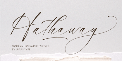 Introducing, Hathaway! Hathaway is a modern and stylish handwritten font. With natural flow it can add a human touch to your designs. Hathaway is perfect for many design needs such as merch, T-shirts, titles, wedding, book covers, social media posts, websites, events, and many more. What's you get : - Ending Swashes - Underline Swashes (just type _1, _2, etc) - Numeral & Punctuation. - ligature. - Multilingual Support. Enjoy Designing! Thanks! Lunas Type
 - Supertuba by Tipos Pereira,
$10.00 Supertuba is a :) geometric sans vernacular humanist :) display type family with 6 weights. There's literally dozens of ligatures in this font so It works very well for flyers, package, stickers and posters, also you can use it as a text font if you're looking for something slightly bold. Supertuba has multilingual support and useful open type features. Letter boards that used to be seen in churches, dive bars and butcher shops are the main inspiration for this typeface. The name Supertuba came from an old supermarket that no longer exists in the city of Indaiatuba , I just believe this name is super fun (at least in Portuguese) and wanted to keep it alive. I was in Indaiatuba when I get started designing this typeface so this is fair enough. Supertuba the third piece of a particular trilogy of fonts that Stubby and Stubby Rough take part, from the lazy vernacular drawing to an unusual geometry. Enjoy!
 - Gallinari by Jehoo Creative,
$18.00 Modern Grotesk with attractive Display set Gallinari has it. . Gallinari is an attractive Grotesque suitable for all kinds of design needs. Starting from the Heading - Body font is reliable, Has a humanist and geometric character makes it a universal grotesque. Gallinari is equipped with very complete size variants, thin to black, not only that, this font has a condensed style which is paired with Oblique style for a total of 36 fonts in a complete family. What makes it interesting Gallinari has the Uppercase Display set on ss05 bold and sharp, for the letters C, G, O, Q, S, Z completely changed from their basic shape to meet the wild and cool type of display, ss01 ss02 ss03 ss04 is used to give alternative forms of the basic letters (A, P, R, Q, W, Y, a, w, y). Each Gallinari style has more than 680 glyphs and supports various Western European and Cyrillic languages.
 - Majora Pro by Latinotype,
$29.00 Majora Pro is a slab serif typeface which derives its name from a Portuguese historical toy manufacturer. The font comes in 8 styles, ranging from a delicate Thin to a robust Black, with matching italics and an upright version of stencil fonts, resulting in a total of 24 weights. Majora Pro is well-suited to a wide range of design projects which include packaging, editorial design, screen use, etc. Its humanistic features and moderate contrast between thick and thin strokes make it also suitable for long block of texts while having a high degree of legibility. The font includes a set of alternate glyphs which help give your compositions a different and unique look. The Stencil version was specially designed for use in signage, packaging, titles and headings. Majora Pro contains an extensive set of 750 characters (including small caps, different figure styles, etc.) that support over 200 Latin-based languages. Majora is the previous version of Majora Pro.
 - Neue Reman Sans by Propertype,
$45.00 Neue Reman Sans 1.0 --- New Update! CONDENSED - SEMI CONDENSED - SEMI EXPANDED - EXPANDED It has 70 fonts style in total family + 2 Variable Style. --- It is a Roman, Humanist, Grotesk and Geometri sans serif family. The family comes in 7 weights with matching italics + Variable Font File and includes multilingual latin characters. Neue Reman Sans contains 306 glyphs - this is the first version of Neue Reman Family with standard ligatures and a variety of figures and fractions. We create Neue Reman typeface to use in multipurpose project such as on website, systems, printing, embedding, servers, screens, display, digital-ads, branding, logos, titles, headlines, teks, and everything else. This font is a project that we are working on for the long term. We has updating the Condensed and Expanded versions. Then we plan to continue working on Latin Pro, Greek and Cyrillic. It all will be updated gradually. So, hope you would like the first version of Neue Reman Sans Serif Typeface. Thank you very much.
 - Ergonomique by Monotype,
$31.99 Ergonomique is a humanist sans serif typeface that has been designed to be efficient and comfortable to use across all applications. Ergonomique’s personality is defined by its spurless lowercase glyphs – the stems are truncated and blend into their adjoining arcs, as can be seen in the a/b/d/m/n/p/q/r/u characters. Ergonomique is ideal for branding and display purposes, but also performs well as body copy if you’re seeking a unique style for your text. With its nine weights and complementing italics, Ergonomique is highly versatile, especially when you consider that there are small caps and old style figures included, along with a Latin Extended character set. Key Features: • 18 font family – 9 weights in Roman and Italic • Small Caps, Ligatures, with Proportional, Old Style, and Small Cap figures, plus Fractions, Numerators, Denominators, Superiors, and Inferiors • Full European character set (Latin Extended) • 800+ glyphs per font.
 - Slow Tempo by Dharma Type,
$19.99 Slow Tempo is a relaxed, loose-fit font that you can easily enjoy. Slow Tempo has basic, natural and neutral letterforms and skeletons for a wide range of usage. Though, there are some distinctive features. As you can see, Slow Tempo has low curvature of the intersections between stem & shoulder or bowl and also has large and open apertures. This makes this font relaxed. The letterform has low contrast and geometric shape to be neutral design, large x-height and humanistic terminal to be legible and distinguishable. Slow Tempo consists of 8 weights and their matching Italics for a wide range of usages. Further, Slow Tempo is supporting international Latin languages and basic Cyrillic languages including Basic Latin, Western Europe, Central and South-Eastern Europe. Also CSS covers Mac Roman, Windows1252, Adobe1 to 3. This wide range of international characters expands the capability of your works.
 - Short Films by Dharma Type,
$19.99 Short Films is an all-new-styled family, which kind of looks like Art Deco Style. Wide opened counters and softly rounded bowls create a new feeling – Retro but futuristic, geometric but humanistic. Exquisite contrast between thin and bold parts of glyphs make mixed feeling – Pop and feminine, formal and casual, strong and soft. The most distinctive feature is a coexistence of decorativeness and Readability. This coexistence expands the range of font usage. You can use this font for not only titling but also body-text. Short Films consists of 6 weights and their matching Italics for a wide range of usages. Further, Short Films supports international Latin languages and basic Cyrillic languages including Basic Latin, Western Europe, Central and South-Eastern Europe. Also, Short Films covers Mac Roman, Windows1252, Adobe1 to 3. This wide range of international characters expands the capability of your works.
 - Post Box by Great Scott,
$16.00 Written in a ballpoint pen style POST BOX is a neighborly sans serif is slightly condensed and slanted. Scribbled quickly but readable. Exact but still human. Perfect for print, package and display use. You can also use it in shorter paragraph text.
 - Rustic TC by Tom Chalky,
$19.00 Proudly introducing Volume Rustic, where hand-craftsmanship meets professional design. Each of these meticulously handcrafted fonts were thoughtfully designed to harmoniously complement one another, oozing the essence of authenticity, warmth, and the human touch. These fonts are tailor-made for projects that celebrate the organic, the handmade, the local, and everything that puts people at the center. Compatible & Multilingual The fonts are in the OpenType font format. OpenType fonts are accepted within the vast majority of design software (including mobile and tablet design apps). Multilingual support is also included for Basic Latin, Western European, Euro & Pan African Latin.
 - Admire Gustavo by Balpirick,
$15.00 Admire Gustavo is a Handbrushed Font. Our handwritten font takes inspiration from the fluidity and uniqueness of human handwriting, ensuring that each letter carries a sense of character and charm. With its graceful curves and delicate strokes, this font adds an intimate and personal feel to your written words. Perfect for creating notes, memos, journal entries, or beautiful quote designs, our handwritten font elevates your messages with a sense of authenticity and warmth. It transforms your ordinary words into a beautiful composition, breathing life into your writing. - also multilingual support Enjoy the font! Feel free to comment or feedback! Thank you!
 - Creative Wonder by Balpirick,
$15.00 Creative Wonder is a Modern Handwritten Font. Our handwritten font takes inspiration from the fluidity and uniqueness of human handwriting, ensuring that each letter carries a sense of character and charm. With its graceful curves and delicate strokes, this font adds an intimate and personal feel to your written words. Perfect for creating notes, memos, journal entries, or beautiful quote designs, our handwritten font elevates your messages with a sense of authenticity and warmth. It transforms your ordinary words into a beautiful composition, breathing life into your writing. - also multilingual support Enjoy the font! Feel free to comment or feedback! Thank you!
 - Toughton by 99TyppeFoundry,
$12.00 Introducing Toughton Handwritten Font Unveil the beauty of handwritten elegance with Toughton, a font that breathes life into your creative projects. Designed to capture the essence of human touch, Toughton transforms words into a poetic dance of strokes and curves. The Art of Personalization Toughton isn't just a font; it's a journey through the art of personalization. Whether you're crafting wedding invitations, designing branding materials, or adding a human touch to your digital creations, Toughton's unique character will infuse your work with warmth and authenticity. Timeless Appeal With a timeless appeal that transcends trends, Toughton embraces the charm of handwritten script. Its fluid strokes and carefully crafted ligatures ensure that every word flows effortlessly, making it the perfect choice for projects that demand elegance and readability. Versatile Application From logos to social media graphics, packaging to editorial designs, Toughton adapts seamlessly to a variety of design contexts. Let your imagination run wild as you explore the versatility of this handwritten gem. Features and Functionality OpenType Features: Toughton comes with a set of OpenType features, including ligatures and alternates, to add depth and character to your text. Multilingual Support: Express yourself in various languages with Toughton's extensive multilingual support. Web and Print Ready: Whether it's for web design or print publications, Toughton is optimized for both digital and physical mediums. Elevate Your Creations Elevate your design game with Toughton Handwritten Font. It's not just a font; it's an artistic tool that allows you to tell your story with flair, grace, and a touch of humanity. Unlock the potential of your creative projects and make your message resonate with the world. Experience the magic of handwritten authenticity. Get Toughton today and let your words dance with elegance.
 - Letterbot by Comicraft,
$19.00 "If you prick me, do I not bleed? If you tickle me do I not laugh? If you poison me do I not DIE? And if you wrong me shall I not REVENGE?" "I am not a TYPEWRITER! I am not a MACHINE! I am -- NOT -- JUST -- a lettering ROBOT! I -- AM -- A -- HUMAN -- BEING!" Having trouble with YOUR lettering artist? LETTERBOT is here to help. Take all the fuss and muss out of dealing with a real person and install this helpful and responsive robotic font. It has no opinions of its own and will assist you in the lettering of your comic without all that tedious human interaction which lettering artists seem to think they're entitled. Designed by John JG Roshell.* *Now obsolete. Features: Four weights (Regular, Italic, Bold & Bold Italic) with upper and lower case alphabets. Includes Western & Central European accents and Cyrillic characters.
 - Naive Line Sans by S&C Type,
$8.00 Naïve Line Sans is an unusual handwritten sans serif font designed by Fanny Coulez and Julien Saurin in Paris. Our goal was to draw a font with finely irregular lines that give a human and whimsical feeling. We designed five weights, finely balanced, to assure a good readability whatever the size. This font is part of our Naïve superfamily that contains lot of variations: Line, Inline, Serif, Sans Serif, and a special Art Deco one. Just click on our foundry name to see them all! We hope you will enjoy our work. Merci beaucoup!
 - Destructive Decisions by Chank,
$99.00 Destructive Decisions is a font based upon the inherent flaws of human nature—presented under the guise of complete legibility. At first impression this font is very readable, but upon closer examination you'll notice the edges are fuzzy and some of the lines are off-kilter. You can read it, but it is also a bit foggy. No matter how hard it strives for perfection. This font was originally designed for a cable tv show about substance abuse, but is now available for use in your web and print designs, too.
 - Naive Line by S&C Type,
$8.00 Naïve Line is an unusual handwritten serif font designed by Fanny Coulez and Julien Saurin in Paris. Our goal was to draw a font with finely irregular lines that give a human and whimsical feeling. We designed five weights, finely balanced, to assure a good readability whatever the size. This font is part of our Naïve superfamily that contains lot of variations: Line, Inline, Serif, Sans Serif, and a special Art Deco one. Just click on our foundry name to see them all! We hope you will enjoy our work. Merci beaucoup!
 - Schwabacher by RMU,
$25.00 One of my favorite blackletter fonts - Schwabacher - redrawn and redesigned, whereby I took care to stick to the original forms as close as possible. This font which has its roots in the 15th century represents at the most the uprising humanism in this period. To get access to all ligatures, it is recommended to activate both Standard and Discretionary Ligatures. By using the OT feature Stylistic Alternatives you get the historical German umlauts which are small e above a, o, u, A, O, and U. This font contais also oldstyle figures.
 - Qubo by Hoftype,
$49.00 Qubo, a new forcefully drawn monoline face. Its clear graphics create its appeal and give it distinctive characteristics. The slightly squared round elements make for an open and elegant look; subtle details refer to humanistic models. Qubo is a neutral, cool and very versatile typeface. It works superbly both in print and on the web. Qubo is well-equipped for ambitious typography. The Qubo family consists of 14 styles, comes in OpenType format with extended language support for more than 40 languages. All weights contain ligatures, proportional lining figures, tabular lining figures, proportional old style figures, lining old style figures, matching currency symbols, fraction- and scientific numerals.
 - Kylo Sans by The Northern Block,
$29.95 Kylo Sans is a carefully blended typeface, one-part humanist, one-part grotesque and a small dose of geometric. It takes the essence of three distinct forms to create a unique, readable typeface with an exact and understated personality. Additionally, the design process includes a hand-eye adjustment to three master weights, giving a greater range of usability across text layouts. Kylo Sans remastered to version 2.0 for improved OpenType features and usability. Details include six weights and italics, over 700 characters with alternative lowercase Q, a, g, l and y. Open type features include six variations of numerals, small caps, ligatures, and language support covering Western, South and Central Europe.
 - Homenko by Apostrof,
$35.00 Homenko was the only Ukrainian typeface for metal type casting developed in the last century. It has already become a 'classic'. Vasyl Homenko worked on it from 1964 to 1967. The typeface successfully combines the qualities of lineal humanist typefaces with the Ukrainian tradition of asymmetrical slab serif. The works on its digitization and further development has been in progress since 2000. The present version contains Latin Extended characters, Cyrillic with stressed alternates and several ornaments based on Vasyl Homenko's works. It works perfectly for books for children and is ideal for publications related to culture, history, literature and traditional art of Ukraine and other nations of Eastern Europe.
 - Mathieu Sans by Borutta Group,
$39.00 I really like the moments when classic meets modern. Mathieu was inspired, by the proportions, texture and elegance of Renaissance typefaces, and by the works of Dutch typographers, in whom I have always appreciated the balance between the traditional approach and experiment. Mathieu has the features of a sans-serif typeface, but you can feel delicate notes of calligraphy through humanistic details. The whole family has several width options complemented by a slightly slanted but expressive italics – making it suitable for both longer texts and for use in visual identities. Karol Mularczyk and Małgorzata Bartosik worked on the project creatively directed by Mateusz Machalski.
 - Chiavettieri by Kostic,
$50.00 Chiavettieri draws inspiration from Humanist types, marked by low contrast between thick and thin strokes and the angle of stress in the bowls of letters. On the other hand, generous x-height, clean angled serifs and sharp cuts in the ball terminals suggest a more contemporary look. All these characteristics make it a robust, well balanced, legible typeface ideally suited for book text, editorial and publishing, as well as web and screen text. With distinct Italics, small capitals, complete set of superior lowercase (Latin), oldstyle and lining figures (each in tabular and proportional widths), ligatures, fractions, superior and inferior characters – Chiavettieri is equipped for proper typography.
 - M Marker HK by Monotype HK,
$523.99 M Marker is a humanistic script design characterised by its italic, modern, box marker pen-like style. M Marker incorporates features of carton box marker pen, its strokes beginning and ending are rough, parallel without flare. Contrast of strokes is high. Its extra bold stems (豎) make it suitable for large display text to catch attention. Crossbars (橫) and stems (豎) are straight but slanted while angles (折) are smooth and well rounded. Dots (點), ticks (剔), hooks (勾) and downstrokes (撇、捺) are irregular, smooth and long to create softness, liveliness. It is best suited for casual and lively display, illustrations, set upright (naturally slanted), non-condensed.
 - Cynosure by Device,
$39.00Cynosure is a humanist sans with a subtle thick/thin stress. This gives it a clean, sharp elegance and precision that can be missing in some more familiar monoline sans faces. The wide range of weights and the matching reweighed italics make it a versatile solution where a consistent appearance across a broad range of applications is required. Its clear and inarguable design make it suitable for a wide variety of uses, from corporate to entertainment, text to headline, signage, logotypes, magazines and reports. The italics retain the design of the upright across all characters, again ensuring consistency. Includes tabular, lining and old-style numerals. - Koya Sans by JAM Type Design,
$15.00 Koya Sans is a contemporary, humanist sans with a friendly yet clear and distinct personality. It is designed for excellent legibility, particularly for long continuous reading. The sharp terminals add liveliness and variety to the carefully crafted letterforms. Koya Sans, a highly versatile type family consisting 12 styles that are designed to work equally well on paper and on screen. The family ranges from Thin to Black variations, with complimenting italics. Inspired by a trip to the Buddhist temple of Kōyasan south of Osaka, Japan, this carefully crafted sans serif typeface with its sharp terminals loosely emulating the sharp corners of the temple’s pagoda roof.
 - MTT Roma by MTT Type Firm,
$39.99 MTT Roma is designed to re-create the atmosphere of the city of Rome of the 21st century. The studio for the letterform evolved from the Trajan Column alphabet. Suitable for both display and body-text usage, stylistically MTT Roma aims to distance itself from the proliferation of geometric sans-serif families of its time. The result is a sharp, subtly humanist typeface inspired by modern day Rome, the city of contrasts and eternal beauty. Featuring an extended character set to support Central and Eastern European as well as Western European languages, the typeface comes with six weights – from thin to black — with matching italics.
 - Macha by Positype,
$16.00 Macha shares the same DNA as its sibling Anago, but is a completely different species than the former or any of my other sans serifs (Aaux Next, Air, Akagi Pro or Wasabi). It's no-nonsense construction bears many influences from Gill Sans and Frutiger while stubbornly blending my own humanist touch. The focus on developing Macha was just to get to the point with each letterform and discard the rest. Macha takes a little but gives a lot. A fully-loaded character set includes: Small Caps, Proportional Lining and Oldstyle Numerals, Tabular Lining and Oldstyle Numerals, Fractions, Ordinals, Inferiors, Superiors, Stylistic Alternates, Ligatures, Case-sensitive, and more.
 - M Marker PRC by Monotype HK,
$523.99 M Marker is a humanistic script design characterised by its italic, modern, box marker pen-like style. M Marker incorporates features of carton box marker pen, its strokes beginning and ending are rough, parallel without flare. Contrast of strokes is high. Its extra bold stems (豎) make it suitable for large display text to catch attention. Crossbars (橫) and stems (豎) are straight but slanted while angles (折) are smooth and well rounded. Dots (點), ticks (剔), hooks (勾) and downstrokes (撇、捺) are irregular, smooth and long to create softness, liveliness. It is best suited for casual and lively display, illustrations, set upright (naturally slanted), non-condensed.
 - CarbonPlus by Cadson Demak,
$29.00 The original Carbon is a popular face at T26. It was released in 2003 under influence of modern typewriter and OCR typeface. Carbon Plus, a re-work version, was commissioned by local communication technology firm and is now available for commercial release. This revised version was designed with more sensible letter forms in order to add some human touch to the face. The initial release of this font also known as Carbon C6.
 - Xanakee by Chank,
$39.00 Xanakee is a curvacious bubbly fun font, with equal parts pleasant approachableness and a swaggerish strut. Xanakee features large, leisurely curves controlled by the consistency of the monoline stroke. All with a friendly, human voice and confident gait. OpenType versions have a few special features, like some smallcaps and some fanciful swash figures. Purchase it from MyFonts and you'll get TrueType format in your download as well. Also available as web type, too, of course.
 - Los Muertos by Just My Type,
$25.00 Happy Halloween (and All Souls Day and Day of the Dead)! I’ve seen other fonts made up of bones of various kinds, but none with this variety. Henry Gray’s Anatomy of the Human Body (the book, not Grey’s Anatomy, the TV series) was heavily scoured to find more unusual bones shaped like letters. You’ll find Los Muertos both fun and appropriate for the up-coming holidays. (Uppercase is Solid, lowercase is Outline).
 - MVB Emmascript by MVB,
$39.00Kanna Aoki drew the letters for MVB Emmascript while on a picnic near the Conservatory of Flowers in San Francisco’s Golden Gate Park. Mark van Bronkhorst adapted the writing as a font that maintains a very natural scrawl. Later a bold weight was added. MVB Emmascript has been used to add a lighthearted, human touch to everything from fiction paperbacks to potato chip packaging. The typeface is named for Aoki's 1968 Volkswagen, Emma. - Neue Latein by Spirit & Bones,
$33.00 This sans serif font carries the flair and mood our Schneidler Latein font family. The calligraphic appearance and the human sound are evident thanks to the preservation of some significant broad edged pen elements. The forms are reduced to the subtle level where they are simplified, but the essence still remains. The expressive and artistic expression of the Schneidler Latein continues to work like a background melody. Together they build a superfamily that works perfectly in combination with each other. More weights will follow soon.
 - SK Quadratica by Shriftovik,
$32.00 SK Quadratica™ is a monumental accidental typeface inspired by the coexistence of nature and human industrialization. Font characters are similar to blocks. The block structure of the typeface allows you to create various typographic compositions with striking simplicity. Besides, typeface symbols are easy to modify because of which it is a pleasure to work with it. SK Quadratica also contains many alternative character variations. In addition to the basic Latin alphabet, the font supports various languages, including the expanded Latin alphabet, Cyrillic, etc.