10,000 search results
(0.06 seconds)
- Liquorstore by Chank,
$99.00 Inspired by hand-painted liquor store signage in Minneapolis, as well as constructivist propaganda posters and old magazine logos, Chank created Liquorstore as a simple yet elegant exercise in font creation based on basic geometric forms with subtle, humanist sensibilities. Works great for display usage for headlines, labels and prohibitive signage. A simple and versatile, must-have display poster font!
 - Huxley Vertical by Bitstream,
$29.99 The PARATYPE library is our latest major addition, consisting of more than 370 typefaces. In the spirit of the perestroika changes and following the collapse of the Soviet Union, a group of Russian type designers quit the state-owned Polygraphmash foundry to establish ParaType, the first, and now largest Russian digital type foundry. The ParaType team under the supervision of Vladimir Yefimov creates new typefaces and explores the Russian typographic heritage by making digital versions of existing Russian designs: these include the hits of Soviet typography such as Literaturnaya and Journal Sans. Most ParaType fonts are available in Western/Roman, Central European, Turkish and Cyrillic encodings. The Russian constructivist and avant garde movements of the early 20th century inspired many ParaType typefaces, including Rodchenko, Quadrat Grotesk, Ariergard, Unovis, Tauern, Dublon and Stroganov. The ParaType library also includes many excellent book and newspaper typefaces such as Octava, Lazurski, Bannikova, Neva or Petersburg. On the other hand, if you need a pretty face to knock your clients dead, meet the ParaType girls: Tatiana, Betina, Hortensia, Irina, Liana, Nataliscript, Nina, Olga and Vesna (also check Zhikharev who is not a girl but still very pretty). ParaType excels in adding Cyrillic characters to existing Latin typefaces — if your company is ever going to do business with Eastern Europe, we recommend you make them part of your corporate identity! ParaType created CE and Cyrillic versions of popular typefaces licensed from other foundries, including Bell Gothic, Caslon, English 157, Futura, Original Garamond, Gothic 725, Humanist 531, Kis, Raleigh, or Zapf Elliptical 711.
 - RT Singular by Estudio Calderon,
$23.00 RT Singular is a Sanserif with human touch based on Renaissance inscriptions. It was designed in orden to be use specially in health, beauty and scientific brands. The version 1.0 of RT Singular includes a Regular style with the following specifications. - Available as a suite of OpenType® features, as ligatures and alternate characters - A character set supporting most Central European and many Eastern European languages - German capital sharp S
 - Bravely by Craft Supply Co,
$20.00 Bravely- Handwritten Font is an handwritten script font based on the expression of real handwriting, lets you transform type into an exciting and beautiful piece of work. The irregular, hand-lettered look adds a real human touch to things and comes along with a lot of loving details. Combine all font-styles the way you want, add some ornamental swashes or banners and even a single word becomes magnificent.
 - Carbon Neutral by Okaycat,
$29.95 Carbon Neutral has a distinctly human style - lettering done cleanly with care -- not mass-produced nor mechanical. Get smooth typography which upon closer inspection is gritty & grassroots. The small details make this font friendly & inviting. Carbon Neutral has an exceptionally high level of detail which may cause your graphics program to operate slowly. Carbon Neutral is extended, containing West European diacritics & ligatures, making it suitable for multilingual environments & publications.
 - Hathaway by Lunas Type,
$19.00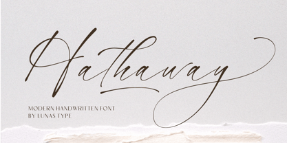 Introducing, Hathaway! Hathaway is a modern and stylish handwritten font. With natural flow it can add a human touch to your designs. Hathaway is perfect for many design needs such as merch, T-shirts, titles, wedding, book covers, social media posts, websites, events, and many more. What's you get : - Ending Swashes - Underline Swashes (just type _1, _2, etc) - Numeral & Punctuation. - ligature. - Multilingual Support. Enjoy Designing! Thanks! Lunas Type
 - Tilda by Etewut,
$30.00 Tilda is a sans serif typeface with big potential. It’s gonna be your daily font, because it perfectly fits to different tasks. Tilda is good as long text but also cool as eye-catch title. This font can be like human ages: childhood, adolescence, youth, adulthood and maturity: stylish THIN, fancy LIGHT, great REGULAR, golden BOLD, brilliant HEAVY And beautiful Isabella Bersellini created illustrations, say her hello! http://www.isabellabersellini.com
 - FS Albert by Fontsmith,
$80.00 The x factor How do you make a font like FS Albert unique, distinctive? “When designing a font I try to question every letter,” says Jason Smith, “but all you need is a few that have an x factor. With FS Albert, they’re the lowercase ‘a’ and ‘g’ and the uppercase ‘I’ and ‘J’. “I remember a friend saying, ‘Why on earth have you designed the ‘a’ like that? Isn’t it too friendly for this kind of font?’ And, in a way, that’s what I wanted – honesty and warmth, because a lot of big brands at the time really needed to show a more human side.” Range of weights and styles FS Albert is a charismatic type: a warm, friendly sans serif face with a big personality. Open, strong and amenable, and available in a wide range of weights and styles, FS Albert suits almost every task you put it to. Fontsmith has crafted five finely-tuned upright Roman weights and four italic weights, as well as a special Narrow version to provide the best coverage and give headlines and text an easy-going character. The chunky kid “FS Albert was inspired by – and named after – my son, who was a bit of a chunky kid,” says Jason Smith. “I designed an extra bold weight because I always felt that the really big font heavy weights had the most personality. “I recently told Albert this story. He laughed, and forgave me for thinking he was a fat baby. He liked the big personality bit, though.” 1000s of glyphs Not content with a character set that covered Europe and the whole of the Western world, the studio decided to go further afield. There are now FS Albert character sets that cover western and eastern European languages, including those of Russia, as well as Cyrillic, Arabic and Greek scripts. In fact, the font now covers more than 100 languages, making it ideal for bringing a consistent typographic style to the communications of global brands.
 - FS Albert Paneuropean by Fontsmith,
$90.00The x factor How do you make a font like FS Albert unique, distinctive? “When designing a font I try to question every letter,” says Jason Smith, “but all you need is a few that have an x factor. With FS Albert, they’re the lowercase ‘a’ and ‘g’ and the uppercase ‘I’ and ‘J’. “I remember a friend saying, ‘Why on earth have you designed the ‘a’ like that? Isn’t it too friendly for this kind of font?’ And, in a way, that’s what I wanted – honesty and warmth, because a lot of big brands at the time really needed to show a more human side.” Range of weights and styles FS Albert is a charismatic type: a warm, friendly sans serif face with a big personality. Open, strong and amenable, and available in a wide range of weights and styles, FS Albert suits almost every task you put it to. Fontsmith has crafted five finely-tuned upright Roman weights and four italic weights, as well as a special Narrow version to provide the best coverage and give headlines and text an easy-going character. The chunky kid “FS Albert was inspired by – and named after – my son, who was a bit of a chunky kid,” says Jason Smith. “I designed an extra bold weight because I always felt that the really big font heavy weights had the most personality. “I recently told Albert this story. He laughed, and forgave me for thinking he was a fat baby. He liked the big personality bit, though.” 1000s of glyphs Not content with a character set that covered Europe and the whole of the Western world, the studio decided to go further afield. There are now FS Albert character sets that cover western and eastern European languages, including those of Russia, as well as Cyrillic, Arabic and Greek scripts. In fact, the font now covers more than 100 languages, making it ideal for bringing a consistent typographic style to the communications of global brands. - Last Episode by Hanoded,
$16.00 I was watching a nice series the other day, which I quite enjoyed, but then I realised that the episode I was watching was in fact the last one. That kinda upset me, as I was just getting into the story. Last Episode is a handmade, all caps font - great for titling, book covers and posters. It comes with a set of alternates and some really interesting discretional ligatures.
 - Hangtime by Type Associates,
$24.50 Hangtime Rad and Extra were designed with surf posters in mind, a subject close to my heart as an avid sailboarder and surfer. Its slightly raked (3 degrees) yet vertical appearance makes for compact setting with extreme impact. Hangtime exhibits some quirky terminal features, its shortened upstrokes are balanced by the lengthened strokes of others providing unusually consistent spacing. Best applied to display situations but is readable at text sizes.
 - Stateside by Studio K,
$45.00 Stateside is a bold condensed serif with a vintage feel. It has an urban and, I like to think, urbane character which puts me in mind of classic Thirties architecture like the Rockefeller Centre or the Empire State Building. I did consider calling it Rockefeller, but the family might think it a bit of a liberty, and I can’t afford to get into a copyright battle with them!
 - Altogether by PintassilgoPrints,
$29.00 Oodles of doodles! Altogether brings not two or three, but eight - yep! - flavours for each letter. Original, creative, authentic flavours. Sometimes sweet, sometimes fun, sometimes weird. A bit eccentric, let's say. So we can say it different. Let the autopilot cycle all these glyphs by simply turning on the contextual alternates feature inside your application. If you prefer, handpick your choices from a glyphs palette. And, mainly, have fun!
 - Juliette Signature by Ferry Ardana Putra,
$10.00 Juliette Signature is natural hand-lettered font manufactured by Bluetype. You will get full set of lowercase and uppercase letters, numerals and punctuation, multilingual symbols, alternate lowercase, and pack of ligatures.This font that is suitable for branding, signature, wedding invitation, promotion, product packaging, and other needs. This font is natural, simple, but still authentic and very stylish. FEATURES Ligatures Uppercase and Lowercase letters Numbering, Symbols, and Punctuations Multilingual Support
 - Merrymakers JNL by Jeff Levine,
$29.00 A throwback design reminiscent of 1950s signage and print ads, Merrymakers JNL takes a previous release (Bluesman JNL) and places the letters and numbers inside parallelograms with ‘TV screen’ openings. Merrymakers JNL is available in both regular and oblique versions. The upper case A-Z characters have the taller side of the shape to the left, while the lower case a-z has the taller side to the right. To make a ‘fan fold’ or zig-zag message, simply alternate upper and lower cases as in this example: C-a-R D-e-A-l-E-r-S You can type spaces between words, but if you prefer blank connectors, use the following: Upper case solid black connector – left bracket key Lower case solid black connector – right bracket key Upper case ‘TV screen’ connector – left brace key Lower case ‘TV screen’ connector – right brace key There is a very limited set of punctuation available. The upper case ampersand, question mark, exclamation point, period, comma, single quote and double quote are all on their respective key positions, but to accommodate the lower case [smaller side] versions, those glyphs have been reassigned to other standard keyboard positions: Type @ to get & Type # to get ? Type $ to get ! Type ^ to get . Type * to get , Type - to get ’ Type = to get ” Additionally, to access the lower case [smaller side] versions of the numerals, type the following keys: Type % to get 0 Type ( to get 1 Type ) to get 2 Type + to get 3 Type / to get 4 Type : to get 5 Type ; to get 6 Type < to get 7 Type > to get 8 Type \ to get 9
 - So Run Down - Unknown license

- Fontazia Stiletto by Deniart Systems,
$20.00 The Fontazia Stiletto font was inspired by my personal obsession with shoes. This is a stylized version of some of the lovely footwear found in my personal closet as well as some of my equally obsessed friends. You'll find 52 assorted shoe illustrations ranging from sandals to boots, some a little strange, but all in good fun.
 - Monospaceland by Pepper Type,
$25.00 Monospaceland is a round monospaced typeface in 7 weights with rich language support (Cyrillic included), small capitals, and some double-width alternatives for added fun. It includes obliques and reverse obliques, making a total of 21 fonts. Plus, the family pack comes with a two-axis variable font to allow setting arbitrary weight and slant angle.
 - Fishbones by Funk King,
$5.00 Fishbones is a font set consisting of fish-bone font-bats. Nothing fishy here – an extensive set of characters makes this an unusual and versatile font.
 - Bibliophile Script by Sudtipos,
$79.00 A friend once jokingly told me that what I really do is mine extinct arts for parts to use in modern things, like going to the scrapyard to pick up bumpers, quarter-panels and dashboards off of Datsuns and Ponies to build a shiny new Ferrari. I still kind of grin at that, but I certainly do spend a lot of time looking at old things and imagining ways they would work today. This shiny new Ferrari here is called Bibliophile, and it contains scrap heap parts from various pages by Louis Prang, the Prussian-American printer and publisher who inspired my Prangs fonts. This is my second engagement with the late 19th century man, and it’s quite a bit more intricate than just an italic Didone with a connected lowercase. Bibliophile marries Round Hand calligraphy with Italian capitals, two styles not often relayed in the same alphabet, but work together beautifully when combined well. When you combine them well with a few long-practised tricks of the trade, then mix in a few trusted features from my previous work over the years, you get my usual crazy exuberance, like 17 different shapes for the d, 21 different forms for the y, endings, beginnings, swashes, ornaments, and so on. It’s no secret that I can get carried away when I’m so consumed by an idea. — Bibliophile comes in 2 weights, each of them with over 900 glyphs covering all the latin languages. Bibliophile also comes with a bold weight, something I’m always reluctant to do with something as adventurous and complex as the structure of this historical mashup. But I couldn’t chase away the idea of increasing the contrast while maintaining the hairlines in a lowercase this narrow. Part of it was the curiosity about the outcome, and part was the sheer challenge of it. I think it turned out OK. Words set in either weight will show delicateness and elegance, and the more time you spend inside the font and micro-manage the setting, the more ways you will find to magnify either. Bibliophile can be as muted or luxurious as you want it to be. This is the kind of alphabet that fits well in fashion marketing and high-end packaging, from the very subdued to the super-exquisite. Enjoy the gleaming new vehicle made with freshly polished old parts.
 - Karela by Blancoletters,
$39.00 English description Karela is a humanist slab serif family. Karela is also the Basque word for gunwale, this is, the widened edge at the top of the side of a boat, where the edge is reinforced with wood or other material and to which the thwarts are attached. Gunwales resemble the way slab serifs reinforce vertical stems giving a more robust appearance to the letters. The sturdy, solid and often mechanical structure that is customary in slab serif or mechanistic typefaces is softened in Karela applying subtle tweaks as: humanist proportions, slightly curved endings in ascenders, and curved edges in serifs. The influence of calligraphy is noticeable all over the character set, especially in counters and letters with instrokes like “m”, “n” and “r”, and it becomes explicit in the italics. On the other hand, its low contrast, generous x-height and the constant width of characters across weights makes it very convenient for editorial uses when low resolution is a concern. Karela pursues to give a human touch to a strong and highly functional structure. It seeks for the ideal combination of strength, precision and warmth of the wooden parts painstackingly handcrafted by ancient boat builders. Besides its 12 standard styles, Karela offers also four additional fonts called "grades". Grades are subtle changes in stroke weight in order to compensate for differences in printing media or display conditions of text layouts. To minimize these subtle changes without a reflow of the text they have to be designed with the same character width of the base style. Karela offers 4 grades for its Regular weight: Grade Minus 5, Grade Minus 5 Italic, Grade Plus 5 and Grade Plus 5 Italic. This makes possible to counteract the effect of changes in paper, temperature, paper, background color… In addition, Karela takes this no‑reflowing idea from grades and extends it to the whole range of styles, allowing to play with any of its weights without undesirable text reflows. Enjoy the layout stability while you experiment and play with variations! Karela presents also a wide range of Opentype features for a professional text layout.
 - PF Bague Sans Std by Parachute,
$39.00 Bague Sans is an award-winning monoline typeface with a distinct and eye-catching personality. Despite its inspiration from early 20th century geometrics, it diverts from the mechanical rigidity of those typefaces by incorporating humanist characteristics, such as subtle variations in stroke width and open counter shapes with vertical endings. This is a very clean and legible typeface with a warm and well-balanced texture which is ideal for intense editorial use in magazines and newspapers. The most remarkable feature of Bague Sans is its vast array of uppercase alternates and ligatures which truly shine when set at display sizes. This typeface is automatically transformed into a flexible, charming and stylish typeface with strong modern aesthetics. Explore its dual personality, switch from Humanist to Geometric and vice versa by using alternate characters such as the single-storey a and single-storey g. From classic to modern, from excessive to neutral, Bague Sans is a multipurpose typeface which offers enormous possibilities and variations for editorial design, branding and corporate identity while it performs amazingly well on web. This superfamily includes 18 weights from Hairline to Ultra Black with a consistent and well-refined structure. It supports extended Latin such as Central European, Baltic, Turkish, Romanian and includes numerous alternates and ligatures for unlimited text variations. You may also want to check out Bague Sans Pro which supports Cyrillic and Greek as well.
 - Morning Magpie by Ana's Fonts,
$15.00 Morning Magpie is a cute handmade brush font with matching illustrations and decorative elements. With an alternates character set, it is perfect for any design that needs a quirky handwritten feel, such as logotypes, postcards and tags, social media quotes. The illustrations will also look great in patterns, in wrapping paper and backgrounds. Morning Magpie includes: Morning Magpie, a brush font with ligatures for a more natural handwritten look Morning Magpie Alternate, a set of alternative characters for A-Z, a-z and 0-9 Morning Magpie Ornaments, a set of 52 drawings, swashed and underlines
 - TT Supermolot Neue by TypeType,
$35.00 Useful links: TT Supermolot Neue PDF Type Specimen TT Supermolot Neue graphic presentation at Behance Looking for a custom version of TT Supermolot Neue? TT Supermolot Neue is a redesigned, extended and greatly enhanced reincarnation of the popular TT Supermolot and TT Supermolot Condensed font families. During its existence, the hammers (‘molot’ in Russian) managed to get into the spotlight in a huge number of projects, for example, in popular video games, films, and branding. Despite its popularity, the limited composition of old families put boundaries their development, which prompted us to release a completely redesigned and greatly extended version. And while the old families could offer designers only a limited number of tools, in the new version you can already find 54 fonts, and each individual font now consists of more than 620 glyphs. First, we have added a completely new subfamily, TT Supermolot Neue Extended. But this is only the tip of the iceberg—in order to achieve visual harmony between the three subfamilies, we completely revised the distribution of widths among them. As a result of this work, the width of the TT Supermolot Neue Basic subfamily became a bit narrower, and the width of the TT Supermolot Neue Condensed subfamily became even narrower than it was in the old version. Secondly, we’ve increased the number of weights. While in the old versions there were only 5 weights, in the new ones there are 9 in each of the subfamilies. In addition, we gave a facelift to the lowercase and uppercase letters. In TT Supermolot Neue, the design of all controversial grapheme forms was soothed and now the family can also be used in the text set. We have completely redrawn italics. It took us half a year to compensate for all the circles, to transform italic strokes, to work out the position of the diacritics, to make right the spacing, and to finish kerning. Following a good tradition, in the TT Supermolot Neue extensive support for useful OpenType features was added, and hinting was also improved. If we talk about visual features, we recommend paying closer attention to two stylistic sets: the first set (ss01) is designed to make the typeface more humanist, and when you turn on the second set (ss02), the typeface becomes even more technological. In addition, the typeface has more than 26 items of standard and discretionary ligatures. We also have not forgotten about the figures and we added a set of old-style figures to the standard version. In addition, the typeface has case, ordn, frac, sups, sinf, numr, dnom, onum, tnum, lnum, pnum, calt, liga, dlig, salt, ss01, ss02.
 - Conthey Inline by ROHH,
$29.00 Conthey Inline™ is your new retro-display best friend! The one and only, unique IN-AND-OUT typeface with strong personality and outstanding flexibility. This display sans features amazing variable fonts letting you adjust not only width of the letters, but also let you fluently transition from thin inline styles to thin outline ones. This mechanics opens a world full of layering possibilities as well as a great fine-tuning ability. The family consists of 39 OpenType fonts - 18 pure inline/outline styles in 3 widths (Narrow, Condensed, Normal) and 21 styles carefully prepared and tuned for layering. For even greater flexibility 3 variable fonts are included in the set. In addition to flexible width and inline-outline transitioning, this playful typeface features 4 different inline styles to spice up things even more! All styles were meticulously crafted with the highest attention to detail in the letterforms as well as spacing. Conthey Inline is a sibling of Conthey, a display unicase family as well as Lutschine, a versatile modern narrow display typeface. Conthey Inline composes perfectly with its family members, covering a very broad range of design scenarios. All these typefaces are a part of big type system containing also a workhorse sans serifs such as Rothorn and Montreux Grotesk. You will have a lot of success using Conthey Inline for any kind of playful, vintage/retro, organic, friendly and stylized designs. Especially, industries such as food & beverage, travel, hospitality, fashion, healthcare, sports, lifestyle, music, art, entertainment and products for youth are perfect areas to make Conthey Inline shine with all its charm.
 - BF Garant Pro by BrassFonts,
$39.99 BF Garant™ Pro elegantly balances geometric design with dynamic character! (This Pro-Edition is the fully packed upgrade of the well-known Hot New Fonts #1 BF Garant.) The strict architecture is combined with open counters, tapered spurs and diagonal cut ascenders and descenders that create an open, lively character without denying the straightness of geometry. 10 weights from Thin to Black and matching (oblique) Italics ensure versatile use of the type family. BF Garant Pro’s characters include the extended Latin Unicode range (incl. Vietnamese), Cyrillic and Greek. So it is very suitable for branding and packaging. “The last modern geometric typeface you really need!” The large x-height, dynamic details and some more conventional, humanist-inspired letter alternatives (a, g, k, u, y, G, Q - some of which are grouped together in the style set “Text”), make it not only a contemporary graphic element, but a highly legible timeless design tool, is not only ideal for logotypes or contemporary branding use, but also for modern editorial design. The 1,760 characters per font include ligatures, alternates, line figures and old style figures, small caps, numerals for small caps, fractions, symbols (incl. Peace sign), currencies, different arrows etc. In addition, 23 useful OpenType features make BF Garant™ Pro a workhorse for many typographic applications. With the 11 style sets, BF Garant™ can be fully adapted to the user’s requirements without losing its unique character. And for those who ever wanted to open a bar on Tatooine, BF Garant™ Pro also includes the currency sign of Galactic Credits! Feel the Font!
 - Fantazija - Unknown license

- Ravenwood by BA Graphics,
$45.00A strange design very mysterious and bizarre but sets extremely well even in text. - 1512 Initials by GLC,
$20.00 This set of initial decorated letters is an entirely original creation, drawn inspired by Italian renaissance patterns. It contains two roman alphabets : one drawn in white on black background and the other in black on white. We have included a few fleurons and decorative elements. It can be used as variously as web-site titles, posters and flyers design, publishing texts looking like ancient ones, or greeting cards, all various sorts of presentations, as a very decorative, elegant and luxurious additional font... This font supports strong enlargements remaining very smart and fine. It's prefered height is about one inch equivalent to about four lines of characters. This font may be used with all blackletter fonts, but works especially well with 1543 Humane Jenson, 1557 Italique and 1742 Civilite, without any anachronism.
 - Gitan Latin by Rosetta,
$60.00 Gitan is a flared sans serif, reminiscent of engraving and stone carving. Sturdy and informal, the design features a moderate contrast that provides durability for text setting. Crisp design details like cuneiform head serifs and deeply cut wedge terminals give Gitan a sculptural appeal – a quality desired for all things display. Gitan’s expressiveness evokes the nuances of forms crafted directly in raw materials. The human touch provides vitality so often absent from purely mechanical designs. Pairing a rhythmic pattern with classic construction makes Gitan shine in text. Its natural look reflects a tangibility that thrives in wooden and rock-solid materials. Gitan’s habitat is at the crossroads of editorial and packaging work, grounded by a feeling of substance, but finished by an artisan’s handicraft. By nature, Gitan is flexible and willing to take risks.
 - Scarab - Unknown license

- Gevher by Hurufatfont,
$23.00 Gevher is a grotesque based font family that the product of a meticulous work that spread over 2 years. It differs from other grotesque fonts with its very soft angular turns to the rounded forms and its daring ink traps. The rigid and stable structure is balanced by deep ink traps and unusual opposite angle at the joints. Thus it has a more humanistic expression. It has 3 widths: Condensed, Narrow and Normal. It consists of 8 main weights and their compatible italics, totally has 48 styles. Therefore, it provides a wide range of usage practices. It offers creative "contextual alternates" for the best reading experience. Ideal for every editorial design, packaging, corporate identity, brand, application, web and desktop usages.
 - Berka by Wahyu and Sani Co.,
$25.00 This is Berka, a low contrast hybrid typeface which combine grotesque typeface traditions with geometry and a little touch of humanistic . This font family comes in 7 weights from Thin to Black with matching italics. Each family member of Berka also equipped with useful OpenType features such as Ordinals, Superscripts, Subscripts, Stylistic Alternates, Stylistic Sets, Proportional Lining, Standard Ligatures, Fractions, Numerators & Denominators. Each font has 490+ glyphs which covers Western & Eastern Europe, and other Latin based languages – over 200 languages supported! Berka will be suitable for many creative projects. With its versatility, Berka typeface will be suitable for logos, posters, presentations, headlines, lettering, branding, quotes, titles, magazines, headings, web banners, mobile applications, art quotes, advertising, packaging design, book title, and more!
 - Libertad by TipoType,
$24.00 Design can do without images, but not without typefaces. Libertad is a sans-serif typeface that mixes humanist and grotesk models. It’s most interesting feature is the combination of balanced regulars with dynamic italics, which makes it a very versatile font for different uses. This typeface follows the Luc(as) de Groot’s Interpolation Theory, that’s why it has seven specially-calculated weights plus their matching italics, from thin to extra-bold. This allows it to be useful in big headlines and also small texts. It has more than 800 characters per weight and support for more than 70 languages. WARNING: This does not work with most Office suites; you only have access to R/I/B/BI. Credits: Photos by Lu-Lee.com - Web template by EleganThemes.com
 - Trebuchet MS by Microsoft Corporation,
$49.00Trebuchet™ Family, designed by Vincent Connare in 1996, is a humanist sans serif designed for easy screen readability. Trebuchet Family takes its inspiration from the sans serifs of the 1930s which had large x heights and round features intended to promote readability on signs. The typeface name is credited to a puzzle heard at Microsoft, where the question was asked, 'could you build a Trebuchet (a form of medieval catapult) to launch a person from the main campus to the consumer campus, and how™' The Trebuchet fonts are intended to be the vehicle that fires your messages across the Internet. 'Launch your message with a Trebuchet page'. Character Set: Latin-1, WGL Pan-European (Eastern Europe, Cyrillic, Greek and Turkish). - Calton by LetterMaker,
$22.00 Calton is a utilitarian workhorse sans serif family. It’s designed to work in as many environments as possible, from small text to big headlines. The roman and italic styles work well for any typographical situation while the stencil really packs a punch and shines as a display family. The design has a hint of familiarity from classical humanist sans serifs, but the proportions are much more economical and the detailing is distinctly modern. All styles come in eight weights, from Thin to Black and the family is well suited for film and TV, advertising, editorial design, packaging, branding, logo, sports, web and screen design. The family is available in multiple bundle options so check out the different choices. The family package is available with a bargain price.
 - Anelo by SullivanStudio,
$9.95 Anelo is about beauty with objectivity. A handmade sans serif with a humanist style. 889 Latin and Greek glyphs covering lots of Western and Eastern European alphabets. You can use Anelo from a LaTeX equation (there are 117 Greek/Coptic glyphs; please see image #6 in the gallery for an example of an Anelo/Computer Modern combination) to billboards and traffic signs. Its crisp, upright, handmade aspect takes communication to a direct and personal level. Anelo has some important OpenType features, like kerning, standard ligatures, old style/tabular/proportional figures and diagonal fractions. There are 25 currency symbols, including Euro ₠ €, Shekel ₪ and Bitcoin ₿. Each Anelo style has a condensed version, which gives room to many interesting combinations. For best results on screen, the Semibold Family is recommended.
 - Mastro Sans by Ndiscover,
$39.00 Mastro™ Sans is a contemporary humanist sans serif and the sans version of Mastro. The lowercase shapes are simple yet distinct, its organic design (specially the italic) are based on different stroke modulation ideas combined into a coherent whole. The uppercase is inspired in roman capital proportions yet keeping the lowercase stroke modulation. Mastro™ Sans has a total of 16 styles and it covers a large set of languages. It also has many Opentype features, such as small caps, superscript numbers and letters, old style and lining figures, tabular figures, case sensitive forms, fractions and more. It is a design with a lot of personality while being versatile. You can use it in branding, editorial, web and video.
 - 19-PRA by ILOTT-TYPE,
$29.00 Inspired by the elegance of Herman Zapf’s designs crossed with the readability of early 20th century Gothic fonts by Morris Fuller Benton, 19-PRA is a sans-serif with a visible stroke contrast and a humanist tone of voice. The large x-height seen in fonts like News Gothic and Palatino increases legibility and condensed proportions give excellent readability making it perfect for newspaper and magazine publishing. A typeface that can serve for both body text and titling the uppercase excels for headlines and renders beautiful brand names when tracked out. It sets well with both a serif or sans serif and has various open type features including: 12 standard ligatures, 3 discretionary ligatures, tabular figures, old stye figures as well as European accents.
 - Convexion by Typogama,
$19.00 Designed as a versatile and functional family, Convexion is the result of a personal exploration into the use of convex forms in serif designs. Its humanist form is inspired by a fusion of classical serif forms with the more expressive forms found in script lettering, to create a legible yet original typeface family. Consisting of 3 weights, with accompanying cursive inspired italics, this family is suited for a wide range of applications such as branding that will expose its defined personality or editorial design were it can be used for both display titles or text. This family supports a range of Opentype features, offering multiple numeral styles, ligatures and other alternate glyphs. With an extended Latin glyph set, it will support most Latin based languages.


