1,671 search results
(0.009 seconds)
- Ecliptica BT by Bitstream,
$50.99Ecliptica is an extended family of five very condensed typefaces in a single bold weight. The creation of Australian designer Robert Bell. Ecliptica has a Sans, a Semi-Serif, a Serif and a single Cursive that can be used with any of the other three styles. As an added bonus, Robert also designed a modern Blackletter companion. The Ecliptica family is an unusual layout of styles and all work equally well with one another. The OpenType versions of the Ecliptica fonts support an extended Latin character set that includes a full array of fractions as well as additional ligatures. The Sans and Cursive fonts contain some cap and lowercase alternates. - Aphasia BT by Bitstream,
$50.99A meeting of Byzantine and Art Deco forms, Aphasia began as a series of handwritten captions to accompany drawings in the early 1990s. The drawings were abandoned to allow the lettering to become the real composition. Playfully set in blocks of verse with each line shaped through free-association, the only visual rule was that all the lines of capitals be of equal length. The challenge of the game required extensive abbreviations, ligatures, small caps, and superiors. With the advent of Letraset’s FontStudio program, the project moved into the typographic realm. - More than human - Unknown license

- 1543 Humane Jenson by GLC,
$38.00 In 1543 the well-known “De humani corporis fabrica” treatise on anatomy by André Vesale, was printed by Johann Oporinus in Basel (Switzerland). Various typefaces were used for this work, mostly in Latin but including Greek characters. Its Jenson-type font was the one which inspired this font. It is a very elegant one, including the “long s”, a few abbreviation forms and ligatures. As it was a Latin text, there were no accented characters and a few capitals were absent. I had to reconstruct them. A render sheet, in the font file, makes all characters easy to identify on the keyboard. This font may be used as a “modern” one for web-site titles, posters and flier designs, publishing ancient texts... and anything else you want! One of the most elegant types ever cut, it stands up very well to enlargement, remaining as readable as in its original small size.
 - 1589 Humane Bordeaux by GLC,
$38.00 This family was created inspired from the Garamond patern set of fonts used by S. Millanges "imprimeur ordinaire du Roy", in Bordeaux, circa 1580-1590. Especially for reprint L'instruction des curés (Instructions to parish priests), from Jean Gerson. The set contains two styles, Normal and Italic, the second one with a lot of caps and ligatures variants. The initials, except a few decorated letters (six in total) where only large caps, covering no more than three lines. Added are a few fleurons. It can be used as variously as web-site titles, posters and flyers design, publishing texts looking like ancient ones, or greeting cards, all various sorts of presentations, as a very elegant and legible font... This font supports strong enlargements as easily as small size (legible from 6 points when printed) remaining very smart and fine. Its original cap height is about five millimeters. Decorated letters like 1512 Initials, 1550 Arabesques, 1565 Venetian, can be used with this family without anachronism.
 - 1431 Humane Niccoli by GLC,
$38.00 Niccolo Niccoli (1364-1437) was a wealthy bibliophile and an acclaimed scribe, in Florence (Italy). He was one of the most important Italian calligrapher in this early time of rediscovering Roman script. Of rare accomplishment was his adaptation of the so called Italian humanistic minuscule script. We were inspired from his late work to create this present Font. We have added a lot of accented and other characters (U/V, I/J...) who was not existing in the original and replacing "long s" by a small "s" for a modern use. The OTF encoding was used for intelligent alternates, permitting to use different forms of the same lower case or capital in a single word, reproducing easily the charming variety of a real manual scripture.
 - 1590 Humane Warszawa by GLC,
$38.00 This family was inspired by a font carved circa 1590 for a Polish editor. We don't know who was the punchcutter, nor the printer's name. We have added the special East European diacritics (Czech, Hungarian, Romanian, Croatian, Slovak, Slovenian, Sorbian )as the original font has only the Polish accents. It is a Garamond type, like our 1592 GLC Garamond or 1589 Humane Bordeaux, rough and a little approximate, but attractive. We recommend using OTF version with Windows Vista, providing a best compatibility.
 - KG Only Human by Kimberly Geswein,
$5.00 A connected, delicate script font.
 - 1543 Humane Petreius by GLC,
$42.00 The regular style of this family was inspired from the typeface used in Nuremberg, Germany, by Johannes Petreius in 1543 to print the famous “De Revolutionibus Orbium Coelestium,” the well-known mathematical and astronomical essay by Nicolaus Copernicus. Petreius was also using an original italic style, as he did for the “De Sculptura” by Gaurico Pomponio, in 1542. Unfortunately, nobody seems to know who was the punchcutter of this Jenson-style font. Also included is a title file, containing initials (without diacritics) and small caps (with diacritics). In our three styles (Regular & Italic + Titling), font faces, kerning and spacing are as closely as possible identical to the original. This Pro font is covering Western, Eastern and Central European, Baltic and Turkish languages, with standard and long-s ligatures in regular and italic styles. Both have twin-letter ligatures, but the italic style has extra (genuine) ligatures for f and t with vowels.
 - Basurero Humano by Woodcutter,
$49.00 "Basurero Humano" is a bold and avant-garde typeface that defies conventions. Its irregular and captivating letters are framed within rectangles, creating a unique and eye-catching visual effect. With influences from the poster Punk style, this typeface stands out for its rebellious energy and its ability to break boundaries. "Basurero Humano" is ideal for projects that aim to convey a sense of rebellion, challenge, and originality. Whether it's in posters, fashion designs, album covers, or urban art projects, this typeface becomes the focal point, capturing the viewer's attention and leaving a lasting impression. With its striking style and deconstructed shapes, "Basurero Humano" becomes a versatile tool to communicate provocative messages and break away from conventional aesthetics. This typeface is perfect for those who want to push boundaries and make a bold statement in their designs. Discover the power of "Basurero Humano" and elevate your projects to a new level of originality and expression. Let this unique typeface be your ally in creating designs that stand out and leave a lasting impression in the minds of your audience.
 - Gothic 821 by Bitstream,
$29.99 - Freehand 591 by Tilde,
$39.75 - Swiss 921 by Bitstream,
$29.99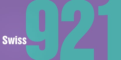
- Transitional 511 by Bitstream,
$29.99 - Transitional 551 by Bitstream,
$29.99 - R21 hSq by 103cia,
$10.00 R21-h sq is stand for "Ratio 2:1 in horizontal square"; a comparison in making a glyph typography, horizontally in the form of a square. R21-h sq font consists of bold-retro typeface with its own unique funky style. Suitable for app design, games, toys character face, storybook covers, logos, advertisements, branding, poster, or anything that needs a daring and fresh typography. Font include: R21-hSq-Latin (+extended) font R21-hSq-Cyrillic font R21-hSq-Greek font* * Additional Light font for Greek only. All styles include Latin standards (except for free/demo version). The glyph 6, 8, 9, x, O, Q and X on display are for commercial version (the free/demo version are different).
 - Aldine 721 by Bitstream,
$29.99 - Swiss 721 by Bitstream,
$29.99 Swiss 721™ is a sans serif family that ranges in style from thin to black while mixing in a few unexpected, but beautifully made and ironically flattering, outline weights that spice up the grotesque design. Couple these upstanding letterforms with matching italic styles and you have yourself a beautiful tool that is as legible on screen as it is off, has the technical prowess to conquer even the trickiest of design riddles and will work in a myriad of projects. Swiss 721 is a staple sans serif that you’ll never be sorry you have in your library. It’s been said that a simple sans serif is one of the most difficult typefaces to design. This is because when letters are reduced to their most basic details, irregularities and inconsistencies in design become immediately visible. The Swiss 721 typeface family is a quintessential example of letterforms distilled to their essence while still possessing warmth and verve. Based on mid-century sans serif typefaces, Swiss 721 is a versatile family of weights and proportions ideally suited to a wide variety of print and interactive design projects and is equally at home as headlines on billboards as it is navigation content on small screens. Swiss 721 takes the essence of mid 20th century sans serif typefaces and melds it with modern design consistency and a systematic weight range.
 - Freeform 721 by Bitstream,
$29.99Auriol font was the basis for the lettering used by Hector Guimard for the entrance signs to the Paris Metro. Bitstream’s Freeform 721 with his brush stroke look, is well-suited to display settings. - Flareserif 821 by Tilde,
$39.75 - Freehand 591 by Bitstream,
$29.99 - Calligraph 421 by Tilde,
$39.75 - Square 721 by Bitstream,
$29.99 - Monospace 821 by Bitstream,
$29.99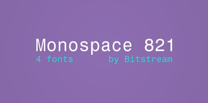
- Calligraphic 421 by Bitstream,
$29.99 - Flareserif 821 by Bitstream,
$29.99 - Humanist 531 by Bitstream,
$29.99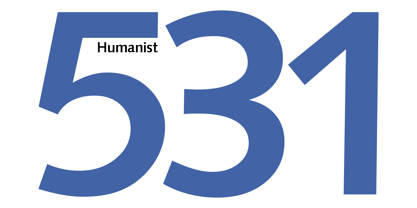
- Humanist 531 by ParaType,
$30.00Humanist 531 is the Bitstream version of Syntax (Stempel, 1968) by Hans Eduard Meier. A humanist sans serif typeface with an optically even thickness of the line which interprets a humanist old style type of the Renaissance. Its vertical strokes are inclined to the right by one degree. Serves well in text and display typography. Cyrillic version was developed at ParaType in 1999 by Isay Slutsker and Manvel Shmavonyan and was awarded Diplomae at Kirillitsa'99 and "bukva:raz!" type design contests. - Chianti BT WGL by Bitstream,
$49.00Chianti was designed at Bitstream by senior designer Dennis Pasternak in 1991 and initially released in 1995. The intent behind the design was to provide a humanist sanserif of high readability at a wide range of sizes and weights. Humanist sanserifs (others that fall into this category are Linotype’s Frutiger and Optima, and Monotype’s Gill Sans) are an attempt to improve the readability of sanserifs by applying classical roman structure to the letterforms. To enhance its versatility, Mr. Pasternak designed a wide variety of alternate characters, rare ligatures, ornaments and swashes. Chianti is a friendly sanserif useful for a broad range of typographic needs. - Jerk Chicken BT by Bitstream,
$50.99British designer Thomas Oldfield, who brought you Hombre BT and Reaper, has scratched out another typeface, this one called Jerk Chicken BT. I guess, if you can imagine a quill tip pen somehow wedged 'tween a scrawny chicken's toes, you'd end up with the scrawl, blobs, blotches and bleeds that would make most type designers run for the hen house. Not Thomas; he saw only commercial potential. So lay down some scratch and order up some Jerk Chicken BT. Hey, while you're at it, why not extend the license to a dozen users? Available as an OpenType font, Jerk Chicken BT includes of a couple of ornaments, well parts, namely a drumstick and a whole fryer, and its extended character set supports Baltic and Central European languages. - VAG Rounded BT by Bitstream,
$34.99
- OCR-B BT by Bitstream,
$29.99Adrian Frutiger’s distinguished and successful 1966 design for the European Computer Manufacturers’ Association improving readability of letters for both machines and humans. OCR-B is replacing OCR-A. - Kuenstler 165 BT by Bitstream,
$29.99 - Big Limbo BT by Bitstream,
$50.99This freeform exercise in typographic design echoes the looseness of early 1960's advertising. Brian breaks almost every typographic rule we can think of — but so what? The bold letterforms of Big Limbo are anything but stuck! - Fat Albert BT by Bitstream,
$50.99 Ray Cruz releases another typeface family, this time inspired by 1970's pop culture. Fat Albert Regular, Outline and Shadow are bold poster types that evoke the fun and funk of an era gone by. Go on bro, get Fat Albert and get down.
 - Ang Thong BT by Bitstream,
$29.99Bitstream developed Ang Thong for the Microsoft Windows operating system. The font is encoded with a Microsoft defined Thai character set, Thai Code Page 874. The font includes Thai glyphs and Latin glyphs from Dutch 801. Ang Thong (basin of gold) is a province in central Thailand which consists mostly of flat agricultural land used for growing rice. - Picayune Intelligence BT by Bitstream,
$50.99The unusual name for this Deco style typeface comes from the playful and pun-laden 1960s Rocky & Bullwinkle TV show. It is the name of the newspaper in the mythical town of Frostbite Falls, MN, home of the two cartoon stars. The name, Picayune Intelligence, literally means “pretty dumb”, but we don’t think that describes Nick’s competent design at all. It is comforting to know that someone is still watching quality television. - Full Moon BT by Bitstream,
$50.99A collaboration based on lettering by Vermont illustrator/artist Mary Trafton and brought to typographic life by Charles Gibbons, the Full Moon Suite is a collection of casual typefaces called after folk names for full moons. A winner of the TDC2 2003 Type Design Competition. Family members include: Falling Leaves, Rustling Branches, Black Cherry, Black Cherry Alternate, Black Cherry Ligatures and Black Cherry Doubles. - Chervonec Uzkj BT by Bitstream,
$50.99Possessing a distinctive Russian appearance, Chervonec Uzkj, or Chervonec Condensed, is a hybrid semi-serif designed by Russian designer Oleg Karpinsky. The typeface family includes three weights with drawn italics. - News Gothic BT by Bitstream,
$29.99 The standard American sanserif of the first two thirds of the twentieth century, prepared for ATF by Morris Fuller Benton in 1908 under the name News Gothic, with a matching lightface known as Lightline Gothic. Linotype’s Trade Gothic follows News Gothic except for its widely-spaced straight-sided boldface based on ATF Alternate Gothic No.3. Linotype matches News Gothic Bold, a boldface version that originated at Intertype, with Trade Gothic Bold No.2. Ludlow Record Gothic follows News Gothic more loosely. News Gothic BT™ font field guide including best practices, font pairings and alternatives.
