10,000 search results
(0.04 seconds)
- Brinar by Hackberry Font Foundry,
$24.95 I've been working on a usable sans serif for body copy since the mid-1990s (though I certainly did not know it at the time). This one works well. It started life back in the mists of time as a scan of an old German font by Carl Fahrenwaldt. It was developed fully as a synergized serif with strong traditional roots and released as Bergsland Pro. Now it finally makes it to where I was headed all along as a sans text font. This is a well modulated humanist, sans serif font family with many OpenType features and over 600 characters: Caps, lower case, small caps, ligatures, swashes, small cap figures, old style figures, numerators, denominators, accents characters, ordinal numbers, and so on. It is designed for text use in body copy. But it also works very well for elegantly stylized display.
 - Allektra by Hackberry Font Foundry,
$24.95Allektra is a humanist sans serif with a modern feel. It is not as whimsical as many of my fonts, but there are many special dingbats for bullets, and so on. It has oldstyle numbers and the small caps versions have lining numbers and small caps numbers. The Fat version is especially interesting and useful. - Hoxton by The Northern Block,
$19.30 A modern humanistic san serif typeface. The horizontal structure of the font gives it a clean lateral dynamic that is ideal for on screen uses. Also the proportions have been condensed to maximize the use of space across various layouts. Details include seven weights, a full character set, manually edited kerning and Euro symbol.
 - Rosetta Tones - Unknown license

- Acrom by Inhouse Type,
$33.78 Acrom is a geometric sans serif typeface with a minimal stroke contrast. It was designed with a modern, contemporary context in mind. Acrom is not merely mechanical, it can also be recognised as a natural typeface with subtle geometric aesthetics. The humanist quality of the font aids legibility across both text and display work. Acrom’s main characteristics lie in the injection of stylistic forms that enhance its individuality without overpowering the font’s functional purpose and integrity. The font can be tamed utilising the set of alternative characters available within the typeface. Details include 500 characters, manually edited kerning and Opentype features.
 - THE AMAZING SPIDER-MAN - Personal use only

- Son of a Snitch - Unknown license

- Sam is my Name - Unknown license

- Van Der Hoef Capitals by Monotype,
$29.99 - The Sun And Flower by Tigade Std,
$15.00 The Sun and Flower is a precise display font yet a good looking crafting font. It is created by precise and combined building blocks that form a unique shape for each characters. The font is suitable for Crafting of course but as well for widely creative ideas. Add this beautiful display font to each of your creative ideas and notice how it makes them stand out! Whether it’s for web, print, moving images or anything else – The Sun and Flower will give a spectacular look to your design. Below what’s included in this product: The Sun and Flower • A unique crafting font. It contains upper & lowercase characters, all punctuation and numerals. Language Support; It does support basic International Characters That's a wrap! I do really hope you like this font, and please don't hesitate to contact me if you have any questions. Also, drop by to our instagram! Tigadestd | Doli Harahap
 - Nothing You Could Say by Kimberly Geswein,
$5.00 Neat printed handwriting.
 - This Man This Monster by Comicraft,
$19.00 Half Man, Half Monster, Comicraft’s latest variable font hybrid is not only your burly, hard-edged, upfront and blunt buddy, it’s also your rough-hewn, tough and grim, rocky-featured pal! Not just Two-in-One, our latest offering brings together Four Fantastic Faces!
 - Architype Van der Leck by The Foundry,
$50.00 Architype Konstrukt is a collection of avant-garde typefaces deriving mainly from the work of artists/designers of the inter-war years, whose ideals have helped to shape the design philosophies of the modernist movement in Europe. Due to their experimental nature character sets may be limited. Architype Van der Leck originates from the lettering that Bart Van der Leck created for ‘Flax’ magazine in 1941. The letterforms‘ restricted shapes and abstract, stencil-like forms reflect the strong geometric language of De Stijl and show influence from his abstract paintings.
 - Tin Pan Alley JNL by Jeff Levine,
$29.00 According to Wikipedia, Tin Pan Alley is the name given to the collection of New York City music publishers and songwriters who dominated the popular music of the United States in the late 19th century and early 20th century. The name originally referred to a specific place: West 28th Street, between Fifth and Sixth Avenues in Manhattan. With this in mind, Tin Pan Alley JNL, a typeface based on the bold hand lettering from a vintage piece of sheet music is aptly named.
 - Uncle Sam Slim NF by Nick's Fonts,
$10.00Based on Morris Fuller Benton's 1905 oeuvre American Extra Condensed, this titling face packs a lot of information into very little horizontal space. Its champfered corners give the font an industrial feel which remains fresh even after more than a century. Both versions include the complete Latin 1252, Central European 1250 and Turkish 1254 character sets, with localization for Lithuanian, Moldovan and Romanian. - TAN The Laundry Room by TANTypeCo.,
$19.00 TAN - THE LAUNDRY ROOM is a fun display serif. Wonky yet composed and retains the legibility. *the italic font used in the display is TAN - ANGLETON (italic) — Our fonts are supported by most design software, please make sure it can read the OpenType fonts to be able to access all ligatures. Please be informed that while our font works well in Canva, but Canva itself doesn’t support advance opentype features such as special characters. For support, please don’t hesitate to contact us at tantypeco@gmail.com.
 - Van den Velde Script by Intellecta Design,
$68.90 Iza and Paulo W (Intellecta Design) are proud to announce Van den Velde Script. A free interpretation of the work of the famous master penman Jan van den Velde, to be found in the “Spieghel der schrijfkonste, in den welcken ghesien worden veelderhande gheschrifften met hare fondementen ende onderrichtinghe. ” (Haarlen, 1605). Van den Velde Script has evocative ancient ligature forms from the XVII Century Dutch master penman Jan van den Velde. Your indescritible writing-book was important not only with regard to the specific period it represents, but also in relationship to the entire history of calligraphy as an art: Van den Velde is rightly credited with having introduced and perfected a new trend in Dutch calligraphy. Our font, Van den Velde Script merges modern necessities o better legibility without loose the taste of his archaic origins. This enhanced OpenType version is a complete solution for producing documents and artworks whith a evocative and voluptuous style of calligraphic script: - dozens of stylistic alternates for each letter (upper- and lowercase), accessed with the glyph palette; - historical ornaments and fleurons in the typical style (and motifs) from the XVII century at the Lower Countryes accessed with the glyph palette using the Ornaments feature); - an extensive set of ligatures (100s of contextual alternates plus discretionary ligatures) providing letterform variations that make your designs really special, resembling real handwriting on the page; - a tour-de-force kerning work: over 700 gliphs in this font was adjusted to your kern pairs handly. In non-OpenType-savvy applications it works well as an unusual and beautiful script style font. Because of its high number of alternate letters and combinations (over 700 glyphs), we suggest the use of the glyph palette to find ideal solutions to specific designs. The sample illustrations will give you an idea of the possibilities. You have full access to this amazing stuff using InDesign, Illustrator, QuarkXpress and similar software. However, we still recommend exploring what this font has to offer using the glyphs palette: principally to get all the power of the Contextual Alternates feature. You can has an idea of the power of this font looking at the “Van den Velde User Guide”, a pdf brochure in the Galçlery section. Two last things: take a special look at the Van den Velde Words (ready words) font and another super script font, Penabico. Van den Velde Script has original letters designed by Iza W and overall creative direction plus core programming by Paulo W.
 - Saw Mill Stencil JNL by Jeff Levine,
$29.00 A vintage metal stencil from a saw mill with the term "reusable skid" was the model for Saw Mill Stencil JNL. Although the original was what would be termed a semi-stencil (some letters did not have 'breaks' in them), the font was designed with a more traditional look.
 - PAss the CheX - Unknown license

- Espuma Pro by Mint Type,
$- Espuma Pro is a soft and friendly humanist sans-serif font family with strong calligraphic aftertaste. Presented in 7 weights, with true italics each, it features the traditionally rich language support, small caps, 6 sets of figures and a bunch of ligatures. Its delicate flavor is suitable for brands that wish to communicate friendliness and openness. This typeface is especially good for FMCG and packaging, but it can be used virtually anywhere thanks to its extreme legibility.
 - Contralto by Synthview,
$34.00 Contralto is a high contrast sans-serif font family, crafted to look elegant but contemporary thanks to soft humanist shapes mixed with sharp geometric details. Contralto comes in 40 styles: 5 weights × italics × 4 optical sizes, to help optimizing contrast and readability. However, you can also use them to fine tune the mood of your graphical composition. Contralto’s generous character set and Opentype features let you meet the most demanding layout needs and lets your creativity fly!
 - Lexis by Typedepot,
$29.00 You can Download All 36 Demo Fonts The Lexis font family is a sans serif “super” family consisting of two sub-families - Lextis & Lexis Alt. While the first one follows the humanist model, its alternative version Lexis Alt dives way deeper into the geometric aesthetic. It’s simple yet versatile, packing great amount of well balanced weights, extensive character set and numerous Opentype features. The Lexis typefamily comes in 9 weights plus their italics, two distinctive styles and support for over 200 languages.
 - Barkanon by wearecolt,
$29.00 Barkanon is not your ordinary humanist sans serif typeface. Blending modern styling with classic humanist flow creates a bold and captivating look. Designed to be expressive in the right places and legible where needed. Barkanon is great for headings, body copy, logos, etc. Barkanon was picked to be a part of the 2024 Typodarium and an early version of the font was featured on James Edmonson's (Oh No Type Co) YouTube channel Barkanon covers 96 languages, 9 styles plus italics, with stylistic alternates, ligatures, and other opentype features.
 - Lupio by Tour De Force,
$25.00 Lupio comes as 102nd family in our catalogue. It is geometric sans serif family with humanistic elements. Lupio family contains variable and classic versions, so you can pick which one suits better for you and your project. Classic version is additionally fine tunned to get overall character look more equalised and uniform. When it comes to distinction – in sea of dozen other sans serif famlies, we made Lupio decently recognizable. You won't mistaken him with others. Lupio is designed as working horse family, to be used in all possible situations – from websites to packages, editorial design and applications.
 - Arial Windows compatible by Monotype,A contemporary sans serif design, Arial contains more humanist characteristics than many of its predecessors and as such is more in tune with the mood of the last decades of the twentieth century. The overall treatment of curves is softer and fuller than in most industrial-style sans serif faces. Terminal strokes are cut on the diagonal which helps to give the face a less mechanical appearance. Arial is an extremely versatile family of typefaces which can be used with equal success for text setting in reports, presentations, magazines etc, and for display use in newspapers, advertising and promotions.
- MC Botes by Maulana Creative,
$17.00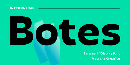 Botes is a modern semi-geo humanist sans serif font. With medium stroke, fun character with a bit of ligatures and alternates. To give you an extra creative work. Botes font support multilingual more than 100+ language. This font is good for logo design, Social media, Movie Titles, Books Titles, a short text even a long text letter and good for your secondary text font with script or serif. Make a stunning work with Botes font. Cheers, Maulana Creative
 - AC Texto by Antoine Crama,
$- Texto is a synonym of SMS (Short Message Service) in french. As a SMS that you would send or receive from a friend, this typeface is friendly, warm and informal. It is a humanist sans-serif typeface that comes in 9 weights to meet all needs.
 - Modet by Plau,
$30.00 Modet is a versatile and friendly humanist sans-serif prepared for all typographic tasks. It is quite readable in smaller sizes and shows its character in larger sizes. You can change the face of Modet through its many alternate characters and OpenType features. This versatility makes it a great performer in editorial and branding projects. Modet comes in 10 roman styles, from thin to 'ultra black' and speaks 289 languages.
 - Ni Slab by DSType,
$40.00 Ni is a kind of typographic love letter, revealed in three distinct, yet close, type formulas. Ni Serif is a contemporary serif typeface with slight diagonal modulation, amazingly legible, and with a very steady rhythm that allows a wonderful performance, especially in long passages of text. Ni Sans closely match the design characteristics and proportions of the serif counterpart. Ni Sans undeniably shows the strong calligraphic influence that comes from Ni Serif, resulting in a very comfortable humanistic typeface, suited both for print and digital environments. Ni Slab is not a simple Sans with serifs attached. Despite the thick and strong serifs, Ni Slab is a gentle mixture of the DNA of the Serif and Sans counterpart and does not intend to reflect any mechanic approach.
 - Jotia by Hashtag Type,
$32.00 Creating a combination between serif and sans serif typefaces, Jotia utilises the best of both worlds, resulting in a unique and modern neo-humanist font family. Taking its inspiration from lapidary inscriptions rather than pen drawn text, Jotia uses triangular serif shape details to create a strong uniformed personality with clear legibility. This original quality enables characters to be expressive in headlines, as well as in printed and onscreen text situations. Jotia also works beautifully alongside both serif and sans serif typefaces giving complex editorial work a more powerful and visually stimulating dynamic. Details include six weights, manual kerning and spacing, ligatures and alternatives.
 - Tinman Pro by No Bodoni,
$35.00 TinmanPro is a mildly stressed humanist sans serif type based on the University of California Oldstyle type designed by Frederick Goudy. The design captures the warmth and friendly character of Goudy�s original in a monotone sans. Broad Latin support along with small caps, fraction support and other typographic niceties are included in the ten font family. Weight range includes Regular, Medium, DemiBold, Bold and ExtraBold with matching italics for each.
 - Between by Monotype,
$40.99 Akira Kobayashi’s Between™ typeface comes in three main states. While different from each other, they all offer human-centered design to ensure that copy set in them is affable and approachable. An added benefit is the ability to transition “between” font designs, choosing different styles – or even individual characters – to create hierarchy, contrast or emphasis. Kobayashi designed the Between typeface in response to the current popularity of rounded, humanist sans serif designs over the cool grotesques of the 20th century. Between 1 melds industrial and humanist sans ethics. Between 2 represents a sans version of Kobayashi’s Cosmiqua® typeface, striking a balance between crisp and legible, organic and friendly. Between 3 is a freestyle sans with an uplifting sprightly mien. Between has 48 styles; each has eight weights of roman with its own italic counterpart. The family offers a large set of alternative glyphs and OpenType® features. A full interactive type specimen can be viewed here: http://www.monotype.com/fonts/between/ Featured in: Best Fonts for Logos
 - Stylin by Typadelic,
$19.00Stylin is…stylin! It’s unique in that some of the letters join together where you wouldn’t expect (mostly at the top of the letters). Stylin is very legible at small sizes and is great for body copy, falling somewhere between a monoline sans serif and humanist. If you’re looking for something unique and very readable, Stylin is your font. - ALS Mezzo by Art. Lebedev Studio,
$63.00 Mezzo is a slender, humanist sans serif with four font styles. Designers will find it useful when creating packaging, candy and pastry wrappers, perfume and wine labels, etc. Slim and elegant letterforms are especially fit for small pieces of text, headings and subheads. Mezzo is a good choice for women’s magazines with their particularly subtle approach.
 - Kalli Sketch by Posterizer KG,
$19.00 Basicly, Kalli Sketch is humanistic cursive drawn with pen. Inside the font you'll find a host of Opentype features, alternate characters, including a full set of alternate ampersand characters (stylistic alternates), standard ligatures that automatically connect as you type and discretionary ligatures. Also, font contains basic and alternative Cyrillic characters, and more than 50 floral ornaments. Because of lightness and transparency, Kalli Sketch is looking good in combination with serif and sans serif (particularly bold) fonts.
 - Delargo DT Rounded by DTP Types,
$49.00This design is based on DelargoDT, the popular humanist sans from DTP Types Limited. - Spoon by Dharma Type,
$19.99 Spoon is a fresh and contemporary sans-serif that can be used in wide range of project. Its skeleton of letterform is geometrically-based and minimal but the body was designed with a touch of humanistic outlines as though they were handwritten. This not only make the font clean, legible and functional, but also make it possible to give natural, friendly and soft impressions. Spoon comes in seven weights with matching italics and includes diacritics for most European in each weight.
 - Aretha by Lafontype,
$25.00 Aretha is a classy and beautifully designed sans serif. The main idea of Arteha is to combine the sans serif humanist font style with traditional styles so as to provide a pleasant atmosphere for the reader. The horizontal side of Aretha is designed with a slightly thinner so that the counter can look wider and also looks stiff in some parts to give a firm impression on the letters. Not only for display size, Aretha also works well in text size. Represents multilingual and is equipped with several Open Type features such as tabular figures and stylistic alternates in letters a, g, t and y, so this is very suitable to complement your various design needs.
 - Aptifer Slab by Linotype,
$39.00 Aptifer Sans and Aptifer Slab are two 21st century typeface families created by Mårten Thavenius. Each family has seven weights, in roman and italic respectively, making 28 font styles in total. A heritage from two design traditions can be seen in Aptifer. One is the robust American gothic typefaces, like M. F. Benton’s, from around 1900. This is combined with the openness and legibility that comes from the humanist tradition. The sans serif part of the family, Aptifer Sans, is designed without excessive details disturbing the reading. Its sibling Aptifer Slab with its wedge slab serifs is more eye-catching but still suited for text settings. The italics fit well into the text flow of the roman. They are a bit narrower than the roman and have cursive characteristics. Both Aptifer Sans and Aptifer Slab are highly legible typefaces and can be used both in print and on screen. Featured in: Best Fonts for PowerPoints
 - Mathelo by Maulana Creative,
$15.00 Mathelo is a modern semi geo-humanist sans font. With three different weight stroke, fun character with a bit of ligatures and stylistic alternates. To give you an extra creative work. Mathelo font support multilingual more than 100+ language. This font is good for logo design, Social media, Movie Titles, Books Titles, a short text even a long text letter and good for your secondary text font with sans or serif. Make a stunning work with Mathelo font. Cheers, Maulana Creative


