5,607 search results
(0.029 seconds)
- Novel Sans Pro by Atlas Font Foundry,
$50.00 Novel Sans Pro is the humanist grotesque typeface family within the largely extended award winning Novel Collection, containing Novel Pro, Novel Sans Pro, Novel Sans Hair Pro, Novel Sans Condensed Pro, Novel Mono Pro, Novel Sans Rounded Pro and Novel Sans Office Pro. Novel Sans Pro has a carefully attuned character design and a well balanced weight contrast. Classic proportions and the almost upright italic makes Novel Sans Pro being a modern humanist with the calligraphic warmth of a real italic. Many similarities with the other typeface families within the Novel Collection enable designers to combine the families and reach highest quality in typography. Novel Sans Pro [1020 glyphs] comes in 6 weights and contains small caps, an extra set of alternate glyphs, many ligatures, lining figures [proportionally spaced and monospaced], hanging figures [proportionally spaced and monospaced], small caps figures [proportionally spaced and monospaced], positive and negative circled figures for upper and lower case, superior and inferior figures, fractions, extensive language support, arrows for uppercase and lowercase and many more OpenType™ features.
 - Kardinal by Ani Dimitrova,
$30.00 Kardinal is a sans serif humanistic type family. The family has 16 weights, ranging from Thin to Black with extra drawn italics and small caps versions. The Kardinal type family is ideally suites for small text, books and magazines, branding, posters, as well as web and screen design, headlines and more. Kardinal comes in 16 styles with extended language support. All weights contain standard ligatures, proportional figures, tabular figures, old style figure, numerals and arrows, matching currency symbols and fraction. The construction of characters combines clean grotesque style and calligraphic features with humanist fragrance. Out standing for the designs are the small serifs. They are giving the letters movement and freshness, as well as contribute to a better readability in different volume texts and including lots of details that give it a unique personality. The Regular and Medium weights are perfect for body text while the italic give an interesting texture to the text. The range of styles give a good flexibility to this family. The fonts are carefully hinted and perfect for digital use.
 - Novel Sans Rounded Pro by Atlas Font Foundry,
$50.00 Novel Sans Rounded Pro is the humanist grotesque typeface family within the largely extended award winning Novel Collection], also containing Novel Pro, Novel Sans Pro, Novel Sans Hair Pro, Novel Sans Condensed Pro, Novel Mono Pro, Novel Sans Rounded Pro and Novel Sans Office Pro. Novel Sans Rounded Pro has a carefully attuned character design and a well balanced weight contrast. Classic proportions and the almost upright italic makes Novel Sans Pro being a modern humanist. Many similarities with the other typeface families within the Novel Collection enable designers to combine the families and reach highest quality in typography. Novel Sans Rounded Pro [1020 glyphs] comes in 6 styles and contains small caps, an extra set of alternate glyphs, many ligatures, lining figures [proportionally spaced and monospaced], hanging figures [proportionally spaced and monospaced], small caps figures [proportionally spaced and monospaced], positive and negative circled figures for upper and lower case, superior and inferior figures, fractions, extensive language support, arrows for uppercase and lowercase and many more OpenType™ features.
 - Novel Sans Condensed Pro by Atlas Font Foundry,
$50.00 Novel Sans Condensed Pro is the humanist grotesque typeface family within the largely extended award winning Novel Collection, containing Novel Pro, Novel Sans Pro, Novel Sans Hair Pro, Novel Sans Condensed Pro, Novel Mono Pro, Novel Sans Rounded Pro and Novel Sans Office Pro. Novel Sans Condensed Pro has a carefully attuned character design and a well balanced weight contrast. Classic proportions and the almost upright italic makes Novel Sans Condensed Pro being a space saving, modern humanist with the calligraphic warmth of a real italic. Many similarities with the other typeface families within the Novel Collection enable designers to combine the families and reach highest quality in typography. Novel Sans Condensed Pro [1020 glyphs] comes in 6 weights and contains small caps, an extra set of alternate glyphs, many ligatures, lining figures [proportionally spaced and monospaced], hanging figures [proportionally spaced and monospaced], small caps figures [proportionally spaced and monospaced], positive and negative circled figures for upper and lower case, superior and inferior figures, fractions, extensive language support, arrows for uppercase and lowercase and many more OpenType™ features.
 - Novel Sans Office Pro by Atlas Font Foundry,
$50.00 Novel Sans Office Pro is the humanist grotesque typeface family optimized for office environments within the largely extended award winning Novel Collection, also containing Novel Pro, Novel Sans Pro, Novel Sans Condensed Pro, Novel Mono Pro and Novel Sans Rounded Pro. Novel Sans Office Pro has a carefully attuned character design and a well balanced weight contrast. Classic proportions and the almost upright italic makes Novel Sans Office Pro being a modern humanist with the calligraphic warmth of a real italic. Many similarities with the other typeface families within the Novel Collection enable designers to combine the families and reach highest quality in typography. Novel Sans Office Pro [1020 glyphs] comes in 6 weights and contains small caps, an extra set of alternate glyphs, many ligatures, lining figures [proportionally spaced and monospaced], hanging figures [proportionally spaced and monospaced], small caps figures [proportionally spaced and monospaced], positive and negative circled figures for upper and lower case, superior and inferior figures, fractions, extensive language support, arrows for uppercase and lowercase and many more OpenType™ features.
 - Mairy by Typesketchbook,
$39.00 Mairy font family is a modern sans serif font family. Featuring 9 separate weights each followed by own true italics Mairy is positioned somewhere between rounded sans with humanist touch. In fact the humanist presence in Mairy is a little bit more than the usual doze adding more calligraphic elements mostly noticeable in italic weights but also very important in regulars. This symbiosis of Grotesk geometry with handwriting is well balanced regarding contrast and legibility so that at the end we have a highly usable font family. Light weights are very tender and elegant while the old and blacks are soft, friendly and full of vitality. The mid weights are just perfect with their medium contrast and excellent legibility. Mairy is very fresh font family and is surprisingly flexible when it comes to screen or print use – it is optimized for both even if the conditions are poor. Use it with OpenType compatible software and explore its true potential by accessing additional set of ligatures, alternates and multilingual support.
 - RoglianoPro by Untype,
$25.00 RoglianoPro is a 70-font humanist slab serif super family (7 weights on 5 styles each plus matching italics) that while maintaining a strong and direct backbone, sustains a warm undertone that nods to the lettering and lithographic posters of the Victorian era when you take into account its multiple stylistic alternates, borders and decorative ornaments. Extremely legible for small text as well as finely-detailed enough to be very attractive when used in large settings, RoglianoPro is a versatile typeface that offers a wide range of voices that can move from mechanical to humanistic with absolute ease, and perform efficiently from branding to editorial design. Its Slab serif letterforms are strong, but gregarious and approachable – it’s friendly, but its solid presence is still a typographic force to be reckoned with. Rogliano includes a large set of over 900 glyphs, support for more than 200 latin script languages, a full complement of ligatures, small caps, swashes, William Morris-influenced borders and many Opentype features. In summary, a great addition to any multi-purpose type library.
 - Our Infinity Love by Putracetol,
$28.00 Our Infinity Love - Monoline Wedding Font. Our Infinity Love wedding script fresh & modern script with handmade calligraphy style. This font is inspired by monoline the character's style which shows the romance of a relationship through hand strokes with the added "love" symbol at the end of the line. This font is perfect for a professional touch making this font more elegant and suitable for all types of projects you are working on, especially for romantic-themed work. But this font is also suitable for logos, branding, greeting cards, invitation cards, advertisements, titles, healines, book titles, stickers, packaging, quotes, posters, t-shirts/apparel, billboards and others. The alternative characters were divided into several Open Type features such as Swash, Stylistic Sets, Stylistic Alternates, Contextual Alternates, and Ligature. The Open Type features can be accessed by using Open Type savvy programs such as Adobe Illustrator, Adobe InDesign, Adobe Photoshop Corel Draw X version, And Microsoft Word. This font is also support multi language.
 - Gattermoon Handwritten Signature Font by Fontysia,
$12.00 Gattermoon Script takes you away for romantic rendezvous with your love of signature handwritten scripts. Slightly slick, slightly classy, Gattermoon is a must-have for any signature handwritten font collection. Gattermoon adds a different nuance because of its different slope. It's a little more cheerful and relaxed and tends to be more elegant. Perfect for: elegant branding, wedding stationery, romantic book cover designs, classy packaging, album covers, handwritten quotes, greeting cards, quirky social media posts and more.
 - Anime Eyes - Unknown license

- Garalda by TypeTogether,
$49.00 Type designer Xavier Dupré’s Garalda is a charming 21st century family that renews a legacy of finesse. As paragraphs on a page, Garalda’s overall impression is of a workaday personality, committed to the main purpose of the job: easy long-form reading. But setting it in display sizes proves something different: This reinvented Garamond is anything but basic. The Garalda story begins with the serendipitous finding of a book typeset in a rare Garalde, called Tory-Garamond, with which Dupré was not immediately familiar. This Garamond was used in bibliophile books in the decades surrounding 1920, but after that it became déclassé for an unknown reason. Dupré found the italic styles especially charming and discovered the family was probably the mythical Ollière Garamond cut from 1914. He obtained low resolution scans of the typeface and used them, rather than high resolution scans, as the basis for his new type family. This allowed Dupré the mental freedom to experiment and remix as he saw fit, culminating in a contemporary family with heritage. As seen in the simplistic rectangular serifs, Garalda is a humanist slab serif, but with a mix of angles and curves to give the classic shapes a fresh, unorthodox feeling. While almost invisible in paragraph text, these produce a graphic effect in display work. The set of ligatures in the roman and italics lend themselves to unique display use, such as creating lovely logotypes. In the italics, some swashes inspired by different historic Garamonds are included, sometimes breaking their curves to be more captivating. Just look at how the italic ‘*-s’ ligatures create ‘s’ with a cursive formation rather than merely a flowing slant. And how the roman ‘g’ link swings as wide as a trainer’s whip. These are all balanced by squared serifs in the roman to keep an overall mechanised regularity. The Garalda family comes in eight styles, includes some of the original arrows and ornaments, and speaks multiple languages for all typesetting needs, from pamphlets to fine book printing. The complete Garalda family, along with our entire catalogue, has been optimised for today’s varied screen uses.
 - Sweet Charlie by AEN Creative Studio,
$12.00 Sweet Charlie is a fun, quirky and authentic font that will easily embody any romantic craft idea. It will turn any creative idea into a true standout.
 - Shepherd by Letterara,
$12.00 Shepherd is a beautiful calligraphy font with an incredibly luxurious feel. It will add a romantic touch to any crafting project! Get inspired by its whimsical charm!
 - Gara Gara by Daylight Fonts,
$50.00 This is a new generation of Garamond. This delicate and powerful Roman will captivate you and those who have seen your typography!
 - P22 Mercian by IHOF,
$24.95 P22 Mercian is a Roman font with distinctively angled stub serifs. Comparatively even in weight and color. Designed for continuous text setting.
 - Francesco Decorative by Intellecta Design,
$14.95In accordance with Roman use, please note that the cap 'U' in this font has been made to look like a 'V'. - Mancunium by K-Type,
$20.00 Mancunium is a sans serif family with a contemporary monolinear character, though designed with the iconic proportions of Roman capitals in mind. In addition to reliable romans, the typeface includes proper, optically corrected italics. Also, uniquely, a set of ‘vertalics’ that contain the more script-like glyphs of the italics with angled stem terminals, but which are unslanted and upright in aspect, and without the slight narrowing of the italics. Each font includes a full complement of Latin Extended-A characters and additional oldstyle numerals. Mancunium is sold in two collections – a Regular/Bold package and a Light/Medium package. Each package contains six fonts - two romans, two italics, and two vertalics.
 - Turquoise Inline by Resistenza,
$49.00 Turquoise Inline is a new version of our bestseller Turquoise This version of roman capitals is more focused on display use, with the details of an inline roman type. This font can be used, for ads, labels, wine labels, logo and all kind of display uses. Open Type features needs to be activated for all the ligatures and alternates. Enjoy it! We recommend to combine Turquoise Inline with Nautica Sottile & Auster
 - Decima Mono Round by TipografiaRamis,
$39.00 Decima Mono Round – another addition to the Decima fonts family. Decima Mono Round is a modern monospaced condensed sans serif family with classic geometric design, built in three weights and six styles. The letterforms in roman style are techno (engineered) in appearance, while italics remind one of elegant handwriting balanced with Roman geometry. The typeface is released in OpenType format with extended support for most Latin languages, as well as Cyrillic.
 - Faber Serif Pro by Ingo,
$42.00 Faber Serif is the Roman typeface which was born out of the sans serif design Faber Sans. The proportions are nearly identical to those of Faber Sans. In comparison, Faber Serif has heavy — although very short — serifs. The character of contrasting strokes is not very pronounced; therefore, this font is closely related to the first Roman typefaces from the 15th century. Faber Serif perfectly matches with Faber Sans!
 - Finura by DSType,
$26.00 Finura was inspired by American lettering from the 60s, specially the Stunt Roman for ruling pen and compass presented in the Speedball Textbook for Pen & Brush Lettering by Ross F. George, but also by looking carefully to University Roman characteristics. Finura is an experience on very thin poster typefaces and the possibilities to design extreme delicate typefaces, with plenty details, that sheer simplicity and readability to the classic forms.
 - Koobler by Zang-O-Fonts,
$25.00Named in homage of Toronto writer and spoken word performer Monica S. Kuebler, Koobler is an interesting interpretation of the classic roman font. - Japan Knees by PizzaDude.dk,
$19.95How much more multi-cultural can you get, than a Japanese-style Roman font from Denmark? Looks like an LCD font gone awry! - Maszynista by RMU,
$35.00 This font family is based on the letterforms of a fin-de-siècle sans serifs, and comes in two versions - Roman and Shadow.
 - Peanut Butter Man by PizzaDude.dk,
$20.00Forget everything about Times New Roman and all the other classic typefaces! Forget all that and take a bite of Peanut Butter Man! - Harmonique by Monotype,
$31.99 Harmonique is an incised serif typeface designed for both text and display purposes. It’s a type family of two styles that work in harmony together to add distinction and personality to your own typographic compositions. Harmonique’s low contrast forms have the appeal of a humanist sans serif typeface. Its subtly flared terminals evoke the craft and skill of a signwriter’s steady hand, creating an authentic and pleasing aesthetic. Harmonique Display is more calligraphic in its structure – as if drawn by a wide-nibbed pen. This style is accentuated by aggressively barbed serifs and chiselled arcs in its counters and bowls. These strong characteristics help to define a flamboyant, confident style that will provide impact and flair to your headlines, titles and identity designs. Practical features include 48 ligatures that will enhance titling possibilities with their all-capital pairings – these are accesssed by turning on Discretionary Ligatures and then selecting either Sylistic Set 1 or 2. There are also a number of alternate caps that will subtly enhance your titles and headlines – access these via Stylistc Sets 3 and 4. Small Caps are included too (along with their matching diacritics) – adding another layer of versatility to this typeface. Proportional Lining figures are available as an option if you prefer them to the default Old Style figures. There are 32 fonts altogether, with 8 weights in roman and italic from Light to Ultra in both text (low contrast) and display (high contrast) styles. Harmonique has an extensive character set (650+ glyphs) that covers every Latin European language. Key features: 8 weights across two styles in both roman and italic 48 Ligatures 11 Alternates Small Caps Full European character set (Latin only) 650+ glyphs per font.
 - Rum Soft Serif by Trine Rask,
$30.00 Rum Soft Serif is a soft version of Rum Serif with softly rounded outer corners. Rum Soft Serif is a text & display family suitable for any purpose, any media, any size. A humanistic modular Serif in five weights containing small caps, italic, swashes, alternative characters, old style, lining, tabular & proportional figures. Design date: 2011-2023 The complete family consists of Sans Serif & Serif in both sharp and soft version + the display fonts Rum Plakat & Rum Silhouette.
 - Rum Soft Sans by Trine Rask,
$30.00 Rum Soft Sans is a soft version of Rum Sans with softly rounded outer corners. Rum Soft Sans is a text & display family suitable for any purpose, any media, any size. A humanistic modular sans serif in five weights containing small caps, italic, swashes, alternative characters, old style, lining, tabular & proportional figures. Design date: 2001-2021 The complete family consists of Sans Serif & Serif in both sharp and soft version + the display fonts Rum Plakat & Rum Silhouette.
 - Malino by Lafontype,
$25.00 Malino is a humanist sans serif that gives a slightly stiff and strong feel but still presents a harmonious blend. The main characteristic of Malino is the flat shape at the end of the letter (specific : inner side of the letter C, G, J, S, a, c, e, g and s) and still maintain the curvature of the outside (Overshoot) so that empty space ( Open Counter) looks wider and the level of readability produced is much higher.
 - Apres RE by Font Bureau,
$40.00 Apres is a clear and comfortable typeface from David Berlow, originally designed for the Palm Pre smart phone. This humanist geometric design projects a friendly and forthright familiarity, without being static or mechanical. This version of the family is part of the Reading Edge series of fonts specifically designed for small text onscreen, having been adjusted to provide more generous proportions and roomier spacing, and having been hinted in TrueType for optimal rendering in low resolution environments.
 - Tabac Sans by Suitcase Type Foundry,
$75.00 Tabac Sans is a linear, dynamic sans serif type that blurs the lines between text and title typefaces. Drawing on the rich tradition of European lettering, the humanist basis supports excellent readability even at the smallest letter sizes, while unique details and a wide array of alternative glyphs prove highly effectual in titles and headlines. The broad variety of types and weights make this font family a versatile aid when composing complex magazine and newspaper layouts.
 - Keymer by Talbot Type,
$19.50 Talbot Type Keymer is inspired by Margaret Calvert's Transport typeface, designed for the British road sign system in the early 1960s. Keymer mixes geometric and humanist traits to achieve a modern, clean, elegant appearance. It is a legible and versatile text and display face available in seven weights. Keymer features an extended character set to include old style numerals, accented characters for Central European languages and bespoke characters in the italic for a more flowing look.
 - MC Brakely by Maulana Creative,
$17.00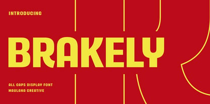 Brakely is a semi humanist sans Display font. ExtraBold stroke, fun character with a bit of ligatures and alternates. To give you an extra creative work. Brakely font support multilingual more than 100+ language. This font is good for logo design, Social media, Movie Titles, Books Titles, a short text even a long text letter and good for your secondary text font with script or serif. Make a stunning work with Brakely font. Cheers, Maulana Creative
 - St Ryde by Stereotypes,
$- St Ryde is a humanistic sans-serif with a slight touch of a script typeface. The most significant aspect of the typeface is the combined sharp and round treatment of the stroke endings. The complete Ryde Family contains five weights including real matching italics, so you can choose from thin, light, regular, medium and bold. St Ryde has a wide range of characters, including small caps, lining proportional and tabular figures plus small caps figures, too.
 - Protofo by Lafontype,
$19.00 Protofo is a modern-humanist sans-serif with characters that features various geometric shapes — from square, round and triangle. Protofo comes in 16 styles — upright and italic — from thin to black with each equipped with features such as localized, ligature, fraction, ordinal, superscript, numerator, nominator, subscript, proportional and tabular numerals. Protofo is also equipped with extended latin letters which can represent multi languages so making it perfect for any kind of project (display, editorial, web, interface, app, etc).
 - Sarun Pro by Stawix,
$49.00 Sarun is a typeface that harmonises between Humanist, Geometric and Industrial Sans, it would be a bit problematic to define its definite character. Nevertheless, Sarun is very compatible with layouts and super easy to use in a variety of designs. Not only is Sarun equipped with Italic, Small Caps and a complete Alternate set, it also contains the 10 most significant Cryptocurrency signs. Sarun consists of 10 weights and 3 widths along with Italic in every styles.
 - Kalli Sketch by Posterizer KG,
$19.00 Basicly, Kalli Sketch is humanistic cursive drawn with pen. Inside the font you'll find a host of Opentype features, alternate characters, including a full set of alternate ampersand characters (stylistic alternates), standard ligatures that automatically connect as you type and discretionary ligatures. Also, font contains basic and alternative Cyrillic characters, and more than 50 floral ornaments. Because of lightness and transparency, Kalli Sketch is looking good in combination with serif and sans serif (particularly bold) fonts.
 - Mariné by TipoType,
$19.90 Mariné is a geometric sans but with the softness of humanistic strokes. It’s mild contrast and multiple different styles allow Mariné to work well as both a text and display font. It also includes an Up version and calligraphic features that add a touch of informality. Mariné is available in an extended family and is the close cousin of Amelia (available at MyFonts.com). All differences between Mariné and Amelia appear in the italic and Up versions.
 - Rigid Square by Dharma Type,
$19.99 Rigid Square There is a rule, Octagonal shape and 45 degree cuts. Very geometric shape but designed especially for body text, long sentence such like a mechanical instructions. Capital I and lower l have distinguishable shape. Neo-humanist shape on lowercase b.d.g.p.q is for further smooth readability. However, Also useful for display, titling, captions by their sophisticated glyph shapes and their eye-catching geometry. Consists of seven weights and their matching italics. Supporting almost all latin languages.
 - Tazugane Gothic Variable by Monotype,
$1,049.99 Tazugane Gothic is a Japanese typeface family developed by the Monotype Studio. The project began as a companion Japanese typeface for the famous Neue Frutiger. The goal for Tazugane Gothic was a humanist sans serif face with a clear and legible forms, and nearly unlimited applicability in a broad range of uses, from signage and publishing to advertising and websites. The Tazugane Gothic font family is extremely versatile with ten different weights from Ultra Light to Extra Black.
