8,205 search results
(0.01 seconds)
- Corporaet by Characters Font Foundry,
$25.00 CFF Corporaet is a corporate brand typeface that comes in 5 sans serif weights; Light, Regular, SemiBold, Bold & Black. Its character is warm, friendly, humane, clear and soft. The humanistic design style is rooted in the cursive style of handwriting, clearly visible in letters such as the e, f, g and y. The spurless letters round it off. Striking characters, such as the z, and small quirky details make it both a corporate and a friendly typeface. The proportions of each character are carefully constructed in such a way that they're balanced and create an even colour in text. That’s why it works extremely well with long body copy. Making it a hero for magazines and editorial design challenges. The Corporaet fonts can be applied in large sizes for print or web, bringing out the refined details that give the fonts its distinctive personality.
 - Rustica by TipoType,
$24.00 The world has changed; we want it to change. But it has a history too. Rustica draws back to the sans typeface tradition and updates it for the 21st century; we aim to go back to the humanist values without dismissing the role played by technology.It’s a GeoHumanist sans serif. Type design looks back at its past to return with renovated strength to its march to the future. Rustica is based on a humanist architecture with the addition of the determination and precision of the geometry of the classic sans of the early 20th century. Thus, a typographic conception typical of 21st century communications: returning to the human values of closeness and proximity, adding the certainty of knowledge and science. Rustica is born out of the DNA of our awarded font Rotunda, contributing to this typographic ecosystem humanist notes enhanced by the precision and discipline of geometry.
 - Ballpoint Catalog by Double Z Studio,
$19.00 Ballpoint Catalog is a handwriting typeface, based on my dad's real handwriting, he was a teacher. I'm amaze by its smoothness and elegant, not fully follow the rules of penmanship handwriting but he has his own style of script which make it more human, natural handwriting rather that 'generic' handwriting typeface style. This typeface contain several ligatures to make it more natural in the writing. Suitable for any uses from branding, book cover, menu, quotes, invitation, wedding cards, advertising, blog, etc. Features Latin A-Z and a-z Numbers Symbols Ligature To enable the OpenType Stylistic alternates, you need a program that supports OpenType features such as Adobe Illustrator CS, Adobe Indesign & CorelDraw X6-X7. There are additional ways to access alternates/swashes, using Character Map (Windows), Nexus Font (Windows), Font Book (Mac) or a software program such as PopChar (for Windows and Mac).
 - Chypre by insigne,
$- 21st century innovation demands a 21st century style. It’s the age of virtual assistants. It’s machine learning and AI. It’s blockchain and cryptocurrencies. Shape the feel of these modern concepts with the mechanically-inspired forms of Chypre. Chypre’s subtle technological feel is perfect for our culture’s evolving electronic media applications. At its source, the carefully adjusted character designs and the balanced weight contrast convey to the modern reader an understanding of cutting edge concepts through a pleasing human feel. Unlike many other tech-driven fonts out there, this next-gen cyborg is a great option for text settings as well as headlines. The new face is composed of six styles, including numerous alternates which dramatically alter the appearance. There are also extra letter shapes, numerous figure options, and extensive language support. Designed to fit where you need a high-tech feel, Chypre is a modern font for a modern age.
 - Monologue Rounded by Halfmoon Type,
$20.00 INTRODUCING MONOLOGUE ROUNDED! A softer, more humane, and funnier version of MONOLGUE. MONOLOGUE itself is a simple, condensed sans serif font with bold and complex personality. It was purposely crafted to be used in large point sizes, although it doesn't lose it's magic in small point sizes. With this rounded version, you can be even more expressive in your design projects. FEATURES: Basic latin characters, numerals, punctuations and symbols. Extensive language support, including slavic languages with cyrillic alphabet. Stylistic Alternates Stylistic Sets (ss01–ss06) 100+ Discretionary Ligatures Ordinals Preconstructed fractions Fractions Superscript and Superscript Numerals Kerned, spaced, and hinted If you have any questions, please don't hesitate to contact me via email at muhtadi.yusril@gmail.com. Check out my other works, such as font design, lettering, and type exploration on Instagram @yusril.muhtadi (https://www.instagram.com/yusril.muhtadi) Thank you for visiting and have a great, great day! Yusril Muhtadi
 - Gineso Titling by insigne,
$19.00 Before the Great War, there were great posters. Posters of elegance and grandeur. Posters calling people to the pleasures of sunny southern France and to the perfections of northern Italy’s dolce vita. Le Havre, based on a poster by AM Cassandre, was one of my first typefaces that took inspiration from this genre. Now, the golden memories of years past are the inspiration for insigne design’s new Gineso Titling as well. Gineso revives the retro forms of past poster design with its newly crafted sense of humanity, which is amplified by a great variety of texture options. While the new forms are perfect for posters, this titling font is also ideal for bringing the charm of pre-war Southern Europe to a new bottle of wine, to fine foods and beverages, and to high-end logotypes. For the grandeur and elegance you need in your titling, look to Gineso Titling.
 - Sunrise Till Sunset by Comicraft,
$19.00 Between twilight and daybreak it is said that the dark side of the human psyche eclipses the sun that shines from the depths of our souls. Certainty turns to doubt, clarity becomes confusion, man turns into wolf, the dead wake, vampires seduce the young are restless and milk boils over on the stove. Those that seek only to bathe in the light of a romantic new moon often end their tragic lives soaked in nothing other than their own blood, and the milk spilt on the stovetop has no one left to cry over it. There are fifty shades of grey during those hours after sunset and I think just as many in my porridge this morning. Yes, okay, I admit it, I spoiled the milk! This porridge tastes like it was left in a graveyard overnight. Death warmed over. Gothic and lumpy. Just like the Buried weights of this font.
 - Naive Inline Sans by S&C Type,
$8.00 Naïve Inline Sans is a layered sans serif handwritten font designed by Fanny Coulez and Julien Saurin in Paris. Our goal was to draw a font with finely irregular lines that give a human and whimsical feeling. We designed three weights to assure a good readability whatever the size. They can be enhanced with five different interior patterns and three shadows to improve your designs and bring a charming and unusual feeling. To do so, you can simply superimpose the layers with a compatible software like Photoshop, the weight above and the pattern(s) below, then choose a color for each. This font is part of our Naïve superfamily that contains lot of variations: Line, Inline, Serif, Sans Serif, and a special Art Deco one. Just click on our foundry name to see them all! We hope you will enjoy our work. Merci beaucoup!
 - Entestats by Typephases,
$25.00 Nearly a hundred human heads, in three dingbat files. The whole series comes from the sketchbook: the original ink drawings were then digitized and refined to create vector outlines. Rather than perfectly smooth, geometrical shapes, the Entestats, like their close relatives in the Capsbats series, the Entestats retain a handmade look and feel. The Entestats are ready-made illustrations, though of course they will appreciate being enriched with colours, textures, an imaginative layout... and use them for a variety of projects. Use them small, as spot illustrations or as big as a whole page or page spread. The Entestats and their kin, the Capsbats, are a terrific resource for presentations, packaging, logos, brochures and advertisements, to name a few applications. The book 1000 Heads is a compendium of the drawings featured in the Capsbats and Entestats and it gives a glimpse of the limitless applications of this collection.
 - Writeback by Trim Studio,
$15.00 Writeback Bring a touch of unique character to your designs with this simple style script brush font. The font features a mix of clean and simple brush strokes, with a touch of texture added to enhance its natural look. The casual script style and mixed textures make this font versatile, allowing it to be used for a wide range of projects. Give your designs a touch of creativity and personality with this simple style script brush font. Writeback also have 2 different style, so you can easily combine and adjust the design theme with it Its perfect for casual and fun designs, this font is great for adding a personal touch to t-shirt designs, logos, posters, and more.
 - Luco Sans by artill,
$19.00 A headline typeface with an impression of standardisation and stylish touches.
 - Madeline Forhes by Luhop Creative,
$29.00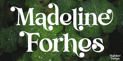 Madeline Forhes is a stylish and modern serif font that’s perfect for bringing a touch of sophistication to your designs. Its clean lines and contemporary letterforms create a timeless yet fresh look that’s perfect for editorial design, branding, and any project that requires a touch of elegance.
 - Airthay by Nirmana Visual,
$17.00 Airthay is a Beautiful Modern Calligraphy script font carefully created with a touch of romantic. This is a beautiful combination of timeless elegance and authentic calligraphy, For those of you who are needing a touch of elegance and modernity for your designs, this font is for you!
 - Oona by Autographis,
$39.50 Oona is a joining script with that classic, elegant "Old England" touch.
 - American Spirit STF by Altered Ego,
$30.00American Spirit STF is a glorious collection of contemporary patriotic symbols: US Flags (traditional and contemporary), a variety of stars, eagles, torches, and combinations of them all. Designed for print and web, this collection is useful for embellishing your designs with a subtle (or not-so-subtle) patriotic touch. The flags have been designed for easy ungrouping in a drawing program, in order to colorize the union and stripes. And as a special feature, American Spirit™ splits the flags into two characters (the union and the stripes) that can be separately colored and will kern together based on the character chosen. Suggestions for doing this are included in every package. This versatile collection also contains a special contemporary version of the US Flag, with rounded corners on the union and stripes, and a five-pointed asterisk-like shape as the stars. (This allows the stars to appear as stars at smaller sizes.) Show your American Spirit! Sign up today for this contemporary collection of patriotic symbols! - Saniyah by Mazkicibe,
$12.00 Saniyah Font is Beautyful Sans Serif and modern font combined with a sweet touch and beautifully curved each letter. using a touch of soft curves so that it is pleasing to the eye. Saniyah Font is great for: Wedding invitations, fashion magazines, logos, signatures, and suitable for watermark photography.
 - Trompies by Mazkicibe,
$10.00 Trompies Font is Beautyful handwritten and modern font combined with a sweet touch and beautifully curved each letter. using a touch of soft curves so that it is pleasing to the eye. Trompies Font is great for: Wedding invitations, fashion magazines, logos, signatures, and suitable for watermark photography.
 - Millate by Mazkicibe,
$11.00 Millate Font is Beautyful handwritten and modern font combined with a sweet touch and beautifully curved each letter. using a touch of soft curves so that it is pleasing to the eye. Millate Font Spirit is great for: Wedding invitations, fashion magazines, logos, signatures, and suitable for watermark photography.
 - Teenage Workhood by Teenage Foundry,
$19.00 Teenage Workhood typeface, a classic and vintage-inspired font that brings a charming and nostalgic touch to your designs. Designed to evoke the essence of youthful creativity and the timelessness of workmanship, this typeface is perfect for projects that require a touch of vintage appeal. This versatile typeface lends itself well to a range of design projects. Whether you're creating old-school logos, vintage posters, retro packaging, or even designing an authentic vintage-inspired website, Teenage Workhood is the go-to choice to add that classic touch.
 - Parshanut MF by Masterfont,
$59.00 A modern touch to a Biblical oriented font. High legibility as text font.
 - 20 Kopeek by Letterhead Studio-YG,
$35.00 20 kopeek is sans serif font with a slight touch of a steampunk.
 - Bravo ND by Neufville Digital,
$29.60 Designed by José María Cerezo, with a geometric style and futuristic touches. A typeface family that offers good results in labeling, posters and big formats. Inspired by art deco with a sci-fi touch, it is a typeface with a strong character and personality. Bravo is a Trademark of BauerTypes SL
 - Konera by Typebae,
$15.00 Konera is a fun and stylish hand-drawn display font that adds a playful touch to any design. With its charming style and 26 distinctive ligatures, it brings a touch of uniqueness and character to your projects. Let your creativity shine with this captivating font that effortlessly combines fun and style.
 - Three Candy by Mazkicibe,
$11.00 Three Candy Font is Sans Serif and modern font combined with a sweet touch and beautifully curved each letter. using a touch of soft curves so that it is pleasing to the eye. Three Candy Font Spirit is great for: Wedding invitations, fashion magazines, logos, signatures, and suitable for watermark photography.
 - Janda Quirkygirl by Kimberly Geswein,
$5.00 Curly dotted and serifed alphabet perfect for adding a touch of quirk or whimsy.
 - Avooka MF by Masterfont,
$59.00 The formal letter formal will have that impressive touch to you next annual report.
 - FG Jordan by YOFF,
$14.95FG Jordan is an artistic font ready to add its touch to your projects. - Carbona by Plau,
$30.00 Carbona is our attempt to imagine the future through typography. The perspective of the future is, perhaps, the greatest force of action humans have. Knowing that there will be a tomorrow is the stimulus we depend on to decide how we are going to act today. This idea is also one of the best fuels for creativity. That's why we thought of Carbona as a typeface in sync with everything that appears on our technological future. From the countless births of new digital currencies to the sending of ultra complex algorithms at 5G speed, the future of any habit, choice or task that we will perform will transit through some super computer located somewhere very far away – who knows even on another planet. The family is designed to deal with the situations of the digital world, today and what is yet to come. It is optimized for programming, contains cryptocurrency symbols, advanced features for use in interfaces, and much more.
 - Neutraface Display by House Industries,
$33.00 Although better known for his residential buildings, Richard Neutra’s commercial projects nevertheless resonate the same holistic ecology—unity with the surrounding landscape and uncompromising functionalism. His attention to detail even extended to the selection of signage for his buildings. It is no wonder that Neutra specified lettering that was open and unobtrusive, the same characteristics which typified his progressive architecture. House Industries brings the same linear geometry to Neutraface without sacrificing an unmistakably warm and human feel. FEATURES LIGATURES: This feature is on by default. It will substitute a long list of “f” and “t” ligatures. For example, open InDesign or Photoshop and type “ff” or “tt”. NEUTRAFACE DISPLAY ALTERNATES: Neutraface Display contains several stylistic alternate characters useful when a purely geometric setting is desired. Like all good subversives, House Industries hides in plain sight while amplifying the look, feel and style of the world’s most interesting brands, products and people. Based in Delaware, visually influencing the world.
 - 1529 Champ Fleury Initials by GLC,
$42.00 In 1529, Geofroy Tory, French scholar, engraver, printer, publisher and poet, was publishing the well known so called Champ Fleury, printed by Gilles de Gourmond, in Paris. It is a fully illustrated handbook where the author explains how to draw Roman characters. The font used for the text - a Humane/Jenson type - was not a very beautiful one, but rough and ready, and the book is well known for its capital letters designs. We are offering here the two complete historical type sets and more -- we have entirely redrawn the lacked letters: J, U and W, Eth, Lslash, Thorn and Oslash in the two initial forms. The text font, 1529 Champ Fleury Regular is now containing all characters for West European (including Celtic), Baltic, East and Central European and Turkish language, and the Initial set 1529 Champ Fleury Init is containing two complete alphabets, with a very great effort to be as close as possible to the original pictures.
 - The Best We Could Do by Chank,
$39.00 The new font “The Best We Could Do” was created by artist and author Thi Bui who used the font in the graphic novel by the same name. The font is brush-script handwriting font which displays human personality rendered with bold confident strokes full of passion and expression. Chank’s work on this font captured Bui’s distinctive textual style and also saved her a ton of headache and time in inking. A debut memoir that tells the story of one family’s journey from their war-torn home in Vietnam in the 1970s to their new lives in America, the autobiographical book is lauded for its heart-breaking exploration of identity, family, and home. Bui ties her modern life with the multi-generational experiences of her family, weaving together the emotional threads of their relationships to find clarity in her current day. “The Best We Could Do” graphic novel is published by Abrams ComicArts and is available wherever fine books are sold.
 - Lucida Sans Typewriter by Monotype,
$29.99Lucida Sans Typewriter adapts the humanized look of Lucida Sans to the fixed pitch of typewriter fonts, in which all letters have the same set width. The vertical proportions, strong stem weights, and crisp details of Lucida Sans are continued in the Lucida Sans Typewriter font family. The result is a strong, clear, fixed-pitch design that can be used wherever a functional, legible monospaced font is needed, in typewritten correspondence, memos, and telefaxes, in commercial forms, invoices, and packing lists, in programming and data processing applications, and in line printer emulations and terminal emulations. Lucida Sans Typewriter is economical in setting: at a 10 point size, it is equivalent to a 12 pitch typewriter font. For improved legibility in long lines of 80 characters or more, users can add extra line spacing, equivalent to 20% or more of the font size. When proportional fonts are needed for text to accompany Lucida Sans Typewriter, then Lucida Bright can be used. - Intelo by Kastelov,
$25.00 Intelo was created with the single idea of redefining what makes a functional grotesque typeface nowadays. Its large x-height and letterforms with subtle elliptical finish create a distinctive look that can help brands cater to an increasingly design savvy audience. To top it off, Intelo comes in two versions - an attention-grabbing original cut and an additional version with flat endings for a more streamlined effect. The family weights range from thin to extrabold with matching italics making it a versatile choice and perfectly suited for digital applications including web and interaction design as well as printed media such as editorial and corporate materials. When it comes to Opentype features, Intelo is loaded with stylistic alternates, tabular figures, fractions, ligatures, and more. In addition, the font family has an extended language support featuring Western, Eastern and Central European languages. To sum it up, the friendly and inviting letterforms of Intelo came as a solution to the need for more human fonts in our technology-oriented environment.
 - Horizontes Script by Sudtipos,
$39.00 Horizontes Script is the result of Panco’s personal experimental calligraphy project. Designed with the goal of finding a balance between spontaneity, elegance and beauty, his first typography was born and inspired on the horizon´s blue line from the city he was born. Relaxed, energic and very natural. With different alternatives of proportion, a wide range of ligatures, initial letters, terminals, floritures, Horizontes Script comes in two weight for large and small formats. “Horizontes Script” results in an ideal font for titles and short texts that find something else to show more than just words. A casual and harmonious font with strong personality. Great for projects that need to connote class and style without being too formal. Ideal for design that need to transmit warmth and humanity feel to be applied on invitations, labels, poetry, songs or thoughts. Created by Panco Sassano, under the supervision of the experienced typographer Ale Paul – in a duo work - “Horizontes Script” is the latest typeface by Sudtipos.
 - Egyptian Slate by Monotype,
$34.99 Just as the camera adds weight to human faces, serifs can add weight to typographic faces. Rod McDonald trimmed and adjusted his new Egyptian Slate design as it emerged from its sans serif predecessor, the Slate typeface family. Slate is a great sans serif design, and the addition of his Egyptian Slate to your typeface library will make it even more versatile. Egyptian Slate is a solid and stylish slab serif design that will look superb in the spotlight of your choosing. Available in six weights – from a svelte light to a commanding black – each upright member of the Egyptian Slate family has a complementary italic. Egyptian Slate fonts are available as either OpenType Std or OpenType Pro fonts; the later options offers an extended character set that supports most Central European and many Eastern European languages. Egyptian Slate™ font field guide including best practices, font pairings and alternatives. Featured in: Best Fonts for Logos, Best Fonts for Websites
 - Hanley Pro by District 62 Studio,
$29.00 The origin story of HANLEY FONT COLLECTION all starts with the Script. We were designing logos and kept feeling like we needed a different kind of script, vintage feeling but not dated, and not too baseball-y or too formal. We couldn’t find exactly what we were looking for, so we decided to create it ourselves. After that we realized what we really wanted was good wood block looking lettering especially with small caps. And the collection just grew from there - a tall slim style, a monoline version of the script and of course a good sans. We topped off the group with a large selection of catchwords and extras with plenty of swirls, swashes and frames. Hanley has just enough irregularity to the edges to impart a human feel, but it’s still clean. Super versatile, all the styles work well together and can look authentically vintage or modern and hand-crafted.
 - Drop_it by Just in Type,
$18.00Drop_it is a redesign of fonts originally created to be recognized by computers using OCR (optical character recognition) softwares. Strangely, human beings fell in love for the stylistic inconsistencies of these fonts made for machines. In small sizes, Drop_it emulates the appearance of fonts in antique operational systems monitors. In large sizes, its structure is composed of capsules and pills allude the universe of medicines, drugs and rave culture. Drop_it Dingbats follow the the same grid of its alphabetic version, and can be used side by side in sign projects. Besides the traditional symbols, it present specific images from the rave culture like DJ (Disc-Jockey) and VJ (Visual-Jockey). Drop_it italic set adds velocity to text compositions using six angle variations. All the fun starts with a very unusual Break version. Fall version is a kind of "anti-italic". Slow version put your text in another rhythm. Swing have a little italic emphasis. Italic is, you know, italic. And Speed version run away. - Avenir by Linotype,
$42.99 In drawing the Avenir® typeface, Adrian Frutiger looked to both the past and the future for inspiration. His goal was to reinterpret the geometric sans serif designs of the early part of the 20th century in a typeface that would portend aesthetics of the 21st century. He succeeded handsomely. In doing so, Frutiger added a bit of organic humanism to the design, freeing Avenir from the rigid geometric overtones of the earlier designs. Avenir is employed on signage at Dallas Fort Worth and Hong Kong international airports. The city of Amsterdam adopted Avenir as its corporate typeface in 2003. The original Avenir family is made up of designs with gradual weight changes in order to satisfy the needs of specific text applications. While the book and light weights have similar stroke widths, the book weight is well suited for body text, whereas the light was designed for captions and subhead text. Featured in: Best Fonts for Resumes
 - 1565 Venetian by GLC,
$20.00 This set of initial decorated letters is an entirely original creation, drawn inspired by Italian renaissance engraver Vespasiano Amphiareo's paterns published in Venice circa 1568. It contains two roman alphabets : the first of large Initials, the second of small caps. Both containing thorn, eth, L & l slash, O & o slash. It can be used as variously as web-site titles, posters and flyers design, publishing texts looking like ancient ones, or greeting cards, all various sorts of presentations, as a very decorative, elegant and luxurious additional font... This font is conceived for enlargements remaining very smart and fine. The original height of the initials is at least about one inch equivalent to about four lines of characters, small caps may have the same height than the caps of the font used with, but cover two lines is better. This font may be used with all GLC blackletter fonts, but preferably with "1543 Humane Jenson", "1557 Italic", "1742 Civilite", "1776 Independence" without any fear for doing anachronism.
 - Spathe Pro by DBSV,
$10.00 About family “SpathePro” Spathe(Sword) the guy… There are many versions of the expression spathe, some of them are: A guy who says things by name we say is a sword, is correct in explaining a situation or an event. Sometimes we say again that a woman is beautiful and has a body like a sword!! It is one of the four versions of the pack of cards for example "ace sword". We also say of someone that he won a case with his sword (his sword), with transparency and knowledge of the case. It is also one of the oldest weapons used by humans in wars, sometimes used by the defendants to resolve their differences or for reasons of honor. While even today it is an Olympic game as fencing. This is a font as sharp as a swordfish… This series is composed and includes ten fonts with 630 glyphs each, with true italics, true Sloping and supports of course: Latin, Greek & Cyrillic.