10,000 search results
(0.021 seconds)
- Dip Pen Deco JNL by Jeff Levine,
$29.00 The hand lettered title on the cover of the 1938 sheet music for “If It Rains – Who Cares” featured a condensed Art Deco typeface made with a round nib pen. The square shaped characters with rounded corners were a perfect subject for a digital font revival, and are now available as Dip Pen Deco JNL, in both regular and oblique versions.
 - Asteru by Gatype,
$14.00 ASTERU An elegant font designed when in a creative mood and perfect shape, inspired by the bold, natural look of serifs so beautiful for today's fashion. bold, balanced and varied, born for luxury and beauty. including uppercase letters, numbers, and various kinds of punctuation ASTERU is perfect for invitations, logos & branding, photography, advertising, watermarks, social media posts, product packaging, product designs.
 - Pleroid by Adam B. Ford,
$14.00 Designed to be a square font that isn’t square, Pleroid takes its cues from the shape of a square when “bulged” outward like a balloon. The caps are all rounded, the verticals are straight, and it has the feel of an old cathode-ray tube monitor—just the kind of thing for a retro-futuristic view of science fiction. Your robot approves.
 - Likely by Adam Ladd,
$25.00 Likely is a joyful, brush script type family with complementary sans and extras styles. Hand drawn freely but carefully, each font is designed to work together to present a vibrant and natural package. Layer and colorize the free Counter styles to easily enhance the color palette or use the over 170 matching catchwords and shapes to make your designs even more fun!
 - Barrage by RagamKata,
$14.00 Barrage Display Font Barrage presents a modern take on typeface design, merging cheerful boldness with artistic touches. Each letter is meticulously shaped, striking a balance between confidence and elegance. The box-like lines provide a sturdy foundation, while the subtle curves add a delightful creative flair. With its lively boldness and delicate lines, Barrage conveys courage and a positive personality.
 - Nerd Maze by Gleb Guralnyk,
$14.00 Hello! Introducing a trendy geometric typeface - Nerd Maze. It's an original modern and simultaneously simple font. Several letters variations, using OpenType feature (contextual alternates) automatically creates a seamless words shape. Note: Make sure that “Contextual Alternates” feature is supported & enabled in your software. Please consider that this feature is available only for English alphabet. Thank you and wish you a peaceful sky!
 - FTMilky by Factory738,
$15.00 The FTMilky Serif is a lovely classic serif font family. The mix of modern and vintage elements results in an elegant design. The different weights give you a variety of options for determining the best typographic color for your project. The available Ligatures and Italic styles provide a variety of different characters that give your project design an unique shape.
 - Crobista by Gatype,
$14.00 Crobista is a versatile font with a clean, sleek shape. The overall typeface is strong to bring order and harmony between letters. Best used as Instagram, poster, web design, magazine, logo or product. Include files: Crobista. OT Crobista. TT -Letters, Numbers, Puntuations, Accens Ligatures, Swashes, Alternates If you've got any questions don't hesitate to drop me a message thank you
 - Ciabatta by Sudtipos,
$39.00 Ciabatta is a luscious font made especially for packaging. Thanks to 5 weights, it can be used for all eventualities; powerful in headlines or as lettering, yet very legible in small texts. Its shapes are slightly narrow and based on classical italics but Ciabatta includes alternates with a double-storey ‘a’ and ‘g’ which offer a more formal appearance upright.
 - ND Form by NeueDeutsche,
$55.00 An innovative font merging the essence of schablonen lineal with modern design. Composed of carefully shaped rectangles and semi circles, this typeface encapsulates geometric precision and contemporary aesthetics. "ND Form" breathes life into your creations, infusing each character with a fusion of structure and creativity. Elevate your projects with the sleek, distinctive allure of "ND Form," where geometry meets artistic expression.
 - Libertad Mono by ATK Studio,
$15.00 A new dynamic and industrial display font with octagonal shape and rounded inner contours. Constructed with a modular system. It includes a full set of letters (uppercase), numerals, and symbols. Libertad Mono family comes with 6 weights, from Thin to Black. Designed by Radinal Riki Mutaqin. This type features a Latin Pro character set, covering multiple languages written with the Latin script.
 - Headstone by RagamKata,
$14.00 Headstone a classic blackletter typeface combining a modern and classic typography style, with a touch of retro style. A very suitable font to make your project look elegant with it’s rounded and bold shape. Headstone is very ideal for heading, flyers, posters, product packaging, book cover, printed quotes and many more. Enhance your work with Headstone to make your work more well-known!
 - Masserini by Studio Sun,
$16.00 Masserini is inspired by the 20's art deco era of colorful posters, fonts, and typography with a vintage flair. With its strong geometric shapes and letters, like a style of sans serif that was used in signs and posters during that time period. This collection consists of a variety of widths, weights, and variants to suit your creative needs.
 - Viory by Sign Studio,
$15.00 Viory is a versatile font family. There are 7 thicknesses that match the italic version. They will complement each other to support your design. Equipped with Stylistic Set, Discretionary Ligature and Alternative Character features. Viory has a smooth shape because the pressure on each curve has been adjusted to the ideal. The impression of an elegant and classic is in this family.
 - Rainbow Symphony by Violatype,
$14.00 Introducing "Rainbow Symphony" is a cute and unique type of handwritten font, made with hand strokes to produce a unique and cute font shape, this font style is thick and thin so it adds a natural and aesthetic impression. This font is very suitable for design needs such as Branding, Logotype, Magazine, Quotes, Wedding Invitations, and many others, please try it yourself and perfect your design with the Rainbow Symphony font. If you have any questions, don't hesitate to contact us.
 - Bagefi by Maulana Creative,
$22.00 Bagefi is a modern sans serif display font. With semi rectangle shape edge and bold stroke, fun character with a bit of ligatures. To give you an extra creative work. Bagefi font support multilingual more than 100+ language. This font is good for logo design, Social media, Movie Titles, Books Titles, a short text even a long text letter and good for your secondary text font with script or serif. Make a stunning work with Bagefi font. Cheers, Maulana Creative
 - Magnificent Signature by Bluestype Studio,
$16.00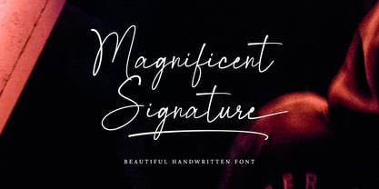 Introducing Magnificent Signature Font. Magnificent Signature font is an elegant and beautiful handwritten font that has a natural shape. This stylish font will look beautiful on a variety of design projects. It will add a fun and natural touch to any of your projects! This font is suitable for use on business branding, fashion, quotes, signature, magazines, logos, social media, photography watermarks, and wedding invitations. Features : - Ligatures - Stylistic Set - Swash Character - Number & Punctuation - Support Multilingual Language Thanks. By Bluestype Studio.
 - Hannah Style by Sensatype Studio,
$15.00 A new Serif font that we created special for logo and branding needs, with extra unique shape that will add your brand value. I. And specially for Hannah font, We prepared any alternate characters to help you create unlimited variations for your creative needs specially for logotype or wordmark. Hannah Cute Serif font ready with: Any options to get creative variations Preview as a inspirations that you can do with Hannah font Ready with Lowercase and Uppercase characters Wish you enjoy our font. :)
 - Laerna by Sensatype Studio,
$15.00 An Unique Feminine Display Serif font that we created special for elegant branding needs, with unique shape will be ready to add value of your brand. And specially for Belgium font, We prepared any characters to help you create unlimited variations for your creative needs. Laerna Unique Feminine Display Serif Font ready with: Ready with Alternate Fancy Characters Preview as a inspirations that you can do with Laerna font Ready with Lowercase and Uppercase characters Wish you enjoy our font. :)
 - Yink by Eclectotype,
$40.00 Yink takes big, bulbous, ball terminals up a notch, by repeating the shapes not only in the black but in the white space too. This interplay between black and white shapes is reminiscent of the yinyang symbol in places, which is where the name Yink originates. It's a shamelessly over-the-top font, and should be set large. There's a handful of OpenType features, including ligatures and alternates: Ligatures for ff, fft, ft, tt, gj Alternates are grouped into stylistic sets: 1. An alternate u, possibly more legible, but definitely not as much fun! 2. Again, a more boring version of m, just in case the default is ambiguous. 3. A more exuberant L 4. A blackletter informed T 5. Alternate P and R 6. An alternate 1 (one)
 - Citizen Kern by Pierre Tur,
$9.00 Citizen Kern is a modern, geometrical grotesk typeface. It comes in 5 different styles and opentype features for a better use of typography: it’s good for both headlines and body copy. It was made from the simplest geometrical shapes for a universal appearance, with enhanced overlaps to ensure an offbeat look. Citizen Kern is meant to work for any graphic project. You can use it for branding, editorial design, signage or even motion design : its simple shapes make it super easy to animate. Do you love the classic sans serif fonts? We all do. But what if you could add some singularity to your projects? Then Citizen Kern is the ideal pick for you. It will never be as perfect as the classics but will definitely offer an alternative, and freshness to your work.
 - Hot, Hot, Hot - Unknown license

- Textan - Square - Unknown license

- Ye Benjamin by Yinon Ezra,
$30.00 Ye Benjamin is a smooth italic typeface, that will spread style and good vibes everywhere you put him. The crystallization of the letters shape was through seeking an iconic look, that would be a useful branding tool.
 - Kallisto by Device,
$39.00 A robust rectangular sans with round corners and subtle rounded stroke terminals, Kallisto weds a rational, machine-made aesthetic with a certain warmth that derives from more familiar letter shapes found on diestamped or embossed boilerplate signs.
 - Premier by ITC,
$29.99Premier font was designed by Colin Brignall. Premier Lightline displays all the elegance and sophistacation of the 1920s and 30s and consists of a refined lowercase with high ascenders and generous capitals which can also be used alone. Premier Shaded is an all caps typeface which provides a robust counterpart to the fine elegance of Premier Lightline. Premier Shaded should be used with close or ever overlapping letter spacing and is ideal for strong, eye-catching headlines. - Lovely Rose by Namara Creative Studio,
$14.00 Lovely Rose Romantic calligraphy script font inspired by lovely valentines themes. This font is suitable for greeting card, wedding invitation, instagram post, quotes and so on. Feel free to follow, like and share. Thanks so much for checking out my shop!
 - Buum by Ondrej Chory,
$70.00 The Buum typeface evolved from the explosive lettering originally designed as part of a house style for an interactive science centre for kids. Beside its usual application as a strong display font in print and on screen, the bold angular shapes of glyphs are adapted for negative machine- or laser-cutting into structural materials such as iron sheets, plywood, or stone ... and for creating tactile expressive surfaces and 3D objects. This pictogrammic and dazzling font remotely echoes the morphology of the lettering of futurism and constructivism, when avant-garde typography was once an exciting adventure. It is a lettering building kit with a number of stylistic alternatives of glyphs that enable a user to shape the same word differently each time. Buum is recommended by nine out of ten old school futurists, favored by steampunk CNC operators and respected by the majority of infantile anarchists.
 - Cute Letters by Harald Geisler,
$68.34 Cute Letters is a hand drawn font family in two styles with extensive character sets. Cute Letters - Hearted is a vibrant happily singing script, all capital as well as some lowercase letters are decorated with heart shapes. Second: Cute Letters - Heartless is still as vivid as it’s sister Hearted but a little less briskly, some straightened forms and without the decorative hearts. Both styles are readable and suitable for longer texts in medium point sizes. Cute Letters Hearted & Heartless is a part of the Light Hearted Font Collection that is inspired by a recording of Jean Baudrillard with the title, "Die Macht der Verführung" (The Power of Seduction) from 2006. Further inspiration came from the article, "The shape of the heart: I'm all yours". The heart represents sacred and secular love: a bloodless sacrifice. by British writer Louisa Young printed in EYE magazine (#43) London, 2002.
 - Bastie by Say Studio,
$14.00 astie - Elegant Serif Font Unique, playful and versatile serif with 35+ ligatures and 50+ alternates can combine to get curves and beautiful shapes just in seconds. Type the words and Add the unique shapes from Bastie ornament to get a more stunning display. This font is suitable for many design forms, such as magazines, postcards, logos, DIY Projects, invitation cards, quotes, vintage look design, an old classic, the 60s, 70s, 80s, wedding projects and much more. We recommend using Adobe Illustrator or Photoshop. how to access alternate? Adobe Photoshop go to Window - glyphs Adobe Illustrator go to Type - glyphs Supported Languages What's you get? - Unique Alternates - Multilingual Support - Works on PC & Mac - Simple Installations - Accessible in the Adobe Illustrator, Adobe Photoshop, Microsoft Word even work on Canva! - PUA Encoded Characters - Fully accessible without additional design software. Let me know if you any question:) Have a wonderful Day Say Studio
 - Versina by Latinotype,
$39.00 Versina is a display typeface with a unique and expressive yet moderate personality resulted from its organic elegant shapes which are inspired by Spanish transitional typefaces from the 18th century. This font is perfectly suitable for both titles and short text. Versina features a flowing organic stroke and asymmetric bracketed serifs, and its shapes convey rhythm and dynamism. The font has a large x-height and its ascenders are shorter than the cap height, making it look more slender and modern. Calligraphic and crescent-like terminals give the design great formal richness. Versina comes in 5 weights with matching italics plus a set of ornaments, in Regular and Black styles, and also includes old style/lining/tabular figures, fractions, superscripts and subscripts as well as a set of small caps, standard ligatures, historical ligatures, symbols and frames. Versina contains a set of 694 characters that support over 200 Latin-based languages.
 - Superb by Resistenza,
$49.00 Superb is a new typeface based on real brush pen script and also influenced by lettering shapes from the sixties and seventies. The font includes various swashes with volume and curls.. Superb’s letters got high contrast and some psychedelic curves. This font includes negative figures and a full alphabet set with cut out shapes. Take a look at the Superb Video https://vimeo.com/94062611 It’s designed with high contrast and enhanced legibility regardless its artistic look. Superb’s original letterforms are a beautiful piece of art and elegance no matter you observe them as separate symbols or as words, text paragraphs etc. Their appropriate use could be found therefore in many different aspects – from decorative greeting card, fresh packaging or expressive headline, to artistic t-shirt design, poster or distinguished brand name. Superb has a lot more to show when you access its OpenType features.
 - Scribal by Loaded Fonts,
$15.00Designed with help and inspiration from legendary tattoo artist Dustin Horan. This beautiful time saver was designed specifically for skin application. Short words and initials can instantly be turned into seamless tribal style tattoos. Each glyph links with the next allowing letters to flow endlessly around limbs and in circles. Respecting the rhythm and geometry principles laid forth by American pioneering tribal artist Leo Zulueta, Scribal makes flowing text shapes that disguise themselves as design. When mirrored back to back and rotated vertically, Scribal becomes well-crafted tribal pattern. Typeface wise, Scribal breaks the mold. While a script font, Scribal was designed to be written in all capitals. Each capital is a mono-spaced glyph, providing even spacing. The shape influences are also vast, ranging from scripts, to blackletters, to romans. Making Scribal a very "Americanized" font, reflective of this "Americanized" style of Tribal Tattooing. - SK Irrationalist by Shriftovik,
$16.00 SK Irrationalist is a new experimental accidental font created by the SHRIFTOVIK font foundry and Tikhon Reztcov. This font is very unusual. It uses non-standard graphic techniques. Sloping non-parallel lines, sharp shapes and a combination of rectangles and circles all make the font special. The SK Irrationalist font was inspired by the works of constructivist artists of the early 20th century. The font contains both Latin, Latin Pro version for European countries and Cyrillic. This font delivered in 4 styles: Regular; Sharp; Outline; Rounded.
 - Clinto by XdCreative,
$29.00 Clinto Sans Serif Clinto Sans is a simple geometric sans serif font Clinto Sans are constructed using basic geometric shapes such as circles, squares, and triangles. The letterforms are based on simple geometric proportions, resulting in a consistent and harmonious visual rhythm. Clinto sans serif fonts embrace simplicity and have a minimalistic approach. They aim to reduce letterforms to their essential elements, eliminating any unnecessary embellishments or flourishes Clinto Sans also has Straight Lines and Clean Edges. Clinto Sans also have open apertures, which refer to the space enclosed by the curved or diagonal strokes of certain letters like "a," "e," "g," and "s." The open apertures contribute to legibility and readability, especially at smaller sizes. Special features: - Ink trap Ink traps are small recessed areas or notches incorporated into the corners or junctions of letterforms. They were originally designed for letterpress printing to prevent ink from filling in and distorting the shapes, especially at small sizes. However, in modern digital fonts, ink traps are often used as a design element to add visual interest and maintain legibility at small sizes or in low-resolution environments. - Alternates Stylistic alternates offer alternative shapes or forms for certain letters in the font, a, e, g, and r, etc. Stylistic alternates can be accessed through OpenType features in design software. OpenType is a font format that allows for advanced typographic features and character substitutions, you can access the alternate letterforms through the glyphs palette or the OpenType panel in their design software and apply them selectively to specific letters. Thank You _
 - Basic Bullets by Gerald Gallo,
$20.00 Contains 19 bullet designs in solid, outline, and outline shaded.
 - Gill Sans MT by Monotype,
$45.99 Gill Sans is a humanistic sans serif family that, while is considered by many to be quintessentially British in tone and concept, has been used in virtually every country and in nearly every application imaginable. Gill Sans has reached this level of near-ubiquity for one simple—and very good—reason: it is an exceptionally distinctive design with a potential range of use that is almost limitless. This toolkit family includes a wide range of styles including the standards such as Light—which is open and elegant—and a Regular that, with its flat-bottomed d, flat-topped p and q and triangular-topped t, has a more compact and muscular appearance. Its Bold styles tend to echo the softer, more open style of the light while the extra bold and ultra bold have their own vivid personalities, but each of them would make for an eye-catching headline. Take into account the family’s many weights, including condensed and extra condensed designs, and extended language support and you have yourself a tool you’ll be thrilled to return to, time and again. Gill Sans was designed by Eric Gill: a versatile, brilliant, and prolifically successful designer of the early part of the last century. One of the main reasons for the enduring success of his namesake design is that it is based on Roman character shapes and proportions, making it unlike virtually any other sans serif out there. Gill also worked his own warmth and humanity into his design, resulting in a typeface in which each weight retains a distinct personality of its own. Pair with serif fonts like Gill's own Joanna; or more modern offerings like Frutiger® Serif, Malabar™, Syntax® Serif, FF Scala®, or DIN Next™ Slab.
 - Oita by insigne,
$- Oita might be a carefully crafted typeface family, created by a meat-bag human. Or, it might have been made by a supremely clever sentient robot. Found in the dark recesses of a top secret spy agency’s quantum computer, this font came with this somewhat unusual description, which is presented without comment. "To conquer, we cannot simply overcome. Success is found in supremacy--in the dominance of Oita. While looking for the right tool for this success, our research has led us to the finely executed forms found of military domination throughout history. In our labs, we've used our specialized machines to harness these forms' power and refined their impact through elements of contemporary and computer design. The structure proves to be robotic and squared on its edges. However, the chutzpah of this technical face still allows it to pass as if created by human hands. Our resulting payload, Oita, is modern and sturdy. While based on a practical, octagonal structure, make no mistake; this new instrument will drive forward the energy you want to push through your projects. Oita has 42 cuts certain to encompass your designs on world domination. Each font contains the glyphs to support over 52 languages. The font also includes tabular and lining figures, numerous ligatures, and selected advanced Opentype options, including stencil and experimental options to bring out the dynamic characteristics that have already been crafted into Oita. Early tests have found that the new instrument is easily scalable to smaller dimensions without reducing its impact. The font remains highly readable across a variety of applications. We speculate from our findings that it will be successful for sporting and technical applications. So for you who venture to use Oita, use it boldly. Don't just overcome. Dominate. Go and conquer mightily with Oita. We'll be watching." We may never know whether Oita hails from mind or mechanism. What we do know is that, should you choose to take on Oita, you'll be acquiring a dynamic poster and packaging face, a minigun-toting bad robot of a font that exudes pace and power.
 - Eksja by Protimient,
$29.00 Eksja is a modern slab serif available in four weights, each with a corresponding italic. All the fonts in the family have small caps, the extended latin character set, diacritical f-ligatures, enclosed numerals (numbers in circles) and case-sensitive punctuation. The general design of the typeface has been with a strong human touch in mind. The ends of the serifs have been given a subtle rounding, just enough to take the edge off which, when coupled with the largely humanist structure of the design, creates an open, friendly and approachable design, abandoning the usual geometric severity commonly associated with slab serif typefaces. Eksja contains quite a comprehensive numerals system. Obviously, each font has the standard proportionally and tabularly spaced lining and old-style figures but, crucially, the tabular numerals share the exact same width in each font variant. That means that you can choose to use the thin, regular, bold, black and their italic forms all in the same setting and they will always line up. In addition to the 'normal' numerals there are super-script and sub-script numerals and OpenType fractions that can be automatically composed as you type. There are also the enclosed numerals, numbers inside a circle, that are useful for numerically listing items and, thanks to the wizardry of OpenType, they can contain any number of digits (typically, enclosed numerals are precomposed single digits, only encompassing the 0–9 range, the enclosed numerals in Eksja can go to double digits, triple digits or, in fact, any number of digits*). *The automation of the enclosed numerals is accessed via either "Stylistic Set #1" or "Stylistic Alternates" which requires the use of an application that supports OpenType stylistic sets or stylistic alternates, such as Adobe's InDesign or Photoshop.
 - Celtic Monograms by Kaer,
$24.00 Here is my next Celtic Monograms font family. I used a lot of authentic knots and curves to imitate Insular art style. The term derives from insula, the Latin term for “island” in this period Britain and Ireland shared a largely common style different from that of the rest of Europe. I've drawn sketches set, manually vectorized it and assemble the font family. In an attempt to replicate the intricate patterns found in Celtic art, I endeavored to create a design that embodied the essence of true Celtic knot work. The interweaving lines, which were prominent motifs in Celtic art prior to the arrival of Christian influence around 450, served as the foundation for my creation. Over time, these designs seamlessly integrated into early Christian manuscripts and artwork, incorporating depictions of various elements from everyday life, including animals, plants, and even human figures. In the beginning, the patterns were intricate interwoven cords, called plaits. This particular style is often linked to the Celtic regions, but it was also widely embraced in England and spread throughout Europe through the efforts of Irish and Northumbrian monks. The utilization of the Celtic knot as a tattoo design gained popularity during the 1970s and 1980s in the United States. Consequently, it has proven to be a highly advantageous font choice for various applications such as posters, banners, and sportswear. You can also create a vintage color shift effect. Please note, you should use graphic applications such as Adobe Illustrator or Photoshop, but not Microsoft Word. All you need is put Two or Three lines style initial on the top of Back style. I’m happy to present you the Rough, Two lines, Three lines, and Back styles for your design. You’ll get uppercase and numbers set. Thank you!

