3,140 search results
(0.019 seconds)
- Sign Kit JNL by Jeff Levine,
$29.00During trips to the Miami Beach Public Library as a youth, Jeff Levine first caught sight of the signs made with a product called the Webway Sign Cabinet, manufactured by the Holes- Webway company of St. Cloud, MN. Having purchased an old set, Jeff has carefully re-drawn the alphabet and unique contrasting numbers from the original assortment, adding in an extended character set to his font. - Cabarga Cursiva by ITC,
$29.00Cabarga Cursiva is the work of the father and son team of Demetrio E. Cabarga and Leslie Cabarga, both New York designers. The details of the sharp strokes almost give the impression of a knife blade, whether straight or curved like a scimitar. The capitals should be used only as initials and are complemented by a robust lower case alphabet as well as alternate forms and ligatures. - Pen Sans Rounded by Jeff Levine,
$29.00 Many alphabet style examples from the Speedball Textbook on pen lettering have offered amateurs and professionals a source of inspiration since its first publication in 1915. A 1940s edition presented a simple sans serif design rendered with the style ‘B’ round nib pen point, and has been recreated as the digital type face Pen Sans Rounded JNL, which is available in both regular and oblique versions.
 - Art Deco Flowery Initials by Celebrity Fontz,
$19.99Art Deco Flowery Initials is a collection of richly decorated Art Deco letters set on a background of vines and blooming flowers. Includes one set of A-Z ornamental initials conveniently assigned to both the upper and lower case alphabet characters. Perfect for starting off the beginning of paragraphs in artistic publications, storybooks, fairy tales, and texts conveying the feel of the Art Deco period. - Constellation Pro by Tilde,
$39.75 Constellation started with a simple geometric concept in the manner of Art Deco which gradually developed to a complete typeface, both upright and italic, total of seven weights. The concept allowed the font to be designed from Ultra Light in both very light and quite black styles. This Pro font is packed with all European and Cyrillic alphabets, small caps, variable figure sets and features .
 - Olaus by Monotype,
$29.99The Olaus Magnus and Olaus Bandus alphabets are inspired by the letterforms cut in the pictures and wood-cuts of Olaus Magnus great book Historia de Gentibus Septentrionalibus. This great history of the Nordic Peoples was printed in Rome in 1555 in his own printing shop there. Olaus Magnus, Catholic priest and appointed archbishop by the Pope, never returned to the now Lutheran Sweden. - Selene by Flanker,
$17.99 Selene is a sans-serif font family designed by Leonardo Di Lena. The font is based on geometric forms with as few improving legibility optical corrections as possible. If you need a minimalist font, technical but friendly and elegant, this is your choice. There are glyphs for all languages with Latin, Greek and Cyrillic alphabets, all the basic ligatures, old style numerals and alternates.
 - Darling Butter by Timurtype,
$14.00 Introducing by Timur type Proudly Present, Darling Butter Darling Butter A Handwritten Script Font Darling Butter is perfect for product packaging, branding project, megazine, social media, wedding, or just used to express words above the background. This Bread Forest font includes: -Full Set of standard alphabet and punctuation & symbol -Extra set Alternate ending lowercase -multilingual support. Embelish your designs with our original fonts.Enjoy the font,Thank you!
 - Silver Brighter by Timurtype,
$14.00 Introducing by Timur type Proudly Present, Silver Brighter Silver Brighter A Handwritten Font Silver Brighter is perfect for product packaging, branding project, megazine, social media, wedding, or just used to express words above the background. This Silver Brighter font includes: -Full Set of standard alphabet and punctuation & symbol -Extra set Alternate ending lowercase -multilingual support. Embelish your designs with our original fonts.Enjoy the font, Thank you!
 - Haisley Garden by Timurtype,
$14.00 Introducing by Timur type Proudly Present, Haisley Garden Haisley Garden A Handwritten Font Haisley Garden is perfect for product packaging, branding project, megazine, social media, wedding, or just used to express words above the background. This Haisley Garden font includes: -Full Set of standard alphabet and punctuation & symbol -Extra set Alternate ending lowercase -multilingual support. Embelish your designs with our original fonts.Enjoy the font, Thank you!
 - Flox Rounded by ParaType,
$30.00 Flex Rounded display typeface was designed in 2000 by Vladimir Pavlikov as alternative 'soft' variant to the original Flox face. In contrast to Flox there are rounded stroke ends and curved shapes in most of Flex characters. The project was aimed to create a decorative vivid alphabet of geometric shapes. Cyrillic was developed in 2005. For use in advertising and display typography. Licensed by ParaType in 2005.
 - History Yenifer by Timurtype,
$14.00 Introducing by Timur type Proudly Present, History Yenifer History YeniferA Handwritten Font History Yenifer is perfect for product packaging, branding project, megazine, social media, wedding, or just used to express words above the background. This History Yenifer font includes: -Full Set of standard alphabet and punctuation & symbol -Extra set Alternate ending lowercase -multilingual support. Embelish your designs with our original fonts.Enjoy the font, Thank you!
 - Spur Wide JNL by Jeff Levine,
$29.00 Spur Wide JNL was modeled from an example of hand lettering from the antique French alphabet book L'Art du Tracé Rationnel de la Lettre. Heavy Roman style letters with spurs (often referred to as Latin) were most popular with sign painters and show card writers in the early part of the 20th century. Spur Wide JNL is available in both regular and oblique versions.
 - Creamy Dreams by Timurtype,
$14.00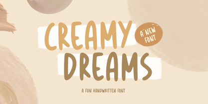 Introducing by Timur type Proudly Present, Creamy Dreams Creamy Dreams A Handwritten Script Font Creamy Dreams is perfect for product packaging, branding project, megazine, social media, wedding, or just used to express words above the background. This Creamy Dreams font includes: -Full Set of standard alphabet and punctuation & symbol -Extra set Alternate ending lowercase -multilingual support. Embelish your designs with our original fonts.Enjoy the font,Thank you!
 - Duffy’s Tavern NF by Nick's Fonts,
$10.00Originally presented as an alphabet suitable for movie title cards, this font is based on a 1920 work by showcard artist E. C. Matthews, and named after the eponymous 1940s radio show about a local saloon and its never-present owner. Both versions of this font contain the Unicode 1252 (Latin) and Unicode 1250 (Central European) character sets, with localization for Romanian and Moldovan. - Prismatiq JNL by Jeff Levine,
$29.00Prismatiq JNL was modeled from lettering found in a French alphabet book from the turn of the last century - the type sample appearing online at an image sharing site. All of the imperfections of hand-lettering were left intact. This is a limited character set comprising A-Z, 1-0, basic punctuation, forward slash and dollar and cents signs, and is best used in large headline applications. - Liturgisch by Lamatas un Slazdi,
$19.00 Liturgisch was created by Otto Hupp for Klingspor foundry in 1906. The basis of this font is a publication in the magazine "Das Plakat" of October 1921. The font contains contextual alternates, ligatures, discretional ligatures for use in German, ornamental bullets and other OpenType features. It supports all the European languages using Latin alphabets (including slashed S and slashed longs used in Latvian old orthography till 1930s).
 - Benn Beckman by Factory738,
$15.00 Beckman is a modern and minimalist sans-serif font family. The combination of minimal and geometric elements renders a modern design. Beckman includes 6 fonts, clean and modern caps, thereby creating more variability. This is irreproachable sans serif to diversify your headlines, branding visual identity, poster, logo, magazines and etc. Six weights Alternate glyphs Latin alphabets Thanks for looking, and I hope you enjoy it.
 - Karaoke JNL by Jeff Levine,
$29.00Karaoke JNL is one of the many alphabets created by the late Alf R. Becker that was showcased in Signs of the Times magazine from the 1930s through the 1950s. Thanks to Tod Swormstedt of ST Media (and who is the curator of the American Sign Museum in Cincinnati, Ohio) for providing Jeff Levine the research material from which this font design was modeled. - Tromso by Moontesk,
$9.00 Tromso is an extra wide sans serif font typeface. The family includes 3 fonts in a variety of styles. The uppercase alphabet in each font / style has been wide extended to allow for easy customization and creative control of character widths. Includes uppercase multilingual letters, numbers and punctuation. Well kerned. Including cyrillic. Perfect for logotypes, posters, app, etc. Characters Basic Latin Latin-1 Supplement
 - Nabataean 50 by Archaica,
$30.00This font provides a typical set of characters for the ancient Nabataean language, used in what is now Jordan and adjoining regions during the period of the Roman Empire, based on lapidary letter-forms of the first century of the present era. It includes a full set of alphabetic characters as well as the ancient numeral forms, with ligatures and variant shapes for some numerals. - Scary Scrimshaw NF by Nick's Fonts,
$10.00Fire up the incense and break out the love beads! A 1968 poster for a Doors concert by legendary artist Gary Grimshaw provided the inspiration for this wild, far-out and funky romp through the alphabet. Use it liberally to add a little trippy hippie charm to your next project. Both versions of the font include 1252 Latin, 1250 CE (with localization for Romanian and Moldovan). - General Chang JNL by Jeff Levine,
$29.00General Chang JNL is one of a number of fonts redrawn by Jeff Levine from the creative output of the late Alf R. Becker. Becker's alphabets were a monthly feature of Signs of the Times Magazine from the 1930s through the 1950s. Thanks to Tod Swormstedt of ST Media (who also is the curator of the American Sign Museum in Cincinnati, Ohio) for the resource material. - Pedantic by Larin Type Co,
$15.00 Pedantic it's a classic, delightful and charming, sounds like a perfect melody, flows like water,working with her is a pleasure. This font duo includes a monumental serif and a calligraphy script. The Serif font is contracting and elegant, will emphasize your taste and impress with its sophistication and simplicity. The calligraphic Script is elegant, beautiful and carefully assembled, he includes many alternates for uppercase and lowercase as well as swashes. Script and Serif looks great both separately and together and they will be a wonderful addition to your font library.This font is easy to use has OpenType features and all characters in this font have PUA encoding. Includes: Full alphabet with Uppercase and Lowercase A-z for Script Full Capital alphabet A-Z for Serif Numbers, fractions for Script and Serif Punctuation and symbols for Script and Serif Alternates for Serif "Q, K, R, ampersand" Alternates uppercase for Script Alternates lowercase for Script Ligatures for Script "ff, oh, ol, ok, or, os" Swashes for Script
 - Diverda Sans by Linotype,
$40.99Diverda Sans is a geometric family of typefaces that are all free from ornament. Swiss designer Daniel Lanz optimized Diverda Sans for maximum legibility. In contrast to many other modern typefaces, which try to squeeze the traditional rounder forms of the alphabet into square designs, and which often attempt to equalize the widths of the capital letters, Diverda Sans remains true to the proper proportions of the Roman alphabet. The x-heights of Diverda's characters are low, and the differences between curved, square, and triangular elements are very clear. Like the more calligraphic typefaces of the past, Diverda's strokes exhibit contrast that is inspired by movements of the pen on paper; down strokes are heavier than up strokes. Possible applications for the Diverda Sans include magazine design, as well as advertising for fashion, design, or architectural products. Because of its 10 different individual styles or weights, Diverda Sans is also a good fit for Corporate Identity solutions. - Sedid World by Fontuma,
$28.00 Sedid, “solidity; It is an Arabic term meaning “righteousness”. In particular, the correctness and soundness of a word is indicated by this word. The fact that I gave this name to the writing family is to point out its accuracy and robustness. This typeface, which is sans serif, consists of three families: ▪ Sedid: Font family containing Latin letters ▪ Sedid Pro: Font family including Latin, Arabic and Hebrew alphabets ▪ Sedid World: A family of typefaces including Latin, Cyrillic, Greek, Arabic and Hebrew alphabets Do you want a difference in your work? Then meet the Sedid World font family. This font will meet all your expectations in terms of the languages it supports and the variety of glyphs it contains. You can easily use the Sedid World font family in every project. Because this font has beautiful and soft lines. The font family includes open type features, as well as a large number of ligatures, small caps, modifiers, and currency symbols of many countries.
 - Phrasa by Arrière-garde,
$12.00 Phrasa is a robust humanist sans-serif typeface family which will carry you through most of your design needs. Designed for legibility, she truly shines in running text. However her solid (yet elegant) construction allows for usage in such settings as branding or signage. Phrasa's most prominent features are: 13 weights, from hairline to black Moderate x-height Large apertures Modern capitals proportions Designed for readability… … without sacrificing good looks True Italics Small capitals Adobe Latin 3 language range Cyrillic alphabet Old-style and tabular figures The idea behind Phrasa was to create a stylish typeface but with legibility in mind. The inspiration came from history, namely from two of the most legible typefaces known: Garamond and Gill Sans. The new typeface boasts a smooth, easy-on-the-eyes texture which allows the reader to simply sink into the text. It also posses a set of true italics to compliment it. Phrasa has a broad linguistic range, spanning from extended latin alphabet to cyrillic.
 - Seol Sans by Monotype,
$187.99 The Seol Sans design offers a fresh palette for designers working with the Korean alphabet, particularly those looking to pair Latin and Korean alphabet (or Hangul) forms without creating typographic friction. The choices for Hangul fonts that work well with humanist Latin typefaces are limited. As Monotype’s first original Korean design, the Seol Sans typeface is a humanist take on the traditional rigid and hard designs of Hangul characters. The Seol Sans design more closely resembles the natural curve of hand-written characters. Seol Sans features Neue Frutiger for its Latin glyphs, and works harmoniously with Neue Frutiger World and Monotype’s CJK typefaces: Tazugane Gothic (Japanese) and M XiangHe Hei (Chinese). Seol Sans is a great choice for global brands using a Sans Serif design looking to maintain their visual identity, and communicate with a consistent tone of voice in the Korean market. Seol Sans has over 18,000 glyphs, and supports the Adobe-Korea1-2 and KS X 1001:2004 character sets.
 - P22 Schumann Pro by IHOF,
$29.95 Schumann Pro is the very first issue of a long lost early 1960s typeface project done by Heinz Schumann while he was at the University of Graphics and Book Design in Leipzig, where he studied under German type design giants Albert Kapr and Herbert Thannhaeuser. This alphabet was never published as a typeface, but Schumann went on to design Stentor for Typoart a couple of years after graduating. Albert Kapr’s influence is unmistakable in this playful upright script, especially in the wide and breezy capital forms. Unique exit strokes and serif placement work together to define the bouncy rhythm of this face. This is an expressive original alphabet that successfully bridges the gap between expert calligraphy and everyday sign lettering. P22 Schumann Pro comes with over 500 glyphs, which include plenty of alternates, quite a few ligatures, and extended Latin language support. It is a very effective font when used sparingly in packaging, signage, posters and things designed to catch the eye.
 - Opificium Sans by Unio Creative Solutions,
$5.00 Opificium is a visual contemporary sans serif typeface composed of three weights plus their matching obliques. The industrial design creates and develops concepts and specifications that optimize the function, value, and appearance of products. Indeed, this is reflected in the concept behind each glyph of our font family which geometry has required particular attention for the purpose to preserve optical exactness, along with proportions continuity. The whole design of this typeface is in fact ruled by versatility and legibility and makes it functional for any text in small and large sizes. "Opificium" typeface includes over 450 characters with coverage for several languages using the Latin alphabet as well as the Greek alphabet. The font family provides advanced typographical support such as a significant number of neat standard and discretionary ligatures and broad support of OpenType features (OTF). Recommended for headlines, logos, and any destination of use such as corporate identity, typography, posters, web design, and social feeds.
 - Burner by Graffiti Fonts,
$29.99 Burner is an advanced, connecting, wildstyle graffiti font family including over 200 unique letters, numbers & symbols. The family includes outlines, fills, details and more. Mix and match glyphs from 3 alphabets, add end pieces and more. Repeating flames, arrows & flourishes & other embellishments are included. The Burner family includes 3 full alphabets in each of the 4 styles as well as numbers, punctuation and a wide array of arrows, bars , begining & end pieces. Like some of our earlier wildstyle typefaces such as RaseOne or WildStyle, the Burner font family is a layered type system made to work as a team. In nearly any application 2 or more styles can be easily layered to create advanced, multicolor, wildstyle pieces. This layering system provides a shortcut to time consuming effects such as sharp corners & variable widths on outlines, fills & details. The original glyphs were all drawn by hand taking inspiration from actual painted & drawn wildstyles from RaseOne spanning the late 90's to about 2006.
 - Cumhuriyet Pro by Fontuma,
$28.00 Cumhuriyet is an Arabic concept that means "the form of government in which the nation holds the sovereignty and uses it through the deputies elected for certain periods". The reason why I gave this name to the font is that 2023 is the centennial anniversary of the Republic of Turkey, which was founded by Atatürk. This typeface, which is sans serif, consists of three families: ▪ Cumhuriyet: Font family with Latin letters ▪ Cumhuriyet Pro: Font family including Latin, Arabic and Hebrew alphabets ▪ Cumhuriyet World: Font family including Latin, Cyrillic, Greek, Arabic and Hebrew alphabets Cumhuriyet Pro is a family of multi-purpose typefaces designed in a geometric style. This font is an extremely useful font for media and digital media as well as for printed products. In this respect, the Cumhuriyet font can be used as a text and title font in publishing and printing areas, magazines, newspapers, books, banner and poster designs, and websites.
 - Cumhuriyet by Fontuma,
$24.00 About the font family Cumhuriyet is an Arabic concept that means "the form of government in which the nation holds the sovereignty and uses it through the deputies elected for certain periods". The reason why I gave this name to the font is that 2023 is the centennial anniversary of the Republic of Turkey, which was founded by Atatürk. This typeface, which is sans serif, consists of three families: ▪ Cumhuriyet: Font family with Latin letters ▪ Cumhuriyet Pro: Font family including Latin, Arabic and Hebrew alphabets ▪ Cumhuriyet World: Font family including Latin, Cyrillic, Greek, Arabic and Hebrew alphabets Cumhuriyet is a family of multi-purpose typefaces designed in a geometric style. This font is an extremely useful font for media and digital media as well as for printed products. In this respect, the Cumhuriyet font can be used as a text and title font in publishing and printing areas, magazines, newspapers, books, banner and poster designs, and websites.
 - Pasto by Antipixel,
$15.00 Pasto is a fun and charming display type family of two styles with four weights each. 'Print' is a textured irregular stamp style, and 'Sharp' is a straightforward soft-edged type with clean strokes. It is clean, playful, and expressive, with a lightweight structure and fairly aired inner space. Pasto is perfect for display use and intended for medium and large settings. Still, it can be used in smaller point sizes for short sentences or words, providing a softer, delicate look. Pasto has three alternating alphabets that slightly differ from one another. Thanks to the Contextual Alternates, these alphabets are automatically replaced to avoid the same letterforms and textures appearing next to each other, creating a more spontaneous look when typing. This OT Feature is available for all the Sharp and Print styles. Some of Pasto's features are ligatures, stylistic alternates, numerators, fractions, special characters, currency symbols, and a glyph coverage that ensures extended language support.
 - Protest by Society of Fonts,
$29.00 Protest is inspired by protest posters and the power of the people! Each glyph is written by hand with a Sharpie® Magnum marker on big sheets of paper. It is designed to fit more into the poster and still be legible for the media from a block away. It's bold, slightly condensed, and neatly drawn with love and conviction, with the warm imperfection that comes from being hand drawn. Protest consists of over 1,430 glyphs. This includes 300 alphanumeric glyphs with 3 contextual alternates each, 20 stylistic alternate glyphs, and 20 protest themed dingbats. Contextual alternates will rotate through automatically when OpenType features are enabled, giving it more human irregularity. Protest supports 219 latin-based languages, using Underware’s Latin Plus glyph set.
 - Bellatrice Natural by IbraCreative,
$17.00 Bellatrice Natural is a captivating natural signature font that effortlessly combines elegance with a touch of organic charm. Its fluid strokes emulate the graceful movements of handwritten script, lending a personalized and authentic feel to any design. The gentle curves and slightly irregular lines of Bellatrice evoke the warmth and individuality of a handcrafted signature, making it an ideal choice for projects that seek a distinctive and human touch. The font’s natural flow and intricate details create a harmonious balance, resulting in a timeless and sophisticated signature style that can elevate a variety of creative endeavors, from invitations and branding to personal correspondence. Bellatrice is a testament to the artistry of a well-crafted signature font, capturing the essence of natural handwriting with grace and finesse.
 - Neo Brushly by IbraCreative,
$17.00 Neo Brushly is an enchanting handlettered brush font that encapsulates the artistry of free-flowing strokes and the warmth of handcrafted expression. With each character meticulously crafted, the font exudes a genuine, human touch, reminiscent of brush strokes on canvas. The letters dance dynamically, creating a harmonious rhythm that lends a unique, personalized flair to any project. Neo Brushly captures the essence of spontaneity, making it an ideal choice for designs that seek a balance between casual elegance and a hint of playful sophistication. The organic, brush-inspired design imparts a sense of authenticity, making Neo Brushly an inviting and versatile choice for a wide range of creative endeavors, from branding to invitations, infusing a touch of handmade charm into every typographic creation.
 - Baldufa Cyrillic by Letterjuice,
$66.00 Baldufa is a charming typeface with strong personality, which looks very comfortable in text. There is a search to obtain complicated curves and detailed features, which gives the typeface a touch of beauty and elegance. However, this is also a self-conscious design that claims through the rounded serifs and irregular vertical stems appreciation for quirkiness and human imperfection. The letterforms are inspired by the slight distortions and idiosyncrasies that came with old printing methods. It has distinct, features such as rounded serifs, irregular vertical streams, ink traps and extremely thin junctions. In the Italic, serifs have been removed to enhance movement and expressivity. These experiments in form have not come at the cost of legibility: The typeface remains suitable for both small and display text.
 - Old Wood JNL by Jeff Levine,
$29.00 One of the charming features of vintage wood type is the unusual interplay of stroke widths or letter shapes that can vary from character to character. In today's world of digital perfection, a set of letters, numbers and punctuation marks must conform to rigid standards of uniform lines, balanced curves and other form-and-function rules that has often removed the human feel from the overall type design. While this is fine when applied to most text fonts and some modern display faces, Old Wood JNL is a simple throwback to an earlier time when type design was an artistic, not engineering endeavor. Modeled in part from vintage source material, this wood type design retains that charming imperfection of a time long passed.
 - Imperfection by LIGHTDESIGNS,
$9.00 IMPERFECTION Is a hand-written san-serif font inspired by human imperfections (mistakes). This is the first font created by LIGHTDESIGNS. It has no consistency in it's design which made the font looks like a lot of mistakes has been made. But this is done with purpose. With these characteristics, the font is given the name "IMPERFECTION', With surprising font and glyph designs, the intent of this font design is to pass a message that says, "SUCCESS IS NOT THE ACHIEVEMENT OF PERFECTION, BUT THE ACCOMMODATION OF IMPERFECTION™ This font design will be a fit in every design project it is utilised like logos, posters, flyers, magazine, card designs e.t.c. This font can be nicely pairs with script fonts & San serif font.