2,596 search results
(0.007 seconds)
- Rachelle JNL by Jeff Levine,
$29.00One of Jeff Levine's friends kept requesting that he name a font after her, and he finally obliged with Rachelle JNL. The font gets its inspiration from the antique wood type version of the popular font most often known as a Latin typeface - complete with spur serifs and all of the usual quirks of wooden type. - Spaghetti And Cheese by Hanoded,
$15.00 Who doesn’t like Spaghetti & Cheese? Well, my son doesn’t like it, because he hates cheese, but he seems to be one of the few. Spaghetti & Cheese is also a handmade font: slightly slanted, slightly eroded, yet very legible and clear. It was made with a Japanese ‘Shake & Write’ marker pen. Comes with a generous topping of diacritics.
 - French Plug by HiH,
$8.00 Frank H. Atkinson was a popular Art Nouveau sign painter in Chicago, Illinois. He designed signs for the Cadillac Motor Car Co., Chicago Academy of Fine Arts and the department store Marshall Field. Oddly enough, he even designed signs for other sign painters. In 1908 he published a book, Sign Painting, which sold well. French Plug, a bold, rounded, all-cap design in an American Art Nouveau style from that book. It has a relaxed, easy-going informality that is useful for ads and flyers. It also would have fit very nicely with many French posters of the period.
 - Big Chuck by Proportional Lime,
$1.99 Charlemagne, one of the great rulers of the Middle Ages, was instrumental in the reestablishment of formal education in the West. This font was inspired by the notion that he felt the need to protect his communications from people with the ability to read; a rare skill then. Did he really command such a script to exist? He did instigate the development Carolingian minuscule script. Here are two different systems that are both attributed to him. Does it provide any real security? No, but it is fun to think about how such a system might have been used.
 - LoveYaHoney by Typadelic,
$14.95 Aw, aren't they sweet? This lettering is based on a 1950s note a husband wrote to his wife shortly after they were married. His beautifully controlled and strong handwriting knows no lowercase characters; he gets his point across in uppercase only. In today's world of email and internet writings, we know that uppercase means shouting and is considered quite rude, but he didn't know that when he wrote this letter to his lovely wife! Love Ya Honey is very legible and looks beautiful when used for headlines, titling or even long expanses of body copy. Perfect for scrapbooking too!
 - ITC Tyke by ITC,
$29.99Tomi Haaparanta got the idea for the Tyke typeface family after using Cooper Black for a design project. He liked Cooper's chubby design, but longed for a wider range of weights. “I wanted a typeface that was cuddly and friendly,” recalls Haaparanta, “but also one that was readable at text sizes.” He started tinkering with the idea, and Tyke began to emerge. Even though Haaparanta knew his boldest weight would equal the heft of Cooper Black, he began drawing the Tyke family with the medium. His goal was to refine the characteristics of the design at this moderate weight, and then build on it to create the light and bold extremes. Haaparanta got the spark to design type in 1990, when he attended a workshop held by Phil Baines at the National College of Art and Design in Dublin. “I've been working and playing with type ever since,” Haaparanta recalls. He released his first commercial font in 1996, while working as an Art Director in Helsinki. After about two dozen more releases, he founded his own type studio, Suomi Type Foundry, early in 2004. At five weights plus corresponding italics, Tyke easily fulfills Haaparanta's goal of creating a wide range of distinctive, completely usable designs. The light through bold weights perform well at both large and small sizes, while the Black is an outstanding alternative to Cooper for display copy. - Big Bag NF by Nick's Fonts,
$10.00This industrial-strength titling face takes its design cues from Hans Eduard Meier's Syntax Antigua. This version is bolder and beefier, so your headlines will grab and hold attention in a refined and genteel manner. Both versions include complete Latin 1252, Central European 1250 and Turkish 1524 character sets, with localization for Moldovan, Romanian and Turkish. - Quessera by Oui Studio,
$21.00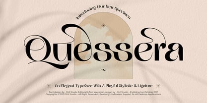 Hello, friend! 'Quessera' font is coming; an elegant typeface with huge playful stylistic & ligatures. Quessera has a complete stylistic of uppercase and has many unique ligatures, so you have many choices to determine the most perfect one for your work and make it look stunning. Quessera is perfect for branding, logo, invitation, wedding vibes, fashion, headlines, and more.
 - Douceur by Hanoded,
$15.00 Douceur (pleasantness in French) is an all caps, serif typeface with a flourish. It was created by hand in one go: no sketches, no try-outs. The font comes in two styles: regular (outlined) and black. Due to style naming issues, the black version will show up as a different font. Douceur comes with all diacritics.
 - Slivky by Slava Antipov,
$25.00 Slivky is a condensed rounded font family. It includes 6 styles: All Caps, All Caps Swash, Regular, Regular Swash, Small Caps, Small Caps Swash. Swash fonts have large capitals in the style of handwritten / script fonts. This cute rounded font is quite versatile due to the different styles. Good for logos, packaging, posters, advertisements and more.
 - Angela Love Sans by Fargun Studio,
$12.00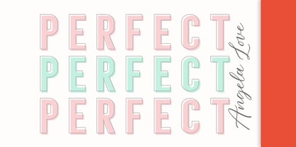 Introducing Angela Love Sans, a modern combination of 4 fonts, each carefully designed to naturally complement one another. With 4 clean sans styles, Angela Love Sans gives you a hugely versatile collection of fonts - ideal for experimenting with striking & modern typographic designs in any modern design brief. It is so beautiful and classy for your projects.
 - Neue Einstellung by Hanken Design Co.,
$25.00 Neue Einstellung is a geometric typeface with simplicity and straightforwardness that stands out in small or large scale applications. Inspired by the Einstellung Effect, it embodies rigidity in the way it looks and the way it performs. It has been used by contemporary brands all over the world due to the clean and minimalistic feel that it promotes.
 - Grand Prairie NF by Nick's Fonts,
$10.00This addition to the Whiz-Bang Woodtype series in based on a 100+ year-old typeface originally named Medallic. Due to the highly ornate nature of this font, it has a limited character set (no math operators or footnote accessories). The Opentype version of this font supports Unicode 1250 (Central European) languages, as well as Unicode 1252 (Latin) languages. - RM Elegance by Ray Meadows,
$19.00 With an obvious nod to Art Deco, this font offers a stylish design with distinctively elongated ascenders and descenders. Includes: Western European, Central European, Baltic & Turkish sets. Due to the modular nature of this design there may be a slight lack of smoothness to the curves at very large point sizes (around 100 pt and above).
 - Loredana by Larin Type Co,
$10.00 Loredana - a new handwritten font duo will give you the opportunity to make amazing compositions. These fonts fit into any project, due to its simplicity. Use those fonts for branding or to create a logo, a beautiful frame for your home, or use them for book covers, stationery, marketing, a blog, magazines, for your business and much more.
 - The Bold Taffi by Scratch Design,
$12.00 The Bold Taffi is a bold, big, huge, geometric sans-serif with a modern style. This font is eye-catching custom-made and still has a fun and retro style. This font is perfect for headlines, logos, brandings, packaging, posters, labels, and other designs that need a high-fashion font. Includes: Two styles Numbers & punctuation Multilingual support Ligatures
 - Chocolate Peaches by PeachCreme,
$12.00 Hey guys! So happy to introduce you our new font “Chocolate Peaches”! It is great for projects that have a playful or cute theme, whether for labels, signage, packages, stickers, etc. Along with being legible due to its bold letters, this typeface can make a lovely addition to boho designs that incorporate natural elements, patterns, texture and many colors.
 - Hullabaloo by Solotype,
$19.95We saw a few letters of this in a catalog, and liked it so well we drew it up and made it as a film font for photolettering. Due to a surplus of interesting types in our shop this one never made it into our catalog, so we can¹t tell you anything about its popularity. - RM Hangle by Ray Meadows,
$19.00 This strong angular cousin of RM Hunky offers a bold display face. The distinctive nature of this design will be a welcome addition to any designers collection of useful fonts. Due to the nature of this design there may be a very slight lack of smoothness to the curves at extremely large point sizes (around 200 pt and above).
 - MVB Bossa Nova by MVB,
$39.00MVB Bossa Nova is based on unattributed hand-lettering found in an old book, circa 1946. Yet unlike many scripts based on a vintage source, it feels fresh and dynamic. This is due to the skilled hands of Holly Goldsmith, who gave the forms a contemporary vigor despite their age. Alternate glyphs with extended ascenders offer extra flair. - Smart Frocks NF by Nick's Fonts,
$10.00 A sign in a London storefront, ca. 1930, pitching—surprise!—Smart Frocks provided the visual cues for designing this typeface. Singularly stylish, hip and haughty and decidedly Deco, this is the smart font to use! This font contains the complete Latin language character set (Unicode 1252) plus support for Central European (Unicode 1250) languages as well.
 - Schneidler Latein by Spirit & Bones,
$33.00 The Schneidler Latein is a sharp and elegant Antiqua based on the ductus of the broad edged pen with a strong character. Running perfectly in paragraph text giving it something quite special and being effortlessly legible at the same time, Schneidler Latein works great in headings as well. Each glyph is a piece of art ready to be used in branding and blowup combining beauty and personality in a kick-ass blend. It is absolutely new to the digital world as it never has been digitized before. This new version digitized, further developed and extended by artist and graphic designer Lena Schmidt comes in nine styles from which there are four application-related ones like Subtext and Display and five weight-related ones like Bold and Heavy. Each style contains 948 glyphs, variations of numbers, three stylistic sets one preserving the historic forms of changed characters, small caps, open type features and superior and inferior characters. Designed by F. H. Ernst Schneidler the Schneidler Latein was released in 1916, the bold version in 1920 and the italics in 1921. Schneidler was born in 1882 in Berlin. He studied at the school for applied arts in Düsseldorf with professor F. H. Ehmcke and P. Behrens. He was as a painter, graphic designer and illustrator. In 1920 he was appointed as teacher in the school for applied arts Stuttgart. His students were Albert Kapr, Imre Reiner and Lilo Rasch-Naegele among others. Further well-known fonts from his hands are for example Legende, Amalthea, Schneidler Mediävel and Schneidler Antiqua. Lena Schmidt was born 1981 in Bremen. She is a german painter, graphic designer and illustrator mostly known for her huge wood carving paintings. From 2003 to 2011 she studied Fine Arts in Hamburg with professor Matt Mullican. From 2015 to 2019 she studied graphic design with a focus on type design at HAW Hamburg Department Design with professor Jovica Veljović. She lives and works in Hamburg, Germany.
 - Blocke by RicardoLetters,
$9.00 Bloque es una fuente moderna de tipo bloque perfecta para proyectos de grandes dimensiones como vallas, pósters artísticos, señalización, packaging, títulos y logotipos. Ya que su contador es tan estrecho no debes usarla en tamaños pequeños porque la definición de cada carácter se perderá. Es una fuente que cuenta con una sensación limpia y minimalista. Bloque es una excelente elección cuando se necesita una fuente impactante de letras en bloque para crear diseños impresionantes. Bloque is a modern block font perfect for large projects like billboards, poster art, signage, packaging, headlines and logos. Since its counter is so narrow you should not use it in small sizes because the definition of each character will be lost. It's a font that boasts a clean, minimalist feel. Bloque is an excellent choice when you need a striking font of block letters to create impressive designs.
 - Latim by Ixipcalli,
$26.00 Latim es una tipografia inspirada en el esitlo románico latino La fuente amplía su uso proporcionando 4 pesos desde delgado hasta negrita; mientras que los pesos más delgados han reducido el contraste y las correcciones ópticas para crear una apariencia cálida y suave. Los tamaños de letra grandes, puede apreciar las formas de las letras, mientras que la misma moderación y enfoque crean una textura uniforme para tamaños de letra pequeños y lectura larga. ------- Latim is a typeface inspired by the Latin Romanesque style The font expands its use by providing 4 weights from thin to bold; while thinner weights have reduced contrast and optical corrections to create a warm, soft look. Large font sizes, you can appreciate the shapes of the letters, while the same restraint and focus create an even texture for small font sizes and long reading.
 - HUMobydick KR by Heummdesign,
$25.00 HU mobydick KR is a body font with square modules and a wide space composition. Korean is included.
 - Jenson Old Style by ITC,
$29.00In 1458, Charles VII sent the Frenchman Nicolas Jenson to learn the craft of movable type in Mainz, the city where Gutenberg was working. Jenson was supposed to return to France with his newly learned skills, but instead he traveled to Italy, as did other itinerant printers of the time. From 1468 on, he was in Venice, where he flourished as a punchcutter, printer and publisher. He was probably the first non-German printer of movable type, and he produced about 150 editions. Though his punches have vanished, his books have not, and those produced from about 1470 until his death in 1480 have served as a source of inspiration for type designers over centuries. His Roman type is often called the first true Roman." Notable in almost all Jensonian Romans is the angled crossbar on the lowercase e, which is known as the "Venetian Oldstyle e." Jenson Old Style™ was designed by Freda Sack and Colin Brignall for Letraset in 1982. Because of its darkness, this version is best used for display designs that call for a sense of old-world elegance and solidity." - P.I. by Hanoded,
$20.00 As he eyed the bloody corpse of Lefty Jones in the hallway, Mac figured the crook had it coming: he always seemed to end up in the wrong place at the wrong time. Mac sighed, his head heavy with last night's alcohol; this meant another day behind his desk, typing endless reports and drinking the bureau's poor excuse for coffee…
 - Boris Brush by Hanoded,
$20.00 Boris is my son: he was born on January 7th and he is as cute as can be. Boris Brush font is a very loud, very useful brush typeface, which I created using some fine-haired brushes and black paint. It is all caps, but lower and upper case are different and can be freely interchanged. Comes with all the diacritics you need.
 - Geometa Rounded by Wiescher Design,
$39.50 Geometa is based on Paul Renners Futura Classic, the one that he designed before he had to soften it to make it more appealing to the broad public. I thought the original design would lend itself perfect to make a rounded version, that has got more character than the ever so boring DIN-typeface. The type-designer for interesting solutions, Gert Wiescher
 - Stradivarius by GroupType,
$29.00 Stradivarius, sometimes known as Symphonie was designed by Hungarian born Imre Reiner (1900-1987). Reiner was not only a type designer, he was a fine artist. He enjoyed sculpture, painting, graphic and industrial design. In 1921, F. H. Ernst Schneidler, (Schneidler Initials) introduced Reiner to type design. Stradivarius was designed and first released by the Bauer Type Foundry in 1938.
 - Geometra Rounded by Wiescher Design,
$39.50 Geometra is based on Paul Renners Futura Classic, the one that he designed before he had to soften it to make it more appealing to the broad public. I thought the original design would lend itself perfect to make a rounded version, that has got more character than the ever so boring DIN-typeface. The type-designer for interesting solutions Gert Wiescher
 - Zainer by Proportional Lime,
$9.99 Günther Zainer, (or Zeyner or Zeiner), was the first printer to operate in the city of Augsburg. He was active from 1468 to his death in 1478. In that single decade he was responsible for printing 80 works. Most of these editions were for the clergy but he also printed the first Calendar and large-scale illustrated book intended for the wider public. This font is based on one of his more interesting and peculiar fonts. And it has been enlarged to include over a 1,000 defined glyphs for modern use and also for historical purposes many glyphs recommended by the Medieval Unicode Font Initiative organization have also been included.
 - Hostetler Fette Ultfraktur Ornamental by Intellecta Design,
$18.90 I digitized and revitalize Hostetler Fette Ultfraktur Ornamental from the classical type specimen book from Rudolf Hostetler. He was a Swiss type designer, author of “The Printer’s Terms” designed by Jan Tschichold, of “Technical Terms of the Printing Industry” (5th edition was printed in 1995), and of "Type: eine Auswahl guter Drucktypen; 80 Alphabete klassischer und moderner Schriften" (Teufen, Ausser-Rhoden: Niggli, 1958). He also wrote "Type: A Selection of Types" (1949, fgm books, R. Hostettler, E. Kopley, H. Strehler Publ., St. Gallen and London) in which he highlights type made by European houses such as Haas, Enschedé, Deberny and Nebiolo. Jost Hochuli wrote his biography.
 - Valecia by ejhaa,
$20.00 Valecia is a calligraphic script font that presents exquisite vogue characters, a form of classic ornamental copper script infused with a modern touch. It has been intricately designed with 715 glyphs to convey a stylish and elegant flair. Valecia possesses an alluring quality characterized by refinement, cleanliness, femininity, sensuality, glamour, simplicity, and remarkable readability due to the abundance of lavish letter connections.
 - Bergsland Pro by Hackberry Font Foundry,
$24.95 This new OpenType pro family has four members so far with 588 characters and glyphs each. It is a redrawing of Diaconia Old Style, which has been worked hard and found to be very readable, elegant, and extremely useful for books, newsletters, or anything you need. It is elegant enough to use the regular weight as huge display type over 200 point.
 - Quick by Pen Culture,
$15.00 Quick is modern elegant serif typeface. this font perfect for branding, logo design, product packaging, magazine headers, and so much more. I really hope you enjoy it - please do let me know what you think, comments & likes are always hugely welcomed and appreciated. More importantly, please don't hesitate to drop me a message if you have any issues or queries. Thank you
 - Compilation Grotesk by Estudio Calderon,
$14.00 Compilation Grotesk is a variable font concept that includes 9 sort of adjustable heights inspired principally on Matterhorn Headliners 2. The "height" axis allowes the glyphs expand along the Y-axis upward from the baseline as the values increases from 700 to 1100. Due to it, the system adapts keeping the contrast and the original proportions. Don't stretch it out, just adjust it!
 - Toyprint JNL by Jeff Levine,
$29.00Toyprint JNL is based on scanned print samples of a toy rubber stamp set imported from Japan circa the 1930s. No kerning and a very limited character set, but fun and nostalgic nonetheless. NOTE: Large size rendering of the type will give the appearance of cut paper rather than rubber stamp impressions due to the nature of the scans for this font. - SK Shriftovik by Shriftovik,
$32.00 SK Shriftovik is a geometrical, caps and small caps only, sans serif typeface inspired by the works of constructivists of the early XX century. Due to its structure, this display typeface is good for posters and magazines. The SK Shriftovik typeface supports many languages, including extended Latin and Cyrillic. The font contains many ligature combinations and stylistic alternatives that significantly transform the text.
 - Spacy Avocado by PizzaDude.dk,
$15.00 Due to some grease on a menu, I misread "Spicy Avocado" as "Spacy Avocado" which led me to the name of this font. I love Avocados and I love things that are a bit spacy, and I love the combination of these two! Space Avocado is my handdrawn, layered headline font. Mix the layers or use them as a single font - you choose!