10,000 search results
(0.048 seconds)
- Jaxell by Twinletter,
$14.00 Jaxell is a whimsical display typeface with distinct and unique qualities that may be used as the title of your project, and it’s also lovely when used in sentence text. This font is perfect for games, sporting events, branding, banners, posters, movie titles, book titles, quotes, logotypes, and more. of course, your various design projects will be perfect and extraordinary if you use this font because this font is equipped with a complimentary font family, both for titles and subtitles and sentence text. start using our fonts for your amazing projects.
 - Nefarious by Hanoded,
$15.00 A few fonts ago I mentioned the fact that I like posh English words; words you don’t really use in conversation. As I am busy expanding my ‘halloween’ font collection, I came across the beautiful word Nefarious. It means wicked or evil and when you say the word, it even sounds evil! Fantastic! Nefarious is a halloween/witches font. It looks like my Griezelig font, but it is rougher and spikier. Use Nefarious for your halloween invitations, posters and books about evil geniuses. Comes with all diacritics and a bunch of swashes as well.
 - Hiruko Stencil by Thinkdust,
$10.00 Building on Hiruko’s success, Hiruko Stencil continues the tradition of minimalism and clarity with support for a wide range of languages. Cut in such a way that each character works well with those surrounding it, this font is created with an understanding that even the most minor seeming things can make a big difference. The thick nature of the font makes it work wonderfully at larger sizes, but thanks to the carefully considered cuts in each letter, it remains incredibly legible even when shrunk down, so it’s useful in whatever you intend to craft.
 - Santa Fe Spring by Haksen,
$21.00 Santa Fe Spring is a chic casual modern calligraphy script font. It is perfect for branding, signature, wedding invitation, promotion, product packaging, and other needs. You will get full set of lowercase and uppercase letters, numerals and punctuation, multilingual symbols, lowercase beginning and ending swashes, ligatures and extra swashes that giving realistic hand-lettered style. In order to use the beautiful swashes, you need a program that supports OpenType features such as Adobe Illustrator, Adobe Photoshop, Adobe Indesign and Corel Draw. Thanks and have a wonderful day, Haksen
 - Arona by Peninsula Studioz,
$4.99 Arona is a modern geometric sans typeface tailored to elevate all your design projects, from UI and app design to web design, branding, posters, magazines, infographics, packaging, and beyond. With its sharp yet rounded strokes, Arona effortlessly radiates both professionalism and friendliness. Boasting 12 font weight variations, Arona excels in delivering a multi-level content hierarchy in your design, ensuring your value is communicated clearly and easily. Key features: Extended language support Small capitals Mathematical symbols Currency symbols Alternate stylish letters Directional arrows Fraction support Special ligatures Numerator and Denominator support
 - Narrow Minded JNL by Jeff Levine,
$29.00 In the days of hand lettering, a common philosophy was "the problem creates the solution". Often times the layout artist would have to adapt the lettering style to fit the amount of copy on a line. A perfect example is during the early 1900s, when popular sheet music of the time almost seemed to be competing for how many words could be used within a song's a title. One such piece of sheet music offered up the tall, condensed and variable-width lettering found within Narrow Minded JNL.
 - Barnic Slab by Peninsula Studioz,
$9.00 Barnic Slab is a modern geometric slab typeface tailored to elevate all your design projects, from UI and app design to web design, branding, posters, magazines, infographics, packaging, and beyond. With its sharp slab edges, Barnic Slab effortlessly radiates professionalism and trustworthiness. Boasting 12 font weight variations, Barnic Slab excels in delivering a multi-level content hierarchy in your design, ensuring your value is communicated clearly and easily. Key features: Extended language support Mathematical symbols Currency symbols Alternate stylish letters Directional arrows Fraction support Special ligatures Numerator and Denominator support
 - Tompouce by Hanoded,
$15.00 A Tompouce (also know as Tompoes) is a typical Dutch pastry. It consists of a thick layer of pastry cream, sandwiched between two layers of puff pastry. It usually comes with pink icing, except on the king’s birthday, when the icing is orange. Tompouce is also a very nice connected script, with a lot of curly letters, some double letter ligatures and all the diacritics you can throw a pastry at. If it is an elegant, yet fun connected script you’re looking for, well… Tompouce may just be what you need!
 - Matrona by Hubert Jocham Type,
$39.00 When letterpress started with the Gutenberg Bible, the typeface was like a texture. Before humanism, type did not really need to be legible. The letters were rather drawn in an ornamental way. It filled a space. My idea for Matrona was to create a similar structure. I wanted it to be very bold and still as legible as possible. The result was a headline typeface that can fill spaces. You can even fill it with a picture. Or you create an ornament with contents. There are 3 weights to extend the usage to different sizes.
 - Saudagar by Sensatype Studio,
$15.00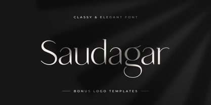 Saudagar is a stylish modern calligraphy font with casual chic flair. It is perfect for branding, wedding invites and cards, and maybe for some project. Saudagar includes a full set of gorgeous uppercase and lowercase letters, numerals, and alternates. In order to use the beautiful alternates, you need a program that supports OpenType features such as Adobe Illustrator CS, Adobe Photoshop CC, Adobe Indesign, and Corel Draw. but if your software doesn't have Glyphs panel, you can install additional alternates font files: Thanks and have a wonderful day
 - Kurato by Gatype,
$10.00 Kurato font with a simple natural and comic style, you can take advantage of any occasion one of the beautiful ways to highlight your best holiday celebrations, because this font will be the driving force for purposes such as cover design, wedding invitations, parties, graduations, birthdays , gatherings, etc. Kurato font if you want to use for your work this font can be used easily and simply because there are many features in it contains a full set of lowercase and uppercase letters, various punctuation marks, numbers, and multilingual support.
 - Westony by Haksen,
$16.00 Westony is a stylish modern signature font with casual chic flair. It is perfect for branding, wedding invites and cards, and maybe for other brand. Westony includes full set of gorgeous uppercase and lowercase letters, numerals, a large range of punctuation and many ligatures. What you get? You will get: Westony OTF In order to use the beautiful ligatures, you need a program that supports OpenType features such as Adobe Illustrator CS, Adobe Photoshop CC, Adobe Indesign and Corel Draw. Thanks and have a great day, Haksen Studio
 - HWT Mardell by Hamilton Wood Type Collection,
$24.95 The Hamilton Wood Type & Printing Museum staff is honored to partner with New York-based graphic designer Louise Fili on her first font release project. The new font, “Mardell,” is named for Hamilton retiree and wood type cutter Mardell Doubek. This is the fourth font to be cut for the museum as part of the Wood Type Legacy Project. "The bold, lively angularity of Italian futurist letterforms made it a natural choice for wood type.” says Fili. This digital version presents Fili’s wood type design for use in web and print applications.
 - Zaystack by Ergibi Studio,
$20.00 Zaystack is a handwriting with brush effect that comes with a style that seems real. This font style inspired by luxury goods and branded makes in many ways for your latest project. Zaystack is perfect for logos & branding, photography, invitations, watermarks, advertisements, product designs, stationery, wedding designs, labels, product packaging, special events or anything that requires handwritten content. Zaystack Also available for some lowercase characters that have swash, as well as multilingual. This can be accessed easily via opentype in Photoshop / Illustrator. if you have any questions, don’t hesitate to contact us Ergibi Studio
 - Psychophante by Kenn Munk,
$15.00Remember back in the day when medals where for The Beatles and foreign dictators only? No more! Psychophante is a 64 pixel medal-building dingbat. Make fresh pixly medals (like the 'I Really Like Your 'fro medal' and the 'Best Hotel Booker medal') for yourself and/or for friends who deserve them. Each medal is made up of three interchangable parts: - Uppercase consonants are the top of the medal. - Vowels are the middle. - Lowercase consonants are the dangly bit. Numerals are special characters, to be followed by a lowercase consonant - HGB Bluesband One by HGB fonts,
$23.00 The roots of this font go back to 1967. A book title in trendy letters was created in a completely ingenuous way as a film prop for a Super 8 fun film. I drew the letters with felt-tip pen and poster paint without thinking too much about it. It wasn't until a good 50 years later that I realized, this was a first awkward typeface draft. The flower power vibe was captured here subconsciously. In 2019 I completed the few glyphs and created variants that I would not have thought of at the time.
 - FairyTale by Comicraft,
$29.00 In its beauty, Comicraft's Fairytale font is without rival in the heavens, the earth, or the stuff of men's dreams! A wee thing it may be, but 'tis like a star pulled from the sky. Luminescent. Radiant. Perfect. Yes! PARADISE can be yours...from the pages of "Captain Stoneheart and the Truth Fairy," comes a font that might very well change your life forever... it's a dream, a myth, a neverending story, it's a FairyTale! Words by Joe Kelly & art by Chris Bachalo from Captain Stoneheart and the Truth Fairy
 - Ghania Roses by Akrtype Studio,
$19.00 Ghania Roses Script is a lovely script that brings a luxury feel. Ghania Roses comes with 460+ glyphs, The natural handwritten script is suitable for you who needs a typeface for headlines, logotypes, apparel, wedding invitations, Valentines day, branding, packaging, advertising, watermark, and more. Ghania Roses was created to look as close to authentic hand-lettering as possible. Not only will you find a range of stylized ligatures/alternates, but you’ll have much fun mixing and matching the upper and lowercase letters to give each word a truly personalized, hand-lettered vibe.
 - Chellomego by Haksen,
$19.00 Chellomego is a stylish modern handwritten script font with casual chic flair. It is perfect for branding, signature, wedding invitation, promotion, product packaging, and other needs. You will get full set of lowercase and uppercase letters, numerals and punctuation, multilingual symbols, lowercase beginning and ending swashes, ligatures and extra swashes that giving realistic hand-lettered style. In order to use the beautiful swashes, you need a program that supports OpenType features such as Adobe Illustrator, Adobe Photoshop, Adobe Indesign and Corel Draw. Thanks and have a wonderful day, Haksen
 - Charlonka by PleasureFonts,
$22.00 I‘d like to introduce “Charlonka“ to you. When my daughter finished high school, she wanted to get rid of her entire school stuff. So I saved a few sheets of her beautiful handwriting and promised her to create a typeface out of it. That‘s how the idea of Charlonka was born, a typeface family out of Charlotte‘s handwriting (by the way: that‘s her name). Some characters of Charlonka have extended crossbars, like in upper case A or H, and reduced descenders, like in lower case g or y.
 - PIXymbols Baby Blocks by Page Studio Graphics,
$25.00 The PIXymbols™Baby Blocks font is designed to create both single color, and two-color titles or initials. Each package includes a document showing the full character set with key codes. The font package includes both TrueType and PostScript versions, and is available in either PC/Win or Macintosh format. In order to avoid serious problems, be sure not to install the same fonts in both TrueType and PostScript on the same computer. The font offers opportunities for various color treatments, with either single or double characters.
 - Aveline by Zealab Fonts Division,
$18.00 Aveline is a gorgeous font that is both classically elegant and inherently modern. Create unique watermarks, logos, beautiful wedding invitations, use it as an elegant solution for your next magazine layout, or choose Aveline for any graphics that require a sleek look with an elegant flair. Aveline features a unique typeface stylistic set which when use to some of the Uppercase, lowercase characters and multilingual support as well.
 - Gavotte by Linotype,
$29.99Linotype Gavotte was designed by Rudo Spemann in 1940. His style was unmistakable, marked by original ideas and completely new forms. His tendency toward the unusual and adventurous resulted in unique, decorative characters. When he wrote, the tip of his pen flew across the page, leaving behind rows of letters which displayed an almost unbelievable regularity of form and flow. Gavotte is a perfect example of the best of Spemann’s calligraphy. - 1863 Gettysburg by GLC,
$38.00 This script font was inspired by a lot of autographs, notes and drafts, written by President Abraham Lincoln, mainly the Gettysburg address, first draft and copies, but also the emancipation proclamation. It is an attempt to offer a typical manual script from this American period, not to propose the exact writing from A. Lincoln himself. This font is a little fat and monotone, maybe Abraham Lincoln used a smooth or rounded pen, but some letters I have consulted were written obviously with a sharp one, so, in the future, I will certainly produce a slim version of this font. It is used as variously as web-site titles, posters and fliers design or greeting cards, all various sorts of presentations, menus, certificates, letters. This font supports enlargement as well as small size, though the original size was about 18 to 24 pts. When printed, it remain perfectly legible from 10 to 12 pts.
 - 1885 Germinal by GLC,
$38.00 This script font was inspired by a lot of manuscripts, notes and drafts, written by the famous french novelist Émile Zola (1840-1902). Specially, letters and notes from the period he was writting "Germinal" one of his very famous novel (published in 1884-1885) depicting the french minor's life in the past middle of eighteens. It is an elegant pen written type, sometimes connected, sometimes disrupted, but always regular and legible, with many variants, ligatures and contextual alternate glyphs specialy numerous in the OTF version. It is used as variously as web-site titles, posters and fliers design or greeting cards, all various sorts of presentations, menus, certificates, letters. This font, in spite of its small size, supports very strong enlargements as well as small sizes ( the original size was about 22 to 30 pts ). When printed, it remain perfectly legible and elegant from 12/14 pts even if using an ordinary inkjet printer.
 - Maison Luxe by FontMesa,
$25.00 Maison Luxe is a revival of a very old font designed in France in or around the year 1820. You may have seen this font in the past under the names of Circus, Roma, Madame and Gillé Classic. As of November 2016 we have changed the name of this font from Gillé Classic to Maison Luxe which means Luxury House in French. For many years Joseph Gillé was credited as the original designer of this font however we've recently been contacted by a type historian in France reporting that he could not find any evidence supporting Joseph Gillé as the designer and to the best of his knowledge an artist by the name of Sylvestre may be the true designer. If you love this classic font then you're sure to enjoy the alternate version also with a matching lowercase available from FontMesa under the name of Home Style. This version of the classic with its squared off shadow is true to the original design where Home Style has diagonal lines creating a cast shadow. New in 2016 for Maison Luxe is a new matching lowercase, an uppercase German Double S (versal eszett), Greek character set, opentype features including case sensitive forms and old style numerals. We know you'll enjoy the new additions to this timeless classic design.
 - FF Dingbats 2.0 by FontFont,
$51.99 German type designers Johannes Erler and Henning Skibbe created this pi and symbols FontFont in 2009. The family has 12 weights and was one of the first symbol typeface for a new generation.It has one of the largest collections of contemporary symbols and icons for office communication.
 - Glossily Enigmatic by Ali Hamidi,
$12.00 Glossily Enigmatic is a modern and natural handwritten font. It has has a elegant expression, with a charming and chic impression. Glossily Enigmatic brings a warm feeling and cozy style to your design such as wedding, stationery, logos, social media quotes, branding identity, and many more.
 - Astrid Grotesk by Eclectotype,
$40.00 Astrid Grotesk is a normalized version of Schizotype Grotesk. Normalized; not neutralized. Where many neo-grotesks appear cold with their harsh neutrality, Astrid has a warmth, eminating from its (for want of a better word) clunkiness. With the latest update, it becomes a true workhorse, with a range of widths and italics for the normal widths. Astrid Grotesk, while being clearly a neo-grotesk in appearance, has a personality all of its own. Standout characters include the f and t, and the default binocular g, unusual in neo-grotesks. And the right angled terminals on c, e and s. Stylistic sets offer up alternate forms of a, g, y, I, @, dutch IJ, german eszett and l. A full complement of numerals is included: proportional and tabular, lining and oldstyle, plus fractions, subscript and superscript. Note also that the tabular figures are duplexed across weights - very useful when highlighting specific entries in tables. The tabular figures feature also substitutes in fixed width (across all weights) comma and period, so your decimals line up perfectly always. Lastly, case sensitive forms of certain glyphs are included for all-cap settings. This typeface will be useful for corporate identities and branding work. It’s spaced more for text settings in the normal width, and gets more display-optimized as the width decreases, but with careful tracking, all styles can sing at display sizes. Bored of those other Swiss style typefaces? Astrid Grotesk could be the face you need to breathe new life into your designs. Coupled with Schizotype Grotesk, its more eccentric cousin, you've got an unorthodox branding system ready to use straight out of the box.
 - Qualitype by Bülent Yüksel,
$19.00 QUALITYPE + VARIABLE FONT FAMILY "QualiTYPE" font extends its use by providing weights from "Thin" to "Black". Natural curves, ridges, and curved bodies grow in character as the font gains weight. "Qualitype" is an exciting serif font with contemporary twists. It has a distinctive sound that preserves the simplicity and elegance of classic "serif" fonts with a fresh, stylish rework. Her personality is bold and fills the space without shouting, she looks elegant and confident. The low X-height provides a great amount of visibility at all weights and is optically corrected for better readability. In the process of working on "Qualitype" we wanted to expand the functionality of the typeface a bit more, so after a few tries two different fonts were born: "Old", "Neo" and "italics" versions. "Qualitype" is perfect for use in magazines, in the fashion industry, in the branding of premium goods and services. "Qualitype" is quite versatile and suitable for use both in headings and in text arrays. In addition, we have done manual hinting in the typeface, and now it can be used with a clear conscience in the web and applications. “Quality” typeface consists of 56 styles: 2 style, 2 Shining, 7 weights and italics. Each typeface style consists of 860+ glyphs (except for the decoratives). “Qualitype” supports over 80+ languages. A variant version of the basic styles has been prepared for the most demanding users. Using the variability slider, you can adjust and select the individual thickness regardless of the current weight distribution. An important clarification - not all programs support variable technologies yet, you can check the support status here: https://v-fonts.com/support/. OPENTYPE FEATURES aalt, dnom, onum, pnum, tnum, lnum, numr, frac, zero, sing, sups, subs, case, c2sc, smack, salt, hist, titl, holing, dig, liga, ss01, ss02, ss03, ss04, ss05, ss06, ss07, ss08, ss09, ss10, kern FEATURE SUMMARY: - 4 Axes: 2 Style: Old and Neo. 7 weights: Thin, Light, Book, Regular, Medium, Bold and Black. 2 Shining: Dark and Lamp. Matching italics (12º) for all weights and style . - Matching small caps for all weights and widths. - Lining and old style figures (proportional and tabular). - Alternate characters (a, d, g, m, n, p, q, r, u, y). - Unlimeted fractions. - 24 Dingbats. - Extended language support. - Extended currency support. You can contact me at buyuksel@hotmail.com, pre-purchase and post-purchase with questions and for technical support. You can enjoy using it.
 - Letterhack Serif by Comicraft,
$19.00 IT’S MAILBAG TIME! Dear Jolly JG Roshell and Rascally Richard Starkings, Comicraft Fonts are a thing of Beauty and a Joy Forever! You guys must be a Wild Bunch, and I roar with delight whenever a new comicbookfonts release appears in my emailbox. But I have to level with you daredevils...what about us Letterhacks? We need representation too! We haven’t spent years hammering away on our typewriters to be ignored! BRING BACK THE LETTER HACK! In fearless font form. You know it makes sense! Truly Yours, Forbush, Irving, senior. We give up! We can’t resist your appeals, threats and commands ANY LONGER!!! We may crack under the strain, but this month’s release IS two (count 'em) Letterhacks! That’s right, a pair of fantastic fonts that recreate the look and feel of your Marvelous Letters of the Sixties! It’s a Bullpen Bulletin! It’s an Iconoclastic Item!
 - Aeroko Variable by Monotype,
$279.99 Meet Aeroko, a slick variable typeface that evokes grit and speed, a dynamic play, a future–present competitive edge that evokes motorsport and all progressive brand design. This is a robust type system that creates memorable brand headlines. Powered by four display weights and three widths. Turbo-charged by a two-axes variable font. High performance brands can expect Aeroko to out-pace in every graphic condition. Aeroko is bold and assertive, it moves fast in headlines, it flexes when and where you need it. The forms are boxed and solid from Condensed to Wide, and they provide a distinct contrast when paired with rounder text fonts. Aeroko’s secondary power unit is harnessed from the ever adaptable variable font format. Variable font technology enables vast levels of typographic scale and expression, furthermore it allows Aeroko to react instantly in any digital space to maximize results. Aeroko evokes confidence, this is a typeface that actively encourages you to be courageous and daring with type in your own way. Brands demand distinct and robust typography, much in the same way that drivers demand pace. Aeroko meets these demands with ease, delivering assurance and weight across a valiant aesthetic. Aeroko is designed by Krista Radoeva and the Monotype Studio.
 - Aeroko by Monotype,
$49.99 Meet Aeroko, a slick variable typeface that evokes grit and speed, a dynamic play, a future–present competitive edge that evokes motorsport and all progressive brand design. This is a robust type system that creates memorable brand headlines. Powered by four display weights and three widths. Turbo-charged by a two-axes variable font. High performance brands can expect Aeroko to out-pace in every graphic condition. Aeroko is bold and assertive, it moves fast in headlines, it flexes when and where you need it. The forms are boxed and solid from Condensed to Wide, and they provide a distinct contrast when paired with rounder text fonts. Aeroko’s secondary power unit is harnessed from the ever adaptable variable font format. Variable font technology enables vast levels of typographic scale and expression, furthermore it allows Aeroko to react instantly in any digital space to maximize results. Aeroko evokes confidence, this is a typeface that actively encourages you to be courageous and daring with type in your own way. Brands demand distinct and robust typography, much in the same way that drivers demand pace. Aeroko meets these demands with ease, delivering assurance and weight across a valiant aesthetic. Aeroko is designed by Krista Radoeva and the Monotype Studio.
 - Ribfest by FontMesa,
$25.00 Ribfest is a new font based on lettering found on old United States currency from the 1800’s. Named after the Ribfest held in Naperville IL over 4th of July weekend each year, this font will be perfect for your next summer barbecue party. Ribfest offers three Fill fonts that can be layered behind the main open faced fonts, the regular Fill font covers the complete opening on the main fonts while the Fill T for top and Fill B for bottom gives you the option to fill with two different colors for top and bottom. The Fill fonts for Ribfest may also be used as stand alone fonts, the Fill T and Fill B fonts when layered together creates a unique look on its own. Expand your summertime fun with Ribfest and save me some of those rib’s, with extra barbecue sauce please. Special Note: When using the Opentype format of Ribfest, if you experience some letters appearing too bold at point sizes of 36 or above please install the truetype version that came with your purchase. Due to the extra detail in this font some graphics drivers may increase the boldness of the Opentype version of this font, the solution is to uninstall the Opentype and install the Truetype version.
 - Nightshade by MKGD,
$13.00 Nightshade was my attempt to bring the Old English fonts up to date. The capital letters still contain flourishes, but they look more machined and less calligraphic. I called the font Nightshade after the plant of the same name. Like the plant, it may be considered to be beautiful or poisonous depending on one's outlook. As a result, it can be applied when an attractive, ornate look is required, or it can be used when there is a need to create a more chilling effect. Nightshade has a glyph count of 389 and supports the following languages Afrikaans, Albanian, Asu, Basque, Bemba, Bena, Bosnian, Catalan, Chiga, Colognian, Cornish, Croatian, Czech, Danish, Embu, English, Esperanto, Estonian, Faroese, Filipino, Finnish, French, Friulian, Galician, German, Gusii, Hungarian, Icelandic, Indonesian, Irish, Italian, Kabuverdianu, Kalaallisut, Kalenjin, Kamba, Kikuyu, Kinyarwanda, Latvian, Lithuanian, Low German, Lower Sorbian, Luo, Luxembourgish, Luyia, Machame, Makhuwa-Meetto, Makonde, Malagasy, Malay, Maltese, Manx, Meru, Morisyen, North Ndebele, Norwegian Bokmål, Norwegian Nynorsk, Nyankole, Oromo, Polish, Portuguese, Romanian, Romansh, Rombo, Rundi, Rwa, Samburu, Sango, Sangu, Scottish Gaelic, Sena, Shambala, Shona, Slovak, Slovenian, Soga, Somali, Spanish, Swahili, Swedish, Swiss German, Taita, Teso, Turkmen, Upper Sorbian, Vunjo, Walser, Zulu
 - Engebrechtre - Unknown license

- Keitana MF by Masterfont,
$59.00 A practical font family with 2 weights for all your day by day headlines, signage etc. An extended sans serif typeface with rounded endings that provides unique bold appearance without losing legibility.
 - FS Silas Slab by Fontsmith,
$80.00 Slab-like sibling Why stop at sans? Rather than leave FS Silas Sans as an only child, the team wanted to extend the family, and create a complete system for brands and editorial. Unsure what the result would be, the team started experimenting with a slab serif version. ‘We didn’t know how it would turn out, but we really liked it and wanted to take it further. A fresh angle ‘We stuck with the angular theme of the sans by drawing angled slab serifs,’ says Phil Garnham, ‘as opposed to the square serifs that slab fonts usually have. That created an inner dynamism in words and sentences on the page, and a very distinctive, crafted character, like a Victorian soul in a contemporary body.’ These crafted touches include details such as the angled ascenders on the ‘i’ and ‘l’, while characters such as the ‘y’, with its abruptly-ending descender, add a mark of distinction. A perfect pair Silas Slab, like its sibling, offers a clear-cut range of five weights, from the elegant Thin to the monumental ExtraBold. Put it together with Silas Sans and you have the full complement, capable of performing the full range of tasks, above the line and below, in headlines, body copy and logotypes, B2B and B2C. Keep them together; they don’t like it when they’re apart.
 - Surfinta Mars - Unknown license

- Zt Sigata by Khaiuns,
$15.00 Zt. Sigata is an experiment where combining the two font styles into one, namely sans serif and serif, maybe this sounds very strange, don't worry this has been designed with very deep consideration with the serif style superti water droplets in the foliage that present coolness in every word and simple style sans serif with softness on each side, So when combined the two will be an extraordinarily beautiful design invention. Zt. Sigata comes with 6 styles (Regular/ italic, Kozi / italic, Rame / italic) that from each style have their own uniqueness, so it further expands your design experiment, and is great for poster design, packaging, logos, films and thanks to the uniqueness of each style may look good either in magazines or kompanye branding effectively. I hope you have a blast using zt.Sigata Thanks for use this font ~ Khaiuns X zelowtype

