10,000 search results
(0.077 seconds)
- Ambition & Ink by Brittney Murphy Design,
$8.00 Ambition & Ink is a driven hand-drawn font with lots of customization options. It includes contextual alternates, stylistic alternates for a-z and A-Z, and ligatures. It can also easily be used as a unicase font by subbing the lower case letters that have ascenders and descenders (bdfghjklpqty) for uppercase ones. The font has 546 characters, including lots of accented letters, as well as Greek & Cyrillic.
 - Lorjuk by Aisyah,
$12.00 Lorjuk is a handwritten font that features a natural and casual style. It has a personal and unique touch, with strokes that mimic the look of hand-written letters. This font is perfect for adding a personal touch to your designs, such as invitations, posters, or social media posts. The font is versatile and can be used for various projects, from informal to more formal ones.
 - Merlandio by FadeLine Studio,
$14.00 Introducing! Merlandio is a hand painted font with a style natural, sweet and simple. Made with great care to provide the natural and modern elements. This font will look great if used single even with other pairing fonts. The great thing about this font is you can find some style when you use it, examples such as natural handwriting style, unique, simple, elegant, and bold.
 - Musical Score JNL by Jeff Levine,
$29.00 A number of pieces of antique sheet music utilizing the same Roman typeface were the inspirational basis for Musical Score JNL. This antique design closely resembles pen lettering and its hand-made charm due to the rounded stroke ends and varying character widths. Informal, yet attractive - the character design evokes the feeling of the turn of the previous century and simplicity of life at that time.
 - Lastwinter by Garisman Studio,
$23.00 The Lastwinter comes from hand scratches to get natural and natural writing. With the main vintage theme it will be very interesting if added with various kinds of Alternates (Uppercase) and also 8 kinds of Stylistic Sets in Lowercase. Lastwinter is very suitable for use in various media such as; packaging, logo, label, poster, shirt design, quote of wisdom, handlettering, typography and many other media.
 - Hall Of Fun by Konstantine Studio,
$15.00 Hall of Fun, a fast dry brush handwriting script font, comes out with clean and brush version to fit for your needs. Included the Stylistic Alternates for every letters and Ligatures to seamlessly handwriting feels. Straight from the hands and will be a perfect pair for fashion branding, logo, social media marketing, presentation, vintage products, make yourself standout with the Hall of Fun right away!
 - M Felt Pen PRC by Monotype HK,
$523.99 To blend a handwritten style with a graphical aesthetic, Monotype designers paid attention to the balance between the two, hence harmoniously combine their qualities like a mix of tradition and modern. M Felt Pen references the unified stroke thickness and rounded terminals of rounded Heiti typefaces, imitating the fluidity of marker writing. The linked strokes are vivid and suggest the presence of the human hand.
 - August Cameron by Agniardi,
$15.00 August Cameron is a signature font with beautiful curves and alternate characters. A style that we choose was the natural look hand made, unique identity. South Portland also comes with alternative characters that are carefully created for adding a minimalist decor of the letters. Stylistic alternates allows versatile design options and works perfectly for Headlines, Posters, Logos Packaging, Branding, T-shirts, Greetings, Presentations and much more.
 - Spring Season JNL by Jeff Levine,
$29.00 Spring Season JNL is a decorated and stylized Art Deco slab serif design from1935 which is based on the hand lettered title on the sheet music for “Paris in the Spring”. The characters are cut through with both a straight line and a wavy, spoked line which looks something like a thorny vine. Spring Season JNL is available in both regular and oblique versions.
 - Quickbrush by Trial by Cupcakes,
$29.00 Like its cousin Quickpen, Quickbrush is an unfussy, confidently jotted script, with lots of rich texture to recreate the skips and jumps that appear in brush pen lettering. Contextual alternates for lowercase letters mimic starting and ending marks, to make each word look truly written by hand. It’s a typeface you’ll reach for again and again, for any project that needs a casual, handwritten touch.
 - Woodrow by Chank,
$49.00If Mister Frisky is a bit too kooky for your project, try Woodrow. The big floppy serifs and hand-drawn strokes give this font very "Chanky" characteristics. Woodrow is bold, bouncy, fun and legible like Mister Frisky, but it is also a little more traditional and structured. Chank created Woodrow in 1997. It was named in honor of The Chank Company's first office assistant, Scott "Woodrow" Macdonald. - M Felt Pen HK by Monotype HK,
$523.99 To blend a handwritten style with a graphical aesthetic, Monotype designers paid attention to the balance between the two, hence harmoniously combine their qualities like a mix of tradition and modern. M Felt Pen references the unified stroke thickness and rounded terminals of rounded Heiti typefaces, imitating the fluidity of marker writing. The linked strokes are vivid and suggest the presence of the human hand.
 - Blinks High by Reyrey Blue Std,
$12.00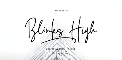 Blink High Signature Script is a beautiful handwriting font based on authentic hand writing with natural signature style. Blink High Signature Script is perfect for branding projects, logo, wedding designs, social media posts, advertisements, product packaging, product designs, label, photography, watermark, invitation, stationery and any projects that need handwriting taste. Features : · All Uppercase and Lowercase · Number & Symbol · Supported Languages · Alternates and Ligatures · PUA Encoded
 - Inked Balterm by Adam Ladd,
$25.00 Inked Balterm is a hand-inked typeface with a humanist touch. It provides visual interest through the contrasting elements of the thin strokes mixed with the solid ball terminals. The placement of each ball terminal is varied and placed at the most defining point of interest and distinction in each letterform; creating an appealing visual rhythm. Great for display and works in smaller text settings.
 - Brosley by RCKY Studio,
$18.00 Brosley is a beautiful hand-painted font, a contemporary approach to design and unique in each letter. Suitable for use in title designs such as clothing, invitations, book titles, stationery designs, quotes, branding, logos, greeting cards, T-shirts, packaging designs, posters, and more. Brosley contains a complete set of lowercase, uppercase, alternative, binder, punctuation, numbers, and multi-lingual support. Thank you for your purchase!
 - Grizzly by Victory Type,
$15.00Grizzly is a handwritten display style typeface. It was designed by hand using a flair pen, then scanned in, vector traced and fontisized. It is a very detailed typeface that looks great at large point sizes on screen and in print. Grizzly"s aggressive, chicken scratch appearance definitely adds pizzazz to every document. Grizzly features a full character set including European and alternate characters! - Vintage Fonts Collection by GRIN3 (Nowak),
$15.00 Vintage Fonts Collection is a set of 18 hand-drawn fonts inspired by vintage ads, old newspapers and retro sign painting. Every lowercase letter has three variations. When the font is used in OpenType-savvy applications, the 3 variants of glyphs are automatically alternated to achieve a random-like effect. Language support includes Western, Central and Eastern European character sets, as well as Baltic and Turkish languages.
 - Prismatiq JNL by Jeff Levine,
$29.00Prismatiq JNL was modeled from lettering found in a French alphabet book from the turn of the last century - the type sample appearing online at an image sharing site. All of the imperfections of hand-lettering were left intact. This is a limited character set comprising A-Z, 1-0, basic punctuation, forward slash and dollar and cents signs, and is best used in large headline applications. - Satin Blues by PizzaDude.dk,
$18.00 Satin Blues is my easy going and very legible sans. Actually I drew this by hand and then traced each letter digitally, leaving a super steady, yet funky, comic font. I've made two versions: the Regular and Soft. The Soft version has rounded edges, which gives a smoother look. The font is very suitable for anything that needs a clear but wild comic look.
 - Meredith by Aestherica Studio,
$9.00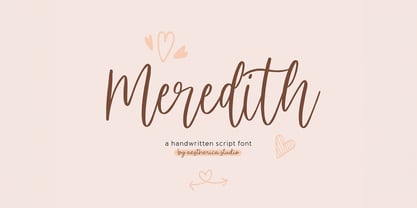 Meredith is a handwritten script typeface specially made by the hands of experts, making this font look so beautiful and natural. This font can be used for products that use a natural, beautiful, and charming handwriting feel. Meredith is perfect for branding projects, logos, wedding designs, social media posts, advertisements, product packaging, product designs, label, photography, watermark, invitation, stationery, and any projects that need handwriting taste.
 - P22 Aglio by IHOF,
$24.95 Aglio was developed from letterforms originally painted by muralist/artist Tanya Zabinski. Aglio maintains the character of bold brushstrokes with random gaps and marks, and there are flourishes of articulated endstrokes. This typeface merges the looseness and freedom of hand painting with a decorative artistic sensitivity. Aglio (the Italian word for garlic) has an organic construction that evokes the spirit of this most assertive culinary favorite.
 - Bugatine by Typebae,
$15.00Bugatine is a captivating handwritten monoline signature script font. With its graceful curves and fluid strokes, this font exudes an air of elegance and sophistication. Bugatine perfect for branding, logos, invitations, and more. Let your words dance across the page with this mesmerizing font that effortlessly captures the essence of hand-drawn beauty.Handwritten, Handwriting, Script, Monoline, Signature, Vintage, Stylish, Calligraphy, Wedding, Logo, Fashion, Feminine, Magazine, Branding, Elegant - Waffelstein by Fontease,
$11.99 Waffelstein is a modern geometric typeface inspired by the passion for eating waffles, the old fraktur fonts, some heavy rock bands, some PC games and the graphical perspective in general. Although it is somewhat decorative by nature, Waffelstein includes extended Latin language support, but also Cyrillic and Greek. Designed with OpenType features like glyph alternates and ligatures, Waffelstein is perfectly suited for graphic design and any display use. It could easily work for army, bands, breweries, cinema, gamers, metalheads, militaries, movies, posters, pubs, quotes, t-shirts, zeppelins and many more.
 - Diamonds by HVD Fonts,
$30.00 The Diamonds type family was designed by Hannes von Döhren in 2012. It is an experimental search for geometric new letterforms, which are still easy to read and generate some unexpected attention. Hannes wanted to create a straight and clear typeface but pull away from the path of classic and well learned letter shapes. The Diamonds type family is equipped for complex, professional typography. The OpenType fonts have an extended character set to support Central and Eastern European as well as Western European languages. Each font includes alternate letters, fractions, scientific superior/inferior figures and a set of arrows and geometric forms.
 - Monotype Janson by Monotype,
$29.00 The Monotype Janson font family is based on types originally cut by the Hungarian punch-cutter, Nicolas Kis circa 1690. Named after Anton Janson, a Dutch printer. The original matrices came into the hands of the Stempel foundry in Germany in 1919. New type was cast and proofs made; these were used as the source for Monotype's version of Janson. The original hand cut Janson types have a number of small design irregularities which give the typeface its unique charm. These have been carefully incorporated into the new version. The overall effect is of even color and an easy readability that makes Monotype Janson most at home in book and publishing work.
 - Sonneta by District 62 Studio,
$39.00 Introducing Sonneta, a free flowing, modern hand drawn script. With a spontaneous feel and lots of alternates, it's a perfect typeface for your branding projects or anywhere you need a fresh hand drawn look. Sonneta has three complete character sets plus alternates, swashes and ligatures making it look authentically handwritten - no duplication of characters here. Note the three distinct styles of capitals, making it a truly versatile font. We particularly like using the large, extravagant caps for monograms. There are also eleven swashes to provide a nice finishing touch to your design. Sonneta pairs beautifully with both sans and serif styles. We think it's particularly successful when paired with ultra thin sans. Check out the previews to see more.
 - Manchette by Abjad,
$45.00 Manchette is an Arabic headline typeface that was inspired by the hand-written Naskh newspaper headlines during the 60s-70s era in the Arab world. The word "manchette" is a french word, that means headline. It was used mainly by the Egyptian calligraphers and designers. The typeface presents sharp and contemporary details, while taking into consideration the original Naskh rules to echo the elegancy of the hand-written titles. Featuring many opentype features, such as contextual alternates, ligatures, and a small set of stylistic alternates. The typeface also features a dynamic Kashida that can be controlled through the variable fonts technology in the Variable GX file which contains all the weights as well.
 - Manchette Fine by Abjad,
$45.00 Manchette Fine is the high contrast cut of Manchette typeface, which was inspired by the hand-written Naskh newspaper headlines during the 60s-70s era in the Arab world. The word "manchette" is a french word, that means headline. It was used mainly by the Egyptian calligraphers and designers. The typeface presents sharp and contemporary details, while taking into consideration the original Naskh rules to echo the elegancy of the hand-written titles. Featuring many opentype features, such as contextual alternates, ligatures, and a small set of stylistic alternates. The typeface also features a dynamic Kashida that can be controlled through the variable fonts technology in the Variable GX file which contains all the weights as well.
 - Sztos by Borutta Group,
$39.00 Sztos (2018-2022) is a remix of one of the most famous grotesques used in Poland – Baccarat (published by Jan Idźkowski i S-ka in 1922). My version loosely refers to the original. On the one hand, I wanted to modernize the drawing and proportions, on the other hand, I did’t want to lose the historical flavour and details in which you can still feel traditional printing. In addition to the fairly wide version of the normal style, there is also a narrow version. Thanks to this contrast, Sztos gives the possibility of expressive combinations of different styles. The whole family consists of 10 weights, two widths and an additional slant version. Design Support: Małgorzata Bartosik, Karol Mularczyk
 - Signation by Garisman Studio,
$20.00 Signation comes from hand scratches to get natural and natural writing. With the main style of the hand-lettering script, it will be very interesting if it is added with a variety of Alternates (Capital letters) and also Stylistic Sets that are very suitable. Signation is very suitable for use in various media such as; packaging, logos, labels, posters, shirt designs, wisdom quotes, bulletins, typography, and many other media. - Ligature - Stylistic Alternates, Stylistic Sets (SS01-SS06) & Contextual Alternates - PUA Encoded open - Support for MAC or PC - Simple installation for Adobe Illustrator, Corel Draw, Photoshop, or Procreate (New Updated) - Support Multilanguage (for 14 languages): Afrikaans Albanian Danish Dutch English Estonian Finnish French Italian Norwegian Portuguese Spanish Swedish Zulu
 - Seddon Penmans Paradise Capitals by Intellecta Design,
$29.50 John Seddon (1644-1700), was a famous English writing master, the leading calligrapher of his time, and master of Sir John Johnson’s Free Writing School in Priest’s Court, Foster Lane. His portrait was drawn by William Faithorne and was engraved by John Sturt as the frontispiece for his copy-books, such as ‘The Ingenious youth’s companion’ of c.1690 and 'The pen-man’s paradise' of c.1695. These were engraved after his work by others. Your extra-rare book - "The Pen-mans Paradise Both pleasent & Profitable OR Examples of all ye usuall hands of this Kingdome. Adorn'd with variety of ffigures an Flourishes done by Command of hand. Each ffigure being one continued & entire Track of the pen most where of may be struck as well Reverse (or to answer bothwayes) as Forward", London (1965). - (YES, that is the title of the book!) was the starting point to these new extra accurated works of Iza W, a series of revivals of the penmanship Seddon’s artworks, like this highly ornamented animal kingdom inspired capitals and alphabets: the Seddon Penmans Paradise Capitals typeface. And, on the other hand, you can get the animal and human kingdon inspired penmanship forms in the Bestiario font. The “SeddonsFleurons” will complete the collection. Fantastic choice to elaborated barocque/renaissance inspired and historical accurated layouts.
 - Rare Bird Specimen VI by Rare Bird Font Foundry,
$200.00 Specimen VI is a refined hand by artist Aileen Fretz of Plume Calligraphy: thoroughly modern yet absolutely timeless. We have our sights set on this one becoming an instant classic. OBSERVATIONS Specimen VI takes its inspiration from the old world, while remaining thoroughly contemporary. It is unique while maintaining legibility. DEFINING CHARACTERISTICS At 2,580 characters, we dare say it is one of the most robust script fonts on the market today. The font includes extensive Opentype programming that authentically replicates Aileen’s unique handwriting pattern. As you type, watch the letters automatically adjust between connected and disconnected forms. Specimen VI also features formal titles, prepositions, social media wordart, and web navigation wordart, serif and sans serif Roman numerals, in and out-stroked letterforms at beginning and end of words, multiple alternate lowercase t cross-strokes, realistic double-letter ligatures, seamlessly connecting calligraphic letters, multiple styles of alternate capital letters, including swashes, and basic Latin encoding. Specimen VI is a typesetters’ dream. POTENTIAL SIGHTINGS In the pages of your favorite wedding tome; the signage, robe embroidery, and dinner menus of that coveted boutique hotel on the Italian Riviera, the labels of an artisanal hand-poured candle line, your new favorite Rosé, hand-crafted Belgium chocolate truffles, the indie cosmetic line fit for royalty, in any instance that you may be in need of a refined modern script.
 - Maidern by Aliptype,
$15.00 Maidern is a gore and death metal typeface style. Maidern is perfect for logotype death metal brands, products, merchandise death metal band, death metal band covers, rock events, rock posters, rock magazine covers, branding, product design, labels, and other creative project. Make your artwork more gore with the deadly style of this font.
 - Parkour by Resistenza,
$39.00 Parkour Brush Font takes the repertoire of moves and free spirit of this modern sport and bring it to a graphic definition. Handwritten with authentic dry brush imperfections and a bouncy baseline to evoke the energy of this urban sport discipline which emphasizes the athlete to be strong and flexible as to be able to move quickly and efficiently through any given environment. Sounds like a fun game, right? This font comes with a full set of upper and lower case characters - giving you the extra freedom to turn your text into authentic custom-made hand lettering. Parkour Marker font Includes a large range of glyphs including numerals, punctuation & multilingual support. It comes with a perfectly paired handy set of bonus Swashes and extras perfect to complete and customize your layout. Perfect for branding, social media, stationery, advertising, logos, handwritten quotes, product packaging, header, poster, merchandise & greeting cards. Features: - OTF Font file - Punctuation & numbers - Splashes & Splatters - Alternate letters - Uppercase letters - Multi Language To enable the OpenType Stylistic alternates, you need a program that supports OpenType features such as Adobe Illustrator CS, Adobe Indesign & CorelDraw X6-X7. There are additional ways to access alternates, using Character Map (Windows), Nexus Font (Windows), Font Book (Mac) or a software program such as PopChar (for Windows and Mac).
 - Prismatic Spirals by MMC-TypEngine,
$93.00 PRISMATIC SPIRALS FONT! The Prismatic Spirals Font is a decorative type-system and ‘Assembling Game’, itself. Settled in squared pieces modules or tiles, embedded by unprecedented Intertwined Prismatic Structures Design, or intricate interlaced bars that may seem quite “impossible” to shape. Although it originated from the ‘Penrose Square’, it may not look totally as an Impossible Figures Type of Optical Illusions. More an “improbable” Effect in its intertwined Design, that even static can seem like a source of Kinetical Sculptures, or drive eyes into a kind of hypnosis. Prismatic Spirals has two related families, its “bold” braided version Prismatic Interlaces and the Pro version. While the default is simpler or easier to use, as all piece’s spin in same way, PRO provides a more complex intricate Design which requires typing alternating caps. Instructions: Use the Map Font Reference PDF as a guide to learn the 'tiles' position on the keyboard, then easily type and compose puzzle designs with this font! All alphanumeric keys are intuitive or easy to induce, you may easily memorize it all! Plus, often also need to consult it! *Find the Prismatic Spirals Font Map Reference Interactive PDF Here! (!) Is recommended to Print it to have the Reference in handy or just open the PDF while composing a design with this typeface to also copy and paste, when consulting is required or when it may be difficult to access, depending on the keyboard script or language. As a Tiles Type-System, the line gap space value is 0, this means that tiles line gaps are invisibly grouted, so the user can compose designs, row by row, descending to each following row by clicking Enter, same as line break, while advances on assembling characters. Background History: The first sketches of my Prismatic Knots or Spirals Designs dates back then from 2010, while started developing hand-drawn Celtic Knots and Geometric Drawings in grid paper, while engage to Typography, Sacred Geometry and the “Impossible Figures” genre… I started doing modulation tests from 2013, until around 2018, I got to unravel it in square modules or tiles from the grid, then idealized it as fonts, along with other Type projects. This took 13 years to come out since the first sketches and 6 months in edition. During the production process some additional tiles or missing pieces were thought of and added to the basic set, which firstly had only the borders, corners, crossings, nets, Trivets connectors or T parts and ends, then added with nets and borders integrations. Usage Suggestions: This type-system enables the user to ornate and generate endless decorative patterns, borders, labyrinthine designs, Mosaics, motifs, etc. It can seem just like a puzzle, but a much greater tool instead for higher purposes as to compose Enigmas and use seriously. As like also to write Real Text by assembling the key characters or pieces, this way you can literarily reproduce any Pixel Design or font to its Prismatic Spirals correspondent form, as Kufic Arabic script and further languages and compose messages easily… This Typeface was made to be contemplated, applied, and manufactured on Infinite Decorative Designs as Pavements, Tapestry, Frames, Prints, Fabrics, Bookplates, Coloring Books, Cards, covers or architectonic frontispieces, storefronts, and Jewelry, for example. Usage Tips: Notice that the line-height must be fixed to 100% or 1,0. In some cases, as on Microsoft Word for example, the line-height default is set to 1,15. So you’ll need to change to 1,0 plus remove space after paragraph, in the same dropdown menu on Paragraph section. Considering Word files too, since the text used for mapping the Designs, won't make any literal orthographical sense, the user must select to ignore the Spellcheck underlined in red, by clicking over each misspelled error or in revision, so it can be better appreciated. Also unfolding environments as Adobe Software’s, the Designer will use the character menu to set body size and line gap to same value, as a calculator to fit a layout for example of 1,000 pts high with 9 tiles high, both body size and line gap will be 111.1111 pts. Further Tips: Whenever an architect picks this decorative system to design pavements floor or walls, a printed instruction version of the layout using the ‘map’ font may be helpful and required to the masons that will lay the tiles, to place the pieces and its directions in the right way. Regarding to export PNGs images in Software’s for layered Typesetting as Adobe Illustrator a final procedure may be required, once the designs are done and can be backup it, expanding and applying merge filter, will remove a few possible line glitches and be perfected. Technical Specifications: With 8 styles and 4 subfamilies with 2 complementary weights each (Regular and Bold) therefore, Original Contour, Filled, Decor, with reticle’s decorations and 2 Map fonts with key captions. *All fonts match perfectly when central pasted for layered typesetting. All fonts have 106 glyphs, in which 48 are different keys repeated twice in both caps and shift, plus few more that were repeated for facilitating. It was settled this way in order for exchanging with Prismatic Spirals Pro font which has 96 different keys or 2 versions of each. Concerning tiles manufacturing and Printed Products as stickers or Stencils, any of its repeated pieces was measured and just rotated in different directions in each key, so when sided by other pieces in any direction will fit perfectly without mispatching errors. Copyright Disclaimer: The Font Software’s are protected by Copyright and its licenses grant the user the right to design, apply contours, plus print and manufacture in flat 2D planes only. In case of the advent of the same structures and set of pieces built in 3D Solid form, Font licenses will not be valid or authorized for casting it. © 2023 André T. A. Corrêa “Dr. Andréground” & MMC-TypEngine.
 - Halogen by Positype,
$29.00 Who doesn't want or need an expansive contemporary extended sans that has a sense of style and swagger… what if it had a lowercase, small caps and various numeral options… how could you say no? This was the foundational argument I made for myself when I drew the initial alphabet on my birthday last year (something I do each year, draw a new font, kind of a fun OCD thing). I wanted to see a wide, utilitarian sans that had more to it than just a basic character set and didn't resemble standard geometric models. As I continued sketching, the letterforms were being influenced more by my 'lettering tendencies' than the normal mechanical trappings of drawing flat, wide letters. The letters have retained aspects of letters created by hand — stresses, modulation, naturally ending terminals. Truncation and quick clipping of strokes became antithetical to the letterforms I drew, so I continued this once I brought the design into the computer. I kept it precise and dependable, but made every attempt to keep a conscientiously crafted typeface and not let it devolve into a grid-based drone. As such, it works just as well looking back in time as much as it does assuming a lead role in a sci-fi movie. Halogen does deliver and opts not to take a short cut and provide an anemic offering of glyphs — a modern typeface offered today must provide more than just the basics and this one does — lowercase, smallcaps, old style numerals, tabular forms, stylistic and titling alternates, fractions, case-sensitive features, and even an alternate uppercase ordinal set is included. So go make cool print and digital things with it, now.
 - WBP Emperio by Studio Jasper Nijssen,
$20.00 A classic serif font with a twist. WBP Emperio has an interesting shape. She has rounded corners and a slightly 'curvy' look. The little indent makes her stand out above the rest. A sensation in the making. Emperio has two styles. The Regular: Great for designing friendly corporate identities. And there's the Hand Drawn style: Great for design posters of prints with a handmade feel. Combine the two and you can go infinite. WBP Emperio was a sketch I designed when I started my company. So you can say it's been five years in the making XD. When I was invited to add two pages to the Typodarium 2022, I speeded up the process and added the hand-drawn style. The end result is awesome. A classic serif font, with a crazy extra style.
 - Geographica by Three Islands Press,
$29.00 Thomas Jefferys (ca. 1710–1771) was the best-known map maker in 18th-century England, chiefly because he won (and hyped) the title “Geographer to King George III.” Jefferys was really more an engraver/publisher than a geographer, since he mostly relied on the cartographic materials of others. Still, his maps of the North American colonies were well known. Geographica is a legible, four-style serif family modeled after the neat hand-lettered place names and peripheral text on Jefferys’s maps. With its long serifs, tall x-height, and robust curves, Geographica somehow combines classic elegance with a whiff of coastline and sea. The italic styles have the slant and warmth of the hand-drawn source materials. And the typeface comes with a slew of distinctive map-based ornaments—including compass wheels and sailing ships. This evocative serif works well in both display situations and long blocks of text, whether on paper or screen. OpenType features include small capitals, numerous ligatures, and two stylistic sets of titling caps. Geographica offers full support for Central and Eastern European languages—more than 1,200 glyphs in all.
 - Tertius by Scholtz Fonts,
$21.00 Tertius, with its high ascenders and clubbed serifs, is a modern interpretation of the classic Carolingian style (7th - 9th centuries AD). There was no capital form in the Carolinian hand and Roman square capitals were originally used with it. The Carolingian hand began, after a while, to develop more cursive tendencies as people looked for a way to speed up the writing process. I have “capitalized” on this trend and have devised an appropriate and dramatic set of flowing capitals for this family. With its elegant swashes and bold letter shapes, Tertius embodies the romance of medieval life, of knights, castles, and chivalry. Tertius comes in four styles:- -- Regular: with elegant, smoothly penned characters; -- Crenellated: written with a scratchy pen over rough parchment -- many drops of ink and blotches have been left on the parchment (“Crenellated” means battlements -- the rough protrusions on the top of castle walls); and -- Romantic: the capitals have been loosely overwritten generating a contemporary version of illuminated capitals. -- Illuminated: richly decorated illuminated capitals for use with Tertius Regular (28 characters) All fonts have been carefully crafted, letterspaced and kerned and contain full character sets of 237 characters.
 - Macarons by Latinotype,
$35.00 The Macarons font family consists of a monoline version, regular and bold weights, and a set of gestural catchwords, which reflects the use of the ruling pen as a freestyle tool. Ornaments and dingbats are also included. Macarons is a display type based on the classic Garamond typeface. It’s inspired by the foodie culture and the slow food movement, which began as a rebellion against fast food and has now grown to a global scale. Every day, thousands of people around the world take pictures of their food, look for new recipes to try and recover old ones, enjoy wine-pairing, and value locally produced food. Macarons is a fresh and spontaneous looking typeface that has been designed by Coto Mendoza, who also has developed a hand-made product line (Ride my Bike, Ride my Bike Serif, Four Seasons, D.I.Y. Time, Dans le Cuisine and In a Jar). This font is not constructed out of modules: each character is drawn by hand. Macarons is ideal for cookbooks, menus, liquor bottle labels, food packaging, wedding invitations, greeting cards, tea boxes, food blogs, small shops, cupcake bakeries and so on. Try! A freshly-baked homemade macaron!