10,000 search results
(0.014 seconds)
- Boldye by Logofonts,
$10.00 Boldye Font Inspired by the Reebok Logo and Sport typeface style. Boldye are strong on the curves and sharp on the edges of some of the letters suitable for logo projects, branding, posters with sports themes. Easily creates your own logo type with fonts. Boldye has an Open Type feature to access a large selection of unique alternative letters and many ligatures to make it easier for you to create. Boldye can be accessed perfectly on design applications such as Adobe Illustrator, Adobe Photoshop, Corel Draw, Affinity Designer but does not rule out the possibility that it can also be accessed using web-based applications such as kittl, canva, artboard studio and others.
 - Golos by Hiekka Graphics,
$25.00 Golos is a sleek and authentic font face with two styles: regular and italic. Golos is recommended for use as a display typeface.
 - Boldies by Illushvara,
$14.00 Boldies is a serif font, mixed the modern with the classic concept line serif. The Alternate shape will make your design look like Modern. But don't worry if you need the Design like Classic and Bold Serif, you just put the normal Uppercase and Lowercase. With many ligatures will make your design projects stand out! Add this font to your most creative ideas for Application, Art Gallery Poster or postcard, Architectural Logo Project, Classic Magazine, Product Skincare or Logotype you want to used! Support the Multilingual Language! If you have any question, don’t hesitate to contact me. Happy Designing !!! Thank You, Illushvara Design
 - Goodness by Arendxstudio,
$18.00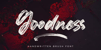 Goodness Handbrush Script Font is a font with distinctive handwritten characters perfect for branding projects, logos, wedding designs, media posts, advertisements, product packaging, product designs, labels, photography, watermarks, invitations, stationery, and any project who need handwritten dishes. Features : • Character Set A-Z • Numerals & Punctuations (OpenType Standard) • Accents (Multilingual characters) • Ligature • Swash Multilingual Support : Afrikaans, Albanian, Asu, Basque, Bemba, Bena, Catalan, Chiga, Cornish, Danish, English, Estonian, Faroese, Filipino, Finnish, French, Friulian, Galician, German, Gusii, Icelandic, Indonesian, Irish, Italian, Kabuverdianu, Kalenjin, Kinyarwanda, Low German, Luo, Luxembourgish, Luyia, Machame, Makhuwa-Meetto, Makonde, Malagasy, Malay, Manx, Morisyen, North Ndebele, Norwegian Bokmål, Norwegian Nynorsk, Nyankole, Oromo, Portuguese, Romansh, Rombo, Rundi, Rwa, Samburu, Sango, Sangu, Scottish Gaelic, Sena, Shambala, Shona, Soga, Somali, Spanish, Swahili, Swedish, Swiss German, Taita, Teso, Vunjo, Zulu There it is! I really hope you enjoy it
 - Bond by 4RM Font,
$10.00 Its very simple form is the hallmark of this font, the bond font is a simple styled font but still has an aesthetic value, this font is suitable for use in simple themed designs.
 - Grold by Typesketchbook,
$55.00 Grold is a post-geometric typeface made up of 40 fonts across 10 weights with normal and slim options. It’s a unique and modern sans typeface, which is well suited for a variety of typographic applications such as headlines and small texts. The Grold font family supports multiple languages and is available as both webfont and desktop font.
 - Boldy by Larin Type Co,
$18.00 BOLDY This is a stunning display serif font, it includes alternates for lowercase, as well as ligatures for lowercase. This multi-purpose font captures a huge range for the design and creation of your project. Laro will perfectly cope with a variety of tasks and will always look stylish and modern. With it, you can create logos, labels, advertising, packaging, branding, book covers and magazines, cosmetics, banners, posters, headings, descriptions, stationery, advertising and much more. Full alphabet with Uppercase and Lowercase A-z Numbers, fractions Punctuation and symbols Alternates for Lowercase Ligatures for Lowercase Multilingual support
 - Blods by Mans Greback,
$59.00
- Bord by Linecreative,
$16.00 Bord is a type of display font that gives a clean, minimalist and futuristic impression. This font is equipped with upper and lowercase letters (all caps) but the uppercase have futuristic characters and their lowercase give a clean impression, so the combination of upper and lower case letters can give unlimited impression of design, This font supports multiple languages as well.
 - Bolo by Bogusky 2,
$34.50 - Goldwings by Supfonts,
$12.00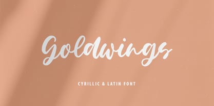 Goldwings will be perfect for wedding lettering, beautiful frame for your home, book covers, greeting cards, logos, marketing, magazines or anything that requires cute handwritten lettering :) Goldwings идеально подойдет для свадебного леттеринга, рамки для вашего дома, обложек книг, поздравительных открыток, логотипов, маркетинга, журналов или всего, что требует симпатичных рукописных надписей :) What's inside: Goldwings.otf Multilingual support Кириллица Cricut support If you have any questions, please contact me directly or in instagram @superdizigner
 - Golf by FontForum,
$19.99 Golf was originally designed by Henry Reinhard Möller in 1935 for Schriftguss KG. Coen Hofmann redrew the capitals and then added lower case letter and Cyrillic alphabets by himself. This digital version of the original typeface is best used in sizes above 24 points.
 - Golred by Canden Meutuah,
$15.00 Introducing Golred is a simple, minimalist and neat sans serif font. It can be easily adapted to a very large range of projects, such as advertising, titles, blogs, logos, branding, invitations, business cards and more! So add it to your creative ideas and watch how it makes it stand out! you will not be disappointed with the results.
 - Boldu by Ryzhychenko Olga,
$4.00 Boldu is a simple grotesque font. I created it using simple forms. I love geometry and tried use only one size of lines. Boldu was created being impressed by works of beginning of 20th century - period of strict and geometric forms
 - HS Al Basim A by Hiba Studio,
$59.00 HS Albasim A is an Arabic display typeface. It is useful for headlines, books covers and other graphic projects. It is a collaborative effort, as "HS Albasim A" first letters were designed and drawn by Basim Salem Al Mahdi from Iraq and then developed and digitalized as a typeface by Hasan AbuAfash from Palestine. The font is based on the simple lines of Fatmic Kufi but was it distinguished by two main ideas: First, it contains a nice serf in the vertical strokes of its letters. The second, some of storks in its letter differ in the thickness instead of being similar, as it is in the Fatmic Kufi style. The font contains only two weights: regular and bold. Both of them support the OpenType features of Arabic, Persian and Urdu.
 - Final Frontier Old Style - 100% free

- Old printing press_free-version - Personal use only

- SF Old Republic SC - Unknown license

- Old Dog, New Tricks - Unknown license

- SF Old Republic SC - Unknown license

- YY Old English Dingbats - Unknown license

- SF Old Republic SC - Unknown license

- SF Old Republic SC - Unknown license

- Ye Olde Block NF by Nick's Fonts,
$10.00Lewis F. Day, in his book Alphabets Old and New, offered this typeface as an example from sixteenth-century England of lettering incised in wood. The font is essentially monocase, but there several lowercase letters are alternate letterforms. Please note that, due to the ornate nature of the letterforms, this font does not contain math operators, fractions or superior numbers. Both versions of the font include 1252 Latin and 1250 CE (with localization for Romanian and Moldovan) character sets. - Scripps College Old Style by Monotype,
$49.00The story of Scripps College Old Style is a heart-warming and inspiring chronicle about a young librarian, a handful of students, a wealthy grandmother, a dedicated educator -- and two eminent American type designers. The story begins in 1938, when Dorothy Drake, the newly hired librarian at Scripps College, a small women's college in southern California, became an impromptu dinner companion of the American type designer Fred Goudy. By the 1990s, the original fonts that Goudy had created for Scripps College in the 1940s had become prized -- but they were seldom-used antiques. Scripps needed digital versions of the metal fonts. This goal posed two immediate challenges: finding a designer familiar with letterpress printing who was skilled at creating digital fonts, and locating the money to commission the designer's services. The first challenge was the easiest to conquer. Sumner Stone was my first and only choice," recalls Kitty Maryatt, the current curator of the Scripps College Press. "I knew he had letterpress experience, was an accomplished calligrapher, and that his typeface designs were simply exquisite. The choice was easy."The second challenge was more difficult. It took the dedication, hard work and tenacity of Maryatt to bring the beautiful Goudy designs into the twenty-first century. While Stone was eager to begin work on the project, the college had no more money for new typeface designs in the 1990s than it did in the1930s. Years of lobbying, cajoling and letter writing were necessary to obtain the college's approval for the design project. Once she had the necessary funding, the design brief posed yet a third challenge. Goudy had provided two sizes of type to the Press: 14 point and 16 point. Which would serve as the foundation for Stone's work? In addition, the Goudy fonts were quite worn. Should Stone use printed samples as his design master, or base his work on the original Goudy renderings? The 14-point master drawings were the ultimate choice, with the stipulation that the finished fonts would provide both a seamless transition from the worn metal versions and a faithful representation of the original Goudy designs. Once the budget and design brief were established, the process of converting the original Goudy drawings into digital fonts took just a little over two months. Stone delivered finished products to Scripps in the fall of 1997. The first official use of the fonts was to set an announcement for a lecture by Stone at Scripps in February of 1998. But the story is not quite finished. Maryatt was so pleased with the new digital fonts, she wanted to share them with the graphic design community. At Stone's suggestion, she contacted Monotype Imaging with the hope that the company would add the new designs to its library. An easy decision! Now Monotype Imaging is part of the story. We are proud to announce the release of Scripps College Old Style as a Monotype Classic font. The once exclusive font of metal type is now available in digital form for designers around the world. " - Cheltenham Old Style SB by Scangraphic Digital Type Collection,
$26.00Since the release of these fonts most typefaces in the Scangraphic Type Collection appear in two versions. One is designed specifically for headline typesetting (SH: Scangraphic Headline Types) and one specifically for text typesetting (SB Scangraphic Bodytypes). The most obvious differentiation can be found in the spacing. That of the Bodytypes is adjusted for readability. That of the Headline Types is decidedly more narrow in order to do justice to the requirements of headline typesetting. The kerning tables, as well, have been individualized for each of these type varieties. In addition to the adjustment of spacing, there are also adjustments in the design. For the Bodytypes, fine spaces were created which prevented the smear effect on acute angles in small typesizes. For a number of Bodytypes, hairlines and serifs were thickened or the whole typeface was adjusted to meet the optical requirements for setting type in small sizes. For the German lower-case diacritical marks, all Headline Types complements contain alternative integrated accents which allow the compact setting of lower-case headlines. - Baskerville Old Face SH by Scangraphic Digital Type Collection,
$26.00Since the release of these fonts most typefaces in the Scangraphic Type Collection appear in two versions. One is designed specifically for headline typesetting (SH: Scangraphic Headline Types) and one specifically for text typesetting (SB Scangraphic Bodytypes). The most obvious differentiation can be found in the spacing. That of the Bodytypes is adjusted for readability. That of the Headline Types is decidedly more narrow in order to do justice to the requirements of headline typesetting. The kerning tables, as well, have been individualized for each of these type varieties. In addition to the adjustment of spacing, there are also adjustments in the design. For the Bodytypes, fine spaces were created which prevented the smear effect on acute angles in small typesizes. For a number of Bodytypes, hairlines and serifs were thickened or the whole typeface was adjusted to meet the optical requirements for setting type in small sizes. For the German lower-case diacritical marks, all Headline Types complements contain alternative integrated accents which allow the compact setting of lower-case headlines. - Old Borders And Lines by RMU,
$15.00 A special offer by RMU Typedesign for those who like it old-style. Now finally with the possibility to create a Greek Meander frame.
 - Engravers' Old English BT by Bitstream,
$29.99Designed by Morris Fuller Benton in 1907; an improved version of the familiar nineteenth century blackletter as he had executed it in his Wedding Text. - Ongunkan Old Turkic Arrival by Runic World Tamgacı,
$40.00 It's the old Turkish runic script, which I adapted the written language of the three-legged aliens, the characters of a fantastic science fiction movie called Arrival.
 - Archive Old Style Condensed by Archive Type,
$19.95Compressed old style display typeface. - Century Old Style SH by Scangraphic Digital Type Collection,
$26.00Since the release of these fonts most typefaces in the Scangraphic Type Collection appear in two versions. One is designed specifically for headline typesetting (SH: Scangraphic Headline Types) and one specifically for text typesetting (SB Scangraphic Bodytypes). The most obvious differentiation can be found in the spacing. That of the Bodytypes is adjusted for readability. That of the Headline Types is decidedly more narrow in order to do justice to the requirements of headline typesetting. The kerning tables, as well, have been individualized for each of these type varieties. In addition to the adjustment of spacing, there are also adjustments in the design. For the Bodytypes, fine spaces were created which prevented the smear effect on acute angles in small typesizes. For a number of Bodytypes, hairlines and serifs were thickened or the whole typeface was adjusted to meet the optical requirements for setting type in small sizes. For the German lower-case diacritical marks, all Headline Types complements contain alternative integrated accents which allow the compact setting of lower-case headlines. - Cloister Old Style SH by Scangraphic Digital Type Collection,
$26.00 Since the release of these fonts most typefaces in the Scangraphic Type Collection appear in two versions. One is designed specifically for headline typesetting (SH: Scangraphic Headline Types) and one specifically for text typesetting (SB Scangraphic Bodytypes). The most obvious differentiation can be found in the spacing. That of the Bodytypes is adjusted for readability. That of the Headline Types is decidedly more narrow in order to do justice to the requirements of headline typesetting. The kerning tables, as well, have been individualized for each of these type varieties. In addition to the adjustment of spacing, there are also adjustments in the design. For the Bodytypes, fine spaces were created which prevented the smear effect on acute angles in small typesizes. For a number of Bodytypes, hairlines and serifs were thickened or the whole typeface was adjusted to meet the optical requirements for setting type in small sizes. For the German lower-case diacritical marks, all Headline Types complements contain alternative integrated accents which allow the compact setting of lower-case headlines.
 - Iowan Old Style BT by Bitstream,
$40.99Iowan Old Style was designed for Bitstream in 1990 by noted sign painter John Downer. Iowan Old Style is a hardy contemporary text design modeled after earlier revivals of Jenson and Griffo typefaces but with a larger x-height, tighter letterfit, and reproportioned capitals. Iowan Old Style Titling was designed by John Downer and added to the Iowan Old Style family in 2002. The cap-only character set includes several ornaments and fleurons, broadening the appeal and functionality of the typeface family. Iowan Old Style was originally designed for Bitstream in 1990 by Downer, a noted sign painter. Iowan Old Style is a hardy contemporary text design modeled after earlier revivals of Jenson and Griffo typefaces but with a larger x-height, tighter letterfit, and reproportioned capitals. Expert and old style figure font sets were added in 2000. - Monotype Century Old Style by Monotype,
$29.99The Century Old Style family was modeled on Century Expanded, which had been cut in 1900. Similar weights and proportions were maintained, but the letter shapes were made more elegant by the introduction of a number of old style characteristics. The Century Old Style family is a useful text design that offers good legibility and economy. - Ongunkan Old Hungarian Runic by Runic World Tamgacı,
$50.00 It was used in parts of Transylvania until the 1850s, although it was banned by Istvan, the first Christian king of the Hungarians (Szekel), in line with an order to "destroy all pre-Christian inscriptions". Hungarian runic script was usually written on wood-stone pieces in the bustrofedon style. In this method, the writing was written consecutively from right to left and from left to right. This article is available in Bosnian, Carpathian and Glozel editions. Whenever possible, I will present the fonts in these versions.
 - Goudy Old Style DT by DTP Types,
$49.00Based on custom design work by DTP Types Limited in 1992. - Old Brass Stencil JNL by Jeff Levine,
$29.00 An antique barrel lid stencil spotted in an online auction for a company once located in Guttenberg, NJ provided the hand-cut sans serif lettering which inspired Old Brass Stencil JNL; available in both regular and oblique versions.
 - Old Spur Stencil JNL by Jeff Levine,
$29.00 A partial set of antique brass stencils inspired Old Spur Stencil JNL, which is available in both regular and oblique versions. The lettering is based on a traditional Roman stencil design with Western-style spurs added to the approximate centers of each character.
 - ITC Berkeley Old Style by ITC,
$29.99 ITC Berkeley Old Style is based on a typeface designed by Frederic W. Goudy in 1938 called University of California Old Style. It was a private press type for the publishing house of that school. In 1958, about ten years after Goudy's death, Monotype re-issued the type under the name Californian, and it became a very successful face for book typography. Goudy himself said he designed this face to have the greatest legibility possible, and it is indeed free from the exuberances in some of his other faces. Tony Stan redrew the family for ITC for 1983, and it was named ITC Berkeley Old Style, Berkeley being the city where the University of California Press is located. Stan did a careful drawing of eight styles including italics. ITC Berkeley Old Style is a crisply beautiful tribute to a distinguished typeface, and it works well for books, magazines, and advertising display. Featured in: Best Fonts for Tattoos


