10,000 search results
(0.028 seconds)
- Tokyo Olive by Dharma Type,
$14.99 Tokyo Olive was designed as an homage to nostalgic display types and advertisements in the mid-late 80s. The mid-late 80s was the era of the post-modernism and fancy-decorative design especially in Japan In other words, it was the mixture of superficial form-operation and girly taste. This curious design movement vanished without a trace in the 90s, but it had its moments. Tokyo Olive has voluminous and simple geometric skeleton (for post-modern) with rounded and craft-style stencil joints (for fancy decoration). We added a classic open style as a little spice. The mixture of those essences makes new impression we have never seen before. Tokyo Olive family consists of 5 styles for stacking color font. Please use Photoshop or Illustrator, or your favorite graphic design apps that can handle layers. Layers are the printing plates of wood type. You should be able to change text color for each layer. Tokyo Olive "Standard" style is the base of this font family. You can add open effect by stacking "Fill" layers over the Standard layer. Instruction 1. Type your text as you like. 2. Set font-name "Tokyo Olive" and font-style "Standard". 3. Set color of "Standard" layer. 4. Duplicate the "Standard" layer to make "Fill" layer. 5. Set font-style "Half Fill" or "Full Fill" and new color of upper layer. Tokyo Olive Standard, Half Open, and Full Open style can be used solely.
 - Karita by Nathatype,
$29.00 Your design project is your brand’s introduction to the public, so it is crucial to do it in the right way. An inappropriate font can totally change your messages and damage your work. For that reason, Karita is here to assist you with your needs. Karita is a classic, elegant, professional display serif font to increase the product and brand values promoted. This font looks more prominent than the others and shows strong, yet elegant impressions to attract customers. Continuity elements on every little scratch of the letters’ edges lead your eyes to follow one letter to another in line with serif font characters. Besides, this font type has thick lines and strong contrasts to attract customers and to show firm impressions. For a legibility reason, you can use this font for big text sizes. You can enjoy the available features here as well. Features: Stylistic Sets Ligatures Multilingual Supports PUA Encoded Numerals and Punctuations Karita fits best for various design projects, such as brandings, posters, banners, headings, magazine covers, quotes, invitations, name cards, printed products, merchandise, social media, etc. Find out more ways to use this font by taking a look at the font preview. Thanks for purchasing our fonts. Hopefully, you have a great time using our font. Feel free to contact us anytime for further information or when you have trouble with the font. Thanks a lot and happy designing.
 - Chasing Miracles by Ardian Nuvianto,
$19.00 Hello there Here is my new font Chasing Miracles. Chasing Miracles is a whimsical script font with a relaxed theme, featuring a lovely style. No matter the topic, this font will be an incredible asset to your fonts’ library, as it has the potential to elevate any creation. This font was created to look as close to a natural handwritten script as possible. Chasing Miracles is perfect for branding projects, logo, wedding designs, social media posts, advertisements, product packaging, product designs, label, photography, watermark, invitation, stationery and anything that you want. Here is that you get: Works on PC & Mac Simple installations Supports multilingual Accessible in the Adobe Illustrator, Adobe Photoshop, Adobe InDesign, even work on Microsoft Word. PUA Encoded Characters – Fully accessible without additional design software. Drop me message if you have any questions. Happy Creating Thanks
 - Wanker - Unknown license

- Juno by W Type Foundry,
$20.00 JUNO is a soft & friendly script font for display use. Inspired by latin American vernacular signs, defined by the freshness of the freehand strokes, and mixed with the rigor of typography. Juno is well suited for packaging, headlines, advertising and any handmade feels graphic. Designed with a wide range of options, its variables move between tow poles; regular to black & condensed to expanded, plus true italics. This 40 font family sums up to 5 weight subfamilies: Regular, Semi Condensed, Condensed, Semi Expanded, Expanded. Designed with powerful opentype features, alternate characters and extended language support. We’re proud to introduce: Juno.
 - Breadcrumbs by Hanoded,
$15.00 Every morning, after the kids have gone to school, I vacuum the floor and remove about half a kilo of breadcrumbs… No, not really have a kilo, but any given bird could probably survive on the leftovers. When it was time to name this font, Breadcrumbs was all I could think of! Breadcrumbs and children seem to go together well, as they are featured in Hansel & Gretel and Hop-o'-My-Thumb. Breadcrumbs font is a happy, sloppy fairytale font, which you can use for your book covers, your party posters and maybe crumbly bread packaging. But that is entirely up to you.
 - Brasika Display by Nurrontype,
$14.00 Hello my name is Brasika Display, a fun, funk and swirly font. I was designed with versatility, easy to adapt to your needs. I'm playful enough to make you happy. Just look my styistic and anatomy, it's cool, isn't it ? You can put me in your logo project. Or your magazine title. In your Christmas greetings card, wedding invitation, perhaps use me in your Instagram feeds, Youtube title, and many more, you name it. All my friends called me Polyglat, because I'm speaking and understand many languages. I'm Brasika, buy me now, and I will help you to ignite your next project.
 - Tolkiens Christmas by Kaer,
$19.00 Hey guys! Once I got a book "Letters From Father Christmas" by J.R.R. Tolkien. He wrote them for the children every December from 1920 to 1943. I totally fell in love with the calligraphy in those letters. Now I created a font and you can use it to write your own letter from the North Pole. I've also redrawn stamps and patterns from that book, so you can decorate your blank. It's Icons font style. You'll get: Regular and Icons styles Numbers and symbols Multilingual support and alternative symbols Thanks! Feel free to request to add characters you need: kaer.pro@gmail.com
 - I am not a robot by PizzaDude.dk,
$15.00 The other day I had to login to a page several times, and as security I had to check the "I am not a robot" box. Actually, I think I did a login at that particular page like 30 times that day...and in the end I was thinking "Come on, you should know by now that I am not a robot" And even though I thought it was a repetitious hassle I figured that I needed to name a font "I am not a robot" - and not a robotic-like one, but a sweet and funny cartoonish one! :)
 - Hub by ParaType,
$25.00Designed by Gennady Fridman and released by ParaType in 2008. Hub represents so called block letter handwriting style, which becomes more and more usual and nowadays replaces traditional cursive handwriting. One of the reasons for these changes is an often requirement in official forms to write in block letters. Some forms contain even stricter rule – to write in capital letters. Hub was designed to meet these requirements and includes small caps instead of lower case letters. It’s recommended for use in advertising and display typography and especially when you need to show a sample of properly filled bureaucratic form. - Chalky Fingers by Jeremy DV Boyd,
$14.00 Chalk lettering without the mess! Chalky Fingers was designed by a genuine chalkboard artist as his go-to hand-lettering style for custom illustrating menu boards for bars and cafés – now available for all to enjoy as a font. A rough textured font, hand-drawn with real artists’ chalks and perfect for use on restaurant & cafe menu boards, signage, posters, displays, t-shirts, social media quotes, children’s books and food packaging. Chalky Fingers includes loads of swashes and arrows to give extra emphasis to your messages. Numbers, punctuation and multi-language characters are all included. Enjoy getting Chalky Fingers!
 - Go Home JNL by Jeff Levine,
$29.00 Sheet music for another one of those songs from the early part of the 20th Century with a wonderfully wordy hand lettered title was the model for the Art Nouveau flavored Go Home JNL, which is available in both regular and oblique versions. 1908's "I Used to be Afraid to Go Home in the Dark (Now I'm Afraid to Go at All)" is comprised of eighteen words. It may have been a mouthful to request from the local sheet music shop, but the lettering on its cover made it a great candidate for preserving as a digital typeface.
 - Tioga by Monotype,
$29.99Tioga is a highly legible typeface designed specifically to display clearly on low-resolution displays. With superior readability even at small sizes, Tioga is an ideal typeface for developers of set-top boxes and digital televisions. Tioga is metrically compatible with Tiresias, a widely-used typeface designed for digital TV applications and adopted by the DVB and MHP standards. Tioga was fine-tuned to be more readable and aesthetically pleasing. Individual characters were adjusted for improved legibility and the letter spacing was revised to improve appearance and readability. Tioga bold was created to make the design more versatile. - Colosseum by Alan Meeks,
$45.00 Although a sans serif, Colosseum owes its style to the original Trajan Roman form. Borrowing some characteristics from Friz Quadrata, in its san serif form it is more adaptable to text usage whilst still having a modern and original look which works well in headlines.
 - Cheapside by Device,
$29.00 A condensed serif that’s been through the ravages of reproduction but has now been digitized for modern use. Elegantly wasted.
 - Knofedt by PizzaDude.dk,
$15.00 Comicbook letters with a laid back slightly wobbly look! 4 different lowercase letters, which automatically cycle as you type! Wow!
 - Rolling Ball Cursive by Gerald Gallo,
$20.00 Rolling Ball Cursive simulates a handwritten style executed with one of the many types of rolling ball pens now available.
 - Victorian Orchid by Dharma Type,
$19.99 Victorian Orchid is a gorgeous vintage flower. Victorian Orchid is a beautiful, organic serif font family available for both text and display. Its bizarre serifs for A and other diagonal letterforms came from decorative types and letterings in old Victorian era. These unusual serifs support and enhance the horizontal flow of the eyes and vertical alignments. Very eye-catching lowercase g also came from the Victorian era and this is one of the most dramatic letterform of this font. Lowercase such like n and d also have horizontal serifs which designed in the same theory. Victorian Orchid is somewhat organic, humanistic and soft-impression font like Transitional Serif as typified by Times New Roman. But at the same time, this font has horizontal serif and vertical stressed letterform like Modern Serif. They make this font sharp, handsome and neat. In addition, Victorian Orchid has low contrast and the serifs are not too flat and not too coved. By them, Victorian Orchid create strong and casual impression like Slab Serif fonts. Victorian Orchid family consist of 5 weights from Light to Bold including about 500 glyphs, international accented letters, some OpenType features. Italics are "True" italics which designed very carefully to match Romans.
 - Telepath by Coniglio Type,
$19.95 TELEPATH Telepath by Coniglio Type, first appeared in 1998. It is now in opentype .otf as of 2021. Telepath is a master sampling of a Royal office typewriter of industrial strength provided by the Miller Furniture store, of Dunkirk, New York. It had a baseline set of numbers to make accounting practices easy and line up nicely on the statements. (No gentile old fashioned numerical ascenders and descenders.) Yet, for a a rather old and stolid machine, it was very luxurious and built to definitely take the test of time. Cudo's for Royal Typewriter Company, is all I can say. The set of images were very carefully gathered and has fallen into the preferred category for a typewriter font that has it all. The font has exceptional value as a text font -and- a display font. It contains a great deal of graphic information and doesn't spike at higher sizes. Telepath presents a strikingly handsome typewriter font with a uniquely intuitive difference. Unlike the original source material—scans of monospaced typewriter copy, every font is painstakingly hand kerned for your most demanding copy fitting work in justified or casually ragged settings for print or the web. All Coniglio Type fonts are 100% embeddable. It will get you there.
 - Karmina by TypeTogether,
$49.00 Karmina is a text typeface developed mainly for pocket books and budget editions. It was built to withstand the worst printing conditions: low quality papers, high printing speed with web presses and variations in the ink level of the printing press. Some of Karmina's most representative features are the rather large serifs, intended to work perfectly in small reproduction sizes, the sharpness of the shapes, including some calligraphic reminiscences, and the large and yet graceful ink traps in the acute connections. Structurally, Karmina combines a significantly large x-height with relatively compressed letterforms. The result of these features grants Karmina outstanding legibility and economy. Karmina features four weights and 800 characters per weight, including small caps, discretionary ligatures, fractions and a complete range of numerals for every use. It also supports over 40 languages that use the latin extended alphabet. Karmina was selected in the text typography category at the Letras Latinas exhibition 2006 and won a merit in the European-wide ED-Awards competition 2007. Karmina Basic is a reduced version of Karmina. It is still an OT-font but without any particular features except of a set of ligatures, class-kerning and language support including CE and Baltic.
 - Walkway by Sabrcreative,
$25.00 Discover the elegance of Walkway Font, a stunning handwritten signature script with a natural flow. Whether you're a photographer, brand designer, or simply looking to add a touch of sophistication to your projects, Walkway Font is the perfect choice. It is versatile and can be used for various purposes such as watermarks, social media posts, advertisements, logos and branding, invitations, product designs, labels, stationery, wedding designs, and product packaging. With its full set of alternate characters, Walkway Regular offers endless creative possibilities. As a bonus, you'll also receive the Walkway Bonus, which includes ornamental vector graphics to enhance your designs further. This font provides multilingual support, catering to a wide range of languages including Afrikaans, Albanian, Catalan, Danish, Dutch, English, Icelandic, Italian, Spanish, Portuguese, German, Swedish, Norwegian, Polish, Indonesian, Zulu, and more. Its extensive language support ensures that you can communicate your message effectively to diverse audiences.
 - White Dandelion by Timurtype,
$14.00 Introduced by Timurtype Studio! White Dandelion is a Qoutable Handwritting Font This font are a captivating and expressive type of font that embodies the essence of handwritten quotes and phrases. These fonts are designed to mimic the natural movement and irregularities of actual handwriting, capturing the charm and authenticity of personal notes or messages. With their unique character and style, quotable handwriting fonts infuse text with a sense of warmth, personality, and familiarity. They are perfect for creating visually appealing quote graphics, social media posts, inspirational designs, and personalized stationery. With their versatility and ability to convey various moods and messages, quotable handwriting fonts have become a popular choice for designers, writers, and anyone seeking to add a touch of handcrafted charm to their words. White Dandelion Font also supports multilingualism. Enhance your designs with our original fonts, feel free to comment or provide feedback, Enjoy the fonts 😊 Thank You
 - CA Saygon by Cape Arcona Type Foundry,
$40.00 CA Saygon was originally conceived for a large corporate design project, but as this was never implemented, the way was free to make a public font. As a striking corporate typeface, it transports the fractions of a society after the post-modernist phase. After hundreds of sketches a bunch full of letters were selected, some of them quite twisted, others rather conventional. The combination of these letters reflects a rebellion of individuality but also leads to a coherent typeface. Additionally there are alternative letterforms in the Stylistic Sets or in the glyphs palette, which keeps the font always exciting to the designer. Thanks to the Cyrillic and Latin Extended character sets, a huge language area is covered that even extends to Vietnam! Numerous OpenType features make life easier for the professional typographer: There are fractions, superscript and subscript numbers, as well as proportional and tabular numbers.
 - Semilla by Sudtipos,
$79.00 I spend a lot of time following two obsessions: packaging and hand lettering. Alongside a few other minor obsessions, those two have been my major ones for so many years now, I've finally reached the point where I can actually claim them as “obsessions” without getting a dramatic reaction from the little voice in the back of my head. When you spend so much time researching and studying a subject, you become very focused, directionally and objectively. But of course some of the research material you run into turns out to be tangential to whatever your focus happens to be at the time, so you absorb what you can from it, then shelf it — like the celebrity bobblehead that amused you for a while, but is now an almost invisible ornament eating dust and feathers somewhere in your environment. And just like the bobblehead may fall off the shelf one day to remind you of its existence, some of my lettering research material unveiled itself in my head one day for no particular reason. Hand lettering is now mostly perceived as an American art. Someone with my historical knowledge about lettering may be snooty enough to go as far as pointing out the British origins of almost everything American, including lettering — but for the most part, the contemporary perspective associates great lettering with America. The same perspective also associates blackletter, gothics and sans serifs with Germany. So you can imagine my simultaneous surprise and impatience when, in my research for one of my American lettering-based fonts, I ran into a German lettering book from 1953, by an artist called Bentele. It was no use for me because it didn't propel my focus at that particular time, but a few months ago I was marveling at what we take for granted — the sky is blue, blackletter is German, lettering is American — and found myself flipping through the pages of that book again. The lettering in that book is upbeat and casual sign making stuff, but it has a slightly strange and youthful experimentation at its heart. I suppose I find it strange because it deviates a lot from the American stuff I'm used to working with for so long now. To make a long story short, what’s inside that German book served as the semilla, which is Spanish for seed, for the typeface you see all over these pages. With Semilla, my normal routine went out the window. My life for a while was all Bezier all the time. No special analog or digital brushes or pens were used in drawing these forms. They're the product of a true Bezier process, all starting with a point creating a curve to another point, which draws a curve to another point, and so on. It’s a very time-consuming process, but at the end I am satisfied that it can get to pretty much the same results easier and more traditional methods accomplish. And as usual with my fonts, the OpenType is plenty and a lot of fun. Experimenting with substitution and automation is still a great pleasure for me. It is the OpenType that always saves me from the seemingly endless work hours every type designer must inevitably have to face at one point in his career. The artful photos used in this booklet are by French photographer and designer Stéphane Giner. He is very deserving of your patronage, so please keep an eye out for his marvelous work. I hope you like Semilla and enjoy using it. I have a feeling that it marks a transition to a more curious and flexible period in my career, but only time will tell.
 - Fresh Lemons by Yumna Type,
$15.00 Your font choice is important because without the right font, you have a higher risk of failure to attract the audience's attention resulting in having a big trouble competing with competitors. A good font shows characters of your projects and makes them more prominent than the others. Therefore, Fresh Lemons is here to be the perfect, eye-catching font option. Fresh Lemons is a visually amazing display font with thin lines suitably applied for a more elegant, modern looking display. In addition, such a font shows professional, high quality nuances on your designs due to the simple forms and consistent proportions to be legible enough. You will receive a clipart as a bonus and you can also enjoy the available features here. Features: Ligatures Multilingual Supports PUA Encoded Numerals and Punctuations Fresh Lemons fits best for various design projects, such as brandings, posters, banners, headings, magazine covers, quotes, invitations, name cards, printed products, merchandise, social media, etc. Find out more ways to use this font by taking a look at the font preview. Thanks for purchasing our fonts. Hopefully, you have a great time using our font. Feel free to contact us anytime for further information or when you have trouble with the font. Thanks a lot and happy designing.
 - Mayberry by Ascender,
$92.99The Mayberry® is an extensive family of 14 OpenType fonts. Mayberry was initially designed by Steve Matteson to emulate the technical behavior of a font family called Tiresias™ for use in set top TV devices and user interfaces. Mayberry is a significant improvement in aesthetics and functionality over Tiresias. Mayberry includes true italics and a wide range of weights to provide the highest quality and readability on low resolution devices, while also featuring a range of OpenType features that will appeal to creative professionals. Mayberry is a slightly condensed humanist sans serif which allows for more readable text in a narrower column. Open counters and upright stress help keep the design of Mayberry readable at low resolutions. A significant amount of care has been given to design subtleties allowing the design to function well at large sizes. The Mayberry character set supports Cyrillic, Greek, Central and Eastern European, Turkish and Baltic, Mayberry also includes a slashed zero for use where absolute distinction between 'O' and zero is a concern. Also included are typographic features such as old-style figures, fractions, superior and inferior numbers for use with applications that provide advanced OpenType typographic support. A set of closed captioning symbols and arrows add to the font's versatility in interface design. - Gliners by Dumadi,
$25.00 Gliners is a simple stylized font that overlies the center of the glyphs bar in the font. Glyphs font doesn’t have too many, it only offers Uppercase and Multilingual, but don’t worry because its simple shape will make your project look interesting. The Gliners font is very suitable for use as movie titles, movie title poster covers like the review image I shared above. how? are you interested in trying it? Thank You, stay the center of attention and classy!
 - Soho by Monotype,
$29.99 Soho is the latest addition to the growing range of typefaces from Sebastian Lester. This grand opus of a project resulted in a typeface that comprises nine weights and five widths of precision engineered OpenType. 40 fonts, 32,668 characters and 24 OpenType features. Hot on the heels of the popular Neo Sans and Neo Tech range, and his first typeface release Scene, Soho represents three years of work by Lester. As a type designer I'm preoccupied with finding ways in which I can address modern problems like good legibility in modern media, and create fonts that work precisely and efficiently in the most technically demanding of corporate and publishing environments." Slab serif typefaces are enjoying something of a renaissance, offering versatility whether for corporate identity, product branding, text or display use. With 40 weights to choose from Soho gives designers endless possibilities from the ultra chic lines conveyed by the lighter weights to the rock solid statement made by the heavier weights. Soho is cross-platform compatible. The Pro version provides extended language support for Central European languages. Used in conjunction with software applications that support OpenType many useful features like "stylistic sets" can be leveraged -- in which a wide variety of alternative characters can be introduced at the click of a mouse button giving one font several "tones of voice" from conservative to cutting edge. The wide range of glyphs includes ligatures and small caps."
 - Holofernes NF by Nick's Fonts,
$10.00The raw emotional energy of German Expressionism is evident in this font, based on Judith Type, designed by C. H. Kleukens in 1923. This version takes its name from the Biblical character who lost his head to the original font’s namesake. Both versions of the font include 1252 Latin, 1250 CE (with localization for Romanian and Moldovan). - Formosa by Hanoded,
$15.00 Formosa is the old, colonial name for Taiwan. Formosa means beautiful in Portuguese and I think this handwritten typeface has a certain beauty itself. It comes in three styles, all of which make extensive use of ligatures, to give the font an authentic, handwritten feel. Like most of my fonts, Formosa comes with Babylonian language support.
 - YT Big Latin by Yangtype,
$9.00 The concept of this letter is a young alligator. Young crocodiles have lean bodies and are agile. It has uncontrollable power, and the angular leather vinyl and teeth feel vivid. This font was created to convey the most compressed energy possible through a collection of compressed squares. Although it doesn't attack, it is quite an aggressive letter.
 - Pannartz by Suomi,
$29.00 I happened to come across a facsimile of a sample of text with typeface made by Sweynheim & Pannartz in 1476. I scanned the sample, and redraw all the available glyphs from the sample in RobFog. After that I added the missing characters by copying and pasting the forms of the original characters, and filling in the missing parts.
 - Chancellor by PintassilgoPrints,
$24.00 Chancellor is a robust hand-drawn sans serif display typeface. Its sturdy letterforms takes inspiration from Plakatstil era posters, while bringing up also cool adornments to flourish your lettering designs. This all caps typeface has two versions for each letter, amplifying your composition choices. It's positively a great tool for a wide range of creative display uses.
 - Basika Core by NOS,
$18.00 The Core edition unleashes the true nature of Basika. A powerful communication means for designers and a bridge from the past into the future of experimental typeface design. Basika Core comes in three styles, it includes discretionary ligatures and stylistic alternates. Don't hesitate to get in touch at nos.ink. Basika Core current version: 1.0 - released in May 2022.
 - Quessera by Oui Studio,
$21.00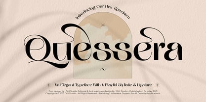 Hello, friend! 'Quessera' font is coming; an elegant typeface with huge playful stylistic & ligatures. Quessera has a complete stylistic of uppercase and has many unique ligatures, so you have many choices to determine the most perfect one for your work and make it look stunning. Quessera is perfect for branding, logo, invitation, wedding vibes, fashion, headlines, and more.
 - Night Delivery by Kitchen Table Type Foundry,
$15.00 Since I live in a hamlet without any facilities whatsoever, I order a lot online. Most deliveries are done during daytime, but some companies prefer to deliver my stuff at night. When I was drawing out the glyphs for this font (using my Chinese ink and a broken paint stirrer), the door bell rang. It was a Night Delivery…
 - Cats by Celebrity Fontz,
$24.99 Cats is a whimsical font made up of two different sets of cat alphabets in upper and lower cases. Happy cats are pictured in a variety of poses forming the letters they represent. If you love cats, you will not want to miss having the Cats font in your collection. Includes full set of accented characters.
 - Universally Corrupt Pro by The Type Fetish,
$25.00 Universally Corrupt is a distressed, noisy and corroded font that is perfect for hiding any words of truth by burying it in chaos. A “must have” typeface for any politician or corporate C.E.O! It was expanded to include extended Latin, extended Cyrillic and Greek alphabets so it will work with most languages in Europe and the Americas.
 - Blicalon by Tanincreate,
$24.00 Blicalon is a geometric sans serif font with modern look and good legibility. Blicalon aims to be a universal, it works great in headlines, short and long texts, high-end branding, logo designs, magazines, product packaging & invitations. It comes in 2 different styles - regular and italic and is equipped with an extended character set, supporting most European languages.
 - Handmade Font by Ingrimayne Type,
$14.95 In Handmade Font the letters are made of hands or handprints, something children sometimes do when they are set free with paint. It is caps only but the letters on the lower-case keys differ from those on the upper-case keys. It comes with a large assortment of accented letters to support most European languages.
