6,559 search results
(0.012 seconds)
- Encorpada Pro by dooType,
$40.00After the successful release of Encorpada Black, now it’s time of Encorpada Pro type system. Now with seven weights and a lot of curves. Freely inspired by the didones shapes, Encorpada Pro now have a extended character set with more than 40 languages supported, Opentype Features and Amazing Swashes in Italic Version. Enjoy It. - Vermicello by ParaType,
$30.00 An original display typeface was designed for ParaType in 2007 by Isabella Chaeva. Informal handwriting shapes of letters are formed by several separate elements — traces of monoline writing tool like broad felt-tipped pen. The name of the font reveals the fact that curvy strokes resemble worms. For use in advertising and display typography.
 - HT Cartoleria by Dharma Type,
$19.99 This font has a lovely roundish shape and gives us cute and relax impression. But because it is upright, it has a well-ordered atmosphere. Holiday Type Project offers retro hand drawing scripts. Inspired by retro script on shopfront lettering, wall paint advertisements in Italy around 1950s. Check out the script fonts from Holiday Type!
 - Neon Planet by Din Studio,
$25.00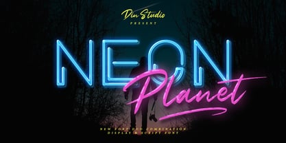 Neon Planet is a modern and futuristic font duo. Combining the neon shape design and the brush textured handwriting will make your design project more powerful. The font is suitable for any project that needs Retro, Modern, and Casual Vibes. Enjoy the Font! Features: Accents (Multilingual characters) PUA encoded Numerals and Punctuation (OpenType Standard)
 - Feogra by limitype,
$20.00 Feogra is a font inspired by the geometric shape of a robot designed in a modern style that makes this font look futuristic and unique, suitable for your modern design and requires a bold and prominent typeface. This font can also be applied to posters, magazines, etc. Feautures: All Caps Font Numbers Symbols Multilingual
 - Guglia by Leo Colalillo,
$20.00 Guglia is an extra textura typeface ispired by the gothic architecture shapes and in particular to his vertical extremization based on a rigid scheme, like the calligraphy of that period. A spire (Guglia in italian) is a tapering conical or pyramidal structure on the top of a building, often a skyscraper or a church tower.
 - Yefimov Serif by ParaType,
$30.00 Yefimov Serif is a contemporary serif face, with low contrast, squarish shapes of round glyphs and emphasized businesslike nature. It is one of the last original faces by Vladimir Yefimov. Yefimov Serif will suit perfectly for business texts, periodicals and corporate identity. The typeface was completed by Maria Selezeneva and released by ParaType in 2014.
 - Agane by Trim Studio,
$20.00 Agane is a Basic modern Sans Serif font. Design with oval as main shape, It's combine the basic sans type with smooth curve in the end, perfectly suited for graphic artists to complete their design such as web design, advertisements, posters, logos, product signs, and many more. Agane contains all standard glyphs and punctuations.
 - Tithua by Muykyta,
$20.00 Tithua is a modern font with strokes clear and well marked, easy to read and simple design. The curved shape on the slab terminations give a harmonious and pleasant smoothing which removes stiffness and enriches the design. For now comes in five different widths and includes Latin extended-A characters and some OpenType features.
 - Jhaneponto by Liartgraphic,
$18.00 Jhaneponto is a display font with a hint of a modern blackletter style. Jhaneponto font is suitable to use for logos, titles, landing pages, leaflets, and others. With its shape and uniqueness, you will definitely like this font! This font is PUA encoded which means you can access the available glyphs and swashes with ease!
 - Jasmine Bloom by Orenari,
$16.00 Jasmine Bloom is a semi-allcaps font with lovely and cute shape. This font has two styles, regular style and decorated style with jasmine flower decoration which spread from the bottom of each letter. Jasmine Bloom font is perfect for any design purposes. Mix and match some uppercase and lowercase to get lovely combining.
 - Valina by Khoir,
$15.00 Valina - Modern serif has an elegant impression and displays a unique shape in each letter but does not leave the readability of the font itself so this font is good for logos, quotes, posters, covers and many more. Valina Uppercase Lowercase 75+ Language Alternates Font So what are you waiting for? Thank you for seeing
 - Machtwerk by Volcano Type,
$29.00Religions are filled with signs and symbols. Some of them, like the the star of David and the Swastika-Rune received other significance during the third Reich. The superimposition of these two shapes creates the basis for this font. Matchwerk is a font, that critically questions and recalls the darkest chapter of our history. - philson block by chris philson,
$25.00 Philson Block is a family with upright and oblique versions. The structure of each character is based on a square divided into simple fractions. Each letter has at least one variation, with angled corners, increased widths, or altered shapes. This font is recommended for display lettering, headlines, and blocks of type that mask images.
 - Glamure by Fauzistudio,
$10.00 Glamure was inspired by the Myriad font which has been frequently used by technology companies and governments since the 1990s. Glamure is a clean, sleek and versatile font, by applying geomattric shapes to create a fantastic, modern and humanistic font. Glamure can function as a title, logo, body copy, subtitle, headline and so on.
 - Umbra by Linotype,
$29.99Umbra was designed by R. Hunter Middleton for the Ludlow Corporation in 1935. This is a three-dimensional typeface, unique in that the main character shape is defined only by its shadow. It was originally designed to be a second-color drop-shadow for the typeface Tempo, but stands alone as an unusual display face. - MTF Groovy Giggles by Miss Tiina Fonts,
$15.00 Groovy Giggles is a playful and fun display font that adds a touch of whimsy to any design. With its lively shapes and quirky details, this typeface is perfect for creating a lighthearted feel in your designs. Use it for children’s books, invitations, and other applications that call for a touch of playfulness and creativity.
 - Systema by Gspr one,
$4.00 "Systema" is an innovative typeface that combines modularity and pixelated style in a surprising way. Its letters continuously transform, taking on shapes ranging from soft circles to sharp squares, with occasional flashes that add a touch of vitality. This versatility makes it the perfect choice for design projects looking for a dynamic and unique aesthetic.
 - Shield 2 Letters Monogram by MonogramBros,
$12.00 Shield 2 Letters Monogram Font is a perfect shield shaped monogram font consisting of 52 letters and 1 basic frame. With just a single font file you will be able to create beautiful monograms in just a matter of minutes after the purchase! Shield 2 Letters Monogram Font comes with font file in OTF format.
 - RANNEX by Gatype,
$14.00 Bannex is a versatile font with a clean, sleek shape. The overall typeface is strong to bring order and harmony between letters. Best used as Instagram, poster, web design, magazine, logo or product. -Letters, Numbers, Puntuations, Accens Ligatures, Swashes, Alternates If you've got any questions don't hesitate to drop me a message thank you
 - Evergreen by Sudtipos,
$39.00 Evergreen is Koziupa and Paul going all Zeitgeist after a few Malbec drinks. Two fonts praise nature from when the lights go out to the crack of dawn, and vice versa. That's 24/7/365 of wild leafy Kumbaya. Even butterflies and flowers were mystified so much they had to get in there. Evergreen is local, organic, and certified free trade. At some point we wrote down the name of the jungle where it originated, then lost the parchment in the hot springs a few hours later. But that's immaterial. Crank up your Deep Forest sound, prep your Earthtone and Foliage palettes, and get into the big herbal.
 - Dusk Till Dawn by Comicraft,
$19.00 The Vampires have risen from their graves! Innocent young virgins (also goats, sheep, sheep dogs, cows and other sundry farmyard animals) may not see out the night. DUSK TILL DAWN has been exhumed, lightly dusted in dry earth and exsanguinated for your convenience. Bury your tombstones in Gothic Chic with a font that may very well be worth dying for. We cannot guarantee you will come back to life however. We waited to unleash this font until the midnight hour, so grab your wooden stakes, silver bullets, crossbows, slingshots and any supernatural weaponry you may have at hand. Garlic capsules and Holy Bibles are also recommended!
 - Corpesh by Typotheticals,
$4.00 Corpesh was drawn in Adobe Illustrator during the wee hours of the night. It is a single weight set of fonts, no bold version. As is/was much of what I have done over the last year, it was created purely to pass time. As a self taught amateur in this field, I only do this for the enjoyment it brings me. This typeface is being released early, at the same time as 'Brainstroke', for exactly the same reason that typeface is, that being a health crisis. I know this typeface is not complete, with, as mentioned, no bold version, and probably never will have.
 - Reluctant Aviator by Hanoded,
$15.00 I read something interesting the other day: in 1910 a cat called Kiddo snuck on board an airship and was found by aeronaut Walter Wellman - after he had already taken off in an attempt to cross the Atlantic Ocean. Wellman and Kiddo spent 71 hours aboard the airship, but never completed the journey, due to engine problems and foul weather. Luckily, they were both rescued. It was a funny story, so I decided to name a font after it. Reluctant Aviator is a handmade font (pen and paper). It has a rough edge, some shaky glyphs and a lot of bravado. Comes with diacritics and swashes.
 - Kinsale Display by Fontdation,
$15.00 Introducing our new font Kinsale Display. A bold and strong looking display font that not only heavily inspired by the vintage/classic letterforms, but also some touch of modern twists and absurdities. Mouse-crafted with high attention to details; clean lines, sharp edges and tempting curves. Its wide and blocky letterforms make Kinsale is a great spacekiller. Suits best for title/headline, logo/logotype, packaging/label designs, etc. Packed with 300+ glyphs, weaponized with standard upper/lower case characters, numerals, punctuations, some multilingual letters, alternate characters, and ligatures. This font is a must have item for your designing arsenal. Get yourself one and start creating something cool! THANKS AND ENJOY!!!
 - Bottled Moon by Tour De Force,
$29.00 Bottled Moon is display serif typeface full of possibility. It is lively family containing Regular and Italic styles. By it's design, Bottled Moon took inspiration from vintage typefaces and their specific charm, with catchy details like curly terminals and gently curved sharp serifs. All characteristics of Bottled Moon together give combination with dose of calligraphy, working horse serif typeface and display OpenType features. Works pretty well in small sizes, keeping it's uniqueness and legibility. Whether you're looking for typeface for whiskey label, wedding invitation, restaurant branding or parfume package, Bottled Moon recommends itself with original Initials, shadowed Stylistic Set and pack of adjustable Borders together with classical Fractions.
 - Coo Coo by chicken,
$23.00 So I made five rather odd characters for a logo for a friend… Then I thought I'd fill a couple of spare hours expanding it to a single alphabet… And some considerable time later I ended up with a whole font with full punctuation, a bunch of alternates, pretty broad international support and some OpenType features to keep things varied… There are elements of Art Deco, Art Nouveau, Lego, circuit boards and Ceefax, Memphis lamps and lab clamps, hieroglyphs, googly eyes and who knows what else… Intricate, insane, highly irregular, but somehow it hangs together… Throw down a few letters nice and big when the fancy takes you…
 - Scene by Monotype,
$29.99 Work on Scene began some time after designer Sebastian Lester joined Monotype Imaging in 2000. Clean, calm, and highly legible — thus the design brief Lester set for himself. With Scene, he wanted to provide graphic designers and creative directors with a suite of fonts that would serve as a strong foundation for identity projects, incorporating what he had learned about on-screen and print legibility. Scene was developed during two years of after-hours and weekend work. The family comes in six weights with matching italics, there is a set of “semi-sans” characters to introduce more expressive word rhythms into headlines and blocks of copy.
 - Ebony by TypeTogether,
$35.00 Some typefaces need time to ripen; Burian and Scaglione made the first sketches for Ebony back in 2008, but it took a few years of maturing in a drawer to be developed into a multi-functional type family. While keeping in tune with TypeTogether’s focus on complex typographic structures needed for magazine, newspapers and books —whether printed or digital—, Ebony goes far beyond editorial use and promises great performance in branding and advertising. The range of dark weights with taut and powerful curves can boost any headline, while the lighter styles create an approachable and clean feel in blocks of continuous text. Ebony does not fall short on aiding legibility either; letterforms have a distinct direction of ductus and features like the top serif on ‘l’ help making them clearly distinguishable from each other. It is a type family that cleverly seeks a balance between the openness and legibility of humanist sans serifs and the striking and more regularised character of grotesques. The letter-shapes feature generous counters and open terminals with crisp angles, and daringly grow both in colour and width as the fonts get bolder. Infused with this strength, Ebony also shows a quirky side in some of her shapes; the vertical fractions, the at-symbol, the old-style numbers, … The predominantly slanted style of the italics is broken up in some letterforms, such as ‘a e f l’, that are more in line with a classic cursive appearance. This, together with a forceful italic angle, ensure a change in texture within a block of text, despite sharing the same letter weight and width with the uprights. With 18 styles, tending towards the heavier part of the weight-spectrum, this face has a powerful quality!
 - Eclectic One by Altered Ego,
$45.00STF Eclectic One is a visual cornucopia of symbols, like the junk drawer in your kitchen. Stuff you'll need someday for a graphic element, bullet or dingbat application. Perfect for website icons! The Eclectic family is legendary, with a cult-like following among the inititated. As one of the first dingbat fonts available on the web, it gain popularity after its design in the early 1990s. With over 150 characters in the complete set, you'll find yourself using Eclectic One almost daily to add spice to your otherwise san-serif typographic existence. This font is essentially a soap opera of typographic image elements, created for projects when I couldn't find the "thingbat" I needed. Almost more of a collection of illustrations, there are many characters which connect to form patterns, and of course it's like a "small neutral European country" army knife for the creative community. EcOne features complete hour, quarter, and half-hour notations in an analog clock design glyph, recycled/recyclable symbols, a registration mark, a toaster, globes, sideways diamond arrows, spaceships, stoplights, the "running man," several atomic references, da buzz saw, target icons, the unusual smiley face floating in a ball (with a drop shadow, no less!), and the fish skeleton which complements the fallout shelter symbol, and more. Make your own juxtapositions! One reviewer proclaims "for whatever you do, Eclectic One is an excellent dingbat source." Available in Mac and PC formats. License it today! - Edison by HiH,
$12.00 Edison, is it Victorian or is it Art Nouveau? While this typeface may be found in Petzendorfer’s Treasury of Art Nouveau Alphabets, I believe the decorative spirals are more Victorian than “New Art.” To me, they looked tacked on, rather than organic -- with the industrial mechanics of a coiled spring, rather than the tendrils of a growing plant as the philosophical wellspring. Originally released by ATF in 1894 as Houghton, this typeface was re-released shortly thereafter by Bauer and Berthold in Germany as EDISON. Please do not make the mistake of thinking the font we offer here is no better than freeware fonts in cheap rip-off collections. This font has a set 218 characters and represents many hours manipulating the bezier curves to produce acceptable results. Available freeware fonts are often little more than raw scans with little accuracy of letterform. The muddy line intersections are a dead give-away. Frequently all you get is the alphabet itself. No numbers, no punctuation and don't even think about diacriticals. The font we offer represents a tremendous value. Considering the hours of work involved, I have no business charging so little. I could make better money cooking hamburgers or bagging groceries. But we want very much to encourage you to purchase and enjoy these fascinating historical typefaces and are making it as easy as possible for you to do so. So please encourage us and order Edison today.
 - Ankle by VType,
$8.00 An elegant sans serif typeface with style. Fashionable, classy but still modern! Designed and shared by Vikers | RerdSystems. Perfect for logos, posters and more.
 - Ongunkan Liljegren Runic by Runic World Tamgacı,
$50.00 It is the 3rd inscription font I shared with Liljegren Runic, one of the inscriptions in America. I couldn't find much information about it.
 - Illinoise by Just in Type,
$18.00Illinoise is a mutation of one of the most beautiful screen fonts ever. But, there are no straight lines. Everything is shaking. Let's party! - Mashq by Arabetics,
$29.00 The Mashq script is the oldest documented Arabic Jazm calligraphy style. It was invented by the early Muslims in the Arabian cities of Mecca and Medina, exclusively for writing the Quran and other Islamic religious texts. The Mashq style employed complex ligature and multi-level baseline rules, and therefore it went through a continuous simplification process. Around the time period Mashq was developed, the early Arab Muslims experimented with another short-lived Mashq-like style with heavily slanted vertical stems, which closely resembled the common Ḥijazi style. This style is commonly referred to as the Ma’il (slanted) style. Eventually, the early complex Mashq style was replaced as the main Islamic Arabic script, by a more simplified Mashq-derived calligraphy style that was developed in the city of Kufa, modern day Iraq, which was commonly referred to as Kufi. The Kufic style became the official Arabic script style for centuries before it was replaced by the more developed Naskh, the modern Arabic script style used today. The Mashq font family by Arabetics includes three styles of Mashq. The first is Mashq regular, which closely follows the script style of Musḥaf ‘Uthman (currently displayed in the Topkapi Museum in Turkey) with only the initial and final Haa’ baselines shifting. The second is Mashq Maail, which emphasizes the features of the Ma’il style shared with Mashq. The third is Mashq Kufi, which closely follows the script style in an adequate sample from the Quran manuscripts of the Bergstraesser Archive. All three fonts include two styles, with and without Tashkeel (dots). The Mashq and Mashq Kufi fonts include two more styles, with and without Harakat (soft vowels), and Hamza. Only three soft vowels are implemented along with their Tanween (double) forms. The Sukoon vowel is the default shape before inserting a soft vowel. Hamza was treated as a vowel in the Mashq and early Kufi manuscripts. Kashida is a zero width character. In the Mashq fonts, inserting one Kashida before the final ‘Ayn glyph group will trigger alternative shapes. In the Mashq Kufi fonts, inserting one Kashida (or two) before the final Yaa’, ‘Ayn, and Ḥaa’ glyph groups will trigger alternative shapes. The Mashq font family by Arabetics was designed to be as compatible as possible with the Arabic keyboard and Unicode alphabet used in computers today. Calligraphic variations were implemented only when they marked significant and permanent script features.
 - Fierro by Los Andes,
$16.00 Fierro is a heavy-geometric-retrofuturistic typographic construction that, without any curve, still retains good legibility. These shapes are based on great bended metal pieces, which represent its name, meaning "hardware store". It has been designed to be used in large sizes and for designs with character that look to create a strong visual block. Designed by Jko Contreras.
 - Shield Classic 2 Letters by MonogramBros,
$12.00 Shield Classic 2 Letters Monogram Font is a perfect shaped monogram font consisting of 52 letters and 1 basic frame. With just a single font file you will be able to create beautiful monograms in just a matter of minutes after the purchase! Shield Classic 2 Letters Monogram Font comes with font file in OTF format.
 - Wafterby by Paramajan,
$8.00 Wafterby is a handsome sans serif typeface family. It comes in eight weights which have a minimal and clean feel. Its design is based on circle and line geometric shapes. It can be used as a cute minimal-style header display or as a stylish text for magazine, blog, corporate branding, packaging, wedding invitation project, etc.
 - The Morille by Wildan Type,
$15.00 The Morille is display bold serif typeface. The shape is classic and unique style. You can also get more elegant serif in alternate and ligature. With vintage fill It's great for logotypes, wedding invitations, romantic cards, labels, packaging, spelling of names and others. Add to your most creative ideas and watch how they bring them to life!
 - Xenois Serif by Linotype,
$29.99“Drawing letters is my passion,” says Erik Faulhaber, the designer of the Xenois typeface family. Pronounced “zeeno-is,” the design distills character shapes into what Faulhaber believes are their purest forms. “I studied many typefaces, carefully examining their structure, before I began drawing Xenois. Then I actually wrote out a detailed design brief establishing the goals for my design.”