10,000 search results
(0.55 seconds)
- Andron 2 by SIAS,
$44.90 The sister fonts Andron 2 English and Andron 2 Deutsch provide a groundbreaking new possibility to render literature text bodies in a sophisticated traditional and yet modern way of type. In German typographic history there has once been a long-lasting struggle called the Frakturstreit (the blackletter quarrel). It was about wether German text ought to be composed in blackletter or rather in Roman type, a question upon which even Goethe, Schiller and other period celebrities got grey over time. However, blackletter type remained alive and has just recently seen an astonishing renaissance. This is not about a blackletter revisionism or some ‘mixture’ concept arguably bridging the gap between either worlds. Andron 2 English and Andron 2 Deutsch offer a new approach to circumvent that old antagonism. As for the lowercase letters I applied certain features of blackletter type onto the glyphs – but entirely abandoned the principle of the broken stroke as such. The result is a lowercase alphabet in the classical Andron style which may be considered an attractive alternative for text in English, German or even other languages. So it’s no longer entirely about choosing between ‘modern’ Roman or ‘ancient’ blackletter only. Andron 2 English Regular and Andron 2 Deutsch Regular feature the same lowercase glyphs but differ in the majuscules (Andron 2 English has normal Latin capitals). ++++ 2012 + NEW! +++ In response to its growing popularity we now present five new fonts as part of the Andron 2 series. Andron 2 English is completed by an Italic and a Bold font. Andron 2 Deutsch now contains three interesting alternative fonts: Italic, Scriptive and Laendlich. Last but not least – A new set of wonderful classical typographic ornaments is part of the Italic and Scriptive fonts. – You can also purchase these ornaments separately as “Andron Ornamente”.
 - Ardena Variable by Julien Fincker,
$185.00 About Ardena: Ardena is a modern sans-serif typeface family. While neutral and clear at first glance, it can be characterized as both pleasant and confident due to its open, rounded forms and vertical terminals. It can be used in both a restrained and expressive way. The thinner and thicker weights are particularly suitable for strong headlines, while the middle weights can be used for typographic challenges and body text. Completed with an extensive character collection, it becomes a real workhorse. A versatile allrounder that is up to all challenges – for Corporate Identity, Editorial, Branding, Orientation and Guidance systems and much more. Variable Font The Variable Font contains 2 axes: weight and oblique – all in just one file. Features: With over 1064 characters, it covers over 200 Latin-based languages. It has an extended set of currency symbols and a whole range of Open Type Features. There are alternative characters as stylistic sets, small caps, automatic fractions – just to name a few. Arrows and numbers: In particular, the extensive range of arrows and numbers should be highlighted, which are perfectly suited for use in orientation and guidance systems. Thanks to Open Type Features and an easy system, the various designs of arrows and numbers can also be simply "written" without first having to select them in a glyph palette. The principle is easily explained: If a number is placed in round or square brackets, it will automatically be displayed in an outlined circle or square. If you add a period to the number, it is displayed in a full circle or square. The same principle also applies to the arrows. The arrows themselves are combinations of greater/less symbols with the various slashes or hyphens. Get the static version of the Ardena family here: https://www.myfonts.com/fonts/julien-fincker/ardena/
 - MVB Solitaire Pro by MVB,
$39.00 A typeface is a tool. Sure, there are frilly fonts that are more art than craft, showy faces that exist merely to call attention to themselves. But, in the end, any functional typeface worth its salt lives to serve one thing first: the text, the content. Everything else—the fashion of the moment, the allure of individual words and letters—is secondary. MVB Solitaire™ epitomizes this universal typographic mandate. As a tempered sans serif somewhere between a humanist and a gothic, MVB Solitaire captures a 21st-century neutrality. But practical doesn’t have to mean banal. MVB Solitaire has a soul. While some “neutral” type is dead the moment the ink hits the page, MVB Solitaire delivers text that feels lively, contemporary, relevant. Readers will not tire of this type. Behind the useful exterior is an arsenal of thoughtful technical features. It’s no surprise that this family’s creator, Mark van Bronkhorst, was first a graphic designer before becoming a type designer. Mark built all the goodies into MVB Solitaire that he would appreciate as a user: case-sensitive punctuation; alternate forms that can be invoked individually or together; oldstyle and lining figures in both tabular and proportional widths; slightly shorter lining figures that don’t stand out in running text, but also cap-height figures for all-cap settings; and the ability to speak nearly any Latin-based language. MVB Solitaire aspires to be the sort of workhorse that a designer keeps installed on their system at all times. It is a family bound to have a permanent spot in the font menu, always at the ready for projects (those most common of all) where the typography mustn’t mask the message. It has that quality that all truly useful typefaces have: the capacity to get the job done without getting in the way.
 - Andyou by Sakha Design,
$12.00 Andyou is a lovely and delicate script font that exudes elegance and class. This font was particularly crafted for those who need a beautiful and refreshing look to their designs. Andyou is PUA encoded which means you can access all of the glyphs and swashes with ease!
 - Starx by Koray Özbey,
$11.00 Starx is a variable display typeface with angular lines, offering a futuristic and dynamic aesthetic. It consists of three axes: angular, rounded, and slanted. The bold version embodies a strong and high-tech expression, while the italic and rounded versions convey a dynamic, sporty, and futuristic impact.
 - Adversary BB by Blambot,
$8.00 Blambot's Adversary BB family is a robust sans with a hint of retro-futurism. It was initially created for use in Blambot founder, Nate Piekos's pesonal title block for design projects. It's therefor very clean and extremely legible. The set includes regular, italic, bold, and bold italic.
 - Infrastructure JNL by Jeff Levine,
$29.00 A 1930s-era poster to "See America - Welcome to Montana" was issued by the United States Travel Bureau; one of the WPA (Works Progress Administrations) projects promoting travel and tourism within the country. The hexagon-inspired angular lettering on the poster provided the inspiration for Infrastructure JNL.
 - Wood Condensed Grotesk JNL by Jeff Levine,
$29.00 Wood Condensed Grotesk JNL is a more condensed version of the type style found in Wood Type Grotesk JNL. The font was a popular sans used for large posters or broadsheets as well as newspaper titles where more copy needed to be fit into limited space.
 - Cognac by Solotype,
$19.95Many years ago, we bought a bunch of proofs that had apparently come from the defunct Van Loey-Nouri foundry in Belgium. Cognac was an incomplete alphabet among them, which we completed. Just a guess, but 1910 seems like a probable date for this art nouveau design. - Bretanis by ahweproject,
$14.00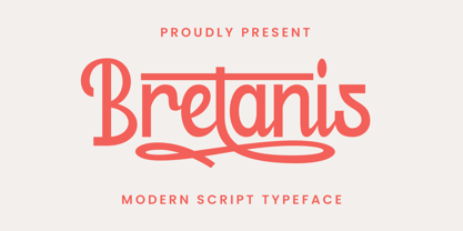 Bretanis a lovely and delicate script font that exudes elegance and class. This font was particularly crafted for those who need a beautiful and refreshing look to their designs. Bretanis is PUA encoded which means you can access all of the amazing glyphs and ligatures with ease!
 - ITC Usherwood by ITC,
$29.99 ITC Usherwood font was designed by Leslie Usherwood, an informal and personable font which bridges the gap between modernity and tradition. There are hints of Bauer, Goudy and Augustea in this font, but ITC Usherwood remains both classic and contemporary, beautiful in form and functional in design.
 - Platoon by Canada Type,
$25.00Platoon was designed as a much needed alternative to other stencil fonts that don't provide enough weights. Comes in four weights, regular, medium, bold and black, which gives it enough flexibility to make it the stencil of choice for posters, titling, book covers, and military-related designs. - Gerakona by Ws Studio,
$18.00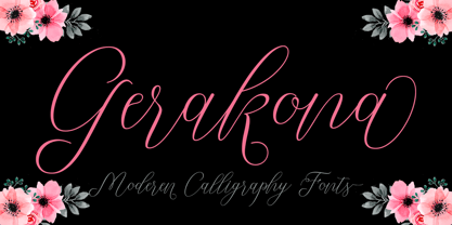 Gerakona is a lovely and delicate script font that exudes elegance and class. This font was particularly crafted for those who need a beautiful and refreshing look to their designs. Gerakona is PUA encoded which means you can access all of the glyphs and swashes with ease!
 - WIP Symbol by WIP Fonts,
$49.00WIP Symbol is a font of illustrations and icons drawn by hand for office communication and beyond; a perfect companion for the WIP handwriting fonts: FirstLady, GrandMa, MachoMan, MoneyMaker, SugarBaby and ThePresident. Originally designed in 1995 the font was extended and the paths were simplified in 2005. - Mistral by Linotype,
$40.99 Mistral is a loose running script based directly on the handwriting of its designer, Roger Excoffon. His goal was to create a typeface with a true handwritten style, but in this case, the writing looks as though it were done with a brush or heavy felt tip.
 - Standard Cap by Graffiti Fonts,
$19.99Standard Cap is rough font made to look like it was written with a "standard cap" (the cap that comes on a krylon, rusto or other spraycan). The font includes full uppercase and lowercase alphabets as well as a full array of numbers, symbols, punctuation etc. - Bergling Fantasia NF by Nick's Fonts,
$10.00This quirky little gem was patterned after single-stroke handlettering originally crafted by John M. Bergling, whose peregrinations through pulchritudinous penmanship also provided the inspiration for Erehwon Roman NF. Both versions of this font include the complete Unicode 1252 Latin and Unicode 1250 Central European character sets. - Count Floyd by Elemeno,
$10.00Bold and simple, but shaky, Count Floyd was named for the horror host spoof from SCTV. It has the look of a spooky grunge font, but is far easier to read, even at relatively small sizes. Please note that this font has a limited character set. - Pomponianus by Scriptorium,
$18.00Pomponianus comes from a 4th century inscription found in North Africa. It is an attractive example of early uncial lettering. Uncial inscriptions are quite uncommon, because although the style was well suited for writing on vellum, the curved letters made it more difficult to carve in stone. - Shibby by Hanoded,
$15.00 shibby adj (etc.). Used to indicate that something is “cool.” Apparently Shibby was first used in the 1999 movie Dude, Where’s My Car? I don’t think Shibby is THE cool word of the moment, but I think it is cool enough for this rather shibby font!
 - Bloktor Mosaik JNL by Jeff Levine,
$29.00Bloktor Mosaik JNL from Jeff Levine was at first a straightforward brick design sent to Typodermic's Ray Larabie for preview. Ray decided to run it through a filter to see what would happen, resulting in a font that emulates the look of cut stone or tile. - Ice Cream Man by Hanoded,
$10.00 I was listening to an old Van Halen album when I made this font. I named it after one of my favorites: ‘Ice Cream Man’. Ice Cream Man is a happy, sloppy, wobbly kids font. Use it for your book covers, posters and ice cream packaging!
 - Elite Resort JNL by Jeff Levine,
$29.00 A 1940s sheet music edition of an early 1900s song entitled "You Taught Me How to Love You, Now Teach Me to Forget" was set in a popular metal type slab serif face. It is presented digitally as Elite Resort JNL, in both regular and oblique versions.
 - Demillina by AEN Creative Studio,
$12.00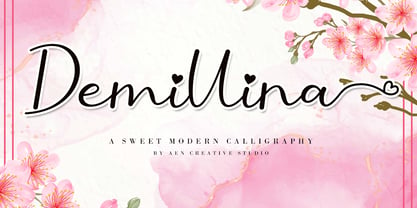 Demillina is a lovely and delicate script font that exudes elegance and class. This font was particularly crafted for those who need a beautiful and refreshing look to their designs. Demillina is PUA encoded which means you can access all of the glyphs and swashes with ease!
 - Hebrew Latino by Wiescher Design,
$39.50 Hebrew Latino was started out of frustration. I could not find a font that looked like Hebrew - actually I found one, but it had only capitals. So I decided to make my own. Strangely enough it looks a little bit Jugendstylish! Here it is. Shalom! Gert Wiescher
 - Moulin Rouge by Solotype,
$19.95This came from a shop near Munich, Germany, and was a very poor proof with no font name on it. Never did identify it. When we cleaned it up, we liked it pretty well. We think it is typical of some early twentieth century art nouveau fonts. - Village by Matteson Typographics,
$19.95 Frederic Goudy’s Village typeface was originally used exclusively for his Village Press publications. Designed in 1903, Village is a Venetian book face with sturdy, open forms. Steve Matteson digitized this typeface from books printed by the Village Press. An excellent companion to any of Goudy’s other typefaces.
 - Musical Prelude JNL by Jeff Levine,
$29.00 Musical Prelude JNL is a thin Art Deco typeface with some interesting character shapes, and was inspired by the hand lettering on the cover of the 1933 sheet music for "Blue Prelude" by Gordon Jenkins and Joe Bishop. It is available in both regular and oblique versions.
 - AZ Tiki by Artist of Design,
$20.00 AZ Tiki font was inspired from Polynesian pop art Ephemera of the 1950's. This font utilizes an "old look" to the line work which is designed to have a "worn feel" to it. Ideal for use as headline or sub-head text in you design.
 - Arcano by Resistenza,
$39.00 After four long months of work, Arcano Type has finally been released. It was completely designed by hand, letter by letter, using Chinese ink on Japanese calligraphy paper. Arcano is inspired by nature, symbols, icons, jewels, hand-drawn designs and much more... Modern Love Slanted-Turquoise-Nautica
 - Thinker Peachcreme by PeachCreme,
$19.00 This is "Thinker," a new font designed by Peachcreme. It has a rough look, giving the impression that it was scrawled down in a hasty and disorganised manner by hand with a pencil. Plus, it comes with a bonus set of hand-drawn graphics and alternate letters.
 - Behrens Antiqua by Solotype,
$19.95Designed by Peter Behrens, well known graphic artist and architect in Germany in the late 19th and early 20th century. This "Antiqua" was done for Rudhard's Typefoundry in Offenbach A. M. around 1902, and has been used in modern times for museum retrospectives of the designer's work. - Estro by profonts,
$39.99Estro was originally designed by Aldo Novarese in 1961 for the foundry Nebiolo. Estro can maybe be classified a combination of Egyptienne and script.Ralph M. Unger redrew and digitized this font exclusively for profonts in 2003. His work is based on artwork taken from old font catalogues. - Discotheque JNL by Jeff Levine,
$29.00 A 1930s casual Art Deco type style with as much influence in 1970s graphic design as in its day was found within the pages of the 1930s French publication L'Art du Tracé Rationnel de la Lettre. Discotheque JNL is available in both regular and oblique versions.
 - Cresta by James Todd,
$40.00 Loaded with personality and functionality, Cresta is built to look good while surviving the worst conditions. It is at home on screen and in a magazine. Its six weights are intended to be used everywhere. Unlike most typefaces, Cresta was built without a reference. For this project, everything design choice was based on what worked best for a workhorse sans serif family. Cresta was originally created as the primary typeface for this website. This meant it needed to work in copy, headlines, and navigation across all devices, browsers and operating systems. This meant it needed to be sturdy and have enough character to make it stand out from other UI typefaces. With its large x-height, ample counters, and giant apertures, Cresta is meant for easy utility in rough conditions. Even with all of this, that doesnít mean that its dull; as the weights increase, the style of Cresta becomes more appearant. This style is defined most apparently by the terminals on the lowercase r and the angle of the joins between the curved and straight strokes (such as in the connection on the n).
 - Waza by Linotype,
$29.99 Reviving a handwriting style from centuries past is similar to playing antique musical instruments; the pleasure of communing with live music arranged centuries ago by brilliant composers is heightened by the use of authentic or reconstructed artifacts. A new revived" script from the Baroque epoch is the Waza typeface, developed by Polish designer Franciszek Otto. Waza is inspired by a Wilhelm Hondius (Hondt) etching. Hondius was a Dutch court engraver for the Polish king, Ladislaus IV of the Vasa dynasty. The decorative character of the script engraved in the etching is a display of Hondius's calligraphic skill. The tangle of the flourishes in the capital letters, as well as the decorative lengthening of ascenders and descenders in the lowercase, contrast ideally with the rhythmic 30-degree slant of the design. Waza includes a set of alternative capital letters that have been deprived of ornaments; these allow the setting of proper Roman numerals, e.g., Ladislaus IV."
 - Garamond Rough Pro by Elsner+Flake,
$59.00 With its animated contours, and set in an appropriate size, the Garamond Rough typeface attempts to simulate printed hot metal typesetting. Its roughened edges make it appear softer and less crisp, and, thus, takes the harshness out of the type image. The size of the offered type complement as well as the number of its affiliated symbols makes it ideal for differentiated text setting. Furthermore, its display types make surprising visual accents possible. The origins of the design of Garamond Rough go back to the middle of the 16th century. They are ascribed to Claude Garamond who was one of the first typographers who designed typefaces specifically for the setting of books. During the course of the past centuries and decades, many different variations and new design interpretations of the Garamond typeface were developed to accommodate the most diverse typesetting and printing practices in many different countries. As such, today’s designers can take advantage of a comprehensive digital repertoire for text and display applications. Translation Inga Wennik
 - Bixa by Novo Typo,
$26.00 Bixa is a chromatic typeface designed for display use. Bixa comes in 13 different layers containing 11 weights for beautiful color combinations. Bixa was originally designed for the Typewood project in 2015. Read more about this project here. In 2016 we launched the chromatic web version of Bixa. More information about Bixa Color here. Bixa was awarded by the Type Directors Club New York and the European Design Awards in 2016. Bixa is designed by Novo Typo in 2015. Youtube
 - Fiebiger Zwei by Hanoded,
$15.00 Franz Fiebiger (1880 - 1932) was an Austrian painter and designer who was associated with the Vienna Secession. In 1908 he created a beautiful poster for the Kaiserjubiläums Möbel Ausstellung - a furniture exhibition during the Kaiser's Jubilee. Fiebiger Zwei (meaning Fiebiger Two) is the second font based on one of the hand made typefaces gracing this poster. As I had to work with only a few glyphs, I designed the missing ones myself. Fiebiger Zwei comes with language support befitting a Kaiser...
 - Gilmore Sans by Red Rooster Collection,
$45.00 Gilmore Sans Extra Bold Extra Condensed Titling is a sans serif typeface that was inspired from early designs by the renowned English typographer Eric Gill. It was designed in 1992 by A. Pat Hickson (P&P Hickson) and Steve Jackaman (ITF) exclusively for the Red Rooster Collection. It has a clean, fresh, sturdy feel that is exceptionally powerful at display size. The typeface lends itself well to a variety of projects, including everything from packaging to signage to high-profile advertising campaigns.