10,000 search results
(0.044 seconds)
- Van Dijck by Monotype,
$29.99 The seventeenth century Dutch old faces have a distinct character of their own, and were the source for eighteenth century English type designs, such as Caslon. Christoffel van Dijck was one of the great Dutch typefounders, although this face, which bears his name, may not have been cut by him, it is nevertheless representative of the best designs from that period. The Van Dijck italic, for which original punches survive, is almost certainly the work of van Dijck. Drawn at Monotype under the supervision of Jan van Krimpen. The Van Dijck font is a graceful typeface, best used for setting books, quality magazines and articles.
 - Irpin Type by Aronetiv,
$- Irpin Type is an original font dedicated to the city of Irpin. Intended for everyday use, for books, logos, corporate style. It can also be used in posters and presentations where a confident character is needed. This font suits a large size, but it has good readability even in a small one. This is a modern slab serif with geometric shapes, inspired by the Ukrainian avant-garde of the 20th century. It has characteristic alternates for "G", "a", "u", and "&". Irpin is a city of Ukraine in the suburbs of Kyiv. On March 24, 2022, by the Decree of the President of Ukraine in order to celebrate the feat, mass heroism and resilience of citizens, shown in the defense of their cities during the repulsion of the armed aggression of the Russian Federation against Ukraine, the city was awarded the honorary title "Hero City of Ukraine"
 - P22 Brass Script by IHOF,
$39.95 P22 Brass Script is a new font from an old source. This script font was discovered in a booklet from Dornemann & Co. of Magdeburg Germany, circa 1910. The book was titled Messingschriften fur Handvergoldung, which roughly translates to “Brass types for hand foil stamping.” The mini catalog called this type simply “Script.” It has not been previously digitized or seen in standard metal type form. The antique specimen book featured most of the characters needed for a full alphabet, but a number of letters were not shown. Since no other examples of this style could be found, P22 enlisted the assistance of master calligrapher Michael Clark to draw the missing characters in the same style as the original. The style is very loosely based on the secretarial hands and reminiscent of “French Hand” with a very early 20th century, pre-modern feel. It has an unusual flow that is neither too casual nor too formal. The font would be useful for wedding invitations or packaging and advertising. P22 Brass Script Pro features include: automatic ligatures for common pairs such as ll, tt, qu and a variety of f ligatures, full CE language support including Turkish and Romanian and a variety of swash underscores for different length words that can be added manually in OpenType ready applications with the glyph palette or with the contextual alternates. The length of the word will automatically select the best length of swash for the work.
 - FS Maja by Fontsmith,
$50.00 Youthful Fontsmith received a brief to develop a font that would form part of the broadcast identity for the UK’s first digital Freeview channel – E4. It needed to work seamlessly in text and display, both in print and on-screen, and please the eye of the target audience, 18-34-year-olds. So, young, fresh and informal. No problem. Except for one thing: the timing. Daughter As he worked on FS Maja, Jason Smith was occupied by another imminent deadline: the birth of his third child. The pressure was mounting, but rather than let it get to him, Jason embraced the challenge and made light of the tension, fashioning a bright, bubbly, entertaining type with a personality made for memorable headlines. Beautifully random FS Maja’s soft, rounded shapes and assured, fluent lines encompass lots of notable features that contribute to its warm, fun-loving personality, including: a very large x-height; a short, rounded serif to allow for close spacing and give texture to body text; a slight convexity, or bulge, in the stroke terminals; a calligraphic fluidity in the entry to the down-stroke of most lowercase letters; open, generous curves, especially in the “B”, “P” and “R”; and a “w” made of two “u”s.
 - Nanami Handmade by Thinkdust,
$10.00 Can we get a drum roll please? It’s not every day that a new link in a best selling chain is forged. First, there was Nanami, a font which took the world of type by force, storming to the top of MyFonts Hot New Fonts list; then there was Nanami Rounded, the most successful follow-up since Terminator 2. Well, say Hasta La Vista to boring design because now, there’s Nanami Handmade. With all the geometric, Japanese inspiration and style of the first two iterations, Nanami Handmade carries a quirky, mischievous charm. The font has a charisma matched by roguish anti-heroes; bad guys you love to love and good guys the other good guys hate, but everyone knows they’re what the audience turns up to see. Nanami Handmade comes in two styles, a solid and a hand-drawn, each of which has eight weights. Mix and match between these options to create a balanced piece which makes good use of the tactile, warm, earthy nature of the font. With these sans-serif styles working well in small and large sizes, both on and off screen, Nanami Handmade’s applications are virtually endless. Get your own piece of typography’s elite now, with Nanami Handmade, by Thinkdust.
 - Promenade by Jen Wagner Co.,
$17.00 Introducing Promenade – a calligraphic serif that started on paper with a flat nib pen (see the 6th image), and blossomed into a full serif with italics. At its core, this font is just... beautiful. It's elegant, it's crisp, it's delicate, but can still hold its own. As I was creating the graphics, I just couldn't get over the flow of the letters – especially the italic. It's got class, but also isn't afraid to rock a pair of Doc Marten's. Funny enough, Jen from Tonic (they make beautiful websites) saw a preview of this font and said, "I'd take that font to prom." Which of course spurred a conversation about how this font would take a Mercedes G-Series instead of a limo, and wear Doc Marten's instead of heels, but still wear the most gorgeous dress, and that is 100% Promenade (and inspo for the name – thanks, Jen!). I've also been loving combining the regular and italic, especially for logos (see the "Friendfolk" logo) One thing to note about Promenade is the letter spacing. It was spaced for clean reading and intentional balance, so I recommend setting the spacing a little tighter if you want to create the display look found in many of the logo mockups(around -20 to -40 should do!).
 - Berryfield by Missy Meyer,
$12.00 Berryfield started as an experiment: making a font entirely out of geometric shapes. It started with a couple of circles and a couple of rectangles, and was constructed entirely from those parts, and parts made from those parts! For the uppercase, I took style inspiration from the heavy serif classics. But when it came time to create the lowercase set, I took a sharp turn and looked to fun unicase fonts, creating uppercase-height lowercase letters, in addition to uppercase alternates. When I finished Berryfield Regular, I liked it so much I made a lighter version (almost like a typewriter font), and a heavier version, to give you even more variety! Each font in the family contains over 520 characters, including over 300 extended Latin characters for language support. There are also a number of alternate letters to choose from, as well as superscript ordinals (ST, ND, RD, and TH), all of which are PUA-encoded for easy access no matter what design program you're using. Berryfield was a ton of fun to make, and I hope you have a ton of fun using it! It's smooth and easy for both print and crafting; the uppercase alone is straightforward enough for a magazine headline, but combining in the lowercase makes it quirky and fun.
 - Big Vesta by Linotype,
$29.99Vesta™ was originally designed as an orientation and information system for the city of Rome, the birthplace of the roman alphabet. The forms are inspired by letterforms found on a frieze in the Vesta temple in Tivoli. Vesta has more contrast than the average sans serif but, like many of other designs of Gerard Unger, let in a lot of light - the letterforms are open, the counters generous. Relatively narrow and hence economical - without feeling too compressed - Vesta is an ideal solution for newspapers and magazines, and numerous other applications, including corporate identity and more. Big Vesta was intended as Vesta's display partner. However, it also performs very well at small sizes - its large x-height and short ascenders and descenders make it particularly economical, making it ideal when space is limited; for example on a mobile display. Vesta and Big Vesta are now available in seven weights - from Light to Black - and include everything necessary for setting extended texts well: italics, small caps, and a range of figures, including old style, lining, and tabular figures. All in addition, Vesta is available as a family of OpenType fonts with a very large Pro character set and supports most Central European and many Eastern European languages. - Gens De Baton by HiH,
$10.00 Gens De Baton is based on a charming lower case alphabet that appeared in the Almanach des Enfants pour 1886 (Paris 1886) under the heading “Amusing Grammar Lessons.” Gens De Baton means simply “Stick People.” The unknown designer turned the bare letter forms into drawings of people for the enjoyment of the children for whom the almanac was intended. The letter forms themselves were based on the French Romain du Roi (King’s Roman), except for the ‘g’ and the ‘j’ -- which were based on Baskerville. The letters ‘w’ and ‘y’ were not included, as they are seldom seen in French. We have left the letters somewhat rough, as they appeared in the Almanach des Enfants , resisting the temptation to clean up all the lines and render them with digital perfection. We have used our HiH Firmin Didot to supply an upper case and auxiliary characters, as Didot was originally a modified version of Romain du Roi. It is interesting to observe the contrast between the polished look of the Didot upper case and the rough, hand-drawn look of the lower case. Purchasers of this font have our permission to use it for the amusement of adults as well as children. We recommend setting Gens De Baton at 24 points or larger.
 - Quendel by URW Type Foundry,
$39.99 Quendel has been expanded to become Quendel Happy Family. Apart from the new Bold weight for easy distinction and emphasis, there are now four other very exciting variants, rendering different writing tools and writing materials. The basic form of Quendel was written with a Japanese bamboo tip and therefore embodies a form letter of natural flow. The new versions show other features that provide the feel of written scripts. While the styles Wood and Crayon include some alternate characters, Q Marking Pen and Q Fingertip, due to their apparently more complex enacted forms, do not need additional alternates without looking stiff or boring. The wood relief of Quendel Wood was created by a freehand wood relief drawn with oiled chalk. Quendel Marking Pen seems to be written with a felt-tip pen soon depleted. At the same time it is also reminiscent of the blooming effect, which we know from photography. The name of Quendel Fingertip suggests what can be seen - someone seems to have written with the finger in a grainy material. One would like to try it himself. The effect of broken lines which can be gained by writing with chalk as reflected in Quendel Crayon. Almost like parched sandy soil, the writing material seems to crumble.
 - Arabesque by Scholtz Fonts,
$15.00 Arabesque is a romantic, ornamental font, in which intertwining, flowing lines and generous loops enhance the beauty of the basic shapes. Arabesque successfully combines legibility with a decorative, sumptuous style. In its European interpretation it was also called "Moresque". The font "Ability" was the origin of Arabesque, however, numerous, subtle changes set it apart. Arabesque, is characterised by a small x-height and relatively large ascenders and descenders (loops). The loops are created out of two or three delicate, intertwined lines that contrast with the much less expansive bowls and shapes of the lowercase letters. The capitals, more complex and composed of intertwined lines, echo the elegance of the loops on the lowercase letters. As a result of these changes "Arabesque" is both more readable, controlled and extravagant than "Ability". Suggestions for use: - wedding stationery - greeting cards - valentines day media - beauty products media - lingerie tags - women's magazine pages - classical music media - award certificates - magazine pages The font is fully professional: carefully letterspaced and kerned. It contains over 235 characters - (upper and lower case characters, punctuation, numerals, symbols and accented characters are present). It has all the accented characters used in the major European languages. Arabesque works well in Application packages such as Microsoft Word that do not support professional kerning.
 - Argithea DEMO - Personal use only

- Kremlin Kourier II - Unknown license

- Kremlin Duma - Unknown license

- Atomic Alice by Letterhead Studio-YG,
$46.00 Atomic Alice was designed by Yuri Gordon in 2018. This typeface is simple and clear, with strong character. Gives wide opportunity to create expressive texts with 877 glyphs. Atomic Alice has has some OpenType features including small caps, stylistic alternates and huge amount of ligatures.
 - Arupala Grotesk by Jetsmax Studio,
$15.00 Arupala Grotesk is a Grotesk font this versatile typeface will grab readers’ Attention. This font was inspired by a character named H. Aroepala. This font is suitable for both formal and informal events and is also suitable for various types of print and digital media.
 - Ziggy Sans by Just Jace,
$5.00 Ziggy Sans is my debut font, a straightforward headline typeface. It was devised from simple sketches and came together fairly smoothly, but very slowly. Each letterform is comprised of only two shapes for maximum consistency, and every letter combination has been painstakingly kerned by hand.
 - Erratic Nouveau JNL by Jeff Levine,
$29.00 The title on the 1925 sheet music for “By the Light of the Stars” was hand lettered in an eccentric Art Nouveau type style with varying character shapes and line widths. This is now available as Erratic Nouveau JNL in both regular and oblique versions.
 - Bealiva Vintage by Mevstory Studio,
$15.00 Bealiva is one of my fonts based on a hand lettering project in 2020. It was very inspired from the famous retro typography designs in late 60's until 70's. It includes the extrude look, so you will not have to add it later.
 - Business Lunch JNL by Jeff Levine,
$29.00 Business Lunch JNL is an extra bold hairline serif font based on Monotype’s Falstaff, which in turn was greatly influenced by Bodoni Extra Bold. Great for posters, menu headers and other forms of headlining, Business Lunch JNL is available in both regular and oblique versions.
 - Penelope by Solotype,
$19.95This was originally brought out as a caps-only font, but later the foundry scrounged up a lowercase that wasn't our idea of a very good match. So we cleaned up the caps and made them a bit bolder, then drew a harmonizing lowercase. - Beauvoir by Scriptorium,
$12.00Beauvoir is based on a sample of Art Nouveau period hand-drawn poster lettering designed by Chicago designer Frank Atkinson. The original sample was limited, so we extrapolated from it and added new characters and character variations to make the final result more interesting. - Tallahassee Chassis JNL by Jeff Levine,
$29.00Tallahassee Chassis JNL was modeled from a toy alphabet rubber stamp set made in Japan and imported to the U.S. during the late 1950s and early 1960s. The lettering style somewhat resembled that found on the side of old railroad cars, buses or trolleys. - EF Kaffeesatz by Elsner+Flake,
$35.00 The Kaffeesatz EF typeface was designed in 1993 by Ralf Borowiak in three weights: “Schwarz”, “Weiß” and „Süß“ (“Black“, “White” and “Sweet”). Since it is experiencing ever increasing popularity, the Elsner+Flake Designstudios augmented the “Schwarz“ and “Weiß“ versions with a complement of Cyrillic characters.
 - Deco Wide JNL by Jeff Levine,
$29.00 A unique and stylized type design with Art Deco influence was found within the French publication “Modèles de lettres modernes par Georges Léculier” (“Models of Modern Letters by Léculier”). This lettering is now digitally available as Deco Wide JNL in both regular and oblique versions.
 - News Gothic by Linotype,
$40.99News Gothic was created by Morris Fuller Benton in 1908 and presented by the American font foundry American Typefounders. Despite, or perhaps because of, the font’s unconventional relationships in proportion and form, News Gothic has long been a popular typeface for almost any use. - Slabserif Grotesk JNL by Jeff Levine,
$29.00 Slabserif Grotesk JNL was modeled from an example of a wood type design called Antique Light Face, and is available in both regular and oblique versions. The numerals (although an odd fit to the overall design) make this vintage font quite unusual and charming.
 - Adolf William by Wildan Type,
$10.00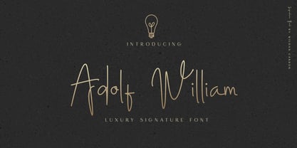 Adolf William is a handwritten signature script with a natural & stylish flow. This collection of scripts is perfect for personal branding. It was made with the intention to be used by Photographers as a watermark for Photography Business,personal branding & wedding invitations to advertising
 - Bonkey by PizzaDude.dk,
$14.00 Drawn with a loose hand and keeping the eye off what's considered right (regarding typefaces) Bonkey saw the light of day on a napkin during dinner, and was scanned, cleaned up (just a bit) It's an unpredictable font that just wants to have some fun!
 - Lake Informal by Linotype,
$29.99Lake Informal was designed by Rudolf Ruzicka in 1935. It is a handwriting font which imitates the result of a feather script on paper. A dynamic, individual font, it is also very legible even in smaller point sizes and is perfect for personal correspondence. - Hollywood and Vine JNL by Jeff Levine,
$29.00 A condensed type design with Art Deco influences was used for titles within the February, 1938 issue of Modern Screen Magazine. The digital version is named for the famous “Tinsel Town” street intersection. Hollywood and Vine JNL is available in both regular and oblique versions.
 - Hayfork JNL by Jeff Levine,
$29.00 Hayfork JNL is based on a vintage wood type sanserif typeface from the 1880's. A font of similar design is Eckhardt Poster Display, which was modeled from a 1920's sign painter's handbook; no doubt getting its inspiration from this wood type's design.
 - Linex Sweet by Monotype,
$29.99Linex Sweet was designed by Albert Boton in the late 1990s. It's a smallish family of three weights; the middle weight has an italic companion face. With its soft corners and slightly quirky head-serifs, Linex Sweet is a friendly design that sees much use. - SK Kalender by Salih Kizilkaya,
$9.99 SK Kalender is a sans serif and mono weighted font. It was designed by Salih Kızılkaya in 2020. The name of the font comes from the word “kalender”, which means humble, unpretentious and simple living. SK Kalender has three different versions, regular, medium and bold.
 - Carl Beck by Monotype,
$29.99Cartographer Carl Beckman was appalled by the low standard of lettering in Sweden during the 18th century. He published an instruction and pattern book with four different letter forms in Stockholm 1794. The Carl Beck font is based on his Cursiv Skriften no. 1. - Evening Gown JNL by Jeff Levine,
$29.00 Evening Gown JNL comes from the lettering displayed on a printed ad for the fictional "Gowns by Roberta" in a scene in the 1935 film of the same name. "Roberta" starred Fred Astaire and Ginger Rogers and was based on the successful 1933 stage play.
 - Digi Antiqua by Linotype,
$39.00DigiAntiqua was designed by the Hell Design Studio in 1968. Its basic forms were influenced by the slab serif fonts produced at the beginning of the industrial era in England around 1820. Its clear and timeless forms are extremely legible even in small point sizes. - Surreal PostIndian by Type-Ø-Tones,
$40.00 Surreal PostIndian by Laura Klamburg. OpenType, 2 styles According to its creator, Surreal Post Indian was inspired by the performance of an American Indian artist, but this typeface seems more connected with pop neon signs. Anyway, here is an amusing Laura Klamburg font. Enjoy it.
 - Campaign by ITC,
$29.99Campaign was designed by Alan Meeks, a bold sans serif font with details typical of a stencilled alphabet. When using this font, letters and words should be set close together for the best effect. Campaign is perfect for large displays like posters or billboard advertisements. - Jungler by Rumors Foundry,
$3.99 Jungler is a new handwritten consensed typeface, based on the lettering from comic magazines, designed by Gabriele Bellanca in early 2022 for Rumors Foundry. It was created with FontSelf App and the support of Glyphs App. Counts over 270 glyphs in one Regular weight.


