10,000 search results
(0.029 seconds)
- Honeyguide by Hanoded,
$15.00 Description: Honeyguide is a beautiful, handmade set of fonts. One is a brushed script font; the other a playful all caps font. Both come with italic styles. Use these two babies for your product packaging and book covers, happy holiday greeting cards and products in need of some quality packaging. A honeyguide, by the way, is a bird species (fam. Indicatoridae) from Africa and Asia. They are famous for leading humans to bee colonies, so they can feast on the grubs and beeswax that are left behind.
 - Curves by Just My Type,
$15.00Be it a blessing or a curse, when a type designer sees a shape that could be interpreted as a letter, his/her mind is off and running. My parents loved to travel; Dad drove to Florida seven different years, winding on (barely) two-lane “highways” clinging to the hills of Kentucky and Tennessee. My brothers and I saw many of these letters along the way. Watch those Curves . - Saki by Thinkdust,
$10.00 Saki is big and bold, presenting messages in an easy to understand, pleasant to read manner. Simple straight edges, shallow curves and sans-serif, Saki was created with legibility and minimalism in mind and its thick weight gives it great scalability. It is admirable for maintaining such close attention to form, each character fitting neatly into the space provided and slotting together smoothly for undistracted reading. For use in headlines and similar large text, Saki is the font you need to get your message across loud and clear, no ifs, ands or buts.
 - Shàngó Sans by CastleType,
$59.00 Taking the concept of a monoline version of Shàngó — as exemplified in Shàngó Gothic — to its extreme, resulted in the latest addition to the popular Shàngó family of typefaces: Shango Sans. This is a minimalist face, still maintaining the elegant classic letterforms of Professor F.H. Ernst Schneidler's original design, but without obvious contrast in the stroke widths, and of course, without serifs. An extensive set of ligatures and alternate letterforms, along with powerful OpenType features, give Shàngó Sans a great deal of versatility. This elegant, modern typeface supports dozens of languages that use the Latin alphabet as well as modern (monotonic) Greek and most languages that use the Cyrillic alphabet. Shàngó Sans is a member of the extended Shàngó family (Classic, Chiseled, Sans, Gothic).
 - Foom by Comicraft,
$19.00 DOCTOR OCTOPUS! BOOM! DOCTOR DOOM! 'SHROOM! DOCTOR EVIL! BA-THROOM! DOCTOR FRANKENSTEIN! KRA-KOOM! Never let it be said that Comicraft does not possess a Varied Vocabulary of Vile Villainy or a Tremendous Thesaurus of Terrible Tinkerers! It's our belief that every Medley of Madmen, every Rogue's Gallery of Ragged Rascals and every Sinister Selection of Scoundrels, Scalliwags and Sick Scientists --even they deserve a Nefariously Notorious Name-Finagling Font to announce their Apocalyptic Arrival. That font is here, towering murderously above the city blocks of Manhattan even as we speak... It's a Despicable Doctor of Dastardly Deeds, it's a Master of Evil Scheming, an Infamous Infidel, your Arch Enemy, your NEMESIS... IT'S THE END OF THE WORLD AS WE KNOW IT! FING... FAN... FOOM!
 - Capsbats by Typephases,
$25.00 Everything your head should not be or would rather not do is here. A complete collection of 225 illustrations (plus bonus shadows) in three fonts. The illustrations collected in the Capsbats keep the free-flowing lines of the ink-on-paper sketches. As a dingbat, or pictorial typeface, the Capsbats are very versatile: you can use them immediately in any application. The vectorial format of the font file means they are scalable with no loss of quality. And you can customize them in no time in your favourite graphics program. They can be used out of the box, as accents or spot illustration, or enlarged, combined, coloured, textured... to achieve an infinite variety of results easily. With Capsbats you have an incredible resource for your concept illustration needs: enlarge them and you can create a high impact page layout, posters, magazine covers and book jackets, advertising... The Capsbats Shadows are bonus silhouettes that you can use in very different situations. Use these shadows to fill them with your own patterns, or use them as a mask or clipping path, to paste the images you want inside them. The possibilities are endless. We didn't limit our imagination in drawing them, so why would you when using them? The book 1000 Heads is a compendium of the drawings featured in the Capsbats and Entestats and it gives a glimpse of the limitless applications of this collection.
 - Permanent Park by Wing's Art Studio,
$16.00 Permanent Park - 1990s Graffiti Inspired Marker Pen Font A hand-drawn marker pen font inspired by graffiti tags and 1990s Hip Hop. Permanent Park is a marker pen font with a graffiti tag aesthetic inspired by the golden-age of Hip Hop and 1990s TV shows. It’s 100% hand-drawn and comes packed with alternative characters for creating truly natural looking type treatments. No repeated oo’s, ee’s and ll’s that are a dead give-away of lazy lettering! Permanent Park is a highly customisable all-caps design featuring a complete set of uppercase and lowercase characters, along with numerals, punctuation and language support. It also features a complete set of alternatives with additional lowercase characters (for mixing things up even more), and a selection of underlines and symbols for an illustrative flourish. It’s a uniquely fun, urban looking font, typical of 90s music videos and TV shows, and equally suited to sports, travel and food themes. Check out my visuals for ideas on how you might use it on posters, movie titles, product packaging, broadcast and advertising.
 - Restoe Iboe by Green Adventure Studio,
$20.00 Restoe Iboe is a quirky and cartoon like display font. It is perfect for headings, flyers, greeting cards, product packaging, book covers, printed quotes, logotype, apparel design, instagram post, album covers, and more.
 - Gistela by Solidtype,
$15.00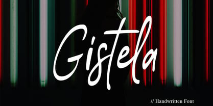 Gistela is a handwritten script font. Contemporary and fashionable. with Ligatures and Multilingual Support. This font is perfect for modern projects, headings, blogs, logos, branding, business cards, websites, invitations, shirts, mugs, and more!
 - Hate Your Writing by Crumphand,
$15.00 Introducing the new font "Hate Your Writing". This font written by my daughter. Easy to read. Make your design looks stuning. What's Character Included ? Uppercase Lowercase Numerals Symbols Multilingual Language. Thank you, Regards!
 - Trostie Love by Lemonthe,
$9.00 Trostie Love is a handwritten font, cute and fun. This font is perfect for quotes, headings, blogs, logos, invitations, wedding, watermark, social media posts, product packaging, product designs, label, special events and more!
 - Dungarees by Victory Type,
$-Dungarees is a font on caffeine... It's a normal sans-serif typeface gone wild: jagged in some places, smooth in others. It makes documents not only fun to read but really interesting too! - Volken by Phonnastudio,
$12.00 Volken is a heavy bold sans-serif font. This font is perfect for various projects, clean, and easy to read. what you get: · Alphabet · Number and Punctuation · Lettering format font · Include Multilingual support.
 - Autumn Leaves by Matthias Luh,
$15.00 These modern, handwritten letters can be used for fancy headings or images. The characters aren't oriented straight or orderly, but a bit random. So they look like they were written by a human.
 - Desmond Text by MADType,
$24.00 Desmond Text is a highly readable and quirky serif face with a tall x-height and glyphic serifs. It is easy to read small, but with pleasing details that shine at display sizes.
 - StudioSans by BrightHead Studio,
$20.00 StudioSans — is a modern representative of the class of sans-serif fonts inspired by the traditional Swiss design and typography of the mid 20th century. This is a minimal, clean and open font family with friendly forms. Focuses on functionality, has a high x-height and short ascender and descender elements. This is combined with soft circles and high legibility of characters contributing to comfortable reading. The family contains six weights from ExtraLight to ExtraBold. Each of them has in its arsenal more than 450 glyphs and knows more than 50 languages. Support for OpenType Features focused on the Oldstyle Figures (including signs of currencies and interest), Case-Sensitive Forms, Standarts and Discretionary Ligatures, Slashed Zero and Etc.
 - Ministry Script by Sudtipos,
$99.00 Ministry Script was designed to be “A time capsule that marks both the American ad art of the 1920s, and the current new-millennium acrobatics of digital type.” First letters of Ministry comes from a how-to lettering book but immediately turned on a complex and modern new digital typeface design with thousand glyphs. Ministry’s OpenType features include contextual and stylistic alternates, swash characters, and a galaxy of ligatures. A single face with over 1,000 characters to explore. The OpenType palette provides access to four different variants of each letter. For more info about the use of Ministry, its background, ligatures, alternates, please read The Ministry Script Guide in the Gallery section.
 - Rapido Racers by Putracetol,
$22.00 Introducing “Rapido Racers” - a Quirky Display Speed Font that encapsulates the essence of speed, agility, and dynamism. Crafted meticulously to resonate with the fast-paced world of racing and e-sports, this font is a harmonious blend of pixel perfection and artistic craftsmanship. With 13 unique variations, each tailored to fit the theme of speed and sportiness, Rapido Racers is versatile yet specific in its application. Whether you’re designing logos that stand testament to the electrifying world of racing or branding materials that echo the swift movements of e-sports athletes, this font is your companion. Its strong display characteristics make it ideal for crafting eye-catching titles on posters or headings on web pages.
 - Paperclip Wire by Blackout,
$20.00Paperclip Wire is a great font for anyone looking to have a straightforward yet elegant look. All letters consist of Capitals yet the uppercase letters are exaggerated. Because of the nature of the font I suggest using it in no less than 20 pt. font. However, because it is simple it can easily be read when printed. This typeface was developed loosely based on a paper clip itself. the x-height was determined based off the size ratio of the clip and the cap height was based off of a paper clip as it is folded open. The overall shape is straight lines and subtle curves, all relating to each other to allow for a constant flow of letters. - Titla by ParaType,
$25.00 The name of the font Titla emphasizes it heading and display functionality. At the same time low contrast, narrow proportions, wide variety of weights and clear glyph constructions make it possible to use it for long texts as well. Combination of modern serifs with flexing stems (see n, p,…) brings to the font fresh, informal and noticeable appearance. The character set includes alternative variations and specific 'vertical ligatures' for paired letters that are built with the help of diacritical forms of letters placed above basic ones. This feature also was reflected in the name of the font as Greek 'titlos' means diacritical mark. The font was designed by Oleg Karpinsky and released by ParaType in 2009.
 - Amhara by Ingo,
$38.00 A “latin” alphabet modelled on the ethiopian Ge'ez script - an experiment that works. Amhara was created by transferring the typical forms of the Ethiopian Amharic script to the west European alphabet. Because Amharic is traditionally written with an expanded pen tip, it shows the typical ductus also characteristic of the uncial scripts of late antiquity and the early Middle Ages. So this font »Amhara« has a somewhat sacramental effect. And, although the individual forms look foreign, the overall picture is strangely familiar. The two styles of »Amhara« include a number of ligatures which dispose of many non-attractive letter combinations. Stylistic alternates are available for some letters, too. Read more about this font at ingoFonts...
 - The "Only Fools and Horses" font is inspired by the classic British television comedy series of the same name. This font captures the essence and heart of the show, which has been beloved by audience...
- Lubaline by Lián Types,
$39.00 Who haven't heard the phrase that ‘any past time was better’?. Although I sometimes find this phrase a little too pessimistic (because I try to think that the best is yet to come), it may be true regarding my passion, typography. I'm too young (29) unfortunately, and this means I did not have the pleasure of being contemporary with maybe the man who has influenced my work the most (1). The man that showed that letters are more than just letters to be read. Herb Lubalin (1918-1981), also called sometimes as ‘the rule basher’ (2), smashed the taboos and sacred rules of type design and gave it personality. He rejected the functionalist philosophy of europeans in favor of an eclectic and exuberant style. To him, letters were not merely vessels of form, they were objects of meaning. (3). Nowadays, when looking at his portfolio, who dares to deny that the term ‘typography’ and ‘beauty’ may go hand-in-hand without any problem? Ed Benguiat, one of Herb’s partners, still likes making jokes with the phrase “screw legibility, type should be beautiful” and what I understand of this is not to forget the rules, but to know and break them carefully. In an era of pure eclecticism, we, the lovers of flourishes and swashes, can't do nothing but admire all the legacy that Lubalin, this wonderful type-guru, left. My font Lubaline read as “the line of Lubalin” is my humble tribute to him. Those who know his work, may see the influences easily like in his ‘Beards’ (1976) and ‘The Sound of Music’ (1965) posters; the art-deco forms in many of his amazing logos and practically in all his creations where letters seem to be alive just like you and me. I really hope that the future finds me still learning more and more about type-design and letterforms, and like him, always willing to make innovations in my field: Because letters are not just letters to be read. NOTES (1) These are some of my fonts in which some of Lubalin’s influences can be seen (in order of creation): Reina, Aire, Erotica, String, Beatle, Heroe, Selfie, Model, Seventies, and many others that are still in progress. (2) (3) Steven Heller. Herb Lubalin: Rule Basher. U&lc (1998) http://www.printmag.com/imprint/my-favorite-lubalin/
 - Regione by Reyrey Blue Std,
$19.00 Introducing, Regione Typeface. A modern typeface that embodies timeless elegance and aesthetic appeal. Regione Typeface accentuates uniqueness with a variety of stylish alternatives. Enhance your creative projects with the font's extensive collection of standard and discretionary ligatures, allowing you to add a touch of finesse to your text. Lunette Typeface is perfectly suitable for a layout design for quotes or body copy, best used as a display for headings, logos, branding, magazines, product packaging, invitations: logotypes, and much more. Features : All Uppercase and Lowercase Number & Symbol Supported Languages Ligatures PUA Encoded Hope you enjoy our font!
 - Night Sign JNL by Jeff Levine,
$29.00 For decades, the soft glow of a neon sign beckoned weary travelers to roadside rest courts, told the hungry individual where to eat; let enthusiastic revelers know where the night life was happening. There is something special about a neon sign, yet changing times, city ordinances and even technology itself is turning this staple of urban life for over a hundred years into a museum piece. Night Sign JNL emulates the craft of hand-formed neon signage and it (along with a few added special effects) can really add some good-old-fashioned pizzazz to a print or web project.
 - Scott McCloud by Comicraft,
$39.00 Whether you're Making, Understanding or Reinventing comics, you'll need a comic book font that makes your comic book—or comic book about making, understanding or reinventing comic books—look like a, um, comic book. Yes, it's all very well writing about the Invisible Art of Making Comics, but if you can't read about the Storytelling Secrets of Comics, Manga and Graphic Novels, they'll still be secrets, won't they? That's why Scott McCloud came to us to create the official "Making Comics: Storytelling Secrets of Comics, Manga and Graphic Novels" comic book font, or as we like to call it: McComicBookFont.
 - Circulaire by Canada Type,
$24.95 Circulaire is a set of initial caps designed by Sjoerd Hendrik de Roos in 1926, and digitized in 2009 by Hans van Maanen. Unusual serifs, spurs and swashes make for interesting continuity points in the familiarly angled shapes, while adding a unique calligrapher's touch to the beheld forms. As far as initials go, this set contains the extra touch of personality needed to lead into a paragraph, which is preferable to the usual swashed italics that are widely used. Circulaire is available in all popular font formats and includes extended support for a wide variety of Latin-based languages.
 - Alexandar by JMA,
$20.00Born into a world of serif fonts, where beautiful styling and script-like italics abound, Alexandar has neither. His appearance is, dare we say it, Spartan. Alexandar’s styling is minimal, it is stark—with uniform strokes and a high x-height. Alexandar’s goal is to conquer the world of legibility—to be readable in even 4 point text. We think he has succeeded and we are prepared to proclaim him The World’s Most Legible Serif Font. Of course, you may not want your clients to be able to read the small print—in that case, Alexandar is not for you! - Whale Song by Hanoded,
$15.00 I grew up with the ‘Save The Whales’ slogan: I remember watching the news and seeing little Greenpeace dinghies taking on huge Japanese whalers, and activists clinging on for dear life. I haven’t heard that slogan for a while: maybe because whaling is soooo 1890’s, but also maybe because the world has other problems to address. Out of respect for the ‘Save The Whale’ activists, I named this fattish font Whale Song. Whale Song is a robust comic font. It was especially created for book covers, product packaging and posters and, of course, it comes with a whale of diacritics.
 - Marconi by Linotype,
$29.99 Marconi was created by Hermann Zapf in 1973. According to Gerard Unger, it was the world's first digital typeface. Zapf’s design was developed as a text face for books and magazines. The round forms of the Marconi follow the principle of the superellipse. The lowercase letters are enlarged as the result of reading tests, while the capital letters are slightly reduced. The 8-point size — normally used for newspapers — looks more like 9 1/2 points. Marconi is a legible typeface with its large and open lowercase letters. It is ideal for long text blocks in newspaper, book, and magazine production.
 - Big Chuck by Proportional Lime,
$1.99 Charlemagne, one of the great rulers of the Middle Ages, was instrumental in the reestablishment of formal education in the West. This font was inspired by the notion that he felt the need to protect his communications from people with the ability to read; a rare skill then. Did he really command such a script to exist? He did instigate the development Carolingian minuscule script. Here are two different systems that are both attributed to him. Does it provide any real security? No, but it is fun to think about how such a system might have been used.
 - Fatum by ParaType,
$25.00 Fatum™ is a new original ultrablack slab serif typeface that was initiated by the impression of the TDC 2011 exhibition. Redundant stem thickness and closed character shapes make a feeling that counterspaces are the narrow slits cut in massive character bodies. Fatum can be used in large sizes in placards, playbills, in the headings of magazines, newspapers and Web-pages, as initials in book setting, for typographic illustrations and compositions. Ultrablack weight also gives a possibility to insert pictures, ornaments or other decorations into the contours of letters. This typeface was designed by Sveta Morozova and released by ParaType in 2013.
 - Sassoon Felt by Sassoon-Williams,
$48.00 Sassoon Felt’s more casual letterforms can be used either as informal text or for the teaching of reading and handwriting; having the letterforms most taught in UK schools. These fonts are an educators alternative to Comic Sans (from Microsoft) and Chalkboard (from Apple), which are more appropriate for ‘Print’ style writing in United States Elementary schools and may also be appropriate for parts of Australia, which can be identified usually by crucifix t, diagonal y downstroke, short f, two-stroke and there may be more. Free to download resources: How to access Stylistic Sets of alternative letters in these fonts
 - Breuer Text by TypeTrust,
$30.00 Breuer Text is a simple geometric sans with relaxed curves and slightly condensed proportions suitable for moderate lengths of body copy. The italics are optically adjusted obliques with a selection of augmented lowercase glyphs for a warmer read. Breuer Text offers the distinct aura of technical precision in a personable tone, ideal for instructional copy or safety warnings. Its basic structure and conservative letterforms maintain a level voice without turning robotic or sterile. Pair with the two-font Breuer Headline family for a simple and complete editorial type system. Breuer Text includes Small Caps, Old Style Figures and Tabular Figures.
 - Epoca Pro by Hoftype,
$39.00 Epoca, designed in 2010, is a classic linear sans for text and display. It has economical proportions, a neutral appearance and a discreet elegance. While sturdy and robust, it is nonetheless a strong workhorse. The slightly angular shape of the round elements results in a quiet flow of the line which enables fatigue-proof reading even with large amounts of text. Epoca comes in eight styles and in OpenType format. All weights contain small caps, standard ligatures, proportional lining figures, tabular lining figures, proportional old style figures, lining old style figures, matching currency symbols, fraction- and scientific numerals.
 - Maculature by Pesic,
$29.00 Maculature features grunge, uneven look inspired by letters from old posters and advertisements. Capital glyphs are, although damaged, satisfactorily legible, whereas instead of lowercase letters, capital glyphs are placed, also featuring nearly abstract, hard to read dirty looks damaged spots and stains. The overall visual experience is rough. Capitals are legible and of small size, whereas the second group can be used only in bigger size, whereby rendering an interesting text texture in the course of alternate use. The font contains all the Latin accented characters used in European languages, Cyrillic and various ancillary graphemes, ornaments and rough lines.
 - Bilestha by Bungletter,
$12.00 Bilestha is a modern script font that features a classic and elegant touch. Bilestha is attractive because it is sleek, clean, feminine, sensual, glamorous, simple and very easy to read, thanks to its many beautiful letter relationships. I also offer a decent number of stylistic alternatives for some of the letters. Classic style is very suitable to be applied in various formal forms such as invitations, labels, restaurant menus, logos, fashion, make up, stationery, novels, magazines, books, greeting/wedding cards, packaging, labels or all kinds of advertising purposes. Contains full set: -Uppercase -Lowercase -Alternative -Style -Ligatures -Punctuation -Number -Multilingual support.
 - Mato Sans by Picador,
$29.00 Legible and dynamic shape, tons of OpenType options, different scripts – that’s Mato Sans. Difficult small size, long text in Vietnamese, huge heading in Russian or table full of figures to create? It’s not a problem with this family. There are over 2000 glyphs in every weight with such features: superscript and subscript characters, tabular lining and old style figures, small caps, fractions, arrows or even case sensitive parenthesis. Mato Sans was designed for use in Latin as well as in Cyrillic script. Every font contains an extended set of Cyrillic characters including special, local glyphs for Bulgarian, Macedonian and Serbian.
 - Librum by Hackberry Font Foundry,
$24.95 This is the serif text family for the book design group of font families which David designed in the process of writing "Practical Font Design With FontLab 5". The letterspacing is set wide for body copy use. The main purpose is readability and reading comfort. There are several whimsical graphics, plenty of OpenType features: oldstyle figures [tabular and not], small cap figures, lining figures [tabular and not], discretionary ligatures, small caps, and so on. The feature set is limited for the italic and bold versions. It produces an exceptional book. See Librum Book Design Group for a package containing all fifteen fonts,
 - Butterfly Ball by Hanoded,
$15.00 The Butterfly Ball and the Grasshopper's Feast is a 70's concept album/rock opera by Deep Purple's Roger Glover. The music video to Love Is All, featuring a lute playing frog in a cape, must be one of the best videos ever made. At least, I believe so. When working on this font, the song popped up in my head (it is still there), so I decided to name this cute, cartoonish font after the album. Butterfly Ball is a fun and happy typeface with rounded glyphs and an uneven baseline. Of course it comes with a hallucinatory range of diacritics.