10,000 search results
(0.021 seconds)
- TG Cthu by Weishan Gao,
$39.00 This is an industrial-style font with a strong and powerful presence, suitable for use in headings and slogans. It can be applied to industries such as factories and construction.
 - Not Your Droids by Thomas Käding,
$5.00 A clean and easy to read Aurebesh font, in the style used at the Droid Depot at Disney's Hollywood Studios. This style is also called Droidebesh. Have fun with it.
 - Leaner by Kulturrrno,
$9.00 "Leaner" is uppercase sans-serif typeface. It’s clean and universal. Best for logos and heading. Extended latin glyphs Uppercase letters Thin / Regular / Bold weights + Same italics Numbers & punctuation That's it!
 - ArTarumianKhachatur by Tarumian,
$40.00 This is a font imitating the stage of outline construction of letters using drawing tools - compass and ruler. It is very geometric (with auxiliary lines, axes, centers of circles, tangents, and conjugation of circles), although the circles are somewhat compressed from four sides. The second style, which plays the role of Bold style, is a hatched version of the Regular style. The font has very small elements that appear in a sufficiently large size, so it is better to use it for large compositions, in particular, advertisements, posters, large headings, etc. The family is named "Khachatur" after the name of the father of designer Ruben Tarumian — architect Khachatur Hakobyan, his first master.
 - Alfarooq by Eyad Al-Samman,
$20.00 Alfarooq is the most widely known epithet for the Islamic figure Umar ibn al-Khattab (c. 586 - 644) who was a leading companion and an adviser to the Islamic prophet Muhammad (peace be upon him) who later became the second Muslim Caliph after Muhammad’s death (pbuh) in 632. Muslims widely know Umar ibn Al-Khattab (may Allah be pleased with him) as Alfarooq (i.e., he who knows and distinguishes between truth and falsehood). Alfarooq is a unique, wide, and headline Arabic display typeface. The main trait of this typeface is the novel design of its letters' tails and its dots which renders it as one of the modern stylish typefaces used for headlines and titles. This can be noticed in different letters such as Ain, Ghain, Jeem, Khah, Seen, Sheen, and others. In addition, Alfarooq font has an Arabic character set which supports Arabic, Persian, Kurdish, and Urdu letters and numerals with a limited range of specific Arabic ligatures. This typeface comes in two ultra-bold styles (i.e., Alfarooq and Alfarooq-Pro) and more than 430 distinctive glyphs with a single weight for each style. Alfarooq typeface effectively offers diverse typographic and digital usages including mainly the very large and wide poster-size works. Due to its strong baseline-stroke, Alfarooq typeface is appropriate for heading and titling works in Arabic, Persian, Kurdish, and Urdu newspapers, magazines, and other printed materials. It is also elegantly suitable for signs, book covers, advertisement light boards, street and city names, products- and services names, and titles of flyers, pamphlets, and posters. The wide style of Alfarooq font’s characters gives it more distinction when it is used in greeting cards, covers, exhibitions' signboards, external or internal walls of malls, and also the exits and entrances of airports and halls.
 - Areplos by Storm Type Foundry,
$53.00To design a text typeface "at the top with, at the bottom without" serifs was an idea which crossed my mind at the end of the sixties. I started from the fact that what one reads in the Latin alphabet is mainly the upper half of the letters, where good distinguishableness of the individual signs, and therefore, also good legibility, is aided by serifs. The first tests of the design, by which I checked up whether the basic principle could be used also for the then current technology of setting - for double-sign matrices -, were carried out in 1970. During the first half of the seventies I created first the basic design, then also the slanted Roman and the medium types. These drawings were not very successful. My greatest concern during this initial phase was the upper case A. I had to design it in such a way that the basic principle should be adhered to and the new alphabet, at the same time, should not look too complicated. The necessary prerequisite for a design of a new alphabet for double-sign matrices, i.e. to draw each letter of all the three fonts to the same width, did not agree with this typeface. What came to the greatest harm were the two styles used for emphasis: the italics even more than the medium type. That is why I fundamentally remodelled the basic design in 1980. In the course of this work I tried to forget about the previous technological limitations and to respect only the requirements then placed on typefaces intended for photosetting. As a matter of fact, this was not very difficult; this typeface was from the very beginning conceived in such a way as to have a large x-height of lower-case letters and upper serifs that could be joined without any problems in condensed setting. I gave much more thought to the proportional relations of the individual letters, the continuity of their outer and inner silhouettes, than to the requirements of their production. The greatest number of problems arose in the colour balancing of the individual signs, as it was necessary to achieve that the upper half of each letter should have a visual counterbalance in its lower, simpler half. Specifically, this meant to find the correct shape and degree of thickening of the lower parts of the letters. These had to counterbalance the upper parts of the letters emphasized by serifs, yet they should not look too romantic or decorative, for otherwise the typeface might lose its sober character. Also the shape, length and thickness of the upper serifs had to be resolved differently than in the previous design. In the seventies and at the beginning of the eighties a typeface conceived in this way, let alone one intended for setting of common texts in magazines and books, was to all intents and purposes an experiment with an uncertain end. At this time, before typographic postmodernism, it was not the custom to abandon in such typefaces the clear-cut formal categories, let alone to attempt to combine the serif and sans serif principles in a single design. I had already designed the basic, starting, alphabets of lower case and upper case letters with the intention to derive further styles from them, differing in colour and proportions. These fonts were not to serve merely for emphasis in the context of the basic design, but were to function, especially the bold versions, also as independent display alphabets. At this stage of my work it was, for a change, the upper case L that presented the greatest problem. Its lower left part had to counterbalance the symmetrical two-sided serif in the upper half of the letter. The ITC Company submitted this design to text tests, which, in their view, were successful. The director of this company Aaron Burns then invited me to add further styles, in order to create an entire, extensive typeface family. At that time, without the possibility to use a computer and given my other considerable workload, this was a task I could not manage. I tried to come back to this, by then already very large project, several times, but every time some other, at the moment very urgent, work diverted me from it. At the beginning of the nineties several alphabets appeared which were based on the same principle. It seemed to me that to continue working on my semi-finished designs was pointless. They were, therefore, abandoned until the spring of 2005, when František Štorm digitalized the basic design. František gave the typeface the working title Areplos and this name stuck. Then he made me add small capitals and the entire bold type, inducing me at the same time to consider what to do with the italics in order that they might be at least a little italic in character, and not merely slanted Roman alphabets, as was my original intention. In the course of the subsequent summer holidays, when the weather was bad, we met in his little cottage in South Bohemia, between two ponds, and resuscitated this more than twenty-five-years-old typeface. It was like this: We were drinking good tea, František worked on the computer, added accents and some remaining signs, inclined and interpolated, while I was looking over his shoulder. There is hardly any typeface that originated in a more harmonious setting. Solpera, summer 2005 I first encountered this typeface at the exhibition of Contemporary Czech Type Design in 1982. It was there, in the Portheim Summer Palace in Prague, that I, at the age of sixteen, decided to become a typographer. Having no knowledge about the technologies, the rules of construction of an alphabet or about cultural connections, I perceived Jan Solpera's typeface as the acme of excellence. Now, many years after, replete with experience of revitalization of typefaces of both living and deceased Czech type designers, I am able to compare their differing approaches. Jan Solpera put up a fight against the digital technology and exerted creative pressure to counteract my rather loose approach. Jan prepared dozens of fresh pencil drawings on thin sketching paper in which he elaborated in detail all the style-creating elements of the alphabet. I can say with full responsibility that I have never worked on anything as meticulous as the design of the Areplos typeface. I did not invent this name; it is the name of Jan Solpera's miniature publishing house, in which he issued for example an enchanting series of memoirs of a certain shopkeeper of Jindrichuv Hradec. The idea that the publishing house and the typeface might have the same name crossed my mind instinctively as a symbol of the original designation of Areplos - to serve for text setting. What you can see here originated in Trebon and in a cottage outside the village of Domanín - I even wanted to rename my firm to The Trebon Type Foundry. When mists enfold the pond and gloom pervades one's soul, the so-called typographic weather sets in - the time to sit, peer at the monitor and click the mouse, as also our students who were present would attest. Areplos is reminiscent of the essential inspirational period of a whole generation of Czech type designers - of the seventies and eighties, which were, however, at the same time the incubation period of my generation. I believe that this typeface will be received favourably, for it represents the better aspect of the eighties. Today, at the time when the infection by ITC typefaces has not been quite cured yet, it does absolutely no harm to remind ourselves of the high quality and timeless typefaces designed then in this country.In technical terms, this family consists of two times four OpenType designs, with five types of figures, ligatures and small capitals as well as an extensive assortment of both eastern and western diacritics. I can see as a basic text typeface of smaller periodicals and informative job-prints, a typeface usable for posters and programmes of various events, but also for corporate identity. Štorm, summer 2005 - RePublic by Suitcase Type Foundry,
$75.00In 1955 the Czech State Department of Culture, which was then in charge of all the publishing houses, organised a competition amongst printing houses and generally all book businesses for the design of a newspaper typeface. The motivation for this contest was obvious: the situation in the printing presses was appalling, with very little quality fonts existing and financial resources being too scarce to permit the purchase of type abroad. The conditions to be met by the typeface were strictly defined, and far more constrained than the ones applied to regular typefaces designed for books. A number of parameters needed to be considered, including the pressure of the printing presses and the quality of the thin newspaper ink that would have smothered any delicate strokes. Rough drafts of type designs for the competition were submitted by Vratislav Hejzl, Stanislav Marso, Frantisek Novak, Frantisek Panek, Jiri Petr, Jindrich Posekany, and the team of Stanislav Duda, Karel Misek and Josef Tyfa. The committee published its comments and corrections of the designs, and asked the designers to draw the final drafts. The winner was unambiguous — the members of the committee unanimously agreed to award Stanislav Marso’s design the first prize. His typeface was cast by Grafotechna (a state-owned enterprise) for setting with line-composing machines and also in larger sizes for hand-setting. Regular, bold, and bold condensed cuts were produced, and the face was named Public. In 2003 we decided to digitise the typeface. Drawings of the regular and italic cuts at the size of approximatively 3,5 cicero (43 pt) were used as templates for scanning. Those originals covered the complete set of caps except for the U, the lowercase, numerals, and sloped ampersand. The bold and condensed bold cuts were found in an original specimen book of the Rude Pravo newspaper printing press. These specimens included a dot, acute, colon, semicolon, hyphens, exclamation and question marks, asterisk, parentheses, square brackets, cross, section sign, and ampersand. After the regular cut was drafted, we began to modify it. All the uppercase letters were fine-tuned, the crossbar of the A was raised, E, F, and H were narrowed, L and R were significantly broadened, and the angle of the leg and arm of the K were adjusted. The vertex of the M now rests on the baseline, making the glyph broader. The apex of the N is narrower, resulting in a more regular glyph. The tail of Q was made more decorative; the uppercase S lost its implied serifs. The lowercase ascenders and descenders were slightly extended. Corrections on the lower case a were more significant, its waist being lowered in order to improve its colour and light. The top of the f was redrawn, the loop of lowercase g now has a squarer character. The diagonals of the lowercase k were harmonised with the uppercase K. The t has a more open and longer terminal, and the tail of the y matches its overall construction. Numerals are generally better proportioned. Italics have been thoroughly redrawn, and in general their slope is lessened by approximatively 2–3 degrees. The italic upper case is more consistent with the regular cut. Unlike the original, the tail of the K is not curved, and the Z is not calligraphic. The italic lower case is even further removed from the original. This concerns specifically the bottom finials of the c and e, the top of the f, the descender of the j, the serif of the k, a heavier ear on the r, a more open t, a broader v and w, a different x, and, again, a non-calligraphic z. Originally the bold cut conformed even more to the superellipse shape than the regular one, since all the glyphs had to be fitted to the same width. We have redrawn the bold cut to provide a better match with the regular. This means its shapes have become generally broader, also noticeably darker. Medium and Semibold weights were also interpolated, with a colour similar to the original bold cut. The condensed variants’ width is 85 percent of the original. The design of the Bold Condensed weights was optimised for the setting of headlines, while the lighter ones are suited for normal condensed settings. All the OpenType fonts include small caps, numerals, fractions, ligatures, and expert glyphs, conforming to the Suitcase Standard set. Over half a century of consistent quality ensures perfect legibility even in adverse printing conditions and on poor quality paper. RePublic is an exquisite newspaper and magazine type, which is equally well suited as a contemporary book face. - Futurex Deco - Unknown license

- Futurex Embossed - Unknown license

- Futurex Engraved - Unknown license

- Jusline by Letterafandi Studio,
$12.00 Jusline is a modern handwritten font. It can be used for various purposes such as logos, wedding invitations, headings, t-shirts, letterhead, signage, labels, news, posters, badges and so much more.
 - Schwarz by Miguel Ibarra Design,
$20.00 Schwarz is a Black Letter typeface inspired by all that is black. Jagged edges and sharp diagonals make Schwarz a head banging font. Some stylistic alternates and ligatures are also available.
 - Hando by Eko Bimantara,
$24.00 Being one of the most popular font style; Neo Grotesk, Hando offers a wide range of usage possibilities. It's low x-height and variety of light size options make it a good choice for reading, it's tenuous white spaces in the counter letterforms make it legible enough to be recognized remotely. It's curve tensions on the circular letterforms gave a futuristic impression. It's sleek and simple strokes make it perfect for a broad range design purposes. Hando consist of 10 syles from Hairline to Black with each matching oblique. Contain more than 440 glyphs that support a broad latin languages. Also some Opentype features e.g. stylistic alternates, variation of figures, e.t.c
 - Birmingham New Street by Greater Albion Typefounders,
$12.50 Birmingham New Street is the latest updated development of a typeface family inspired by the hand lettered title on a 19th century railway map. The map, prepared by the London and North Western Railway was headed "Birmingham and environs". New Street, meanwhile is the great 19th century commercial road linking the city centre of Birmingham with the train station of the same name. So, in a spirit of 19th century enterprise, we present "Birmingham New Street", a fun family of three display faces, laden with open type features and late Victorian charm, ideal for posters, book covers and any other high flown design you might have in mind.
 - Geometry Circle by Vjeko Sumic,
$39.00 Geometry circle is a heading/display type, built with the intent to illustrate and attract the viewer, not to be used for long text. The inspiration comes from the Futurist movement typefaces, especially from Marinetti’s own workshop on new age typography of that time (Italy 1920). The typeface is composed of only capital letters. The letters are of an unique geometric design taking the basic 64 grid system and subtracting the shape of a circle form each glyph in a unique way to form a letter. There is a full complement of typography symbols as well as a support for Central and Eastern European symbols and characters.
 - Hilberta Austine by Timurtype,
$14.00 Introduced by Timurtype Studio! Hilberta Austine is a Modern Script Font This font leads you into the enchanting world of modern script fonts, where written words transcend mere communication and turn into visual masterpieces. These fonts, decorated with elegant and eye-catching strokes, redefine the art of typography. Each letter becomes a brushstroke , meticulously crafted to weave a narrative of sophistication and elegance. Graceful curves and intricate sweeping details add a touch of luxury, turning every word into a work of art. Hilberta Austine Font also supports multilingualism. Enhance your designs with our original fonts, feel free to comment or provide feedback, Enjoy the fonts 😊 Thank You
 - Fallery Script by Zane Studio,
$15.00 Fallery Script is a calligraphy script font that comes with exquisite character changes, a kind of classic decorative copper script with a modern twist, designed with high detail for an elegant style. Fallery Script is interesting because it is smooth, clean, feminine, sensual, glamorous, simple and very easy to read, because of its many fancy letter relationships. I also offer a decent number of stylistic alternatives for some of the letters. Classic style is very suitable to be applied in various formal forms such as invitations, labels, restaurant menus, logos, fashion, make up, stationery, novels, magazines, books, greeting/wedding cards, packaging, labels or all kinds of advertising purposes.
 - Breuer Condensed by TypeTrust,
$30.00 Breuer Condensed is a mechanical sans ideal for captions and headline settings, and may also be suitable for moderate lengths of body copy with its comprehensive offering of OpenType features. The italics are optically adjusted obliques with a selection of augmented lowercase glyphs to provide a warmer read. The overall design ensures a distinct aura of technical precision in a personable tone. This family of eight fonts is designed to accompany the Breuer Text and Breuer Headline sets released in 2007. Breuer Condensed offers a 76% narrower footprint compared to Breuer Text and is fine-tuned to render typographic color equivalent to each sibling Text weight.
 - Pill Gothic by Betatype,
$40.00 Pill Gothic walks the tightrope between a heads down, hard working, utilitarian sans and something that stands out, saying, "Look at me!" Designers looking for a type that will work in blocks of text for callouts, captions and headlines will find that unique balance with Pill. Pill Gothic asks the question: what is the effect of a few truly unique characters on the meaning of a type? In particular, the 'a' and the 'g', while relating strongly to the forms of the other characters, stand out from the traditional milieu of sans serif types. The name Pill Gothic came from early studies of the condensed weight where the lower case characters had the shape of a pill capsule.
 - Ghost Reverie - Personal use only

- Fortima by Meat Studio,
$30.50 Fortima is a 12 style angular sans serif that utilises subtle modular shapes, designed by Stew Deane. The result is a font with character that adapts to a variety of sectors and brands, and is suitable for anything from advertising and branding to web and screen. The angular shapes help create a unique aesthetic that are instantly recognisable and have impact and character in large or small sizes.
 - Shanela by Putracetol,
$12.00 Introducing a new romantic and modern script font called "Shanela", a lovely and sweet swirly letter font. Comes with open type features with a lot of alternates and end swashes to help you to make great lettering. Shanela is best used for headings, wedding events, birthday, greeting cards, logotype, branding, elegant logos, posters, packaging, stationery, website, covers, quotes, merchandise, social media, any project requiring a handwriting, and many more.
 - Mezz by Adobe,
$29.00Clarinetist Milton ?Mezz? Mezzrow (1899-1972) was a remarkable jazz musician, as becomes evident upon reading his autobiography Really the Blues. His sharp tone and serpentine lines inspired English lettering artist and jazz lover Michael Harvey to create a condensed, oblique display typeface with the look of a chiseled alphabet in the musician's honor. Vertical formats such as book jackets and posters will be invigorated by Mezz as the display face. - Mohan by Allmo Studio,
$22.00 Mohan is a Bold Minimalist Elegant Fancy typeface font with tons of alternative characters, ornaments, multilingual support and unique ligatures. It's a very versatile font that works great in large and small sizes. Perfectly fit for your logo, headings, branding, magazine, cover album, book cover, movie, apparel design, quotes, invitations, flyer, poster, greeting cards, product packaging, printed quotes, or simply as a stylish text overlays to any background image.
 - Romantic Dates by Putracetol,
$28.00 Introducing a beautiful romantic script font called "Romantic Dates", a special fonts for valentine and wedding events. Come with open type feature with a lot of alternates and end swash, its help you to make great lettering. Romantic Dates best uses for valentine, wedding, invitation, heading, cover, poster, logos, quotes, product packaging, header, merchandise, social media & greeting cards and many more. This font is also support multi language.
 - Flying Saucer by Hanoded,
$15.00 My 7 year old son is reading a book called ‘Spees De Ruimtewees’ (Spees, the Galactic Orphan), so when I needed a name for this font family, I didn’t have to think a lot! Flying Saucer is a family of 2 fonts: a rough(ish) sans serif and a script font. Both fonts come with Italics. Use Flying Saucer for anything space related (or whatever you feel like using it for).
 - Sign Work JNL by Jeff Levine,
$29.00 The 1951 sheet music of "I Like the Wide Open Spaces" has the cover title set in a casual type design that emulates the "one stroke" or "speed letter" style so popular with sign painters in that decade. Taking the lettering on the sheet music and expanding the character set with a new interpretation, the result is Sign Work JNL which is available in both regular and oblique versions.
 - Donut Catchy by EmbunStudio2018,
$9.00 You came to the right place, if you need a Bold Clean Script font to make your project perfect such a logo design project, poster design, brand identity, heading, wedding, greeting cards, invitation and more this script handwritten font is into it ! I Created this font for social media need first, but i think this logo is great for corporate branding or logo design project too and boom ! Of Course !
 - Vintage Party by Putracetol,
$25.00 Introducing a new vintage bold script "Vintage Party". Inspired from retro typography from 80's combine with bold typography style. Come with open type feature with a lot of alternates and end swash, its help you to make great lettering. Vintage Party best uses for Logotype, heading,cover, poster, logos, quotes, product packaging, header, merchandise, social media & greeting cards and many more. This font is also support multi language.
 - Dolphins by Alandya TypeFoundry,
$15.00 Dolphins is a unique serif font family consisting of 16 styles. It is equipped with alternative decorative letters to be able to handle most typographic applications ranging from branding to body copying with various weights and inherent readability. Complete with decorative letters, it will be perfect and will look luxurious for many projects such as fashion, magazines, logos, branding, photography, invitations, quotes, blog headings, posters, advertisements, postcards, and more.
 - Nancy Walner by Yukita Creative,
$14.00 Nancy Walner fonts are perfect for high-end design branding, cinematic videos, social media titles and other cutting-edge creations! What sets this typeface apart from the others? This typeface is easy to read yet sophisticated. And even if you already have a few talents, you don't need to go overboard and add others. Just use fonts of different sizes and layouts—and you'll end up with a truly stunning
 - Helvair Graffiti by Sipanji21,
$16.00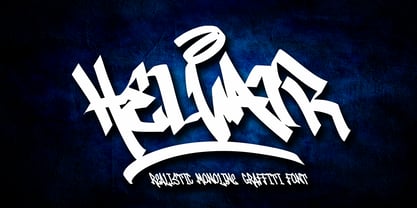 Helvair is a Handwritten font with a Realistic monoline graffiti style, with awesome swash perfect for your awesome urban designs. It will elevate a wide range of design projects to the highest levels, be it branding, headings, designs, invitations, signatures, logos, labels, and much more! Features: Uppercase Punctuation Swash PUA Encoded open Support for MAC or PC Simple installation for Adobe Illustrator, Corel Draw, Photoshop, or Procreate (New Updated)
 - Syakira by Sulthan Studio,
$10.00 Syakira Script has a romantic and modern calligraphic style, and is ready to give your design a fresh and fabulous Style. Syakira Script comes as a single font file packed full of great features and cuteness. Perfect for weddings, branding and romantic invitations and also suitable for various purposes such as digital lettering, headings, logos, wedding invitations, t-shirts, letterheads, signage and much more! Thank You, Sulthan Studio
 - Dansburg by Uncurve,
$30.00 Dansburg is an aesthetic vintage font, inspired from the past typography , elegant signage, gold leaf , sign painting and old label product. Dansburg comes with tons of alternates characters to make more eye cacthy . Dansburg Font is suitable for authentic logos, headings, sign painting, posters ,letterhead, branding, magazines, album covers, book covers, movies, apparel design, flyers, greeting cards, product packaging, and more. Finally BOOM..!! you get a great design for your project.
 - Asphaltica by Mevstory Studio,
$25.00 Asphaltica is a geometric sans serif font. This is a universal font that can be used for both headings and paragraphs, thanks to the customized kerning for bold style. The typeface includes uppercase multilingual letters, numbers and punctuation. I've found the font to be great for logos, titles and I enjoy using it with really wide spacing. Asphaltica is also included full set of: OTF, TTF Uppercase Lowercase Numbers & Punctuation
 - David And Sovhie by Silverdav,
$14.00 David and Sovhie is a formal script, and is ideal for wedding invitations, magazines, social media, restaurant menus, greeting cards, birthday invitations, feature headings and more. This font comes with a complete set of lowercase and uppercase letters, various punctuation marks, numbers and multilingual support. David and Sovhie includes 304 glyphs, uppercase and lowercase characters with ligature, numbers, many punctuation marks and up to 4 alternatives for each character.
 - Swine And Roses by Proportional Lime,
$1.99 It's cool to be square. Among the many strange attempts to conceal writing, these two systems allegedly used by the Masons have a wonderful simplicity and relative ease of use. Both systems, the Rosicrucian and Free Mason, (also called the Pigpen cypher) as simple replacement ciphers never offered very great cryptographic security, but certainly would ensure that the casual observer would not be able to read documents written in such scripts.
 - PR Hydra by PR Fonts,
$15.00 A sequel to my own Herakles font, with multiple faces, and more to come, so the name refers to his second labor, slaying the Hydra. The straight lines and sharp angles make it suitable for evoking the feel of many ancient civilizations where writing was cut into stone. Whether your heroic deeds include slaying mythical monsters, or making the best spanakopita in the city, this font is for you.
 - Black Home by Linecreative,
$14.00 Black Home Inspiring from vintage playful style typography. This font is perfect for a design that makes it more attractive and playful. made with a very good level of aesthetics making this font suitable for book cover, poster, packging, merchandise, logotype and much more. What you get dear, you will get : Black Home- including Upper & Lowercase characters(ALL CAPS), Numbers and Punctuation Supports Multi linguage (Latin Western Europe)
 - Oh Honey by Diana Kohne,
$16.00 Oh Honey is a handmade, feminine, new retro serif font made in 2021 by an artist who wanted to create an organic font to stand out in a world of rigid letterforms. Use Oh Honey for logos, headings, packaging, weddings, self help and fiction book covers and anywhere where you want to stand out with artsy sophistication. According to one font enthusiast, "This font is the typographic zeitgeist!"


