10,000 search results
(0.02 seconds)
- Felek by Mili + Wise,
$12.00 Introducing Felek - hand-drawn sans serif font with a lot of character. Playful, bouncy & cute. Perfect for creating logos, greeting cards, posters, packaging and so much more! Suitable also for longer paragraphs, for example in children's books. Its charming and warm character will help you give your project a truly unique feel. Designed and kerned with care and love to make using it a breeze. What you will get - a hand-drawn font with lots of stylistic alternates and ligatures - a dingbat font with 53 illustrations and icons - multilingual support with accented characters for international designers Happy creating!
 - American Scribe by Three Islands Press,
$39.00 The Declaration of Independence was authored by Thomas Jefferson, but his is not the classic handwriting on the engrossed copies familiar to most Americans. That belonged to Timothy Matlack, an early patriot who fought in the Revolution, sat as prosecutor at Benedict Arnold’s court martial, and also penned copies of a number of documents for then-General George Washington. Matlack’s script was compact but legible, perfect for the first and most famous of American documents. Now you, too, can write that way. Please note: The font does not include any of the signatures from the Declaration of Independence.
 - Aurisha Script by Matra Creative,
$14.00 Aurisha - Handwritten Font is an brush script font based on the expression of real handwriting, lets you transform type into an exciting and beautiful piece of work. Hand-lettered look adds a real human touch to things and comes along with a lot of loving details. Aurisha- Handwritten Font has lots of alternates that gives you possibility to build your text almost like handwriting with all the charming imperfections and variations that a real handwriting has. Aurisha will work perfectly for fashion, e-commerce brands, trend blogs, wedding boutiques or any business that wants to appear upscale
 - Lychee Farmland by Putracetol,
$25.00 Lychee Farmland - Playful Sans Serif Font. This font is a playful quirky font with a lot of character ligatures, as many as 90 ligatures. With a soft and warm appearance, it is suitable for all ages from children, teenagers and the elderly. This font is perfect for logos, greeting cards, quotes, svg, clothes, posters, logos and more. This font can be installed on MAC OS and Windows OS, it can also be installed in the procreate and cricut applications. Come with lot of ligatures character, its help you to make great lettering, quote, logos and. This font is also support multi language.
 - Oldash by Ilhamtaro,
$23.00 OLDASH is a bold, all-caps serif font, perfect for motorcycle and vintage-related designs. A fairly simple font with not much variation from the serifs of the past. With only a thick feature and the hook is a little fat. This font is also suitable for headlines or short texts not for paragraphs. This font is also suitable for modern designs. To enable the OpenType Stylistic alternates, you need a program that supports OpenType features such as Adobe Illustrator CS, Adobe Indesign & CorelDraw X6-X7. Guides to access all alternates glyphs : http://adobe.ly/1m1fn4Y Cheers!
 - Tide Sans by Kyle Wayne Benson,
$6.00 Tide Sans’ fresh, carefree, look makes you almost forget that you’re staring at a monitor and not on the beach. When Tide Sans is not surfing, you’ll find it at community college parties, giving free henna tattoos, or tossing a Frisbee to the dachshund next door. The Tide Sans family includes beautiful italics and an equally affable condensed set. Tide Sans does the work for you by providing a ridiculously large stylistic alternates set, fine tuned small caps, and a whole beach of alternate (amper)sands to feel between your toes. Also check out its kid brother, Tide Sans Condensed.
 - Martinez by Arterfak Project,
$11.00 Greetings. Introducing our new font, "Martinez". Made with vintage references like a cowboy, lumberjack, wooden and handcraft. A modern slab serif that you can apply for your headline, sub headline even your body text. There is a Normal and a Shadow style that gives you lots of possibilities. "Martinez" is a western font with a lot of features inside. Make your own combination with ligatures, alternates and swashes. Recommended for any style, especially vintage, retro, minimalism and contemporary design. This font is made with simple shapes that you can apply too in your print works like t-shirt, embroidery, posters and craft.
 - Blitanos by Youngtype,
$18.00 Blitanos-Handwritten is a hand brushed font created with a brush and ink, bold and irregular baseline. Contains a complete set of lowercase, uppercase, Alternates, ligatures, punctuation, numbers, and multilingual support. This font ideal for use in watercolor design or lettering style bold hand, such as blog header, posters, wedding elements, t-shirt, apparel, cover books, business cards, greeting cards, branding, merchandise, invitations and handmade quotes and more. How to access all alternative characters, using Windows Character Map with Photoshop: - https://www.youtube.com/watch?v=Go9vacoYmBw How to access all alternative characters using Adobe Illustrator: - https://www.youtube.com/watch?v=XzwjMkbB-wQ Thank you!
 - Copenhagen Grotesk by David Engelby Foundry,
$- From Weimar to København/Copenhagen, picking up some decadent traits on its journey. The design of Copenhagen Grotesk is inspired by the great German grotesque type design history, although it will not fall into ranks in all aspects. Indeed, Copenhagen Grotesk will not be put into one single time pocket of style, so you'll notice that there's a hint of art deco style in its capital letters. The visual expression is first and foremost firmly rooted in the style of Scandinavian design, so feel free to use Copenhagen Grotesk for functional typographic design in relation to multiple media types.
 - Yaddasht by Si47ash Fonts,
$24.00 The most popular Persian / Arabic handwriting fonts! Yaddasht [means Note], is a child-like, fantasy and simple handwritten font which supports Persian, Arabic and basic Latin. This font which comes in 2 weights, brings a full diacritics set with it. Shahab Siavash, the designer has done more than 30 fonts and got featured on Behance, Microsoft, McGill University research website, Hackernoon, Fontself, FontsInUse,... Astaneh text and headline font which is one of his latest designs, already got professional typographers, lay-out and book designers' attention as well as some of the most recognizable publications in Arabic/Persian communities.
 - Tupã by Just in Type,
$19.00 Tupã is the Brazilian indigenous word for thunder, that is worshiped like God in their mithology (in Tupi language). The typeface was developed to be strong and with great impact. The UPPERCASE was carefully designed with a lot of different features, and the lowercase is a mix of small caps and traditional forms, which brings a lot of personality and uniqueness to the design. Tupã familly is composed by two weights and four styles: Regular, Italic, Bold and Bold Italic. It’s a project recommended for titles, logos, posters and everything else you think it works. Take a look at the complete Specimen here.
 - Bounesva by Ilhamtaro,
$14.00 BOUNESVA is a bold, all-caps serif font, perfect for motorcycle and vintage-related designs. A fairly simple font with not much variation from the serifs of the past. With only a thick feature and the hook is a little fat. This font is also suitable for headlines or short texts not for paragraphs. In addition to vintage motorcycle designs, this font is also suitable for modern designs. To enable the OpenType Stylistic alternates, you need a program that supports OpenType features such as Adobe Illustrator CS, Adobe Indesign & CorelDraw X6-X7. Guides to access all alternates glyphs : http://adobe.ly/1m1fn4Y Cheers!
 - Duck Footprint by AaAAaAlena,
$10.00 This font looks like a natural gel pen handwriting. It supports both uppercase and lowercase Cyrillic and Latin alphabets, numeral, punctuation, symbols, currencies. The story of creating is short: I made a font that would support the concept of the website. And then it seemed to me that this font could have more uses, so I decided to share it. You can use it for any creative project, I’m not going to list examples not to limit you. I am sure that with this font you will convey the vibe you want. Just use imagination, and your masterpiece will look perfect)
 - ITC Lintball by ITC,
$29.99Eric Stevens's latest typeface, ITC Lintball, combines two unusual features: its letterforms are based on the serifless lettering inscribed in stone by the ancient Greeks, yet the wobbly edges of the strokes, and especially the slightly wider “lintballs” on the ends, suggest lettering done on paper with a modern felt-tip pen. The ball motif is carried through in the fat dot under the raised capital O, and in the similar dot used in place of a crossbar in the capital A. There's an angularity to many of the strokes, especially in the lowercase, that gives Lintball its distinctive character. - Purveyor by Hustle Supply Co,
$18.00 Purveyor Purveyor is a bold modern sans serif with a lot of character. This will be your "Work Horse" for a lot of projects. It works nicely for projects that require a more refined yet vintage aesthetic. Purveyor is a simple yet refined All-Caps sans serif. I had a ton of fun making the specimens for this font, which is usually a good sign that I'll use it regularly. Purveyor includes 8 versions: Regular, Rounded, Rough, Textured (+ 4 Oblique Versions). Purveyor comes with Western European Characters. By the way, I included 2 R's - Just uppercase and lowercase to access
 - The Yoshi by Vim ddd,
$15.00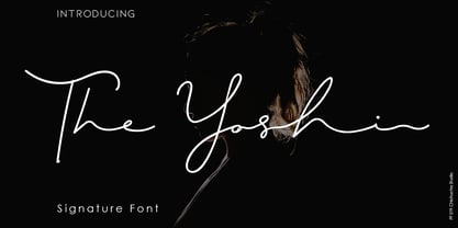 The Yoshi is a beautiful signature font and can make your design project look elegant, classy and modern. This font is perfect for branding, invitations, stationery, wedding designs, social media posts, product packaging, product designs, label, photography, watermarks, special events and more. It comes with full set of uppercase and lowercase letters, ligatures and alternates. How to Enable OpenType Features in Word, Photoshop and Illustrator: https://medialoot.com/blog/how-to-enable-opentype-features-in-Microsoft word-photoshop-and-illustrator/ Hope you enjoy with this font. If you have any questions please don't hesitate to drop me a message :) Thank You, Chichucha Studio
 - Channel B by Just My Type,
$25.00 Channel B was derived from the logo for Channel B, a British entertainment internet channel, anchored by former Soccer AM presenter Tim Lovejoy at www.dailymotion.com/channelbee. I’m not sure what it was in 2008 when I first ran across the logo, but that elegant capital B seemed to cry out for a font to support it. Many of the capitals, numbers and other glyphs of Channel B are split into a top and bottom, but not all. The tall, condensed capitals are contrasted to the rounded lowercase (derived from the bottom half of the B, rotated 180°).
 - VVDS Rashfield by Vintage Voyage Design Supply,
$20.00 Rashfield is a soft serif type family in 5 weights and italics. Inspired by classical Windsor mood in Woody Allen movie titles, with outward bent h, m, n and a lot of modern alternates. Softly character with a hint of retro feeling. Rashfield has a lots of stylistic alternates that makes it very playful in various uses like logos, prints, branding, web design, packaging and more. Use it to create short powerful phrases and headlines and also use it in longer text like paragraphs and block texts. Perfect for modern projects with a little retro mood feel.
 - Double Frames by Putracetol,
$22.00 Introducing Double Frames - Display Font, a font with unique shape. there are two styles – standard and decorative. The modern and powerful display font you've been looking for. Each character is carefully crafted until the result is perfect. A lot of detail is preserved when characters are digitized, so uppercase looks fantastic up close Come with open type feature with a lot of alternates, its help you to make great lettering. best uses for wedding invitation, invitations, signature, typography lettering, branding, label, poster, logos, quotes, product packaging, header, merchandise, social media & greeting cards and many more. Double Frames is also support multi language.
 - Dear Penpal Script by Giaimefontz,
$6.00 This is a fully connected script font, not calligraphic, but entirely designed to follow handwritten cursive ligatures rules as teached in schools. In order to correctly visualize it, you have to enable OpenType features (Contextual Alternates, Discretionary Ligatures, Standard Ligatues and Kerning). Trying to write All Capitals will generate Block Letters writings, since cursive style doesn't allow more than the first uppercase per word, however this font is not meant to be a Block Letters font. Using specific type combinations will generate special glyphs. All of these features are intended to reproduce a classic schoolboy or schoolgirl notebook.
 - Angelica Angelina by Shape Studio,
$10.00 Angelica Angelina is a hand brush font created with brush and ink. Angelica Angelina This typeface is ideal for use in bold watercolor designs or handwritten styles, such as blog titles, posters, wedding elements, t-shirts, clothing, book covers, business cards, greeting cards, branding, cafe / restaurant signs. merchandise, etc. Contains the complete set: - Uppercase - Lowercase - alternative - fasteners - Punctuation - number - Multilingual support. How to access all alternative characters, using the Windows Character Map with Photoshop: - https://www.youtube.com/watch?v=Go9vacoYmBw How to access all alternative characters using Adobe Illustrator: - https://www.youtube.com/watch?v=XzwjMkbB-wQ Thank you!
 - KillSwitch by Comicraft,
$19.00 Not all our font releases come with an emergency full stop triggered by a BIG RED BUTTON. And not all font releases come with a Caution: NEVER TOUCH THAT SWITCH! Even if you really want to. You're going to touch it, aren't you? Be advised: even an untrained user with impaired executive function can operate KILLSWITCH, so we've hidden the BIG RED BUTTON where it can NEVER BE FOUND. This Comicraft mechanism may cause injury or death; please study all literature regarding the safe handling of Comicraft fonts posted in your workplace or adjacent cyberspace. KillSwitch
 - Double Pineapple by Putracetol,
$25.00 DoublePineapple - Playful Quirky Font. This font is a playful quirky font with a lot of character ligatures, as many as 85 ligatures. With a soft and warm appearance, it is suitable for all ages from children, teenagers and the elderly. This font is perfect for logos, greeting cards, quotes, svg, clothes, posters, logos and more. This font can be installed on MAC OS and Windows OS, it can also be installed in the procreate and cricut applications. Come with lot of ligatures character, its help you to make great lettering, quote, logos and. This font is also support multi language.
 - Portello by Greater Albion Typefounders,
$14.50 Portello is a display family in the tradition of Tuscan advertising and display faces. It's a family of three 'all capital' faces. A perpendicular regular form is offered, along with an italic form (a true italic - with purpose designed glyphs-NOT merely an oblique) and a basic form for small text - which dispenses with the family's characteristic outlined look. It offers the spirit of the Victorian era with ready and distinctive legibility. It's ideal for poster work, especially at large sizes, and for signage with a period flair. Why not give your work the flair of colorful 19th century commercial design today?
 - Better Kamp by Ingrimayne Type,
$6.00 BetterKamp was originally constructed in 1995-6. It was not constructed to meet any specific purpose but out of curiosity, to see what the result would be if two quite different faces were blended. KampIngriana is the offspring of BetterTypeRight, which has characteristics of a typewriter face without the monospacing, and KampFriendship, which mimics a serifed face drawn by hand. The original blending had many oddities that I did not clean up until 2020 when I also added the semi-bold weights. BetterKamp lacks polish and elegance, but it is very readable at small point sizes.
 - Zhang QA - Unknown license

- John Sans by Storm Type Foundry,
$49.00 The idea of a brand-new grotesk is certainly rather foolish – there are already lots of these typefaces in the world and, quite simply, nothing is more beautiful than the original Gill. The sans-serif chapter of typography is now closed by hundreds of technically perfect imitations of Syntax and Frutiger, which are, however, for the most part based on the cool din-aesthetics. The only chance, when looking for inspiration, is to go very far... A grotesk does not afford such a variety as a serif typeface, it is dull and can soon tire the eye. This is why books are not set in sans serif faces. A grotesk is, however, always welcome for expressing different degrees of emphasis, for headings, marginal notes, captions, registers, in short for any service accompaniment of a book, including its titlings. We also often come across a text in which we want to distinguish the individual speaking or writing persons by the use of different typefaces. The condition is that such grotesk should blend in perfectly with the proportions, colour and above all with the expression of the basic, serif typeface. In the area of non-fiction typography, what we appreciate in sans-serif typefaces is that they are clamorous in inscriptions and economic in the setting. John Sans is to be a modest servant and at the same time an original loudspeaker; it wishes to inhabit libraries of educated persons and to shout from billboards. A year ago we completed the transcription of the typefaces of John Baskerville, whose heritage still stands out vividly in our memory. Baskerville cleverly incorporated certain constructional elements in the design of the individual letters of his typeface. These elements include above all the alternation of softand sharp stroke endings. The frequency of these endings in the text and their rhythm produce a balanced impression. The anchoring of the letters on the surface varies and they do not look monotonous when they are read. We attempted to use these tricks also in the creation of a sans-serif typeface. Except that, if we wished to create a genuine “Baroque grotesk”, all the decorativeness of the original would have to be repeated, which would result in a parody. On the contrary, to achieve a mere contrast with the soft Baskerville it is sufficient to choose any other hard grotesk and not to take a great deal of time over designing a new one. Between these two extremes, we chose a path starting with the construction of an almost monolinear skeleton, to which the elements of Baskerville were carefully attached. After many tests of the text, however, some of the flourishes had to be removed again. Anything that is superfluous or ornamental is against the substance of a grotesk typeface. The monolinear character can be impinged upon in those places where any consistency would become a burden. The fine shading and softening is for the benefit of both legibility and aesthetics. The more marked incisions of all crotches are a characteristic feature of this typeface, especially in the bold designs. The colour of the Text, Medium and Bold designs is commensurate with their serif counterparts. The White and X-Black designs already exceed the framework of book graphics and are suitable for use in advertisements and magazines. The original concept of the italics copying faithfully Baskerville’s morphology turned out to be a blind alley. This design would restrict the independent use of the grotesk typeface. We, therefore, began to model the new italics only after the completion of the upright designs. The features which these new italics and Baskerville have in common are the angle of the slope and the softened sloped strokes of the lower case letters. There are also certain reminiscences in the details (K, k). More complicated are the signs & and @, in the case of which regard is paid to distinguishing, in the design, the upright, sloped @ small caps forms. The one-storey lower-case g and the absence of a descender in the lower-case f contributes to the open and simple expression of the design. Also the inclusion of non-aligning figures in the basic designs and of aligning figures in small caps serves the purpose of harmonization of the sans-serif families with the serif families. Non-aligning figures link up better with lower-case letters in the text. If John Sans looks like many other modern typefaces, it is just as well. It certainly is not to the detriment of a Latin typeface as a means of communication, if different typographers in different places of the world arrive in different ways at a similar result.
 - ALS Direct by Art. Lebedev Studio,
$63.00 ALS Direct is an open and dynamic typeface with clear-cut letterforms that make it instantly readable. It lends text a neutral, yet agreeable and modern feel. Direct has nine font styles convenient for the purposes of navigation signage. Regular-style letterforms are rather wide, because direction signs are likely to appear before readers at an angle, so the type needs to withstand perspective distortions. And as signs and boards may vary in size, Direct was developed to include several width variations. Condensed fonts can be used where horizontal space is limited, allowing you to keep proper height and readability of the characters. A signage typeface must be easily readable from some distance away and have simple letterfoms with clear-cut features to quickly identify characters. Designing a type for a potentially wide range of purposes calls for a universal approach. If not destined to be used for navigation in a particular building, it shouldn’t incorporate any peculiar elements to agree with certain design or architecture. All of the above determined our choice of a sans serif with large apertures and definite features allowing readers to instantly recognize letters. Descenders are made compact not to interfere with the line below. And the low contrast between thick and thin strokes renders all elements equally perceptible. The x-height is significant, close to the cap height, which inhances readability of the lowercase type. There are two reasons why directions must not be set in all caps. Firstly, lowercase letters are more diverse and include ascenders and descenders identifying some of the letters in the line. And secondly, having learned to read, people recognize word shapes rather than individual letters, which makes lowercase text more readable. With Direct being a signage typeface, first to be developed were its width variations, and different weight styles and italics were added later. Another thing to be kept in mind was that signs often use dark background colors, and black type on a white background appears smaller than white type on a black background. Direct is the first Cyrillic typeface created for navigation purposes. Before that, designers could use the Cyrillic version of Frutiger (Freeset) developed by Adrian Frutiger for the Paris Charles de Gaulle International Airport, and a number of other, mostly body copy, neutral sans serif types. However, signs and boards were dominated by Arial, which Direct would be glad to replace offering elegance and lucidity of form instead of type bluntess. Direct was designed as a signage typeface, but its neutral style and clear-cut letterforms suggest various other ways of application.
 - La Jolla ES - 100% free

- York Script ES - Unknown license

- BoomBox - Unknown license

- CHEESE - Unknown license

- Drowning Monkey - Unknown license

- Olde European ES - Unknown license

- Urbax by Eko Bimantara,
$16.00 Urbax; Bold expressive script for urban people and urban projects. Fit for Logo, Brand, Titling, Shirt, Hoodie, Products, Signage, Prints and Various Creative Projects. Contain 5 stylistic sets with lot of alternates. Contain basic latin multilanguage support.
 - Emotional Expression by Seemly Fonts,
$14.00 Emotional Expression is a cute and simple lettered handwritten font. It can easily be matched to an incredibly large set of projects, so add it to your creative ideas and notice how it makes them stand out!
 - Cheedo by Aah Yes,
$7.95Cheedo is a bold funky font with a white internal stripe, with two variations - one having occasional outline stars, the other without. The packages contain both OTF and TTF versions -install either OTF or TTF, not both. - Dizzy Boy by Mchcrafter,
$14.00 Dizzy Boy is a cool and thin lettered display font. It can easily be matched to an incredibly large set of projects, so add it to your creative ideas and notice how it makes them stand out!
 - Cut Sans Serif by Aksharasarovara,
$25.00The thought behind this font was not to join vertical, horizontal and diagonal stems. Each stem is designed separately and arranged in a good manner to create glyphs. Something different from tradition; liberal, but in the limit. - Be Kind by Seemly Fonts,
$12.00 Be Kind is a sweet and simple handwritten font. Its friendly feel makes this font incredibly versatile, fitting a wide range of contexts. Add it to your creative ideas and notice how it makes them stand out!


