10,000 search results
(0.022 seconds)
- Ahoura by Naghi Naghachian,
$58.00 The Ahoura font family, designed by Naghi Naghashian, was developed considering specific research and analysis on Arabic characters and definition of their structure. The Ahoura innovation is a contribution to modernisation of Arabic typography; gives the Arabic font letters real typographic arrangement and provides for more typographic flexibility. This step was necessary after more than two hundred years of relative stagnation in Arabic font design. Ahoura supports Arabic, Persian, and Urdu and includes proportional and tabular numerals for the supported languages. The Ahoura Font family is available in three weights; Light, Regular and Bold. Each has two different styles-- normal and italic. Ahoura is the first real italic Arabic typeface known until now and its intuitive design arrangement fulfils the following needs: - It is precisely crafted for use in electronic media and it fulfils the demands of electronic communication. Ahoura is not based on any pre-digital typefaces and it is not a revival. Rather, its forms were created with today’s ever-changing technology in mind. - Ahoura is suitable for multiple applications, and gives the widest potential for acceptability. - It is extremely legible not only in its small sizes, but also when the type is filtered or skewed, e.g., in Photoshop or Illustrator. Ahoura's simplified forms may be artificially obliqued with In Design or Illustrator, without any degradation of its quality for the effected text. - Ahoura is an eye-catching and classy typographic image that developed for multiple languages and writing conventions. - Ahoura uses the very highest degree of geometric clarity along with the necessary amount of calligraphic references. The Ahoura typeface is of a high vibration that is finely balance between calligraphic tradition and the contemporary sans serif aesthetic commonly seen in Latin typography.
 - The Dellgado by Pista Mova,
$15.00 The Dellgado is the font of choice for writing things beyond words. This typeface is designed with great detail to convey stylish elegance. So, it can be said, the character of the transformation is very beautiful, a kind of classic ornamental copper script. The Dellgado provides alternative variants of most fonts, binders and many calligraphy tips, ideal for elegant labels, high-end packaging, stationery and compositions for certain brands, beautiful titles, paragraphs, letters and short text, intended for read only with the eyes or meant to be whispered into someone's ear. The Dellgado includes various language support. It features OpenType with alternative styles and elegant binders. The OpenType features don't work automatically, but you can access them manually and for best results your creativity will be required in combining variations of these Glyphs. And also a touch of ornament makes this font look elegant. To enable the OpenType Stylistic alternative, you need a program that supports OpenType features such as Adobe Illustrator CS, Adobe Indesign & CorelDraw X6-X7, Microsoft Word 2010 or a later version. (Windows), Font Book (Mac) or a software program such as PopChar (for Windows and Mac). How to access all alternative characters using Adobe Illustrator: https://www.youtube.com/watch?v=XzwjMkbB-wQ How to use the font style set in Microsoft Word 2010 or later versions: https://www.youtube.com/watch?v=NVJlZQ3EZU0 There are additional ways to access the alternative/swash, using the Character Map (Windows), Nexus Font (Windows) Font Book (Mac) or a software program such as PopChar (for Windows and Mac). How to access all alternative characters, using the Windows Character Map with Photoshop: https://www.youtube.com/watch?v=Go9vacoYmBw If you need help or advice, please contact me by email Regards Mova Pista
 - Geometria by Brownfox,
$44.99 Although geometric Sans Serifs have been in vogue for nearly a century, they have never been as ubiquitous. It is not improbable that the old adage would be phrased: “When in doubt, set it in geometric sans”, had it been composed today. Have we not had enough? We think, not. Postmodern times demand a variety of expressions. The vision behind Geometria was to revisit the perennial favorite to lend subtle individuality to its tried and true forms. Geometria stands out in the crowd of similar fonts thanks to its complicated nature. It combines dynamic elements with a certain degree of stability. A slightly higher waistline of the capitals contributes to their distinctive appearance. If the upper case refers to the American grotesques of the 19th century, the lower case tends toward the forms of the Renaissance in its proportions. Geometria is a typeface of clean shapes that is well-suited for continuous reading, and it sets remarkably well. At the same time, it can be friendly, even flirtatious. Its distinct personality combines seeming opposites. At times it may appear serious, at times playful. On occasion, it may be deliberate, other times dynamic. It could seem rigid, then elegant. It is a typeface that could be perceived either as cutting-edge, or as nostalgic. A careful and discerning typographer will bring out and emphasize those aspects of its multifaceted personality that are needed to solve the problem at hand. Geometria consists of 24 fonts — eight weights with matching italics and narrow styles. The font includes multiple sets of figures and currency signs, alternate glyphs, a variety of experimental ligatures, and punctuation marks for the two cases. The 835 glyphs support 72 languages. Granshan 2013 award.
 - Handwriting1800 - 100% free

- Farckenzlabb - 100% free

- Stargazers - Unknown license

- ActionIs - Unknown license

- Gobbledegook - 100% free

- Firefly - Unknown license

- MonstoCaps - Unknown license

- FarHat - Unknown license

- Chuck Chillout - Unknown license

- Cerbature - Unknown license

- Hyper Kinetic - Unknown license

- Fearless - Unknown license

- Tirade by Fontosaurus,
$19.95I'm not sure where the inspiration for Tirade originally came from, but it looks like a good rant, hence the name. - Number 515 by Wooden Type Fonts,
$20.00 A display style, with protuding bulb round ends at the serifs and mid-points, very bold, lower case originally not designed.
 - Wandhen by RahagitaType,
$16.00 Wandhen is handwritten brush font suitable for a lot of projects. such as flyers, crafting, logo, banner, packaging, design product, etc.
 - Lagniappe by Funk King,
$5.00 Lagniappe is a thin decorative font. Kerning is not the best on this one. You may want to adjust as needed.
 - Goodwine by Gleb Guralnyk,
$15.00 Hi. Presenting a simple and elegant font named "Goodwine" includes lots of characters with many languages support (West European, Cyrillic, etc...).
 - Squidink by Gleb Guralnyk,
$15.00 Introducing a calligraphic script font named Squidink. This smooth font is perfect for lettering, has lots of ligatures and multilingual support.
 - Shakeout by PizzaDude.dk,
$20.00 A legible sans serif, with bouncy edges. A little loose but not too jumpy! Comes with a fi and fl ligature.
 - Cayenne by Luxus,
$25.00 Cayenne is an all-caps hand-lettered font in three weights, two dotted versions and an outline and an inline font.
 - Technomat by Storm Type Foundry,
$10.00Technomat takes inspiration from matrix or thermal dot printers. Minimalistic construction and soft edges makes it legible from 3 point size. - Tonys Trees by Komet & Flicker,
$10.00 Tony’s Trees was inspired by the handmade signs down at the local Christmas tree lot. A fun-forest of typographic possibilities!
 - Olean by Andfonts,
$15.00 Olean is modern handwritten font, with including a lot of alternates and ligatures. Great for headlines on posters, packaging and advertising.
 - Angel Eyes by Autographis,
$39.50 Angel Eyes is a wide, swinging stylized brush script with a lot of personality, a unique look and very good readability.
 - Bladis Night by Scoothtype,
$10.00 Bladis Night is a font duo between a serif and modern script fonts. Bladis Night is good for logo branding, wedding invitation, typography wedding, quotes text, magazine, or anything you want to do. Bladis Sans Serif includes numbers punctuation, alternates, and it also supports other languages. Bladis Night was built with OpenType features and includes ligatures, beginning and ending swashes , numbers, punctuation, and it also supports other languages. Thank you!
 - Syakira by Sulthan Studio,
$10.00 Syakira Script has a romantic and modern calligraphic style, and is ready to give your design a fresh and fabulous Style. Syakira Script comes as a single font file packed full of great features and cuteness. Perfect for weddings, branding and romantic invitations and also suitable for various purposes such as digital lettering, headings, logos, wedding invitations, t-shirts, letterheads, signage and much more! Thank You, Sulthan Studio
 - Romi by Scholtz Fonts,
$15.00Romi is a legible, feminine, script font, suitable for wedding invitations, valentine cards, beauty products, or wherever a soft, romantic image is sought. Suggestions for use: - wedding stationery - greeting cards - valentines day media - beauty product media - lingerie tags - women's magazine pages - classical music media The font is fully professional: carefully letterspaced and kerned. It contains over 235 characters - (upper and lower case characters, punctuation, numerals, symbols and accented characters are present). - Magic Ivy by Anmark,
$18.00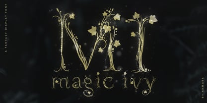 I’m pleased to introduce my decorative font Magic Ivy. Magic Ivy is a fantasy font to add a touch of magic to your designs! Unique uppercase letters are ideal for your wedding monograms and logos. Use this botanical font for wedding invitations, branding, packaging, magazines, florist shops, social media, restaurant menus, greeting cards, headers, poster, fabulous book cover and many more. Magic Ivy comes with uppercase, lowercase, numerals and punctuation.
 - Somia by Creativemedialab,
$22.00 Somia font is a modern, attractive and beautiful font. It has many alternates characters with nice curves that you can arrange to create a nice logo lettering or use as a poster display. Add a few alterations to it to make beautiful eye-catching words. Somia font is best for logo lettering, headlines, product packaging, t-shirt design, wedding theme, poster, book covers, wedding invitations, Christmas and more.
 - Octavus Caps Black - Personal use only

- Octavus Black - Personal use only

- Campuni by Identity Letters,
$29.00 A charming confidant. Italic, but without the slant. Campuni is a sans-serif typeface that can be described as an “upright italic”: its letters are modeled on the handwritten forms of italics—but without the slant. This gives Campuni a contemporary, charming, and trustworthy character. As with most modern sans-serif typefaces, Campuni’s design is based on low-contrast, almost monolinear strokes with a neat and clear appearance. This is where Campuni’s steep and tapered joints come in: with a bit of contrast, they provide the perfect foundation for a steady rhythm between characters—just like you’d find in meticulous handwriting. Careful spacing ensures that this rhythmic character is preserved on the page and on screen, making for a pleasant reading experience. It’s not just the letterforms that gain from Campuni’s calligraphic heritage, though. This typeface is packed with calligraphy-style swash capitals and end swashes on lowercase letters, as well as discretionary ligatures. These are available via OpenType, allowing you to spice up your logo or headline with a hint of calligraphy in a breeze. Despite its flawless legibility in body text, Campuni is definitely eye-catching in display sizes. (Decrease letterspacing for some additional punch.) Besides logo design, Campuni is a great choice for branding, advertising, packaging, corporate design, or even signage and wayfinding. The range of topics that Campuni excels in varies from food, leisure, retail, e-commerce, music, and travel to games, toys, childcare, and family-themed events. Campuni has got an Extended Latin character set, seven sets of figures, case-sensitive forms, arrows, and a few other advanced typographic features—622 glyphs in total. Its eight weights span from Thin to Black.
 - VLNL Bromfiets by VetteLetters,
$30.00 Vette Letters are thrilled to add maverick designer Dirk Uhlenbrock to the family, with the release of VLNL Bromfiets. Bromfiets (the Dutch word for moped) is a ‘holiday child’, the basic idea coming from a stop at a road junction in the Dutch coastal province of Zeeland. The Dutch signage, the black and white rings of traffic light poles, the symbols for brom- and snorfiets have always appealed to Dirk. While on vacation in Zeeland the first scribbles and digital drafts were created, always in mind that the typeface had to be striking, clear and friendly. The end result is more than that, a strong and instantly recognisable font with a matching dingbat weight full of icons and arrows. Stencil fonts have always interested Dirk, the informal character and the possible universal use as a paint- or spray-stencil on a wide variety of surfaces makes this type of font so interesting for me. The technically necessary dissolution of closed font contours always ensures a special aesthetic: What’HAT and HOW MUCH has to be removed or left, in order to make words easy to read and to avoid a fractal impression. Dirk Uhlenbrock has been working as graphic designer and illustrator in his hometown Essen, Germany for over 30 years. Always interested in typedesign he got in contact with Fontographer in 1996 and started to create and distribute loads of free fonts through his online platforms ‘Eyesaw’ and ‘Fontomas’. A bunch of these type experiments have been extented on request to complete fonts. Still located in Essen in 2009 Dirk started his second owner-based business erste liga büro für gestaltung - ersteliga.de
 - Breakfast Pastry by Missy Meyer,
$12.00 I’d been thinking for a while about making a serif font with ball terminals: big fun round ends to the letters anywhere I can squeeze them in. So I made Breakfast Pastry! I started with a hand-drawn set of basic letters, then went hog-wild making alternates and ligatures galore with fun swirls, curls, and even more balls! I’ve cleaned the letters up significantly to make them smooth and easy for any cutting or printing you may want to do, but I’ve also left in some of the hand-drawn character so that the letters are warmer and not too formal. Then I took the first font, and made a second solid version without the cutouts. After that I thought: I tend to make plumper fonts ... why not make an even thinner version? So I did! All three versions have the same character set (over 700 glyphs total), which means they all have the same extras and alternates. All three fonts have over 300 extended Latin characters for language support, as well as over 200 bonus items: alternate letters, letters with swashes, two-letter ligatures, small caps, catchwords, and even some bonus ornaments and elements to make the fonts even more flexible. (After all, if one swash on a letter is good, two or three might be great!)
 - Studio Neon by LLW Studio,
$22.00 Studio Neon is an all-caps display font constructed with three rounded-end strokes; the lowercase set is included as a repeat of the uppercase to make setting type just that little bit easier. It’s a modern rendition of neon sign lettering, with a decidedly art deco pedigree, and is intended for use in larger sizes of type, upwards of 36 pt. It’s perfect for a design that wants to imitate neon — use Photoshop layer effects to light it up! I originally started this font with only a few letters, since I could not find a neon-style font made with 3 strokes that looked modern. (Once I started, I found out why. It's a LOT of work!) Most traditional neon fonts include a “bent tube” element in the design; however, not all modern neon signage is constructed with the tubes bent. I also wanted to design a fun font that would have more life than just as an imitation of signage — something to inspire designers who love the geometry of art-deco type. So I made all the corners consistent, with no references to bent tubes. Use this font for any application that needs a bold and decorative look. Studio Neon should work well for sign production and even vinyl cut applications at larger sizes.
 - Cubio Mono by R9 Type+Design,
$38.00 Cubio™ Mono is a new monospaced geometric sans serif inspired by the hexagonal silhouette of isometric cubes. We applied this angular form through all aspects of Cubio™ type design from the overall look of letters and icons down to the small details such as the end of each letter stem and hexagonal dotted lines. This font family comes in 3 weights/styles: 300 (Regular), 500 (Medium), and 700 (Bold). With over 1,500 glyphs, Cubio™ Mono not only supports most Latin-based languages, but also features an extensive set of UX/UI icons, and patterns. Cubio™ Mono is a versatile typeface for both digital and traditional designs. Perfect for packaging design, logo design, print design, store signages, UX/UI web & apps designs. Cubio™ Mono packed with features such as case-sensitive marks, punctuations and math symbols. It also comes with an extensive set of box/compartment drawing glyphs to help you create a unique modern design without even using the line tools. We designed the Cubio™ Mono font system with your convenience in mind. It comes with two sets of hexagonal dotted line and icon positions (Mid Cap Height and Mid X-Height ), so you don’t have to use the baseline shift command to set them to the perfect spots. To find out more about Cubio™ Mono Opentype features and type specimen, please visit www.r9typedesign.com
 - VLNL Thueringer by VetteLetters,
$30.00 We cannot imagine anyone not liking beer. Especially on a warm summer night there is simply little that can top an ice cold brewski. And with the current wave of home-brewed ales and lagers, Vette Letters decided to not stay behind and brew its own brand. Just so we can design our own beer bottle label using our own font. VLNL Thueringer comes from the drawing board of Jacques Le Bailly (a.k.a. Baron von Fonthausen), the German-French specialist in the fields of both beer and type design. One day Jacques got inspired by Albrecht Dürers 15th century Fraktur (blackletter) alphabet, and decided to design a contemporary rounded version of it. Although the historic context is clearly visible, Thueringer definitely stands its own ground. It's a modern techno-style blackletter with a (beer)truckload of interesting design details. Thueringer contains a number of ligatures and an alternate set of numbers. Apart from the regular uses like logos, posters, flyers and headlines we definitely would like to see our Thueringer used on beer bottle labels and crates, but also cafés and hipster bars would do well with this modern-day blackletter. Hell, even wine or liquor labels, football team jerseys, Oktoberfest flyers, it's just too much to mention. As long as it is accompanied by a cold beer.


