10,000 search results
(0.033 seconds)
- Handsome by Shinntype,
$50.00 Handsome was the first digital typeface to resemble nice, ordinary, fully cursive handwriting. Or neon. In 2005, Handsome Pro was one of the first script typefaces to utilize the OpenType format to simulate the natural quality of writing, by automatically substituting alternate contextual glyphs. The effect follows the conventional “joining rules” of calligraphy, which are a formalization of the way in which letter forms are modified in cursive handwriting for the sake of speed and efficiency—and also perhaps to make life more interesting. For the look of real handwriting, Handsome is most convincing at around 15 pts. At much smaller or larger sizes it works differently. At display size, the feel of the non-nib styles is very slick, more like a speedball Kauffman, owing to the smoothness of the finish. As script fonts go, Handsome has a relatively large x-height, which can be useful if you don't want the “writing” to look too small.
 - Solpera by Storm Type Foundry,
$32.00This type face fills one of the gaps between the world of Roman alphabets and that of linear alphabets. The first to be designed was the set of upper-case letters. The expression of these characters cannot conceal that they were originally intended only for the sculptor's use, as a type face for three-dimensional inscriptions. Their width proportions reflect a dialogue between the contemporary feeling and the legacy of classical Roman inscriptions. The type face was later complemented with a set of lower-case letters and elaborated into further designs. Its clear, concise letter forms end with small serifs which not only make the type face more refined, but above all anchor the individual letter signs visually to the horizontal of the text line. The austere construction of the majority of the letters is balanced by the more exuberant, humanizing forms of the most frequently used letters "a"; "e". (The three variants of the lower-case "e" enable to create rhythmically differentiated texts.) The letters in which a straight stroke is connected with an arch are designed in two ways. That means that the letters "n", "h","m" and the group of letters "b","d","p","q" are conceived in a different way. Thus an interesting tension is created in the structure of the text, which, however, does not endanger legibility. The economizing, slightly narrowed design of this type face predetermines its use for the setting of usual texts. In larger sizes, however, it produces a rather serious, even solemn, impression. - Hamlet by Canada Type,
$24.95Based on a specimen of an obscure and uncredited old face called Kitterland, Hamlet is one of those curiosities hardly ever noticed in the world of modern fonts, the kind that infuses a variety of historic Blackletter and calligraphy traits in an otherwise Roman alphabet. Such typefaces, what few of them exist, are almost always classified by typophiles as traditional decorative Roman alphabets. We beg to differ. We think such hybrids are fascinating enough to deserve a classification of their own. And we think today's aspiring letterers and type designers would benefit from paying special attention to this kind of hybrid alphabet, not only because it has much more hand than machine in it, but also because it is a prime example of how to succeed in mixing different lettering techniques into one self-contained and distinctly functional alphabet. As in any efficient mixture of lettering methods, Hamlet ended up with characters that are uniquely its own, such as the cupped A, M, V, W and Y, the very luscious and inviting curves on the arms of E, F, L and T, both single- and double-story forms of the a, and the humblest, friendliest g and y ever. A dozen alternate characters are sprinkled throughout the character set, so check out the map for a few pleasant surprises. We also made the Handtooled and Headstone styles because we thought these friendly forms were just crying out for such treatments. The Handtooled version turned out quite lovely, if we may say so ourselves, perhaps even better than the main font. The Headstone version is available as a free bonus to those who purchase the complete Hamlet package. All Hamlet styles come with lining figures as well as old style ones. Hamlet comes in all popular font formats. The OpenType fonts contain push-button swapping alternates and figures, which come in handy in software programs that support this kind of thing. - SK Pangramma by Shriftovik,
$48.00 SK Pangramma is a modern universal geometric typeface. For greater universality, it was developed in two stylistic variations: sans serif and slab serif. The uniqueness of the typeface is supported by stylistic alternatives that give the character set the spirit of modern typeface design. The SK Pangramma typeface is named this way because it supports more than 200 languages, including the Extended Latin Alphabet, Cyrillic, and even Greek. Thanks to a wide range of characters, alternatives, and two stylistic variations, the typeface is great for design projects of any complexity, no matter whether it is printed products or web design.
 - Avenir Next Paneuropean by Linotype,
$99.00 Avenir Next Paneuropean is a new take on a classic face—it’s the result of a project whose goal was to take a beautifully designed sans and update it so that its technical standards surpass the status quo, leaving us with a truly superior sans family. This family is not only an update though, in fact it is the expansion of the original concept that takes the Avenir Next design to the next level. In addition to the standard styles ranging from UltraLight to Heavy, this 56-font collection offers condensed and semi condensed faces that rival any other sans on the market in on and off—screen readability at any size alongside heavy weights that would make excellent display faces in their own right and have the ability to pair well with so many contemporary serif body types. Overall, the family’s design is clean, straightforward and works brilliantly for blocks of copy and headlines alike. Akira Kobayashi worked alongside Avenir’s esteemed creator Adrian Frutiger to bring Avenir Next Pro to life. It was Akira’s ability to bring his own finesse and ideas for expansion into the project while remaining true to Frutiger’s original intent, that makes this not just a modern typeface, but one ahead of its time. Complete your designs with these perfect pairings: Dante™, Joanna® Nova, Kairos™, Menhart™, Soho® and ITC New Veljovic®.
 - Cherily Blussom by PizzaDude.dk,
$15.00 Cherily Blussom was made with an inky pen, and little was done to correct the blurry edges. That's why Cherry Blussom stands out in such an authentic way! Comes with both ligatures and alternates - combine them and spice up your text!
 - Noad Sans by Groteskly Yours,
$60.00 Noad Sans is an experimental sans serif typeface with a strong character and some very unique visual features. At the core of Noad Sans is a sturdy sans serif with closed apertures and fairly simple letterforms. The defining feature of Noad Sans, however, is its visualised nodes: all control points of Bézier curves in each of the fonts in the family are intentionally visualised. The effect of this feature is largely defined by the usage: in titles and larger bodies of text, the visualised nodes stand out and create a rhythmic pattern of their own. In smaller sizes, the sans serif base of the font becomes more prominent and the nodes create a visual fuzz. Noad Sans comes in 6 styles and as a Variable Font with two axes–Optical Size and Slant. The size of each node can be changed from the smallest (Mini and Mini Italic) to the largest (Extra and Extra Italic). Variable Font technology allows you to fine tune the size of the nodes and the slant angle, so that your version of Noad Sans can be truly unique. Noad Sans has a large character set of 570+ glyphs, covering the vast majority of Latin based languages. In addition to that there are dozens of special characters, punctuation, numbers, and symbols. Noad Sans is equipped with a number of useful OpenType features, such as Case-Sensitive Punctuation, Stylistic Alternates, Ligatures, Fractions and many more. Noad Sans began as an experimental project, and during its development the spirit of experimentation was at the heart of the project. Thanks to the unique nature of the typeface, it can feel at home in a variety of settings: from web development, graphic and product design to more novel uses like 3D and NFTs. Noad Sans type family includes 6 static fonts (Mini, Mini Italic, Regular, Regular Italic, Extra and Extra Italic) and one variable font. Each style can be purchased separately. There is a free trial version of Noad Sans that can be downloaded free of charge on MyFonts. For more information on the typeface, feel free to download Noad Sans PDF Specimen.
 - Groovy Syndrome by Haksen,
$18.00 Groovy Syndrome is perfect for shirts, retro designs, procreate, stickers, logos, branding, greeting cards, Cricut projects, posters, magazines, social media, prints and more! There are three fonts included - Regular, Outline and Extrude. You can use these three fonts to create your own retro quotes and words! Hope You enjoy it. All the Best, Haksen
 - Pink Gladiolus by madeDeduk,
$15.00 Pink Gladiolus is a modern brush script! It comes with two variations and bonus ornaments. This font perfect for all your designs project, events and more. Feature Uppercase Lowercase Numbers & Symbol International Glyphs Alternative Uppercase Alternative Lowercase Ligatures If you need anything else just shoot me on email at: dedukvic@gmail.com Hope you enjoy it.
 - Diosa Rubia NF by Nick's Fonts,
$10.00This svelte type family, whose name translates as "Blonde Goddess", is ideal for creating loquacious headlines in tight spaces, as well as dense informational blocks such as movie credits. Available in three weights. This font contains the complete Latin language character set (Unicode 1252) plus support for Central European (Unicode 1250) languages as well. - Sewing Patterns by Lauren Ashpole,
$15.00 When I created my first website, I loved using vintage sewing pattern illustrations in my designs. Thinking back on it, I wanted to create a dingbat inspired by those images and Sewing Patterns is the result. The font features ladies-fashions in silhouette form for uppercase and lowercase letters and childrens- styles for the numbers.
 - Monster Night by Supfonts,
$13.00 Monster Night spooky halloween font will be perfect for halloween lettering, beautiful frame for your home, book covers, greeting cards, logos, marketing, magazines or anything that requires cute handwritten lettering :) What's inside: Monster Night Regular Monster Night Sharp Multilingual support Cricut support If you have any questions, please contact me directly or in instagram @superdizigner
 - Twenty Night by Aminmario Studio,
$20.00 Twenty Night is a modern handwriting font. Its charm makes it appear wonderfully, readable, and, ultimately, incredibly versatile. This font will look outstanding in any context, whether it’s being used on busy backgrounds or as a standalone headline! Comes in Regular and Italic styles. Thank you for your purchase! Hope you enjoy with our font
 - Delightful Monoline by Supfonts,
$12.00 Delightful Monoline DUO will be perfect for wedding lettering, beautiful frame for your home, book covers, greeting cards, logos, marketing, magazines or anything that requires cute handwritten lettering :) What's inside: Delightful Monoline Script Delightful Monoline Sans Swashes Multilingual support Cricut support If you have any questions, please contact me directly or in instagram @superdizigner
 - Komix Eighties by Figuree Studio,
$18.00 Say hello to Komix Eighties font. Made with love and joy. Comic look, so it will make your design more beautiful, cute, fun, and colorful. It comes With three awesome styles. Features: - Character Set A-Z (All-caps) - Numerals and Punctuation (OpenType Standard) - Accents (Multilingual characters) - PUA Encode I hope you can enjoy the font :)
 - Cashmere by Larin Type Co,
$12.00 Cashmere - sweet handwritten font with an incredible charm. Clean, elegant, it fits and turns any design project into a true stand out! Use this font for branding or create a logo, a beautiful frame for your home, decorate any project. Or just use it for book covers, stationery, marketing, a blog, magazines, and more.
 - Mermaid Babies by Subectype,
$14.00 Mermaid Babies is a fun, jolly and incredibly charming display font. It embodies playfulness and authenticity and is the perfect choice for any children activity or school project. What's Included : - Multilingual Support I hope you enjoy this font. If you have any questions please don't hesitate to drop me a message :) Thank You, Subectype
 - Fresh Pineapple by Zeenesia Studio,
$12.00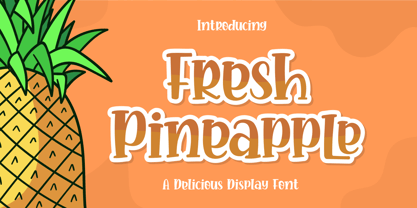 Fresh Pineapple, Delicious handwritten font. It is a beautiful quirky font that perfect for a lettering project like t-shirt design, mugs, advertisements, cutting vinyl, silhouettes, book covers, posters, business cards, social media and more. It supports multiple languages and offers PUA encoding. The doodles make this font so perfect. Hope you love it
 - Kids Toys by Hatftype,
$15.00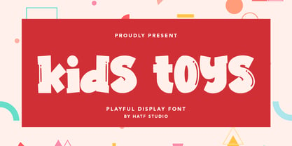 Is a simple display font with distinctive handwritten characters perfect for branding projects, logos, wedding designs, media posts, advertisements, product packaging, product designs, labels, photography, watermarks, invitations, stationery, and any project who need handwritten dishes. Features : • Character Set A-Z • Numerals & Punctuations (OpenType Standard) • Accents (Multilingual characters) • Ligature I really hope you enjoy it.
 - Talesian by Viaction Type.Co,
$15.00 Talesian is in an original handwriting style, and looks very natural and beautiful. It is suitable for boutique brand, photography, magazine, quote, business card, logo, poster and many more. There are two weights: regular and bold, script is equipped with OpenType features such as ligatures and multilingual support. I hope you enjoy and thank you.
 - Anttalla by Attype Studio,
$15.00 Anttalla is modern script calligraphy font, include front swash and ending swash for lowercase glyph, combine it to make the best word for your design. Anttalla font perfectly match for design like banner, book cover, t-shirt, branding, promotion, social media post, quotes, wedding, photography and more. Hope you enjoy with our font! Attype Studio
 - Brskovo by TypeClassHeroes,
$14.00 Introducing Brskovo is a modern uppercase serif, use this font for any branding, product packaging, invitation, quotes, t-shirt, label, poster, logo etc. Feature - Uppercase & Lowercase - Number & Symbol - International Glyphs - Multilingual support - Alternative - Ligature Feel free to drop us a message any time and follow my shop for upcoming updates Hope you enjoy it.
 - Bandoleer by MADType,
$24.00 The inspiration for this versatile typeface came from both Art Deco and Military sources. It comes with both a clean geometric and hand drawn version so you don't have to get carpal tunnel sketching it out yourself. This typeface is equally at home stenciled with paint on a wall or used on a music poster.
 - Kaos by Wiescher Design,
$39.50 On a huge garbage bin in Lisbon I saw the sentence, “Perdidos no kaos”, which means lost in chaos and I really liked the rough stenciled lettering. Back home I designed a typeface that wasn't quite as chaotic as the lettering on the garbage container. Yours – always on the lookout for great typefaces – Gert Wiescher
 - Smooth Fantasy by Din Studio,
$29.00 Smooth Fantasy is designed with a chic and natural handwritten style, and makes for a beautiful typefaces. Smooth Fantasy is best used for logotype, branding, quotes, and more. Features: - Ligatures - PUA Encoded - Multilingual Support - Numerals and Punctuation I hope your project design would be more beautiful with this Smooth Fantasy. Happy Design :) Thank You!
 - Ludwig Sans by Hyber Type,
$40.00 Ludwig Sans is a modern Sans Serif Font Family inspired by american Gothics. It also contains many Alternates that are inspired by Ludwig Sütterlin’s Latin Script from 1911. All those Alternates can be combined seamlessly within the neutral Sans Serif Typeface, so you get both: a bread-and-butter type and a display font.
 - Cheese Tarts by Supfonts,
$12.00 Cheese Tarts will be perfect for wedding lettering, beautiful frame for your home, book covers, greeting cards, logos, marketing, magazines or anything that requires cute handwritten lettering :) What's inside: Cheese Tarts Font Multilingual support Cyrillic support / Поддержка русского языка Cricut support If you have any questions, please contact me directly or in instagram @superdizigner
 - Better Summer by Din Studio,
$29.00 "Summer is Never Ending :D" Introducing a Better Summer Script. Made from a chic brush, it will make your design more beautiful. Includes: Better Summer (OTF) Features: Character Set A-z Numerals and Punctuation (OpenType Standard) Accents (Multilingual characters) PUA Encoded Beautiful ligatures I hope you can enjoy the font as you enjoy the summer :)
 - Bemsod Decker by madeDeduk,
$14.00 Introducing Bemsod Decker is a casual handwritten font and will be perfect for book, title branding, product packaging, invitation, quotes, label, poster, logo etc. Feature Uppercase & Lowercase Number & Symbol International Glyphs Multilingual support Alternative Ligature Feel free to drop us a message any time and follow my shop for upcoming updates Hope you enjoy it.
 - Irrlicht by Aarhaus,
$30.00 Irrlicht is based on C. H. Kleukens’ 1923 typeface Judith Type . Whilst Dunkle Irrlicht is a fairly faithful rendition and extension of Kleukens’ typeface, the Licht style was initially added as a stand-alone stencil version; yet, the two styles work perfectly together – for different nuances, for emphasis or simply stacked/layered. Irrlicht is equipped with upper- and lowercase ligatures, contextual and stylistic alternates, fractions, superior and inferior figures, extended language support and a few extra goodies. Additional information – How Irrlicht came to life Christian Heinrich Kleukens cut his Judith Type in 1923, at the peak of German expressionism, exclusively for publications with the Ernst-Ludwig-Press, such as a limited series of biblical prints – the first being the Book of Judith , hence the original’s name. I stumbled upon this typeface a couple of years ago in a nice little 1930 booklet of the Gutenberg-Gesellschaft and was struck by its forceful darkness on paper and its seemingly simple, crude letterforms. The lack of a long-ſ in the final version of Judith Type – quite unusual for a German typeface of that time – adds to this feel of crudeness and spontaneity*. Judith Type seemed to me like a semi-blackletter cousin of Rudolf Koch’s typeface Neuland (cast in the same year). Besides its apparent affinity with expressionism, it reflects a lot of that deeply spiritual craftsmanship of the era – much like Neuland. A few months later, when I was working on a stencil project and looking for a typeface that could be cut into thin wooden plates easily, I remembered those dark, sharp letters that seemed to be lacking any curves at all. After enlarging a few letters and tracing them by hand, the whole set was redrawn digitally, using only straight lines. As for spacing, the goal was to keep the letters tight but to avoid touching characters – without ironing out all the original’s tension and rhythm. Deliberate kerning, subtle contextual alternates and ligatures help to deal with critical glyph combinations. Two additional versions were developed: a stencil version with open counters and, in reference to a popular style of the 1920s and inspired by dry, cracked wood, an inline version. These two additional styles were later merged into one font – Lichte** Irrlicht was born. — AARHAUS * Consequently, the original typeface’s German eszett is simply a ligature of the “round s” and standard z . In some of his publications, Kleukens dispenses with using eszett altogether and sets double s instead. Irrlicht , however, does feature a more common eszett (ß); the original, among other more faithful letter forms, can be accessed via the stylistic sets feature ** licht – literally bright – being the German term for inline typefaces – not to be confused with leicht ( light )
 - TT Fellows by TypeType,
$39.00 TT Fellows useful links: Specimen | Graphic presentation | Customization options There can't be too many universal fonts! Meet TT Fellows, a new workhorse whose functionality allows you to comfortably use the font in a variety of projects. Calm and neutral at first glance, the mood of TT Fellows can change. Working with the typeface, you can reveal its soft and friendly nature, or even the brutal one, for example, by typing the text exclusively in capital letters in the bold style. TT Fellows is easy to use and perfect for setting large text arrays. Thanks to the font's uniwidth and versatility, the font is ideal for use on websites or in periodicals. Bold styles will work harmoniously in headlines or as accents in print or on packaging. TT Fellows is a humanist sans serif with a mechanical touch. With its open shapes, the friendly neutral character of thin weights and an even softer character in bold weights, the new typeface differs in character from the classic TT Norms® and TT Commons sans serifs, while still offering the same functionality. Calm regular styles differ from bold, deliberately display and more expressive ones. By the way, TT Fellows is a unwidth typeface. It was important for us that the user could change the styles, knowing that the layout will not suffer. The typeface features equal width proportions, open apertures, and slightly squared ovals, which associatively brings it closer to other popular modern fonts. Since the idea of the typeface was focused on it being a uniwidth typeface, we needed to fit the bold styles into the regular em squares, which led to interesting graphic solutions that are noticeable, for example, in the k and ж characters, in which the branches are cut directly into the stems. TT Fellows consists of 19 styles: 9 upright, 9 italic and 1 variable, each with over 700 glyphs. The font has 26 useful OpenType features. For example, there is a switch to single-part versions of letters a and y, fractions, tabular characters, case versions of punctuation, and localized versions of characters for different languages. There is a ligature for a combination of two characters of a complex design fl. TT Fellows font field guide including best practices, font pairings and alternatives.
 - Guinevere Pro by Canada Type,
$29.95 Guinevere Pro is a typeface designed by Icelandic art director Sigurdur Armannsson. It started in 2001 as simple hand-drawn sketches of a few letters built from modules, then became an experiment with four goals: - Construct an original alphabet from a specific set of predetermined modules. - See how certain letter forms built without said modules would behave within the totality of the module-constructed alphabet. - See if certain letters would actually enforce their own shapes to be drawn a certain way within the totality of the typeface. Likewise, see if the totality of the alphabet demands that individual letters be drawn in a specific way, and if so, how much room for variation would there be? - See how all of the above reacts/changes to implementing the alphabet across different weights. The experiment was finessed and re-worked over many years of technology changes, and Guinevere Pro is the final outcome, ten years later. The Guinevere Pro set is four cross-platform Open Type fonts, with built-in small caps, alternates, ligatures, and support for a wide range of Latin-based languages.
 - Gutenberg A by Alter Littera,
$- This is a free abridged edition of the full-featured Gutenberg B and Gutenberg C fonts. Although (as the name suggests) it was originally conceived as the first release in the B42-type series, it actually represents the colophon to this series. In addition to having a narrower scope, the font differs from its full-featured predecesors in both letter and word spacing, as well as in glyph design, using exclusively straight lines for every glyph and providing a significantly rough appearance at medium to large point sizes. The font includes the usual standard characters for typesetting modern texts, as well as a few special characters, alternates and ligatures that can be used for typesetting nearly as in Johann Gutenberg’s 42-line Bible and later incunabula. Please note that the use of this free font is subject to the same terms and conditions as those for Alter Littera’s pay fonts. Specimen, detailed character map, OpenType features, and font samples available at Alter Littera’s The Oldtype “Gutenberg A” Font Page.
 - Antique Initials by Kaer,
$19.00 Hello, friends! I have a good news! At last I have finished working on my Antique Initials color font. Wow! It was a long and hard work because every initial is unique. I sketched each letter of the font very scrupulously from scratch. Each letter is uniquely designed and has a unique flower pattern in the background. I used a pale old color palette to color these letters. There came out two font variants: a black and white and a nice colored one. The font contains initials from A to Z (26 characters, lowercase glyphs are same). I hope you enjoy this font. Follow my shop to receive updates of products and the very hottest news! If you have any question or issue, please contact me: kaer.pro@gmail.com Please request to add additional characters and glyphs if you need! Thank you! You can use color fonts in PS since CC 2017, AI since CC 2018, ID since CC 2019, QuarkXPress since 2018, Pixelmator, Sketch, Affinity Designer Since macOS 10.14 Mojave, Paint.NET Windows only. Please note that the Canva do not support color fonts!
 - Selfie Neue Sharp by Lián Types,
$29.00 INTRODUCTION When I started the first Selfie back in 2014 I was aware that I was designing something innovative at some point, because at that time there were not too many, (if any) fonts which rescued so many calligraphy features being at the same time a monolinear sans. I took inspiration from the galerías’ neon signs of my home city, Buenos Aires, and incorporated the logic and ductus of the spencerian style. The result was a very versatile font with many ligatures, swashes and a friendly look. But… I wasn’t cognizant of how successful the font would become! Selfie is maybe the font of my library that I see the most when I finally go out, (type-designers tend to be their entire lives glued to a screen), when I travel, and also the font that I mostly get emails about, asking for little tweaks, new capitals, new swashes. Selfie was used by several renowned clients, became part of many ‘top fonts of the year’ lists and was published in many magazines and books about type-design. These recognitions were, at the same time, cuddles for me and my Selfie and functioned as a driving force in 2020 to start this project which I called Selfie Neue. THE FONT "Selfie for everything" Selfie Neue, because it’s totally new: All its glyphs were re-drawn, all the proportions changed for better, and the old and somehow naive forms of the first Selfie were redesigned. Selfie Neue is now a family of many members (you can choose between a Rounded or a Sharp look), from Thin to Black, and from Short to Tall (because I noticed the feel of the font changed notoriously when altering its proportions). It also includes swashy Caps, which will serve as a perfect match for the lowercase and some incredibly cute icons/dingbats (designed by the talented Melissa Cronenbold, see also Selfie Neue Rounded for more!) which, as you see in the posters, make the font even more attractive and easy to use. You'll find tons of alternates per glyph. It's impossible to get tired with Selfie! Like it happened with the old Selfie, Selfie Neue Sharp was thought for a really wide range of uses. Magazines, Book-covers, digital media, restaurants, logos, clothing, etc. Hey! The font is also a VF (Variable Font)! So you can have fun with its two axes: x-height and weight, in applications that support them. Let me take a New Sharp Selfie! TECHNICAL If you plan to print Selfie Neue VF (Rounded or Sharp), please remember to convert it to outlines first. The majority of the posters above have the "contextual" alternates activated, and this makes the capitals a little smaller. I'd recommend deactivating it if you plan to use Selfie for just one word. Use the font always with the "fi" feature activated so everything ligatures properly. The slant of the font is 24,7 degrees, so if you plan to have its stems vertical, you may use Selfie with that rotation in mind. THANKS FOR READING
 - Bradley Gratis - Unknown license

- Hopeless Romantic Society by PeachCreme,
$23.00 An imperfectly charming handwritten font, "Hopeless Romantic Society", is here to liven up your design works. This carefree ligature-filled handwritten typeface was influenced by writings that were sloppily produced by hand. With these 55 ligatures, your designs will have that extra layer of authenticity. Whether you're looking to create a playful logo or send a handwritten letter, this typeface is the way to go.
 - Widdershins by Hanoded,
$15.00 I like strange words. Widdershins is one of them: it means ‘to go counter clockwise’ and I picked it up from a book I am reading at the moment. Widdershins font was created using a broken bamboo satay skewer and Chinese ink. It is a little messy, uneven and maybe even unnerving, but I am sure you’ll find a way to put it to good use.
 - Afrikana by Mina Arko,
$18.00 Afrikana is based on various African letters and signs. The main inspiration for making this typeface was the book by Saki Mafundikwa, Afrikan Alphabets. Letters were designed based on signs and characters from African alphabets. They were than cut out of cardboard, scanned, traced and put in a font. You are free to modify the font in any way and have fun with it.
 - Chronic by PintassilgoPrints,
$24.00 Chronically strong, yet pacific. Chronically bold, yet friendly. This font was at first inspired by a HAP Grieshaber work and soon incorporated elements from pieces by Willem Sandberg, two astonishing artists who lived through two world wars. They had to struggle for freedom and consistently manifested, with words, works and actions, their absolute love of liberty. Both were chronically free. As this font intends to be.
