10,000 search results
(0.019 seconds)
- Quantico by MADType,
$21.00 Quantico is an angular typeface family that was inspired by old beer packaging and military lettering. It utilizes 30 degree angles and completely straight lines to form unique character shapes. Equally at home in text or display settings, Quantico includes 3 alternate characters as well as several ligatures.
 - Hello Hellen by Hrz Studio,
$14.00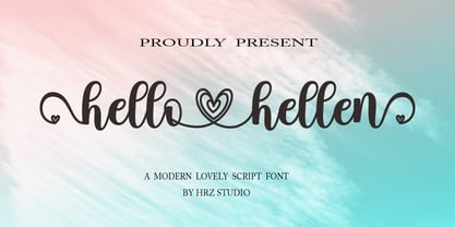 Hello Hellen is a lovely and delicate script font that exudes elegance and class. This font was particularly crafted for those who need a beautiful and refreshing look to their designs. Hello Hellen Script is PUA encoded which means you can access all glyphs and swashes with ease!
 - VLNL Wood Burger by VetteLetters,
$35.00 We all love a good burger here at Vette Letters. We also love to prepare them ourselves. Grilling the patties, cutting the tomatoes and cucumber, nothing beats a home made hamburger. And the best and tastiest way to grill a burger is on a wood charcoal grill. So all in all we can safely say that burgers and wood are a pretty darn good combination. This made Donald Roos decide to design VLNL Woodburger, obviously based on 19th century American wood type alphabets. Donald decided to add cyrillic characters, as he strongly believed that Russians would be equally partial to home made burgers. VLNL Woodburger is not really polished font, it will give any design a rough sturdy edge.
 - Envoy by Tim Rolands,
$20.00 Envoy is a serif type inspired primarily by Garalde oldstyle types like those of Claude Garamond. As such, it is particularly well suited for book and magazine text. Characteristic details more typical of Venetian oldstyle faces serve to give Envoy just a bit more personality. The base family includes regular, italic, bold, bold italic and small capitals. Expert sets add ligatures and alternate letterforms. Display sets include letterforms customized for titling. Originally designed in 1995 and 1996, for the 1996 Morisawa International Typeface Design Competition, Envoy was later revived, completed and publicly released in 1998. During the initial design, the family was known as Truman in honor of Northeast Missouri State University becoming Truman State University, but the name was changed to Envoy prior to entry in the competition.
 - Marian Churchland Journal by Comicraft,
$39.00 Tall, thin and elegant, Marian Churchland’s fonts are very much like her.. and now available from those awfully nice chaps at Comicraft to allow you to pretend that you are too! Marian Churchland was born in Canada in 1982, and was raised on a strict diet of fine literature and epic fantasy video games. She has a BA in Interdisciplinary Studies (English Literature and Visual Arts) from the University of British Columbia, and has been doing professional illustration work, including book covers and magazine articles, since she was 17. Last year, she became the first woman to solo-illustrate a CONAN story, and this year she’s illustrating three issues of ELEPHANTMEN for Image Comics. Artwork by Marian Churchland from Elephantmen #20. See the families related to Marian Churchland Journal: Marian Churchland .
 - Irena by Hanoded,
$15.00 Irena is a cubist/expressionist font inspired by Vojtěch Preissig. Preissig (1873-1944) was a Czech typographer, printmaker, illustrator and teacher, whose work was influenced by Japanese Art and Symbolism. During WWII, Preissig supported the Czech resistance and he was arrested in 1940. He died on June 11th in Dachau concentration camp. This font was named after his daughter Irena Bernášková. The Irena font is angular and square(ish), yet easy to read. It comes with extensive language support.
 - Graphic Stylin NF by Nick's Fonts,
$10.00The letterforms are based on Inserat Cursive, a bold script popular in the late nineteenth century; the treatment was suggested by cover artwork for Graphic Styles from Victorian to Post-Modern, written by Stephen Heller and designed by Seymour Chwast. Included in the font are several handy ink blots (section mark and superior numbers positions), a stylish tailpiece (florin position), and a couple of ink bottles patterned after those on the bookcover (bar and broken bar). - Angustina by Diego Massaro,
$30.00 Angustina is an elegant display typeface, it takes inspiration from classic letter styles. I chose the font name after reading the classic Italian novel “The Tartar Steppe”. I was inspired by the sickly, stoic and mysterious man who differs for his willingness to stay at Fort Bastiani. Angustina conveys distress and stinging sensation with extreme contrasts between thick and thin strokes and exasperated serifs. The alternate of hairline and bracketed serifs gives Angustina a modern and military appearance.
 - Rehn Condensed by moretype,
$40.00 With all the features of its wider relative, Rehn Condensed has been specifically designed for those situations where space is a premium. Rehn and Rehn Condensed together offer a complete package suitable for a wide range typographic applications.
 - Manifesto Bold by Solotype,
$19.95In digitizing this old font, we took great liberties with the design, removing some jarring elements. The result reads much more smoothly than the original, retaining the overall character of the original. Hope you don't mind, Mr. Beeler. - Rollicking Polly by Happy Heart Fonts,
$19.99 This is my frilly, girly font I created in 2011. It's my version of my teenage handwriting. I hope you enjoy it and use it often. It's perfect for fun scrap-booking projects or making cute tags etc.
 - Blancs by 4RM Font,
$30.00 Blancs font is created with the utmost value of aesthetics and classy aura, with an anatomical feature that is geometrical, with an extended style. This font is suitable for use in graphic design, especially those with futuristic themes
 - Xmas by Linotype,
$29.99Christmas cookies have already slowly crept onto your local supermarket's shelves -- the Linotype Xmas Fonts just can't wait any longer! Ravishingly friendly and universally applicable: Fuenfwerken -- a design studio from Wiesbaden, Germany -- is proud to present its latest Fun Font Family. Bringing variety to the dry Christmas card genre, these fonts can also be used on posters to spread holiday cheer at home. No limits are placed on your creativity here! The family has three different fonts, each with more than 60 symbols inside: Xmas Story includes the whole figure palette necessary for a classical Christmas story. From a cute little Baby Jesus to the Three Wise Men and woolly Aramaic sheep and everything that one needs to add special flair to a letter to grandma, or to set up a Nativity Scene at home for the kids is included. Customers who aren't searching for a biblical font should check out Xmas Essentials. This font contains typical non-denominational end-of-the-year holiday ornaments, such as snowflakes, decorated Christmas trees, nutcrackers, and stars. Last but not least is the Xmas Modern font. Just as global warming poses severe risks to snowmen, this font will make recipients of your holiday and New Year's cards melt. Glyphs such as Santa Claus riding on a Vespa -- complete with iPod -- speed away from normal, stuffy holiday seriousness, and signal that the Fun Generation has arrived! The best choice, of course, is to treat yourself to all three fonts this Christmas. Then you'll be prepared for every situation. Happy Holidays! - Libertat by Elyas Beria,
$9.00 In a not-too-distant future, humanity was ruled by a powerful, technologically advanced empire known as the Synod. The Synod controlled all forms of communication, and through this, they controlled the minds of the people. But a small group of rebels, known as the Resistance, had managed to evade the Synod's surveillance and formed a secret underground movement. They were determined to overthrow the Synod and restore freedom to the people. One of the Resistance's key members was a young artist named Trystån. He had a unique talent for creating powerful, visually striking posters that captured the spirit of the Resistance's message and spread it to the masses. Trystån had just completed a new poster, one that would be critical to the Resistance's plans. It depicted a single, outstretched hand holding a traditional Kimarii laser staff, with the words "Libertat!" emblazoned across the top. The poster featured a striking and powerful font that perfectly captured the spirit of the Resistance's message. The font was a combination of bold lines, elegant confident curves, and strong angles, giving it a sense of strength and determination. The lettering was large and prominent, filling up much of the poster, making it hard to miss. The letters seemed to be almost carved into the surface, giving the impression of something that was permanent and unshakable. The font was colored in dark shades, and was a sans serif typeface, that gives the message a very modern and current feel yet also feels vintage and retro, connecting the present with the struggles of the past. And with multilingual support, the typeface ensured that the message of the Resistance could be disseminated in every language on the planet. The background was minimalistic and in contrast, with a neutral palette, with just a hint of a sand-like color, representing the harsh conditions of the land that the people were fighting for their rights. The focus was all on the lettering, and how it conveyed the message. The poster was indeed a moving piece of graphic design, with its strong, striking font, and powerful imagery. It was clear that Trystån had put a lot of thought and care into its design. The poster, he hoped, would connect with people on an emotional level and inspire them to rise up against the oppression of the Synod Empire. The poster was set to be distributed at a major rally in the capital, where the Resistance was hoping to gain the support of thousands of citizens. But the Synod was not about to let this happen. They had long suspected the existence of the Resistance and had been working to infiltrate their ranks and discover their plans. The night before the rally, the Synod launched a surprise raid on the Resistance's hideout, capturing Trystån and several other members of the Resistance. Trystån was thrown into sand pits and interrogated by the Synod's top agents. They wanted to know everything about the Resistance's plans, including the details of the poster and the rally. Trystån, knowing the importance of the poster, refused to give in, even under the harshest of conditions. Meanwhile, the rally was drawing near, and the Resistance was desperate to get the poster out to the public. They knew that it was their only hope of gaining the support they needed to overthrow the Synod. They came up with a plan to smuggle the poster out of the hideout, but it would be a risky endeavor. As the rally began, the Resistance made their move, slipping the poster into the hands of the crowd. Trystån's poster had made a big impact in the rallies, and soon it became the symbol of hope for the resistance, and the visual representation of their struggle for freedom. The poster had become the catalyst for the revolution, and it would be remembered for many years to come as the symbol of the fight for freedom and democracy. The image of the outstretched hand holding the Kimarii laser staff struck a chord with the people, and they began to rise up against the Synod's oppression. Trystån, still locked away in the sand pits behind a stasis feild, could only imagine the scene unfolding outside. But he knew that his work had helped to spark a revolution, and he felt a sense of pride and accomplishment. The Resistance, with the help of the rally, was able to overthrow the empire, and Trystån was released, celebrated as a hero and hailed as the artist who helped to bring about the new era of freedom and democracy. The poster Trystån had designed had become the symbol of a new era, and it would hang in museums and public places as a reminder of the power of resistance and art, in the face of oppression. Features: regular and light weights numbers and punctuation multilingual characters
 - Newgate by Factory738,
$15.00 Introducing NEWGATE, a trendy font that is both retro and contemporary, is now available. Its thick curves give it a 70s groovy vibe, while the serifs return it to tradition. NEWGATE fits right in with those vintage moodboards and logos. It has separate lower and uppercase letters, as well as numbers, punctuation, and multilingual letters. The Ligature fonts will come in handy for anything your imagination can dream up! 5 Weights (Light, Regular, Semibold, Bold, Black) Basic Latin A-Z and a-z Numerals & Punctuation Stylistic Ligatures Multilingual Support for ä ö ü Ä Ö Ü ... Free updates and feature additions Thanks for looking, and I hope you enjoy it. Check out Leonardo Sans which is a great pair for Newgate.
 - Dubbo by Factory738,
$15.00 I present to you Dubbo, a new retro serif! Dubbo is a fashionable font that is both retro and bold. Its thick curves give it a 70s groovy vibe, while the serifs bring it back to traditional. Dubbo fits right in with those retro mood boards and vintage logos. It includes a distinct lower and uppercase, as well as numbers, punctuation, and multilingual letters. The Ligature and Alternate fonts are sure to come in handy for whatever your imagination can conjure up! 5 Weights (Light, Regular, Semibold, Bold, Black) Basic Latin A-Z and a-z Numerals & Punctuation Stylistic Alternates & Ligatures Multilingual Support for ä ö ü Ä Ö Ü ... Free updates and feature additions Thanks for looking, and I hope you enjoy it.
 - Intermediate JNL by Jeff Levine,
$29.00 The letters and numbers of a home movie titling kit from circa the 1950s or 1960s called the Magna Tech Titler Number 312 were die-cut from cardboard with a magnetic backing and were styled after Futura Bold. The user of this set composed the desired title or phrase onto a metalized board and the result was photographed with their 8 or 16mm camera. Because the dies of the characters were handmade, very slight variations in the shape and stroke width of the lettering would occasionally occur. These variations were incorporated into the design of the digital type face. Intermediate JNL is available in both regular and oblique versions.
 - Devil Kalligraphy by Lián Types,
$17.00Devil Kalligraphy was performed by Argentina Lián Types in 2007. The shapes of each caracter have a strong personality. It was based on antique writings. Devil Kalligraphy was inspirated in calligraphy styles. Gothic and Uncial themselves. A mix with lots of personal qualities. Devil Kalligraphy has ligatures which look evil. Ascendents and descendents were designed to look that way too. Kerning was designed taking into account the way calligraphers used (and still use) to write: Pattern looking. - Schoolyard Stencil JNL by Jeff Levine,
$29.00 A vintage lettering stencil manufactured by the E-Z Letter Stencil Company of Baltimore, Maryland was the model for Schoolyard Stencil JNL, available in both regular and oblique versions. Re-drawn digitally and following the actual bend of the steel rule dies used to cut the stencils, this typeface has not been cleaned up from its original design. Upon close examination, you will find straight angles and slight curves in the most unusual places. This was representative of the difficult work involved in bending steel cutting rule material and fitting it into small areas. For many years, E-Z Letter was the main competitor to the Stenso Lettering Company; the originator of the oil board stencil lettering guide complete with automatic spacing holes. Anyone over 40 will well-remember lettering their science fair posters, report covers and ring binders with these stencils.
 - Naive Line Sans by S&C Type,
$8.00 Naïve Line Sans is an unusual handwritten sans serif font designed by Fanny Coulez and Julien Saurin in Paris. Our goal was to draw a font with finely irregular lines that give a human and whimsical feeling. We designed five weights, finely balanced, to assure a good readability whatever the size. This font is part of our Naïve superfamily that contains lot of variations: Line, Inline, Serif, Sans Serif, and a special Art Deco one. Just click on our foundry name to see them all! We hope you will enjoy our work. Merci beaucoup!
 - Charlemagne by Adobe,
$29.00The capital alphabet Charlemagne was designed in 1989 by Carol Twombly. The basic forms are modelled on those used in classical Roman engravings. They are distinguished by pointed serifs which sometimes extend beyond the bounds of the forms, for instance on the E, F and S. These serif forms have made other historial appearances, for example, in handwritten rectangular capitals of the 9th century. The serifs lend the typeface a light ornamental touch. Charlemagne is a typical titling typeface and is best used in large and very large point sizes to emphasize its classical elegance. - AggressIan by Hackberry Font Foundry,
$13.95 AggressIan is the release of the first font I ever drew. It was done by hand with triangle and parallel rule back in the mid-1980s. I originally called it Aggressor, but I never liked it. My local type designer friend, Ian Roberts, really likes this type of drawing and told me I had to release it. So I named it after him. The small caps should work well if you need a bolder version. It has oldstyle and lining figures, plus the small cap figures. I hope you like it.
 - Zigzag by Volcano Type,
$60.00 ZIGZAG is a funny font family whose letters have four varieties each in order to multiply expressions and attract the eye by breaking the rhythm of reading. There are two styles available Rounded and Not Rounded. The variations oscillate between a hand-drawn design and a geometric or imaginative drawing. Opentype’s function lets you choose between different variations of each glyph and contextual variables allow to mix the styles. Benoît Bodhuin designed ZIGZAG Rounded in 2011/12 for the theatre Vivat. In 2013 ZIGZAG Rounded was supplemented by ZIGZAG Not Rounded.
 - Metalet Modern JNL by Jeff Levine,
$29.00Metalet Modern JNL was based on the letters found within the Metalet Movie Titling Set manufactured by the Modern Display Advertising Company of Hollywood, California circa the 1940s. Each stamped metal letter would be affixed to the background surface via the use of miniature magnets. Once in place, titles for home movies or slides could be photographed, the letters then returned to their storage area in their box. The character shapes show unusual stroke movement, which means the original models used for these letters were most likely hand-drawn. - Naive Line by S&C Type,
$8.00 Naïve Line is an unusual handwritten serif font designed by Fanny Coulez and Julien Saurin in Paris. Our goal was to draw a font with finely irregular lines that give a human and whimsical feeling. We designed five weights, finely balanced, to assure a good readability whatever the size. This font is part of our Naïve superfamily that contains lot of variations: Line, Inline, Serif, Sans Serif, and a special Art Deco one. Just click on our foundry name to see them all! We hope you will enjoy our work. Merci beaucoup!
 - Ye Paradigma by Yinon Ezra,
$30.00 Sans-serif, with clean and fresh Character. "Ye Paradigma" has been established in order to keep its forms as simple as possible - without losing the unique character of each letter, and without simplifying too much. The process was gradual, like the ripening of a sauce that leaves it to be reduced to strengthen flavors, so the letters ripened while reducing unnecessary details, until the taste became more concentrated and uniform. The result is a clean, fresh, remarkably useful 24 fonts typeface, with a clear and stable graphic language.
 - Sassoon Primary Cond by Sassoon-Williams,
$48.00 Those who design books for young children should consider the different needs of their readers. When laying out pages for young readers, particular care should be taken over word spacing. Don't forget that justifying short lines disrupts spacing. Justification should be used only when absolutely necessary. In the research undertaken with young readers the importance of consistent spacing was clear. It also appeared that the poorer readers profited from wider word spacing, while spacing that suited the poorest readers, positively annoyed the better readers. These typefaces have built-in letter spacing because of their exit strokes, as well as extra clarity designed into them. Sassoon Primary Medium Condensed is a compact style for headlines combining the right amount of weight, yet in a friendly style. When used at large sizes the friendliness of Sassoon types really shines. Why not use it for headings throughout a book. You can find many other new ways to use this typeface. Ideal perhaps for the masthead or a magazine? Free to download resources: How to access Stylistic Sets of alternative letters in these fonts
 - Space Traveler JNL by Jeff Levine,
$29.00 The 1990s was a time of creativity, experimentation and exploration into the world of digital typography by amateur and professional alike. Ray Larabie [through his Larabie Fonts] offered dozens upon dozens of wide-ranging (and often most unusual) freeware fonts. Ray was the driving force of encouragement and a behind-the-scenes “mentor” who helped Jeff Levine Fonts get underway in January of 2006. As his focus changed to high-quality commercial type with the launch of Typodermic, Inc., many of Ray’s “less than perfect” font experiments were withdrawn. He eventually turned those typefaces into a bundled zip archive released into the public domain through Creative Commons. “Webster World” resembles a fusion of Techno and Western styles. With Ray's permission, the original characters have been cleaned up and re-made as Space Traveler JNL, which is available in both regular and oblique versions.
 - Volvoreta RG LG by LGF Fonts,
$17.00 Bolboreta Hollow is a revival of "Decorativa" font of Richard Gans Foundry .We've expanded the family with padded versions, striped versions (gray on other Gans fonts, in keeping with the days of lead fonts), and those same fills in separate font files, for graphic designer layered play. In addition to Bold versions.
 - Treves Sans by AdultHumanMale,
$15.00 Treves Sans is a scratchy, messy, hand written display font. It has the look of charcoal or a brass rubbing, reversed in lighter tones it looks like chalk. It reminds me of Edward Gorey's or Eddie Campbell's styles of sketching. It has about 200 glyphs including all those extra pesky foreign features.
 - Neue Haas Grotesk Display by Linotype,
$33.99 The first weights of Neue Haas Grotesk were designed in 1957-1958 by Max Miedinger for the Haas’sche Schriftgiesserei in Switzerland, with art direction by the company’s principal, Eduard Hoffmann. Neue Haas Grotesk was to be the answer to the British and German grotesques that had become hugely popular thanks to the success of functionalist Swiss typography. The typeface was soon revised and released as Helvetica by Linotype AG. As Neue Haas Grotesk had to be adapted to work on Linotype’s hot metal linecasters, Linotype Helvetica was in some ways a radically transformed version of the original. For instance, the matrices for Regular and Bold had to be of equal widths, and therefore the Bold was redrawn at a considerably narrower proportion. During the transition from metal to phototypesetting, Helvetica underwent additional modifications. In the 1980s Neue Helvetica was produced as a rationalized, standardized version. For Christian Schwartz, the assignment to design a digital revival of Neue Haas Grotesk was an occasion to set history straight. “Much of the warm personality of Miedinger’s shapes was lost along the way. So rather than trying to rethink Helvetica or improve on current digital versions, this was more of a restoration project: bringing Miedinger’s original Neue Haas Grotesk back to life with as much fidelity to his original shapes and spacing as possible (albeit with the addition of kerning, an expensive luxury in handset type).” Schwartz’s revival was originally commissioned in 2004 by Mark Porter for the redesign of The Guardian, but not used. Schwartz completed the family in 2010 for Richard Turley at Bloomberg Businessweek. Its thinnest weight was designed by Berton Hasebe.
 - Auriol by Linotype,
$29.99Auriol and Auriol Flowers were designed by Georges Auriol, born Jean Georges Huyot, in the early 20th century. Auriol was a French graphic artist whose work exemplified the art nouveau style of Paris in the late 19th and early 20th centuries. In 1900, Georges Peignot asked Auriol to design fonts for Peignot & Sons. The resulting Auriol font was the basis for the lettering used by Hector Guimard for the entrance signs to the Paris Metro. It was re-released by Deberny & Peignot in 1979 with a new bold face, designed by Matthew Carter. These decorative fonts with a brush stroke look are well-suited to display settings. - Hello Belinda by AF Type,
$10.00 Hello Belinda is a beautiful modern calligraphy typeface, I hope you will be interested in this font, if you want to use it for your work. This font can be used easily and simply because there are many features in it. contains a full set of lowercase and uppercase letters, a wide variety of punctuation marks, numbers, and multilingual support. Hello Belinda is very suitable for the design of today's growing market, this font has a stylish, trendy, natural and soft font, with this font you can take advantage of every opportunity of the moment is a great way to highlight the best party celebrations, because this font will be support for purposes such as wedding invitations, branding, parties, graduations, birthdays, gatherings, etc. Thank You, AF Type
 - FS Sinclair by Fontsmith,
$80.00 ZX Spectrum In 1982, a home computer came on the market that would launch the UK IT industry. The ZX Spectrum sold five million units and spawned thousands of software titles. It was the must-have gadget for every teen. FS Sinclair is inspired by the memory of Sir Clive Sinclair’s greatest creation: the experience of entering its clunky command codes and reading its simple, grid-placed type. Smart, switched-on, great in text and display, FS Sinclair is a modern grid-based font, drawn with the Spectrum in mind and brought to life by well thought-out design. Formula Having completed the font for Channel 4’s brand update, the Fontsmith team defined the formula for its next font: the creative essence of the C4 work but with more structural discipline, more rigid form and a little more seriousness. The new font wouldn’t look self-consciously retro but it would reference the past and, it was hoped, influence the future. Readability Like the ZX Spectrum, it took a while for the new font to do exactly what it was meant to do. Many of the early concepts by Phil Garnham and Jason Smith were too jagged – the result of an awareness of getting too close to existing fonts of the same ilk, such as Wim Crouwel’s Gridnik. Eventually, FS Sinclair evolved into a more readable, functional grid-based type design that answered Phil and Jason’s original, self-set brief. Idiosyncratic There’s a technological, systems feel to FS Sinclair but ultimately, humans are in charge. The lowercase “a”, “n”, “m” and “r” have clean-cut “ears”, and the square-ish design is softened by round joins on the inside of the letterforms. The idiosyncratic design of letters such as “g”, “j”, “k”, “v”, “w” and “y” bring the design up to date. This is a modular font with character, and a range of weights that allow varied application.
 - Grayson by Gleb Guralnyk,
$14.00 Introducing a modern display font "Grayson". It's a sans serif typeface with straight geometrical shape that has a lot of ligatures and stylistic alternates. Those OpenType features can help you to create an awesome unique lettering compositions with unexpected characters combinations. Use capital letters to access all those features. Nevertheless it can be a quite simple font if you'll type lowercase letters, which can be useful for small supporting text. This font has West European multi-lingual support (check out the screenshot with available characters).
 - Tall Tales by Comicraft,
$39.00 In a World where no stories are small stories... In a Land where words need to be Bold, Meaningful and maybe even Italic... Comes a font worthy of telling Marvelous Tales some thought Too Tall, Too Astonishing to be told... And when those Untold Stories, those Astounding Tall Tales, are finally told... THAT WORLD WILL NEVER BE THE SAME AGAIN! From Visionary Font Director John Roshell and the Studio that brought you BlahBlahBlah, you must not miss TALL TALES! In theaters and Streaming now.
 - Aromatica by Latinotype,
$39.00 Aromática—designed by Sofia Mohr—is a rounded typeface with a simple and clean look that reminds us of those strokes found in handwriting while providing functionality and readability. Aromática consists of 7 fonts: a monolinear Script, a Sans-serif of 5 weights, ranging from Extra Light to Bold, and a Patterns font, inspired by aromatic herbs and spices, which is the perfect companion to the Script and Sans faces. Aromática was specially designed for branding and packaging, but it may also be used for headlines, publishing and advertising. The family comes with a character set that supports 207 different languages.
 - Motoride by Epiclinez,
$17.00 Motoride is an authentic handcrafted lettering that transformed into a font. It was inspired by the world of custom motorcycles. It's vintage style is suitable for every design which needs a timeless typeface, such as logotype, apparel, branding, packaging, advertising, Instagram quotes and more! This font features a wealth of OpenType features including alternate glyphs, ligatures, and swashes. This font is multi-language and also PUA encoded which means you can access all of the alternate glyphs with ease. We hope you will enjoy the font, please feel free to comment if you have any thoughts or feedback.
 - 1920 My Toy Print by GLC,
$38.00 This family was inspired by a small French "toy print" box, with rubber stamp characters, from the 1920s. The set contained only capital letters, no accented letters and limited punctuation. We have reconstituted a complete modern standard set. The doubling of each usual character in each style (A-Z/a-z and numerals) gives a rich and variously uneven appearance, looking like the results of the real use of those old rubber stamps. The bold style may be used as a reinforcement, mixed with Normal style without disadvantage, allowing four choices for each usual letter... The original size is 6mm (about 17 pts).
 - TT Compotes by TypeType,
$25.00 Fontfamily “Compotes” was created with love and with care about small collections of "hand-made" fonts. We have created a perfect product for the decoration of home design, small barber’s shops, cafes and bakeries. This fonts is ideally combined with any type of design, for example, you can use them on labels homemade jams and pickles and “Compotes” perfectly can be used in logos and in the press. We did 5 main main typefaces by alphabetical list: A - Apple, B - Basilic, C - Citro, D - Dew, E - Espresso In addition, we have developed five “supplements” for each font!