10,000 search results
(0.025 seconds)
- Mi Casa by FontMesa,
$25.00 Mi Casa is a new condensed version of our Home Style font which is a revival of an old 1800's classic ornate French font. This new 2021 condensed version takes this old classic to an all new level by adding small caps, italics and a new black version. Mi Casa is perfect for headlines and logos from advertising to product labels, t-shirt lettering and restaurant menus. Fill fonts are also part of this family, new to this font style is the half fill font for creating a two color effect on the letters, you'll need an application that works in layers to use the fill fonts in Mi Casa. The regular fill font for Mi Casa isn't meant to be used as a stand alone font so we've created a solid black version with thicker serifs on top and adjusted outlines throughout for a better appearance as a solo font. We hope you enjoy Mi Casa as much as we did making it. Mi Casa is a trademark of FontMesa LLC
 - PeggyFont - Unknown license

- Six Feet Over by Brad Mead,
$10.00 Six Feet Over is tall, cool and near impossible to read - what's not to love? This super condensed and trippy typeface was designed to be elusive and is perfect for those that love condensed, compressed - or any other word for squished - fonts.
 - Brittwey by Balevgraph Studio,
$12.00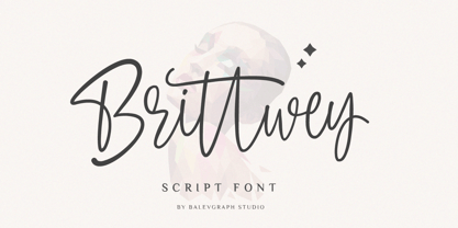 Brittwey is a lovely and delicate script font that exudes elegance and class. This font was particularly crafted for those who need a beautiful and refreshing look to their designs What's Included? Uppercase & Lowercase Numbers & Punctuation Ligature, Alternate & Swashes Multilingual Support PUA Encoded
 - Southwell by Balevgraph Studio,
$12.00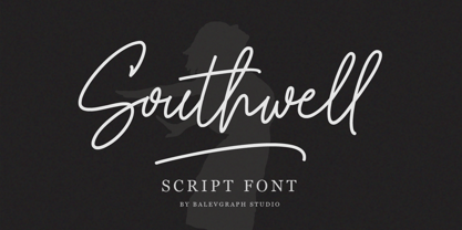 Southwell is a lovely and delicate script font that exudes elegance and class. This font was particularly crafted for those who need a beautiful and refreshing look to their designs. What's Included? Uppercase & Lowercase Numbers & Punctuation Ligature, Alternate & Swashes Multilingual Support PUA Encoded
 - Citation by ITC,
$29.99Citation was designed by British lettering artist Trevor Loane. It is a solemn, all caps roman alphabet whose coolly elegant letters look as though they were etched in stone. Citation is perfect for any work which should have a stately and expensive appearance. - Origami Bats by Lauren Ashpole,
$15.00 The art of paper folding in dingbat form. The uppercase alphabet is made up of origami animals and the lowercase offers those shapes decorated in traditional origami paper patterns. Full patterns, flowers, and partial foldings fill out the symbols and numbers.
 - Coffee by Abedavera,
$20.00 From love into a fontface. Font with the taste of coffee. Made from coffee plant anatomy at local farmer. Hope you enjoy to purchase with price of our "200gr premium green bean" :) Arabica Variety. Dokan, Region Karo - North Sumatra. Indonesia.
 - Zar Brush by SzarDesign,
$19.95 ZarHand began as my "speedball" showcard lettering font, used when the boss brought in a pile of urgent work at the end of the day. We would get out our "4 o'clock brushes" hoping to finish at a reasonable hour.
 - Blue Point by Solotype,
$19.95We began with the Victorian font Dotted, so-called because the counters of many of the letters contained a dot. We knocked out the dots, added a lowercase, and voila! a more useful type than the original without losing its charm. - Kalix by Linotype,
$29.99I have a notation that the summer of 1994, when I worked with Kalix, was a warm one. I had no special typeface in mind when drawing the characters of Kalix, but many typefaces contributed to it, e.g. my own Omnibus from which I borrowed the looks of the smal case g. I think it is a lovely typeface whose use is mainly for books and magazines. Kalix is the name of a northern Swedish town situated along a river called Kalixälven. Its name is of sami origin, *káles, meaning cold. There comes the connection to the warm summer of 1994! But even the Latin word for chalice, calix, has something to do with my choice of name. Kalix was released in 1994. - Condell Bio by Letritas,
$9.00 Condell Bio is part of the bigger Condell family: a project that involves series of typographies and whose early conception and development began in 2006. Unlike its Poster version , with its excessive and eccentric forms, Condell Bio tries to adapt itself to a monolinear shape, but conserving at the same time the organic character of its forms and endings. In this way Condell Bio is able to expanse its typographical use fields to a vaster scale. Condell’s endings and organic strokes haven’t been conceived in a structural way but stylistically. This means that Condell’s high readability doesn’t change and its original personality and idiosyncrasy as well. Condell can be said the ideal typography for connoting the corporation and brand identity, because of its high readability; especially its “eatable” forms, who collects images of food, are easily adaptable to food industry. Condell is highly recommended for the following products groups: cleansers, dish soaps, toothpastes, all sorts of personal hygiene products (shampoos, soaps,..), industrial cleanser products and also for products which refer to its softness, volatility and smoothness. Condell’s soft forms and nice endings, inspired through spontaneous brush strokes, give to the typography a very peculiar pleasant connotation. Its Italic (10 degrees inclination) has been produced singularly and not automatically calculated by the software. Condell Bio is composed of 16 fonts: from thin to black, whose weights are in regular and italic. Each singular weight has 600 characters and is composed of 206 languages.
 - Vernyhora by Bohdan Hdal,
$21.00 The vintage display font family Vernyhora. The typeface is intended to be used in those places where the letters when it is necessary to transmit the strong character, stability and historicity. The font has got 6 weights. It contains extended Cyrillic and Latin alphabets. It also consists of the alternative set of characters from the old Ukrainian alphabet. It can be used for the state institutions names. It was planned to be a font of old cities and towns. From the very beginning the font was created in order to execute signboards at the entrance of towns. For the font creation the author was inspired by the graphic designers of the early 20th century, such as Georgiy Narbut and Fedir Krychevs'kyi. From the Ukrainian language the font name is translated into English as mountains mover.
 - Beatrix Antiqua by Zetafonts,
$39.00 Beatrix Antiqua is a humanist sans-serif typeface designed by Francesco Canovaro. Beatrix Antiqua is part of the Beatrix Family that takes its inspiration from the classic Roman monumental capital model: its capitals are directly derived from the stone carvings in Florence Santa Croce Cathedral - where the serifs are often removed while keeping the variable width strokes. So, even if it’s basically a sans-serif, Beatrix keeps a subtle swelling at the terminals suggesting a glyphic serif - in the same vein as Herman Zapf classic Optima typeface. In the lowercase design, Beatrix references early humanist typefaces, keeping small calligraphic details (as the prolongation of the e nose) that are especially visible in the italics. While Beatrix Antiqua, the companion typeface to Florentia , slightly exaggerates its antique stylistical features, Florentia tries to mix those influence with a more robust & digital age ready design, featuring bigger X-height and an extended character set that covers over forty languages using the latin alphabet, as well as Greek and Russian Cyrillic.
 - Rustick by Thinkdust,
$10.00 Are you hungry for a font design that will blow you away? Do you want to invoke the rustic smell of wood smoke, the mouth-watering thought of antipasti, olive-oil, open French doors in the summer? Well before you book your ticket to Rome, check out the new font from Thinkdust, Rustick. Four weights (and italics) of indulgent, home cooked comfort, warm, earthen and familial. Before making its point, Rustick gives you a cup of deep, rich coffee and double checks you're warm enough. Just one look will start your stomach rumbling. Ideal for food packaging and warm, homey branding, Rustick will never let you go home hungry.
 - Catsme by Peliken,
$7.00 Cats OTF color font. Creative set of characters, kittens pictured in a variety of poses. You can use this font for design logos, quotes prints on t-shirts and other. OpenType-SVG Font was designed with Fontself Maker in Illustrator CC. Contains only uppercase letters and digits. WARNING Color fonts are pretty new technology - they currently show up in Photoshop CC 2017+, Illustrator CC 2018 and some Mac apps. Learn more about color font support on third-party apps here: https://www.colorfonts.wtf/
 - Whalebone by Hanoded,
$15.00 For some reason I had to think of Moby Dick (the classic book by Herman Melville) when I was busy working on this font. No, I don’t live near the sea, nor do I have a pet whale. It’s just one of those things… Whalebone (named after Captain Ahab’s prosthetic leg) is a handmade, all caps brush font. It wasn’t actually made with a brush; I used a broken satay skewer and Chinese ink. Whalebone comes with discretionary ligatures for double letter combinations.
 - Scripps College Old Style by Monotype,
$49.00The story of Scripps College Old Style is a heart-warming and inspiring chronicle about a young librarian, a handful of students, a wealthy grandmother, a dedicated educator -- and two eminent American type designers. The story begins in 1938, when Dorothy Drake, the newly hired librarian at Scripps College, a small women's college in southern California, became an impromptu dinner companion of the American type designer Fred Goudy. By the 1990s, the original fonts that Goudy had created for Scripps College in the 1940s had become prized -- but they were seldom-used antiques. Scripps needed digital versions of the metal fonts. This goal posed two immediate challenges: finding a designer familiar with letterpress printing who was skilled at creating digital fonts, and locating the money to commission the designer's services. The first challenge was the easiest to conquer. Sumner Stone was my first and only choice," recalls Kitty Maryatt, the current curator of the Scripps College Press. "I knew he had letterpress experience, was an accomplished calligrapher, and that his typeface designs were simply exquisite. The choice was easy."The second challenge was more difficult. It took the dedication, hard work and tenacity of Maryatt to bring the beautiful Goudy designs into the twenty-first century. While Stone was eager to begin work on the project, the college had no more money for new typeface designs in the 1990s than it did in the1930s. Years of lobbying, cajoling and letter writing were necessary to obtain the college's approval for the design project. Once she had the necessary funding, the design brief posed yet a third challenge. Goudy had provided two sizes of type to the Press: 14 point and 16 point. Which would serve as the foundation for Stone's work? In addition, the Goudy fonts were quite worn. Should Stone use printed samples as his design master, or base his work on the original Goudy renderings? The 14-point master drawings were the ultimate choice, with the stipulation that the finished fonts would provide both a seamless transition from the worn metal versions and a faithful representation of the original Goudy designs. Once the budget and design brief were established, the process of converting the original Goudy drawings into digital fonts took just a little over two months. Stone delivered finished products to Scripps in the fall of 1997. The first official use of the fonts was to set an announcement for a lecture by Stone at Scripps in February of 1998. But the story is not quite finished. Maryatt was so pleased with the new digital fonts, she wanted to share them with the graphic design community. At Stone's suggestion, she contacted Monotype Imaging with the hope that the company would add the new designs to its library. An easy decision! Now Monotype Imaging is part of the story. We are proud to announce the release of Scripps College Old Style as a Monotype Classic font. The once exclusive font of metal type is now available in digital form for designers around the world. " - Rigel by Supremat,
$15.99 Rigel was inspired by one poster by American artist and illustrator Katherine Milhous. It was a poster promoting the Ephrata Cloister in 1936. The letters from the Ephrata title on this poster are very concise and expressive, reminiscent of blackletter, but have a simplified look, which looks quite fresh even today. It was very inspiring to bring this font to life. In the process of redrawing and redesigning, the font has been slightly modified, but retained the character of those six letters from the reference poster. This is a header font consisting only of uppercase letters. It contains 6 styles from Light to ExtraBold. Despite the fact that the font has the character of blackletter, due to simplified forms, increased contrast and sharp lines, the font looks like a modern rethinking of Gothic script and it has found a new life. The name Rigel is taken for a reason. Rigel is a star, an blue supergiant in the constellation of Orion, and the Ancient Egyptians associated Rigel with the Sah - king of stars and patron of the dead. The human body after mummification was also seen as the embodiment of the soul. Of course, there is no direct connection between the font and Egyptian mythology, but indirectly in this way I wanted to emphasize even more the idea of incarnation, rebirth. Rigel is good for posters, large headlines, logos and any other large font compositions.
 - Linotype Dinosaures by Linotype,
$29.99This font is a must for dinosaur lovers, as it brings back to life a variety of these huge reptiles. Besides figures of complete dinosaurs there are also a number of 'portraits' and poses. A creative combination of dinosaur figures allows the depiction of various situations, fighting, eating, etc. Have fun! - Aguero Sans by Craft Supply Co,
$15.00 Aguero Sans – Font Family is a modern serif font family whose design refers us to the style of modern sans serif. The distinctive features of Aguero Sans – Font Family are the relatively low contrast of strokes, the slightly squarish shapes of round characters and the emphasized business like simplicity.
 - Kamuy by Andinistas,
$39.95 Kamui is a font designed by Carlos Fabian Camargo G. and used to write headlines. Its strategy makes it ideal for covers and advertisements with Japanese-style manga comics requiring latin style. Precisely its purpose was inspired by typographical classics such as Mistral by R. Excoffon and Zapfino by H. Zapf that then were diluted by separate strokes as blackletter calligraphy. However, high doses of miscegenation and lettering untimely torn between 50% esthetic and 50% legibility. That way his radical expression is highly profitable for composing and designing words and phrases with Eastern look. And more importantly, the writing seems drawn quickly with thin-tipped brush staining over a rough surface, from that process comes the idea of corroded outlines and changes in contrast. In conclusion, some diagonal strokes, horizontal, curved and vertical stand or hide from their simulation of scarcity or abundance of ink clots. That way each stroke seems inconsistent, footprint of the 423 brush drawing glyphs in Regular Kamuy. In that sense, the OpenType features included are: Standard Ligatures, Contextual Alternates, discretionary ligatures, swash, stylistic alternates, alternatives for titles, ordinals, fractions. And to end the Variable “Kamuy Dingbats” has is 52 fictitious drawings and zamurais.
 - Imperio by Juan I. Siwak,
$40.00 Imperio is a font inspired by old posters, especially those related to constructivism and futurism. It reflects both the rationalism of Bauhaus as a propagandist and revolutionary spirit of an era. On the other hand it is not nostalgic, but instead looks for its own way to get diagonals where there was rigidity. The poster itself is the language of graphic design, and geometry is its ally. This font aims for that goal. It has two variants that derive from its source. Imperio Giga Black attempts to be a negative typography, starting with the black and then searching for small windows in which they begin to uncover the morph. This is an extreme and modern font. Imperio West is a metamorphosis of the original one, with decorative details which transform it into a typeface of wood and saloon font. In all cases we recommend its use in large sizes (up to 20pt) and main titles. Imperio UltraBlack can work in smaller sizes than Imperio Regular.
 - Old Miami Beach JNL by Jeff Levine,
$29.00 The grandeur of what was Miami Beach had its golden years peak in the 1940s. One of the grande dame hotels that stood at Collins Avenue and 23rd Street was the Roney Plaza; built in the 1920s and demolished around 1969. An online auction offered a pair of gummed labels provided by the hotel to be used by their guests for shipping souvenir packages back home, thus also giving the hotel a promotional plug. Jeff Levine not only created two typefaces from this hand-lettered label - Old Miami Beach JNL and Old Miami Beach Nights JNL (a solid black version), but painstakingly recreated the look of the label for the promotional flag and banner for the fonts.
 - dT Jakob by dooType,
$30.00 dT Jakob started as a revival by Gustavo Soares for Paul van der Laan’s class at the Type and Media Masters, in The Hague, NL – back in 2007. There are quite a few excellent geometric sans typefaces available, but we did want to make our contribution and have a fine geometric face to offer. dT Jakob was born out of Erbar, by Jakob Erbar, one of the very first geometric sans, released in metal around 1926. Our goal was to make a versatile typeface, that handles display and text typography beautifully. To achieve that we designed a complete range of weights, matching italics and lots of OpenType Features. Hope you enjoy it :D
 - Blazing Furnace by Kitchen Table Type Foundry,
$16.00 At home we have a wood stove. Last year, I bought a whole bunch of tree trunks, which I cut up with a chainsaw and then chopped with my Swedish axe. In Holland we have a saying that firewood keeps you warm three times: when you cut the tree, when you chop the wood and when you burn it in the stove. Our stove is rather small, so it is not exactly a blazing furnace, but I liked the name because it seems to fit this font. Blazing Furnace was made with ink and a brush. It is a bit messy and rough, but it comes with multilingual support and a nice set of alternates for the lower case letters.
 - ITC Mixage by ITC,
$29.99Mixage font is the work of Italian designer Aldo Novarese, who cleverly combined the character shapes and proportions like those of Syntax and Antique Olive with the grace and warmth of a calligraphic typeface. Mixage font is a good alternative to more traditional sans serif designs. - P22 Sherwood by IHOF,
$24.95 Sherwood is a reproduction of an unusually small wood type font from England, dating from the last years of the 18th century. Somewhat reminiscent of Caslon Old Face. The original wood type is used at Sherwood Letterpress and can be seen on the Sherwood home page.
 - Rub Gum by PizzaDude.dk,
$15.00 Rub Gum is thick, chunky and heavy as heck! In the progress of making Rub Gum, I got inspiration from the grafitti- and comic universe! Use Rub Gum for something that needs a heavy dose of grafitti and cartoon! Comes with a good handful of ligatures!
 - Rock Face by Studio K,
$45.00 Rock Face was inspired by a crude but effective home made sign I came across advertising a garage sale. The lettering was created using sticky black insulation tape which, like a child's drawing, had a certain naive charm. The type design presented here is obviously more considered, but I like to think it has the same raw dynamism.
 - Quixley by ITC,
$29.00Quixley was designed by Vince Whitlock, who was inspired by an old Zoltan Nagy typeface. The capitals can be used alone or combined with the lowercase and should be set with close letter and word spacing. Quixley is an eye-catching, condensed display typeface whose unusual angles and marked stroke contrast lend it marvelous visual appeal. - Kaligrafia Galana by Lián Types,
$14.95 Intended mainly for invitations, Galana is available in 4 styles: Uno, Dos, Tres, and Alt. The first three styles use the Open-Type ligature function for a better legibility. Alt style was thought for those who love swashes and flourishes. Galana was designed to look elegant and sentimental, each glyph being unique and hard to forget.
 - Mentor-51 by Pilot,
$10.00 While developing one of their own IP's, Pilot needed a typeface which reflected a developing story with a science fiction theme. Mentor-51 is proudly the first release born out of this IP. It was created by designer and Pilot co-founder Bill Concannon and Brendan Keohane, a graphic designer at the studio. Pilot, located at Boston Design Center, is home to graphic designers and illustrators who enjoy the mix of the two disciplines. Pilot's primary goal is effective brand development through telling brand stories using strategy and art.
 - Stencil by Monotype,
$36.99Stencil™ was designed by Gerry Powell for American Type Founders in 1938. It's a faithful imitation of a stenciled alphabet, much like those used on boxes and crates, with rounded edges and thick main strokes. The font is composed of capital letters and figures; there is no lowercase. Use Stencil™ for graphic designs that call for a rough-and-ready look, a military look, or even to create real stencils for signs and marking boxes or luggage. Alexei Chekulaev made a Cyrillic version of Stencil™ in 1997. - Marketing Strategy JNL by Jeff Levine,
$29.00 Marketing Strategy JNL was inspired by some display signage used in an episode of the classic "Alfred Hitchcock Hour". Evoking the early-60s feel of kitchy advertising, this display font has a limited character set and is specifically designed for creating retro ad banners and point-of-sale attention getters as well as period piece signage. For those preferring a blank hexagon for spaces between words, one is located on the equal key. Marketing Strategy JNL is available in both regular (outline) and solid (white letters on black) versions.
 - Sidenty by Lady Rose,
$10.00 Sidenty is a wild calligraphy script. The typeface was drawn and created by Lady Rose between 2020 and 2021. Its open shapes are inspired by mid-century advertising, is full of life and emits liberty and optimism. The handwritten family consists of two weights: It is completed with a full alternate alphabet and a big set of ligatures, which together give the handwriting genuine dynamics and a natural flow. It has extensive lingual support, covering all European Latin scripts and contains all characters you'll ever need, including all punctuation and numbers.
 - Tiemann by Linotype,
$29.99Tiemann Antiqua was designed by Walter Tiemann in 1923 and appeared with the Klingspor font foundry. It is one of the modern book typefaces created in the first half of the 20th century, but differed from most in its Modern Face forms. It displays the same strong stroke contrast and flat serifs but its proportions have more in common with those of neorenaissance fonts. Tiemann Antiqua is an elegant, legible font suitable for books and longer texts, but also found in headlines, newspapers and magazines due to its classic yet unusual appearance. - Elida JNL by Jeff Levine,
$29.00 Elida JNL was modeled from an image of some wood type for sale online. Although the type design most likely has its roots in the classic Bodoni, there were a few characters in the original wood type that had a bit of a square or block shape to them. Those characters were modified in order to keep with the overall roundness of the other characters. The name Elida JNL comes from a small town in New Mexico. Available in six styles: Regular, Oblique, Extra Condensed, Extra Condensed Oblique, Ultra Condensed and Mega Condensed.
 - Collingethon by Namara Creative Studio,
$20.00 Collingethon is chic handwritten script font with a calligraphy flair, Perfect for creating handwritten-style logos, wedding stationery, photographer watermarks logos, modern websites, and more. For those of you who are needing a touch of elegant, chic and modernity for your designs, this font was created for you! Font Features Full Set of standard alphabet and punctuation. Beginning and ending swashed lowercase. Alternates, ligatures and multilingual characters. PUA Encoded | no special software needed to access extra characters. Feel free to follow, like and share. Thanks so much for checking out my shop!
 - Savoye by ITC,
$29.99 Savoye was created by Alan Meeks in 1992. The spirit of the Jugendstil lies behind the design of this font. Graceful upright letters combine to create delicate, flowing word figures. The light stroke contrast and slant to the right emphasize the liveliness of Savoye. Generous capitals contrast with small, demure lower case letters whose distinguishing characteristic is their high ascenders. This contrasts beautifully with the relatively reserved descenders. The capitals can also be used as initials combined with other alphabets. Savoye is the perfect font for invitations, greeting cards and other personal correspondence.
