10,000 search results
(0.02 seconds)
- 825 Lettrines Karolus by GLC,
$20.00 We have created this font as a complement for the 825 Karolus. It is a set of decorated letters in the style of those used by the scribes during the early medieval era. It is inspired from a manuscript copy of "The Hobbit" (in Caroline style) that we obtained in the year 2000 as a present for our daughter’s 15th birthday.
 - ITC Caribbean by ITC,
$29.99ITC Caribbean is the work of California designer Jill Bell, earthy yet exotic. In her typeface experiment, Bell combined unusual angles and curves to produce tall, thin letters whose stroke style completes the suggestion of palm trees which this typeface brings to mind. The typeface contains capitals and small caps. The natural look of ITC Caribbean lends any work a human touch. - Primordial by Hanoded,
$15.00 Primordial is a chaotic handmade script font. It is rough around the edges, glyphs are shaky and don’t follow a baseline. Yet, in all this chaos, you will find the budding of a new idea, a glimpse of hope and a glint of something beautiful. Primordial comes in a regular and italic style, plus a back slanted style called Primordial Chaos.
 - Madhewari by Nian Keun Studio,
$12.00 Maheswari is an elegant font specially designed for those of you who like luxury. Maheswari has a specialty in sharp fonts but also has elements of curves in some of its characters. This font can be applied to your designs ranging from jewelry designs, hotels, magazines, to branding logos. Thank you for coming to my shop and enjoying other fonts.
 - Crem Slab by LomoHiber,
$- Crem is a big Slab Serif font family with gentle minimalistic forms. Variability of styles allows you to experiment very widely with moods Crem reflects. Perfect for use in magazines, posters, logotypes, quotes, invitations, flyers, greeting cards, product packaging, book covers, etc. Crem Slab consists of 14 styles total, has wide language support and dozens of ligatures. Hope you'll enjoy using Crem Slab!
 - Yekuana by Neo Type Foundry,
$28.50 Yekuana is a typeface whose design is based primarily on the study of certain geometric ethnic ancestral Venezuelan signs, visually rich and originally used in the enrichment of various utilitarian objects with high symbolic and cultural content. Yekuana is a family of two weights, stylistic alternates, fractions, ordinals and ligatures. Its use is recommended for titles or short phrases and elements of oversized visual communication.
 - Flavium by Flanker,
$11.00 Flavium is the reconstruction of the typographic character used in the engravings of the marble street name sign of Rome from about 1970 until the end of the eighties. It is an uniquely uppercase Roman font whose letters are confined within the space between the baseline and the caps line. Its style is severe but elegant, very useful for expressing authority and officialdom with simplicity.
 - Snushane by PizzaDude.dk,
$17.00 Another one of those "perfect for a headline that needs an organic and handdrawn look" fonts. Snushane has a lot of character and likes to play with it's organic typographic muscles. I've added 5 different versions of each letter that automatically cycles as you type - and that goes for the Regular, Outline and Inside versions. All of these versions have multilingual support as well!
 - Wordless Script by Sudtipos,
$59.00 We are very happy to announce the release of our first collaboration with master calligrapher, designer and illustrator Gabriel Martínez Meave from México. The first in the series of new designs is Wordless Script, an emotional calligraphic typeface published by Sudtipos. Speechless. Breathless. Wordless. There are letters that transcend simple functionality and sheer legibility, to be recognized instead by their style, their charm, their emotion. It’s like when we don’t remember the exact sentences, but we recall the tone of the voice of a loved one: it just doesn’t matter WHAT he or she said, but HOW he or she said it. Wordless Script is the font of choice for writing those things that go beyond words. Based on the connected-scripts of late 18th-century England, this typeface preserves the irregular finish and gestural strokes of the pointed nib. It is, so to speak, a personal rendition of the English roundhand as originally executed with the bird’s quill. Imbued with a Rococo, neoclassical, romantic spirit, Wordless radiates the gallantry of a time when the celebrated «douceur de vivre» that Talleyrand was so fond of was still alive and well; echoes of which still haunt us in our eclectic 21st-century, which has once again come to appreciate these magnificent styles of old. Wordless features alternate variants of most letters, ligatures and multiple calligraphic endings, ideal for elegant labels, high-end packaging and personalized stationery, as well as compositions for selected brands, exquisite titlings, verses, letters and short texts, like those meant to be read with the eyes only or intended for whispering into someone’s ear.
 - IMAN RG by LGF Fonts,
$10.00 This type of Richard Gans, has always seemed very striking, despite having the complexity of the sources extrusion, has its own personality, and readability unusual for this type of letters. Use it for composing posters, programs or logos was very common at the time. My father, Antonio Lage Parapar, typographer by profession, who composed the texts, which not only had it for profession, but he liked to do, always he spoke of sources and decorative elements of the type foundry Richard Gans, as well as other foundries, especially those that required the mender of them, exercised creator, many of these types they have already been recovered by professionals and companies with excellent results. I've been surrounded by these movable type, and the occasional catalog unfortunately lost. One of those guys that has always struck me visually speaking was the type IMAN Richard Gans, the typographer and more of German origin arrived in Spain, back in 1874, also a pioneer. This work to revive the type mentioned, as well as create non existing glyphs between documents and parts I've been finding, is and has been a personal pleasure all I want serve as a tribute to my father (of aopodo curiously "Richard"), the only sadness it has not been completed. Richard Gans, arrived in Spain in 1874 as a representative of several European factories. then liaised with journalistic and publishing companies, which led him knowledge required of the first sector art. In 1878 he created a center importer gadgets graphic arts and three years later he created his own type foundry. The first rotary newspaper ABC, very famous and the most advanced of the time, the brand manufactured Richard Gans.
 - ITC Tickle by ITC,
$29.99When Patricia Lillie was growing up, she thought the coolest thing in the world would be finding her own name listed in a library catalog. The fantasy came true in 1986 when her first children's book was published. Five more followed. The thrill of seeing her work on library shelves hasn't abated, but today, Lillie is just as likely to see one of her typefaces on the cover of a book. She has created several display faces and image fonts. My first typeface designs were based on lettering I'd done while working for a library, doing graphics work for the children's section," she explains. "I currently do a lot of web design, but type is my favorite thing." The Tickles (ITC Tickle and ITC Tickle Too) are Lillie's first ITC typeface releases. "I was playing around with a Sharpie marker one day and liked the way the letters looked," she recalls. "I started redoing the letters from scratch in Fontographer to see what developed, and liked those letters too." ITC Tickle is a bi-form font (with both cap and lowercase letters of the same size) that clearly breaks a typographic rule or two. ITC Tickle Too has the same basic lettershapes, but they've grown clusters of stipples that give a three-dimensional quality to the design. The result is a friendly, offbeat display family that's guaranteed to add a giggle to your work." - Schnorr Gestreckt by HiH,
$12.00 Peter Schnorr was a German artist/illustrator of Art Nouveau period (called Jugendstil in Germany and Austria). He was quite adept at calligraphy and did a variety of commercial work, including business signs. He designed at least four different alphabets and collaborated with Bruce Rogers on advertising work and title page designs for books. One of their clients was the publishing house of Houghton Mifflin. I have not been able to discover anything else about him, but I suspect he might be the grandson of the Bavarian artist Jules Schnorr von Carolsfeld, who was once commissioned to do a mural by Ludwig II of Bavaria (whose famous castle was copied by Disneyland). Schnorr did not give individual names to his fonts. Where there is no historical name, we like to follow the tradition initiated by Bauer and name fonts after their designer, with a descriptive adjective in the designer’s native language. Gestreckt is German for stretched or elongated. An interesting deign detail of this typeface is the cross bar of the “T” --it is NOT symetrical. The right hand side extends only 88% as far as the left hand side (a ratio of 9:8). I presume this was done for a more pleasing letter fit. Today Schnorr’s design is frequently offered under the name “Ambrosia.” However. close inspection will usually reveal that the serifs have been treated differently. I believe our font has a greater fidelity to the original design. Please also compare the design of the various auxiliary characters to those in other fonts. Often they are either borrowed from an inappropriate font of a different period or are missing altogether. We make every effort to design characters that are in keeping with the overall design and spirit of the typeface. For example, see the superscript Registered Trademark symbol (0174) and the Double s (0223). I think both are quite successful. Schnorr Gestreckt ML represents a major extension of the original release. In addition to the standard 1252 Western Europe Code Page with character slots up to decimal position 255, there are glyphs for the 1250 Central Europe, the 1252 Turkish and the 1257 Baltic Code Pages. There are also two alternate letter forms, one ornament and seven ligatures with Unicode codepoints (Private Use Area) and OpenType aalt, ornm & liga GSUB layout features. There are a total of 318 glyphs and 351 kerning pairs. Please note that some older applications may only be able to access the Western Europe character set (approximately 221 glyphs). This release also incorporates a redesign of several glyphs: the comma, quotes, acute accent, and grave accent.
 - Virginia by Type Associates,
$31.95 Virginia has a proven track-record. Unashamedly geometric, starkly simple with a touch of art deco/bauhaus/rococo about her, she was the most popular headline face around, at least in my home town in the year of her release circa 1970. That was the year my five-weight design won the inaugural (and only) Lettergraphics International Alphabet design competition and shut out 5000 competitors. Alas, Lettergraphics ceased to trade from its LA studios after the mid-80s and Virginia's two-inch film fonts were left to collect dust on the cutting room floor. Until my recent decision to revive her along with some subtle tweaking, a few additional glyphs and Opentype features, supported by an abundance of kern pairs making Virginia suitable for text or the largest display type.
 - Beautifully Delicious by My Creative Land,
$29.00 Beautifully Delicious is a new font family that combines an elegant extended sans serif fonts and a signature script. Both fonts create a harmonious union that can enhance your designs in the best possible way. The family is suitable for graphic design, quotes, branding, all sorts of social media ads, magazines, greeting cards, packaging etc. The script fonts contain more than 1000 glyphs and benefit from OpenType features such as ligatures (including triple-letter ones), swashes and contextual alternates, two sets of capital letters (tall and short) and underline symbols. Sans serif font also contain some stylistic alternates and presented in 4 weights: Thin, Regular, Bold and Black. Hope you enjoy using it!
 - Companion Old Style by Matteson Typographics,
$19.99 A unique design accurately revived by Steve Matteson in 2021. Frederic Goudy designed Companion Old Style for Women’s Home Companion in 1928. In his own words: “I believe the new letter I showed him, both in roman and italic, is one of the most distinctive types I have ever made. It incorporates features which deliberately violate tradition as to stress and curves, but which are so handled that attention is not specifically drawn to the innovations introduced.” Companion Old Style exudes the style of pre-World War 2 Americana. The unique characteristics are wonderful for greeting cards, wedding announcements and holiday invitations. Companion’s nostalgic letterforms are light hearted and quirky yet highly readable.
 - Marmellata Jar 01 by Fontscafe,
$39.00 When you think of marmalade or jam (that’s Marmellata in Italian), images of a happy breakfast table are conjured up into the mind, with of course the unforgettable emotive response accompanied. These emotions are exactly what our Marmellata fonts can conjure up for your designs as well (we agree, nothing can beat marmalade on a hot toast)! Our Jar 1 is ideal for all designs where you need to send across a feeling of care, childhood, comfort, motherhood or friendship...amongst all those ideas you will get on your own! With that classic breakfast table feel, you are sure to connect on a very comforting level with all those who view your designs using these fonts. May we suggest, these fonts go very well with unusually dull colours, and can add a spark of life to the most mundane of words! Try getting a taste of our Jar 2 if you want even more of the classic taste (sorry, touch!).
 - Ely Rounded by Cory Maylett Design,
$30.00 Smooth and shapely without a trace of fat. A seductively handsome devil without the attitude. This typeface wears a tie at the office, but keeps a pair of sneakers and a beach volleyball in the car. Ely Rounded is a family of four weights plus matching italics (with more on the way). Each weight includes extended language support for European, Cyrillic and Greek. OpenType features include fractions, tabular and proportional figures plus a few ligatures thrown in for good measure. This is a typeface that works well from text sizes to billboards, and is equally at home in print or on the web. Future updates of purchased fonts are, of course, free. Buy the full set and receive yet-to-be-released weights at no charge — even as the price of that growing full package increases.
 - Violent Brave by Alit Design,
$24.00 Introducing the "Violent Brave Brutalism Typeface" - a cutting-edge font that seamlessly merges modern aesthetics with a fearless and commanding metal concept. This typographic masterpiece is designed for those who seek to make a bold statement with their visual communication. Design Concept: The Violent Brave Brutalism Typeface exudes an uncompromising and audacious personality. Inspired by the world of heavy metal, the font features fierce and firm spines, capturing the essence of raw power and strength. The design strikes a perfect balance between modernity and bold brutality, making it a standout choice for those who crave a unique and impactful typographic experience. Style Characteristics: The font boasts a distinctive metal-inspired aesthetic with sharp edges and robust letterforms. Each character is meticulously crafted to convey a sense of aggression and intensity, creating a visual impact that leaves a lasting impression. Glyph Diversity: With an expansive set of 1240 glyphs, this typeface goes beyond the ordinary. It includes ligatures, alternates, and a comprehensive multilingual character set. The ligatures and alternatives add fluidity and variation to the text, allowing for a dynamic and expressive display of content. The multilingual PUA Unicode support ensures compatibility across various languages, making it a versatile choice for global communication. Usage Scenarios: Ideal for graphic designers, musicians, and artists who want to inject a dose of unapologetic boldness into their projects. Whether used in album covers, posters, merchandise, or any other creative endeavor, the Violent Brave Brutalism Typeface is designed to command attention and convey a sense of fearless individuality. Key Features: Modern and bold metal-inspired design. Fierce and firm spines for a powerful visual impact. 1240 glyphs with ligatures and alternates for versatility. Multilingual PUA Unicode support for global accessibility. Incorporate the Violent Brave Brutalism Typeface into your projects and let your words roar with the intensity of a metal anthem, making a lasting impression on anyone who encounters your design.
 - Saracen by Hoefler & Co.,
$51.99 Saracen is the Latin (wedge serif) member of The Proteus Project, a collection of four interchangeable type families designed in different nineteenth century styles. The Saracen typeface was designed by Jonathan Hoefler in 1992. Saracen is a design in the ‘latin’ style, characterized by wedge-shaped serifs, a genus of type that emerged in the mid-nineteenth century. A part of The Proteus Project, the typographic theme-and-variations based on related Regency styles, Saracen was created for Rolling Stone, in whose pages the typeface first appeared in 1993 . From the desk of the designer: Though the wedge serif printing type is a nineteenth century innovation, Saracen does not resemble any font from this era. It’s mysterious that typefounders of the Victorian age who sought the extreme and fanciful in their work — exploring all manner of serif treatments, and creating extra-condensed and super-expanded designs — never made a latin font of this straightforward proportion. <
 - Monotype Janson by Monotype,
$29.00 The Monotype Janson font family is based on types originally cut by the Hungarian punch-cutter, Nicolas Kis circa 1690. Named after Anton Janson, a Dutch printer. The original matrices came into the hands of the Stempel foundry in Germany in 1919. New type was cast and proofs made; these were used as the source for Monotype's version of Janson. The original hand cut Janson types have a number of small design irregularities which give the typeface its unique charm. These have been carefully incorporated into the new version. The overall effect is of even color and an easy readability that makes Monotype Janson most at home in book and publishing work.
 - Equines by Attractype,
$12.00 Equines Display is a versatile font family designed specifically for display purposes. Its modern, thick and strong appearance is perfect for branding, logos, banners and any lettering that requires bold and clear letters. To add an artistic image rather than just the thickness of the shape, Equines Display adds a rounding feature to the corners of the letters with a cross system, which makes the word display dynamic, strong and elegant. Until this description was published, Equines Display had 14 styles including condesed, expanded, outline and shaded in hopes of meeting the display font needs of designers and everyone at large. Enjoy working with the Equines Display font family. Best regards, Saefulloh - Attractype Foundry.
 - Ragtag by In-House International,
$15.00 Ragtag is an adventurous display font that’s fun, graphic and loud. The font features three irreverent, geometric variations for each letterform, plus a few extra goodies like eñes and diacritics so it’s ready to use En Español. Ragtag creates harmonies from the fully interchangeable collection of letters. Each letter is unique and designed so it composes beautifully with all others — but can also stand on its own as an accent piece or as part of a design. Ragtag is inspired by the scattered crew of makers and designers from design studio In-House International--a fully remote creative home based in Austin, TX. The design of Ragtag was led by Alexander Wright and digitized by Rodrigo Fuenzalida.
 - Marigold Dreamer by Pen Culture,
$17.00 Introducing Marigold Dreamer, a captivating handwritten script font created with love and care using traditional techniques. Every letter of this font was meticulously handcrafted, resulting in a truly authentic and unique typeface. Marigold Dreamer exudes a whimsical charm that adds a touch of warmth and personality to any project. Its graceful strokes and intricate details capture the essence of handwritten elegance. The font boasts exquisite ligatures and delightful tails, enhancing the fluidity and natural flow of your text. I really hope you enjoy it – please do let me know what you think, comments & likes are always hugely welcomed and appreciated. More importantly, please don’t hesitate to drop me a message if you have any issues or queries. Thank you
 - Argyle Rough by Type Associates,
$24.95 Argyle Rough was originally developed for a packaging campaign in the late 80s in my studio and sat around in various stages of completion until I decided to autotrace my original drawings. I liked the quirky roughness and decided that it did not detract from the charm of the original, in fact it improved it and saved me a whole lot of work. The original campaign called for a few additional alternate characters for use at either end and double in the middle of words, ee, ff, ll, ss etc and a stylized Th, always useful. I hope you enjoy Argyle Rough, named after the world’s largest diamond mine – a rough diamond, get it?
 - Janky Action by Bogstav,
$15.00 First of all, let me get one thing straight: With Janky Action, I didn’t make any attempt on making a beautiful or good looking font! Janky Action is my humble attempt to recreate a sign I saw at a flea market. The sign was obviously made by someone who didn’t give a darn about the width of strokes, height of letters, and other “rules” when making a sign. I fell in love with the naive approach on how to make a sign. In order to create some randomness, I have added 4 different versions of each lowercase letter. I hope you find this font as enjoyable as I did while making it! :)
 - Meleo by Alexis Luengas,
$1.00 Meleo is a semiserif consisting of 10 fonts with a few original quirks but still very legible at both text and display sizes. Since its conception, the aim was a balance of uniqueness and functionality. The typeface owes its energy to the slight suggestion of calligraphic crafting and humanist structure. But it also breaks the rules: a small x-height and a whimsical uppercase with resemblance to the lowercase may render Meleo more friendly than a conventional (semi-)serif. Titles and texts of moderate length, like those found on websites, flyers and packaging, are the natural habitat of Meleo, but it may as well thrive under different settings. Meleo supports most of western-european latin languages which are included in the ISO-Adobe character set.
 - Emporia Roman by Bean & Morris,
$35.00 SPQR Senatus Populusque Romanus or The Senate and People of Rome as quoted by the likes of Marcus Tullius Cicero or Tully to his friends and Titus Livius otherwise known as Livy. SPQR appeared on battle standards carried by Roman troops and no doubt can still be seen chiseled into stone facades across the old empire of the ancient Romans. This evokes visions of stonemasons delicately inscribing messages that were meant to endure, one which can still be seen on the Trajan column circa 114AD. Emporia Roman is a modern display font that was inspired by the craft of those ancient artisans, with an added lowercase set, some flourished alternates, an oldstyle set of figures and now with a matching Italic.
 - Privilege Sign JNL by Jeff Levine,
$29.00 The above-the-store signage for many newspaper stands, soda shops, candy stores, luncheonettes and pharmacies of the 1950s and early 1960s were what was referred to as “privilege signs” provided by one of the major cola brands. Consisting of the brand’s emblems on the left and right, the remainder of the sign would carry the desired message of the storekeeper (such as “Candy – Soda – Newspapers”) in prismatic, embossed metal letters. Inspired by these vintage signs, Privilege Sign JNL recreates the condensed sans serif lettering style in both regular and oblique versions. The typefaces are solid black, but adding a selected color and a prismatic effect from your favorite graphics program can reproduce the look and feel of those old businesses.
 - Cling Vinyl JNL by Jeff Levine,
$29.00The Joseph Struhl Company of Long Island, NY pioneered the use of cling vinyl in the field of reusable signs. Along with sets of die-cut letters and numbers, one of their main products for many years was a set of letters and numbers silk screened onto vinyl panels for larger window displays. Cling Vinyl JNL is Jeff Levine's tribute to this sign kit and its innovative contribution to retail marketing. The font comes in two styles: Cling Vinyl JNL has white characters on a black background and Cling Vinyl Clear JNL has black characters on an open (clear) background. For those wanting a "panel" space between words, there are two different width ones on the < and > keys. Please note: limited character set. - Maison Luxe by FontMesa,
$25.00 Maison Luxe is a revival of a very old font designed in France in or around the year 1820. You may have seen this font in the past under the names of Circus, Roma, Madame and Gillé Classic. As of November 2016 we have changed the name of this font from Gillé Classic to Maison Luxe which means Luxury House in French. For many years Joseph Gillé was credited as the original designer of this font however we've recently been contacted by a type historian in France reporting that he could not find any evidence supporting Joseph Gillé as the designer and to the best of his knowledge an artist by the name of Sylvestre may be the true designer. If you love this classic font then you're sure to enjoy the alternate version also with a matching lowercase available from FontMesa under the name of Home Style. This version of the classic with its squared off shadow is true to the original design where Home Style has diagonal lines creating a cast shadow. New in 2016 for Maison Luxe is a new matching lowercase, an uppercase German Double S (versal eszett), Greek character set, opentype features including case sensitive forms and old style numerals. We know you'll enjoy the new additions to this timeless classic design.
 - FF Real Text by FontFont,
$50.99 FF Real is a convincing re-interpretation of the German grotesque style from between 1998 and 1908, but with much more warmth and improved legibility as well as a hint towards the warmer American grotesques. Later on, not just slanted styles, but a “proper” italic version was added inspired by the way Roman and Italic are distinguished in traditional serif faces. NEW: a specially created set of obliques were added in 2018 to give designers more design flexibility, for those looking for a less calligraphic look. In 2020 the family was extended with matching condensed weights. FF Real was originally conceived by Erik Spiekermann as one text weight and one headline weight to be used as the only faces in his biography ‘Hello I am Erik’, edited by Johannes Erler, published in 2014. While Spiekermann drew the alphabets, he passed on the font data to Ralph du Carrois and Anja Meiners who cleaned it up and completed it. In the meantime, FF Real has been extended to a family of two styles and 65 weights each. The design of FF Real is rooted in early static grotesques from the turn of the century. Several German type foundries – among them the Berlin-based foundries Theinhardt and H. Berthold AG – released such designs between 1898 and 1908. The semi-bold weight of a poster-size typeface that was lighter than most of the according semi-bolds in metal type at the time, gave the impetus to FF Real’s regular weight. In the words of Spiekermann, the historical example is “the real, non-fake version, as it were, the royal sans serif face“, thus giving his new typeface the name “Real” (which is also in keeping with his four-letter names, i.e. FF Meta, FF Unit). FF Real is a convincing re-interpretation of the German grotesque style, but with much more warmth and improved legibility. With a hint towards the warmer American grotesques, Spiekermann added those typical Anglo-American features such as a three-story ‘g’ and an ‘8’ with a more defined loop. To better distinguish characters in small text sizes, FF Real Text comes in old style figures, ‘f’ and ‘t’ are wider, the capital ‘I’ is equipped with serifs, as is the lowercase ‘l’. What’s more, i-dots and all punctuation are round.
 - FF Real Head by FontFont,
$50.99 FF Real is a convincing re-interpretation of the German grotesque style from between 1998 and 1908, but with much more warmth and improved legibility as well as a hint towards the warmer American grotesques. Later on, not just slanted styles, but a “proper” italic version was added inspired by the way Roman and Italic are distinguished in traditional serif faces. NEW: a specially created set of obliques were added in 2018 to give designers more design flexibility, for those looking for a less calligraphic look. In 2020 the family was extended with matching condensed weights. FF Real was originally conceived by Erik Spiekermann as one text weight and one headline weight to be used as the only faces in his biography ‘Hello I am Erik’, edited by Johannes Erler, published in 2014. While Spiekermann drew the alphabets, he passed on the font data to Ralph du Carrois and Anja Meiners who cleaned it up and completed it. In the meantime, FF Real has been extended to a family of two styles and 65 weights each. The design of FF Real is rooted in early static grotesques from the turn of the century. Several German type foundries – among them the Berlin-based foundries Theinhardt and H. Berthold AG – released such designs between 1898 and 1908. The semi-bold weight of a poster-size typeface that was lighter than most of the according semi-bolds in metal type at the time, gave the impetus to FF Real’s regular weight. In the words of Spiekermann, the historical example is “the real, non-fake version, as it were, the royal sans serif face“, thus giving his new typeface the name “Real” (which is also in keeping with his four-letter names, i.e. FF Meta, FF Unit). FF Real is a convincing re-interpretation of the German grotesque style, but with much more warmth and improved legibility. With a hint towards the warmer American grotesques, Spiekermann added those typical Anglo-American features such as a three-story ‘g’ and an ‘8’ with a more defined loop. To better distinguish characters in small text sizes, FF Real Text comes in old style figures, ‘f’ and ‘t’ are wider, the capital ‘I’ is equipped with serifs, as is the lowercase ‘l’. What’s more, i-dots and all punctuation are round.
 - French Fries by Red Rooster Collection,
$60.00 French Fries is a three-weight decorative font family. It was created and produced by Steve Jackaman (ITF) in 2017. French Fries has a casual, lighthearted, playful, hand-lettered look, and is food for the eyes at any size. The family is surprisingly versatile, and might be right at home on menus, packaging, and early education materials.
 - Luckangle by Balpirick,
$15.00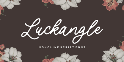 Luckangle is a Monoline Script Font. Luckangle is a lovely and delicate script font that exudes elegance and class. This font was particularly crafted for those who need a beautiful and refreshing look to their designs. Luckangle also multilingual support. Enjoy the font, feel free to comment or feedback, send me PM or email. Thank you!
 - Strobos by ITC,
$29.99Strobos was designed by Vince Whitlock, who used the Corinthian typeface as a model. It is a dramatic, high-tech alphabet which is most effective in large display sizes. Strobos is a sans serif typeface whose characters are surrounded with details which make each letter look as though it is shaking, spinning, or otherwise constantly moving. - Gordis by John Moore Type Foundry,
$25.00 Gordis is a letter to display ideal for situations humorous and tender, based on rounded shapes that weigh about their weight. It comes in three versions combined Open Type, which can be used in layers for special effects. Gordis was awarded at the third biennial TL08 Tipos Latinos. Put an end to those boring headlines, use Gordis!
 - Blackbone by Balpirick,
$15.00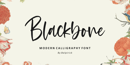 Blackbone is a Modern Calligraphy Font. Blackbone is a lovely and delicate script font that exudes elegance and class. This font was particularly crafted for those who need a beautiful and refreshing look to their designs. Blackbone also multilingual support. Enjoy the font, feel free to comment or feedback, send me PM or email. Thank you!
 - ATC Timberline by Avondale Type Co.,
$20.00 ATC Timberline, is an ultra wide-set sans-serif typeface. With its sharp points and extended curves, ATC Timberline feels just at home in mid-century modern as it does in forward-looking modern settings. Contains 370+ glyphs, full alphabet, ligatures, numberals, accents and punctuation. File type included in download is .otf. ATC Timberline was released in 2016.
 - Bagusih by Twinletter,
$15.00 Bagusih is the perfect font for anyone who wants to bring their designs to life with a bold, unique look that’s sure to stand out from the crowd. With its retro-inspired design, this font is perfect for those who want to create a 60s-inspired aesthetic, or who want to give their designs a retro feel. And with its bold and geometric design, Bagusih is also perfect for those who want to create a geometric look with lots of impacts. So whether you’re looking for a retro or geometric look, Bagusih is the perfect font for you.
 - Gilbert JNL by Jeff Levine,
$29.00 Gilbert JNL is an interpretation of Eric Gill's classic sanserif typeface, which has become an all-purpose workhorse in ad copy. While other versions of gill-sans fonts have multiple weight sets, Jeff Levine chose to replicate this particular weight as a single design [in both regular and oblique versions] because of its popularity with sign makers of the past and give to it the minor nuances of hand-made lettering.