10,000 search results
(0.033 seconds)
- Sathya Script by Gian Studio,
$14.00 Introduce Sathya Script in beautiful handwritten style. Equipped with 600 glyphs. Sathya Script is perfect for branding projects, home appliance design, product packaging, use in business cards, invitation cards, etc. Just as a stylish text overlay onto a background image or anything else that needs a touch of elegance. Available in the Satya. To enable the OpenType Stylistic alternative, you need a program that supports OpenType features such as Adobe Illustrator CS, Adobe Indesign & CorelDraw X6-X7, Microsoft Word 2010 or a later version. There are additional ways to alternate/swash, using the Character Map (Windows), Nexus Font (Windows), Font Book (Mac) or a software program such as PopChar (for Windows and Mac). How to access all alternative characters, using Windows Character Map with Photoshop: https://www.youtube.com/watch?v=Go9vacoYmBw How to access all alternative characters using Adobe Illustrator: http://youtu.be/iptSFA7feQ0 How to use the font style set in Microsoft Word 2010 or later versions: https://youtu.be/x1A_ilsBsGs Thanks for checking! I really hope you enjoy it. Regards Designers: Afri Giani Publisher: Gian Studio
 - Ginky by PizzaDude.dk,
$20.00Ginky is another one of those grafitti- and comic-inspired pizzadude.dk fonts! You will need to use OpenType supporting applications to use the ligatures. - Poster Plain JNL by Jeff Levine,
$29.00 Poster Plain JNL and its oblique counterpart offer the simple, hand-lettered look of home-made poster board projects with a bold, friendly typeface.
 - Bunny Story by Haksen,
$7.00 A hand lettered font with quirky style Specifics: Cute style with average high of uppercase Numerical, Punctuation, Multi language included Hope You enjoy it.
 - Tora Caligraphy by Samtype,
$39.95 This font is a new fresh type of caligraphy hebrew font. The opentype features are much better then those are in the font market.
 - DB Roman Philosophy by Illustration Ink,
$3.00Ancient Rome boasted some of the most gifted Philosophers and Roman Philosophy puts those ideas to words in this fun and very wise DoodleBat! - Multiple by Latinotype,
$39.00 As its name suggests, Multiple is a family with multiple font styles. The idea that sums up the concept behind the typeface is “workhorse”. The challenge was to develop a useful font fit for any scenario and suitable for any design needs: editorial design, packaging, branding, screen use, etc. Multiple features soft, rounded shapes and large counterforms which make it well-suited for both text and display usage. The proportions are based on classic typefaces yet its design was specially created to provide a high degree of versatility. Multiple contains different stylistic sets whose variety of glyphs provides a wide range of choices for any design project. Partly humanist and partly grotesque, Multiple comes with a number of font variants that will help you choose the style that will best meet your needs. The font also includes a serif version with the same number of variants as its sans counterpart. The sans version includes 4 stylistic sets while its slab companion comes with 3 sets, both available as separate alt family packages (ideal for those seeking ready-to-use alternate glyph sets). These alternate characters are also available as OpenType features in the regular versions. Multiple comes in 5 weights—ranging from Extra Light to Bold - with matching italics, and contains a 395-character set that supports 207 different languages. Multiple: one font, multiple faces.
 - Hammer Horror by Comicraft,
$29.00Those footsteps you hear as you walk down that dimly lit Victorian street...? That flapping of leathery wings in the air...? The howl of some kind of Wolf-man in the countryside...? Those sounds that chill your spine and triphammer your heart are the sounds of unspeakable, terrifying terrors.... some might say horrifying horrors, scarifying scares... hammering, uh, hammers and now there's a font to capture them... a font that wants to suck your blood. Custom made for Ian Churchill's Awesome comic, THE COVEN. - Enza by Neo Type Foundry,
$25.00 Enza is a display font designed by José José Villamizar. Its design stems from the typographic exploration for the realization of the identity of a company aimed at entrepreneurs in the millennium generation. It’s a family of five weights composed of 455 glyphs. includes Thin, Light, Medium, Bold and Black styles. It also includes stylistic alternates, fractions, and ligatures. Its use is recommended for titles, semicondensed texts or short, and elements of visual communication large phrases. It is also ideal for creating logos, in packaging, signboards and poster design.
 - Kursivfraktur by RMU,
$25.00 Inspired by Rudolf Engelhardt's Journal-Kursiv, released by Ludwig Wagner, Leipzig, in 1913, Kursivfraktur was freshly drawn and redesigned, and comes as one of those rare beautiful italic blackletter fonts. This font contains the letter long s which can be reached in two ways. Either you use the OT feature historical forms, or you type the integral sign [ ∫ ] on your keyboard. There are two graphic elements implemented, a corner element and a straight element for framing. The corner element lies on the Product sign [ ∏ ], the straight element you will find on the pi-key [ π ]. Furthermore it is recommended to activate the discretionary ligatures OT feature.
 - Burger Shake by Bogstav,
$17.00 A burger and a shake - the classic companions! Mix those two and you get the Burger Shake - it may not sound very delicious, but the thought of mixing two nice things is great...or something! :) Anyway, the Burger Shake font is about having fun in a legible way. The letters are slightly uneven and rough here and there, and has this nice handmade organic feeling. I've added 5 slightly different versions of each letter, and they automatically cycle as you type!
 - Scratch by ITC,
$29.99Scratch was designed by Andrew Smith in 1995. It looks as thought many fine lines were drawn next to and over each other with a felt-tipped pen. Small bits of white peek out among the strokes and give the font its dynamic character. Flexible and sketchy, the forms are based on those of a classic sans serif cursive typeface. Scratch is meant exclusively as a headline or display font. - Farm Girl by Open Window,
$19.95 From the lab of Open Window comes Farm Girl. Farm Girl was inspired by old Art Nouveau posters from Toulouse Lautrec and others. Farm Girl utilizes the same 'loosey-goosey' quality as those posters. Farm Girl consists of 3 different styles which are designed to be used in combination with each other. Many different variations are possible. It's fresh cut and contemporary. It's ideal use is as a display font.
 - Diem Gibling by Mchcrafter,
$18.00 Introducing the new Diem Gibling Ligature Serif!!! Diem Gibling is an elegant and classy serif typeface – This font is both modern and nostalgic and works great for logos, magazine, social media. Already matched up and ready to be used together for your next design! For those of you who are needing a touch of elegant, stylish, classy, chic and modernity for your designs, this font was created for you!
 - Maulie Script by Gatype,
$14.00 Introducing the new elegant Maulie Script! For those of you who need a touch of elegance combining classic style with modern calligraphy style for your design, this font is made for you! Whats INCLUDED? Maulie Script was built with OpenType features and includes initial and ending stylistics, alternative characters for most lowercase letters, numbers, punctuation, alternatives, ligature and also supports other languages. There are more than 404 glyphs in this font.
 - Vtg Stencil Italy No. 2 by astype,
$29.00 The Vtg Stencil fonts from astype are based on real world stencils from several countries. The Italian stencils that I chose as a model for this font are roughly based on classic French stencil letters. Please compare the figures (numbers) with their French counterparts. However, the Italian stencils are made with a different production technique. The design of the letters is clearly not punch-cut into the plates, maybe they are drilled, milled or etched. Details such as the serifs look bold and clumsy, and when using the stencils as they are meant, with viscous sign paint, smaller details easily fade away. So I took my freedom to design a font close to the original design but adding several typographic tweaks to let it shine, hoping to get closer to the intended design idea of these Italian stencils. Enjoy the vintage!
 - Bolkit by Khaiuns,
$15.00 zt. Bolkit Serif is a typeface with two types of styles, one with an elegant and smooth arch shape, while the other has a type of firmness and the character presents a strong character in it. Being a letter whose concept is very interested in simplicity, the lines present in the elegant and firm zt. Bolkit make you feel it too. zt. Bolkit also comes with two widths that all have two weights (Thin and Bold) Containing characters that include uppercase letters, lowercase letters, numbers, punctuation, 52 ligatures, 25 alternatives and symbols that will make your designs cooler in the future. Do not forget also this supports more than 60 languages derived from Latin, namely Western, Central and Southeastern European languages. I hope you have a blast using zt.Bolkit Thanks for use this font ~ Khaiuns X zelowtype
 - Estimo by Karandash,
$28.00 Estimo is an unusual, yet elegant type family of three styles in five weights. Originally developed as upper-case-only family, Estimo was inspired by the works of Bulgarian type and graphic designers in 1980’s. It is characterized by its lack of diagonal strokes (wherever possible), thus experimenting with letterforms without losing legibility. This unique typeface is suitable for all kinds of creative and editorial works, creating impact for headlines of all sizes, as well as readability for text blocks.
 - Tamagoyaki by Tigade Std,
$35.00 Tamagoyaki is an inspired natural Japanese brush font that created handmade with excellent quality. Each stroke shows a natural and cultural elements in each of the glyphs. This font is suitable for those who like Japanese style design, besides this font is also suitable for those of you who have a Japanese restaurant, Japanese clothing brand, Japanese arts, and business purpose related with Japanese culture. This Tamagoyaki is perfect for your branding and marketing!
 - Elektrakution by Comicraft,
$19.00 SHE'S DEAD, FRANK It's the year 1991, BC (Before Comicraft) when REM were still making records and Frank Miller’s memorable run on Marvel Comics’ DAREDEVIL was just over ten years old. Comicraft’s Richard Starkings found himself working in Anaheim, California for Graphitti Designs. Graphitti had produced the first hardcover edition of Miller’s Batman tale, DARK KNIGHT RETURNS and was now putting together the sequel to Miller’s DAREDEVIL — ELEKTRA LIVES AGAIN! Richard was not engaged to letter this book, the pages of Frank’s incredible original art that came through Graphitti’s studio were already lettered by Marvel Stalwart, Jim Novak. However, there were some cover elements that needed to be added, based on the logo originally rendered by Frank’s brother, Steve. Starkings set about the task of creating an alphabet that could be used to develop Steve’s idea for the trade dress -- the cover elements, the back cover copy and credits on the interior pages. This was long before Macintosh computers and font programs made this work considerably easier, so Rich sat down with a pencil and a sheet of vellum and rendered an alphabet that could be used as the basis for the text that was needed... Those sketches have languished in a drawer for nearly thirty years, but now, finally, Comicraft’s John Roshell has dusted off those old letterforms and Elektrakuted a font based on those designs, a font we HAD to call ELEKTRAKUTION! As for Elektra; she’s dead, Frank. Features: Ten weights (Light, Regular, Bold; Rough Light, Regular & Bold; Inline, Inline Rough, Outline & Outline Rough) with upper & lowercase characters, Western & Central European accents and Greek characters.
 - Organic Pro by Positype,
$29.00 When I released the original Organic in 2009, I was satisfied with it. It was what was possible from me and the technology at the time. The Organic Pro of 2021 takes those original desires of delivering a highly legible and friendly sans serif, and doubles down on those notions, while exploring what further infusing warmth in a highly structured sans serif can really do for a client. Free of distracting and potentially dating visual traits and cues that could be seen as endemic of a specific time period or ‘type trend’, Organic Pro is its own person—take it or leave it. Inviting warmth, assured reliability, and a head nod of confidence is what you walk away with—a stark contrast to the cold, impersonal geometrics and grotesques proliferating the design annuals currently. Releasing this typeface now, completely redrawing the masters, as well as expanding the weight and language options, should be seen as a laid back challenge that we need to do less with type, let it communicate confidently and warmly when it needs to, and stop forcing one-size-fits-all type trends on everyone.
 - Fidusmager by PizzaDude.dk,
$17.00 This is definitely a font suitable for kids toys. The letters are legible, and at the same time totally wacky! Kinda like what a kids toy should be! Fidusmager started out as a handdrawn, slightly rugged looking fon. However I ended up manually tracing each letter in order to have those smooth lines. By the way, Fidusmager is danish and actually means someone who’ll trick you - but as a kid I didn’t know that, and found that it most likely was something positive! :)
 - Simplicity Angela by Ahmad Jamaludin,
$15.00 Say hello to Simplicity Angela! Simplicity Angela is an elegant modern calligraphy font inspired by delicate inky hand lettering, a gorgeous wedding calligraphy for trending minimal branding designs. This beautiful font is for those who are needing elegance for their designs and is particularly well suited for wedding invitations, cards and feminine branding. I have wanted to create such combination a long time and can’t believe that it is here. I’m super excited and hope you’ll like it too. Now all you need for perfect wedding invitation design is in one product. I think this decision will help you to save your time What's included? - More than 100 beautiful swashes in this font - Works on PC & Mac - Simple Installations - Accessible in the Adobe Illustrator, Adobe Photoshop, Adobe InDesign, even work on Microsoft Word. - PUA Encoded Characters - Fully accessible without additional design software. Multilingual Support : ÁĂÂÄÀĀĄÅÃÆĆČÇĊÐĎÉĚÊËĖÈĒĘĞĢĠ ÍÎÏÌĪĮĶĹĽĻŁŃŇŅÑ ÓÔÖÒŐŌØÕŔŘŖŚŠŞŤŢÚÛÜÙ ŰŲŮẂŴẄẀÝŶŸỲŹŽŻ áăâäàāąåãæćčçċďđéěêëėèēęíîïìīįĺľļłńňņñóöòőōøõŕřŗśšşßúûüùűūųůẃŵẅẁýŷÿỳźžż I hope this font is suitable for your project.
 - Ongunkan Brahmi by Runic World Tamgacı,
$60.00 The Brāhmī alphabet is the ancestor of most of the 40 or so modern Indian alphabets, and of a number of other alphabets, such as Khmer and Tibetan. It is thought to have been modelled on the Aramaic or Phoenician alphabets, and appeared in India sometime before 500 BC. Another theory is that Brāhmī developed from the Indus or Harappa script, which was used in the Indus valley until about 2,000 BC. The earliest known inscriptions in the Brāhmī alphabet are those of King Asoka (c.270-232 BC), third monarch of the Mauryan dynasty. Brāhmī was used to write a variety of languages, including Sanskrit and Prakrit.
 - Helter Slab by Dora Typefoundry,
$15.00 NEW! Helter is a slab-serif font that gives off a clean and very elegant feel that has a strong and bold look. the slab is thick and does not regret the size of the width. The slab-serif helter is perfect for your upcoming project which is applied especially to various other formal forms such as invitations, labels, logos, magazines, books, greeting / wedding cards, packaging, fashion, make up, stationery, novels, home decor labels, book / cover titles, special events and many more. Features: • Full set of uppercase letters, • Numbers & Punctuation • Characters with accents • Supports Multiple Languages This type of family has become a work of true love, making it as easy and enjoyable as possible. I really hope you enjoy it! I can't wait to see what you do with Helter Slab! Feel free to use the #Dora Typefoundry tag and # Helter Slab font to show what you've done visit my Instagram : https://www.instagram.com/doratypefoundry/
 - Parliament by Hoefler & Co.,
$49.99 The Parliament typeface was designed by Jonathan Hoefler beginning in 1995. A burlesque typeface in the Regency Blackletter style, Parliament was inspired by the ‘Four-line Pica Black No. 1’ typeface of William Caslon Jr (1821), whose enigmatic design for the letters E, G, I, N, V and Y hinted at a broader ambition to modernize the arcane shapes of the gothic alphabet’s capital letters. Parliament completes this project for the first time by including two sets of alphabets, one archaic and one modern, along with a third set of ‘small caps’ that restores to the blackletter the versatility of Roman type. Parliament was first used for the 1998 ATypI Conference in Lyon, and was published by Hoefler&Co in 2022.
 - Rotulo Variable by Huy!Fonts,
$195.00 Rotulo Variable is a contrasted sans family which combines the Thick & Thin signpainter's style and some 70s feeling in a huge font family with three axis: Width, Weight and Slant. A visit to an exhibition of Spanish movie posters by Jano was the beginning of Rótulo (Spanish for Sign) project. Classic thick & thin signpainter style was featured in many letterings of those posters, as it was a very common style in 60s and 70s Spanish design. Unfortunately, today very few Contrasted Sans are seen, something that was quite common years ago has fallen into disuse in favor of Helvetic monotony. Rótulo recapture all that personality, with an extense range of weights and widths to be used in striking headlines and short texts.
 - Ingeborg by Typejockeys,
$70.00 The Ingeborg family was designed with the intent of producing a readable modern face. Its roots might well be historic, but its approach is very contemporary. Ingeborg’s Text Weights are functional and discreet. This was achieved without losing the classic characteristics of a Didone typeface, which are the vertical stress and the high contrast. The Display Weights on the other hand are designed to fulfil their job and catch the reader’s eye by individual form language and a whole lot of ink on the paper. Nevertheless both are of one origin and work together in harmony.
 - fancyPens by JOEBOB graphics,
$9.00 In case you find yourself looking for an erratic, inconsequent and loose free-style calligraphy font, I guess you need to look no further and try fancyPens. I used several pens in several ways on several days to create it and it shows. Hope you like it.
 - HT Qays Sans by HadiTypeStudio,
$85.00 HT Qays Sans New Arabic Font performs equally well in print and on-screen and the designs can be used at very small sizes in packaging and catalogs, while massive print headlines – even complicated way-finding projects pose no stumbling blocks to the family’s typographic dexterity.
 - Hannover Modern by Type-Ø-Tones,
$40.00 Hannover Modern belongs to a series of typefaces used at the Estudio Mariscal in Barcelona. José Manuel Urós developed this weight, a vigorous egyptian-style, the embodiment of the Javier Mariscal style.
 - Hayride JNL by Jeff Levine,
$29.00 Based in part on the hand-lettered title for a piece of vintage sheet music, Hayride JNL gets both its inspiration and name from Michael Todd's 1948 production "Mexican Hayride". The original design was in outline form, and the letters with straight-lined shapes had slight curves to them. For Hayride JNL, those lines were straightened and the letters made solid in appearance.
 - Ultimate Battle by Letterara,
$12.00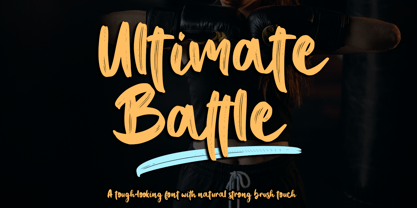 Ultimate Battle is a stylish and incredibly natural elegant handwritten font. This font was particularly crafted for those who need a strong and looks like a natural brush to their designs. Add it confidently to your projects, and you will love the results. This font is PUA encoded which means you can access all of the glyphs and swashes with ease!
 - Valkyrie by Brave Lion Fonts,
$9.49 Valkyrie was designed following the idea to have realy strong letters taking a lot of room. This results in a heavy appearance and gives Valkyrie its special look. It is possible to give it an even more uniform look by using the alternate characters. What can a strong font be used for? Valkyrie hopes to break rules. Use its power.
 - Carlos by CastleType,
$59.00 Carlos was inspired by a Spanish typeface designed by Carlos Winkow called 'Elektra' (c. 1940), available elsewhere as Casablanca. Carlos is an exceptionally graceful, condensed art deco sans serif design that supports all European languages that use the Latin alphabet as well as those that use the Cyrillic alphabet, and includes OpenType features, arbitrary fractions, and a collection of geometrics, dingbats & fleurons.
 - Linotype Markin by Linotype,
$29.99 Markin is named after the writing utensil with which it looks like it was drawn, the marker. Its even strokes display characteristics similar to those of a sans serif typeface, but the stroke endings with their typical handwritten look give Markin a personal touch. Extremely versatile, it is the perfect choice for any work where individuality and spontaneity are the emphasis.
 - Lily Hilo NF by Nick's Fonts,
$10.00This sometimes-top-heavy, sometime-bottom-heavy, sometimes-centered typecase is based on an old Photolettering face designed by the irrepressible Dave West, originally called "Nickelodeon". That name was already taken, so I chose another with a nod to the 1953 film starring Leslie Caron. Both versions of this font include the complete Unicode Latin 1252 and Central European 1250 character sets. - Anchor by Etewut,
$20.00 I glad to introduce to you my new display font Anchor. I was inspired by Russian fairy tales with cyrillic lettering. So I hope you'll keep a bit of fairy in you upcoming products using my font. Please, mind a spirit! It perfectly fits to making design from corporative identity to Xmas cards. And it has extra symbols for european languages.
 - Boomerang JY by JY&A,
$39.00Based around the Australian boomerang, Greg Bastin’s design originally appeared on private Christmas cards and individual projects. It was formalized into a font in 2002 by David Philpott (JY Circles) and brings a quirky antipodean style to the JY&A Fonts range. This display family is available in Solid and Outline forms, the latter containing patterns that parody those of Aboriginal culture. - Hiruko Stencil by Thinkdust,
$10.00 Building on Hiruko’s success, Hiruko Stencil continues the tradition of minimalism and clarity with support for a wide range of languages. Cut in such a way that each character works well with those surrounding it, this font is created with an understanding that even the most minor seeming things can make a big difference. The thick nature of the font makes it work wonderfully at larger sizes, but thanks to the carefully considered cuts in each letter, it remains incredibly legible even when shrunk down, so it’s useful in whatever you intend to craft.