2,935 search results
(0.01 seconds)
- Cross Stitch Basic by Gerald Gallo,
$20.00 Cross Stitch Basic is based on upper case characters 7 stitches tall and contains the upper case characters A-Z, lower case characters a-z, numbers 0-9, ampersand, exclamation and question marks, comma, period, colon, and semi-colon.
 - YT basic Latin by Yangtype,
$9.00 The reason you should buy this font is simple and clear. This is because we have accumulated experience in realistic typography. This typeface exists as a unity with diversity. The intuitive form of letters and the subtlety of letter spacing create artistic value in the combination of words and sentences.
 - Wild Style Basic by Graffiti Fonts,
$14.99Wild Style basic is a simpler version of our Wild Style font with outlined letters on the capital keys and filled letters on the lowercase keys. This font also includes several symbols & foreign language characters. - Basic Nouveau JNL by Jeff Levine,
$29.00 The 1913 sheet music for "You’ll Be Welcome When You Get Back Home" had its title hand lettered in a simple, yet attractive Art Nouveau sans serif design which has been preserved as digital type. Basic Nouveau JNL is available in both regular and oblique versions.
 - Basic Lettering JNL by Jeff Levine,
$29.00 Sometimes lettering without any frills or formality gets a message across better than the use of fancier typefaces. The simple charm of the hand-lettered phrase "Safety Comes First" found on a vintage WPA (Works Progress Administration) poster served as the model for Basic Lettering JNL.
 - Basic Stencil JNL by Jeff Levine,
$29.00 Basic Stencil JNL was inspired by a lettering stencil sold by Dymo around 1968 that featured a sans serif design with rounded corners and an overall square look to the characters. This bold stencil design is available in both regular and oblique versions.
 - HU Basic Round by Heummdesign,
$15.00 English HU Basic Sans is a body text font with simple Sans structure. It is well used in medias that are appropriate to use sensible font types. yet, its shows it's stylish aspects with it's wide main body. Greek Το HU Basic Round είναι μια γραμματοσειρά κειμένου σώματος με απλή δομή Sans. Χρησιμοποιείται καλά σε μέσα που είναι κατάλληλα για χρήση λογικών τύπων γραμματοσειρών. Ωστόσο, δείχνει ότι είναι κομψές πτυχές με το μεγάλο κύριο σώμα του. Υπάρχουν 1 βάρη του HU Basic Round : light Cyrillic HU Basic Round - это шрифт основного текста с простой структурой Sans. Он хорошо используется в средствах массовой информации, которые подходят для использования разумных типов шрифтов. тем не менее, это показывает его стильные аспекты с его широким основным корпусом. HU Basic Round имеет 1 толщины: light
 - Daily Hours - Unknown license

- Midnight Hour - Personal use only

- Horse Puke - 100% free

- HOCUS FOCUS - Personal use only

- Insane Hours - Unknown license

- After Hours - Unknown license

- Dark Horse - Unknown license

- After Hours by Supfonts,
$15.00 After Hours is a cute handwritten font with Cyrillic support. It is perfect for branding, wedding invitations, menu design, YouTube covers and many more Font includes a full set of gorgeous uppercase and lowercase letters, numbers, a large selection of punctuation marks & Cyrillic support After Hours - это симпатичный рукописный шрифт с поддержкой кириллицы. Он идеально подходит для брендинга, свадебных приглашений, дизайна меню, обложек YouTube и многого другого Шрифт включает в себя полный набор великолепных прописных и строчных букв, цифр, большой выбор знаков препинания и поддерживает кириллицу Test it out below to see how it could look for your next project! Includes: Regular Script Latin languages support Cyrillic languages support Uppercase and lowercase Numbers and punctuation Check out my blog: https://www.instagram.com/di.zigner https://pinterest.com/dmitriychirkov7 Enjoy
 - Torus Pro by Monotype,
$40.00 Torus Pro is a rounded monoline typeface. As its name suggests, this is a more professional version of my original Torus family released in 2017. Each glyph has been scrutinised and redrawn where necessary. In addition, there are now italics, small caps, old style figures, and numerous other improvements. Torus Pro includes many new decorative alternates and ligatures that will add distinctive flourishes to your typographic compositions. With up to nine alternates for some glyphs, these additional styles include stencilled, simple dots, looped and smooth swashes, plus a more aggressive angled option for those looking for something a little different. When used subtly, these alternates and glyph combinations will add flair and personality to your own creations. Perfect for titling and branding, Torus Pro also packs a punch without these features activated, as well as being a comfortable read in long runs of text. There are 12 fonts altogether, ranging from Thin to Heavy weights in both roman and italic. The variable font versions of the family allow you to define the weight exactly to your liking. Torus Pro has an extensive character set that covers all Latin European languages. Key features: 6 weights in both roman and italic Variable fonts included with full family 212 Alternates 20 Ligatures Small Caps Full European character set (Latin only) 1450+ glyphs per font.
 - Gorus Duo by Smartfont,
$20.00 Gorus Duo is a modern and futuristic display font family. This is irreproachable font to diversify your headlines, logo, poster, branding visual identity, magazines and etc. Gorus Duo includes 5 fonts. Goes well with Gorus typefamily. The combination of futuristic and geometric elements renders a modern design.
 - Fright Hours by Sarid Ezra,
$15.00 Fright Hours is a rough handwritten font with horror & freaky vibes! This font contains the regular and the bloody versions that you can combine to get the best result. This font is very suitable for poster movies especially thriller & horror movies. With unique lowercase, this font will make your poster or your craft more creepy and stunning! You also can use this font for any design because of the versatility in this font. Also, this font support multi language. This is your next halloween font for your future event!
 - Horse Pro by Studio Fat Cat,
$14.00 Horse Pro is another popular sans-serif typeface. Horse Pro was designed by Atok Khoirudin and released through the Studio Fat Cat Type foundry. It is characterized by its bold and uppercase letters, giving it a strong and impactful appearance. Horse Pro is perfectly used in various design contexts, such as headlines, posters, logos, and banners, where a bold and modern look is desired. The font family includes different weights and styles, allowing for flexibility in design projects and have become go-to choices for many designers looking for a bold and stylish sans-serif font for their projects.
 - Golden Hours by Nirmana Visual,
$29.00 Golden Hours Script is a Natural Brush handwriting modern calligraphy font. Introducing our dynamic dry brush style font, a typeface that infuses your designs with a lively and handcrafted aesthetic. With its bold strokes and rough texture, this font is perfect for creating designs that exude a sense of energy, spontaneity, and authenticity. the appearance of being painted with a dry brush create a unique, hand-drawn quality that sets your designs apart.
 - Sake Moru by Kulokale,
$19.00 Sake Moru is a experimental display font. Sake Moru is well-suited for advertising, branding, logotypes, packaging, titles, headlines and editorial design. This font comes in two styles, Regular and Outline Version. This font is encoded with Unicode PUA, which allows full access to all additional characters without having special design software. Mac users can use Font Book, and Windows users can use Character Map to view and copy one of the extra characters to paste into your favorite text editor / application. We highly recommend using a program that supports OpenType features and Glyphs panels such as Adobe Illustrator, Adobe Photoshop CC, Adobe InDesign, or CorelDraw, so you can see and access all Glyph variations. We hope you enjoy the font. Thanks and have fun!
 - Spicy Hour by PizzaDude.dk,
$17.00 Spicy Hour can be used for all your dishes and designs that needs that extra seasoning. Just mix, and you are ready to go! The ingredients includes contextual alternates, which in this case means that every letter has 5 different versions, which automatically cycles as you type. In other words, it spices up your text! Multilingual support is also a part of the dish!
 - Three Horse by Alit Design,
$18.00 Introducing the "Three Horse" Vintage Letter Font Collection – a captivating journey into the artistry of yesteryears. This remarkable font family embodies the essence of vintage charm, offering 12 distinct font variations that encapsulate the character and nostalgia of classic letterforms. The "Three Horse" collection is your gateway to a world of timeless design, perfect for projects seeking to evoke the allure of eras gone by.
 - Torus Variations by Monotype,
$25.99 Torus Variations are an addition to the original monoline Torus family from 2017. The four new styles are Biline, Outline, Inline and Notched. The Torus family has been designed specifically for use in logo design, headlines and for branding purposes. While the default character sets are distinctive in their own right, graphic designers will love playing with the numerous alternate glyphs that will help them create unique wordmarks and logo designs. Torus’ simplistic forms and soft terminals make this a lovely, warm typeface perfect for a multitude of typographic applications. Key features: • 4 styles • 6 weights • 49 Alternates (via 2 Stylistic Sets) • Full European character set (Latin only) • 550+ glyphs per font.
 - Hocus Pocus by Anastasia Kuznetsova,
$14.00 I present my funny font with "Hocus Pocus"cutouts This is a playful font in the style of a cut-out "all capital letters". Lowercase letters are filled with letters (A, O, B, etc.), and uppercase keys have ordinary black letters. :) Great for sweet greeting cards and invitations, for playful branding and quotes, for unusual packaging and much more! This font is unique and simple:) Font Features • character set A-Z, A-Z; • 1 languages (English); • numbers It is recommended to use it in Adobe Illustrator or Adobe Photoshop Made with love ♡ Thank you for stopping by, and I wish you a creative day!
 - Bubble Horns by Sipanji21,
$17.00 "Bubble Horns" is an urban graffiti font characterized by Bubble edges and a bold look. Ideal for music posters, apparel designs, shirts, and streetwear, this font brings a touch of edginess to your projects. The unique style of "Bubble Horns" makes it the perfect choice any urban graffiti themes. Whether you want to create a strong and powerful statement or simply add a touch of attitude to your designs "Bubble Horns" is the font for you.
 - Early Hours by Epiclinez,
$18.00 Early Hours is a fun crafty font. A little bit quirky, this font looks incredibly adept in a wide variety of contexts, such as children's craft, teaching material, quotes, apparel, or any other design that needs a touch of fun and playfulness. The font Early Hours contains 203 glyphs, supporting 66 languages from Africa, Albanian to English, and Zulu. The font Early Hours contains 8 ligatures in 1 OpenType feature. Thank You
 - Drunken Hour by PizzaDude.dk,
$20.00Drunken Hour is not your everyday-ransom-note font! It has autoligatures for both double numbers and letters, and a good handful of the most common letter combinations...even the accented characters has got their own unique look! Well, that means you can make your next punk-grunge project look like YOU actually did all the cutting of letters! :) You will need to use OpenType supporting applications to use the autoligatures. - Cape Horn by Palmer Type Company,
$30.00 Cape Horn is a typeface inspired by seafarers who have perished by navigating the treacherous seas surrounding Cape Horn, which is at the southern-most tip of South America. A-Z Numbers Multi-language support Symbols Special Characters Uppercase
 - Horse Belonk by Arterfak Project,
$16.00 Introducing "Horse Belonk" a western style font. Designed well and inspired by cowboy, rodeo, texas, and vintage designs. This font is based on serif form and reversed contrast, featuring strong looks with the spurs in the middle. Horse Belonk is a display font with an additional Extrude style that you can apply to get a 3-Dimensional typographic design. It's bold, brave, and elegant to use on title or headline, poster, flyer, stickers, vintage logos, signboards, packaging, and more! Packed with extra special characters that allow you to create more magnificent designs. Here what you'll get : Uppercase Smallcaps Numbers & punctuation Ligatures Stylistic alternates Catchwords : And, Or, Is, The, By, On, Be, To, Out, End, In, Will, With, Of, No, For, From, At, Am, Pm. Thank you for watching! Cheers
 - Uncle Hours by Adante Creative,
$23.00 Introducing by Adante.Creative Proudly Present, Uncle Hours Uncle Hours is A Bold Display Typeface Font Uncle Hours is perfect for product packaging, branding project, megazine, social media, wedding, or just used to express words above the background. Enjoy the font, feel free to comment or feedback, send me PM or email.
 - 112 Hours by Device,
$9.00 Rian Hughes’ 15th collection of fonts, “112 Hours”, is entirely dedicated to numbers. Culled from a myriad of sources – clock faces, tickets, watches house numbers – it is an eclectic and wide-ranging set. Each font contains only numerals and related punctuation – no letters. A new book has been designed by Hughes to show the collection, and includes sample settings, complete character sets, source material and an introduction. This is available print-to-order on Blurb in paperback and hardback: http://www.blurb.com/b/5539073-112-hours-hardback http://www.blurb.com/b/5539045-112-hours-paperback From the introduction: The idea for this, the fifteenth Device Fonts collection, began when I came across an online auction site dedicated to antique clocks. I was mesmerized by the inventive and bizarre numerals on their faces. Shorn of the need to extend the internal logic of a typeface through the entire alphabet, the designers of these treasures were free to explore interesting forms and shapes that would otherwise be denied them. Given this horological starting point, I decided to produce 12 fonts, each featuring just the numbers from 1 to 12 and, where appropriate, a small set of supporting characters — in most cases, the international currency symbols, a colon, full stop, hyphen, slash and the number sign. 10, 11 and 12 I opted to place in the capital A, B and C slots. Each font is shown in its entirety here. I soon passed 12, so the next logical finish line was 24. Like a typographic Jack Bauer, I soon passed that too -— the more I researched, the more I came across interesting and unique examples that insisted on digitization, or that inspired me to explore some new design direction. The sources broadened to include tickets, numbering machines, ecclesiastical brass plates and more. Though not derived from clock faces, I opted to keep the 1-12 conceit for consistency, which allowed me to design what are effectively numerical ligatures. I finally concluded one hundred fonts over my original estimate at 112. Even though it’s not strictly divisible by 12, the number has a certain symmetry, I reasoned, and was as good a place as any to round off the project. An overview reveals a broad range that nonetheless fall into several loose categories. There are fairly faithful revivals, only diverging from their source material to even out inconsistencies and regularize weighting or shape to make them more functional in a modern context; designs taken directly from the source material, preserving all the inky grit and character of the original; designs that are loosely based on a couple of numbers from the source material but diverge dramatically for reasons of improved aesthetics or mere whim; and entirely new designs with no historical precedent. As projects like this evolve (and, to be frank, get out of hand), they can take you in directions and to places you didn’t envisage when you first set out. Along the way, I corresponded with experts in railway livery, and now know about the history of cab side and smokebox plates; I travelled to the Musée de l’imprimerie in Nantes, France, to examine their numbering machines; I photographed house numbers in Paris, Florence, Venice, Amsterdam and here in the UK; I delved into my collection of tickets, passes and printed ephemera; I visited the Science Museum in London, the Royal Signals Museum in Dorset, and the Museum of London to source early adding machines, war-time telegraphs and post-war ration books. I photographed watches at Worthing Museum, weighing scales large enough to stand on in a Brick Lane pub, and digital station clocks at Baker Street tube station. I went to the London Under-ground archive at Acton Depot, where you can see all manner of vintage enamel signs and woodblock type; I photographed grocer’s stalls in East End street markets; I dug out old clocks I recalled from childhood at my parents’ place, examined old manual typewriters and cash tills, and crouched down with a torch to look at my electricity meter. I found out that Jane Fonda kicked a policeman, and unusually for someone with a lifelong aversion to sport, picked up some horse-racing jargon. I share some of that research here. In many cases I have not been slavish about staying close to the source material if I didn’t think it warranted it, so a close comparison will reveal differences. These changes could be made for aesthetic reasons, functional reasons (the originals didn’t need to be set in any combination, for example), or just reasons of personal taste. Where reference for the additional characters were not available — which was always the case with fonts derived from clock faces — I have endeavored to design them in a sympathetic style. I may even extend some of these to the full alphabet in the future. If I do, these number-only fonts could be considered as experimental design exercises: forays into form to probe interesting new graphic possibilities.
 - Scary Hours by Seemly Fonts,
$12.00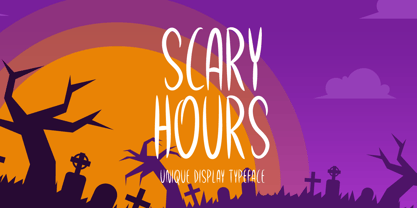 Scary Hours is a unique and spooky display font. It is perfectly suitable for any Halloween-related project or crafty idea! The only limit is your imagination.
 - Básica-Unicode - Personal use only

- Sudbury Basin - Unknown license

- Bakic Shomeryg by Imoodev,
$20.00 Bakic Shomeryg is vintage typography, this typeface has smooth curves and a visual style a can embodies charm and elegance in every lettering, making your work look stunning and attractive. A versatile font that works in both large and small sizes, suitable for a wide variety of projects such as a display for headings, logos, invitations, branding, magazine, photography, card, product packaging, product mockup, mugs, posters, labels, signatures, editorials, art deco, any type of advertising purpose.
 - Basim Marah by Hiba Studio,
$59.00 Basim Marah is an Arabic display typeface and is useful for titles and graphic projects. The font is based on the simple lines of free style calligraphy. A collaborative effort, Basim Marah was designed and drawn by Basim Salem Al Mahdi from Iraq and then digitalized as a typeface by Hasan Abu Afash from Palestine. In November, 2008, Basim Marah was upgraded by working with Mirjam Somers an award-winning Arabic type designer to the DecoType font format for use in WinSoft Tasmeem which is now bundled with InDesign CS4.
 - Typewriter BasiX by Matthias Luh,
$29.99 I found an old typewriter and well... Typewriter BasiX is the result. Enjoy this rough retro looking design to use for your digital or print project and also check out Typewriter Revo, the clean version of Typewriter BasiX, and Typewriter DirtY, an even rougher and dirtier version.
 - !Disc Inferno® BASIC - Unknown license

- Basic Commercial Soft Rounded by Linotype,
$29.99 Basic Commercial is a font based on historical designs from the hot metal typeface era. It first appeared around 1900, and was created by type designers whose names have not been recorded but whose skills cannot be overlooked. This typeface's design has been popular among groups and movements as diverse as the Bauhaus, Dadaism, and the masters of Swiss/International-Style typography. It influenced for a variety of later grotesque fonts, such as Helvetica and Univers. Basic Commercial was distributed for many years in the United States under the name Standard Series. The typeface worked its way into many aspects of daily life and culture; for instance, it became the face chosen for use in the New York City subway system's signage. The Basic Commercial's font family members have a clear and objective design. Their forms exhibit almost nothing unusual, but remain both lively and legible nonetheless. Perhaps for this reason, Basic Commercial's design has been popular with graphic designers for decades. To read more about the history of typefaces like Basic Commercial, visit our font feature, The Sans Serif Typefaces. In addition several weights of this typefamily are available as soft rounded versions."


