10,000 search results
(0.021 seconds)
- Interbellum by Punch,
$22.00 Interbellum is an Art Deco inspired font family which contains 3 display fonts, 2 modern-looking text fonts and 4 AllCaps fonts. In combination, you can easily give your designs a bold, yet elegant look. And by using the many different style sets, it is able to stand tall in all sorts of designs. Although it was inspired by the roaring 20s, we still think of Interbellum as an everlasting time traveller that will definitely impress your clients.
 - Sheko by Valentino Vergan,
$14.00 Sheko is a creative headline pixel font that looks great on any retro design. Sheko is designed to be very eye catching, it’s tight kerning and bold letters makes it great for bold headline vintage designs. You can use Sheko for a wide range of projects, including print and web. If you are looking for something bold and retro for you next project, Sheko is the font for you. I hope you enjoy using the Sheko font.
 - Starstone by Din Studio,
$29.00 If you’re looking and imagining for a modern font to interest your audiences or customers then we’ve got the font for you! Introducing Starstone - A Display Font This typeface with modern style looks very interesting for loads of different projects and promotions. It is perfect to be used on any projects likes website, for your social media branding, pinterest banners, printed products, and more, especially that needs outers space touch. Features: Multilingual Support PUA Encoded Numerals and Punctuation
 - Rudge by Adam B. Ford,
$9.00 Rudge is an intentionally rough sans-serif font. It was designed to share the look and feel of many “antique” fonts, although it lacks the standard serif look of those fonts. The corners are slightly rounded, the edges are wobbly, and the kerning is tight. It could be used as a faux “sloppy printing” font or just a more regularized hand-drawn font. It comes in six flavors: Light, Regular, and Bold, with italic versions of each.
 - Adriane Lux by Typefolio,
$49.00 Adriane Lux is the decorative, "inline" or "openface" titling companion to Marconi Lima's acclaimed Adriane Text family. This single weight offering is modeled after the Regular weight of the primary family. While Adriane Text is intended for thoroughly classical book design, Adriane Lux enters the fold as an equally traditional display face. Have it foil-stamped on your next faux-leather book cover design or embossed on your personal calling card for a touch of well-behaved, regal formalism.
 - Revelstoke by Rook Supply,
$14.00 Revelstoke is a family of five sans serif fonts designed with a vintage print look in mind. Rounded edges and imperfections were added to the characters to give that old school printing vibe. For those looking to take things one step further with some texture, we’ve added in grunge versions as well. Revelstoke is extremely versatile on its own. The font family also works great as a secondary font to go along with existing logos and branding.
 - Pind-O-Rama by PintassilgoPrints,
$24.00 Pind-O-Rama is quite an unconventional font, with strange counters and shapes and choices and interlocks that just stand out. For sometimes fitting in is absolutely not wanted. Pindorama is how the native Tupi people originally called Brazil before colonization by the Portuguese. This font draws inspiration from a book on Brazil colonial background, precisely from a 1961 edition - the book was first published in 1943. Unfortunately the cover design is uncredited. Why fit in? Let's stand out!
 - Charlietta de Angela by Almarkha Type,
$35.00 Introducing Charlietta de Angela - Brush Script Signature is a Authentic brush script that is written casually and quickly. Letters are made with brushes on paper. Then scanned and carefully drawn into vector format. That is why Charlietta de Angela has charming, authentic and relaxed characteristic more natural look to your text with a more natural look to your text. You can activate Ligature OpenType panel, Charlietta de Angela Perfect for designs, branding projects, Logo design, Quotes product packaging.
 - Belgia by HansCo,
$15.00 Here come our latest product with sans serif typeface called Belgia. This font has the characteristics of a rounded shape on each side. Besides this font is perfect for those of you who are looking for font with bold and rounded but still look classy. You can use it on corporate branding, logo, document, social media design, presentation, print design, web, etc. This typeface is comes in uppercase, lowercase, punctuation, symbols, numerals, etc also support multilingual.
 - Hybi5 Finescript by Hybi-Types,
$12.50 The Hybi5 Finescript is intended for the more reputable applications. It’s fine and elegant look makes it great for invitations, menu and concert. The Hybi5 Finescript is technically based on my Hybi5 font family, but with a significantly different appearance. The font contains a lot of accents, ligatures and special characters. Please be sure to set kerning to “metric” and spacing to “zero” in your layout app and please allow ligatures for a more smooth look.
 - Dinzy Minzy by The Printers,
$20.00 If you are looking for an expressive, witty and whimsical typeface, Dinzy Minzy will beckon to a change of pace for any designer looking to create space, time and lighthearted imagery. This typeface draws you into the message of the mind, lending fresh, new life to party, holiday and grand opening invitations. Whether it's a poster, a billboard, or the card in the mail, Dinzy Minzy will be sure to capture attention and turn on the senses.
 - Bunga Pro by Graptail,
$15.00 Bunga is a serif typeface that gives a romantic feel to every curve. With 45 ligatures and alternates which are included, it is very helpful in creating the title of each of your projects such as film titles, book covers, branding, logos, packaging, magazines and more. Also supported PUA encoded. Simply copy and paste the alternate characters using the Character Map (Windows), Font Book (Mac) or a software program such as PopChar (for Windows and Mac).
 - Antemowa by Gatype,
$12.00 Antemowa is modern script font, where every single letter has been carefully crafted to make your text look beautiful. With a modern script style, this font will perfect for many different project such as: quotes, blog headers, posters, weddings, branding, logos, fashion, apparel, letters, invitations, stationery, and more. This font includes alternate glyphs and beautiful swirls How to access alternate glyphs: Windows Character Map: https://www.youtube.com/watch?v=BScPsiubM1k Adobe Illustrator: https://www.youtube.com/watch?v=y5XTaWYwWA4 Thanks for looking.
 - Boxtoon by Mofr24,
$15.00 Introducing Boxtoon, a lively comic font with a bold, modern-retro twist. Bursting with fun, it seamlessly blends the nostalgia of classic cartoons with a contemporary edge. Boasting 16 versatile styles, this multilingual marvel supports Cyrillic characters. Perfect for dynamic displays, comics, posters, book covers, and playful designs like t-shirts, games, and digital crafts. Embrace the whimsical charm that Boxtoon brings to kid's books and beyond—an all-in-one font for your creative adventures! **Uppercase
 - Muray House by Flavortype,
$19.00 Muray House is a bold serif font with a rough, balanced look, with beautiful curves and alternate characters. A style that we choose was the natural look hand made, Muray House ha a unique identity. Muray House also comes with alternative characters that are carefully created for adding a minimalist decor of the letters. Stylistic alternates allows versatile design options and works perfectly for Headlines, Posters, Logos Packaging, Branding, T-shirts, Greetings, Presentations and much more.
 - Kamerik 105 Cyrillic by Talbot Type,
$19.50 Based on the popular Talbot Type Kamerik 105 , this Cyrillic variation is now available for the first time. Kamerik 105 is inspired by the classic, geometric sans-serifs such as Futura and Avant Garde, but has shallower ascenders and descenders for a more compact look. It's a versatile, modern sans, highly legible as a text font and with a clean, elegant look as a display font at larger sizes. The Kamerik 105 Cyrillic family comprises of five weights.
 - Sweet Girls by Haksen,
$12.00 Hello all, I will introduce my new font with the name “Sweet Girls” “Sweet Girls” is the form of letters that many variation and look very beautiful. available over than 50 glyphs for alternative letters that will make this font look so cute, funny, beautiful and fascinating. What's Included : Sweet Girls OTF Sweet Girls Slant OTF Sweet Girls Icons OTF Thanks so much for checking out my shop! Hope You enjoy it so much All the best, Haksen
 - Selfie Neue Rounded by Lián Types,
$29.00 INTRODUCTION When I started the first Selfie back in 2014 I was aware that I was designing something innovative at some point, because at that time there were not too many, (if any) fonts which rescued so many calligraphy features being at the same time a monolinear sans. I took inspiration from the galerías’ neon signs of my home city, Buenos Aires, and incorporated the logic and ductus of the spencerian style. The result was a very versatile font with many ligatures, swashes and a friendly look. But… I wasn’t cognizant of how successful the font would become! Selfie is maybe the font of my library that I see the most when I finally go out, (type-designers tend to be their entire lives glued to a screen), when I travel, and also the font that I mostly get emails about, asking for little tweaks, new capitals, new swashes. Selfie was used by several renowned clients, became part of many ‘top fonts of the year’ lists and was published in many magazines and books about type-design. These recognitions were, at the same time, cuddles for me and my Selfie and functioned as a driving force in 2020 to start this project which I called Selfie Neue. THE FONT "Selfie for everything" Selfie Neue, because it’s totally new: All its glyphs were re-drawn, all the proportions changed for better, and the old and somehow naive forms of the first Selfie were redesigned. Selfie Neue is now a family of many members (you can choose between a Rounded or a Sharp look), from Thin to Black, and from Short to Tall (because I noticed the feel of the font changed notoriously when altering its proportions). It also includes swashy Caps, which will serve as a perfect match for the lowercase and some incredibly cute icons/dingbats (designed by the talented Melissa Cronenbold) which, as you see in the posters, make the font even more attractive and easy to use. You'll find tons of alternates per glyph. It's impossible to get tired with Selfie! Like it happened with the old Selfie, Selfie Neue Rounded was thought for a really wide range of uses. Magazines, Book-covers, digital media, restaurants, logos, clothing, etc. Hey! The font is also a VF (Variable Font)! So you can have fun with its two axes: x-height and weight, in applications that support them. Let me take a New Selfie! TECHNICAL If you plan to print Selfie Neue VF (Rounded or Sharp), please remember to convert it to outlines first. The majority of the posters above have the "contextual" alternates activated, and this makes the capitals a little smaller. I'd recommend deactivating it if you plan to use Selfie for just one word. Use the font always with the "fi" feature activated so everything ligatures properly. The slant of the font is 24,7 degrees, so if you plan to have its stems vertical, you may use Selfie with that rotation in mind. THANKS FOR READING
 - Maree by Ashton,
$5.00 If you want to write something sincere and genuine but not too formal then this is the font for you. It is based on real handwriting, not some artificial calligraphy made to be either too haphazard or spiky or have loads of elegant flourishes but an ordinary person's writing, and designed to look as natural and as close to the original lettering as possible. Like any person's writing it is individual and distinctive, but so easy going on the eye those differences sit comfortably with you. It is friendly and open with easy to read glyphs both as lowercase and uppercase. The letters are relatively wide with clearly shaped distinct outlines. This font may be ideal for projects where you expect a wide readership with different reading abilities from young to old. When you are using this font a slightly bigger point size usually gives a better result so for a standard letter or similar you should size up to 15 points or more. Maree has been individually crafted to the smallest detail. To create a realistic handwriting font that looks relatively simple but works in a wide variety of languages requires a complexity and attention to detail most fonts will never require. This font in any ordinary business environment would never have been made, the effort required to make it too great, the length of time too long. There have been no shortcuts in this font, no automatic scanning or tracing, no automatic generation, no class kerning. Not only is each glyph individual but the width of letters, the height, the accents and the positions of the accents are all different. Even the line weight of the letters is designed to have natural variation but yet similar enough that the font appears as though it were written effortlessly in the same pen. And in order to keep the spacing consistent even though the letters have different widths, heights, lengths of descenders and so on, there are a vast number of kerning pairs, letter to letter, number to number, letter to number... All kerning has been individually assessed with an eye to proportionality taking in character shape, size and weight. For instance if you write a telephone number the numbers all sit close together but if you write a number before a letter such as in a UK post code or before a unit of measurement an extra little bit of space has been added which makes the number more distinct and therefore readable. That space is so natural to the eye that you don’t even know it is there. However even in the spacing allowance has been made for the fact it can’t be too perfect because when you write by hand the spacing is inconsistent. There have to be some letters which are too close or far apart otherwise the font would look artificial. For similar reasons if you are going to print out this font for a letter, etc, check the print version before you make any letter spacing changes because with the zoom functions in modern applications that uneven spacing and lettering can seem more pronounced than it actually is. When this font is printed out you will find it is surprisingly neat. This font is what it is, simple clear handwriting. You will not go wow. But if you want something unique and different and looks good on the page you won’t be disappointed. This font is not a work of art but it is a work of love. This font has a soul. How many fonts can you say that about?
 - Quirky Quill by Mix Fonts,
$13.00 MIX QUIRKY QUILL is not your average font. Inspired by the old archival books and documents from the days of yore, MIX QUIRKY QUILL brings a touch of history and tradition to your designs. With its clean, slightly italicized letters, this font is the perfect choice for projects that aim to evoke a sense of timelessness. Think of the old record books in church archives, the documents from Ellis Island, and pre-technology paperwork. MIX QUIRKY QUILL is reminiscent of these timeless pieces, making it ideal for art events, classic artwork, theatre posters, and anything that demands an air of tradition and classic sophistication. But don’t let its historical roots fool you. MIX QUIRKY QUILL is a perfectly imperfect digitized handwriting font, with a playful and fun flair that makes it stand out. Its clean lines and slightly italicized letterforms provide a touch of sophistication, while its charming imperfections add a touch of personality. This font is perfect for use in earthy, classic palettes such as browns, creams, and ink greens. Whether you’re looking to create a vintage-inspired design or a modern, quirky take on tradition, MIX QUIRKY QUILL is the font for you. Add Quirky Quill to your design arsenal today and see what story you can tell! MIX QUIRKY QUILL comes with the following glyphs: ABCDEFGHIJKLMNOPQRSTUVWXYZ abcdefghijklmnopqrstuvwxyz 0123456789 !@#$%^&*()`~♥✿•· ÷×+−±≈=≠≥≤[]<>:;'”,.\|/ {}“”‘’-–—_…‚„©®™‹›«»°¹²³¡¿₱¢€£¥¶§№† ÁÀÂÄȦÃÅĂĀĄÆĆĈČĊÇÐĐÉÈÊËĖĒĘḞǴĜǦḠĠĤȞḦḢIÍÌÎÏĪĮĴḰǨŁḾṀŃÑŇ ÓÒÔÖÕŌŐØŒṔṖŔŘṘŚŜŠŞȘŤṪȚÚÙÛÜŨŮŬŪŰŲẂẀŴẄẆÝŶŸŹẐŽŻƵ áàâäȧãåăāąæćĉčċçðđéèêëėēęḟǵĝǧḡġĥȟḧḣıíìîïīįĵḱǩłḿṁńñň óòôöõōőøœṕṗŕřṙśŝšşșťṫțúùûüũůŭūűųẃẁŵẅẇýŷÿźẑžżƶ Alternates/Ligatures: & j gg kk ll lt mm nn oo th tt
 - Salma Alfasans by Alifinart Studio,
$10.00 Salma Alfasans is a modern sans serif font, created on February 25, 2021. The main inspiration for this font is its modern geometry and bold design, but looks elegant and smooth. This font is well-crafted and has almost no contrast at all. The advantage of the Salma Alfasans font is that it is very appropriate when used as a heading, but also looks good when used as body text. With many weight options, you can freely adjust the design scenario based on your needs. Salma Alfasans is very good for logos, branding, books (headings, sub headings, and body text), invitations, business cards and others. SALMA ALFASANS UPDATE VERSION 2.0 Update Details: - New designs and mayor changes - Tabular and proportional lining figures - Tabular and proportional oldstyle figures - Stylistic set for a, l, y, and G - Numerator, denominator, and fractions - New ligatures for ff, fi, fj, ft, fk, ffk, and more - Case sensitive, and - Arrows Language Support: Afrikaans, Albanian, Asu, Basque, Bemba, Bena, Breton, Catalan, Chiga, Cornish, Danish, Dutch, English, Estonian, Filipino, Finnish, French, Friulian, Galician, German, Gusii, Indonesian, Irish, Italian, Kabuverdianu, Kalenjin, Kinyarwanda, Luo, Luxembourgish, Luyia, Machame, Makhuwa-Meetto, , Makonde, Malagasy, Manx, Morisyen, North Ndebele, Norwegian Bokmål, Norwegian Nynorsk, Nyankole, Oromo, Portuguese, Quechua, Romansh, Rombo, Rundi, Rwa, Samburu, Sango, Sangu, Scottish Gaelic, Sena, Shambala, Shona, Soga, Somali, Spanish, Swahili, Swedish, Swiss German, Taita, Teso, Uzbek (Latin), Volapük, Vunjo, Zulu. Thank you. Alifinart Studio alifinart@gmail.com Instagram | Behance
 - Condemned by Grype,
$16.00 Condemned is a light destructive sans typeface created from an old damaged ATF Specimen Book from 1912, and looks reminiscent of poorly transferred rub off type. It contains a complete alternate core character set for a subtly randomized look. Here's what's included with Condemned: 684 glyphs - including Capitals, Lowercase , Numerals, Punctuation and an extensive character set that covers multilingual support of latin based languages. (see the 5th graphic for a preview of the characters included) Contextual Alternates that auto-switches between Capitals & Alternate Capitals, Lowercase and Alternate Lowercase, as well as Numerals and Alternate Numerals for visual randomness. To access the Contextual Alternates feature, you will need to be using software with Opentype compatibility otherwise you can access the alternate glyphs via a Glyphs panel. Stylistic Alternates feature that swaps all standard Capitals, Lowercase, and Numerals with their Alternates Alternate Capitals and Lowercase are complete with all international accented characters Font is provided in TTF & OTF formats. The TTF format is the standard go to for most users, although the OTF and TTF function exactly the same. Here's why Condemned is for you: You're into legible but distressed typestyle that imitates a random distress to it You love condensed gothics, and want to pair them with a distressed condensed gothic You're a fan of old Letraset/Transfertype rub off lettering You're recreating weathered military ephemera and want a typeface with some tooth to it You just like to collect quality fonts to add to your design arsenal
 - TT Espina by TypeType,
$19.00 Addition to the collection of TypeType display fonts! TT Espina useful links: Specimen | Graphic presentation | Customization options TT Espina is a display antiqua with expressive serifs. Inspired by the historical shape of the letter O, which took on a diamond shape due to print quality, the designers created a modern typeface with high contrast between horizontals and verticals. TT Espina is yet another proof that antiquas can be stylish and expressive display fonts suitable for modern projects. TT Espina will look harmoniously in headlines of posters or billboards, in gallery and exhibitions design, in large-format printed materials or on websites. The font is easily distinguishable among other antiquas by its high contrast, expressive and large serifs, closed aperture and diamond-shaped circles. TT Espina’s characters are quite narrow, which adds to the materials designed using the font a special aesthetic. It makes you to look closely into each letter, so the headlines set in TT Espina will definitely be read. A full set of different icons is a nice addition for designers who will work with a new typeface. TT Espina consists of 7 typefaces: 6 romans and 1 variable. Each typeface has 648 glyphs. The font family has 21 OpenType features, including changing the shape of some characters (Q, g, j), the possibility to replace characters with high-set diacritics with characters with low-set diacritics, which is convenient for poster design.
 - Inka by CarnokyType,
$49.00 Inka is the name by which the closest-ones called my partner. Inka is also the name of a text typeface – in its form very friendly and welcoming. The same way as relationships develop through the life, text typefaces develop, too. I had started the work on this typeface about the same time as I met Inka, while reaching the final output has been a long and progressive process. Inka is a modern serif typeface with wide universality in functions (various editorial usages as books, magazines, annual reports…). The concept and the scope of the complete type family are based on the principle of optical sizes of the typeface designed for the particular use of the size of typesetting. Inka consists of several drawing variations for the typesetting of small sizes (Small), text typesetting (Text), larger typesetting sizes (Title), and headlines sizes (Display). Two constructive alternatives, differing in the height of the construction of the font signs, further extend the variability of the usage of the typeface. Inka A has classical proportions ideal for book typesetting. Inka B has lower ascenders and descenders, lower uppercase glyphs and numbers. Typeface with such construction allows us to use the typesetting efficiently while using tighter leading and still looking more contemporary. Each of the font set (Display, Title, Text, Small) consists of four weights (Regular, Medium, Bold, Black), each has wide character set and a lot of OpenType features. “Inka is dedicated to Inka.”
 - Zrnic by Typodermic,
$11.95 Looking for a typeface that perfectly captures the essence of industrial precision and futuristic design? Look no further than Zrnic. With its unique blend of boxy, plastic letterforms and strategically placed gaps, Zrnic delivers a stark, high-tech look that’s perfect for conveying your message with clarity and impact. Zrnic’s six weights and italics give you a range of options to choose from, allowing you to fine-tune the look and feel of your designs to perfectly match your needs. Whether you’re creating technical documentation, product manuals, or other materials that require a precise, professional look, Zrnic has got you covered. With Zrnic, you don’t have to worry about your message getting lost in the noise. Our unique design allows your text to stand out with crystal-clear precision, ensuring that your audience can quickly and easily understand your message. Zrnic’s gaps are strategically placed to reduce overall weight, giving you a clean, minimalistic look that’s perfect for modern designs. These gaps also provide increased impact, allowing your text to stand out and capture your audience’s attention. Zrnic is the ultimate tool for designers who want to convey the notion of technological precision with their designs. With its high-tech, industrial look and range of weights and italics, Zrnic is the perfect choice for technical documentation, product manuals, and other materials that demand a precise, professional look. Most Latin-based European writing systems are supported, including the following languages. Afaan Oromo, Afar, Afrikaans, Albanian, Alsatian, Aromanian, Aymara, Bashkir (Latin), Basque, Belarusian (Latin), Bemba, Bikol, Bosnian, Breton, Cape Verdean, Creole, Catalan, Cebuano, Chamorro, Chavacano, Chichewa, Crimean Tatar (Latin), Croatian, Czech, Danish, Dawan, Dholuo, Dutch, English, Estonian, Faroese, Fijian, Filipino, Finnish, French, Frisian, Friulian, Gagauz (Latin), Galician, Ganda, Genoese, German, Greenlandic, Guadeloupean Creole, Haitian Creole, Hawaiian, Hiligaynon, Hungarian, Icelandic, Ilocano, Indonesian, Irish, Italian, Jamaican, Kaqchikel, Karakalpak (Latin), Kashubian, Kikongo, Kinyarwanda, Kirundi, Kurdish (Latin), Latvian, Lithuanian, Lombard, Low Saxon, Luxembourgish, Maasai, Makhuwa, Malay, Maltese, Māori, Moldovan, Montenegrin, Ndebele, Neapolitan, Norwegian, Novial, Occitan, Ossetian (Latin), Papiamento, Piedmontese, Polish, Portuguese, Quechua, Rarotongan, Romanian, Romansh, Sami, Sango, Saramaccan, Sardinian, Scottish Gaelic, Serbian (Latin), Shona, Sicilian, Silesian, Slovak, Slovenian, Somali, Sorbian, Sotho, Spanish, Swahili, Swazi, Swedish, Tagalog, Tahitian, Tetum, Tongan, Tshiluba, Tsonga, Tswana, Tumbuka, Turkish, Turkmen (Latin), Tuvaluan, Uzbek (Latin), Venetian, Vepsian, Võro, Walloon, Waray-Waray, Wayuu, Welsh, Wolof, Xhosa, Yapese, Zapotec Zulu and Zuni.
 - Cream Cheese by Rocket Type,
$10.00 Cream Cheese and Onion Bagels go together like apples and oranges. Taste this brand new font duo from Rocket Type! Great for branding, broadcast, and childrens books!
 - Lead Paint by Fonthead Design,
$19.00Lead Paint is a font designed by Ethan Dunham that is very rough and grungy looking. It was created using ink and a piece of shredded wood. - Hazel Page by Fromletterel,
$14.00 Hazel Page has natural stroke and casual look that gives youth and friendly vibes, suitable for branding, video editing material, printing and any other kind of designs
 - Alyanda by Nissa Nana,
$20.00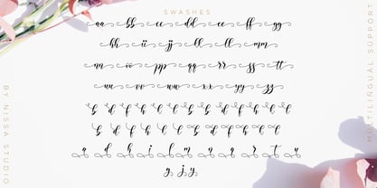 Alyanda is a beautiful script with a classy, elegant, and modern look. Fall in love with its authentic vibe, and turn any design project into a standout!
 - Amstello by Letterafandi Studio,
$16.00 Amstello is a cute and fun handwritten display font. This original look will appeal to a wide range of crafty ideas, from letterheads and titles to stationery.
 - Valiante by Gerald Gallo,
$20.00 Valiante is a bold contemporary sans serif font. It is ideal for headlines, titles, branding, small blocks of text or wherever a fresh new look is desired.
 - Salty Malthy by MJB Letters,
$15.00 Salty Malthy is a beautiful display font it made with perfect combining of each characters and looks original and can be used for all your project needs.
 - Price Tag by Turtle Arts,
$20.00Price Tag is a bold, graphic alphabet inspired by labels and vintage price tags. A touch of grunginess makes this alphabet look extra cool in larger sizes. - Brownie Girly by OCSstudio,
$12.00 The elegant and cute Brownie Girly font was inspired by children's handwriting and is very suitable for book covers, magazine covers, packaging products, birthday gifts, and more.
 - Love Castle by Epiclinez,
$18.00 Love Castle is a fun and playful display font. This cute font will look truly outstanding in a wide of contexts from letterheads and titles, to logos.
 - Weird Garden by Rashatype,
$10.00 Weird Garden is a cool, quirky and spooky display font. This font was particularly crafted for those who need a beautiful and refreshing look to their designs.
 - P22 Koch Signs by P22 Type Foundry,
$24.95This set reproduces over 350 of the signs contained in German typographer Rudolf Koch's "The Book of Signs," the symbols include Astrological, Christian, Medieval and Runic iconography. - Morning Rain Dot by ToBeThea,
$12.00 Morning Rain Dot is handmade font with cute little dots. It’s great for big and short titles. You can costumize it and make it look even cuter :)
 - ItalicHand by Grummedia,
$24.00Inspired by 11th 12th century Carolingian hand drawn cursive. Elegant and clearly legible this italic looks well in large or small sizes for formal or informal use. - GR onsoo Script by GORAE Font,
$19.99 The typeface of GR onsoo Script is the handwriting of artist 'onsoo'. This font is designed for use in the text or title of fairy tale books.