5,530 search results
(0.016 seconds)
- Nantua by Characters Font Foundry,
$- Nantua is inspired by the Russian Constructivism from the early 1920s. Artists like Aleksandr Rodchenko used typography as forms. Nantua can be used with that very same principal. It's a very geometrical display font with hard edges. Used in big sizes it is very 'in your face'. Used in small sizes it tends to work like a compact background pattern. With very small inner forms, Nantua needs to be used in big sizes to be legible. It's preferably seen on posters or flyers.
 - Gutta Percha by HiH,
$8.00 Gutta Percha is a font for golfers. It takers its name from a hard, resilient natural substance that comes from the sap of trees grown in southeast Asia and which was used for the hard core of golf balls well into the twentieth century, when it was gradually replaced with synthetic material. It therefore seemed an appropriate name for a font using the image of a golfer of the 1920s. The letters are from our font Besley Clarendon, reduced to 70%. That means that Gutta Percha set at 40 points will have the same size letters as Besley Clarendon set at 28 points. However, it should be noted that the two fonts have different baselines. If you use them together you will have to manually adjust the vertical alignment. Gutta Percha is obviously a very specialized font, both because of the subject matter and because the uppercase is designed for use as dropped caps. There may not be many uses for it, but when it is right, it will be really right. Whether you are publishing a book about the history of golf or a clubhouse bulletin, Gutta Percha will surely be noticed.
 - Emoticons - Personal use only

- Tanach - Personal use only

- Rediviva - Unknown license

- HumboldtFraktur - Unknown license

- Fraenkisch - Unknown license

- Bitgette Script by Nk Studio,
$14.00 Bidgette Script is a beautiful script font with many alternative styles, this font looks natural, elegant and perfect for extraordinary projects. Bidgette Script is suitable for various products such as invitations, product packaging, offers, product designs, crafters, labels, photography, watermarks, logos & branding. Everything can be accessed using software that supports Opentype, such as Adobe Indesign, Adobe CS Illustrator, Adobe Photoshop CC, and Corel Draw.
 - 1769 by Almarena,
$22.00 1769® Display is an elegant and modern serif typeface inspired by the history of France and more particularly the Romantic movement (1700s and 1800s). The roundness of its characters and its numerous ligatures reflect the grace, refinement and sensitivity that were omnipresent during the 18th century. Its name refers to the birth of Napoleon Bonaparte, the fascinating or revolting emperor, the emblematic figure of this period.
 - HT Pasticceria by Dharma Type,
$19.99 HT Pasticceria is extremely eye-catching and high-contrast font. It is a chic typeface with a?sweet?and?perhaps?girly touch. HT Pasticceria is great for use in all kinds of display typography. Holiday Type Project offers retro hand drawing scripts. Inspired by retro script on shopfront lettering, wall paint advertisements in Italy around 1950s. Check out the script fonts from Holiday Type!
 - HT Osteria by Dharma Type,
$19.99 HT Osteria is a monoline script, but you don’t feel it monotonous because of distinctive shapes of the characters. HT Osteria is suitable for signage, package, and posters or any other kind of display use. Holiday Type Project offers retro hand drawing scripts. Inspired by retro script on shopfront lettering, wall paint advertisements in Italy around 1950s. Check out the script fonts from Holiday Type!
 - Sullivan by Magpie Paper Works,
$36.00 Sullivan is a modern calligraphy font with a sweet and considered vibe. Handdrawn with vintage calligraphy nibs and ink, he is ready to shine in personal correspondence, scrapbooks, stationery, and illustrated reference and picture publications. (Sully adores love letters and recipes.) In addition to a complete set of capital and lowercase letters, he also includes multi-lingual support, currency figures, fractions, numerals, punctuation and more.
 - Honest by W Type Foundry,
$28.00 Honest draws inspiration from the serif fonts prevalent in print media during the 1970s and 1980s. Its letter shapes are well-suited for prominent uses like logos and striking headlines due to their distinctive style. The font's large x-height makes it suitable for tight leading in headlines. Honest offers a variety of options, including seven different weights and two styles: Standard and Italic.
 - Egorycastle by Seventh Imperium,
$40.00 Egory castle was inspired from the history of the medieval age. The idea was to make us interested to explore in the aspect of art and decorative letters forms. Lots of studies that we have learned from history in middle age and inspiration from many different sources make very valuable references for us to develop a new idea in the development of this typeface.
 - Fagetone by Prioritype,
$15.00 Dating back to the 60s 70s, this retro script font comes in bold bold and thin, perfect for your projects and supports multilingualism and other character additions. Can be applied to various print and digital media such as food packaging, clothing stores, accessories, clothing, creative goods, antique workshops, sports, entertainment and even logos. For reference, see preview. Features: -Uppercase -Lowercase -Numeral -Punctuation -Ligature -Multilingual
 - Zachar by Rosario Nocera,
$14.00 Zachar is a Roman typefaces designed for the horror and thriller genre but thanks to its strong distinctiveness it’s also suitable for branding. Zachar is available in Regular and Medium weights in four versions: Regular, Rust, Scratched and Rust Scratched, it also offers a large selection of alternative letters, special glyphs and ligatures. Zachar has a sinister elegance and is suitable for display works, posters and billboards.
 - Qore by Linecreative,
$16.00 Qore font is a sans-serif typeface with minimal, modern,and futuristic style. This typeface is available in all caps only with stylistic alternates feature plus supports multilingual languages. This font is appropriate for your branding, logo design, shirts, etc. Qore offers you: Qore- A clean San serif font including Upper & Lowercase characters(ALL CAPS) Stylistic alternates Character Numbers and Punctuation Multilingual Support (Latin Western Europe)
 - SG Mikura by Studio Gulden,
$20.00 Introducing SG Mikura: Redefine Possibilities with Typography. Elevate your designs with the perfect blend of variability and versatility offered by our brand new font. With 9 meticulously crafted weights and over 600 meticulously designed glyphs, your creativity knows no bounds. From elegant finesse to bold statements, let SG Mikura be the cornerstone of your visual masterpiece. Discover the art of expression through typography today.
 - Daffadowndilly NF by Nick's Fonts,
$10.00Here’s another offering based on the work of Alf Becker, long-time contributor to Signs of the Times magazine. This only comes from the 1940s, and is a light and bouncy single-stroke face that’s sure to pep up any project it graces. This font contains the complete Latin language character set (Unicode 1252) plus support for Central European (Unicode 1250) languages as well. - CamingoDos Condensed by Jan Fromm,
$45.00 CamingoDos Condensed was designed to achieve a more powerful impact for the use in headlines. The compact appearance and the tight letter spacing makes it an ideal solution for display settings on a limited space. CamingoDos Condensed comes with a Pro version that offers a rich set of expert typographic features like small caps, ligatures, stylistic alternates, different figure sets, arrows, fractions and ordinals.
 - Carolina by Linotype,
$29.99Carolina is a part of the 1990 program Type before Gutenberg, which included the work of twelve contemporary font designers and represented styles from across the ages. Linotype offers a package including all these fonts on its web page, www.fonts.de. Gottfried Pott designed his Carolina in the tradition of the Carolingian Minuskel. The rhythmic flow of the font gives text a light and elegant feel. - Bageton by Nk Studio,
$20.00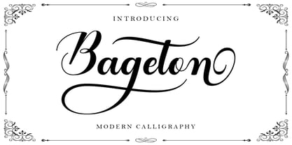 Bageton is a beautiful Calligraphy font with many alternative styles, it looks natural, elegant and perfect for extraordinary projects. This font has 350+ glyphs. Bageton is suitable for various products such as invitations, product packaging, offers, product design, crafters, labels, photography, watermarks, logos & branding. Everything can be accessed using software that supports Opentype, such as Adobe Indesign, Adobe CS Illustrator, Adobe Photoshop CC, and Corel Draw.
 - Toot Sweet Bistro NF by Nick's Fonts,
$10.00A 1928 poster for a café by German artist Karl Bauer informed the creation of this charming and expansive typeface. This font hops, bops, flip-flops and never stops, and is named after a fictitious café which offers cool jazz and fast service. Both versions contain the complete Unicode 1252 (Latin) and Unicode 1250 (Central European) character sets, with localization for Romanian and Moldovan. - Alpha by CTR,
$30.00 The initial designs for this font first came from the idea of creating a dynamic and visually appealing typeface just by using squares so throughout the development stages I had restricted myself to just the use of squared paper. The hardest thing that I found was overcoming the problems regarding letter forms that have diagonal lines and therefore defer from the ongoing style of the typeface.
 - Corkboard JNL by Jeff Levine,
$29.00Corkboard JNL is a bold, yet fun rounded-ends typeface that was popular in the 1970s and enjoying a revival amongst students and teachers via die-cut bulletin board letters. Five variations are offered—Regular, Slanted, Shadow, Shadow Slanted and Kiddies. Corkboard Kiddies JNL has a limited character set and eccentric spacing that emulates the way a child might put letters onto a bulletin board. - Mylazy by Twinletter,
$13.00 Introducing Mylazy Font – the quintessential display typeface that embodies the authentic art of handwriting! Crafted to infuse your projects with a genuine handwritten touch, Mylazy offers a creative solution for diverse design needs. Explore Mylazy now to redefine your creative endeavors! What’s Included : File font All glyphs Iso Latin 1 Alternate, Ligature Simple installations PUA Encoded Characters – Fully accessible without additional design software. Fonts include Multilingual support
 - Leyton by The Colour Grey,
$35.00 A bold, friendly, impactful typeface. Ideal for filling with graphics and textures and layering with other type. Named in reference to the generously proportioned Alfred Hitchcock (born in Leytonstone). Leyton was designed to be as fat and punchy as possible without losing legibility. Each character fills up the space – throwing away counters in the process. Discounts available for certain projects – particularly charities and students.
 - Dalty. by Rezastudio,
$9.00 Introducing Dalty. is a stylish Signature font with a contemporary and sophisticated accent. Perfect for logo/branding projects, large header text, and product packaging. Dalty. Style Features : Ligatures Alternative Swash Multilanguange We really hope you enjoy and are interested in our offer. We will be happy to answer your questions. Alternatively, you can send me a message and you can immediately start your service ~Reza Studio~
 - Mally by Sea Types,
$25.00 Mally is a family of humanist fonts, sans serif with 32 styles, variable with 08 normal and condensed weights and their respective italics, with 594 characters in each font, offers alternative characters, was conceived as a variable font encompassing various weights and widths. Characterized by its excellent readability even in the smallest sizes, with a contemporary design it has a wide support of Latin languages.
 - Skyline by Font Bureau,
$40.00 Skyline was commissioned from Font Bureau by Condé Nast specifically as a headline typeface for Traveler magazine. This strongly personal work by Imre Reiner from 1929 and 1934 was known in Europe as Corvinus. Skyline Black and Bold Condensed offer immediate headline recognition through Reiner’s variations on the themes found in the classical Modern structure. Both styles were adapted by Jane Patterson; FB 1992
 - Magdalene Sans by Greater Albion Typefounders,
$10.00 Magdalene is a classically designed sans-serif face for the 21st century. It's designed to offer clear and immediately legible lettering for signage and poster use which still has a touch of character and elegance about it. Magdalene is also ideal for the display of web pages and legible text on small LCD panels. Use Magdalene to combine traditional design attributes with modern technology.
 - Eurostile by URW Type Foundry,
$89.99 Eurostile Display Caps The Eurostile font family was designed (by Novarese and Butti in 1952) to complement the titling font, Microgramma, by offering a lowercase alphabet. Issued by the Nebiolo foundry, the rather square sans serif Eurostile became popular for display and advertising use. The linear nature of Eurostile suggests modern architecture, and its attraction is technical and functional. Eurostile is commonly misspelled Eurostyle.
 - Hillstate by Sabrcreative,
$25.00 Elevate your designs with the captivating charm of Billbest Brush Script Font. This versatile typeface combines the free-flowing elegance of brush strokes with a modern twist, making it a perfect choice for adding an artistic touch to your projects. Whether you're designing logos, branding materials, posters, or invitations, Billbest offers a seamless blend of lowercase and uppercase letters that create a harmonious and balanced visual appeal.
 - Comet Hotspur by Putracetol,
$28.00 Comet Hotspur - Display Typeface Font is a bold and distinctive font that seamlessly blends modern and retro aesthetics. With its unique character shapes, bold strokes, and alternative letterforms, this font offers a captivating typographic solution. The font exudes a retro bold and vintage vibe while maintaining a fresh and contemporary edge. Whether you're creating logos, branding materials, titles, posters, film graphics, cards, quotes, or landing page titles.
 - Hera Big by Lucas Sharp,
$40.00 Hera Big is a type family in eight weights & 16 fonts. The family explores the motion and fluidity of the ball serif, in an evolution from its previous identity as a counterpart to the slab serif. Informed by great fat-faces from Figgins to Lubalin, but never deferring to precedent by default, Hera is a fresh mix of originality and organic form, never sacrificing function for beauty.
 - Granville by Greater Albion Typefounders,
$14.95 Granville, is inspired by traditional British (and transatlantic) shop signage. It's an elaborate confection, drawing on Roman and Blackletter influences and is ideal to give any project an instant Victorian feel. Granville is offered in Regular, Condensed and Expanded widths as well as an oblique form and a yet more decorative 'Grand' form. These faces are especially suitable for posters, period advertising, Chapter headings and signage.
 - HT Libreria by Dharma Type,
$19.99 This font consists of thin lines, we get very delicate impression.The straight lines are regularly arranged, at the same time, this font has very beautiful curved lines. So its overall atmosphere is intelligent and sophisticated. Holiday Type Project offers retro hand drawing scripts. Inspired by retro script on shopfront lettering, wall paint advertisements in Italy around 1950s. Check out the script fonts from Holiday Type!
 - LC Merkén by Compañía Tipográfica de Chile,
$30.00 Merkén is a typeface inspired in the Slab Serif fonts designed by Vincent Figgins in the early 20th century: his famous designs; Antique and Egiziano, were the main references when developing this project. The typeface is perfect for headlines, medium length texts, branding and advertising. His original set is strong and spicy but it also has an alternative set which is cursive and kind.
 - NS Gibswing by Novi Souldado,
$35.00 Gibswing born based on the reference of old fancy lettering, vintage illustration, and victorian calligraphy. The Gibswing decorative style make it as an instant time machine to the era from 1800-1900 victorian visual style of the products, printed advertising, and signs back in the day. It will be a perfect companion of your classic visual direction for decorative sign, labels, branding, logotype, you name it.
 - Elmcourt by Greater Albion Typefounders,
$20.00 Elmcourt is a clear and simple display slab-serif typeface family. It's offered in two weights and regular and italic forms. An extensive range of opentype features are included in all typefaces, including small capitals, ligatures, and old-style numerals. It's an ideal family for bold headlines and eye catching poster work. The simplicity of its outlines make it ideal for carved and cutout work.


