10,000 search results
(0.049 seconds)
- FastFingers by ParaType,
$25.00A set of signs designed by Andrey Belonogov. It includes representation of gestures used by left- and right-handed people in different countries to enhance the power of speaking. The typeface (under the name Handmade) was awarded a diploma at the ATypI International Type Design Contest “Bukva:raz!”, 2001. Released by ParaType in 2008. - Ostbahnhof by Sylvain Mazas,
$14.99 Ostbahnhof is a headline font inspired by both german blackletter and hand-painted signs. The 4 weights can be combined together to achieve a fancy letterpress effect, where slightly rounded corners are not proportional to the font size. Not sure what I'm talking about? Have a look at the examples. youtube video
 - Theater Lobby JNL by Jeff Levine,
$29.00 A vintage photo (circa 1950s) taken outside one of the movie houses owned at the time by Miami-based Wometco Theaters showed a small hand lettered sign with the word “Wometco” painted in a stylized Art Deco alphabet. This inspired Theater Lobby JNL, which is available in both regular and oblique versions.
 - Moscovium by Throndsen,
$29.99 Moscovium is a radioactive, synthetic element about which little is known. It is classified as a metal and is expected to be solid at room temperature. It decays quickly into other elements, including nihonium. The element had previously been designated ununpentium, a placeholder name that means one-one-five in Latin. Element 115
 - Rodista Brush by Stripes Studio,
$20.00 Rodista Brush is a super casual hand brushed script with detailed brush stroke texture, and a quirky, Can be used for various purposes. such as the title, signature, letterhead, signage, labels, newsletters, posters, logos, correspondence, wedding invitations, badges, etc. Rodista Brush Font international Support for a review of most Western languages included.
 - Nouveau Nights JNL by Jeff Levine,
$29.00 The deep well of creativity that is the era of the hand lettered sheet music title page brings forth Nouveau Nights JNL. Re-drawn from a period example of the 1920s, this titling font perfectly captures the warm "human" look of pen and ink lettering, long before the advent of "perfect" digital type.
 - Self Promotion JNL by Jeff Levine,
$29.00 The July 26, 1934 of the movie industry trade paper The Film Daily contained an ad for Paramount promoting its most recent releases. Hand lettered in an ultra bold Art Deco sans serif style, it was the working model for Self Promotion JNL, which is available in both regular and oblique versions.
 - Lil' Punk by Celebrity Fontz,
$19.99Youthfully energetic, this unique typeface looks like it came straight from the hand of a skateboarding teenager. The quirky strokes and unrestrained characters convey the essence of early adolescence like no other font you will find. Perfect for children's books or publications appealing to an adolescent audience or for texts portraying unbridled youth. - Ramadesh by Typotheticals,
$5.00Lightly playful, this font had a lot of influences in its design. I liked the look of this style in three fonts and decided to create my own version. This is it. Included is a version called Italic, but it is not a true Italic, just a variation in some lower case letters. - Serif Formal Oblique JNL by Jeff Levine,
$29.00 An advertisement in a 1936 issue of “The Film Daily” for the movie “Mr. Deeds Goes to Town” had much of its copy set in an extrabold typeface similar to the Beton/Stymie/Karnac group of slabserif designs. This is now available digitally as Serif Formal JNL in both regular and oblique versions.
 - Barbary Pirates by OzType.,
$16.00 Imagine a hot summer day with a cool breeze, watching the sun set over the beach, ice cold lemonade in your hand and some of your favorite music playing in the background. A perfect postcard moment! Use Barbary Pirates to make awesome type designs for logos, posters, album covers, packaging, Instagram posts...
 - Metrolite #2 by Linotype,
$29.00In 1929 Chauncey Griffith at Mergenthaler commissioned W.A. Dwiggins to design a warmer and less mechanical Geometric Sanserif to compete with Futura. Dwiggins’ best efforts proved that human warmth had little to do with cool geometry; for twelve years, until the introduction of Spartan, Mergenthaler lost ground to Intertype’s licensed version of Futura. - Choc by ITC,
$29.99 Choc font is the work of French designer Roger Excoffon, based on the traditions of Japanese brush calligraphy, thick yet graceful. Choc light font was designed by Phil Grimshaw, who had to redraw many times in different weights before finding one that worked as a text face and remained true to the original.
 - Sign Studio by Jeff Levine,
$29.00 The French lettering book Album de Lettres Arti (1949) displayed a number of examples of unique, stylized typefaces. One in particular features a multi-line sans serif in a classic Art Deco style with open-ended characters. This design is now available as Sign Studio JNL in both regular and oblique versions.
 - Moonlit Walk JNL by Jeff Levine,
$29.00 Another variant to the ever-popular Art Deco sans lettering with solid centers (no counters) was found in the hand-lettered title on the cover of the 1933 song "There's A Ring around the Moon". This became the basis for the digital typeface Moonlit Walk JNL, available in both regular and oblique versions.
 - Curtain Up JNL by Jeff Levine,
$29.00 The 1937 sheet music for the tune "Sweet Stranger" has the title hand lettered in a round cornered Art Deco sans with an inline featuring square corners. Now available as Curtain Up JNL, it is available in regular, oblique, solid and solid oblique versions (for those who prefer a version without the inline).
 - Choose Time by Stripes Studio,
$20.00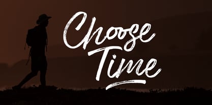 Choose Time is a super casual hand brushed script with detailed brush stroke texture, and a quirky, Can be used for various purposes. such as the title, signature, letterhead, signage, labels, newsletters, posters, logos, correspondence, wedding invitations, badges, etc. Choose Time Font international Support for a review of most Western languages included.
 - Sharon Baker by Letterhend,
$13.00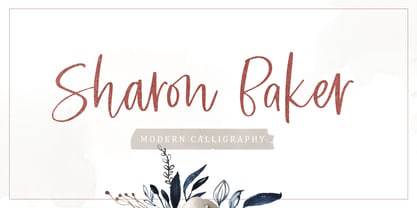 Sharon Baker a modern script that has a bright, lovely feeling. The natural hand written script is suitable for everyone who needs a typeface for headlines, logotype, apparel, invitations, branding, packaging, advertising, and more. This typeface is comes in uppercase, lowercase, punctuation, symbols, numbers, stylistic set alternate, ligatures, also contains multi-lingual support.
 - Lucky Brian by Beary,
$15.00 Hello guys Proudly presents our font lucky brian. lucky brian is mazing hand lettering look attractive and natural! Script font carefully created with a touch of elegance. Whether you’re looking for fonts for Instagram or calligraphy scripts for DIY projects, this font will turn any creative idea into a true piece of art!
 - Fostone by GlyphStyle,
$17.00 Fostone is a signature style font with a natural looking ballpoint pen. Luxurious and elegant font. Font family with 4 version: regular, bold, italic, bolditalic. This signature font is perfect for, watermarks, branding, business, business cards, product logos, etc. – Font feature Uppercase, Lowercase, Numerals & Punctuations, Stylistic Alt, swsh (ending swash), Ligature, Multilanguage
 - Galexica by Ingrimayne Type,
$6.00 Galexica is a geometric, modernistic, sans-serif typeface. The original family had five members, but an upgrade in 2019 expanded that to ten, with five weights and italics for each of those weights. The eccentric letter forms have a techno or futuristic look. There is also a monospaced version of this design,
 - Sundae by SparkyType,
$25.00Sundae is a brush script drawn with a naïve hand-made twist. The flow of curves, contrast in stroke and variations in letter heights add a human touch while the consistency in design allows for semi-extended setting. Sundae is best suited for large, confident headings where a personal impact is desired. - Maest by Omine Type,
$24.00Constructed only with straight lines, Maest is an unusual script typeface. The straight lines give the letters a striking visual effect, specially in small sizes. Maest also features four styles of figures, plus swash capitals, a few ending forms and the f-ligatures. It is available in three weights, from regular to black. - Art Materials JNL by Jeff Levine,
$29.00 The cover of the 1930s-era “Catalog of Artists’ Materials” from Ernst H. Friedrichs, Inc. (New York) has the words “Artists’ Materials” hand lettered in a stylized Art Deco sans serif type style. This unique design is now the digital font Art Materials JNL, which is available in both regular and oblique versions.
 - Sign Painter JNL by Jeff Levine,
$29.00A sales catalog sheet from the American Decalcomania Company circa the late 1940s-early 1950s provided some hand lettering that served as the inspiration for Sign Painter JNL. Emulating the look of characters made with a round pen nib, this Deco-style typeface conveys nostalgia and charm seldom found in advertising of today. - Brush Blaze by Gatype,
$14.00 Brush Blaze is a font that was scratched with a brush pen, to get a natural texture, this font will show the characteristics of the hand. This font is perfect for various places such as clothing, posters, title books, stationery designs, quotes, branding, logos, invitations, greeting cards, t-shirts, packaging designs and more.
 - Casual Tune JNL by Jeff Levine,
$29.00 Brush-style lettering has been a perennial favorite for designers and sign painters because it brings to mind casual, relaxed or friendly themes. A vintage piece of sheet music called “Pretty Butterfly” by Sunny Skylar features the titled hand lettered in a simple, informal design which became the inspiration for Casual Tune JNL.
 - Film Preview JNL by Jeff Levine,
$29.00 An Oct. 7, 1931 advertisement in a British trade paper for the film industry carried the unusual title “The Bioscope Peaks of National Approval”. Just as unusual was the hand lettering for this ad – a quirky, casual bit of novelty typography that inspired Film Preview JNL; available in both regular and oblique versions.
 - Hacklines by limitype,
$17.00 Hacklines is a script font crafted in a natural hand-touched style, featuring a flexible appearance and a slightly textured shape that adds to the uniqueness of this font. Suitable for various design needs, whether modern, luxurious, elegant, or even playful. Hacklines comes with: - Uppercase - Lowercase - Numbers - Symbols - Alternate - Ligatures - Multilingual - Swash
 - Chunky Nouveau JNL by Jeff Levine,
$29.00 Chunky Nouveau JNL was inspired by a circa-1928 water applied decal for the Top Most Insulated Jug. The plump, rounded hand lettering of the brand name was given a slightly thicker treatment to create a more poster-oriented display design. Chunky Nouveau JNL is available in both regular and oblique versions.
 - Oakland by Greater Albion Typefounders,
$9.50 Oakland is a Streamline era design inspired by some hand-drawn lettering on a 1930's French poster advertising a certain brand of Car (Automobile for our American cousins). It's ideal for giving poster and design work that late 1930s to mid 1950s feel. Make a bold statement with this all capitals typeface!
 - Doriss Girls by Open Window,
$- Dorriss girls were the dancing troop at the Moulin Rouge. I had the idea for this font while trying to come up with an alternative to beveling. I thought it would be interesting to create this sort of stepped effect as I've never really seen this treatment on a font before. Then my need to create chaos shows up again with Doriss Girls informal. A hand drawn take on the forms. This seemed like it would appear on an old art nouveau poster by the great Toulouse Lautrec, so there you have the genesis of this font. I've been somewhat compelled by the letterforms so I may expand and create a more normal version of this font someday with a range of weights. That would be the bees knees.
 - Binder by Grype,
$16.00 Our Binder Family is a revival and expansion of Binder-Style, a typeface designed by Joseph Binder and released by D. Stempel AG in 1959. It originally was a single weight. In later film type adaptations, a bold style, and an outline with drop shadow style were made available. However, this typeface never really had a true sense of family or larger language compatible character set. The original Binder-style typeface found revived popularity with its super condensed style when it appeared on the movie poster for "Silence of the Lambs". It was always a disappointment to me how this typestyle had never gained more traction in use. And so, many years later, we decided to revive the original typestyle, and expand it with a range of weights and obliques to pair with those weights. We've moved most of the unusual lowercase forms to a Stylistic Alternates feature, along with unicast alternates for the Capitals. The family includes a full standard character set with expansive international support of latin based languages, and 4 weights jumping from Thin to Bold, along with 4 accompanying obliques. This family is ready for you to eat it up with a nice glass of Chianti. Here's what's included with the Binder Family: 538 glyphs per style - including Capitals, Lowercase, Numerals, Punctuation and an extensive character set that covers multilingual support of latin based languages. 4 weights: Thin, Light, Regular, & Bold. Accompanying Obliques with each weight/width style. TTF formatted fonts have been hinted for optimal performance. Here's why the Binder Family is for you: You're in need of a stylish condensed font with a variety of weights and obliques for your designs You're a fan of the typographic works of Joseph Binder, but wish there was more to them You love the style of Agency and Bank Gothic, but want something uber-narrow You are desperate to recreate the movie poster from Silence of the Lambs You just like to collect quality fonts to add to your design arsenal
 - Anselm Sans by Storm Type Foundry,
$63.00One of the good practices of today’s type foundries is that they release their type families as systems including both serif and sans serif type. Usually, the sources of inspiration need to be well tried with time and practice, since production of a type family is such a laborious and complex process. From the beginning, it needs to be clear that the result will be suited for universal use. Such systems, complete with the broad, multi-lingual variations permitted by the OpenType format, have become the elementary, default instrument of visual communication. Non-Latin scripts are useful for a wide scope of academic publications, for packaging and corporate systems alike. And what about outdoor advertisement designated for markets in developing countries? Cyrillics and Greek have become an integral part of our OpenType font systems. Maybe you noticed that the sans serif cuts have richer variety of the light – black scale. This is due to the fact that sans serif families tend to be less susceptible to deformities in form, and thus they are able to retain their original character throughout the full range of weights. On the other hand, the nature of serifed, contrasted cuts does not permit such extremes without sacrificing their characteristic features. Both weights were drawn by hand, only the Medium cut has been interpolated. Anselm Ten is a unique family of four cuts, slightly strengthened and adjusted for the setting in sizes around 10 pt and smaller, as its name indicates. The ancestry of Anselm goes back to Jannon, a slightly modified Old Style Roman. I drew Serapion back in 1997, so its spirit is youthful, a bit frisky, and it is charmed by romantic, playful details. Anselm succeeds it after ten years of evolution, it is a sober, reliable laborer, immune to all eccentricities. The most significant difference between Sebastian/Serapion and Anselm is the raised x-height of lowercase, which makes it ideal for applications in extensive texts. Our goal was to create an all-round type family, equally suitable for poetry, magazines, books, posters, and information systems. - Anselm Serif by Storm Type Foundry,
$63.00 One of the good practices of today’s type foundries is that they release their type families as systems including both serif and sans serif type. Usually, the sources of inspiration need to be well tried with time and practice, since production of a type family is such a laborious and complex process. From the beginning, it needs to be clear that the result will be suited for universal use. Such systems, complete with the broad, multi-lingual variations permitted by the OpenType format, have become the elementary, default instrument of visual communication. Non-Latin scripts are useful for a wide scope of academic publications, for packaging and corporate systems alike. And what about outdoor advertisement designated for markets in developing countries? Cyrillics and Greek have become an integral part of our OpenType font systems. Maybe you noticed that the sans serif cuts have richer variety of the light – black scale. This is due to the fact that sans serif families tend to be less susceptible to deformities in form, and thus they are able to retain their original character throughout the full range of weights. On the other hand, the nature of serifed, contrasted cuts does not permit such extremes without sacrificing their characteristic features. Both weights were drawn by hand, only the Medium cut has been interpolated. Anselm Ten is a unique family of four cuts, slightly strengthened and adjusted for the setting in sizes around 10 pt and smaller, as its name indicates. The ancestry of Anselm goes back to Jannon , a slightly modified Old Style Roman. I drew Serapion back in 1997, so its spirit is youthful, a bit frisky, and it is charmed by romantic, playful details. Anselm succeeds it after ten years of evolution, it is a sober, reliable laborer, immune to all eccentricities. The most significant difference between Sebastian/Serapion and Anselm is the raised x-height of lowercase, which makes it ideal for applications in extensive texts. Our goal was to create an all-round type family, equally suitable for poetry, magazines, books, posters, and information systems.
 - Ongunkan France Glozel Runic by Runic World Tamgacı,
$100.00 In March 2010, Émile Fradin, a modest peasant farmer from central France, died at the age of 103. To his grave he took the secret behind one of the most controversial archaeological discoveries of the 20th century. A discovery which put into question the very origins of the written word and the paternity of European culture. It was the uncovering of peculiar artefacts would come to be known as the Glozel runes. The discovery of the Glozel runes On the first day of March 1924, a not yet 18-year-old Fradin was ploughing his family’s field in the hamlet of Glozel, when his cow stumbled into a hole. When he and his grandfather, Claude, looked closer, they discovered a mass of broken stone, under which lay an underground chamber. Within, they discovered pottery fragments, carved bones, and a peculiar clay tablet covered in bizarre characters that neither of the two could decipher. The family requested a subsidy for excavation works to be carried out, but were refused by the regional authority. With that disappointment, it seemed as though the discovery would fade into obscurity. However, the following year, news of Fradin’s unusual clay tablet reached the ears of the physician and amateur archeologist, Antonin Morlet. By the end of May 1925, Morlet began the first of his excavations.4 Within the first two years alone, he had amassed some 3,000 finds.
 - Alchemila by Heyfonts,
$18.00 Alchemila "UNIQUE serif modern font" likely refers to a typeface that combines elements of traditional serif design with contemporary and distinctive features. Serif fonts have small lines or strokes attached to the ends of characters, which can contribute to a more formal or traditional appearance. The term "modern" in this context typically implies a contemporary or updated style. Here's an explanation of the characteristics and significance of a UNIQUE serif modern font: -Serif Elements: Serifs are the small lines or strokes at the ends of characters, and they are a hallmark of traditional typography. In a UNIQUE serif modern font, these serif elements are likely to be present but may have a distinctive shape or style that sets them apart from more conventional serif fonts. -Contemporary Design: The "modern" aspect of the font suggests a contemporary or updated design. This may involve a departure from the more classical serif styles seen in traditional typefaces, incorporating modern design principles, cleaner lines, and a more minimalist aesthetic. -Distinctive Characters: A UNIQUE serif modern font is likely to feature characters with unique and individual design elements. This could include unconventional serifs, letter shapes, or other stylistic details that make the font stand out and contribute to its uniqueness. -Versatility: While serif fonts are often associated with formality and readability, a UNIQUE serif modern font may offer versatility suitable for a range of design applications. It could be used in both traditional and modern contexts, providing flexibility for various design projects. -Applicability to Branding: Fonts play a crucial role in branding, and a UNIQUE serif modern font could be an excellent choice for businesses or projects that want to convey a sense of tradition and reliability while maintaining a contemporary and innovative image. -Digital and Print Design: Modern serif fonts are often designed with both digital and print applications in mind. The clarity of the typeface, even at smaller sizes, and its aesthetic appeal make it suitable for a variety of design projects, from websites and apps to print materials like brochures and posters. -Attention to Detail: The uniqueness of the font may be reflected in the careful attention to detail in each character. This could include refined curves, balanced proportions, and other design elements that contribute to the overall visual appeal and readability of the font. -Available Features: Unique serif modern fonts may come with additional features, such as alternative characters, ligatures, or stylistic sets, allowing designers to customize the appearance of the text for specific design needs. When selecting or working with a UNIQUE serif modern font, designers should consider the overall design goals, the intended audience, and the context in which the font will be used
 - Galiba by Juraj Chrastina,
$29.00 Give your voice an eye-catching hand-drawn look thanks to this playful font family. You'll get three styles, along with OpenType features including alternates, ligatures and stylistic sets. Galiba Regular works very well with his small brothers Light and Thin. In addition Galiba Light can be used at smaller size along with the other styles to keep the same line thickness. To achieve a random-like effect, the regular style is packed with 4 different variants of each glyph, that automatically cycle if stylistic alternates are turned on. Also you can choose from 5 stylistic sets to easily change the look of a given string, or pick alternates by hand. Not to mention that we've attentively fine-tuned the kerning that’s crucial for this kind of typeface.
 - Corner by URW Type Foundry,
$35.99 A unique kind of type by Michael Herold: The 14 cuts of Corner are equally distributed to the two style variants A and B. From Thin to Extra Bold, variant A comes with technical and pure forms while B appears with a soft, more personal character. In combination, the two variants add up to a highly versatile family which is very well suited for branding purposes, thanks to its diverse forms of expression. Eine besondere Schriftfamilie von Michael Herold: Die 14 Schnitte der Corner sind auf die beiden Stilvarianten A und B verteilt. Von Thin bis Extra Bold kommt die Corner im Stil A mit technischen, reinen Formen und im Stil B mit weichem, persönlicherem Charakter. Als Kombination ergibt sich eine sehr vielfältige Familie, die sich mit ihren verschiedenen Ausdrucksformen besonders fürs Branding eignet.
 - Sixty Niners by Putracetol,
$24.00 Introducing Sixty Niners - a retro display font that draws inspiration from unique typography and lettering found in vintage magazines, combined with modern typography styles. This font features modern ligatures that allow you to create beautiful lettering and artwork. With its open type features, including a variety of alternates and end swashes, Sixty Niners provides ample options for customization and creativity. Sixty Niners is perfect for a wide range of design purposes, including logotypes, headings, covers, posters, logos, quotes, product packaging, headers, merchandise, social media posts, greeting cards, and more. Its distinctive retro style adds a touch of nostalgia and elegance to your designs, making them stand out and capture attention. To access the alternate glyphs in Sixty Niners, you can use design programs that support OpenType features, such as Adobe Illustrator CS, Adobe Photoshop CC, Adobe InDesign, and Corel Draw. This allows you to easily switch between uppercase and lowercase letters, apply alternates and ligatures, and create unique and customized lettering compositions that suit your design needs. In your zip package, you'll find the Sixty Niners font files in otf, ttf, and woff formats, providing versatility for different design projects. The font includes uppercase and lowercase letters, numerals, punctuation, and symbols, ensuring that you have all the elements you need for your designs. Sixty Niners also offers multilingual support, making it accessible for designers around the world to create designs in different languages. Whether you're designing for English, Spanish, French, or any other language, Sixty Niners has got you covered. In summary, Sixty Niners is a retro display font that combines vintage and modern typography styles, providing a unique and elegant look to your designs. With its open type features, multilingual support, and versatile design options, Sixty Niners is perfect for various design purposes. So, elevate your designs with Sixty Niners and create stunning artwork that captures attention and stands out from the crowd! Thank you for choosing Sixty Niners from our collection. Happy designing!