10,000 search results
(0.031 seconds)
- TT Tsars by TypeType,
$39.00 TT Tsars useful links: Specimen | Graphic presentation | Customization options The TT Tsars font family is a collection of serif display titling fonts that are stylized to resemble the fonts of the beginning, the middle and the end of the XVIII century. The project is based on title fonts, that is, the fonts that were used to design book title pages. The idea for the project TT Tsars was born after a small study of the historical development of the Cyrillic type and is also based on Abram Shchitsgal’s book "Russian Civil Type". At the very beginning of the project, we had developed a basic universal skeleton for the forms of all characters in all subfamilies of the family, and later on, we added styles, visual features, artifacts and other nuances typical of the given period onto the skeleton. Yes, from the historical accuracy point of view it might be that such an approach is not always justified, but we have achieved our goal and as a result, we have created perfectly combinable serifs that can be used to style an inscription for a certain time period. The TT Tsars font family consists of 20 fonts: 5 separate subfamilies, each of which consists of 4 fonts. Each font contains 580 glyphs, except for the TT Tsars E subfamily, in which each font consists of 464 characters. Instead of lowercase characters in the typeface, small capitals are used, which also suggests that the typeface is rather a display than text one. In TT Tsars you can find a large number of ligatures (for Latin and Cyrillic alphabets), arrows and many useful OpenType features, such as: frac, ordn, sinf, sups, numr, dnom, case, onum, tnum, pnum, lnum, salt (ss01), dlig. Time-related characteristics of the subfamilies are distributed as follows: • TT Tsars A—the beginning of the 18th century (Latin and Cyrillic) • TT Tsars B—the beginning of the 18th century (Latin and Cyrillic) • TT Tsars C—the middle of the 18th century (Latin and Cyrillic) • TT Tsars D—the end of the 18th century (Latin and Cyrillic) • TT Tsars E—conditionally the beginning of the 18th century (only Latin) TT Tsars A and TT Tsars B families (both the beginning of the 18th century) have different starting points: for TT Tsars A it is Latin, for TT Tsars B it is Cyrillic. The development of the TT Tsars A family began in Latin, the font is based on the royal serif Romain du Roi. The Cyrillic alphabet is harmoniously matched to the Latin. The development of the TT Tsars B family began in Cyrillic, which is based on a Russian civil type. Characteristic elements are the curved one-sided serifs of triangular characters (A, X, Y), drops appear in the letter ?, the middle strokes ? and P are adjacent to the main stroke. Latin was drawn to pair with Cyrillic. It is still based on the royal serif, but somewhat changed: the letters B and P are closed and the upper bar of the letter A rose. This was done for the visual combination of Cyrillic and Latin and at the same time to make a distinction between TT Tsars A and TT Tsars B. TT Tsars C is now the middle of the 18th century. Cyrillic alphabet itself did not stand still and evolved, and by the middle of the 18th century, its forms have changed and become to look the way they are shown in this font family. Latin forms are following the Cyrillic. The figures are also slightly modified and adapted to the type design. In TT Tsars C, Cyrillic and Latin characters are created in parallel. A distinctive feature of the Cyrillic alphabet in TT Tsars C is the residual influence of the flat pen. This is noticeable in such signs as ?, ?, K. The shape of the letters ?, ?, ?, ? is very characteristic of the period. In the Latin alphabet, a characteristic leg appears at the letter R. For both languages, there is a typical C characterized by an upper serif and the appearance of large, even somewhat bolding serifs on horizontals (T, E, ?, L). TT Tsars D is already the end of the 18th century when with the development of printing, the forms of some Cyrillic characters had changed and turned into new skeletons of letters that we transposed into Latin. The figures were also stylized. In this font, both Cyrillic and Latin are stylistically executed with different serifs and are thus logically separated. The end of the century is characterized by the reduction of decorative elements. Straight, blueprint-like legs of the letters ?, R, K, ?. Serifs are very pronounced and triangular. E and ? are one-sided on the middle horizontal line. A very characteristic C with two serifs appears in the Latin alphabet. TT Tsars E is a steampunk fantasy typeface, its theme is a Latinized Russian ?ivil type (also referred to as Grazhdansky type which emerged after Peter the Great’s language reform), which includes only the Latin alphabet. There is no historical analog to this typeface, it is exclusively our reflections on the topic of what would have happened if the civil font had developed further and received a Latin counterpart. We imagined such a situation in which the civil type was exported to Europe and began to live its own life.
 - Techari by Letterjuice,
$35.00 Techarí comes from a commission in which the brief consisted of the creation of a typeface family to be used for the design of the third disc of the band called Ojos de Brujo based in Barcelona. This disc was called Techarí, which means “free” in Caló, the language of the Spanish gypsies. The starting point of the design was the music of this band, the meaning of the disc 's name, and three words given by the band as key concepts: ethnic, baroque and graffiti. Techarí is a mixture of lots of influences, which give it its unique personality. From its technical viewpoint designing Techarí was a challenge, on the one hand it had to have lots of personality, and on the other it had to work in text at 9 or 10 pt size. Its goal is precisely that, while keeping a strong personality it works in text size. The typeface also contains a Stencil version for use in display sizes which keeps Techarí's innovative spirit. The way it has been “cut" is unconventional, it has been carefully done to keep the freshness of the typeface by taking advantage of the letterforms' flow. Techarí extra complements the typeface by taking a classical typographic form, the ornament, and making it a contemporary graphic tool, vindicating this wonderful typographic element.
 - Fave by Aerotype,
$48.00 The hand-brushed Fave™ Set has ten informal scripts and other handwritten fonts made up of two subfamilies: Fave and the even-more informal Fave Casual, each have a primary script with a bold version and three other handwritten faces for a total of ten typefaces spanning the casual spectrum. All are optimized for large type use too so they look as good up close as they do set at smaller sizes. OpenType features The Fave family has a few features that happen largely in the background. All of the fonts use the OpenType Standard Ligature feature to automatically differentiate consecutive lowercase letters and numbers (using separate glyphs) and like our previous release Turbinado, they also automatically differentiate like characters that are separated by another letter. Alternate characters The script fonts have alternate uppercase and lowercase characters including multiple t (and double t) crossbar alternates that can be selected from the OpenType glyph table. Enable Contextual Alternates feature to automatically insert a bigger crossbar as the surrounding letters allow throughout a text box or document. You can also make your own custom lowercase t and crossbar to fit any situation–all of the lowercase t ascenders and crossbars are available separately in the OpenType glyph table, and can be combined and moved around manually. Stylistic sets and other goodies Fave Script and its bold counterpart have two Stylistic Sets. When enabled, one automatically substitutes non-connecting alternate characters at the ends of words, the other substitutes even bigger t crossbars than the Standard Ligature feature does. Smart apostrophes and ligatures Other subtle but hopefully helpful features include smart apostrophes, which insert themselves between two script characters in common situations without breaking their connection, and a few ligatures that also make character connections more seamless.
 - Maestro by Canada Type,
$24.95 Out of a lifelong inner struggle, Philip Bouwsma unleashes a masterpiece that reconciles classic calligraphy with type in a way never before attempted. Maestro takes its cue from the Italian chancery cursive of the early sixteenth century. By this time type ruled the publishing world, but official court documents were still presented in calligraphy, in a new formal style of the high Renaissance that was integrated with Roman letters and matched the refined order of type. The copybooks of Arrighi and others, printed from engraved wood blocks, spread the Italian cancellaresca across Europe, but the medium was too clumsy and the size too small to show what was really happening in the stroke. Arrighi and others also made metal fonts that pushed type in the direction of calligraphy, but again the medium did not support the superb artistry of these masters or sustain the vitality in their work. As the elegant sensitive moving stroke of the broad pen was reduced to a static outline, the human quality, the variety and the excitement of a living act were lost. Because the high level of skill could not be reproduced, the broad pen was largely replaced by the pointed tool. The modern italic handwriting revival is based on a simplified model and does not approach the level of this formal calligraphy with its relationship to the Roman forms. Maestro is the font that Arrighi and his colleagues would have made if they had had digital technology. Like the calligraphic system of the papal chancery on which it is modelled, it was not drawn as a single finished alphabet, but evolved from a confluence of script and Roman; the script is formalized by the Roman to stand proudly in a world of type. Maestro came together on screen over the course of several years, through many versions ranging widely in style, formality, width, slant, weight and other parameters. On one end of the spectrum, looking back to tradition it embodies the formal harmony of the Roman capitals and the minuscule which became the lower case. On the other it is a flowing script letter drawing on the spirit of later pointed pen and engravers scripts. As its original designers intended, it works with simple Roman capitals and serifs or swash capitals and baroque flourishes. The broad pen supplies weight and substance to the stroke which carries energy through tension in balanced s-curves. Above all it is meant to convey the life and motion of formal calligraphy as a worthy counterbalance to the stolid gravity of metal type. The Maestro family consists of forty fonts distributed over two weights. The OpenType version compresses the family considerably down to two fonts, regular and bold, each containing the entire character set of twenty fonts, for a total of more than 3350 characters per font. These include a wide variety of stylistic alternates, ligatures, beginning and ending letters, flourishes, borders, rules, and other extras. The Pro version also includes extended linguistic support for Latin-based scripts (Western, Central and Eastern European, Baltic, Turkish, Welsh/Celtic, Maltese) as well as Greek. For more thoughts on Maestro, its background and character sets, please read the PDF accompanying the family.
 - ITC Napoleone Slab by ITC,
$29.99There is something straight-forward and no-nonsense about slab serifed typefaces. Calligraphic designs, on the other hand, evoke a sense of humanity and immediacy - even intimacy. ITC Napoleone Slab combines both slab serif and calligraphic design traits into a single typeface design. Heady stuff. The result is unlike almost any other slab serif typeface. According to designer Silvio Napoleone, “The concept developed from my explorations as a student in an independent lettering class. I sketched many historical letterforms by brush. I continued experimenting for several years after, sketching by hand and on the computer. Eventually, I chose the slab serif for production because of its distinctive design quality.” ITC Napoleone Slab is exceptionally versatile. The family is economical in width and contains true italic designs, oldstyle numbers and a suite of special ligatures. According to Silvio, “Napoleone Slab was designed to work well at all sizes, and in on-screen applications.” Silvio currently lives in Toronto, where he works for a “young, enthusiastic interactive firm.” His designs have been exhibited nationally and internationally, and his work was also part of a traveling exhibit for the American Institute of Graphic Arts. - Bartosh by jpFonts,
$19.90 Bartosh is the American short form for Bartholomew. Although I chose this font name because of its sound and its short conciseness, I also liked the fact that Bartholomew had been one of the 12 apostles who had worked in India and Iran and the idea that his spirit could be the inspiration for my work.Bartosh was designed for display on the screen: the large x-height and the clear, open shapes facilitate readability. As a result, it develops a strong expression of character and makes it ideal for headings or highlighting individual text passages – it is ideal for captions of any kind. In each of the six weights, it unfolds its own and special charm. The extra-bold version is particularly noteworthy because fonts in this stroke width are rare and it is precisely these extreme bolds that give them a special graphic appeal.For all fonts there are matching italics in a well-developed set of 677 characters. In addition, it is possible to change the digits and currency characters from proportional to tabular or OldStyle via the OpenType feature, and small caps are also available in all fonts.
 - Sporty Pro by Sudtipos,
$39.00 We love sports – like billions of fans all over the world – but in Argentina, we really love fútbol (soccer). Fútbol is part of our culture: it makes our hearts’ race and our pulses quicken, it inspires screams of joy and screams of anguish, and it has been the cause of more than a few heated conversations amongst friends. So you can imagine our delight when, in recent years, a local team’s fútbol jersey used a Sudtipos font; it got us thinking about designing a font that explicitly had sports in mind yet still had the versatility to work for other types of projects. Sporty has a geometric and modular structure with many potential applications that far exceed jerseys, score boards and stadium wayfinding. Its flexibility is evident when examining its four style – from a square style to a rounded one – as well as the Shadow and Inline options. Each of the styles also comes with a set of miscellaneous shapes including modular banners, plates and arrows. Sporty comes in 3 widths – Condensed, Regular and Expanded – and 7 weights that equate to a total of 39 fonts.
 - Chopper by Canada Type,
$24.95 In 1972, VGC released two typefaces by designer friends Dick Jensen and Harry Villhardt. Jensen’s was called Serpentine, and Villhardt’s was called Venture. Even though both faces had the same elements and a somewhat similar construct, one of them became very popular and chased the other away from the spotlight. Serpentine went on to become the James Bond font, the Pepsi and every other soda pop font, the everything font, all the way through the glories of digital lala-land where it was hacked, imitated and overused by hundreds of designers. But the only advantage it really had over Venture was being a 4-style family, including the bold italic that made it all the rage, as opposed to Venture’s lone upright style. One must wonder how differently things would have played if a Venture Italic was around back then. Chopper is Canada Type’s revival of Venture, that underdog of 1972. This time around it comes with a roman, an italic, and corresponding biform styles to make it a much more attractive and refreshing alternative to Serpentine. Chopper comes in all popular formats, boasts extended language support, and contains a ton of alternate characters sprinkled throughout the character map.
 - Zull Wettis Cyrillic by Ira Dvilyuk,
$18.00 The script font Zull Wettis was handwritten with a dry brush and will look great on branding design, posters, apparel, logotype, website header, fashion design, wedding card design, and more. Zull Wettis script font contains a full set of uppercase and lowercase letters and 23 ligatures - which can be used to create a handwritten calligraphy look. The Cyrillic part of the font contains the uppercase letters and lowercase letters and 18 ligatures, giving a realistic hand-lettered style. Zull Wettis Symbols is a font with over 36 unique, hand-drawn elements and swashes that can help to make your design more original. A different symbol is assigned to every uppercase or lowercase standard character plus numbers 0-9 so you do not need graphics software just simply type the letter you need. Multilingual Support for 32 languages: Latin glyphs for Afrikaans, Albanian, Basque, Bosnian, Catalan, Danish, Dutch, English, Estonian, Faroese, Filipino, Finnish, French, Galician, Indonesian, Irish, Italian, Malay, Norwegian Bokmål, Portuguese, Slovenian, Spanish, Swahili, Swedish, Turkish, Welsh, Zulu. Works perfectly on the Canva platform. For Cricut & Silhouette recommended. And Cyrillic glyphs support Russian, Belorussian, Bulgarian, Ukrainian, and Kazakh languages.
 - Verali by Gilar Studio,
$16.00 This font is a feminine modern handwritten font is made in a modern style with a very beautiful beginning and ending, elegantly, very casual and suitable for your various design needs. carefully handcrafted to become a true favorite. Its casual charm makes it appear wonderfully down-to-earth, readable and, ultimately, incredibly versatile. Verali will look outstanding in any context, whether it’s being used on busy backgrounds or as a standalone headline! I'ts Perfect for logo, branding, tittle, social media posts, advertisements, product packaging, product designs, label, photography, watermark, special event, magazine, web design, etc. Features : Uppercase & Lowercase Numerals & Punctuations (OpenType Standard) Accents/Multilingual characters beginning and ending swash (ss01-ss03) beautiful ligature PUA Encoded To access all OpenType Stylistic alternates, you need a program that supports OpenType features such as Adobe Illustrator, Adobe Photoshop, CorelDraw and Microsoft word. The font has PUA Unicode (Private Use Areas - font specific code), so that all the alternative characters (with flourishes and swirly lines) can be easily accessed in full through Windows and Mac and you can load them into applications such as Cricut Design Space and Silhouette Studio. Check my other Font here : https://gilarstudio.com/ Gilar Studio
 - Last Dance by Wing's Art Studio,
$10.00 Last Dance: Redux - The 80s Feel-Good Script Font - Updated! Welcome to Last Dance: Redux, a new and improved version of my popular brush-script font inspired by 80s movie posters, VHS covers and Friday nights at the video store! This hand-drawn script aims to capture the feel-good vibes of movie blockbusters that won our teenage imaginations, while serving as the go-to font for recreating this unique and nostalgic period. The original Last Dance font features a gritty, hand-drawn texture that looks equally at home on an aerobics competition poster or steamy urban thriller - making great titles that look distinctly cinematic. Last Dance: Redux takes that original design and strips it back to it’s bare essentials resulting in a clean, uniform look that improves letter flow and readability. It’s also much lighter on system resources making it the preferred choice when using extensively across print and web projects. Both versions come with upper and lowercase characters along with punctuation, numerals and language support, plus two full sets of alternatives and a selection of underlines. Check out the visuals to see it in action!
 - Natura by Resistenza,
$39.00 Inspired by old nature field notebooks, Natura was born out of the passion for new modern hand-calligraphy, designed first with a flexible fountain pen and then digitalized glyph by glyph to get the natural feeling of the dry ink on smooth paper. This family includes five different fonts. Natura regular is an upright script with lots of swashes and ligatures and offers a wide range of flexibility with its many Opentype features. You will also find that its initial and terminal letters can enhance your designs in new and creative ways. Natura Slanted font offers the same functionality than Natura Regular but we changed the angle 16 degrees, creating an elegant feeling. Natura Notebook, is a narrow serif font with a stylised grunge effect with strong, legible vertical height. Natura Icons and Natura Stamps complete the whole family with incredible flourished elements and capital letters inspired by nature. Hand-drawn leaves, plants, flowers, as well as large and small animals add original detail while complementing the font perfectly. Natura is ideal to use for event invitations, special purpose cards, signatures, labels and packages. Check out also ‘Modern Love Slanted’ Turquoise Nautica
 - Kwun Tong JNL by Jeff Levine,
$29.00 Loosely based on a hand lettered title found on vintage sheet music for the song "Hong Kong", the design for Kwun Tong JNL emulates the letters and numbers formed from pieces of bamboo stalk. Kwun Tong JNL is named for a locality in Hong Kong although (according to Wikipedia) "the Hong Kong Government is unitary and does not define cities and towns as subsidiary administrative units."
 - Trocadero Pro by RMU,
$35.00 In 1927 Albert Auspurg cut Trocadero for the Trennert foundry in Hamburg. This new version is not a mere digitalization, but many letterforms were altered and updated, and missing links in the complete alphabet had been drawn afresh. Out came a beautiful cursive font with a certain charm of its own which covers beside the West European languages also those of Central Europe and Turkish.
 - Beanstalker by Hanoded,
$15.00 I’m not particularly fond of beans. I do eat them, but they’re not my idea of a delicacy… But this font has ‘fairy tale’ feeling to it, and I liked the name Beanstalker. Beanstalker is a hand made font (I used a fineliner to draw the glyphs). It is quite neat and organized, but does come with some rough edges and a bit of texture.
 - Hengela Script by Hrz Studio,
$14.00 Hengela - is a modern script calligraphic typeface with some alternate bonds and strokes. This font is created in a modern style with a start and end that is very beautiful, elegant, very casual and will suit many of your design needs Perfect for logos, branding, titles, social media posts, advertisements, product packaging, product designs, labels, photography, signs water, special events, magazines, web design, etc.
 - P22 Parrish by P22 Type Foundry,
$24.95 Maxfield Parrish (1870-1966), whose career spanned nearly ninety years, holds a unique place in American art and culture. He was enormously accomplished and successful in both fine art and commercial endeavors. Parrish's hand-drawn letters were a significant part of his works, which bridged the familiar with a startling otherworldliness. P22 has created the Parrish font set in cooperation with the National Museum of American Illustration.
 - MVB Aunt Mildred by MVB,
$39.00 MVB Aunt Mildred has a vintage charm that evokes hand-lettered postcards or advertising. Akemi Aoki drew the letterforms with a fine-tip felt pen and named it after her great aunt. Since its release in 1995, Aunt Mildred has been a popular choice for children’s books. Italics and bold weights have been added, making it even more useful for publications, packaging, and greetings of all sorts.
 - Kingfish by Fype Co,
$16.00 Kingfish is a perfectly playful display font with sweet ligatures. Inspired by hand lettering marker pen with bold, thick and strong style. The unique characteristics of kingfish make it suitable for logotype, packaging, branding, heading, poster, apparel, title, and more kids content. With a set of ligature characters make your have many choices to be creative. It brings joyful and happiness to all of us.
 - Laughter JNL by Jeff Levine,
$29.00 Laughter JNL is a deconstruction of the vintage sign painter's design Brushmark JNL. By flattening most of the curved lines and making other minor adjustments to the original font, the end result was a fun and playful sanserif that is great for lighthearted ads, party invitations, special events, point-of-sale signage and many other applications where a less-than-formal type style is required.
 - Casually Nouveau JNL by Jeff Levine,
$29.00 The 1930 sheet music for “A Peach of a Pair” from Paramount Pictures’ “Follow Through” listed the stars and production credits in a wonderfully casual, free-form Art Nouveau hand lettering. This has been recreated digitally as Casually Nouveau JNL, and is available in both regular and oblique versions. For another Art Nouveau typeface with a free-form look, try the similarly named Casual Nouveau JNL.
 - Blues Malone by Subectype,
$17.00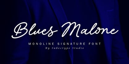 Blues Malone is a monoline signature font with an elegant style. It has good readability and is perfect for logos, invitations, wedding, signatures, Branding, clothing, headline, and much more! Blues Malone comes with ending swash alternate which will make your design more beautiful and elegant. I hope you enjoy this font. If you have any questions please don't hesitate to drop me a message :) Thank You, Subectype
 - Bendigo by ITC,
$29.00The lively calligraphy font Bendigo was created by Phill Grimshaw in 1993 and looks as though it were written by an energetic hand. Generous capitals fit harmoniously with more reserved lower case letters and the right slant of both emphasizes the dynamic feeling of the font. Bendigo should be used in point sizes of 14 or larger and its strong character makes it particularly good for headlines. - Crunold by Trustha,
$17.00 Crunold is a bold hand-drawn with dingbats as his mate. Inspired by today's popular designs, abstract shapes as an important element in both digital and print designs. Crunold is perfect for your creative projects. Because, a combination of typography, and the abstract shape of art. Makes your design perfect, also easier in the process. Crunold is perfect for branding, headlines, packaging, and many more.
 - Flawless Valentines by Aldedesign,
$25.00 Flawless Valentines is a beautiful and light handwritten font. Its unique feel and stunning impact will add a luxury spark to any design project you wish to create! This font is PUA encoded, which means you can access all of the amazing glyphs and ligatures with ease! Each Font Has: Stylish modern handwritten script Beautiful Swash (Ending tail) Beautiful Titling (Beginning tail) Special Ligatures Multilingual Support
 - Chantal by Device,
$29.00 A loose, casual felt-pen script, Chantal comes in three weights plus italics, and a Cyrillic version too. Alternate versions are available in the upper and lower case keys, so settings can be customised according to taste. Chantal communicates a hand-drawn light touch with character. Originally designed to letter the RoboHunter series that Peter Hogan and Rian Hughes produced for the comic 2000AD.
 - Cheddar Gothic Rough by Adam Ladd,
$25.00 Cheddar Gothic Rough is a hand-drawn, textured display all-caps typeface with condensed proportions. The uppercase characters add distinction with extended crossbars and chiseled terminals, while the lowercase provides a more classic sans serif appearance. Carefully drawn for quality and readability, but still rough enough to exhibit the handmade details. Cheddar Gothic Rough is great for display, branding, packaging, advertising, food, sports, titles, and more.
 - Deco Redux JNL by Jeff Levine,
$29.00 A long-set aside Art Deco typeface design begun (but not completed) may or not have been from a vintage source, but its roots go well back into Art Deco lettering. Taking the existing letters and thickening their weights, removing the counters and ending up with a completely new, solid alphabet design resulted in Deco Redux JNL, which is available in both regular and oblique versions.
 - Ambition & Ink by Brittney Murphy Design,
$8.00 Ambition & Ink is a driven hand-drawn font with lots of customization options. It includes contextual alternates, stylistic alternates for a-z and A-Z, and ligatures. It can also easily be used as a unicase font by subbing the lower case letters that have ascenders and descenders (bdfghjklpqty) for uppercase ones. The font has 546 characters, including lots of accented letters, as well as Greek & Cyrillic.
 - Intima Politha by Attype Studio,
$15.00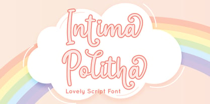 Intima Politha is a lovely script font with stylistic set and alternates. Fall in love with its incredibly versatile style and use it to create spectacular designs! Intima Politha is perfect for branding, logo, invitation, quotes, apparel design, product packaging, merchandise, game titles, cute style design, Book/Cover Title and more. What's Included : - Ending Swash - Multilingual Support --- Hope you enjoy with our font! Attype Studio
 - Rebil Script by Realtype,
$10.00 Introducing Rebil Script. Rebil is a modern script calligraphy fonts. It is clean, feminine and friendly also fashionable. Rebil Script will work perfectly for fashion, e-commerce brands, trend blogs, tagline, title, holiday poster, logos, nametags, wedding cards, invitations, signboards, wedding sign, birthday card, t-shirt design and print, etc. The lowercase has a swashes beginning and ending to compliment your creative design needs.
 - Lorjuk by Aisyah,
$12.00 Lorjuk is a handwritten font that features a natural and casual style. It has a personal and unique touch, with strokes that mimic the look of hand-written letters. This font is perfect for adding a personal touch to your designs, such as invitations, posters, or social media posts. The font is versatile and can be used for various projects, from informal to more formal ones.
 - Merlandio by FadeLine Studio,
$14.00 Introducing! Merlandio is a hand painted font with a style natural, sweet and simple. Made with great care to provide the natural and modern elements. This font will look great if used single even with other pairing fonts. The great thing about this font is you can find some style when you use it, examples such as natural handwriting style, unique, simple, elegant, and bold.
 - Redmarch by BaronWNM,
$12.00 Redmarch is a monoline script font that gives a natural-looking impression that is perfect for those of you who want to use a signature font. Redmarch is very suitable for branding, advertising, name cards, product labels, printing t-shirts, greeting cards, invitation cards, etc. Redmarch has several ligatures, begining and anding swashes to give a sweet touch at the beginning and end of words.
 - Hall Of Fun by Konstantine Studio,
$15.00 Hall of Fun, a fast dry brush handwriting script font, comes out with clean and brush version to fit for your needs. Included the Stylistic Alternates for every letters and Ligatures to seamlessly handwriting feels. Straight from the hands and will be a perfect pair for fashion branding, logo, social media marketing, presentation, vintage products, make yourself standout with the Hall of Fun right away!
 - Sveglia by Wacaksara co,
$15.00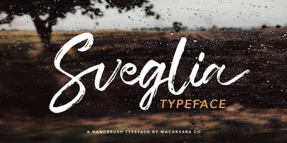 Sveglia is a hand brush casual script font inspired by urban fashion. This font is great for your next creative project such as Logotype, printed quotes, invitations, cards, product packaging, headers, Letterhead, Poster, Apparel Design, Label, and etc. Sveglia comes with uppercase, lowercase, numerals, punctuations and so many variations on each character include OpenType alternates, and common ligatures to let you customize your designs.
 - Little Boy Blue by Hanoded,
$15.00 I believe it was Picasso who had a Blue Period between 1901 and 1904. It seems that I have one myself - really not comparing myself to Picasso btw… Recently I created Blue Sheep font and now this one: Little Boy Blue. Little Boy Blue is a very legible, easy-on-the-eye font for texts, books, covers and packaging. Comes with 50 shades of diacritics.
 - South Sand by Viswell,
$17.00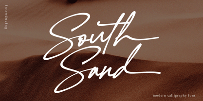 South Sand is a stylish and lovely script font. It looks stunning on wedding invitations, thank you cards, quotes, greeting cards, logos, business cards and every other design which needs a handwritten touch. This font is PUA encoded which means you can access all of the glyphs and swashes with ease! South Sand features : Uppercase & Lowercase Character Numeral & Punctuation Alternate & Ligatures Ending Swash Lowercase Multilingual
 - August Cameron by Agniardi,
$15.00 August Cameron is a signature font with beautiful curves and alternate characters. A style that we choose was the natural look hand made, unique identity. South Portland also comes with alternative characters that are carefully created for adding a minimalist decor of the letters. Stylistic alternates allows versatile design options and works perfectly for Headlines, Posters, Logos Packaging, Branding, T-shirts, Greetings, Presentations and much more.
 - Spring Season JNL by Jeff Levine,
$29.00 Spring Season JNL is a decorated and stylized Art Deco slab serif design from1935 which is based on the hand lettered title on the sheet music for “Paris in the Spring”. The characters are cut through with both a straight line and a wavy, spoked line which looks something like a thorny vine. Spring Season JNL is available in both regular and oblique versions.