10,000 search results
(0.027 seconds)
- Skurier by GRIN3 (Nowak),
$20.00 Skurier is a hand-drawn font inspired by monospaced fonts like Courier. Language support includes Western, Central and Eastern European character sets, as well as Baltic and Turkish languages.
 - Cul De Sac by Hanoded,
$25.00 Cul De Sac is a beautiful cartoon-like font. It was hand drawn, using an old fashioned pen and India ink. Use it for your ads, posters and websites.
 - P22 Kaz by IHOF,
$24.95 Kaz is a casual yet sturdy hand lettering font somewhere between architectural hand lettering and "comic sans". Kaz Thin offers a variation for the look of a thinner pen.
 - WIP Symbol by WIP Fonts,
$49.00WIP Symbol is a font of illustrations and icons drawn by hand for office communication and beyond; a perfect companion for the WIP handwriting fonts: FirstLady, GrandMa, MachoMan, MoneyMaker, SugarBaby and ThePresident. Originally designed in 1995 the font was extended and the paths were simplified in 2005. - Sundowners by PintassilgoPrints,
$29.00 Sundowners is a smiley face. It is a simple and versatile font, with a pocketful of cool interlocking glyphs for those days of groovier moods. It also brings a handful of amusing initial and terminal forms and a couple of ornaments. That simple. And that nice.
 - Argiss by Hanzel Space,
$25.00 Argiss Handwritten Font - A cute and simple hand-lettered font! This font would be perfect for party invitations, baby showers, birthday cards and more. • Uppercase & Lowercase • Includes Numbers and Punctuation Currently supports English characters only. I'm more than happy to add additional characters and glyphs at request!
 - Sage by Scholtz Fonts,
$21.00Sage is a hand generated font with great impact. Robust and vigorous, it's great for informal, exciting design projects. Available all popular font formats, including opentype, Sage has been carefully letterspaced and kerned. All upper and lower case characters, punctuation, numerals and accented characters are present. - Fela by Picador,
$24.00 Fela family was designed for books and posters for young children to gain high readability and nice feeling. Every glyph was hand drawn and shaped for better result. This typeface consists of different alternate glyphs with special automatic script, many special characters for different languages and pictograms.
 - Zimric by Ingrimayne Type,
$5.00 Zimric is a family with 28 styles. It has the look of neat hand printing. It is monoline and sans-serif, friendly and legible. The Zimric family has three widths, each width has four or five weights, and each weight comes in both upright and italic styles.
 - Spoonbread by Hanoded,
$15.00 I originally wanted to call this font Instant Pudding. When I was a kid, we sometimes had instant pudding (the ‘add cold milk and rest in the fridge’ kind) for dessert. My brother and I loved the stuff, especially when some of the pudding powder had not dissolved and had turned into brightly coloured speckles! But this font, alas, did not ‘feel’ like instant pudding, so I hunted the internet for other, more obscure, puddings. I found Spoonbread. Apparently it is a pudding-like Southern American dish, made from cornmeal. I have never tasted it, nor do I particularly like corn (most of it is GMO anyway), but the font and the name became friends. And who am I to tear this beautiful relationship asunder? Spoonbread - use it for your packaging, your books, your posters and your games. And when you make Spoonbread, use organic cornmeal!
 - Lalonde by The Thrill of Design,
$29.00 Lalonde Font Family has great readability and can be used for: logos, call outs and headlines for advertising, wedding invitations, t-shirts, signage, scrapbooking, posters, badges, etc. Lalonde is a modern hand-drawn script font and is available with two formats OTF and TTF and with (Latin-1 Supplement) ÀÁÂÃÄÅÆÇÈÉÊËÌÍÎÏÝ ÑÒÓÔÕÖØŒÙÚÛÜ àáâãäåæçèéêëìíîïñòóôõöðøœùúûüýÿ.
 - Photogenic by Ef Studio,
$15.00 photogenic is natural handwritten that suitable for any purpose like wedding invitation, template, headline, branding, logo and so on. It has beautiful inky texture on its letter form. You will get full set of lowercase and uppercase letters, numerals and punctuation, multilingual symbols, lowercase beginning and ending swashes, ligatures and extra swashes.
 - Show Card Freehand JNL by Jeff Levine,
$29.00 The title and credits for the 1951 Dick Powell and Rhonda Fleming film “Cry Danger” were hand lettered in a freehand brush lettering often seen on store signs and show cards. Serving as the model for Show Card Freehand JNL, this pleasant and casual typeface is available in both regular and oblique versions.
 - Aminta by Alias Collection,
$60.00 Aminta is an eclectic and expressive take on the Courier aesthetic. Aminta mixes the utility aesthetic of Courier, the default computer typeface and subversive piece of non-design graphic designers are presented with in the top left hand corner of Quark documents, and eclectic and expressive letterforms derived from drawing and handwriting.
 - Masterpen Script by Ayska,
$30.00 Masterpen Script is an handwritten font that is suitable for branding, signature, wedding invitation, promotion, product packaging, and other needs. This font is modern, simple, but still authentic. You will get full set of lowercase and uppercase letters, numerals and punctuation, multilingual symbols, lowercase beginning and ending swashes, ligatures and extra swashes
 - Flintlock by CozyFonts,
$25.00 The Flintlock Font Family has a Bold personality. The 'Rough' version of the Flintlock Font has a hand-carved or hand-etched edge, carefully crafted for each of over 300 glyphs. Caps, lower case, all numbers, fractions, accents and European characters that work in over 70 languages. 'Classically Built with a Vintage Flair'. Vintage in the American West Tradition that might have been forged and implemented from the 1860s through the 1930s and consequently fresh again. Flintlock Rough can be envisioned on many things dated from 1860 to present day. The font is available in 3 basic weights as of this release date. There are other versions on the drawing board... Flintlock Rough works extremely well with Posters, Branding, Movie Titles, Invites, Stationary, Signage, Embroidery, Letterpress, Ads, Logos and anything that feels Industrial or Hand-Crafted, eg. Coffee, Breweries, Antiques, Woodcuts, Western Styles, Sports Styles, Holidays, Menus, and more. Flintlock Flat & Flintlock Flat Italic are the siblings to Flintlock Rough without the hand-carved edge but rather clean with slightly rounded corners and edges. Extremely Legible, Bold and best used in all the same application descriptions mentioned above and more, specifically contemporary uses and settings, eg. Sports, Titles, Branding, Headlines, Logos and more. Curiously the Flat & Italic versions of Flintlock work extremely well in 1960s and 1970s settings.
 - Doubtless by Gassstype,
$29.00 Hello Everyone, introduce our new product Font Doubtless This Is Hand Drawn Font.This is a Textured Natural Style and classy style with a clear style and dramatic movement. You can activate 8 Ligatures and 31 Alternate glyphs OpenType panel.
 - Innuendo by Hanoded,
$15.00 Innuendo, despite its name, is a straightforward font. It is an all caps, hand-drawn typeface with an elegant look and some cheeky curls. Upper and lower case differ and like to mingle. Comes with a bagful of diacritics.
 - NoPain by Ingrimayne Type,
$9.00 The letters of NoPain went to a party and had a bit too much to drink. The four NoPain typefaces, regular and bold of NoPainRight and NoPainLeft, were formed by distorting the letters of the wide-serifed font Valgal.
 - Busy Scratch by PizzaDude.dk,
$15.00 Busy Scratch is very useful for something that needs a simple, yet eye-catching handmade look. The letters are carefully hand-kerned and spaced for a natural and legible look. For extra energy, try switching between Regular and Italic!
 - Musical Arrangement JNL by Jeff Levine,
$29.00 The hand-lettered title on a piece of sheet music for 1938's "Don't Be That Way" (as recorded by Benny Goodman) featured squared letters with rounded corners, slight variants in line thickness and interesting "overhangs". Additionally, some letters closed off on one end while others were opened, giving the impression of a slight "maze" effect. This unique song title was enough of an inspiration to be turned into Musical Arrangement JNL.
 - Deco Multiline JNL by Jeff Levine,
$29.00 The 1934 Dick Powell-Ruby Keeler-Joan Blondell movie musical "Dames" gave us the classic song "I Only Have Eyes for You", but the sheet music for the song had the movie title hand lettered in a multi-line Art Deco sans serif design that just begged to be turned into a type font. From these few letters now comes Deco Multiline JNL, which is available in both regular and oblique versions.
 - JennerikInformal by Ingrimayne Type,
$9.95 JennerikInfml is a friendly, casual typeface family that has the appearance of neat hand printing. It began as the italics to Jennerik, but I ended up separating it and giving it a different set of upper-case letters. Although its lower-case letters were designed as italics, it was originally published in 1992 with three weights as upright letters without a slant or skew. The revision of 2020 added the oblique or slanted styles.
 - Nouveau Semi Stencil JNL by Jeff Levine,
$29.00 The cover on the sheet music for the 1922 song "If She Comes from Dixie" had the title hand-lettered in an Art Nouveau style with a semi-stencil effect. It's now available as Nouveau Semi Stencil JNL in both regular and oblique versions. The typeface is not considered a "pure" stencil because many of the letters were made solid; lacking the classic stencil "breaks" at key points found in more traditional stencil designs.
 - Como by Dharma Type,
$24.99 Como is a modern rounded sans-serif family designed by Ryoichi Tsunekawa and the whole family consists of 8 weights from ExtraLight to Heavy. The basic skeleton of their letterform was designed geometrically and their ends were rounded out. The sophisticated geometric design gives them universality, neutrality and sense of unity for the use in all media, all purposes. And their large x-heights makes this family legible and readable. While at the same time, the rounded ends characterizes this family and it makes them very friendly and natural. This rounded feature will also accentuate your design work moderately. Como supports almost all European languages: Western, Central, South Eastern Europeans and afrikaans. And superior figures, inferior figures, denominators, numerators and fraction can be accessed by using OpenType features.
 - Bayshore by Set Sail Studios,
$18.00 Perm your hair, squeeze into your lycra, and retro-fy your text with Bayshore! A totally tubular mono-line script font straight out of the 80's. This hand-drawn font is perfect for creating slick & stylish lettering. Whether it’s for logos, product packaging or merchandise, Bayshore is guaranteed to give your text an unmistakeable retro quality. Bayshore comes as a single font file with added features allowing you to customise your text; End Swashes • Each lower-case character has a separate ‘end-swash’ version, use this for the last letter in a word to give it a custom-feel styling. These end-swashes are accessible via any software with Opentype capabilities, simply by turning on ‘Stylistic Alternates’. Underline Swashes • Four swashes of varying lengths are also available, simply by typing any of the square brackets [ ] { }. These can be used to underline your text and give it a real eye-catching quality.
 - MEGA SLANT LINE by TypoGraphicDesign,
$19.00 CONCEPT/CHARACTERISTICS This strikingly bold, black and extended 3D font reminiscent of sci-fi films and experimental typeface design. The font acts as a chain of ligatures and thus receives a unique aesthetic. The unique letter forms are in sharp contrast to other fonts and thus stand out as a unique selling point. APPLICATION AREA Posters, music cover, book cover, logos, as a headline font for magazines or websites … TECHNICAL SPECIFICATIONS Headline Font | Display Font | Sci-Fi Font »Mega Slant Line« OpenType Font with 303 glyphs – alternative letters and ligatures (with accents & €) & 2 styles (regular & 3d) KONZEPT/BESONDERHEITEN Diese auffällig plakative, fette und breitlaufende 3D Schrift erinnert an Sci-Fi Filme und ist experimentelle Schriftgestaltung. Die Schrift wirkt wie eine Kette aus Ligaturen (Buchstabenverbindungen) und erhält somit eine ganz eigene Ästhetik. Die sehr eigenen Buchstabenformen werden sich deutlich von anderen Schriften abheben und somit als Alleinstellungsmerkmal herausstechen. Der Fluss ergiebt sich aus den EINSATZGEBIETE Plakate aller Art, Musik Cover, Buchcover, für Logos und Wortmarken, als Displayschrift für Zeitschriften oder Websites… TECHNISCHE INFORMATIONEN Headline Font | Display Font | Sci-Fi Font »Mega Slant Line« OpenType Font with 303 glyphs – alternative letters and ligatures (with accents & €) & 2 styles (regular & 3d)
 - Meteora by Andinistas,
$19.95 Meteora is a font designed for headlines by Carlos Fabian Camargo Guerrero. Its purpose is to be useful tool for solving decorative problems in graphic design which require broken letters without ascending and descending strokes. Due to its vertical and horizontal proportions these letters are compact, appealing and special to compose headlines and featured with worn look in covers, magazines, posters and advertising material. The first Meteora sketches were made by hand, photocopying and deforming letters of an old Letraset catalog, specifically from slab serif typefaces from the Nineteenth Century. Hence, uppers cases and lower cases were merged in the same height x, obtaining a narrow width, endings with some serifs and stencil cuts here and there. The amount of low contrast between thick and thin strokes brings strength and consistency with the contours apparently brokens. Thus, developed features slab serif and sans-serif proposing empty and full shapes connoting decomposition and noise; and from a rigorous process of scanning letters I set up damaged letters, but drawn with the greatest possible thoroughness and high definition in 438 glyphs per font. Finally, in regular and bold variables I included opentype features with some discretionary ligatures and a few titling alternates. In Meteora bold all glyphs are framed simulating the effect of letters cut out of paper.
 - Paloma by Jonahfonts,
$35.00 This is a hand-written script font. Specifically designed for books, invitations, magazines and advertisements.
 - Janda Celebration Script by Kimberly Geswein,
$5.00 This beautiful script has lovely connections and swirls that create an elegant, hand-written look.
 - Ballpoint Signature by Viswell,
$18.00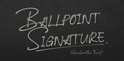 Ballpoint Signature is made with natural hand-drawn inspired by beautiful handwriting, and includes alternates.
 - Luis Serra by Homelessfonts,
$49.00 Homelessfonts is an initiative by the Arrels foundation to support, raise awareness and bring some dignity to the life of homeless people in Barcelona Spain. Each of the fonts was carefully digitized from the handwriting of different homeless people who agreed to participate in this initiative. Please Note: these fonts include only the latin alphabet; no accented characters, no numbers or punctuation. MyFonts is pleased to donate all revenue from the sales of Homelessfonts to the Arrels foundation in support of their mission to provide the homeless people in Barcelona with a path to independence with accommodations, food, social and health care. Luis Serra was born in Alicante. There he grew up and even started a family His life was there. But at the age of 35 he split up with his wife and decided to go to Barcelona in search of a new life. And it wasn’t easy for him. He had to turn his hand to all kinds of jobs and didn’t manage to find the stability he needed. Luis is a shy, retiring person who takes great pleasure in the little things in life such as walking in the mountains or celebrating the victories of his football team, Barça. After four years living in Barcelona, Luis found himself in a position he’d never imagined. “The street’s much worse now, there’s more trouble, there’s more tension,” says Luís. In the street he had to learn, as he always had, to move fast, to find a place to sleep and something to eat. Luís is one of those people who don’t let circumstances mould him, but adapts to them and always tries to do his best.
 - ITC Don't Panic by ITC,
$29.99ITC Don't Panic's distressed shapes and craggy outlines evoke the feeling you get when you're just barely in control of a situation. This is type design on the edge. ITC Panic is further down the emotional track, when you've actually lost control and there is no hope in sight. Thompson says the inspiration for these faces arrived one day in the mail. I received an envelope that looked like it had a rough trip; the type that was stamped on it had a tired, ragged appearance. Ironically, the haggard envelope woke me up. I got excited and wanted to replicate the look as a font of type." Thompson designed ITC Don't Panic, then stood back and looked at it and decided it cried out for a more agitated companion. ITC Don't Panic gave birth to the positively psychotic offspring, ITC Panic. Both are all-cap designs with alternate characters in the unshift position. Creating an authentically disturbed appearance proved to be a challenge for Thompson. "I tried to design agitated characters, but they looked staged. So I tried multiple photocopies, but that didn't work. Eventually, I laser-printed the basic characters, wadded up the lasers, then flattened them out and stomped on them with heavy boots. The end result was scanned and used as the basis for the rest of the design." Thompson's work on web sites and multimedia has influenced his interest in type and typography that transcends the cool, unemotional nature of the computer." - ITC New Esprit by ITC,
$29.99Originally drawn in 1985, Jovica Veljović had intended to add a few kerning pairs and make some minor refinements to the letterforms. However, his work lead him to take a fresh look at the family. Veljović recalls, … I soon realized that some characters could benefit by more refined shapes and proportions. By the time I was done, I had worked on just about every character in the original design." In fact the end result is two systems: one optimized for extended texts; the other for display settings. The original elegance of the design is not lost, but the new design brings with it letterforms that are altogether more harmonious and balanced. The roman is dynamic and spirited, just oozing character. The italic by contrast is a little more restrained, but nonetheless an elegant and fitting accompaniment. The text-optimized fonts come with a generous x-height, and slightly less contrast; though its marginally wider proportions let in the light, making it very legible even at small sizes. ITC New Esprit ® is a versatile family, brought to you in four weights from regular to black. OpenType features like small caps, alternates, and a broad character set make this a welcome addition to everyone's font library. Whether you want elegant and legible text, or dynamic and personable headlines, then you'll want to click through to see more of ITC New Esprit. " - ITC Panic by ITC,
$29.99ITC Don't Panic 's distressed shapes and craggy outlines evoke the feeling you get when you're just barely in control of a situation. This is type design on the edge. ITC Panic is further down the emotional track, when you've actually lost control and there is no hope in sight. Thompson says the inspiration for these faces arrived one day in the mail. I received an envelope that looked like it had a rough trip; the type that was stamped on it had a tired, ragged appearance. Ironically, the haggard envelope woke me up. I got excited and wanted to replicate the look as a font of type." Thompson designed ITC Don't Panic, then stood back and looked at it and decided it cried out for a more agitated companion. ITC Don't Panic gave birth to the positively psychotic offspring, ITC Panic. Both are all-cap designs with alternate characters in the unshift position. Creating an authentically disturbed appearance proved to be a challenge for Thompson. "I tried to design agitated characters, but they looked staged. So I tried multiple photocopies, but that didn't work. Eventually, I laser-printed the basic characters, wadded up the lasers, then flattened them out and stomped on them with heavy boots. The end result was scanned and used as the basis for the rest of the design." Thompson's work on web sites and multimedia has influenced his interest in type and typography that transcends the cool, unemotional nature of the computer." - Molde by Letritas,
$25.00 Molde is a super sans serif font family, belonging to the neo-grotesque style. Formally, Molde was inspired by the extreme sobriety of famous post-Bauhaus Swiss Movement of the mid-twentieth Century. The masters of this style are famous for eliminating all the ornaments, as a brilliant mind said “Ornament und Verbrechen”(Ornament and Crime) as a creation law: ending up with only the essential. Thanks to the purity of its shapes, Molde spreads the message as clear as possible and this quality makes it much more versatile than any other typography. Molde can be therefore used in all types of designs, If we consider its personality and its amount of weights and widths. Molde is composed of 6 widths ranging from the tablet to the expanded and in the set of characters includes a Unicase version and a small caps version. The family is composed of 3 parts: the regular version, the italic version and the reverse version. Each one of them has 9 weights. Each weight has 649 characters and it has been thought for 219 latin languages.
 - Soul Adventures Cyr by Ira Dvilyuk,
$18.00 Soul Adventures Cyrillic Script adds hand look style to all your design projects: logos, signatures, labels, packaging design, and blog headlines. Also, it will look great in mugs, cards, gorgeous typographic designs, wedding stationery, and much more. An additional font Soul Adventures Symbols Font can help you to make a lot of pretty designs and logos. Soul Adventures script includes a full set of uppercase 2 sets of lowercase letters, numerals, a large range of punctuation, and 70 ligatures, giving a realistic hand-lettered style. The Cyrillic part of the font contains the uppercase letters and lowercase letters and 20 ligatures, giving realistic hand-lettered style. Soul Adventures Symbols is a font with over 36 unique, hand-drawn elements and swashes that can help to make your design more original. A different symbol is assigned to every uppercase or lowercase standard character plus numbers 0-9 so you do not need graphics software just simply type the letter you need. Multilingual Support for 32 languages: Latin glyphs for Afrikaans, Albanian, Basque, Bosnian, Catalan, Danish, Dutch, English, Estonian, Faroese, Filipino, Finnish, French, Galician, Indonesian, Irish, Italian, Malay, Norwegian Bokmål, Portuguese, Slovenian, Spanish, Swahili, Swedish, Turkish, Welsh, Zulu. And Cyrillic glyphs support for Russian, Belorussian, Bulgarian, Ukrainian, and Kazakh languages.
 - Sleeve Notes by Wing's Art Studio,
$12.00 Sleeve Notes: A font from the analogue age. Inspired by album covers and hand-written song lyrics. Sleeve Notes is an experimental script font and all-caps pair with a loose hand-written style that explores the golden-age of record stores, vinyl albums, cassettes and CDs. It imagines our teenage selves kicking back with a coke (oversized headphones on) discovering a new band and studying the notes on their latest album. Besides production credits, the best sleeves (otherwise known as liner notes) included photos, cool artwork and hand-written song lyrics that gave the listener a human connection to the mind of the artist. This font embraces it's subtle ink blotches and rough edges; all imperfections that build to create a sense of a hastily written lyric, set-list or just a fun little scribble. The package includes six fonts in total; the regular script with two complete sets of alternatives, then two sets of all-caps, and finally the special characters font that features a decorative alphabet plus symbols and underlines. For authentically retro, hand-made looking lettering, it's a great choice and offers the flexibility few other fonts can match. Check out all the visuals to see it action!
 - Stefano by Signs of Gold,
$25.00 Stefano is a meld of traditional Roman typeface design and calligraphic hand lettering. It is bold yet refined; elegant yet forceful. Stefano will enhance the urbane and elevate the prosaic.
 - Inline Square JNL by Jeff Levine,
$29.00 Inline Square JNL is modeled from the hand lettered title found on the 1935 sheet music for "Cielito Lindo (Beautiful Heaven)", and is available in both regular and oblique versions.