10,000 search results
(0.039 seconds)
- Sanehya by Crowntype Studio,
$12.00 Sanehya is a script type family of three fonts. It is inspired by Gorgeous Fonts and has a soft and welcoming look. Sanehya can be used for branding, packaging and wherever you need a script font that is easy to read and smooth. Sanehya has many ties, strokes and alternate characters that will make your designs unique and beautiful. You can also purchase Sanehya as a Font Family and adjust the weight of Sanehya seamlessly between Italic and Bold weights. Note that you need design software that supports the Font Family. If you have any questions, feel free to contact me by email: crowntypestudio@gmail.com Thank you!
 - Nauman Neue by The Northern Block,
$39.95 Nauman Neue is a modern humanist sans serif typeface made for the screen. Broad open letter forms are combined with precise geometry to create a functional and legible font that’s ideal for web and on-screen applications. In 2021 Nauman was expanded to sixty styles, including two helpful widths condensed and semi-condensed. Included in the font are 900 characters per style, ten weights and three widths with matching italics. Opentype features consist of seven numerals variations, including inferiors, superiors, fractions, tabular, lining, and old style. It also has alternate lowercase a, e, I, M, small caps, arrows and language support covering Western, South, Central Europe and Vietnamese.
 - Ansage by Sudtipos,
$49.00 Ansage does not claim to be neutral; it escapes from the rationalist sans of closed strokes and regular forms. Meaning Announcement in German, Ansage is versatile and communicates effectively across a broad range of media and formats such as branding, posters, websites, apps, titles and compositions with little spacing). Ansage is a sans serif font with a strong personality that emerges from an interest in and the study of a wide variety of typographic specimens of Gothic fonts from the nineteenth century. The design process behind Ansage brought about constant transformations in form; the result is a compact and robust font, with a large x-height, small ascenders and descenders, and open terminals that grow in expressiveness as it increases in weight. It is available in 10 weights, ranging from Hairline to Black, and 3 widths – Condensed, Regular and Expanded – plus italics, which make a total of 60 perfect variables to combine and contrast with each other. In addition, it also includes multiple open-type functions such as alternative styles, Old Style Figures, Tabular Forms, fractions, case sensitive, ligatures and more.
 - Wine Cellar JNL by Jeff Levine,
$29.00 Wine Cellar JNL is a bold, yet casual display face found on some 1930s-era sheet music entitled "Everybody Wants a Key to My Cellar". Since the subject of the song had a number of good times underneath the house, it's a fitting name for the font. The hand lettering for the original song sheet showed strong influence of the 1920s and the Art Nouveau style, and has hints of the popular metal type "Hobo" in its character shapes.
 - Letterhack Sans by Comicraft,
$19.00 IT’S MAILBAG TIME! Dear Jolly JG Roshell and Rascally Richard Starkings, Comicraft Fonts are a thing of Beauty and a Joy Forever! You guys must be a Wild Bunch, and I roar with delight whenever a new comicbookfonts release appears in my emailbox. But I have to level with you daredevils...what about us Letterhacks? We need representation too! We haven’t spent years hammering away on our typewriters to be ignored! BRING BACK THE LETTER HACK! In fearless font form. You know it makes sense! Truly Yours, Forbush, Irving, senior.
 - NuOrder by The Northern Block,
$29.00 NuOrder is a modern-day sans-serif typeface with humanist bones. The design incorporates a dynamic structure with minimal contrast and a natural stroke path to promote easy reading—resulting in a warm well-balanced typeface best suited for a wide range of applications in a hi-tech era. Details include nine weights with matching italics and over 550 characters per style. Opentype features consist of five variations of numerals, including inferiors, superiors, fractions, alternate lowercase a and g, and language support covering Western, South, and Central Europe.
 - Angelic Sonata by Gatype,
$12.00 Angelic Sonata, a modern handwritten font loaded with binders for that handwritten look. Angelic Sonata can be used for wedding invitations and wedding calligraphy, feminine or organic logos, small business branding, packaging and much more! Angelic Sonata features an alternative OpenType style, International binding and support for most Western Languages included. To enable the OpenType Stylistic alternative, you need a program that supports OpenType features such as Adobe Illustrator CS, Adobe Indesign & CorelDraw X6-X7, Microsoft Word 2010 or later. Thank you very much for viewing and Enjoying it.
 - Luwest Rounded by Elyas Beria,
$5.00 Soft, fun, confident, sophisticated, and versatile. Luwest Rounded is a modern rounded font family that comes in two weights and in italics. The chunky weight and buttery curves of Luwest Rounded Regular make it well suited as display type ideal for branding, logos, magazines, films, packaging, greeting cards, invitations, posters, slides, and presentations. Luwest Rounded Light adds contrast and even more flexibility. Luwest Rounded includes a generous selection of international characters to support a broad range of languages. Luwest Rounded includes: Caps and lowercase Regular and Light weights Regular and Italics Extensive international character support
 - Vergilia by Attract Studio,
$18.00 Vergilia - Modern Bold Serif Font is a stylish font It has a modern and retro look that is easy to read. Vergilia also comes with an outline style to help with your designs. Great for creating logos, quotes, posts, branding projects, magazine imagery, wedding invitations, even long text and much more. Vergilia Features: Multi language PUA Encoded Alternates Ligatures. To be able to access alternative fonts, make sure the software you use can support opentype features such as Microsoft Word, Paint, Adobe, Corel draw, Cricut and other applications.
 - Brutal Milk No 1 by Casloop Studio,
$9.00 Introducing Brutal Milk Font Collection where prominence, trustworthiness, and sophistication converge. Brutal Milk is a captivating grotesque typeface that seamlessly blends the robust aesthetics of brutalism with the sleek sophistication of Swiss Design and the nostalgia of Y2K. This collection featuring three distinctive variants – Brutal Milk No1, Brutal Milk No2, and Brutal Milk No3 – offers a unique typographic journey for extraordinary design. Let's break down what we present in this work - Brutal Milk No.1 | Modern Elegance with a Brutal Twist Aims for body text with the perfect balance of elegance and modernity. Brutal Milk No.1 is meticulously crafted for optimal readability, making it an ideal choice for a wide range of applications. - Brutal Milk No.2 | Softened Brutalism for Approachable Headers Aims for display/header text with a gentle and approachable impression. Brutal Milk No.2 is crafted to add a touch of warmth to your designs, making it perfect for conveying a friendly and inviting tone. - Brutal Milk No.3 | Rigid Rebellion for Prominent Headers Make a bold statement with headers that exude firmness. Brutal Milk No.3 is designed to capture attention with its rigid impression, injecting a sense of prominence and confidence into a visual identity. The Features The Brutal Milk Font Collection comes loaded with features such as case-sensitive forms, discretionary ligatures, ordinals, fractions, denominators, numerators, superscripts, and scientific inferiors – ensuring flexibility in design needs. Language Support From Western and Central European languages to South Eastern European, South American, Oceanian, and even Esperanto, Brutal Milk Collections caters to a diverse range of linguistic needs. Brutal Milk stands as a testament to versatility and innovation. Whether you're crafting a sleek logo, establishing a brand identity, adorning decor, creating impactful posters, delivering compelling presentations, designing dynamic websites, refining UI/UX experiences, or engaging in graphic design endeavour. The impressions it imparts—modern, minimal, youthful, funky, groovy, trendy, hip, fly, and undeniably cool—speak volumes about its adaptability to contemporary design trends. Redefine the boundaries of creativity and immerse yourself in the dynamic world of Brutal.
 - Brutal Milk No 2 by Casloop Studio,
$9.00 Introducing Brutal Milk Font Collection where prominence, trustworthiness, and sophistication converge. Brutal Milk is a captivating grotesque typeface that seamlessly blends the robust aesthetics of brutalism with the sleek sophistication of Swiss Design and the nostalgia of Y2K. This collection featuring three distinctive variants – Brutal Milk No1, Brutal Milk No2, and Brutal Milk No3 – offers a unique typographic journey for extraordinary design. Let's break down what we present in this work - Brutal Milk No.1 | Modern Elegance with a Brutal Twist Aims for body text with the perfect balance of elegance and modernity. Brutal Milk No.1 is meticulously crafted for optimal readability, making it an ideal choice for a wide range of applications. - Brutal Milk No.2 | Softened Brutalism for Approachable Headers Aims for display/header text with a gentle and approachable impression. Brutal Milk No.2 is crafted to add a touch of warmth to your designs, making it perfect for conveying a friendly and inviting tone. - Brutal Milk No.3 | Rigid Rebellion for Prominent Headers Make a bold statement with headers that exude firmness. Brutal Milk No.3 is designed to capture attention with its rigid impression, injecting a sense of prominence and confidence into a visual identity. The Features The Brutal Milk Font Collection comes loaded with features such as case-sensitive forms, discretionary ligatures, ordinals, fractions, denominators, numerators, superscripts, and scientific inferiors – ensuring flexibility in design needs. Language Support From Western and Central European languages to South Eastern European, South American, Oceanian, and even Esperanto, Brutal Milk Collections caters to a diverse range of linguistic needs. Brutal Milk stands as a testament to versatility and innovation. Whether you're crafting a sleek logo, establishing a brand identity, adorning decor, creating impactful posters, delivering compelling presentations, designing dynamic websites, refining UI/UX experiences, or engaging in graphic design endeavour. The impressions it imparts—modern, minimal, youthful, funky, groovy, trendy, hip, fly, and undeniably cool—speak volumes about its adaptability to contemporary design trends. Redefine the boundaries of creativity and immerse yourself in the dynamic world of Brutal.
 - Lost and Foundry by Fontsmith,
$15.00 Breaking the cycle of homelessness We are partnered with The House of St. Barnabas, a private members club in Soho Square, whose work as a not for profit charity aims to break the cycle of homelessness in London. Each purchase (of the family pack) comes with a one month membership to The House and 100% of the proceeds from sales of fonts go directly to the charity to help their essential work. This unique collection of 7 typefaces is based on the disappearing signs of Soho, at risk of being lost forever due to the ever changing landscape of the area. By re-imaging the signage as complete fonts, we have rescued this rich visual history from the streets and present the typefaces into a contemporary context for a bright optimistic future. FS Berwick Thanks to its humble tiled origins, this Egyptian serif type maintains a uniform character width, creating the irregular letter proportions found in the final alphabet. Broad-shouldered, the bracketed serifs firmly ground the font, whilst its extreme hairlines become a necessity due to the uniform width. Of note is the upside down ‘S’, to be found on the original sign on Berwick Street. Perhaps due to its ceramic origins, there is a surprising ‘slippiness’ to its final appearance. FS Cattle Cattle & Son is best described as a wide, but not overly extended, grotesque-style sans serif, showing a uniform width and carrying a robust strength to its form. Whilst lightly functional overall, the purposeful diagonal legs of the ‘K’, ‘R’ and the tail of the ‘Q’ add an urgency to its appearance. The reduced size of the ampersand gives away Cattle & Son’s hand-painted origins, and the oblique compacted ‘LTD’ found on the original sign is also included in the final set. This beautiful sign is tucked away under an arch in Portland Mews, sheltering from the weather. Perhaps this is why it has lasted so long. FS Century This somewhat elongated set of Roman capitals was originally rendered in paint circa 1940, but its roots trace back to the Trajan Column in Rome. Witness the slightly unbalanced ‘W’ and the painter’s hand is revealed. Century’s flared serif style is extremely short, sharp and bracketed. The ‘M’ is splayed and has no top serifs. Century has a uniform appearance of width, probably due to its sign-written origins. Yet is elegant, classic and exudes sophistication. FS Charity A true Tuscan letterform, the original is located on The House of St. Barnabas in ceramic tiles and was revealed in all its broken glory in 2014. FS Charity retains the option of using these incorrect characters (try typing lowercase in the test drive above and compare with the more uniform uppercase characters). FS Charity features fishtailed terminals on its strokes, a curious branched ‘T’ and the ‘S’ displays tear-drop ends to its serifs. Almost uniform in width, the ‘A’, ‘M’ and ‘W’ are the widest characters in this set. FS Marlborough The elongated Marlborough features diagonal terminals to some characters and numerals. Also retained is the space-saving contracted ‘T’ glyph from the original sign, while the ‘R’ features a distinctive wedge-shaped leg. Highly individual in this form, similar signage appears around Soho, but featuring a variety of widths in their design. FS Portland The sister type to Cattle & Son, Portland is oblique rather than italic. The serifs are not overly long, yet still enhance its rather rigid cap height and baseline appearance. Its ‘A’ has a top serif, the ‘M’ is square and the ‘G’ foregoes any spur. Particularly delightful is the open ampersand. Numerals align to encourage the horizontal flavour of the oblique style. Overall, Portland is both confident and graceful. FS St James A lineal Continental style, St James also displays a true sense of ‘Londoness’ in its titling form, perhaps influenced by early Underground signage. Irregular letterforms display a continental flavour, particularly evident in its Deco style ‘W’, ampersand and numerals. The rather high cross bar in the ‘A’ is also reflected in the raised middle strokes of the ‘M’. Noteworthy are the distinctive unions found on all of the characters and the additional small caps. The original lettering is still located on Greek St.
 - Nono by Wiescher Design,
$39.50 Nono is the nickname of my oldest son, Konstantin. His little brother could not really speak yet, but he was always looking for him and said something to the tune of, "wea is a nono". From that time on I call Konstantin Nono. I designed a handwritten script with his real name, that i named Konstantin. Now I made this slick version of that script – hence – Nono! I made three basic sets of characters plus a smallcaps version. To top things off, I designed a set of endletters that I throw in for free. Everything can be mixed! I sell single cuts but the best deal would be the entire packet, it goes for a very fair price. Your generous typedesigner, Gert Wiescher
 - BIG Slant Black UltExp - Personal use only

- Welcome Santa Claus by Andrey Font Design,
$10.00 Welcome Santa Claus is a beautiful handwritten font. Its natural and unique style makes it incredibly fitting to a large pool of designs. The only limit is your imagination! This font is PUA encoded which means you can access all of the glyphs and swashes with ease!
 - Bigruns Brush by Din Studio,
$29.00 Looking for a font that will make your branding stand out? Do you sometimes have an appetite for a bit more wholesome typography? Looking for a fabulous, stylish, and adventure font? We've got what you want. Bigruns Brush - A Display Brush Font Bigruns Brush is a display font is accompanied by a gorgeous handcrafted script brush font that works together in perfect harmony. This font made all in uppercase that easy on the eyes and nice to look while it’s also easy to read. Designed primarily as a captivating font to add the right amount of modernity and style, The best choice to ensure a great font match for your designs and projects! Well suited to titles, poster designs, branding, quotes, and logos. Our font always includes Multilingual Support to make your branding reach a global audience. Features: Ligatures Stylistic Set PUA Encoded Numerals and Punctuation Thank you for downloading premium fonts from Din Studio
 - Caslon Graphique by ITC,
$29.99 The Englishman William Caslon punchcut many roman, italic, and non-Latin typefaces from 1720 until his death in 1766. At that time most types were being imported to England from Dutch sources, so Caslon was influenced by the characteristics of Dutch types. He did, however, achieve a level of craft that enabled his recognition as the first great English punchcutter. Caslon's roman became so popular that it was known as the script of kings, although on the other side of the political spectrum (and the ocean), the Americans used it for their Declaration of Independence in 1776. The original Caslon specimen sheets and punches have long provided a fertile source for the range of types bearing his name. Identifying characteristics of most Caslons include a cap A with a scooped-out apex; a cap C with two full serifs; and in the italic, a swashed lowercase v and w. Caslon's types have achieved legendary status among printers and typographers, and are considered safe, solid, and dependable. Caslon Antique was designed by Berne Nadall and brought out by the American type foundry Barnhart Bros & Spindler in 1896 to 1898. It doesn't bear any resemblance to Caslon, but has the quaint crudeness of what people imagine type looked like in the eighteenth century. Use Caslon Antique for that old-timey" effect in graphic designs. It looks best in large sizes for titles or initials. Caslon Black was designed by David Farey in the 1990s, and consists of one relatively narrow and very black weight. It is intended exclusively for titles or headlines. Caslon Black has a hint of the original Caslon lurking in the shadows of its shapes, but has taken on its own robust expression. Caslon Graphique was designed by Leslie Usherwood in the 1980s. The basic forms are close to the original Caslon, but this version has wide heavy forms with very high contrast between the hairline thin strokes and the fat main strokes. This precisely drawn and stylized Caslon has verve; it's ideal for headlines or initials in large sizes."
 - Fruitygreen by Linotype,
$29.99 Fruitygreen is Indonesian designer Andi AW. Masry's second typeface following Coomeec™. Idiosyncratic but appealing forms are the signature feature of Fruitygreen™ and provide this new typeface with its truly distinctive character that you can utilize for your projects - and not just in headlines. The unique forms of fruits are not only individually fascinating, but are just as captivating when they are brought together, for example as decoration on a dining table. For Masry, these can be compared with an alphabet whose letters spell out in combination different words and with this as his inspiration, he based his designs for Fruitygreen on the versatile forms of fruits. However, it was not the whole fruits as such but rather small sections of their curves and ends that he decided to use. It is not only because of the characteristic line terminals that the rounded characters of Fruitygreen seem at first glance reminiscent of a brush-written calligraphic typeface; these are traces of the creation process, in which Masry used a digital brush. At the same time, Fruitygreen is by no means simply a brush font. Its dynamic characters reference biological forms and there is definitely something amoeba-like about them, particularly in the bolder variants, and they exude the same serenity and harmony that is inherent to organic structures. The many unconventionally shaped characters also provide for optical contrast. There is, for example, the very scaled down g", the open "q" and the lowercase "r", which has the form of the capital letter. Other letters, such as the sinuous "k" and the rounded uppercase "F" impart an exotic touch to Fruitygreen. Similarly remarkable is the "@", that has only a semi-circle. Available to the designer are other characters that can be used to accentuate a design, such as swash capitals and numerous ligatures. And, last but not least, there are also various numeral sets with oldstyle and lining figures for setting proportional text and table columns together with a selection of symbols, such as arrows and, appropriately, fruits. "
 - Busted by Canada Type,
$24.95 Busted is the very strange and out-of-character outburst of Bill Troop, a guy who was classically trained in everything, from classical piano and literature to classical photography and type design. As far as we could tell, Bill Troop is the kind of guy whose appearance and voice instantly trigger thoughts of black and white photos, fedoras, and pre-industrial age Europe. A few years ago, he even moved from the United States to England, where it took him less than a week to feel at home and start sounding like a Norwich native. Then something happened and the poor dude just snapped. Busted is the controversial result of the blood rushing to his head. If you know what exactly happened to him, please let us know. Concern, consideration and human interest story aside, Busted is a fascinating thing. It is a set of four interchangeable thick outline fonts where the same letter forms turn from wild to wilder to broken to somewhat clean. Mix them up in a setting and you have words that snarl with a sneer. Life's too short. Take it all with a grain of salt. Scream whenever you feel like it. Busted Pro is a single font combining all four character sets, and rigged with an OpenType pseudo-randomizer in the contextual alternates feature, which you can disable or enable anywhere in your setting for maximum visual shock just the way you like it. Works just as well in PAL or SECAM. Don't be fooled by imitations, and don't get caught with your drawers down.
 - Another Monday by Hanoded,
$15.00 I started this font on a Monday and I finished it the Monday after, so I guess the name is right! Another Monday started off as a bit of doodling (with a Sharpie pen) on a piece of paper. Before I knew it, I had a complete glyph set and it looked nice. Another Monday is a bit messy, uneven and maybe even a little weird, but it will look good on postcards, packaging and labels.
 - ITC Magnifico by ITC,
$29.99ITC Magnifico Daytime and ITC Magnifico Nighttime are inspired by nineteenth-century decorated types and letterings. “Although they are designed as display typefaces, their use is not limited to large headings. Usually three-dimensional types are employed in gigantic headings in large posters, but I thought it would be interesting if such decorative types were used as well in small sizes, say at 12 point,” says designer Akira Kobayashi. “There were a few examples of small three-dimensional types used in cards printed in the nineteenth-century. I studied their letterforms carefully and became more and more interested in those small three-dimensional types. The outlines of ITC Magnifico are robust enough to endure use at small sizes. Sometimes the angle or the shape of the 'shadow' had to be slightly modified or even illogical, because the letterforms ought to look as simple as possible. The resulting types are fairly easy to read at small sizes, and I hope that at large sizes those occasional oddities will appear charming.” - Lilium Star by Krafted,
$10.00 “The modest Rose puts forth a Thorn. The humble Sheep a threat’ning Horn. While Lily white shall in love delight. Nor a Thorn nor a threat stain her beauty bright.” ― William Blake Are you looking for a way to enhance your copy? Introducing Lilium Star - A Modern Handwritten Font. With every hand-drawn stroke and curve, Lilium Star will delight and add brightness, modernity and elegance to wherever it is placed. Impress your wedding guests with gorgeous invitations using Lilium Star. Why not create more engaging content and inspire your audience and clients? This Modern Handwritten font is also perfect for headings, logos, business cards, printed quotes, cards, packaging, and your website or social media branding. What you’ll get: Multilingual & Ligature Support Full sets of Punctuation and Numerals Compatible with: Adobe Suite Microsoft Office KeyNote Pages Software Requirements: The fonts that you’ll receive in the pack are widely supported by most software. In order to get the full functionality of the selection of standard ligatures (custom created letters) in the script font, any software that can read OpenType fonts will work.
 - Cladey by Craft Supply Co,
$20.00 Introducing Cladey – Display Typeface A Striking Serif Display Cladey is a remarkable Display Typeface with a unique twist that sets it apart. Its central serif feature is the key to its stunning appearance. Captivating in Display Cladey is not just visually stunning; it’s also perfectly tailored for attention-grabbing displays. Its distinctive serif at the center adds an extra layer of elegance that captivates the eye. Versatile for Various Designs Going beyond its captivating display prowess, Cladey also boasts versatility. It seamlessly harmonizes with a wide range of creative projects, making it a font of choice for designers seeking flexibility. A Display Typeface with Impact Cladey ensures that your content exudes an aura of elegance and leaves a significant impact on your audience. It commands attention and resonates with viewers, ensuring a memorable experience. In Conclusion In summary, Cladey – Display Typeface is a font that truly stands out in the world of display typography. Its unique central serif feature adds stunning elegance to your projects. Whether it’s for branding, posters, or various creative endeavors, Cladey’s versatile and impactful design caters to a broad readership, ensuring your content leaves a lasting and striking impression.
 - Cravery by Nathatype,
$29.00 Hi, Everyone! Want font to make your branding bold? Looking for a fabulous, vintage, and adventure font? We've got what you want. Cravery- A Vintage Font Wild Month is a a typeface that is made all in uppercase. An excellent choice to add the right amount of retro vibes. This typeface with artistic style looks very interesting for loads of different projects and promotions. A great all-in-one package for your logo, book cover, poster, t-shirt, branding, and advertisement needs. Our font always includes Multilingual Support to make your branding reach a global audience. Features: Ligatures Alternates Stylistic Set Swashes Bonus Ornament PUA Encoded Numerals and Punctuation Thank you for downloading premium fonts from Nathatype
 - Distory Script by Letterfreshstudio,
$15.00 Distory Script Is a calligraphy Vintage script font that comes with beautiful alternate characters. copper plate mix calligraphy with handlettering style. Designed to convey stylish elegance. Pagoda attracts like a typeface that is smooth, clean, feminine, sensual, glamorous, simple and very easy to read. Distory Script comes with a Clean and Aged version, beautiful upper and lower case, binding and loved by many finishes. It has Multilingual support (Western European characters) and works with the following languages: English, Danish, Dutch, Estonian, Finnish, French, German, Hungarian, Icelandic, Italian, Norwegian, Polish, Portuguese, Spanish, Swedish. In my example I show how this script can be used. It's perfect for logos, wedding invitations, alcohol labels, romantic cards, and more. Thanks You.
 - Wild Month by Din Studio,
$29.00 Hi, Everyone! Want font to make your branding bold? Looking for a fabulous, stylish, modern, and adventure font? We've got what you want. Wild Month- A Serif Font Wild Month is a a serif typeface that is made in uppercase and lowercase. An excellent choice to add the right amount of modernity. This typeface with artistic style looks very interesting for loads of different projects and promotions. A great all-in-one package for your logo, book cover, poster, t-shirt, branding, and advertisement needs. Our font always includes Multilingual Support to make your branding reach a global audience. Features: Ligatures Alternates Stylistic Set Swashes PUA Encoded Numerals and Punctuation Thank you for downloading premium fonts from Din Studio
 - Romantic Lovely by Sronstudio,
$18.00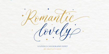 Romantic Lovely � Calligraphy Font with lots of alternate swashes. This font will perfect for adding a romantic and lovely touch to your design. Features: Uppercase and lowercase letters Swash alternates ( Beginning, Middle, Ending ) -Multilingual symbols, numerals, and punctuation How To Access Alternate Swashes? You can read this article: https://helpx.adobe.com/illustrator/using/special-characters.html Follow Instagram: @sronstudio Thank You!
 - Hastings by MKGD,
$13.00 Hastings was inspired by my appreciation for old fashioned English murder mysteries set in the early part of the twentieth century. No one seems to capture the ambience of the roaring twenties or thirties better than the Brits. Everything from the clothing, to the cars, to the telephones, down to the smallest accessories like the pens, all seem to have been appropriated from the local museum. I'm hopeful that this typeface also embodies similar feelings with its sleek and streamlined Art Deco features. Hastings has a glyph count of 389 and supports the following languages; Afrikaans, Albanian, Asu, Basque, Bemba, Bena, Bosnian, Catalan, Chiga, Colognian, Cornish, Croatian, Czech, Danish, Embu, English, Esperanto, Estonian, Faroese, Filipino, Finnish, French, Friulian, Galician, German, Gusii, Hungarian, Icelandic, Indonesian, Irish, Italian, Kabuverdianu, Kalaallisut, Kalenjin, Kamba, Kikuyu, Kinyarwanda, Latvian, Lithuanian, Low German, Lower Sorbian, Luo, Luxembourgish, Luyia, Machame, Makhuwa-Meetto, Makonde, Malagasy, Malay, Maltese, Manx, Meru, Morisyen, North Ndebele, Norwegian Bokmål, Norwegian Nynorsk, Nyankole, Oromo, Polish, Portuguese, Romanian, Romansh, Rombo, Rundi, Rwa, Samburu, Sango, Sangu, Scottish Gaelic, Sena, Shambala, Shona, Slovak, Slovenian, Soga, Somali, Spanish, Swahili, Swedish, Swiss German, Taita, Teso, Turkmen, Upper Sorbian, Vunjo, Walser, Zulu
 - Bountiful Signature by Arendxstudio,
$17.00 Bountiful Signature is a high energy signature-style script font guaranteed to make a big impression. Digitally hand-drawn, it's super-clean smooth flow and high-intensity pen strokes make an unmistakeable impact in logo/branding projects, large header text and product packaging. Features: 1.Uppercase & Lowercase 2.Numer & Punctuation 3.Multilingual support 4.Ligatures 5.Alternates There it is! I really hope you enjoy it - comments & likes are always welcome and accepted. More importantly, don't hesitate to send a message if you have a problem or question. Now just read this, go there and make it happen :)
 - Abdullah by Arendxstudio,
$17.00 Abdullah is a beautiful and characterful brush font that has distinctive brush strokes. Abdullah Script is perfect for branding projects, logos, wedding designs, media posts, advertisements, product packaging, product designs, labels, photography, watermarks, invitations, stationery, and any project that needs a handwritten touch. Features : • Character Set A-Z • Numerals & Punctuations (OpenType Standard) • Accents (Multilingual characters) • Ligature There it is! I really hope you enjoy it! Comments and likes are always welcome and accepted. More importantly, don't hesitate to send a message if you have a problem or question. Now just read this, go there and make it happen!
 - Trade Gothic Next Rust by Linotype,
$29.00 Trade Gothic Next is Akira Kobayashi's 2008 revision of Jackson Burke's 1948 design. Developed over many years, the original Trade Gothic was filled with many inconsistencies. Under the direction of Akira Kobayashi, Linotype's Type Director, the american type designer Tom Grace, a graduate of the MA Typeface Design in Reading, was commissioned to redesign, revise, and expand the Trade Gothic family. Kobayashi and Grace refined many details such as the terminals and stroke endings, symbols, and the spacing and kerning. Moreover, there are newly added compressed widths and heavy weights perfect for setting even more powerful headlines. The Regular weight has been beefed up making it stronger and more robust in text settings. Trade Gothic is a staple of the advertising and newspaper industries, and now Trade Gothic Next brings more features and better quality for today's astute typographers. In addition several weights are available as soft rounded versions.
 - Frieze by Fine Fonts,
$29.00 The origin of this font was a frieze in the RAF Chapel in Westminster Abbey which Michael Harvey was commissioned to design and create. It was comprised of the names of the top brass in wartime Bomber Command, namely Dowding, Harris, Newall, Tedder, Portal and Douglas. The Brief was to cut the letters in bronze and gild them. Instead, they were cut in perspex and gilded. To sit comfortably within the long and narrow vertical space available beneath the chapel’s stained glass window, extended letterforms were used with many vertical serifs omitted and with lengthened horizontal serifs. Some twenty years later, the missing upper-case letters were drawn together with the lowercase letters and Frieze, the font, was born. Subsequently, additional weights and styles were added to create a font family of six styles.
 - Parma by Monotype,
$29.99Giambattista Bodoni (1740-1813) was called the King of Printers; he was a prolific type designer, a masterful engraver of punches and the most widely admired printer of his time. His books and typefaces were created during the 45 years he was the director of the fine press and publishing house of the Duke of Parma in Italy. He produced the best of what are known as modern" style types, basing them on the finest writing of his time. Modern types represented the ultimate typographic development of the late eighteenth and early nineteenth centuries. They have characteristics quite different from the types that preceded them; such as extreme vertical stress, fine hairlines contrasted by bold main strokes, and very subtle, almost non-existent bracketing of sharply defined hairline serifs. Bodoni saw this style as beautiful and harmonious-the natural result of writing done with a well-cut pen, and the look was fashionable and admired. Other punchcutters, such as the Didot family (1689-1853) in France, and J. E. Walbaum (1768-1839) in Germany made their own versions of the modern faces. Even though some nineteenth century critics turned up their noses and called such types shattering and chilly, today the Bodoni moderns are seen in much the same light as they were in his own time. When used with care, the Bodoni types are both romantic and elegant, with a presence that adds tasteful sparkle to headlines and advertising. Parma was designed by the monotype Design Team after studying Bodoni's steel punches at the Museo Bodoniana in Parma, Italy. They also referred to specimens from the "Manuale Tipografico," a monumental collection of Bodoni's work published by his widow in 1818. - Jazayeri Kufic Shoushtar by Arabetics,
$79.00 The Jazayeri Kufic Shoushtar font is a beautiful typographic implementation of the decorative Kufic calligraphy inscribed on the walls of the historic Grand Mosque of Shoushtar in southwestern Iran. This mosque contains many other inscriptions added over time for documentary purposes but its four monumental Kufic inscriptions which are revived in this font are the most essential ones to understand its design and meaning. Built in the ninth century CE, this mosque is one of the earliest hypostyle mosques in Iran. It was built in “the city of scholars” when its residents included two great Sufis, Sahl Ibn Abdullah Tostari and Mansur Hallaj. The designer and producer of the font is Seyed Mohammad Vahid Mousavi Jazayeri, a well-known Iranian master calligrapher, designer, scholar, and author. Mousavi Jazayeri has taken a personal interest in the Kufic script and devoted years to independent research, visiting archaeological locations, historic buildings and cemeteries, mosques, libraries and museums to study the script through direct contact. He has developed a systematic research methodology and published his findings in several books. His professional interest in script and calligraphy stimulated his discovery of the historic method for cutting the Kufic pen, which has had a direct impact on his own work, as seen in several well-received exhibitions and workshops. The historical research and achievements of Mousavi Jazayeri brought together the first international group dedicated to the study and revival of the historic Kufic script operation through kuficpedia.com.
 - Uppercut Angle by Delve Fonts,
$39.00 Joachim Müller-Lancé's Uppercut is a rather sporting fellow, originally developed for the Krav Maga training center of San Francisco (Krav Maga is a simple and efficient self-defense system that has become equally popular in Hollywood and with law enforcement). Joachim has spent several years training, hitting things and people whenever he needs a break from kerning. Uppercut can be seen on the school's t-shirts and other articles. Despite bearing the same moniker as an upwards punch to the chin, the name actually fell together quite naturally as Uppercut is an all uppercase typeface, and the word "cut" is also historically used to describe a type style in hot metal type. For this slanted look, "Angle" felt just right (with thanks to Mia McHatton). The design idea sprang from pencil sketches for the center's new identity. Uppercut's shapes are not calligraphic or handwritten, more like lettering seen in comics or sports logos. Its brush movements are imaginary, not too literally brushy. During development, details were simplified and reduced until a bit of a cut-paper feel emerged, but more fluid like writing. The shapes are economical and efficient; simplicity makes the font versatile, holding up in small as well as big sizes. Uppercut is decidedly analog, muscular but not bulky, with the fluid but determined movements of a boxer or martial artist - not theatrical but powerful, fast, confident and dynamic. Well... it has punch. In the proportions, there is emphasis on a strong upper edge "keeping its guard up", while several stems protrude downward, giving the impression of leaping or being "light on the feet". Use Uppercut to pick up the pace, add snap, verve and drive - on movie posters for action and adventure, to advertise your dojo, rumble or prizefight, racing team or tuning shop, or invite friends to your barbecue with old time rock'n'roll and homemade hot pepper sauce.
 - Privé by TEKNIKE,
$39.00 Privé is a display handwriting font. The typeface is a distinct uppercased style hand drawn font and designed to be easy to read. Privé name is Old French for “private” or “participating in secret”. Privé is great for display work, invitations, writing, architecture, posters and headings. Privé is designed by Thoma Kikis and is currently available with Latin, Cyrillic and Greek character sets.
 - Bizmo by Eko Bimantara,
$24.00 Bizmo font family is meant for display, it's characteristic is in it's wide letterform which is suitable for use in large or long spaces. Bizmo consist of 9 weight with each matching obliques. Several uppercase glyphs can be stretch wider by double or triple typing the letter and using discretionary ligature. It's contain 420 glyphs which covered broad latin languages.
 - Mayes by Sabrcreative,
$15.00 Mayes is a soft, geometric sans serif font family. It consists of 6 weights ranging from Thin to Black, combining elements of Bauhaus and modern styles with its distinctive softness. Its design is minimalist, elegant, and warm, offering a unique yet versatile and easily readable impression. Mayes was created with the purpose of providing text displays that are easy to read, strong, and make a standout impression. It is compatible with both text and display purposes, making it perfect for headers, titles, posters, websites, branding, apps, and various other creative designs or projects. Mayes features several OpenType functionalities, including standard ligatures and number variations such as old-style figures, fractions, numerators, and denominators. It also offers extensive support for the Latin language. With Mayes, you can effortlessly create text displays that stand out with a touch of specialty. Its soft yet strong design makes it an ideal choice for creating remarkable and captivating designs.
 - Platinus Script Pro by Sudtipos,
$69.00 Platinus Script Pro is the latest example of what has now become a Sudtipos tradition: Adapting conventional calligraphic methods from the last two centuries to produce modern digital scripts for the current one. This time the resulting font explores the evolution of invitation scripts from the classic commercial lettering of the 1930s to the ideas clearly visible in the greeting cards of the 1980s and 1990s. Most base characters are made up of a single stroke, with some of the strokes driven from the top down, and some from the bottom up, putting the emphasis on the casual but precise fluidity of the hand, an emphasis magnified by the expert use of loops and swashes everywhere. The Platinus Script Pro family comes in two weights, each loaded with alternates and Latin-based langauge support, for more than 570 characters per font. Platinus Script Pro is great for product packaging, as well book covers, menus and greeting cards.
 - Hebrew Esther Tanach VF by Samtype,
$495.00 This is a font to build an Hebrew Bible (Tanach) or any Hebrew prayer book. This is a variable font with 5 styles! Hebrew Esther Tanach Variable has all Unicode Hebrew marks and others like ShevaNa, Dagesh Chazak, Qamats Katan, and Cholam Chaser. This font has a complex and exclusive Programmation of Opentype features. This font is very good to read even in small texts
