10,000 search results
(0.046 seconds)
- Bagins by Slide Shoot,
$12.00 Bagins Sans Serif is a balanced, smooth, elegant and stylish sans serif font. He has a beautiful character. It fits perfectly with invitation card designs, company logos, movie titles, movie names, business cards, book titles, brand names and various other designs. Bagins Sans Serif is a subtle Sans serif font that exudes sophistication and elegance. Its stylish alternations and ligatures make this font the perfect partner for any project. FEATURE : - Ligature - Uppercase and lowercase - Numbering and Punctuation - Works on PC or Mac - Simple Installation - Supports Adobe Illustrator, Adobe Photoshop, Adobe InDesign, also works in Microsoft Word Hope you like it. Thank you.
 - Almera by Slide Shoot,
$12.00 Almera Serif is a balanced, smooth, elegant and stylish serif font. He has a beautiful character. It fits perfectly with invitation card designs, company logos, movie titles, movie names, business cards, book titles, brand names and various other designs. Almera Serif is a subtle serif font that exudes sophistication and elegance. Its stylish alternations and ligatures make this font the perfect partner for any project. FEATURE : - Ligature - Uppercase and lowercase - Numbering and Punctuation - Works on PC or Mac - Simple Installation - Supports Adobe Illustrator, Adobe Photoshop, Adobe InDesign, also works in Microsoft Word Hope you like it. Thank you.
 - Lorisha by Slide Shoot,
$12.00 Lorisha Serif is a balanced, smooth, elegant and stylish serif font. He has a beautiful character. It fits perfectly with invitation card designs, company logos, movie titles, movie names, business cards, book titles, brand names and various other designs. Lorisha Serif is a subtle serif font that exudes sophistication and elegance. Its stylish alternations and ligatures make this font the perfect partner for any project. FEATURE : - Ligature - Uppercase and lowercase - Numbering and Punctuation - Works on PC or Mac - Simple Installation - Supports Adobe Illustrator, Adobe Photoshop, Adobe InDesign, also works in Microsoft Word Hope you like it. Thank you.
 - Malisha by Slide Shoot,
$12.00 Malisha Serif is a balanced, smooth, elegant and stylish serif font. He has a beautiful character. It fits perfectly with invitation card designs, company logos, movie titles, movie names, business cards, book titles, brand names and various other designs. Malisha Serif is a subtle serif font that exudes sophistication and elegance. Its stylish alternations and ligatures make this font the perfect partner for any project. FEATURE : - Ligature - Uppercase and lowercase - Numbering and Punctuation - Works on PC or Mac - Simple Installation - Supports Adobe Illustrator, Adobe Photoshop, Adobe InDesign, also works in Microsoft Word Hope you like it. Thank you.
 - Veminit by Slide Shoot,
$12.00 Veminit Serif is a balanced, smooth, elegant and stylish serif font. He has a beautiful character. It fits perfectly with invitation card designs, company logos, movie titles, movie names, business cards, book titles, brand names and various other designs. Veminit Serif is a subtle serif font that exudes sophistication and elegance. Its stylish alternations and ligatures make this font the perfect partner for any project. FEATURE : - Ligature - Uppercase and lowercase - Numbering and Punctuation - Works on PC or Mac - Simple Installation - Supports Adobe Illustrator, Adobe Photoshop, Adobe InDesign, also works in Microsoft Word Hope you like it. Thank you.
 - Whitefriars NF by Nick's Fonts,
$10.00Here's an offering from the Blackfriars Type Foundry of London that's perfect for commanding headlines. The letterforms have been carefully kerned for a tight fit to increase the visual color of this nostalgic behemoth. All versions of this font include the Unicode 1250 Central European character set in addition to the standard Unicode 1252 Latin set. - My Darling by Type Innovations,
$39.00 ‘My Darling’ is a stunning new typeface by Alex Kaczun. Inspired by the Didone shapes, ‘My Darling’ incorporates some Didot, a little Caslon, a splash of Scotch and a pinch of old Times. This unique display, with its high-contrast strokes is playful, formal and just a bit ‘sexy’. The swash capital terminals and lively curves, give this design a unique and distinctive look. It works well as a headline font, and because it was designed with generous counters, proportions and spacing—works equally well over a large range of text point sizes. My Darlings' character set supports most Central European and many Eastern European languages. Alex hopes to add many style variations, along with alternate glyph sets and weights to further enhance this offering. Stay tuned!
 - Brute Sans by Wiescher Design,
$15.00 »Brute Sans« is a classic Sans typeface that looks like it has been designed by a chainsaw. »Brute Sans« looks really crude only in big sizes, the smaller the font gets the more it looks like any other Sans typeface. »Brute Sans« prints very fast, because there are no curves to compute, but that is just a side effect. »Brute Sans« is the typeface you should use if you need a really different look, since Sans typefaces tend by design to look very similar. This one is different. I always wanted to do this font, but then other projects crept up so I pushed »Brute Sans« to the end of the line. Enjoy!
 - Enchanted Land DS by Sharkshock,
$125.00 The 2nd installment of the Enchanted Land family takes us on another medieval adventure, opting to completely rebuild instead of refining the legacy script. More emphasis was put into the undulating nature of the Uppercase characters and how they keep your eyes flowing. For this reason, straight lines and right angles are rarely used in favor of flamboyant terminals and wispy swashes. Lowercase characters, by contrast, adhere to a consistent model defined by its straightened edges and sharp corners. This script flirts with several old world styles but seeks only to borrow elements rather than completely emulate them. German Blackletter, Old English, Uncial, Victorian, it’s in there! Enchanted Land DS would work well in a book, video game, or medieval signage. This family is equipped with Basic Latin, Extended Latin, ligatures, punctuation, a few alternates, and kerning.
 - Chicago Brush by Colllab Studio,
$19.00 "Hi there, thank you for passing by. Colllab Studio is here. We crafted best collection of typefaces in a variety of styles to keep you covered for any project that comes your way! If you're looking for a hand-drawn font to help craft a unique statement piece, you've probably been spending hours looking for the perfect brush font. The problem with most brush fonts is that they're not actually made from real brushes - they look like they've been artificially drawn by a machine. There's now a high-quality alternative available. We are proud to introduce our new, very high resolution Chicago Brush font - the result of our meticulous process of digitizing hand-drawn typefaces and then optimizing them through our exclusive, innovative technology. That’s why we created Chicago Brush, a font made from a real brush. Use it to create logos, names and signage. It will look hand lettered, like you really worked on those letters manually. A Million Thanks Colllab Studio www.colllabstudio.com
 - Organic Pro by Positype,
$29.00 When I released the original Organic in 2009, I was satisfied with it. It was what was possible from me and the technology at the time. The Organic Pro of 2021 takes those original desires of delivering a highly legible and friendly sans serif, and doubles down on those notions, while exploring what further infusing warmth in a highly structured sans serif can really do for a client. Free of distracting and potentially dating visual traits and cues that could be seen as endemic of a specific time period or ‘type trend’, Organic Pro is its own person—take it or leave it. Inviting warmth, assured reliability, and a head nod of confidence is what you walk away with—a stark contrast to the cold, impersonal geometrics and grotesques proliferating the design annuals currently. Releasing this typeface now, completely redrawing the masters, as well as expanding the weight and language options, should be seen as a laid back challenge that we need to do less with type, let it communicate confidently and warmly when it needs to, and stop forcing one-size-fits-all type trends on everyone.
 - Esmeralda Pro by Sudtipos,
$59.00 From the beginning “Esmeralda” was born with a strong influence of the classical “capitalis monumentalis”, carved in stone. In the same way, the origin of this majuscule writing emerged from the brush, from a way of writing made merely by hand. For this reason, these two universes were intended to lie beneath the shape of each letter, redefining them. And this combination of styles should also be reflected in a lower case set that also allows to open up the spectrum of usage possibilities. Foundational calligraphy represented a solid base for the development of lower case glyphs, ensuring proper interaction with the upper case letters. “Esmeralda” features a great number of ligatures that mix classic structures with a more contemporary impression. With more than eleven hundred glyphs, it provides a multiplicity of uses across a wide combinatory of ligatures, alternative signs, initial caps, miscellaneous and connectors; each one of them accessible through Open Type. “Esmeralda” is perfect to speak with a classical yet fresh, modern – and a little bit bold – tone of voice. Designed by Guille Vizzari, together with the tough and remarkable work of Ale Paul, in use “Esmeralda” stands out in a subtle and unexpected way that’s almost unnoticeable. Its delicate yet solid curves, serifs and endings give each composition a fine, elegant and exquisite feeling, along with a firm and sturdy look. “Esmeralda” was initially born as a typographic project developed by Guillermo Vizzari – tutored by Ale Paul and Ana Sanfelippo – under completion of the Specialization in Typography Design at University of Buenos Aires, Argentina, during the years 2011 and 2012.
 - Julie Brious by Cotbada Studio,
$5.00 Julie Brious is a handwritten signature typeface. Its classy energetic look makes it the perfect fit for feminine logos, printed quotes, invitation cards, social media headers, product packaging and a lot more!
 - Jamie Handwriting by Mans Greback,
$49.00 Jamie Handwriting is a charming hand-script font. Its contextual and stylistic alternates makes for a typography indistinguishable from a true handwritten text. Jamie Handwriting's cute and quirky lettering fits any project or contexts that requite that extra bit of genuineness and life. It is wild and funny to look at, and its quick movements emits a happy optimism. The family consists of ten high-quality styles: The weights Thin, Light, Medium, Bold, Black as well as each style as Regular and Alternate. The different thicknesses ensures it will work in any size, and the Alt style prevents any repeating characters. Jamie Handwriting is built with advanced OpenType functionality and has a guaranteed top-notch quality, containing stylistic and contextual alternates, ligatures and more features; all to give you full control and customizability. It has extensive lingual support, covering all Latin-based languages, from North Europe to South Africa, from America to South-East Asia. It contains all characters and symbols you'll ever need, including all punctuation and numbers.
 - Tabac Big Sans by Suitcase Type Foundry,
$39.00 Those who have grown tired of text typefaces insensitively blown up to the size of a poster or a building facade should from time to time try out extreme display styles, which are designed precisely for this purpose. They look best in dimensions from around 32 point out to infinity, and they rise to the occasion when a strong impression is necessary. This is especially true for the extreme weights Hair and Black, which don’t allow for any compromise. The sharp hairline and brutal contrast of the strokes test the most extreme possibilities, without having readability suffer in continuous text, as is characteristic for all the typefaces of the Tabac superfamily. Tabac Big Sans has the distinction of having most of its styles hold up not only in giant sizes, but also in smaller texts, where it’s an obedient little doggie. It actually works like a narrowed linear grotesk with an increased x-height. There’s no limit to fantasy.
 - Meter Room JNL by Jeff Levine,
$29.00 The design idea for Meter Room JNL comes from a vintage brass hand-cut stencil of the words "High Voltage". What makes this stencil font a bit different than others is the placement and angle of some of the "breaks" within the letters.
 - Kigali by Monotype,
$50.99Designed by Arthur Baker in 1994 for URW, Kigali is a wide-bodied display type with bold, uneven, pen-drawn strokes that taper dramatically downward. This unusual theme creates a unique, recognizable look. Furthering the effect, the Kigali typeface family contains additional decorative design fonts, one with a zigzag pattern filling the spacious strokes, and another with the letters in black squares for use as ornamental initials. The regular and italic versions include two alternate faces: one with long, tall ascenders and regular-length descenders, and one with shortened ascenders and descenders that allow it to fit where its companion might not. Use Kigali sparingly in display advertising, labels, flyers, and other incidental work. - Nomadic by Heyfonts,
$15.00 Nomadic Blackletter font, also known as Gothic or Old English font, is characterized by its bold, ornate and decorative style with thick vertical and thin horizontal strokes. They are highly ornamental and are distinguished by their black, high-contrasting nature. Features of Nomadic Font: Ornate and Decorative: Nomadic fonts are highly ornamental, artistic and decorative, making them ideal for titles, headlines, logos, and other design applications where a touch of sophistication, elegance, and class is required. Strong and Bold: Due to its bold strokes, Nomadic fonts exude strength and power, making them the perfect choice for logos and branding, especially in fields such as music, fashion and sporting industries. High Contrast: Nomadic font creates a high contrast between the thick and thin strokes, creating a unique visual appeal that is not found in other fonts. Gothic Style: Nomadic font originates from the Gothic period where it was commonly used in manuscripts and inscriptions. This style has persisted through the centuries and is still popular today. Use of Capitals: Nomadic fonts make use of stylized capital letters with exaggerated loops and curves, adding to the uniqueness of the font. In summary, They are excellent for logos and headlines, providing a touch of elegance and sophistication. However, their complexity limits their use in large amounts of text.
 - Nefertiti by JAB,
$12.00As you can see, Nefertiti is a font based on ancient Egyptian hieroglyphs and could be classified as a fun-font. I've always been really interested in Egyptology and a couple of years ago I thought it would be great to be able to write in hieroglyphs. I started to study them but soon realized it would take me a long time to be able to do this. Still, I was determined to find a way around this problem. At some point I came up with the idea of rearranging and reforming the hieroglyphs so as to resemble the English alphabet. During this process I tried as much as possible to preserve their ethos and appearance. However, since they are designed to write in English with, it's obvious that they are not always going to look like the real thing. Despite this, I'm really happy with the final result and I think many Pharaohphiles who just want to have some fun will be also. The only difference in this font between lower and upper case characters, is that the latter are set between two parallel, horizontal lines. These are for use with brackets (motif ends) to form cartouches - elongated ovals for names and/or titles. Try typing the following using the upper case in the sample text box. e.g. (JOHN} The zigzagged vertical lines at each end, separate the motifs from the hieroglyphs. Note the three types of ends/brackets. These lines are also used to separated words from one another and to give a more authentic appearance. So pressing the space bar gives a zigzagged line - not a space. They can also be used at any point within a cartouche to separate first and last names or titles. e.g. ; (JOHN;BROWN} walked straight home after work. Notice the eye glyph (period/full stop) at the end of the sentence. This is the only punctuation mark which can be used within a cartouche, e.g. after Mr. or to add a more Egyptian appearance to a name or title. e.g. (MR>;JOHN;BROWN} Parallel lines dividing hieroglyphical inscriptions and writing into rows or columns are very common. To incorporate these in a body of text, simple use the underline U. e.g. (OSIRUS) and {ISIS} were important gods of the ancient Egyptians. (HORUS) {HATHOR} and [RA],the sun god, were also highly revered deities. The punctuation marks available are shown below. . , " " ' ! ? "where is the king?" The font also includes the numbers 0-9, the following mathematical symbols and the hash sign(Scarab beetle). Once again, I've tried to make them look as Egyptian as possible; whether I've succeeded or not is open to debate. e.g. + - x / = # This font is named after Akhenaten's beautiful wife, Nefertiti, who's image can be seen in the graphic on this page. - Emencut by Twinletter,
$15.00 Emencut sans serif, and everything in between. San Serif is a hot trend, and we have the hottest ones. Our newest font family is waiting for you to get it: The San Serif family offers 18 different styles, each with a unique look. Use this typeface in your design or business projects, of course, your various design projects will be perfect and extraordinary if you use this font because this font is equipped with a font family, both for titles and subtitles and sentence text, start using our fonts for your extraordinary projects.
 - Evoque Text by Monotype,
$40.00 Evoque Text is a humanist serif type family specifically designed for a comfortable reading experience. This has been achieved by optically adjusting the regular weights from my original Evoque family (released November 2021). You will notice a significantly reduced x-height and longer ascenders and descenders, complemented by adjustments to weight and spacing. This makes Evoque Text a perfect choice for any long passages of text. All OpenType features have been retained from Evoque. A plethora of swash alternates and discretionary ligatures enhance Evoque Text, giving you the opportunity to embellish your typography. Simply activate Stylistic Sets to start adding these flourishes to your text. Other useful features include Small Caps at the click of a button, and Old Style Figures are an option to the default proportional figure style. There are 14 fonts altogether over 7 weights in roman and italic, you can also avail of two variable fonts which allow you to fine tune the weight to your exact liking. Evoque Text has an extensive character set (900+ glyphs) that covers every Latin European language. Key features: 7 weights in both roman and italic 80 Alternates 26 Ligatures Small Caps Variable fonts included with full family Full European character set (Latin only) 900+ glyphs per font.
 - Norton by K-Type,
$20.00 Norton is a full character set based on the five letters in the famous Norton Motorcycles logo. K-Type has attempted to remain true to the spirit of the original identity, whilst updating the face, particularly the upper case, to sit more comfortably in contemporary usage. Thanks to Paul Lloyd for the influence of his typeface, Duvall.
 - FS Hackney by Fontsmith,
$80.00 Elliptical The squareness of curves. That was the elliptical – in more than one sense – notion being explored in the making of FS Hackney. The squareness of curves and vertical terminals to create a gentle, soft sans serif, with a little bit of magic. A momentary thought – “It doesn’t have to be like this” – provided the spur to explore the verticals and skeletons of letterforms beyond conventional type design limits. A 12-month gestation period gave rise to a font with a larger-than-usual character set, including non-lining figures, small caps and superior and inferior numbers. It’s a collection that speaks confidently for itself. Assertive It was the Hackney carriage – the black London cab – that gave this font its name, not the north London neighbourhood. Solid, dependable, effective and built to last, FS Hackney was honed to perform in all conditions. Cool, compelling lines and a satisfying overall simplicity lend FS Hackney its assertive air. Assured, versatile and effective; just like a black cab (but without the grumbling). Machined Over a string of meetings, Jason Smith and FS Hackney designer Nick Job worked out how to infuse Nick’s sketched letterforms with Fontsmith’s familiar geniality. “Nick is very meticulous and produces very clean design work,” says Jason. “Hackney is ideal for branding as it’s very clear and its quirks are sensible ones, not odd ones, that don’t distract from the message.”
 - Beijing by Solotype,
$19.95One of the many Solotype experiments in developing fonts with an ethnic flavor, this one is a bit less obvious than most. The lowercase seems to work well. - Auberjean by Abbyland,
$15.00 Auberjean is a playful handmade display font, great for social posts, editorial design, posters, book covers, signs, and more! This font has a hip and contemporary feel. It works well for headlines as both uppercase and lowercase, as well as short blocks of text like quotes and info blurbs. The thick, rounded style means it looks great with an outside stroke or offset outline.
 - Sunlight Dreams by Viswell,
$19.00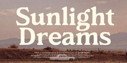 Introducing "Sunlight Dreams", a retro serif font that seamlessly combines vintage charm with contemporary flair. Meticulously crafted, its sophisticated serifs and gentle curvature exude warmth and timeless appeal. Ideal for various design applications, this font adds a touch of refined nostalgia, making it perfect for branding, packaging, and creative projects. Embrace the timeless allure of 'Sunlight Dreams' to elevate your designs with a hint of vintage elegance."
 - PaperCutAlmondDark by PineStreet,
$25.00 This is the 'dark' version of our font PaperCut Almond. It has all of its openings closed to enhance the effect of handcut lettering.
 - Kaat by ChrisNuijen.com,
$29.00 Kaat is a new type (2013). It was designed by Chris Nuijen and named after his daughter Kaat. It represents the period in which everyone has their face behind the latest mobile phone screen or interactive games console. "Kaat"is slick, modern and progressive, to reflect our busy immediate life style, whilst providing the essentials in a period where people can be judged on television. Kaat is here to stay and to evolve. Everyone wants to try to be that little bit different, but essentially we are all the same, with the same inherent needs, just like babies or children. We need to be fed, watered, nurtured and loved, the only difference is in today's world you can do all that from behind a screen. "Kaat" bridges that gap, transcending the basic needs of type, with the sophistication and fast paced sharpness of today, everyone wants to be different but we all stay the same, this is a reflection in the thickness and shape of each glyph. The font represents how we are molded and cast differently in yet we still stay the same, because we need the repetition! Everything needs to be done quicker, simpler and cheaper. We eat we sleep we communicate.
 - Isabelle Pro by Canada Type,
$39.95 Isabelle is the closest thing to a metal type revival Jim Rimmer ever did. The original metal face was designed and cut in late 1930s Germany, but its propspects were cut short by the arrival of the war. This was one of Jim's favourite faces, most likely because of the refined art deco elements that reminded him of his youthful enthusiasm about everything press-related, and the face's intricately thought balance between calligraphy and typography. Not to mention one of the most beautiful italics ever made. Jim's early 2000s digitization included mathematical corrections to the original metal cut, as well as some functional improvements for digital use. In 2013, during the remastering of the entire Rimmer collection, Isabelle underwent a considerable rethinking/expansion and was rechristened Isabelle Pro. The new revisions include small caps, ligatures, seven types of figures, automatic fractions, extended Latin language support, stylistic alternates that include lowercase serif angle options in the roman and looped ascenders/descenders in the italic, and plenty of extra OpenType features like caps-to-small-caps substitution, case-sensitive positioning, ordinals, and extended class-based kerning. Now each of the Isabelle Pro fonts includes over 680 glyphs. 20% of this font's revenues will be donated to the Canada Type Scholarship Fund, supporting higher typography education in Canada.
 - No Bad Days by Cardigan,
$25.00 Get RAD with this unique, fun, handwritten font by Cardigan. This pack includes two fonts. A bold, brush font with a supporting thin, handwritten script font. These typefaces ooze good vibes, adding a fun and edgy style to any design. Whether you need a hand drawn feel to a logo or a bold organic font that jumps off any page. No Bad Days has your back and is a total dream to work with.
 - Dekapot by Chank,
$49.00A grunge-oriented secret code font, Dekapot Deluxxe has mysterious underlines and accent marks that pop up at seemingly random locations as you type. But these morse-code-like dots and dashes are not random at all, they're simply attached to the preceding letter to make things seem more cryptic than they really are. Get it? Originally released as a Chankstore freefont back in the '90s, Dekapot (translated from the Dutch as "the broken font") has a newly bulked-up character set to add functionality and professionalism to its all caps display nature. These are fresh new versions of this font, made to replace prior versions formerly known as Dekapot Masss and Dekapot Deluxxe. Poke around a bit and you'll find new glyphs for Central Europe and a new Cyrillic character set in there, too. OpenType users get DEKAPOT-PRO with lots of language support. Special Mac PostScript and Windows TrueType is available for the individual Regular or Cyrillic version. - Bodoni Ornamental by FontMesa,
$30.00 New for 2020 Bodoni Ornamental now has two italics to choose from, one basic italic and a second which is more of a true italic with a few uppercase letters that have been stylized. Only one italic can be style linked to the regular upright version so in the second italic we've added Avanti to the name which means forward in Italian. When purchasing the regular upright and Avanti italic together they will install as two separate families. Bodoni Ornamental is a revival of a very old typeface based on the Poster Bodoni letter shape. Giambattista Bodoni passed away in 1813, this decorative version was created in the 1820’s or 1830’s which was the time period when many of these ultra bold decorated type faces began to appear, the original artist is currently unknown. The original version of this ornate classic was only available as a set of uppercase letters, today over one hundred eighty years later this font is now complete with a new lowercase, numbers and accented characters for Eastern, Central and Western European countries. Due to the ornate detail in Bodoni Ornamental when printing itís recommended to use a laser printer 600dpi or greater, a 1200dpi printer will give you the best results rendering the most detail at the smallest possible point size for this font. Small home user Ink Jet printers are not recommended for Bodoni Ornamental unless you set the font to a very large point size. With Ink Jet printers much of the detail in the letters will bleed together as the ink hits the page, commercial Ink Jet printers such as GiclÈe printers may give good results. When using Bodoni Ornamental for digital images including web site graphics it may help to add a one pixel stroke fill around the letters setting color to white or grey, this may help the web site images display better on some computer's. You will need a photo editing application such as Adobe Photoshop to create your image adding the stroke fill and save as a jpg , png or gif file. I hope you enjoy this old font as much as I did making it. Note: When previewing the Bodoni Ornamental font in the Windows font preview you may notice some letters appearing lighter and some darker, this is a problem with the preview window and some ornate fonts, Bodoni Ornamental will print normal and not with mixed light and dark letters.
 - Chocoball by Yumna Type,
$16.00 It is significant to have a unique font to create impressive, impactful designs because people often forget common things which may cause your work to be forgotten as well. You may have lost your candidate customers even before they know your brand and product. Let us introduce you to Chocoball, a font with firm impressions to protrude your designs. Chocoball is an uppercased display font designed in playful, modern concepts. It has firm, attractive impressions because of the inclined square letter shapes making it more unique than the others. Furthermore, it can show off your desired messages on your designs easily with the use of the uppercases. Besides, this font is able to build up a strong, recognizable brand identity. A playful display font is flexible and suitable for various design types as its advantage because it is applicable for either formal or informal designs producing interesting, consistent results. You can apply Chocoball, which gives you a clipart as a bonus, for big text sizes to be legible. You can enjoy the available features here as well. Features: Ligatures Multilingual Supports PUA Encoded Numerals and Punctuations Chocoball fits best for various design projects, such as brandings, posters, banners, headings, magazine covers, quotes, printed products, merchandise, social media, etc. Find out more ways to use this font by taking a look at the font preview. Thanks for purchasing our fonts. Hopefully, you have a great time using our font. Feel free to contact us anytime for further information or when you have trouble with the font. Thanks a lot and happy designing.
 - Sound Board by Jesse Tilley,
$19.95 I felt an urge to create a font that used the bars seen in an equalizer; Sound Board is that font. If you're going to use it, you will need to put the size up much more then a normal font, this font is very skinny and tall.
 - Adagio Sans by Borutta Group,
$25.00 The Adagio Family is a part of Mateusz Machalski's, Warsaw Academy of fine arts Master Degree Diploma in multimedia studio, conducted by Professor Stanisław Wieczorek and his brave PHD Jakub Wróblewski. Adagio is a modern type family. It consists of 3 main varieties: sans, serif and slab. Each one of them has it's own “true italic” set. All of the styles together have over 400 characters in 9 different thicknesses. The Adagio family was created mostly for company identities. The idea was to create a wide range of different varieties which are stylistically consistent. Adagio Sans - In its character, inspired by classical English typefaces. Sharp chamfers add a strong character. Thanks to delicate contrast and proportions of capitals, this variety has features of humanist grotesque. Thanks to large x length, and highly stretched descenders, it also works correct in longer text, while it’s strong detail is good for headlines. The Sans version is a great complement for Adagio Serif and Adagio Slab.
 - Hailea by Fateh.Lab,
$15.00 This font family is perfect for those who want to make their designs stand out. It has a modern style with soft but firm characters, making it different than most other fonts you'll see on the market today! This fresh and cheerful theme will work well in any project - whether its posters or social media posts- as long as they have large print formats available (or anything else). With 5 choices of typeface styles, plus some cool free vector bonuses thrown into the mix too; there's no reason why anyone shouldn't give this amazing font bundle a try!
 - Gardens by The Rivertown Inkery,
$20.00 Gardens is a nostalgic arena font. Inspired by a soon-to-be demolished arena, this font was created to capture the memories and good times this building once contained. Upon hearing the news of the demolition, our team was struck with sadness and nostalgia. As youngsters we can recall attending a wide variety of events, such as hockey games, pro wresting and the circus. Our hope is that others can share in our nostalgic love of this once prominent arena. With curvy retro styling Gardens is unique and will fit in with many retro and vintage logos and design. Wether its t-shirts, posters or digital, Gardens will surely make your work stand out!
 - MOO! - Personal use only

- Just Pixo by Latinotype,
$29.00 Inspired by the streets of Brazil, Just Pixo is a display typeface that mimics pixação, Brazilian graffiti. In his book Pixação: São Paulo Signature, François Chastanet says, “This alphabet, with its vertical inscriptions axis, is to be directly classified in the king-size, monumental category; the systematic use of capitals, meticulously aligned and justified, their extreme verticality, are symptomatic of this architectural dimension”. As such, we designed Just Pixo for monumental type sizes and vertical alignments—a family with seven weights, alternate glyphs, multiple ligatures and is provided as a Variable Font too. Unique decorative serif capitals and lowercase sans serif versions make Just Pixo the perfect option for large displays, strong headlines, urban logos, and contemporary concepts. Despite its controversial use on the streets, this often politically charged style will typeface will take your next project to the next level.
 - Slim Pickens by Dear Alison,
$19.00Have you ever seen lettering that you can connect with but have no clue where you've seen it before? It strikes a chord with certain feelings but you don't know why. Slim Pickens was inspired by the lobby card and poster titling from the 1949 Doris Day film "My Dream is Yours", and keys into the look and feel of vintage handwritten film poster titling. Something about that era in film made it easy to tie visuals with getting swept up in all sorts of emotions, good and bad. A narrow font, full of life and wonderfully hand-drawn, Slim Pickens is an accent font you'll want to have in your font collection for those tight fits, so buy it today and fill in the gaps of your designs with a little nostalgia!
