10,000 search results
(0.041 seconds)
- Petty Despot NF by Nick's Fonts,
$10.00A typeface named Times Gothic, which made its first appearance in the 1905 ATF specimen book, inspired this headline sans. Use it to add a bit of quirky visual interest to headlines and subheads. Both versions include the complete Latin 1252, Central European 1250 and Turkish 1254 character sets, with localization for Lithuanian, Moldovan and Romanian. - Brisella by Letterara,
$14.00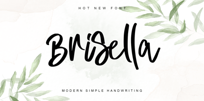 Brisella is a simple modern handwritten font with a wonderful choice of bold and elegant to choose from. Its natural and unique style makes it incredibly fitting to a large pool of designs. The only limit is your imagination! This font is PUA encoded which means you can access the available glyphs and ligature with ease!
 - Cabaret by Solotype,
$19.95We've always liked Art Gothic (you've seen it on the titles and credits for TV's Murder She Wrote) but felt it was far too animated for most uses. Here is our super-simplified version, a calmer font that will fit many display uses. - Port Vintage by Onrepeat,
$25.00 Guided tour available here. Port Vintage is a new typeface expanded upon the original Port typeface, released in 2013, and being an experimental Didone typeface with a modern twist, inspired by the well known forms of typography masters such as Bodoni and Didot and the exuberance and elegance of calligraphy typefaces. A lot of changes were made, the whole typeface is now softer and has less rough edges, the time it took to mature made it possible to achieve an entirelly new and distinct flavour from the original Port, giving away the rough edges from Port and giving place to the soft transitions and curved connections between the stems and serifs of Port Vintage. Port Vintage melts the straight lines and strong contrasts of the Didone typefaces with the elegant lines of calligraphy in a geometric way, resulting in exuberant characters with geometric swashes that can be combined in countless ways. The result of this experiment is Port Vintage, an unique and rich display typeface meant to be used on big sizes and it’s main perk is the amount of alternative characters it features. Port Vintage is Open-Type programmed and includes hundreds of alternates, from swashes to titling alternates, ligatures and stylistic sets with each character having a thin version of itself, giving complete freedom to all your creative needs. Port Vintage is available in 10 different styles: Port Vintage Regular, being the base version and featuring the whole base character set; Port Vintage Regular Decorated, featuring richer forms and containing more ornamentated and more extravagant characters; Port Vintage Medium and Port Vintage Medium Decorated, designed for the occasions you need a bit more thickness and the decoration variants: Port Vintage Ornaments, containing a wide set of elements meant for the creation of fillets, vignettes and fleurons, resulting in an almost infinite number of possible combinations to embellish your designs and Port Vintage Words, a set of some of the most common words used in English, Spanish, French, German, Italian and Portuguese. All styles, except Port Vintage Ornaments and Port Vintage Words, include italic styles. For a better understanding of all the uses of Port Vintage and the full character list the reading of the manual is recommended.
 - Trumania EEN - 100% free

- Yakitori Alley by Kitchen Table Type Foundry,
$16.00 My son Sam saved all his pennies for a trip to Japan with me. Hi dream came true this year and we traveled around Honshu for 10 days. One of the things on his ‘to do’ list was eating yakitori, so I took him to famous Yakitori Alley in Tokyo. The setting was legendary, the smell was great, but the yakitori, unfortuntely, was so-so.. Yakitori Alley is a fun, scribbly script font with language support and a set of contextual alternates.
 - Affair by Sudtipos,
$99.00 Type designers are crazy people. Not crazy in the sense that they think we are Napoleon, but in the sense that the sky can be falling, wars tearing the world apart, disasters splitting the very ground we walk on, plagues circling continents to pick victims randomly, yet we will still perform our ever optimistic task of making some little spot of the world more appealing to the human eye. We ought to be proud of ourselves, I believe. Optimism is hard to come by these days. Regardless of our own personal reasons for doing what we do, the very thing we do is in itself an act of optimism and belief in the inherent beauty that exists within humanity. As recently as ten years ago, I wouldn't have been able to choose the amazing obscure profession I now have, wouldn't have been able to be humbled by the history that falls into my hands and slides in front of my eyes every day, wouldn't have been able to live and work across previously impenetrable cultural lines as I do now, and wouldn't have been able to raise my glass of Malbeck wine to toast every type designer who was before me, is with me, and will be after me. As recently as ten years ago, I wouldn't have been able to mean these words as I wrote them: It’s a small world. Yes, it is a small world, and a wonderfully complex one too. With so much information drowning our senses by the minute, it has become difficult to find clear meaning in almost anything. Something throughout the day is bound to make us feel even smaller in this small world. Most of us find comfort in a routine. Some of us find extended families. But in the end we are all Eleanor Rigbys, lonely on the inside and waiting for a miracle to come. If a miracle can make the world small, another one can perhaps give us meaning. And sometimes a miracle happens for a split second, then gets buried until a crazy type designer finds it. I was on my honeymoon in New York City when I first stumbled upon the letters that eventually started this Affair. A simple, content tourist walking down the streets formerly unknown to me except through pop music and film references. Browsing the shops of the city that made Bob Dylan, Lou Reed, and a thousand other artists. Trying to chase away the tourist mentality, wondering what it would be like to actually live in the city of a billion tiny lights. Tourists don't go to libraries in foreign cities. So I walked into one. Two hours later I wasn't in New York anymore. I wasn't anywhere substantial. I was the crazy type designer at the apex of insanity. La La Land, alphabet heaven, curves and twirls and loops and swashes, ribbons and bows and naked letters. I'm probably not the very first person on this planet to be seduced into starting an Affair while on his honeymoon, but it is something to tease my better half about once in a while. To this day I can't decide if I actually found the worn book, or if the book itself called for me. Its spine was nothing special, sitting on a shelf, tightly flanked by similar spines on either side. Yet it was the only one I picked off that shelf. And I looked at only one page in it before walking to the photocopier and cheating it with an Argentine coin, since I didn't have the American quarter it wanted. That was the beginning. I am now writing this after the Affair is over. And it was an Affair to remember, to pull a phrase. Right now, long after I have drawn and digitized and tested this alphabet, and long after I saw what some of this generation’s type designers saw in it, I have the luxury to speculate on what Affair really is, what made me begin and finish it, what cultural expressions it has, and so on. But in all honesty it wasn't like that. Much like in my Ministry Script experience, I was a driven man, a lover walking the ledge, an infatuated student following the instructions of his teacher while seeing her as a perfect angel. I am not exaggerating when I say that the letters themselves told me how to extend them. I was exploited by an alphabet, and it felt great. Unlike my experience with Ministry Script, where the objective was to push the technology to its limits, this Affair felt like the most natural and casual sequence of processions in the world – my hand following the grid, the grid following what my hand had already done – a circle of creation contained in one square computer cell, then doing it all over again. By contrast, it was the lousiest feeling in the world when I finally reached the conclusion that the Affair was done. What would I do now? Would any commitment I make from now on constitute a betrayal of these past precious months? I'm largely over all that now, of course. I like to think I'm a better man now because of the experience. Affair is an enormous, intricately calligraphic OpenType font based on a 9x9 photocopy of a page from a 1950s lettering book. In any calligraphic font, the global parameters for developing the characters are usually quite volatile and hard to pin down, but in this case it was particularly difficult because the photocopy was too gray and the letters were of different sizes, very intertwined and scan-impossible. So finishing the first few characters in order to establish the global rhythm was quite a long process, after which the work became a unique soothing, numbing routine by which I will always remember this Affair. The result of all the work, at least to the eyes of this crazy designer, is 1950s American lettering with a very Argentine wrapper. My Affair is infused with the spirit of filete, dulce de leche, yerba mate, and Carlos Gardel. Upon finishing the font I was fortunate enough that a few of my colleagues, great type designers and probably much saner than I am, agreed to show me how they envision my Affair in action. The beauty they showed me makes me feel small and yearn for the world to be even smaller now – at least small enough so that my international colleagues and I can meet and exchange stories over a good parrilla. These people, whose kindness is very deserving of my gratitude, and whose beautiful art is very deserving of your appreciation, are in no particular order: Corey Holms, Mariano Lopez Hiriart, Xavier Dupré, Alejandro Ros, Rebecca Alaccari, Laura Meseguer, Neil Summerour, Eduardo Manso, and the Doma group. You can see how they envisioned using Affair in the section of this booklet entitled A Foreign Affair. The rest of this booklet contains all the obligatory technical details that should come with a font this massive. I hope this Affair can bring you as much peace and satisfaction as it brought me, and I hope it can help your imagination soar like mine did when I was doing my duty for beauty.
 - Jessen-Schrift by profonts,
$41.99 The original Jessen typeface, named in reminiscence of the great supporter of the printing art at the end of the 19th century, Peter Jessen, was designed in the years of 1924 until 1930. Bible Gothic was created by the famous German designer Rudolf Koch. Ralph M. Unger digitized this font exclusively for profonts in 2005, keeping his digitization as close as possible to the original design of Koch in order to preserve the distinguished character and the partly unconventional, original forms. The concept of a Bible Gothic was developing for years in Koch's mind and drove the direction of his work, but only after the experience with his Neuland design could he start the creation of his Peter Jessen typeface. Produced quite like Neuland, Jessen, however, is much more refined and more accurate in detail than Neuland. At first glance, it seems to look plain and simple, but if you look closer, the richness of its distinguished upper case forms unfold to a perfectly clear flow of text
 - Bylander by Mans Greback,
$59.00 Bylander is a stateful serif typeface. With robust, heavy letterforms reminiscent of a foundry's hammer hitting molten metal, and an unpaired weight, Bylander's characters seem forged from the core of the Earth. Its rounded corners whisper tales of smoothened river stones, and its gentle curves combined with its industrial mass makes Bylander a paradox; both intimidating in its boldness and welcoming in its approach.
 - Stepside by Sean Thorenson,
$12.00 Stepside is a slick retro display face with plenty of horsepower. Stepside’s heavy-duty type chassis of sturdy uprights and bold strokes was modified with sweet retro details like graceful curves and tapered fins. Inspired by street rods, custom vans and power wagons, Stepside modestly hides its muscle like a true sleeper. Take Stepside for a spin on logos, posters and t-shirts for a more classic look. Need more speed? Step on the gas with Stepside Italic — perfect for type in need of emphasis.
 - FS Pele by Fontsmith,
$50.00 Iconic Conjuring memories of chunky typefaces from the late-60s and early-70s, and named after the world’s greatest footballer of that and probably any other era, FS Pele is one of a set of Fontsmith fonts designed specifically for headlines and other prominent applications. “We wanted to create fonts that could be integral to the design of posters, album covers and magazines,” says Jason Smith. Welcome to FS Pele, iconic, like its namesake (though, perhaps, a little less nimble). Big Pele, little Pele There was only one Pele. But there are two sizes of FS Pele. FS Pele One, with the finer counters and details, adds considerable weight and style at large sizes, especially in big block headlines on posters. FS Pele Two’s thicker “slots” make it a better choice for smaller-sized text. A load of blocks FS Pele began as an exercise by Phil Garnham in turning squares into legible letters, via the least means necessary. The idea extended his ideas about logo-making, and the search for a stamp-like brand mark that lends authority, stability and instant identification. “The thought that the type was a 2D/3D jigsaw of slotted, architectural pieces was almost an after-thought. I wanted to create a strong, stacking, block aesthetic for the most contemporary poster design. “At the time there were a lot of designers creating their own versions of the same thing but I wanted to take the blocker forms to the next step, and infer a more legible text without sacrificing the idea.”
 - FS Pele Variable by Fontsmith,
$199.99Iconic Conjuring memories of chunky typefaces from the late-60s and early-70s, and named after the world’s greatest footballer of that and probably any other era, FS Pele is one of a set of Fontsmith fonts designed specifically for headlines and other prominent applications. “We wanted to create fonts that could be integral to the design of posters, album covers and magazines,” says Jason Smith. Welcome to FS Pele, iconic, like its namesake (though, perhaps, a little less nimble). Big Pele, little Pele There was only one Pele. But there are two sizes of FS Pele. FS Pele One, with the finer counters and details, adds considerable weight and style at large sizes, especially in big block headlines on posters. FS Pele Two’s thicker “slots” make it a better choice for smaller-sized text. A load of blocks FS Pele began as an exercise by Phil Garnham in turning squares into legible letters, via the least means necessary. The idea extended his ideas about logo-making, and the search for a stamp-like brand mark that lends authority, stability and instant identification. “The thought that the type was a 2D/3D jigsaw of slotted, architectural pieces was almost an after-thought. I wanted to create a strong, stacking, block aesthetic for the most contemporary poster design. “At the time there were a lot of designers creating their own versions of the same thing but I wanted to take the blocker forms to the next step, and infer a more legible text without sacrificing the idea.” - Linotype Projekt by Linotype,
$29.99Linotype Projekt was created by German type designer Andreas Koch with both a well-defined inspiration and goal. It occurred to me that typefaces like Helvetica and Univers seemed to have a higher quality in hot-metal composition as with modern digital typesetting. They are stronger and livelier. This is in part due to the printing process, which presses the characters onto paper, and in part to the forms of the letters, which differ from the PostScript version of the same typeface. An important aspect of printing is the slight increase in character width resulting from the pressure which also serves as an optical correction to the forms. (True exact squares appear slightly barrel-formed to the eye.) I wanted to revive this peculiarity, not because of a nostalgic feeling, rather just because it is more attractive." The result is Linotype Projekt, a text font which is harmonious, clear and extremely legible. Koch lives in Bielefeld, Germany, and is a freelance book and type designer." - Lentzers by Ingrimayne Type,
$9.95 The upper-case letters of Lentzers fit into the shape of a convex lens and the lower-case letters fit into the shape of a concave lens. The typeface was designed to have concave shapes alternate with convex shapes so the letters snuggle together. The OpenType contextual alternatives (calt) feature will automatically make this happen if your word processor supports it. (To get only concave or convex shapes, one must turn off the contextual alternatives feature. With only concave shapes the spaces between letters form thin convex lenses and with only convex shapes the spaces between letters form thin concave lenses. The name of the family was inspired by these lens shapes and also by the name of distant ancestors.) Lentzers is caps only. It comes in three weights: light, regular, and bold. It is eye-catching for posters and titles and poorly suited for text.
 - Lamar Pen by Three Islands Press,
$39.00 Mirabeau Buonaparte Lamar had an exotic name for a historic Texan, but he left his mark beginning in 1836, the year of Texas independence and the first year that pioneers other than mountain men made their way West. Lamar went on to become the young republic’s first elected vice-president (to President Houston) and second president -- and to author a number of interesting letters in his elegant, stylish hand. (Mirabeau B. Lamar grew up a well-to-do southerner from Georgia, and his penmanship shows it.) One of the most interesting aspects of designing old handwriting fonts, to me, is pausing to reflect on the actual moment that the letter-writer is sitting at his or her desk or table, pen in hand, putting thoughts to words -- 150 to 200 years ago. Has a complete character set, and plenty more.
 - Deliberately by PizzaDude.dk,
$15.00 Made with a wide pen, with a lot of love! Loads of international letters, and 6 different versions of each lowercase letter (these cycles automatically AS you type - just like magic!)
 - Long Underwear by Comicraft,
$29.00 Boy, they're everywhere. One of your neighbors is probably one of them, Freaking super-heroes (TM, ©, ®, SM blah blah blah) are more ubiquitous in cities these days than Simon Cowell is on talent shows. Notice how that guy on the subway -- the one with the boy scout haircut? -- see how he keeps his shirt buttoned all the way up? He's not sweating either... that's 'cause he's probably from some dead planet that exploded twenty years ago. His REAL parents wrapped him in blankets and, when he turned 18, his Ma on Earth turned those same blankets into Long Underwear for her foster son. He's probably wearing his long underwear right now. That's why he's smiling at you through his horn rimmed glasses. He thinks you don't know. Thinks he's special. Thinks he's a super-hero (TM, ©, ®, SM blah blah blah). Ain't that Super?
 - Cantarell - 100% free

- Hanna by Wilton Foundry,
$29.00Hanna has its roots in the Plato and Cilantro fonts published earlier by Wilton Foundry. It is an informal roman and very legible at any size - a rare combination for many applications. Hanna was specifically designed to generate additional income for an orphanage in Ethiopia. Hanna Teshome runs an orphanage of roughly 140 children in Addis Ababa, Ethiopia. She is an amazing lady with a deep passion for orphan kids as well as innocent kids that find themselves in jail because their mothers have been imprisoned - they are treated as prisoners and are typically sexually abused - it is not uncommon for them to commit suicide when they are released from jail at age 18. Most of the orphans end up with Hanna because one or both of their parents have died from AIDS. Hanna relies entirely on donations to keep her orphanage running and this font is a small but tangible way for you to help make a difference in the lives of the orphan kids. I am committed to helping Hanna after visiting the orphanage several times and seeing the jails from where the kids have been rescued. Hanna is my hero because she stepped out of her comfort zone, with no financial support, to take care of the kids. My hope is that you will use this font as a messenger of good. All of Wilton Foundry royalties for this font will go to the support of Hanna’s orphanage in Ethiopia. Thank you in advance for your support on behalf of Hanna and the kids! - PF Champion Script Pro by Parachute,
$125.00 PF Champion Script Pro is perhaps the most advanced and powerful calligraphic family ever made. It received an award for Excellence in Type Design from the International Type Design Competition ‘Modern Cyrillic 2009’ which was held in Moscow. Most recently, it received another award from the 3rd International Eastern Type Design Competition - Granshan Awards 2010. This typeface was first presented in June 2007 at the 3rd International Conference on Typography and Visual Communication (ICTVC) and was met with rave reviews. It is based mainly on the manuscripts of the 18th century English calligrapher Joseph Champion. Developed over a period of two and a half years, each one of the 2 weights is loaded with 4300 glyphs(!), offering simultaneous support for all European languages based on the Latin, Greek and Cyrillic scripts. Furthermore, a wide selection of alternate forms and ligatures is included for all languages, in order to accommodate diverse design aesthetics. These alternates are either applied automatically through an advanced programming scheme, or manually through several OpenType features. An attempt was made to design a contemporary script typeface with classic roots, by following certain guidelines, i.e. lowercase characters were designed so they are less inclined, have a higher x-height and are less condensed than the original. Several characters were stripped-off their connecting lines in order to enhance legibility. Four sets of alternate swashed capitals as well as a plethora of ornaments and frames (117) was included. Small caps and their alternate forms were designed to replace the capitals which disrupt the flow of text within a sentence with their extravagant swashes. All characters were carefully designed with the proper weight in order to sustain harsh printing conditions (on special papers), a situation which affects mainly the light connecting parts of calligraphic typefaces. Finally, it was programmed in such a way as to preserve handwriting qualities, by designing an extensive array of ligatures and alternate glyphs in all languages, never before released or incorporated within the same font.
 - Offroad by Grype,
$16.00 Geometric typefaces can harken back and visually tie themselves to so many genres, from constructivist posters, to techno club flyers, to raw industrial era power. The Offroad family finds its origin of inspiration in the O’Neal MX logo for their motocross division, represented in its truest form in the MX styles of this family, and expanded to a type megafamily. Offroad grabs hold of that unique pseudo-unicase style and runs with it to create a range of widths and weights that are perfect for historical through modern use. It embodies the hardcore motocross rigidity from the limited inspiration of the original logotype and expands to include a full and expansive glyphset, and a comprehensive range of widths and weights, creating a straightforward, uncompromising collection of typefaces that lend a solid foundation and a broad range of expression for designers. Here's what's included with the Offroad Collection bundle: 382 glyphs per style - including Capitals, Lowercase (Unicase Style), Numerals, Punctuation and an extensive character set that covers multilingual support of latin based languages. (see the 6th graphic for a preview of the characters included) 45 fonts in 6 width subfamilies: Extra Condensed, Condensed, Standard, Expanded, & Wide. 5 weights per subfamily with obliques: Light, Book, Regular, Bold, & Black. Fonts are provided in TTF & OTF formats. The TTF format is the standard go to for most users, although the OTF and TTF function exactly the same. Here's why the Offroad Collection is for you: You're in need of a geometric pseudo-unicase family with a big range of weights and widths You're a die-hard motocross fan, and want to design anything within that genre You're a club flyer designer, and need a kick-ass techno style font family You're totally into constructivist design, and want to create designs within that genre You just like to collect quality fonts to add to your design arsenal
 - Kiddy Sans by TypoGraphicDesign,
$19.00 CONCEPT/CHARACTERISTICS What is a childlike, naive writing, acting not boring static, has enough personality/character and yet is easy to read? › Oversized points › Slightly curved, warm and friendly bars › Open, friendly forms › Organic, lightly battered forms APPLICATION AREA The friendly, playful and warm character of the font »Kiddy Sans« would look good at display size for party flyer & movie poster, music covers or headlines in magazines or websites… TECHNICAL SPECIFICATIONS Headline Font | Display Font | Sans Serif Font »kiddy Sans« with 8 styles & 366 glyphs, inkl. accents & €
 - AmpleNu by Soneri Type,
$50.00 AmpleNu is a display type family derived from the Ample typeface. It has optical mono-linear stroke and a bit squarish form in nature. It has a seamless stroke movement instead of sharp angles formed by the junction of two strokes, which is a prominent feature of its design. It is designed to be a little eye-catching yet legible. It has clear and distinguishable letterforms, which helps to elaborate and emphasize the message. It is graphically strong and commands the viewer's attention. The overall appearance of type is suitable for setting and using it as heading, title, headline, logotype, etc. The type family consists of sixteen styles which include eight upright weights and their italics. AmpleNu has a bit more squarish counters and angles than Ample typeface, it even has straight terminals while Ample typeface has a slight curve. In addition to this, few characters have some major or minor changes and the letter ‘g’ plus ‘y’ and their respective diacritics have alternate style variations. AmpleNu is designed by Aakash Soneri during the period between 2018-2020.
 - Light Metro by Nathatype,
$29.00 Ready to make your branding spark? If you need to create a big, bold logo for your business, work on a poster for an event, or whatever your project may be-then this is the perfect font for you. Light Metro-A Script Font Light Metro is a captive font designed with strong outlines and fat strokes to bring your branding to life and add a touch of vintage, fun, but still stylish. Inspired from pop 1960-1970s. This font features thick and angular letters that easy on the eyes and nice to look while it’s also easy to read. Light Metro becomes more special with extruding version option. Perfect to create amazing headings, logos, menus, social media graphics, and many more. Our font always includes Multilingual Support to make your branding reach a global audience. Features: Ligatures Stylistic Sets Swashes PUA Encoded Numerals and Punctuation Thank you for downloading premium fonts from Natha Studio
 - Swissa Piccola by Jeremia Adatte,
$30.00 The Swiss typewriters were famous for their unique precision. As complex digitalizations and macro shots were a start for the inspiration and studies, each character has been carefully re-crafted from the ultra high def scans of the printouts made on a special bleed-proof paper. Today’s characters such as @, euro sign and most of accents have been crafted according the original alphabet design. The idea was to digitize and keep a saving of the original typewriter including all its functions (e.g. underlining key) . It’s surprisingly very legible at small sizes. Thanks to an x-height tighter and more spaced, a glyph design less detailed and more neutral/simple than other fonts found on american or italian typewriters. The final artwork can be set at very large sizes due to the highly detailed glyph design. Swissa Piccola Regular is loaded with more than 150 glyphs created with the typewriter to avoid letter repetition in a word. This OpenType feature can be accessed through the 'discretionary ligatures' option. Plus it comes with two stylistic sets : one with an original underlining feature, another with a slashed-x feature. In which all characters are unique and also have been originally typed with the typewriter. It contains more 600 glyphs in total. The two features are separated in another two fonts (Swissa Piccola Slashed x and Underlined) in case a non OT-savvy app is used. If you wish to obtain exactly the same prints as the original Swissa Piccola typewriter, you should set your font at 11.3 pt and 19.5 pt of line spacing. The Swissa Piccola font was originally offered in a dedicated limited edition packaging.
 - Kopius by Kontour Type,
$50.00 The Kopius™ family is a contemporary serif type that features friendly characteristics with round, open counters conveying a relaxed ambiance. The robustness of the characters supports a wide variety of applications including editorial and display use. The uniquely defined novel glyph construction and serif shapes convey an allusion to a brush stroke that bestows a contemporary, texture-rich appearance entirely in tune with functionality. The top and bottom slightly curved stems imply flow and reading direction. Kopius is an exuberant family with a genuinely multifaceted repertoire. This upbeat type comes with a multitude of weights to satisfy any fanciful appetite for a colorful typographic palette. With packaging solutions in mind the family includes sets of expandable and combinable box heading material for a boundless range of adjusted composites. In addition, pertinent labels, weight-adjusted arrows, and word logos complete the Kopius family. OpenType provides advanced layout features including figure sets, small caps, fractions, and more. Herbert Thannhaeuser’s Liberta, an Antiqua type family designed for the East German type foundry VEB Typoart between the middle to end 1950s, has stirred the initial inspiring force for Kopius. Baskerville-like open and modern typeface proportions further characterize Kopius’ letter dimensions. With its affable yet serious demeanor, Kopius is confidently assuming numerous tasks.
 - Audace Std by Typofonderie,
$59.00 Between geometry & shapes inspired by nature, in 4 fonts Audace was born as a response to a simple brief: how to visually express human interaction and technology with abstract forms? The starting point is a humanistic sanserif, to which are added external references: design pieces, furniture, buildings. Architects shape our world with the intention to reconnect nature, human and address a perfect functionality. Not so far to typeface design which combines a personal vision and ensures good legibility in a certain context. Audace — like the works of those artists, designers, architects — is clearly influenced by the tension of the line, the play with negative space, the dynamics, the surprise, the nature that will influence the shapes of the letters. So if a v is asymmetrical, and the y based on similar asymmetry but in reverse, these two shapes help to distinguish from one to the other. This is a consequence of the influence of forms from design and art in the design of the Audace. And this small example illustrates the confrontations of the designer’s influences: the search for the most unique shapes, but without compromising on function: to be read, to be legible, even at very small size in the worst conditions. Audace, between geometry and shapes inspired by nature
 - Formular by Brownfox,
$44.99 If you were a grotesque in mid-20th-century Switzerland, you were expected to be serious and proper, if a little dull. Unlike its dogmatic Modernist predecessors, Formular is a hip Swiss sans serif of the new generation. Inspired by the utilitarian 19th-century grotesques, its precision and and versatility are combined with a slightly eccentric character. A child of its time, it scoffs at the ideology of ‟ideal” forms, yet it is every bit as functional for all its idiosyncrasies, as any self-respecting Swiss sans. Formular comes in five weights with corresponding italics and a monospace companion to the regular weight. Each weight includes special extra-light punctuation, lining tabular and old style figures, case-sensitive punctuation, and stylistic alternates.
 - Wacky Duck NF by Nick's Fonts,
$10.00A postcard for a 1952 DeSoto automobile, combined with the (non)sensibilities of legendary British lettering artist Cecil Wade, yielded this slightly tacky and thoroughly wacky gaggle of letters. Use liberally whenever levity, brevity (the soul of wit), or a bit of mischief is called for. Both versions of the font include 1252 Latin and 1250 CE (with localization for Romanian and Moldovan) character sets. - Joanna by Monotype,
$40.99 The English stone carver, artist, and typographer Eric Gill conceived the Joanna typeface as a personal design for use in books printed at his Joanna Press."" Gill saw his press work there as a continuation of the British Arts and Crafts Movement, pioneered in the 19th Century by William Morris. Joanna is notable for its almost vertical ""upright"" italics, and the unusally small size of its italic characters. Joanna is versatile and extremely legible. The letterforms are a bit narrow, so the face is very economic as well. A lot of text may be packed densely together onto a page with Joanna. Joanna mixes very well with other typefaces designed by Eric Gill; especially Gill Sans.
 - Frozenflare by Balpirick,
$15.00 FROZENFLARE is a Sweet and Soft Handbrushed Font. It is suitable for svg designs, mug decorations, pottery, shirts, hats, tote bags, card making, wall art, interior prints, and various other creations. Whatever the topic, this font will be a wonderful asset to your font library, as it has the potential to enhance any creation. This font only has all uppercase letters, but if accessed with lowercase letters it will automatically become uppercase. also multilingual support Enjoy the font, feel free to comment or feedback, send me PM or email. Thank you!
 - Brevet by Solotype,
$19.95Authentic copy of the original, with a couple of minor changes to the caps, making them fit better. Although made for the American market by an American typefounder, we found this font in a York, England printshop when we went on a second visit to the famous DeLittle Wood Type factory. - Kindersley Sans by K-Type,
$20.00 Many street nameplates in Britain use versions of Kindersley serif capitals designed by David Kindersley in the 1950s. K-Type Kindersley Sans is an unfussy alternative to the signage stalwart, perfectly suited to newer environments and more contemporary tastes. Kindersley Sans is a humanist sans-serif that conserves the Gill-inspired character and some of the calligraphic qualities of Kindersley’s lettering, it retains the Roman proportions and its Britishness, but traditional prettiness and intricacy are discarded in favour of a clean modernity. For purposes where Transport (MOT) is considered too formal and Kindersley too old-fashioned, Kindersley Sans offers an open and amiable up-to-date alternative. The typeface is comfortably spaced and carefully kerned to deliver beautiful results with ease, and although designed with nameplates in mind, it excels as an all-purpose text face in print and on screen. The tail of the uppercase Q has minimal descent to avoid constriction. Kindersley Sans includes a lowercase designed for signage with short descenders to prevent unsightly congestion. A generous x-height assists legibility, and characters are designed for easy reading and distinctiveness. The curved foot of the lowercase L distinguishes it from the uppercase i. The six fonts contain a full complement of Latin Extended-A characters, Welsh diacritics and Irish dotted consonants, so European language nameplates need not be a source of frustration. The ascent and descent of accented characters has been kept to an acceptable minimum.
 - Backspacer by Emigre,
$39.00 Years ago, by happenstance, designers Nancy Mazzei and Brian Kelly found an old decrepit typewriter in an abandoned lot with tall grass in Brooklyn. They kept it around their apartment for two years. Then one day they decided that it was time to move and they planned to throw the old typewriter away. But it was so beautiful they wanted to keep at least a part of it. So they decided on keeping the keys. They kept the keys in a brown bag until one fine day the keys were introduced to a camera. It was a match made in heaven that resulted in some beautiful quirky images of typewriter keys. These images were the inspiration for Backspacer. They were scanned, traced and turned into a working typeface by Zuzana Licko.
 - Qualion Round by ROHH,
$39.00 Qualion Round™ is a soft geometric sans serif with lots of swashes and ligatures, a sibling of successful Qualion™ and Qualion Text™ families. The rounded family is designed by carefully adjusting letter shapes, tapering and ink traps to in order to achieve optimal legibility as well as strong personality. The family is intended to serve in display situations like branding and advertising as well as in paragraph text and user interfaces. Its versatility can be even strengthened by pairing it with Qualion™ or Qualion Text™ families. Qualion Round™ family consists of 10 weights with corresponding oblique styles. It has extended language support, as well as broad number of OpenType features, such as case sensitive forms, standard and discretionary ligatures, swashes, terminal forms, stylistic sets, contextual alternates, lining, oldstyle, tabular figures, slashed zero, fractions, superscript and subscript, ordinals, currencies and symbols.
 - Ballet Mechanique by Characters Font Foundry,
$25.00 Ballet Mechanique is a custom designed font for musician Jeroen Borrenbergs, aka Ballet Mechanique. For his upcoming record releases Jeroen asked me to create a special font for him. As co-founder and graphic designer at Stoere Binken Design he creates his own artwork and therefor had very specific wishes. The font should be warm, soft and have soul. He gave me some sketches for his logo that I should use as a starting point. The result is a very narrow, kind of techno, monocased font called "Ballet Mechanique" (what else). After having served his purpose, Jeroen Borrenbergs allowed his font to be sold publicly. Jeroen Borrenberg’s debut work, in 1996, received hugely praising reviews. Muzik Magazine made Evolutionary Entities techno single of the month, Laurent Garnier and Mister C constantly played it in their sets and Morgan Geist just said “I won’t do a review here - let me just encourage all of y’all to listen to and/or pick up the new Eevolute 12″. Beautiful stuff - complex, melodic, soaked in just enough reverb to take it to another room. Check or regret.”
 - Alimentary by Missy Meyer,
$12.00 Alimentary (adjective): relating to nourishment or sustenance. If you've seen my other fonts, you know I tend to lean into food-based names. This name has to do with food and science combined, so it's double nerdy in the ways I like to be nerdy! I started with Alimentary Medium, which was inspired by my shorter, wider font MacGuffin - I wanted something taller, narrower, with a hip and retro feel. When I finished the Medium weight, I felt like I wanted a Light weight. Then a Heavy weight. Then I figured, "what the heck," and made an outline version of the Medium weight too. In the end, I wound up with four members of the Alimentary family, each with over 700 glyphs! Not only do they all have the basics (A-Z, a-z, 0-9, and tons of punctuation), but they also each have 330 characters for European language support, and a limited selection of Greek, Coptic, and Cyrillic characters. Plus a double handful of alternates and ligatures to add a little variety to your designs! And of course, all of the Alimentary fonts are super-smoothed, with reduced nodes and clean curves, so whether you're cutting them out, printing them, engraving them, or using them in a way I haven't even thought of, these fonts will be sharp and crisp!
 - Kaelawan by Sopheynoft,
$40.00 Kaelawan Regular is a beautiful and versatile script font that is perfect for a variety of design uses. It features elegant, flowing lines that are both feminine and elegant. Kaelawan Regular is also highly legible, making it a great choice for both print and digital designs. Possible design uses for Kaelawan Regular: Invitations and wedding stationery Logos and branding Social media graphics Product packaging Website design Book covers and magazines Greeting cards and posters And much more! What makes Kaelawan Regular unique: Kaelawan Regular has been carefully crafted to be both elegant and legible. The flowing lines and graceful curves give the font a touch of femininity, while the clear and concise letterforms make it easy to read. Kaelawan Regular is also highly versatile. It can be used for a variety of design purposes, from formal invitations to fun and whimsical social media graphics. Functional aspects of Kaelawan Regular: Kaelawan Regular is available in OpenType format. Kaelawan Regular includes a variety of special features, such as ligatures and alternates.
 - Univia Pro by Mostardesign,
$25.00 Designed by Olivier Gourvat in December 2015, Univia Pro is a new contemporary OpenType font family with modernity and versatility in mind. Distinctive with its pleasant look and extremely modern, Univia Pro has a lot of personality mostly achieved by smooth curves and round corners that forms a very identical style of the entire family. Univia Pro is perfect both for display and text use and due to its ultra modern look, it is more than excellent for e-books, web-sites, user interface font, mobile apps etc. The Univia Pro font family is heavily equipped with OpenType features: case sensitive, scientific superiors and inferiors, standard ligatures, old style, lining figures, proportional and tabular figures, slashed zeros, stylistic sets. It also provides broad language support. The font family offers 18 variations (9 weights plus italics): Thin, Thin Italic, Ultra Light, Ultra Light Italic, Light, Light Italic Book, Book Italic, Regular, Regular Italic, Bold, Bold Italic, Black, Black Italic, Ultra and Ultra Italic. Univia Pro supports Latin, Extended latin and Cyrillic languages.
 - AZN Knuckles Varsity by AthayaDZN,
$10.00 Introducing "AZN Knuckles Varsity" font by AthayaDZN. Revolutionizing a varsity slab serif, combining sharp and rounded edges, angled serif, and a variety of weights, fitting it into the modern scene. Equipped with 3 styles ( Defined, Regular, Stencil ) Use the Defined version if you are aiming for that slab serif look, just like the name suggested, it defines the modernized slab serif on each letter, giving it that retro look yet still in the modern scene. Especially on the light weight of this version, the slab serif is really prominent. Use the Regular Version if you are aiming for any type of design that you see this font fits especially the modern scene, just like how it's advertised. Use the Stencil version if you are aiming to make a statement, my favorite one is the Bold and Italic version of the Stencil if I was to make a statement, just like the preview where it says "Anarchy", the separated shapes of the letter combined with it's bold and slanted shape is perfect to make a strong statement. Language Support : Afrikaans, Albanian, Danish, Dutch, English, Estonian, Filipino, Finnish, French, Galician, Indonesian, Irish, Italian, Luxembourgish, Norwegian, Portuguese, Romansh, Scottish Gaelic, Spanish, Swedish, Swiss German, Uzbek (Latin). And that's it for this font, thank you for purchasing the product, I wish you success on your projects. Please enjoy the font and let me know if you needed any help or if you have any questions -Athaya twitter.com/Athaya_DZN behance.net/athayadzn

