10,000 search results
(0.024 seconds)
- Seryliat by Aisyah,
$12.00 Seryliat is a simple and dainty handwritten font. Its natural and unique style makes it incredibly fitting to a large pool of designs. Use this font for your designs and explore its endless possibilities.
 - Phobey by Aisyah,
$12.00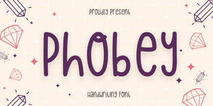 Phobey is a simple and dainty handwritten font. Its natural and unique style makes it incredibly fitting to a large pool of designs. Use this font for your designs and explore its endless possibilities.
 - Another Monday by Hanoded,
$15.00 I started this font on a Monday and I finished it the Monday after, so I guess the name is right! Another Monday started off as a bit of doodling (with a Sharpie pen) on a piece of paper. Before I knew it, I had a complete glyph set and it looked nice. Another Monday is a bit messy, uneven and maybe even a little weird, but it will look good on postcards, packaging and labels.
 - ITC Tyfa by ITC,
$29.99 Some words from the designer, Frantisek Storm... Designed by Josef Tyfa in 1959, digitalized by F. Storm in 1996. This Roman and Italic are well-known perhaps to all Czech graphic artists and typographers ever since their release. Although this type face in some details is under the sway of the period of its rise, its importance is timeless, in contradistinction to other famous types dating from the turn of the sixties which were found, after some time, to be trite. The italics live their own life, only their upper-case letters have the same expression as the basic design. Thin and fragile, they work excellently, emphasizing certain parts in the text by their perfect contrast of expression. When seen from a distance they are a little bit darker than the Roman face. Tyfa Roman was released in 1960 by Grafotechna in Prague for hot setting. Later on, Berthold produced letter matrices - "rulers" for Staromat devices, used for manual photosetting of display alphabets. In the eighties it was available on dry transfers of Transotype and today it is offered also by ITC. The meticulously executed designs of the individual letters in the 288 point size are arranged into a set of signs on a cardboard of about B2 in size. The yellowed paper reveals retouches by white paint on the ink. Blue lines mark the baseline, the capital line, the ascender and descender lines and the central verticals of the letters. With regard to the format of the flat scanner, the designs had to be reduced, with the use of a camera, to the format A4, i.e. to the upper-case letter height of about 30 mm. These were then scanned in 600 dpi resolution and read as a bitmap template to the FontStudio programme. The newly created bold type faces derive from Tyfa's designs of the letters "a", "n", "p", the darkness of which was increased further, approximately by 3%, to enhance their emphasizing function. The text designs have hairstrokes thickened by one third; the contrast between thin and thick strokes has been modified, in order to improve legibility, in sizes under 12 points. We have used electronic interpolation to produce the semi-bold designs. Josef Tyfa himself recommends to choose a somewhat darker design than the basic one for printing of books.
 - Presicav by Typodermic,
$11.95 Introducing Presicav, the sans-serif typeface with a wide and charmingly unique design. Its bold and straightforward approach brings personality and appeal to any design project. We’ve taken inspiration from mid-20th century broad gothic typefaces for our heavyweight versions of Presicav, while the lower weights have a modern and enigmatic finish that sets it apart from other wide grotesques. Presicav is not your ordinary typeface, unlike others that can appear poker-faced and ascetic. Presicav is the perfect choice when you want to add a subtle hint to your readers that something out of the ordinary is happening. With six different weights available, including oblique styles, there’s a Presicav for every occasion. Whether you’re designing a website, creating a logo, or putting together a poster, Presicav will bring a touch of attractiveness and individuality to your project. Its bold and wide design is perfect for catching your reader’s attention and keeping them engaged. So why settle for a boring and ordinary typeface when you can choose Presicav? Try it out today and add a little bit of charm to your next design project! Most Latin-based European, Vietnamese, Greek, and most Cyrillic-based writing systems are supported, including the following languages. Afaan Oromo, Afar, Afrikaans, Albanian, Alsatian, Aromanian, Aymara, Azerbaijani, Bashkir, Bashkir (Latin), Basque, Belarusian, Belarusian (Latin), Bemba, Bikol, Bosnian, Breton, Bulgarian, Buryat, Cape Verdean, Creole, Catalan, Cebuano, Chamorro, Chavacano, Chichewa, Crimean Tatar (Latin), Croatian, Czech, Danish, Dawan, Dholuo, Dungan, Dutch, English, Estonian, Faroese, Fijian, Filipino, Finnish, French, Frisian, Friulian, Gagauz (Latin), Galician, Ganda, Genoese, German, Gikuyu, Greenlandic, Guadeloupean Creole, Haitian Creole, Hawaiian, Hiligaynon, Hungarian, Icelandic, Igbo, Ilocano, Indonesian, Irish, Italian, Jamaican, Kaingang, Khalkha, Kalmyk, Kanuri, Kaqchikel, Karakalpak (Latin), Kashubian, Kazakh, Kikongo, Kinyarwanda, Kirundi, Komi-Permyak, Kurdish, Kurdish (Latin), Kyrgyz, Latvian, Lithuanian, Lombard, Low Saxon, Luxembourgish, Maasai, Macedonian, Makhuwa, Malay, Maltese, Māori, Moldovan, Montenegrin, Nahuatl, Ndebele, Neapolitan, Norwegian, Novial, Occitan, Ossetian, Ossetian (Latin), Papiamento, Piedmontese, Polish, Portuguese, Quechua, Rarotongan, Romanian, Romansh, Russian, Rusyn, Sami, Sango, Saramaccan, Sardinian, Scottish Gaelic, Serbian, Serbian (Latin), Shona, Sicilian, Silesian, Slovak, Slovenian, Somali, Sorbian, Sotho, Spanish, Swahili, Swazi, Swedish, Tagalog, Tahitian, Tajik, Tatar, Tetum, Tongan, Tshiluba, Tsonga, Tswana, Tumbuka, Turkish, Turkmen (Latin), Tuvaluan, Ukrainian, Uzbek, Uzbek (Latin), Venda, Venetian, Vepsian, Vietnamese, Võro, Walloon, Waray-Waray, Wayuu, Welsh, Wolof, Xavante, Xhosa, Yapese, Zapotec, Zarma, Zazaki, Zulu and Zuni.
 - TE Classic 2 by Tharwat Emara,
$79.00 TE Classic2 Tharwat Emara is an exquisite Arabic Thuluth font that is designed to add a touch of elegance and sophistication to any project. This font is named after the renowned calligrapher Tharwat Emara, who is widely celebrated for his outstanding work in the field of Arabic calligraphy. One of the most remarkable features of TE Classic2 Tharwat Emara is its impeccable balance between the thick and thin lines. The font's curves and strokes are carefully crafted to create a seamless and harmonious flow, giving it a unique and mesmerizing appearance. The intricacies and details of the font's characters reflect the skill and artistry of the calligrapher and demonstrate the perfect balance between tradition and modernity. TE Classic2 Tharwat Emara is a perfect choice for designers and artists who want to add a touch of Arabic culture and tradition to their projects. The font comes with a full set of Arabic characters, including ligatures, diacritical marks, and numerals. The characters are designed to be easily legible and readable, making it suitable for use in both print and digital media. One of the most striking aspects of TE Classic2 Tharwat Emara is its versatility. It can be used for a wide range of applications, from branding and advertising to editorial and publishing. Its unique and captivating design will make any project stand out and attract customers, making it a valuable investment for designers and artists. The font's exquisite design is not only limited to its characters, but it extends to its overall layout and spacing. TE Classic2 Tharwat Emara has a perfect balance between its characters' shapes and spaces, giving it a smooth and consistent look. The font's spacing is also carefully crafted to ensure that the characters are well-organized and easy to read. TE Classic2 Tharwat Emara is not just a font; it's a work of art. Its unique design and intricate details make it stand out from other Arabic fonts in the market. The font's exquisite design is a result of the meticulous attention to detail paid by the calligrapher, which is evident in every stroke and curve of the font's characters. Overall, TE Classic2 Tharwat Emara is a font that celebrates the beauty and elegance of Arabic calligraphy. Its captivating design and versatility make it an excellent choice for designers and artists who want to add a touch of tradition and culture to their projects. With its unique and mesmerizing appearance, TE Classic2 Tharwat Emara is sure to attract customers and make any project stand out.
 - Etruria by Dima Pole,
$34.00 Font Etruria is based on a real Etruscan inscriptions and realistic accurately simulates the writing of the Etruscans. The idea of the font Etruria is to give an opportunity for anyone to touch the past of mankind! The character of the Etruscan alphabet involves the creation of a font with only uppercase letters. However, I did not limit this font by that. Etruria has not only a lowercase is different from uppercase, but an additional sets of alternative characters. In General, the main characteristic of Etruscan writing is randomness and diversity of characters. Differs from lowercase to uppercase is only the first step on the road to make randomness effect. Next to the aid of the OT features. To recreate the randomness effect, in Etruria there are several OT features (Contextual Alternates, Stylistic Alternates and Stylistic Sets), which built a script to simulate randomness. Additionally, another script creates the effect of random positioning. Together they create incredibly realistic Etruscan inscription. Thus, any of these features can be disabled at will. I also used a small line spacing, because it is characteristic of the Etruscan writing. Actually the Etruscan writings is a mirror of the writings compared with the current European alphabets. I didn't use this feature all the letters, because this would make the font difficult to perceive, but to make the font characteristic of the Etruscan style, Etruria has a few letters in mirror image. However, if for someone it may seem unusual, mirrored letters can be disabled instead of them will appear more familiar to them. Another feature of Etruscan writing is the use instead of a space dotacentered. Font Etruria has this feature, there is a OT feature Stylistic set ss03. Naturally, it also can optionally be disabled. All these features can be used together, separately, or turn it off. The main goal achieved! The text typed in Etruria, creates full impression of these Etruscan inscriptions.
 - Mantap by Sulthan Studio,
$10.00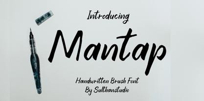 is a sweet and friendly handwritten font. Its natural and unique style makes it incredibly fitting to a large pool of designs. The only limit is your imagination!
 - Happy Dreamer by Seemly Fonts,
$12.00 Happy Dreamer is a simple handwritten font. Its natural and unique style makes it incredibly fitting to a large pool of designs. The only limit is your imagination!
 - PF Haus Square Pro by Parachute,
$79.00The minimal character of this typeface with its direct reference to Bauhaus, manages to keep the balance between strict geometric structure and elegance. It strays from monotonous repetitions and works equally well with Latin and Greek, while it really hits home with Cyrillic. Now, in its 3rd major upgrade comes equipped with all that’s needed for an international career. In total 602 characters offer support for all European languages in six different variations. Finally, five special OpenType features offer typographic solutions which includes a stylistic alternate set for Greek and Cyrillic. - Croissant Lover by ErlosDesign,
$10.00 Croissant Lover is a stylish and delicate brush script font. It has a clean, bold and smooth vibe and it will be a hit for any design that you want to add it to. It is suitable for any branding, product packaging, invitation, quote, t-shirt, label, poster, logo that you wish to develop. Croissant Lover Font comes in two variants - Reguler Brush and Block. The file you will get is: • Works on PC & Mac • Simple installation • Encoded PUA Character - Can be accessed completely without additional design software. Enjoy!
 - Valverde by Jehoo Creative,
$20.00 Valverde is a super-serif font family with 2 widths condensed and normal, each width consists of 18 fonts and has a complete weight from thin to black combined with beautiful italic cuts to meet the needs of any design in any format. Inspired by the type of vintage look that has recently become a trend, this letter character has an elegant, sharp impression. Opentype features such as Stylistic Alternate and Ligature on the Valverde family make it look more aesthetic so that it fits in a classy modern look. Stunningly beautiful and modern serifs make them an essential addition to any type of tool kit.
 - Picastro by URW Type Foundry,
$39.99 Marit Otto about Picastro: The revolutionary typeface. Picastro is a fusion of Picasso and Castro. Don’t be alarmed by the second name! It is no political statement. Both characters represent different qualities in the typeface. The Picasso influence is the artistic, freestyle and frolic part. The Castro influence is the firm, square, perseverant look with a hint of propaganda to it. To combine two opposite inspirational sources (innovative versus persistent) makes the shape a bit edged. This typeface is very suitable for all kinds of graphic design (flyer, posters, CD covers and artworks) but also casual enough for (non academic) letter and text writing.
 - Religiosity by Seemly Fonts,
$12.00 Religiosity is a cute and casual handwritten font. Its friendly feel makes this font incredibly versatile, fitting a wide range of contexts. Add it to your creative ideas and notice how it makes them stand out!
 - Bartholeme by Galapagos,
$39.00The four weight semi-condensed Bartholemé family came into existence as a family expansion based on the designer's earlier concept, Bartholemé Open. This hybrid family was inspired by and loosely based on a number of contemporary mid-twentieth century type concepts having Old Face or Modern influence. Those inspirational type designs were primarily designed for various proprietary photolettering technologies of the time. The award-winning* Bartholemé Open and its companion design Bartholemé small capital open were inspired by various Shaded, Inline and Handtooled type models from the nineteenth and twentieth centuries. Most of those inspirational type designs were designed as titling fonts with all capital sets only. To set it apart from the earlier models, Bartholemé Open is semi-condensed intentionally designed with a lowercase. Design qualities include a large x- height, tightly curved ample counters, crisp serifs and tight bracketing. The overall plan of the family was originally intended for display usage in titling and short passages of text. At higher output resolutions all fonts read well at smaller point sizes. The Bartholemé family works well on its own, but also is compatible with type styles possessing qualities that complement or enhance its own. The Bartholemé family consists of a Regular weight complementing a Bold weight, along with Medium complementing an Extra Bold weight. The companion true-drawn italics are based on the Bartholemé roman design. * Award for Design Excellence bukva: raz! Type Design Competition of the Association Typographique Internationale, 2001 - Kindersley Sans by K-Type,
$20.00 Many street nameplates in Britain use versions of Kindersley serif capitals designed by David Kindersley in the 1950s. K-Type Kindersley Sans is an unfussy alternative to the signage stalwart, perfectly suited to newer environments and more contemporary tastes. Kindersley Sans is a humanist sans-serif that conserves the Gill-inspired character and some of the calligraphic qualities of Kindersley’s lettering, it retains the Roman proportions and its Britishness, but traditional prettiness and intricacy are discarded in favour of a clean modernity. For purposes where Transport (MOT) is considered too formal and Kindersley too old-fashioned, Kindersley Sans offers an open and amiable up-to-date alternative. The typeface is comfortably spaced and carefully kerned to deliver beautiful results with ease, and although designed with nameplates in mind, it excels as an all-purpose text face in print and on screen. The tail of the uppercase Q has minimal descent to avoid constriction. Kindersley Sans includes a lowercase designed for signage with short descenders to prevent unsightly congestion. A generous x-height assists legibility, and characters are designed for easy reading and distinctiveness. The curved foot of the lowercase L distinguishes it from the uppercase i. The six fonts contain a full complement of Latin Extended-A characters, Welsh diacritics and Irish dotted consonants, so European language nameplates need not be a source of frustration. The ascent and descent of accented characters has been kept to an acceptable minimum.
 - Daenerys Signature by Ferry Ardana Putra,
$14.00 Daenerys is a thin, elegant signature font that is perfect for a wide range of design projects. It has a delicate, calligraphic style with smooth, flowing lines that give it a sense of grace and beauty. The letters have a slight slant, which gives them a hand-written feel, making it suitable for invitations, wedding stationery, and other special occasions. One of the most striking features of this font is the abundance of swashes. These are decorative flourishes that extend from the letters, adding a unique and ornate touch to your designs. The swashes come in a variety of shapes and sizes, and they can be used to add emphasis to specific letters or words. This makes the font perfect for creating elegant, eye-catching titles and headlines. The lowercase letters have a unique and modern touch, The uppercase letters are more formal and elegant, making them great for headlines and titles. Daenerys is a versatile font, it's perfect for branding, packaging, and web design. The thin lines make it easy to read in small sizes and it's also great for overlaying on top of other design elements. Overall, Daenerys is a beautiful and sophisticated font that can add a touch of elegance to any design project. Daenerys features: A full set of uppercase and lowercase Numbers and punctuation Multilingual language support PUA Encoded Characters OpenType Features +274 Total Glyphs +40 Signature Swashes
 - Behrensschrift iF Plus by Ingo,
$29.00 Peter Behrens’ renowned art nouveau type from 1902 – with ornaments. Newly revised and neatly digitalized by Ingo Zimmermann In 1902, Peter Behrens (1869–1940), architect, designer and typographer, created a new ”German“ type which became very successful very quickly for the Rudhard’sche Gießerei (foundry which later became Gebr. Klingspor AG) in Offenbach am Main. It served, for example, as the official German type for the world expositions in 1904 and 1910. Behrens himself writes about the development of this type ”...For the actual form of my type, I took the technical principle of the Gothic script, the stroke of the quill feather. The proportions of height and width and the boldness of the strokes of the Gothic letters were also decisive for me in producing a German character. A cohesive character could be hoped for by avoiding all non-necessities and by strictly carrying out the design principle of holding the quill at an angle…“ By the way, when “long s” is activated, the typographically correct “round s” is automatically placed at the end of the word so that you need only pay attention to the correct s on syllable endings within words. When using “long s,” you must ensure the correct use of the rules for the Fraktur font: “round s” is always at the end of the word, also in compound words. For those of you who want to be even more correct, read the corresponding article in >> Wikipedia. Peter Behrens also drew matching ornaments for his typeface – we have likewise carefully revised these decorative touches and arranged them into a font. The "Behrens-Schrift" fits best on all topics that have something to do with art history or the time around 1900.
 - Valverde Rounded by Jehoo Creative,
$20.00 Valverde Rounded is the more playful and gentle variant of Valverde Family. It still remains a super-serif font family with 2 widths condensed and normal, each width consists of 18 fonts and has a complete weight from thin to black combined with beautiful italic cuts to meet the needs of any design in any format. Inspired by the type of vintage rounded look that has recently become a trend, this round letter character has a comfortable and friendly impression. Opentype features such as Stylistic Alternate and Ligature on the Valverde family make it look more aesthetic so that it fits in a classy modern look. Stunningly beautiful and vintage rounded serifs make them an essential addition to any type of tool kit.
 - Joanna by Monotype,
$40.99 The English stone carver, artist, and typographer Eric Gill conceived the Joanna typeface as a personal design for use in books printed at his Joanna Press."" Gill saw his press work there as a continuation of the British Arts and Crafts Movement, pioneered in the 19th Century by William Morris. Joanna is notable for its almost vertical ""upright"" italics, and the unusally small size of its italic characters. Joanna is versatile and extremely legible. The letterforms are a bit narrow, so the face is very economic as well. A lot of text may be packed densely together onto a page with Joanna. Joanna mixes very well with other typefaces designed by Eric Gill; especially Gill Sans.
 - Hibagon by Hanoded,
$15.00 Hibagon is the Japanese equivalent of the Yeti from the Himalayas, or Bigfoot from North America. It is usually sighted on Mt. Hiba (Hiroshima prefecture), hence the name. I have never seen Hibagon myself, even though I have visited Hiroshima several times. Hibagon font is a nice, handpainted, all caps font with a mythical feel to it. It probably won’t scare you, but it will look good on anything that needs a bit of brushwork, or a bit of roughness.
 - David Hadash Sans by Monotype,
$50.99Monotype Imaging is pleased to present David Hadash (New" David), the full family of typefaces by Ismar David, in its intended authentic form. The Estate of Ismar David has sought to revive this jewel of Twentieth-Century design by granting an exclusive license to Monotype Imaging to implement it in industry-standard format. Never before has the typeface in its full set of sub-styles been made available to the design community. David Hadash consists of three style families, Formal, Script, and Sans. Each of these appears in three weigths: regular, medium, and bold. Originally devised as a companion to the upright Formal style, the Script style has a beauty and grace all its own that allows it to be used for full-page settings also. While it is forward-leaning and dynamic, it does not match any of the existing cursive styles of Hebrew script. Ismar David created an eminently readable hybrid style which is like no other by inclining the forms of the upright while blending in some features of Rashi style softened with gentle curves. One can say that the Script style is the first truly italic, not just oblique, typeface for Hebrew script. Although the proportions of the Sans style are very similar to those of the Formal style, its visual impression is stunningly different. If the Formal style is believably written with a broad-point pen, the Sans is chiseled in stone. Rounded angles turn angular and stark. The end result is an informal style that evokes both ancient and contemporary impressions. David Hadash (Modern) supports the writing conventions of Modern Hebrew (including fully vocalized text) in addition to Yiddish and Ladino. David Hadash Biblical is a version of the Formal style that supports all the complexities of Biblical Hebrew, including vocalization and cantillation marks. " - Leroy by Andinistas,
$39.95 Leroy is a font family of 5 members designed from geometrizing Roman and Gothic skeletons. Its purpose is to provide optimal reading of titles and paragraphs with strong mechanical flavor. Because of this, its variables are designed to sort information in media such as labels, signs and industrial atmosphere packaging related with the Soviet Union’s fonts in 1920. This idea matured white horizontal lines superimposed on alphabets drawn with an ancient architectural team known as “Leroy K & E Controlled Lettering System”. Then that evolved into a family concept unifying its proportion to the same X height for its members, resulting in a versatile type system. Therefore, Regular and Bold variables have low contrast between thick and thin strokes. Its upstream and downstream are extremely short, generating a suitable interline that clogs the vertical area. Its overall width equal to its X height, supports its tight spacing that compacts the horizontal area. Therefore, the variant with black caliber has plenty of contrast between thick and thin strokes. The light variable has a “blind” effect radiating light halos, ideal to propose hierarchies and combinations with orthogonal projection. In that sense, Leroy’s modular character reminds constructivist ideology merged with typographical variants suitable for graphic design with geometric look. To achieve this, I studied the softening of forms and counter blocks into a typographical system specially designed for composing useful information to attract attention. In that sense, the dingbats were obtained through a careful process of research and testings done with drawings that provided full and empty visual strategies that with the passage of time helped to forge the major decisions of a metamorphosis from industrial tools, birds and humans from pictogram mixing various genres.
 - David Hadash Script by Monotype,
$50.99Monotype Imaging is pleased to present David Hadash (New" David), the full family of typefaces by Ismar David, in its intended authentic form. The Estate of Ismar David has sought to revive this jewel of Twentieth-Century design by granting an exclusive license to Monotype Imaging to implement it in industry-standard format. Never before has the typeface in its full set of sub-styles been made available to the design community. David Hadash consists of three style families, Formal, Script, and Sans. Each of these appears in three weigths: regular, medium, and bold. Originally devised as a companion to the upright Formal style, the Script style has a beauty and grace all its own that allows it to be used for full-page settings also. While it is forward-leaning and dynamic, it does not match any of the existing cursive styles of Hebrew script. Ismar David created an eminently readable hybrid style which is like no other by inclining the forms of the upright while blending in some features of Rashi style softened with gentle curves. One can say that the Script style is the first truly italic, not just oblique, typeface for Hebrew script. Although the proportions of the Sans style are very similar to those of the Formal style, its visual impression is stunningly different. If the Formal style is believably written with a broad-point pen, the Sans is chiseled in stone. Rounded angles turn angular and stark. The end result is an informal style that evokes both ancient and contemporary impressions. David Hadash (Modern) supports the writing conventions of Modern Hebrew (including fully vocalized text) in addition to Yiddish and Ladino. David Hadash Biblical is a version of the Formal style that supports all the complexities of Biblical Hebrew, including vocalization and cantillation marks. " - David Hadash Biblical by Monotype,
$50.99Monotype Imaging is pleased to present David Hadash (New" David), the full family of typefaces by Ismar David, in its intended authentic form. The Estate of Ismar David has sought to revive this jewel of Twentieth-Century design by granting an exclusive license to Monotype Imaging to implement it in industry-standard format. Never before has the typeface in its full set of sub-styles been made available to the design community. David Hadash consists of three style families, Formal, Script, and Sans. Each of these appears in three weigths: regular, medium, and bold. Originally devised as a companion to the upright Formal style, the Script style has a beauty and grace all its own that allows it to be used for full-page settings also. While it is forward-leaning and dynamic, it does not match any of the existing cursive styles of Hebrew script. Ismar David created an eminently readable hybrid style which is like no other by inclining the forms of the upright while blending in some features of Rashi style softened with gentle curves. One can say that the Script style is the first truly italic, not just oblique, typeface for Hebrew script. Although the proportions of the Sans style are very similar to those of the Formal style, its visual impression is stunningly different. If the Formal style is believably written with a broad-point pen, the Sans is chiseled in stone. Rounded angles turn angular and stark. The end result is an informal style that evokes both ancient and contemporary impressions. David Hadash (Modern) supports the writing conventions of Modern Hebrew (including fully vocalized text) in addition to Yiddish and Ladino. David Hadash Biblical is a version of the Formal style that supports all the complexities of Biblical Hebrew, including vocalization and cantillation marks. " - David Hadash Formal by Monotype,
$50.99Monotype Imaging is pleased to present David Hadash (New" David), the full family of typefaces by Ismar David, in its intended authentic form. The Estate of Ismar David has sought to revive this jewel of Twentieth-Century design by granting an exclusive license to Monotype Imaging to implement it in industry-standard format. Never before has the typeface in its full set of sub-styles been made available to the design community. David Hadash consists of three style families, Formal, Script, and Sans. Each of these appears in three weigths: regular, medium, and bold. Originally devised as a companion to the upright Formal style, the Script style has a beauty and grace all its own that allows it to be used for full-page settings also. While it is forward-leaning and dynamic, it does not match any of the existing cursive styles of Hebrew script. Ismar David created an eminently readable hybrid style which is like no other by inclining the forms of the upright while blending in some features of Rashi style softened with gentle curves. One can say that the Script style is the first truly italic, not just oblique, typeface for Hebrew script. Although the proportions of the Sans style are very similar to those of the Formal style, its visual impression is stunningly different. If the Formal style is believably written with a broad-point pen, the Sans is chiseled in stone. Rounded angles turn angular and stark. The end result is an informal style that evokes both ancient and contemporary impressions. David Hadash (Modern) supports the writing conventions of Modern Hebrew (including fully vocalized text) in addition to Yiddish and Ladino. David Hadash Biblical is a version of the Formal style that supports all the complexities of Biblical Hebrew, including vocalization and cantillation marks. " - Matahari Sans by Studio Sun,
$36.00 Matahari (English : Sun) is the power source of life. The symbol of power and energy that synergies with other part of daily lives. It is one of the most fundamental thing us humans need, just like communication. And like Matahari itself, words are powerful enough to make a living. Referring to Grotesque Font and influenced by the works of Eric Gill, Matahari Typeface is available in 3 widths and 7 weights, also in Oblique version in each font. The font uses oldstyle and transitional letters (double-story ‘a’ and ‘g’). It has a humanist gesture, the thickness of the font is semi-monolinear where the horizontal and vertical size is almost equal, making the font reach its maximum optical readability even in small sizes. The font anatomy refers to the basic geometric square-sized of the letter ‘M’, while the letters of S/C/G/c/e have uneven curve shape which give the sense of humanist and flexibility. This typeface is ideal for various design needs, from Printing to On-Screen/Digital Reading, from Brand Identity, Posters, Caption, Headline, to Body Text. With the numbers of widths available, the font can be used for all kinds of purposes (Label, Signage, Packaging, Website, etc). Supported well over 75+ languages, including Greek & Cyrillic, Matahari Typeface will give you an excellent way in aesthetic communication and message-delivering.
 - MT Bleu Feelin Mono by MametosType,
$20.00 MT Bleu Feelin — is a display font with a monospace typographic feel. Please pay attention to Small Caps, Oldstyle Figures, and Alternates. Good for music album covers, posters and magazines. Inspired by the electronic band from Bandung, Bleu House, which has a light and edgy electronic pop experimental music character, the idea emerged to create a font that changes from sound to visual language, namely font. The use of the design for this font is for Display, and while it is issued one regular weight, in the future will develop multiple masters and other experiments. The design concept of the MT Bleu Feelin Mono Regular font is to take a 45 degree diagonal and geometric cut technique. also every corner is rounded which gives a dynamic impression like electronic music. I created this font design because I like visual experiments, and applied it to the character of the font. By using monospaced font characters have an even width. This is a unique feature in that most fonts are 'proportionally' spaced with characters varying in width. While monospace is perfect in certain ways, it is a proportional font that reigns supreme. Proportional fonts are faster to read. however, the MT Bleu Feelin Mono Regular font is intended for display fonts. MT Bleu Feelin Mono Regular supports language settings - Western Europe - Central Europe - Southeastern Europe - South American - Oceania - Esperanto
 - Dosca by Ardyanatypes,
$10.00 Dosca is a unique and elegant display font with a unique Sans serif style. This font offers nine different thickness options, ranging from Thin to Black, providing a variety of options for a variety of applications. Each Dosca thickness has its own unique characteristics, so you can choose the one that best suits your design aesthetic. For example, Thin may be suitable for a light and elegant design, while Black may be used for a more dramatic and bold appearance. Additionally, Dosca comes with various OpenType features. These include features such as ligatures, which allow certain characters to be combined beautifully, and alternative letterforms that provide more design options. With this feature, you can create more interesting and unique text elements in your designs. Dosca is designed to support multiple languages so it is suitable for use in many countries. This makes it very versatile and suitable for a variety of multilingual design projects. So, if you're looking for a font that combines the beauty of Sans serif with a variety of thickness options, useful OpenType features, and multilingual support, Dosca is the perfect choice to meet your design needs. A guide to accessing all alternatives can be read at http://adobe.ly/1m1fn4Y Adobe Photoshop go to Window - glyphs Adobe Illustrator go to Type - glyphs Features: A – Z Character Set a – z Characters set Numerals & Punctuations Ligatures & Alternates Multilingual
 - Sedid by Fontuma,
$20.00 Sedid, “solidity; It is an Arabic term meaning “righteousness”. In particular, the correctness and soundness of a word is indicated by this word. The fact that I gave this name to the writing family is to point out its accuracy and robustness. This typeface, which is sans serif, consists of three families: ▪ Sedid: Font family containing Latin letters ▪ Sedid Pro: Font family including Latin, Arabic and Hebrew alphabets ▪ Sedid World: A family of typefaces including Latin, Cyrillic, Greek, Arabic and Hebrew alphabets Those who want to meet a new face of writing for their works and projects and make a difference in their work should meet the Sedid writing family. This typeface is as serious as it is affectionate, and solid as well as elegant. The Sedid font family can be used as a text and title font in all publishing and printing areas, magazines, newspapers, books, banner and poster designs, and websites. Sedid also has a pleasant-looking, flexible face with smooth lines and transitions. The inner and outer spaces of the font are proportioned so that the text can be read easily. Sedid font family consists of 14 fonts, seven plain and seven italic. The font family includes open type features, as well as a large number of ligatures, small caps, modifiers, and currency symbols of many countries.
 - Antimony Blue - Unknown license

- Quotes by Sudtipos,
$49.00 «Quotes» is the second typeface calligraphed by Yani Arabena, designed along with Guille Vizzari and Ale Paul, for Sudtipos. Being thrilled by the use of the pointed brush, spontaneous messages, gesture and freshness to represent inspirational phrases and quotes written by hand, «Quotes» comes in two handwriting styles: Script and Caps. «Quotes Script» and «Quotes Caps» are thought together and complement each other filling with rhythm and infinite sensations to the spoken words. A more free and spontaneous version –Script–, joined by an uppercase system –Caps–, that offers a huge amount of alternate glyphs, ligatures and connectors, to enrich different messages brought to life with this type family. «Quotes Script» counts on a great variety of alternate signs in its lowercase as well as its uppercase letters. It hands a combination of ligatures and capital alternates that allows to shape the beginnings and endings of words and phrases intended to be inspiring and to inspire others that read them. «Quotes» also stands for the fashion universe, Gourmet, Natural, the D.I.Y. passionates, and for all those who seek for the Handcrafted spirit and agrees that it adds an added value to its products and in their communication possibilities. Nowadays, new trends in the calligraphic and drawn letters fields, have lead to the use of the brush pen as a daily practice, bringing to life phrases that motivates people to share their thoughts. «Quotes» is a typeface that invites to write, share and influence others to make their own. Sometimes a feeling can’t be explained, but «Quotes» is a font that can.
 - Grethania Script by Romie Creative,
$12.00 Grethania Script is a calligraphic script font that comes with beautiful alternative characters. a mixture of copper plate calligraphy with handlettering style. Designed to convey the elegance of style. Grethania is interesting because it is smooth, clean, feminine, sensual, glamorous, simple and very easy to read. Classic style is very suitable to be applied in all types of formal work such as invitations, labels, menus, logos, fashion, make up, stationery, letterpress, romantic novels, magazines, books, greeting / wedding cards, packaging, labels. Grethania Script displays 310+ glyphs and 122 alternative characters. including multiple language support. With OpenType features with changes in style, binder and character swash, which allows you to mix and match pairs of letters to fit your design. To activate the OpenType Stylistic alternative, you need a program that supports OpenType features such as Adobe Illustrator CS, Adobe Indesign & CorelDraw X6-X7, Microsoft Word 2010 or newer versions. (Windows), Font Book (Mac) or software programs such as PopChar (for Windows and Mac). How to access all alternative characters using Adobe Illustrator: https://www.youtube.com/watch?v=XzwjMkbB-wQ How to use font styles that are set in Microsoft Word 2010 or later: https://www.youtube.com/watch?v=NVJlZQ3EZU0 There are additional ways to access alternatives / swash, using Character Maps (Windows), Nexus Fonts (Windows) Font Book (Mac) or software programs such as PopChar (for Windows and Mac). How to access all alternative characters, using Windows Character Map with Photoshop: https://www.youtube.com/watch?v=Go9vacoYmBw
 - Arcade King by Ditatype,
$29.00 Arcade King is an exciting display font inspired by classic arcade games. Designed in uppercase, this typeface captures the nostalgic essence of retro gaming with its playful style. With consistent letter proportions and high contrast, this font ensures easy readability while immersing you in a world of gaming fun. The consistent letter proportions of Arcade King create a sense of harmony and balance throughout the font. Each uppercase letter is carefully crafted to maintain visual cohesion, ensuring a smooth and enjoyable reading experience. This design choice guarantees that every character complements the others, resulting in a visually appealing and cohesive typographic composition. The stark difference between thick and thin strokes enhances the visibility of each letter, making them easily distinguishable even at smaller sizes. The high contrast design adds a touch of boldness and excitement to the font, capturing the essence of the arcade gaming experience. Enjoy the available features here. Features: Stylistic Sets Multilingual Supports PUA Encoded Numerals and Punctuations Arcade King fits in headlines, logos, posters, product packaging, branding materials, print media, editorial layouts, website headers, and any projects that aim to evoke a sense of fun and adventure. Find out more ways to use this font by taking a look at the font preview. Thanks for purchasing our fonts. Hopefully, you have a great time using our font. Feel free to contact us anytime for further information or when you have trouble with the font. Thanks a lot and happy designing.
 - Motherblood by Letterafandi Studio,
$10.00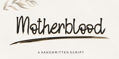 Motherblood is a sweet and friendly handwritten font. Its natural and unique style makes it incredibly fitting to a large pool of designs. The only limit is your imagination!
 - Flintoye by Illushvara,
$10.00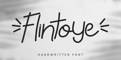 Flintoye is a sweet and friendly handwritten font. Its natural and unique style makes it incredibly fitting to a large pool of designs. The only limit is your imagination!
 - Majestic Valentine by Seemly Fonts,
$12.00 Majestic Valentine is a tall and sweet font. Its natural and unique style makes it incredibly fitting to a large pool of designs. The only limit is your imagination!
 - Georado by Balpirick,
$15.00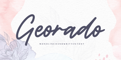 Georado is a sweet and friendly handwritten font. Its natural and unique style makes it incredibly fitting to a large pool of designs. The only limit is your imagination!
 - Love Radiate by Seemly Fonts,
$12.00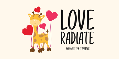 Love Radiate a joyful and casual handwritten font. Its natural and unique style makes it incredibly fitting to a large pool of designs. The only limit is your imagination!
 - Pattaya by Larin Type Co,
$12.00 Modern script font inspired by summer, airy and attractive, Pattaya will fit perfectly into any project and decorate it. Alternates and ligatures will help to make it more natural.
