10,000 search results
(0.019 seconds)
- Syaipul by Mightyfire,
$15.00 Syaipul is font that looks like Arabic letter. The ornament of each letter make the font is unique but still easily to read. This font perfectly suit for calligraphy, Islamic book, headline title, poster, Arabic ornament and many more. We're honored and hope this font can be the part of your special works. Thank you.
 - Anivers by exljbris,
$- Anivers is robust and rigid, forgiving, flexible and elegant ... and also suitable for a broad use: from a stationery to a poster headline. From an intro in a magazine to a base for a logo. This OpenType font family comes in regular, italic, bold and small caps and offers supports CE languages and even esperanto.
 - Hypherin by ahweproject,
$9.00 Hypherin is a gorgeous and bold handwritten font, crafted to give your headlines and logotype projects a stylish touch. This font reads as strong, confident, and dynamic and can add tons of nostalgic character to your designs. Hypherin is PUA encoded which means you can access all of the beautiful glyphs and swashes with ease!
 - Gideon by TypeSETit,
$19.95 Based on a Roman character set, Gideon is a traditional typeface with classic forms. Perfect for uses from invitations, greeting cards and menus, to display advertising. The upper case letters have a tradition calligraphic feel that adds warmth and sophistication to text while the legibility allows for larger blocks of copy to be easily read.
 - Vermicello by ParaType,
$30.00 An original display typeface was designed for ParaType in 2007 by Isabella Chaeva. Informal handwriting shapes of letters are formed by several separate elements — traces of monoline writing tool like broad felt-tipped pen. The name of the font reveals the fact that curvy strokes resemble worms. For use in advertising and display typography.
 - Stout by Greater Albion Typefounders,
$10.00 Stout is a deliberately aggressively solid family of four faces, offered in two weights and in serif (deliberately large serifs) and sans forms. It’s ideal for signage that needs to be read over long distances or for anything where an emphatic statement is needed. Stout is big and clear and always makes a statement.
 - Tithua by Muykyta,
$20.00 Tithua is a modern font with strokes clear and well marked, easy to read and simple design. The curved shape on the slab terminations give a harmonious and pleasant smoothing which removes stiffness and enriches the design. For now comes in five different widths and includes Latin extended-A characters and some OpenType features.
 - Mechaniclove by ahweproject,
$14.00 Mechaniclove is a gorgeous and bold handwritten font, crafted to give your headlines and logotype projects a retro touch. This font reads as strong, confident, and dynamic and can add tons of nostalgic character to your designs. This font is PUA encoded which means you can access all of the glyphs and swashes with ease!
 - Creamer by Creativework Studio,
$14.00 Creamer is a gorgeous and bold handwritten font, crafted to give your headlines and logotype projects a stylish touch. This font reads as strong, confident, and dynamic and can add tons of nostalgic character to your designs. Creamer is PUA encoded which means you can access all of the glyphs and swashes with ease.
 - Fakir Pro by Underware,
$50.00 Fakir | A Hindu ascetic or religious mendicant, especially one who performs feats of magic or endurance. The well known feats performed by them include sitting steadily on a bed of nails and walking on burning coals. Blackletter | A script used throughout Western Europe from approximately 1150 to 1500. It continued to be used for the German language until the 20th century. Fakir, a blackletter with a holy kiss is a contemporary interpretation of gone letterforms with origin in blackletters. More precisely, we based the construction on broadnip textura, with lots of broken, edgy, interrupted strokes – try to sit on a nail bed and you’ll know why fakirs like to read just these kind of fonts! After being abandoned for some time (not accepted, nearly forbidden), we would like to give our generation a blackletter from here and now. So Fakir is not a revival, but an all new 21st-century blackletter. Fakir is a set of edgy text and display fonts, ranging from tight and heavy to light and wide. It has 11 fonts, all supporting Underware Latin Plus character set, that covers 219 languages.
 - Catholic School Girls Intl BB by Blambot,
$20.00This font is, like, totally inspired by the handwriting of, like, teenage girls. You’ll note that the [ ] keys are actually adorable little hearts! Totally rad! This font includes enough European characters to fill a loose leaf binder. - Lamna by Craft Supply Co,
$20.00 Introduction to Lamna – Wide Serif Font Lamna is a distinct wide serif font, characterized by its upright and bold appearance. Its design combines traditional elegance with modern simplicity, making it versatile for various applications. This font stands out due to its unique wedge-shaped serifs and strong structure. Design Features The key feature of Lamna is its wedge-shaped serifs. These serifs are not just decorative; they add a sense of stability and formality to the text. The wide structure of the font enhances readability, making it ideal for both print and digital media. Moreover, its upright stance contributes to its authoritative tone, suitable for titles and headings. Versatility and Usage Remarkably, Lamna adapts well to different contexts. Its clear, strong lines make it perfect for headlines and logos, where a commanding presence is needed. Additionally, it performs well in body text, offering a comfortable reading experience. Its versatility extends to various industries, including publishing, advertising, and digital design.
 - 1557 Civilité Granjon by GLC,
$42.00 Living from 1545 in Lyon, France, the famous punchcutter Robert Granjon created a typeface that looked like his own handwriting. The first book printed with this font, in 1557, was probably Dialogues de la vie et de la mort by Innocent Ringhier. We offer the complete typeface. It is a charming font with historical forms (long s, final s and others) and many ligatures, enriched with accented letters and other characters that did not exist in the original (thorn, eth, lslash and others), and a lot of alternates that permit rich and varying typography. Warning: all characters appear with the 1500s manual blackletter old style, especially letters “e” “r” or “h” alternate and some ending forms, and may be difficult to read at first, but it quickly becomes very easy. The font contains all characters for Baltic, Western European (Including Celtic), Eastern European, Northern European, and Turkish languages.
 - Lectio by Eurotypo,
$14.00 Lectio is a Roman font based on a Venetian Renaissance early typefaces, but with a modern and expressive design. His obvious calligraphic influence favors continuous text reading. The generous internal "eye" gives Lectio an appropriate legibility, its soft and organic modulation avoids fatigue, its robust character is attractive and stimulating in large bodies, especially for use in headlines. Lectio comes in two versions: Lectio and Lectio B. Lectio has seven weight and their corresponding slanted variables (true italics). Lectio B is composed only of Italics in six weight. The ascenders are slightly lower, the descending are more regular and the oblique trace of some letters have a more constant rhythm. Each of these faces has the optimum amount of contrast agains the background and clear and open internal letter shape. These fonts include diacritics for CE languages, Old Style figures, standard and discretional ligatures.
 - Kontrast Grotesk by DizajnDesign,
$55.00 Kontrast Grotesk represents a contrast in type design based on a different principle. It was inspired by W. A. Dwiggins and his experiments with the stroke variations. Contrast in this typeface is created not only with the influence of the writing tool (the thickness of horizontal strokes in relation to vertical), but by setting the primary and secondary construction strokes of the characters (e.g. glyph “E”). The grotesque types are usually with no or minimal contrast. Having the contrast has created a new and original look of this typeface without compromising the legibility. The fonts are designed for fluent reading on the screen. A little wider proportions are specially welcome with no need for saving a space as it is in printed media. Kontrast Grotesk family consists of five weights, with italics, small caps and italic small caps. Fonts contains a range of opentype features.
 - Soundboy by Kustomtype,
$25.00 Soundboy is an ode to Elvis Presley and his music. The font was drawn by hand from a number of images from the Blue Hawaii film and finished to perfection. The digitization was done with great care and the font was also provided with a number of extras such as ligatures. Soundboy is a playful and translatable font that at first sight has already caught everyone with a spontaneous and broad smile. Logos, house styles, magazines, covers, vinyl records, book covers, t-shirts, house styles and all kinds of other graphic expressions will look a lot happier. This font is more than welcome in this sour society. The packaging makes the consumer buy and Soundboy certainly contributes to that. Don't wait for someone else to get it in your area, the best designs deserve the most beautiful fonts. Enjoy the "Soundboy font", it will never let you down.
 - Besley Clarendon by HiH,
$12.00 Besley Clarendon ML is our version of the Clarendon registered by Robert Besley and the Fann Street Foundry in 1845. Besley Clarendon ML represents a significant change from the slab-serif Antiques & Egyptians that had become so popular in the prior three decades. Like Caslon’s Ionic of 1844, it brackets the serifs and strongly differentiates between the thick and thin strokes. Besley Clarendon is also what today is considered a condensed face, as a comparison to the various contemporary Clarendons will show. Robert Besley’s Clarendon was so popular that many foundries quickly copied it, a fact that caused him to complain vigorously. The reason it was so widely copied is simple ó it was extremely useful. It provided the attention-getting boldness to highlight a word or phrase, yet at the same time was compact and easier to read than the fat faces and antiques of the period. It wasn't until sixty years later that the concept of a typeface family of different weights was developed with DeVinne and Cheltenham. Until then, Clarendon served as everyone’s all-purpose bold face. It can be used for ads, flyers, headers or even short text. Don't leave home without it. Besley Clarendon ML includes the following features: 1. Glyphs for the 1250 Central Europe, the 1252 Turkish and the 1257 Baltic Code Pages. Added glyphs to complete standard 1252 Western Europe Code Page. Special glyphs relocated and assigned Unicode codepoints, some in Private Use area. Total of 353 glyphs. 158 kerning pairs. 2. OpenType GSUB layout features: pnum, salt, liga, dlig, hist and ornm. 3. Inclusion of tabular (std) and proportional (opt) numbers. 4. Kreska-accented letters.
 - Sanserata by TypeTogether,
$49.00 Dr. Gerard Unger expands the concept of Sanserata to a sans type family with Sanserata, adding specific characteristics which improve reading. Sanserata’s originality does not overtly present itself at text sizes. Rather, at those sizes, it draws upon its enormous x-height, short extenders, and articulated terminals to improve readability, especially on screens. Having articulated terminals means characters flare as they near their end, but readers likely won’t notice. What they would notice is that their ability to take in more content in a line of text is improved because the lettershapes are more defined. Articulation also makes clearer text from digital sources, where rectangular endings tend to get rounded by the emission of light from the screen. Lately there seems a whispered discontent with the lack of progress in the sans serif category. Designs can either stretch too far beyond what is accepted or be too bland to be considered new. Sanserata’s strength is in being vivid and unique without being off-putting. This bodes well for designers of paragraphs and of branding schemes since, with Sanserata’s two flavors, it is well able to capture attention or simply set the tone. Sanserata’s first voice is a generous, friendly, and even cheerful sans serif. But when using the alternate letterforms its voice becomes more businesslike, though still with nice curves, generous proportions, and a pleasant character. Sanserata comes in seven weights with matching italics, covers the Latin Extended character set, and is loaded with extras. Its OpenType features allow for the implementation of typographic niceties such as small caps, both tabular and proportional lining and oldstyle figures, ligatures, alternate characters, case-sensitive variants, and fractions. The complete Sanserata family, along with our entire catalogue, has been optimised for today’s varied screen uses. Dr Unger worked with Tom Grace on the production of Sanserata. For extended branding use with Sanserata, check out Sanserata, the contemporary, eclectic typeface drawn from roots in Romanesque Europe.
 - Gravesend Sans by Device,
$39.00 Smart, legible and elegant, Gravesend Sans is a based on the unique typeface used for the iconic grass-green signage for the Southern Railway. In existence from 1923 to 1948, when the network was nationalised, the Southern Railway linked London with the Channel ports, South West England, the South coast resorts and Kent. The same design was also used for the ‘hawkeye’ signs on the London, Midland and Scottish Railway, differentiated by black letters on a yellow background. Reference for each letter was taken from vintage ‘target’ station nameplates and other platform signage. The rarest letters were the Q, seen in Queens Road Battersea, the X, seen in East Brixton, and the Z, used in Maze Hill, site of an infamous train crash in 1958. Being hand-made, the letters often differ in width and thickness. There was no lower case. The Bluebell Railway, a heritage steam line, runs over part of the old Southern Railway network and uses a very similar type. The design of the numbers differed considerably, but here have been taken from the Device 112 Hours font Smokebox. As well identifying platforms, they were used on the front of the steam engine’s smokebox, hence the name, and stylistically are more in keeping with the letters than some of the squarer versions that can be seen in old photographs. William Caslon IV is credited with the first Latin sans-serif type, shown in a 1816 Caslon specimen book. ‘Two Lines English Egyptian’, as it was called, was caps-only, and there are several other correlations between that type design and this one. Includes a selection of authentic arrows and manicules, plus abbreviated ligatures such as ‘St.’ (Saint or Street) ‘Rd.’ (Road) and ‘Jn.’ (Junction). The Cameo version includes many graphic banner elements that can be freely combined.
 - Zekton Free - Unknown license

- Pakenham Free - Unknown license

- Mufferaw Free - Unknown license

- Larabiefont Free - Unknown license

- Melancholy by Blechmen,
$20.00 Melancholy is designed to be a rough and blotchy typeface that replicates ink from a typewriter. The letters themselves are meant to be imperfect with a nice flow. The typeface can act as a more natural sans-serif, and provide relief from reading normal perfect sans-serif typefaces. Melancholy comes in three different styles; regular, delusional and glitch.
 - Sassoon Montessori by Sassoon-Williams,
$48.00 Typefaces following Montessori Institute guidelines for reading and handwriting. With these fonts, the crucial stages of letter formation are made easier for parents and teachers to produce consistent worksheets. Children should then progress towards an efficient and mature joined-up handwriting. Free to download resources: How to access Stylistic Sets of alternative letters in these fonts
 - Maritha by Doehantz Studio,
$21.00 Maritha is a gorgeous, cursive and thick lettered handwritten font, crafted to give your headlines and logotype projects a stylish touch. This font reads as strong, confident, and dynamic and can add tons of nostalgic character to your designs. Maritha is PUA encoded which means you can access all of the glyphs and swashes with ease!
 - MSung Gold PRC by Monotype HK,
$523.99 M Sung Gold PRC is a modulated style Simplified Chinese typeface. Modulated font designs have apparent thick-thin contrast at the strokes, and often include special design characteristics at entry, finial and transitional points of the strokes. Modulated Simplified Chinese font design category includes traditional Song, Ming or Fang Song style typefaces which are popular for continuous reading.
 - ITC Humana Serif by ITC,
$29.99ITC Humana font is the work of British designer Timothy Donaldson, an extended and versatile font family with a large array of variations. Donaldson first created ITC Humana Script with a broad-tipped pen and then went on to design the corresponding roman. ITC Humana is the perfect font for anything requiring both clarity and a touch of personality. - Sansational by Type Innovations,
$39.00 Sansational is an original design by Alex Kaczun. The inspiration started with the shape of a "paper clip". Simple and elegant. A condensed sans serif that's, well... just sansational! It's a delight to use and view. Great for advertising, large headlines, web applications, and well... just about anything. Works equally well in a broad range of text point sizes.
 - Concasse by Lillan Team,
$9.90 The family comes in five weights from Thin to Black, all with true italics; and a variable file in weight and slant. Concasse is multi-purpose and reads well in body copy, the open shapes ensure excellent legibility in even the smallest text sizes, while the lightest and boldest weights deliver impact to headlines and other display uses.
 - Aceh Is Great by Shape Studio,
$15.00 Aceh Is Great attracts a typeface that is smooth, clean, unique, elegant, modern, serif, san serif, feminine, sensual, glamorous, simple and very easy to read. Classic style is very suitable to be applied in various formal forms such as invitations, labels, menus, logos, fashion, make up, stationery, letterpress, romantic novels, magazines, books, greeting/wedding cards, packaging, labels.
 - Tudeprins by Bogstav,
$17.00 Tudeprins is not a really positive word - the font probably did deserve another name, but I was inspired after reading a children's novel, starring a "Tudeprins" The font is dedicated to children's books, adventures, comics or something related to that - but feel free to use "Tudeprins" for anything you like! Comes with multilingual support as well as contextual alternates!
 - Old Trail JNL by Jeff Levine,
$29.00 An image of an antique metal marking stencil [circa late 1890s or early 1900s] reading “Folck’s Roller Mills #196 New Surprise manufactured by Wolfe Brothers, Cumberland, MD” had the words “New Surprise” rendered in a Western/Victorian typeface. Those letters served as the model for Old Trail JNL, which is available in both regular and oblique versions.
 - Mordova by Holis.Mjd,
$14.00 The font is done with a minimalist touch of gothic and blackletter, inspired by several music and bands that I was currently enjoying and often listened to throughout the day, where the music depicts a little visually in the form of font characters like this Mordova font, feels loud, vibrant , dark but simple and easy to read.
 - M Smart PRC by Monotype HK,
$523.99 M Smart PRC is a modulated style Simplified Chinese typeface. Modulated font designs have apparent thick-thin contrast at the strokes, and often include special design characteristics at entry, finial and transitional points of the strokes. Modulated Simplified Chinese font design category includes traditional Song, Ming or Fang Song style typefaces which are popular for continuous reading.
 - Romantic Lovely by Sronstudio,
$18.00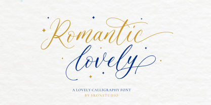 Romantic Lovely � Calligraphy Font with lots of alternate swashes. This font will perfect for adding a romantic and lovely touch to your design. Features: Uppercase and lowercase letters Swash alternates ( Beginning, Middle, Ending ) -Multilingual symbols, numerals, and punctuation How To Access Alternate Swashes? You can read this article: https://helpx.adobe.com/illustrator/using/special-characters.html Follow Instagram: @sronstudio Thank You!
 - Hebrew Esther Tanach by Samtype,
$189.00 This is a font to build an hebrew Bible (Tanach) or any Hebrew prayer book. Hebrew Esther Tanach has all unicode hebrew marks and others like, ShevaNa, Dagesh Chazak, Qamats Katan and Cholam Chaser. This font has a complex and exclusive programmation of opentype features. This font is very good to read even in small texts
 - M Smart HK by Monotype HK,
$523.99 M Smart HK is a modulated style Traditional Chinese typeface. Modulated font designs have apparent thick-thin contrast at the strokes, and often include special design characteristics at entry, finial and transitional points of the strokes. Modulated Traditional Chinese font design category includes traditional Song, Ming or Fang Song style typefaces which are popular for continuous reading.
 - Picasso in Paradise by Nicky Laatz,
$22.00 Say hello to 'Picasso in paradise' - an avant-garde script with loads of fresh buoyant character and an abstract, casual feel. The script includes a large selection of natural-looking ligatures, that form automatically as you type when you have your OpenType features active. Perfect for Branding, Greetings, Book covers, advertising, packaging, and so much more.
 - Bemis by Leksen Design,
$29.00 I accidentally fell in love with type design, and more specifically, the inscription on the historic Bemis building in Seattle. A high waist and great contrast are characteristics of this classic caps lettering that inspired my debut typeface, with additions of 3/4 caps and ornaments to boot. Read and hear more about the creation of this digital revival.


