10,000 search results
(0.016 seconds)
- Tequendama by JVB Fonts,
$30.00 A display fontface for titles inspired on Latin America, Ethnic, Native, Tribal, Mysthical, Handmade, Aboriginal, Pre-Hispanic, Pre-Columbian, Textured. By mid-1997 I was developed the early type edition was called «Muisca Sans» as my work for the degree in Graphic Design (Universidad Nacional de Colombia), based on the concept of pre-Columbian figures characteristics within some of the very few visual elements recovered from the Muisca culture, ancient pre-Columbian tribe disappeared before the arrival of the Spaniards in what is now central Colombia. In fact, the name of the capital Bogotá (the capital of Colombia) goes back to Bacatá as primary or village downtown of what was once the imperial capital of tribe Muisca. Although this unfinished early typographic project has not yet been published, Tequendama is the evolution of the first one. Tequendama reminds the myth of Muisca culture and religion of this tribe. The god Bochica, a wise old man with a white beard heard the cries of his tribe suffered against flooding of their land losing harvests before the divine punishment resulted by the offended god Chibchacun. However Bochica appeared wearing a white robe sitting on a huge rainbow and he broken the mountain towards the southwest wise old man with a golden staff broke the mountain to drain the flooded savanna. This emblematic and iconic place would later be called as «Salto de Tequendama». Tequendama name also been adopted to a nearby province to Bogotá.
 - Koobler by Zang-O-Fonts,
$25.00Named in homage of Toronto writer and spoken word performer Monica S. Kuebler, Koobler is an interesting interpretation of the classic roman font. - Lonestar by FontMesa,
$25.00 Lonestar is a revival of the old classic slab serif font named Hellenic which was very popular in the middle to late 1800s.
 - FG Ellinor by YOFF,
$19.95FG Ellinor is inspired by a handwriting I saw on a receipt once. I liked it so much I named it after me :) - Algarabia by Macizo.com.mx,
$30.00 • Algarabía "Joy" is a provocative and multilingual text face designed by Leonardo Vázquez. • It was created for a mexican magazine with the same name that uses it as the body text font, and now it's released for the public. • In 1397, Frederic Goudy's was asked to draw a face for the exclusive use of the University of California Press at Berkeley. The font was called California. In 1983 a digital version of this typeface was created by Aaron Burns and it was called ITC Berkeley. • Algarabía is inspired by ITC Berkeley, it keeps the calligraphic touch and weight, but it presents certain features in its design that might result unexpected, yet at the same time they are invisible when used as body text and provides the typeface its unique own personality. • Small Caps and Small caps italic, Included in each version. • Ideal for magazines, Art books or any editorial purposes where legibility and originality are needed.
 - Bernhard Brushscript SG by Spiece Graphics,
$39.00 This extremely heavy informal script was created in the early 1920s by Lucian Bernhard. Like so many of his designs, this typeface has its roots in his earlier poster work. Bernhard Brushscript invokes a rather warm, pleasant feeling despite a number of quirky characters. Originally created for the Bauer Foundry of Frankfurt, Germany, the face looks as though it’s been drawn with a brush and contains looping ascenders and descenders. Perfect for situations where a quaint and casual lettering effect is desired. The Bernhard Brushscript is also available in the OpenType Std format. Some new characters have been added to this OpenType version. Advanced features currently work in Adobe Creative Suite InDesign, Creative Suite Illustrator, and Quark XPress 7. Check for OpenType advanced feature support in other applications as it gradually becomes available with upgrades.
 - Cunaeus by George Tulloch,
$21.00 Cunaeus is intended primarily for use in running text. It brings together the types of two renowned sixteenth-century punchcutters: the roman is an interpretation of a pica font cut by Ameet Tavernier (c.1522–1570), and the italic that of a pica font of Robert Granjon (1513–1589/90). Granjon’s italics have inspired a number of revivals in the past, but usually of his more slanted styles; the present digitization features the lesser slant of his so-called ‘droit’ style typical of the mid 1560s. Cunaeus provides wide support for west, central, and east European languages that use the roman alphabet. Among its OpenType features are ligatures, small caps, several sets of numerals, contextual alternates, intelligent implementation of long ‘s’, and fractions. For more detail, please see the pdf available in the Gallery.
 - Jorge Jenks by Colllab Studio,
$14.00 "Hi there, thank you for passing by. Colllab Studio is here. We crafted best collection of typefaces in a variety of styles to keep you covered for any project that comes your way! If you are looking for a font that is perfect to make your designs look hip and fresh, go no further. Jorge Jenks has got it all. It’s simple, organic, versatile, and super modern – but not too futuristic. It will set you above the rest of the market. Jorge Jenks is an urban brush font reflecting the urban freedom and organic flow of city life. it has strokes that are made of multiple connected nodes and his forms are unique and imperfect. This makes him a great match for both display and text typography, as well as logo design. A Million Thanks www.colllabstudio.com
 - Friendly Shaded Sans by Greater Albion Typefounders,
$16.00 ‘FRIENDLY SHADED SANS’ is just what the name says. It’s a chubby and cheerful Sans Serif typeface that is ideal for poster work, headings and informal design generally.
 - Brassens by Typorium,
$53.00 Le Typorium présente une nouvelle famille de caractères calligraphiques basés sur une écriture étudiée à travers les manuscrits et autographes de Georges Brassens, poète et musicien (1921-1981). Son tracé, rigoureux et appliqué, souvent minutieux, est à l’image d’une œuvre unique et singulière, immédiatement reconnaissable. Le script Brassens offre des fonctionnalités OpenType telles que des caractères alternatifs pour les majuscules et les minuscules afin de renforcer la fluidité d’une écriture manuelle, des chiffres alternatifs, des fractions et un jeu de caractères accentués étendu pour prendre en charge de nombreuses langues étrangères. Trois graisses ont été créées afin d’offrir une large palette de possibilités graphiques. 60 images d’un poète qui a cassé sa pipe à l’âge de 60 ans., classées en trois séries de vignettes (pictogrammes, symboles, portraits), elles illustrent l’univers imagé et la richesse symbolique de la poésie de Georges Brassens où les représentations mythologiques et allégoriques y tiennent une part importante. Georges Brassens est un poète, auteur-compositeur-interprète né à Sète le 22 octobre 1921, mort à Saint-Gély-du-Fesc le 29 octobre 1981 et enterré au cimetière Le Py de Sète. Auteur de plus de deux cents chansons populaires, il met en musique et interprète ses poèmes en s’accompagnant à la guitare. Outre ses propres textes, il met également en musique des poèmes de François Villon, Victor Hugo, Paul Verlaine, Paul Fort, Antoine Pol, ou encore Louis Aragon. Il reçoit le Grand Prix de Poésie de l’Académie Française e 1967. Un grand nombre d’écoles, salles de spectacle, voies, parcs et jardins portent également son nom, dont à Paris le parc Georges-Brassens, tout proche de l’impasse Florimont où il vécut ses premières années parisiennes, de sa maison de la rue Santos-Dumont et du café Les Sportifs Réunis – Chez Walczak – rue Brancion qui lui inspira « Le Bistrot ». À Sète, l’Espace Georges Brassens ainsi que de nombreux festivals et associations redonnent vie au poète et à son œuvre. The Typorium presents a new calligraphic typeface family based on a writing studied through the manuscripts and autographs of Georges Brassens, poet and musician (1921-1981). Its layout, rigorous and applied, often meticulous, is in the image of a unique and singular work, immediately recognizable. Brassens script offers OpenType features such as alternate characters for upper and lower case to enhance the fluency of handwriting, alternate numbers, fractions and an extended accented character set to support many foreign languages. Three weights have been created to offer a wide range of graphic possibilities. 60 images of a poet who broke his pipe (French expression for passing away) at the age of 60, classified into three series of vignettes (pictograms, symbols, portraits), they illustrate the imagery world and the symbolic richness of Georges Brassens poetry where mythological and allegorical representations hold an important part. Georges Brassens is a poet, singer-songwriter born in Sète on October 22, 1921, died in Saint-Gély-du-Fesc on October 29, 1981 and buried in Le Py cemetery of Sète. Author of more than two hundred popular songs, he sets to music and performs his poems, accompanying himself on the guitar. In addition to his own texts, he also sets to music poems by François Villon, Victor Hugo, Paul Verlaine, Paul Fort, Antoine Pol, or Louis Aragon. He received the Grand Prix of Poetry from the Académie Française in 1967. A large number of schools, theaters, streets, parks and gardens also bear his name, including in Paris the Georges-Brassens park, very close to the impasse Florimont where he lived his first years in Paris, his house in the rue Santos-Dumont and the café Les Sportifs Réunis - Chez Walczak - rue Brancion which inspired "Le Bistrot". In Sète, the Espace Georges Brassens as well as numerous festivals and associations bring the poet and his work back to life.
 - Gutta Percha by HiH,
$8.00 Gutta Percha is a font for golfers. It takers its name from a hard, resilient natural substance that comes from the sap of trees grown in southeast Asia and which was used for the hard core of golf balls well into the twentieth century, when it was gradually replaced with synthetic material. It therefore seemed an appropriate name for a font using the image of a golfer of the 1920s. The letters are from our font Besley Clarendon, reduced to 70%. That means that Gutta Percha set at 40 points will have the same size letters as Besley Clarendon set at 28 points. However, it should be noted that the two fonts have different baselines. If you use them together you will have to manually adjust the vertical alignment. Gutta Percha is obviously a very specialized font, both because of the subject matter and because the uppercase is designed for use as dropped caps. There may not be many uses for it, but when it is right, it will be really right. Whether you are publishing a book about the history of golf or a clubhouse bulletin, Gutta Percha will surely be noticed.
 - Giulia by HVD Fonts,
$30.00 Giulia is a sweet type family consisting of 12 Fonts. It was created by Hannes von Döhren and published by HvD Fonts. Besides a fancy curly version there is a second version with a more straight architecture, still owning the same soft and friendly character. Informal and easy going at first sight and perfect for display settings, however the straight architecture of Giulia Plain also makes it nice for shorter to medium texts. This contemporary type family is ideal for use in retail, packaging, games, food, kids applications and advertising.
 - Adagio Slab by Borutta Group,
$25.00 The Adagio Family is a part of Mateusz Machalski’s, Warsaw Academy of fine arts Master Degree Diploma in multimedia studio, conducted by Professor Stanisław Wieczorek and his brave PhD student Jakub Wróblewski. Adagio is a modern type family. It consists of 3 main varieties: sans, serif and slab. Each has its own “true italic” set. All of the styles together have over 400 characters in 9 different thicknesses. The Adagio family was created mostly for company identities. The idea was to create a wide range of different varieties that are stylistically consistent. Adagio Slab - Slab variety combines qualities of the Sans and Serif varieties. It has the same contrast as Sans. As distinct from Serif, Adagio Slab contains strong, beamy and symmetrical serifs in the form of pillows. Thanks to large X height, and highly stretched descenders, it also works correctly in longer text, while its strong detail is good for headlines. Slab version is a great complement for Adagio Serif and Adagio Sans.
 - Tokoloshe by Scholtz Fonts,
$17.95Tokoloshe is a name in African mythology for a mischievous leprechaun-like figure that loves practical jokes and tricking people. There are many books of such African stories, for example Tales of the Tokoloshe by Pieter Scholtz. The letter shapes that I used in the Tokoloshe font have inspiration from two sources: -- the spiky character of the font was derived from the wonderfully imaginative, wooden carvings of the Makonde people of beings called "shetani". The word "tokoloshe" is used by other tribes, but from his behaviour, he is certainly a type of shetani. -- some of the letter shapes were informed by Art Deco styles of fonts, for example: Kunjani, Black Tie SF, Selznick Normal, Zaire SF, Binner Gothic and ITC Anna. But the Tokoloshe font, like its namesake, is much more freespirited. Use this font whenever you want to suggest the rich artistic, cultural and spiritual heritage of Africa. The font is fully professional in terms of its character set. It contains over 235 characters - (upper and lower case characters, punctuation, numerals, symbols and accented characters are present). In fact, it has all the accented characters used in the major European languages. - Bartosh by jpFonts,
$19.90 Bartosh is the American short form for Bartholomew. Although I chose this font name because of its sound and its short conciseness, I also liked the fact that Bartholomew had been one of the 12 apostles who had worked in India and Iran and the idea that his spirit could be the inspiration for my work.Bartosh was designed for display on the screen: the large x-height and the clear, open shapes facilitate readability. As a result, it develops a strong expression of character and makes it ideal for headings or highlighting individual text passages – it is ideal for captions of any kind. In each of the six weights, it unfolds its own and special charm. The extra-bold version is particularly noteworthy because fonts in this stroke width are rare and it is precisely these extreme bolds that give them a special graphic appeal.For all fonts there are matching italics in a well-developed set of 677 characters. In addition, it is possible to change the digits and currency characters from proportional to tabular or OldStyle via the OpenType feature, and small caps are also available in all fonts.
 - Retron by MADType,
$19.00 Simultaneously futuristic and retro, Retron is perfectly named. Retron is a partially connected script - or is it a connected sans? Either way, it's a strange, unique combination that works surprisingly well.
 - Strangelove by FaceType,
$12.00 Strangelove is inspired by the title sequence of Stanley Kubrick’s movie Dr. Strangelove. The original titles were designed by Pablo Ferro, who is one of the most acclaimed film title designers, especially famous for his hand-drawn lettering. With the Bombs also come illustrations referring to scenes from the film. Looking for a serif version? Have a look at Strangelove NextSlab!
 - Display Board JNL by Jeff Levine,
$29.00 Display Board JNL is based on Futura Display, which was designed in 1932 by Paul Renner as an extension of his original (1927) Futura family of typefaces. According to Wikipedia, the font was developed as a typeface by the Bauer Type Foundry, in competition with Ludwig & Mayer's seminal Erbar typeface of 1926 Display Board JNL is available in both regular and oblique versions.
 - Suilly La Tour by JBFoundry,
$30.00 Suilly la Tour is an elegant calligraphic and legible font. With his three character sets, Suilly la Tour uses OpenType features (liga, init, fina, isol) especially in second set. Suilly la Tour is available in two versions : -Ot with full OpenType features for OpenType friendly applications. -Office for usual word processors. In every case, use it for cards, invitations, menus, packaging, announcements, jackets...
 - Mangoli by Gatype,
$14.00 Hi all, there is a new modern and unique Mangoli sant font, please have it immediately for a quality project. It comes in many styles, including fasteners. OpenType features include style sets, character variants, start and end forms, and multilingual support. The Mangoli font is suitable for branding logos, poster designs, t-shirts, invitations, designs for children, and editorial designs. Hope you enjoy!
 - Unhuman by AN Studio,
$22.90 Inspired by a futuristic cyberpunk and Neo-Tokyo vibe, UNHUMAN is a typeface that embodies the essence of technology and innovation. With its simple shapes and wide form featuring 45° cuts, this font brings a sleek and hi-tech aesthetic to your designs. Created by AN Górski, UNHUMAN is the perfect choice for projects that require a modern and cutting-edge look. **Uppercase
 - Mafisha by Letterena Studios,
$17.00 Proudly present Mafisha Typeface , created by Storytype, A serif modern and classic typeface that his own unique style & modern look. This typeface is perfect for an elegant & luxury logo, book or movie title design, fashion brand, magazine, clothes, lettering, quotes, and so much more. This font is PUA encoded which means you can access all of the amazing glyphs and ligatures with ease!
 - Groove Thang NF by Nick's Fonts,
$10.00An interesting, unusual and righteously funky variation on the classic “Barnum” style of lettering, this typeface was originally named "Dado". As any woodworker knows, dado is also the name of a slot ploughed, chiseled or cut in wood: in other words, a groove thang. Both versions of the font include 1252 Latin and 1250 CE (with localization for Romanian and Moldovan) character sets. - Tickety Boo NF by Nick's Fonts,
$10.00Here's a new take on an old favorite from Frederic Goudy, named Goudy Fancy. Taking its name from a British expression meaning "A-OK," this font is a perfect choice for engaging and enchanting headlines. The font also contains numerous alternate characters to spice up your layouts. Both versions of the font contain characters to support all major European languages. - Crowd Pleaser by Hanoded,
$15.00 Crowd Pleaser is a pleasant, handmade font. I hoped its lively looks, slightly crooked glyphs and overall happy appearance would appeal to many people - so I named it Crowd Pleaser. Well… not entirely true, as I have a list of font names and Crowd Pleaser was the next one up… ;-) I do hope, however, that you will like this font!
 - Antique by Storm Type Foundry,
$26.00The concept of the Baroque Roman type face is something which is remote from us. Ungrateful theorists gave Baroque type faces the ill-sounding attribute "Transitional", as if the Baroque Roman type face wilfully diverted from the tradition and at the same time did not manage to mature. This "transition" was originally meant as an intermediate stage between the Aldine/Garamond Roman face of the Renaissance, and its modern counterpart, as represented by Bodoni or Didot. Otherwise there was also a "transition" from a slanted axis of the shadow to a perpendicular one. What a petty detail led to the pejorative designation of Baroque type faces! If a bookseller were to tell his customers that they are about to choose a book which is set in some sort of transitional type face, he would probably go bust. After all, a reader, for his money, would not put up with some typographical experimentation. He wants to read a book without losing his eyesight while doing so. Nevertheless, it was Baroque typography which gave the world the most legible type faces. In those days the craft of punch-cutting was gradually separating itself from that of book-printing, but also from publishing and bookselling. Previously all these activities could be performed by a single person. The punch-cutter, who at that time was already fully occupied with the production of letters, achieved better results than he would have achieved if his creative talents were to be diffused in a printing office or a bookseller's shop. Thus it was possible that for example the printer John Baskerville did not cut a single letter in his entire lifetime, for he used the services of the accomplished punch-cutter John Handy. It became the custom that one type founder supplied type to multiple printing offices, so that the same type faces appeared in various parts of the world. The type face was losing its national character. In the Renaissance period it is still quite easy to distinguish for example a French Roman type face from a Venetian one; in the Baroque period this could be achieved only with great difficulties. Imagination and variety of shapes, which so far have been reserved only to the fine arts, now come into play. Thanks to technological progress, book printers are now able to reproduce hairstrokes and imitate calligraphic type faces. Scripts and elaborate ornaments are no longer the privilege of copper-engravers. Also the appearance of the basic, body design is slowly undergoing a change. The Renaissance canonical stiffness is now replaced with colour and contrast. The page of the book is suddenly darker, its lay-out more varied and its lines more compact. For Baroque type designers made a simple, yet ingenious discovery - they enlarged the x-height and reduced the ascenders to the cap-height. The type face thus became seemingly larger, and hence more legible, but at the same time more economical in composition; the type area was increasing to the detriment of the margins. Paper was expensive, and the aim of all the publishers was, therefore, to sell as many ideas in as small a book block as possible. A narrowed, bold majuscule, designed for use on the title page, appeared for the first time in the Late Baroque period. Also the title page was laid out with the highest possible economy. It comprised as a rule the brief contents of the book and the address of the bookseller, i.e. roughly that which is now placed on the flaps and in the imprint lines. Bold upper-case letters in the first line dramatically give way to the more subtle italics, the third line is highlighted with vermilion; a few words set in lower-case letters are scattered in-between, and then vermilion appears again. Somewhere in the middle there is an ornament, a monogram or an engraving as a kind of climax of the drama, while at the foot of the title-page all this din is quietened by a line with the name of the printer and the year expressed in Roman numerals, set in 8-point body size. Every Baroque title-page could well pass muster as a striking poster. The pride of every book printer was the publication of a type specimen book - a typographical manual. Among these manuals the one published by Fournier stands out - also as regards the selection of the texts for the specimen type matter. It reveals the scope of knowledge and education of the master typographers of that period. The same Fournier established a system of typographical measurement which, revised by Didot, is still used today. Baskerville introduced the smoothing of paper by a hot steel roller, in order that he could print astonishingly sharp letters, etc. ... In other words - Baroque typography deserves anything else but the attribute "transitional". In the first half of the 18th century, besides persons whose names are prominent and well-known up to the present, as was Caslon, there were many type founders who did not manage to publish their manuals or forgot to become famous in some other way. They often imitated the type faces of their more experienced contemporaries, but many of them arrived at a quite strange, even weird originality, which ran completely outside the mainstream of typographical art. The prints from which we have drawn inspiration for these six digital designs come from Paris, Vienna and Prague, from the period around 1750. The transcription of letters in their intact form is our firm principle. Does it mean, therefore, that the task of the digital restorer is to copy meticulously the outline of the letter with all inadequacies of the particular imprint? No. The type face should not to evoke the rustic atmosphere of letterpress after printing, but to analyze the appearance of the punches before they are imprinted. It is also necessary to take account of the size of the type face and to avoid excessive enlargement or reduction. Let us keep in mind that every size requires its own design. The longer we work on the computer where a change in size is child's play, the more we are convinced that the appearance of a letter is tied to its proportions, and therefore, to a fixed size. We are also aware of the fact that the computer is a straightjacket of the type face and that the dictate of mathematical vectors effectively kills any hint of naturalness. That is why we strive to preserve in these six alphabets the numerous anomalies to which later no type designer ever returned due to their obvious eccentricity. Please accept this PostScript study as an attempt (possibly futile, possibly inspirational) to brush up the warm magic of Baroque prints. Hopefully it will give pleasure in today's modern type designer's nihilism. - Strogino by maganet,
$5.00 Strogino is a modern display pseudo-monospaced sans serif font. Due to the special design and some variants, all letters are easily identifiable though stuck together. It is as geometric as possible, being made with the simplest forms, capital letter sizes are exactly square. This allows to even create seamless patterns for backgrounds and watermarks. Diacritic can be added to any letter or even symbol and number, giving in total more than 1500 combinations! Strogino is perfect for logos, headings, titles, inscriptions, overlay text, backgrounds, and many more! Short paragraphs or quotes also look great with it. The font is named after Strogino (Russian: Строгино), a district in northwest Moscow, where the designer Roman Maganet came from. You can read more about making this font here.
 - Crunold by Trustha,
$17.00 Crunold is a bold hand-drawn with dingbats as his mate. Inspired by today's popular designs, abstract shapes as an important element in both digital and print designs. Crunold is perfect for your creative projects. Because, a combination of typography, and the abstract shape of art. Makes your design perfect, also easier in the process. Crunold is perfect for branding, headlines, packaging, and many more.
 - Kiti Cuties by Dikas Studio,
$15.00 Hi, i want to introduce my newest font Kiti Cuties. Kiti Cuties is a playful sans serif font, Kiti Cuties is a allcaps font with 4 variations letter in lowercase e,h,o,u that makes your design looks more cheerfull. Kiti cuties is made to help you create a kids and fun theme design such as birthday card, baby shower card, greeting card and many more.
 - Malmont by Larin Type Co,
$15.00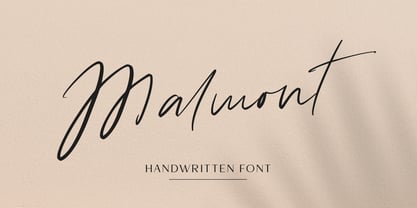 Malmont is an amazing handwritten font is light and elegant, and will emphasize your individuality in any project and will charm you with his signature. This font includes alternates and ligatures for lowercase. You can also use them to create a logo, branding, t-shirts, book covers, stationery, marketing, blogs, magazines, cosmetic, signboard and more. This font is easy to use has OpenType features.
 - Tacky Font by Ingrimayne Type,
$14.95 Four letters for this font came from a puzzle in a 1983 Games magazine. After seeing them, I could not resist the temptation to do a complete set of letters made from push pins or tacks, a truly tacky font. Most of the letters on the lower case keys are alternatives--choose the one works best for your purposes.
 - CoolKids by SevenType,
$29.99 CoolKids was inspired by the song “Signs of Life” by Arcade Fire. Since the lyrics talk about some cool kids we wondered what a typeface with the name cool kids would look like. We immediately knew it had to be laid back yet bold and to stand out from the crowd. After designing the bold script we decided to include a light, regular and medium weight to offer you more options for your designs. It comes with initial and final alternates, that show up automatically, to make it feel more natural and similar to handwriting. Every character was carefully drawn and connections are real smooth. This casual font-family speaks most Latin languages, both in their basic and alternate forms. CoolKids is great for creating logos, packaging, posters and much more. More important than to create a font is to use it… so now it’s up to you to create something awesome with it. Feel free to share your designs with us via email to hi@seventype.com We would love to see and share them with the world!
 - Frambuesa by Sudtipos,
$39.00 Organic versus geometric are two different universes that converges on nature systems and has its reflection on this new sans serif typeface. Frambuesa is a half humanist-half geometric sans that merges decorative curves with straight lines looking for a balance. The result: a solid but somewhat romantic, nostalgic type program that go ahead harmoniously, dancing to the rhythm of a naturally imperfect melody. Frambuesa can’t hide its family genetics. Structure and proportions come from Elisetta, her older sister they so both have a really good text performance. Regular variables and italics feel comfortable in a lot of contexts and are useful for little words or big title compositions. All seven weights are carefully adjusted to achieve soft transitions between one and the other resulting in high readability levels on program combinations and complex uses. This new font family name is a tribute to Lucia’s childhood, a very happy one. Frambuesa honors this sweet intense red fruit that her grandpa’s Coco gave to his grandchildren every Sunday in the summer.
 - Rufina STD by TipoType,
$13.00 Rufina was as tall and thin as a reed. Elegant but with that distance that well-defined forms seem to impose. Her voice, however, was sweeter, closer, and when she spoke her name, like a slow whisper, one felt like what she had come to say could be read in her image. Rufina's story can only be told through a detour because her origin does not coincide with her birth. Rufina was born on a Sunday afternoon while her father was drawing black letters on a white background, and her mother was trying to join those same letters to form words that could tell a story. But her origin goes much further back, and that is why she is pierced by a story that precedes her, even though it is not her own. Maybe her origin can be traced back to that autumn night in which that tall man with that distant demeanor ran into that woman with that sweet smile and elegant aspect. He looked at her in such a way that he was trapped by that gaze, even though they found no words to say to each other, and they stayed in silence. Somehow, some words leaked into that gaze because since that moment they were never apart again. Later, after they started talking, projects started coming up and then coexistence and arguments, routines and mismatches. But in that chaos of crossed words in their life together, something was stable through the silence of the gazes. In those gazes, the silent words sustained that indescribable love that they didn't even try to understand. And in one of those silences, Rufina appeared, when that man told that woman that he needed a text to try out his new font, and she saw him look at her with that same fascination of the first time, and she started to write something with those forms that he was giving her as a gift. Rufina was as tall and thin as a reed, wrote her mother when Rufina was born.
 - Kennedy by Galapagos,
$39.00The Kennedy family is a completely original design, inspired by lettering discovered by George during his exploration of 16th century cartography, some years ago. The charm exhibited by these beautiful artifacts is as much reflected in the letterforms they employ as in the drawing style or content they present. After familiarizing himself with the offerings of the various printing centers of that period, George began work on a design which he called Marconova. This design continued to evolve until it began to take on the look of Dutch Oldstyle typefaces of a later period. At this point George re-christened his work-in-progress Kennedy, and added the Book, Book Italic and Small Cap companion typefaces. Only a small trace of its design ancestry is evident in the resulting typeface family. There is enough, however, to make them a unique entry in the collection of distinguished contemporary designs. - FS Brabo Paneuropean by Fontsmith,
$90.00Worldly Even though it’s a new arrival, FS Brabo has seen the world. Designed by a Brazilian working in London and studying in Belgium under a Dutchman, it’s certainly well-travelled. And it was inspired by the extraordinary archive of early book typefaces at the world-renowned Plantin-Moretus Museum in Antwerp, while Fernando Mello was attending Frank Blokland’s Expert class Type Design course at the Plantin Institute of Typography. It was there that Fernando became engrossed in the collection of early metal type, matrices, punches and type samples by figures such as Garamond and Granjon. So much so that he took on the mighty task of developing ‘a beautiful, functional, serifed text font’ of his own. Heroic FS Brabo’s journey from sketch to font family took an epic three years, starting in Antwerp, continuing at Fontsmith in London, and reaching its conclusion back in Fernando’s home city of São Paulo. No wonder Fernando was reminded of another titanic face-off: that of Antwerp’s Roman hero of legend, Silvius Brabo, and the evil ogre, Antigoon. Brabo came to the town’s rescue after the tyrannical giant had been charging ships’ captains extortionate taxes and chopping off the hands of those who refused to pay up. Having finally downed Antigoon after a long and terrible duel, Brabo cut off the giant’s own hand and threw it into the river Scheldt, unwittingly giving the town its name: the Dutch for ‘hand-throw’ is hand werpen. What better way for Fernando to name his literary typeface than after the hero of Antwerp’s oldest tale? The garalde factor FS Brabo is not a revival, but a very much a contemporary, personal interpretation of a garalde – a class of typeface originating in the 16th century that includes Bembo, Garamond and Plantin, with characteristically rounded serifs and moderate contrast between strokes. Brabo’s ‘ct’ and ‘st’ ligatures, upper-case italic swashes and contextual ending ligatures – ‘as’, ‘is’, ‘us’ – all preserve the beauty and character of traditional typefaces, but its serifs are chunkier than a garalde. Their sharp cuts and squared edges give them a crispness at text sizes, helping to bring a beautifully bookish personality to hardworking modern applications. A workhorse with pedigree It may give the appearance of a simple, four-weight typeface, but FS Brabo has hidden depths beneath its simplicity and beauty. OpenType features such as cap italic swashes, contextual ending swashes – programmed only to appear at the end of words – and stylistic alternatives make this a complete and well-equipped typeface. Comprehensive testing was carried out at text and display sizes, too, to prevent counters from filling in. All of which makes FS Brabo a very modern take on a traditional workhorse serif typeface: colourful and versatile enough to adorn not just editorial projects but also signage, advertising and logotypes. - FS Brabo by Fontsmith,
$80.00 Worldly Even though it’s a new arrival, FS Brabo has seen the world. Designed by a Brazilian working in London and studying in Belgium under a Dutchman, it’s certainly well-travelled. And it was inspired by the extraordinary archive of early book typefaces at the world-renowned Plantin-Moretus Museum in Antwerp, while Fernando Mello was attending Frank Blokland’s Expert class Type Design course at the Plantin Institute of Typography. It was there that Fernando became engrossed in the collection of early metal type, matrices, punches and type samples by figures such as Garamond and Granjon. So much so that he took on the mighty task of developing ‘a beautiful, functional, serifed text font’ of his own. Heroic FS Brabo’s journey from sketch to font family took an epic three years, starting in Antwerp, continuing at Fontsmith in London, and reaching its conclusion back in Fernando’s home city of São Paulo. No wonder Fernando was reminded of another titanic face-off: that of Antwerp’s Roman hero of legend, Silvius Brabo, and the evil ogre, Antigoon. Brabo came to the town’s rescue after the tyrannical giant had been charging ships’ captains extortionate taxes and chopping off the hands of those who refused to pay up. Having finally downed Antigoon after a long and terrible duel, Brabo cut off the giant’s own hand and threw it into the river Scheldt, unwittingly giving the town its name: the Dutch for ‘hand-throw’ is hand werpen. What better way for Fernando to name his literary typeface than after the hero of Antwerp’s oldest tale? The garalde factor FS Brabo is not a revival, but a very much a contemporary, personal interpretation of a garalde – a class of typeface originating in the 16th century that includes Bembo, Garamond and Plantin, with characteristically rounded serifs and moderate contrast between strokes. Brabo’s ‘ct’ and ‘st’ ligatures, upper-case italic swashes and contextual ending ligatures – ‘as’, ‘is’, ‘us’ – all preserve the beauty and character of traditional typefaces, but its serifs are chunkier than a garalde. Their sharp cuts and squared edges give them a crispness at text sizes, helping to bring a beautifully bookish personality to hardworking modern applications. A workhorse with pedigree It may give the appearance of a simple, four-weight typeface, but FS Brabo has hidden depths beneath its simplicity and beauty. OpenType features such as cap italic swashes, contextual ending swashes – programmed only to appear at the end of words – and stylistic alternatives make this a complete and well-equipped typeface. Comprehensive testing was carried out at text and display sizes, too, to prevent counters from filling in. All of which makes FS Brabo a very modern take on a traditional workhorse serif typeface: colourful and versatile enough to adorn not just editorial projects but also signage, advertising and logotypes.
 - Dublon Brus by ParaType,
$25.00 The typeface was designed for ParaType in 1999 by Oleg Karpinsky basing on his Dublon typeface (1994). A decorative face in Op-Art style with slab serifs. For use in advertising and display typography.
 - Kantor by T4 Foundry,
$21.00Kantor's modular stroke and humanist axis defines it as an old-style 15th century Venetian serif typeface. At the same time, the lowercase Kantor alphabet is relatively compressed and has the vertical stems of a textura blackletter. However, Kantor has distinct, penformed shapes and has also kept all the organic irregularities of traditional handwriting (or punch-cutting, as it were). Kantor is not happy, not sad - but calm and dignified. Perfect for buddhist poems, fantasy video games and antique scrolls to give that "long time ago"-feeling. - Changaa by Fonts of Chaos,
$10.00 Changaa is the name of a beer in Africa, the local people call them "drink of the dead". UPPERCASE lowercase Numerals Punctuation 154 characters