10,000 search results
(0.051 seconds)
- Sunetta by Linotype,
$29.99An inkstone, a brush, ink, and paper. In China, one speaks of “wenfang sibao” — the four treasures of the scholar’s study. With these centuries-old hand tools, Werner Schneider created a calligraphic type trilogy of the highest aesthetic order; he named this typeface family after Buddha’s stepbrother, Sunetta. Sunetta is an outstanding choice for contemporary display type purposes. Its combination of lively forms overcome sterile text passages, lending them a more personal note and feeling. But Sunetta is not only recommended for documents bestowing distinction and accolades; the fonts are superb for shorter text passages as well. Sunetta’s spirited flow raises it above the fray that so many generic letterforms find themselves mired in, creating an unforgettable impression. Sunetta’s three complementary styles, Sunetta Flair, Sunetta Charme, and Sunetta Magic, offer three varying degrees of calligraphic verve. The family’s base font, Sunetta Flair, harkens back to the showcard lettering styles of the 1950s, while remaining distinctly European in taste. Sunetta Charme has a more swash-type appearance, while Sunetta Magic is joyfully decorative — its brush-written strokes dance across the line. Together, they may help you reach typographic nirvana. - Klein by Zetafonts,
$39.00 Klein PDF Specimen Klein is Zetafonts love letter to the grandmother of all geometric sans typefaces, Futura. Starting from a dialogue with Paul Renner’s iconic letterforms and proportions, Francesco Canovaro and Andrea Tartarelli decided to depart from its distinctive modernist shapes with slight humanist touches and grotesque solutions - with some design choices evoking the softness of humanist sans serifs like Gill Sans. The end result is a workhorse superfamily of 54 fonts with full multilingual capabilities and coverage of over two hundred languages using latin, cyrillic and greek alphabets. The original display-oriented family, developed in nine weights with matching italics (from the hairline thin to the sturdy black), has been paired with a text version (with slightly higher x-height, better readability and maximum legibility at small point size) and with a condensed version, to be used for space-saving display solutions in editorial and advertising formats. With a name that is both a nod to its humble functionality and an homage to french nouveau realiste artist Yves Klein, this typeface aims to become your next trusted companion in all your adventures in print, digital and motion design.
 - Regardnes by ryan creative,
$10.00 Regardnes Signature is a script typeface with hand-drawn monoline lines and simple lines that make this font look pretty and modern. Get a touch of a modern, simple, and fun signature script font, with glyphs and features open type with styles and binders, Ligatures, and alternative additions bundled together with swashes. It can be used for various purposes. such as brand names, wedding cards, business brands, logos, book covers, magazine designs etc. Regardnes signature is supported with additional characters that have an Alternative shape along with swashes and ligatures that will help you achieve beautiful styles with your own creations. FEATURES; -Uppercase, Lowercase, Foreign Support, Numbers and Punctuation -Alternatives, Swashes and Ligatures -Otf -Work on PC -Simple installation -Accessible in Adobe Illustrator, Adobe Photoshop. Adobe InDesign, even works in Microsoft Word -Fully accessible without additional design software. Regardnes Signature is encoded with PUA Unicode, which allows full access to all additional characters without having to design special software. Mac users can use the Font book, and Windows users can use the Character map to view and copy any extra characters to paste into your favorite text editor/app.
 - Restages by Nathatype,
$29.00 Large font sizes are often hard for the eyes to see and difficult to read. As a consequence, you have to give a lot of extra effort just to find out the right, legible font type with a great weight for your brand. Restages is a capitalized display serif font with less thickness for an effortless readability. This font type is perfect for formal contents because of its stylish, elegant characters to strengthen the impressions delivered. Furthermore, this font is truly legible due to its simple, regular serif forms to ease readers to recognize each letter correctly. Make use of the font features available here. Features: Stylistic Sets Multilingual Supports PUA Encoded Numerals and Punctuations Restages fits best for various design projects, such as brandings, posters, banners, logos, magazine covers, quotes, headings, printed products, invitations, name cards, merchandise, social media, etc. Find out more ways to use this font by taking a look at the font preview. Thanks for purchasing our fonts. Hopefully, you have a great time using our font. Feel free to contact us anytime for further information or when you have trouble with the font. Thanks a lot and happy designing.
 - Ratgohe by Gatype,
$12.00 Ratgohe is an elegant script font with a contemporary atmosphere and impeccable shapes, inspired by timeless classic calligraphy. Neither too thin nor too thick, balanced and varied, Ratgohe is designed to enhance the beauty of your project. These designs are used for branding, web and editorial design, print, crafts, quotes, It's great for logos, wedding invitations, romantic cards, labels, packaging, name spelling and more. Ratgohe includes OpenType style alternatives, ligatures, and International support for most Western Languages. To enable the OpenType Stylistic alternative, you need a program that supports Adobe Illustrator CS, Adobe Indesign & CorelDraw X6-X7, Microsoft Word 2010 or a later version. How to access all alternative characters using Adobe Illustrator: https://www.youtube.com/watch?v=XzwjMkbB-wQ Ratgohe is coded with PUA Unicode, which allows full access to all additional characters without having to design any special software. Mac users can use Font Book, and Windows users can use Character Map to view and copy any additional characters for pasting into your favorite text editor / application. How to access all alternative characters, using the Windows Character Map with Photoshop: https://www.youtube.com/watch?v=Go9vacoYmBw
 - BF Rotwang Pro by BrassFonts,
$39.99 The BF Rotwang™ Pro is a contemporary new edition and re-design of a formerly design by Guido Schneider. Named after the C.L. Rotwang, the inventor of the Mensch-Maschine from the film Metropolis (1925/1926), BF Rotwang plays with the character traits of high-contrast transitional serif typefaces and Didone-style typefaces. BF Rotwang is a typeface characterized by balanced elegance. It is sensitive, sophisticated and self-confident, but unobtrusive. The heavy weights have the power and dynamic for strong headlines and exciting logotypes, the lighter cuts the elegance and lightness for use in continuous text. All letters and characters are a touch condensed, so the typeface looks compact and works space-saving. BF Rotwang™ Pro supports up to 200 Latin-based languages. The family comes with 7 weights plus matching Italics. Each font contains more than 1.220 glyphs, featuring a wide range of alternate characters, small caps, figure sets, fractions, more than 35 ligatures, many currency symbols, special characters and other useful symbols. The style sets give you the option to individualize and adjust the typeface to the requirement of your design, without changing the general visual feeling.
 - Quijote Sauvage by Lián Types,
$45.00 It was in the beginning of 2008 when I designed a font named Quijote, its predecessor. In the middle of 2009, I looked at it again and thought it could be a good idea to make an update of it. Variables and Features: Quijote Sauvage Pro is the most complete variable. It includes all the ligatures, alternates and swashes. It has the OpenType function in order to alternate glyphs easily when running applications which support this. The font is also offered separately. Quijote Sauvage Standard has the right glyphs to get an equilibrium between wildness and softness. It includes standard and discretionary ligatures. Quijote Sauvage Stylistic has the sharpest glyphs. Its decorative traces are discreet in order not to have problems as regards legibility. Its upper case are less wild than the other variables. Quijote Sauvage Text is the most discreet of its partners. This one was thought in order to improve legibility. Its ascenders and descenders are shorter, so the words are easier to read in small sizes. Quijote Sauvage Contextual, Swash and Titling, are the ones with wonderful terminals. They decorate words, adding a wonderful look of wildness or passion.
 - Visine FF by Koral Creative,
$32.00 Visine FF is a typeface that aims to question the geographical borders that in so many ways can define people's lives. It was developed with the experience of advertising and commercial use in mind. The name Visine can be translated most simply as HEIGHTS. Visine FF was developed out of the necessity to make the most of the space on the visual format. With the tall arches and narrow bodies with exceptional, easy-to-read features, Visine FF aims to complement visual languages in many linguistic regions. Visine FF was developed in the Balkans, where Cyrillic, Latin and Glagolitic were the three historical writing systems used in the former Yugoslavia to denote cultural, ethnic, religious and political identities. Today, the languages of the Western Balkans are so similar that they can easily be called dialects, although they are written in different scripts. This is the result of their coexistence and parallel evolutions, which gave a rise to the common traits. This font family celebrates all the languages and scripts of the Western Balkans and is a labour of love. Love of design, love of language and the human need to communicate across borders, cultures and identities.
 - Cavole Slab by insigne,
$22.00 Cavole Slab is a new slab serif, designed in early 2011, that has a strong influence from Dutch typography. The name is an altered form of the Portuguese word for feather, emphasizing the typefaceís soft and friendly character. Slab serifs give this face plenty of impact and make it an excellent choice for contemporary designers. The font family includes a very dark and powerful black all the way down to a hairline thin weight, giving a tremendous versatility. The family also features dynamic italics that add plenty of emphasis and momentum. Cavole Slab is suitable for both headline and text settings and should easily find its place in a number of different settings, from corporate identity to magazine body copy. There are six weights that come with complementary italics, and each font includes over 450 characters and extended Latin-based language support. The typeface family comes in OpenType format, and OpenType alternates are easily accessible through OpenType enabled applications such as the Adobe suite or Quark. Please see the informative .pdf brochure to see what OpenType features are available and to see them in action.
 - Mousse Script by Sudtipos,
$79.00 Mousse Script is based on Glenmoy, a 1932 Stephenson Blake typeface. Glenmoy a prime example of what display typography was in pre-WWII American ad art. It graced the pages of magazines, sold numerous products and services, then simply died out when the typographic trends shifted towards the more personalized, stylized and handwritten types of calligraphy. The current trend in typography is a revivalism that brings all of the distinctive display typography of the 20th century, without chronological discrimination, back in the name of ‘retro’. Who are we to deny the masses what they want? Mousse Script doesn’t just bring Glenmoy back from the ashes of the 20th century. It expands upon the limited metal character set nearly twice over and takes advantage of the latest type technologies. This makes Mousse Script a striking typeface, both functionally and visually. A simple, attractive display font on the surface, Mousse Script is unique in its bold upright calligraphy, something rarely found these days. The OpenType version of Mousse Script combines both the regular and alternate character sets into a single, cross-platform package that takes advantage of the extended typographic features of the OpenType format.
 - Jukebox Hero by Grype,
$19.00 As one of the most popular rock bands of the world, Foreigner has rocked the charts with 10 multi-platinum albums and sixteen top 30 hits in the last 40 years. But one might ask what a band this successful has been missing all these years? No head games here...a consistent typeface based on their logo is the answer. As fans of Foreigner, we've taken the essence of their iconic logotype and expanded it out into a full typeface in regular and bold weights to celebrate their 40th anniversary tour. The Jukebox Hero Family celebrates the typographic stylings of Foreigner, with the soft rounded terminals and an open geometric feel, including the unique stencil flavor of the original logo. It inherited the friendly stylings of the all Capitals logo that inspired it, and goes on to include a full standard character set with expansive international support of latin based languages, and two weights jumping from regular to a beefy bold. This family is ready to rock the charts for your designs towards that of a modern, comfortable appeal. Here's what's included with Jukebox Hero Family bundle: 413 glyphs - including Capitals, Lowercase, Numerals, Punctuation and an extensive character set that covers multilingual support of latin based languages. (see the 3rd graphic for a preview of the characters included) 2 weights: Regular & Bold. Fonts are provided in TTF & OTF formats. The TTF format is the standard go to for most users, although the OTF and TTF function exactly the same. Here's why Jukebox Hero Family bundle is for you: You're a die-hard Foreigner fan, and have a case of "Double Vision" and need both font weights. You're looking for a stylish and sophisticated soft sans-serif stencil typeface family. You've been waiting for fonts like these. You're looking for a Sci-fi vibe typeface that has a look that feels familiar. You just like to collect quality fonts to add to your design arsenal
 - FS Sinclair by Fontsmith,
$80.00 ZX Spectrum In 1982, a home computer came on the market that would launch the UK IT industry. The ZX Spectrum sold five million units and spawned thousands of software titles. It was the must-have gadget for every teen. FS Sinclair is inspired by the memory of Sir Clive Sinclair’s greatest creation: the experience of entering its clunky command codes and reading its simple, grid-placed type. Smart, switched-on, great in text and display, FS Sinclair is a modern grid-based font, drawn with the Spectrum in mind and brought to life by well thought-out design. Formula Having completed the font for Channel 4’s brand update, the Fontsmith team defined the formula for its next font: the creative essence of the C4 work but with more structural discipline, more rigid form and a little more seriousness. The new font wouldn’t look self-consciously retro but it would reference the past and, it was hoped, influence the future. Readability Like the ZX Spectrum, it took a while for the new font to do exactly what it was meant to do. Many of the early concepts by Phil Garnham and Jason Smith were too jagged – the result of an awareness of getting too close to existing fonts of the same ilk, such as Wim Crouwel’s Gridnik. Eventually, FS Sinclair evolved into a more readable, functional grid-based type design that answered Phil and Jason’s original, self-set brief. Idiosyncratic There’s a technological, systems feel to FS Sinclair but ultimately, humans are in charge. The lowercase “a”, “n”, “m” and “r” have clean-cut “ears”, and the square-ish design is softened by round joins on the inside of the letterforms. The idiosyncratic design of letters such as “g”, “j”, “k”, “v”, “w” and “y” bring the design up to date. This is a modular font with character, and a range of weights that allow varied application.
 - Lamenta by Dawnland,
$13.00 All that remains from this once so proud and glorious antiqua are steel skeletons. Destroyed. Distorted. Ruins. The main focus and usage of LamentaX are headlines, posters for event graphics and music/media/game packaging. Lamenta X was revised 2012 and now hold a full character set of basic english/latin letters and west european diacritics!
 - ITC Nora by ITC,
$29.99ITC Nora was designed by James Montalbano when he was on a 1930s sign-lettering kick, poring over showcard manuals to find inspiration for new typeface designs. A few letters led him to create this informal, goofy" script, which falls between the many formal scripts and the completely extravagant. ITC Nora displays a free-flowing openness and elegance." - Bulgatry by Hishand Studio,
$15.00 Elegant look font of Bulgatry. a modern serif font family that drawn inspiration from the elegant of Bali, classy, modern but classic at the same time. just have a look at this beautiful handcrafted serif typeface. Perfect logo, branding, invitations, stationery, wedding designs, social media posts, and much more. Complete with - ligatures - alternates - regular - italic - icon - kerning - multilingual support
 - Megren by Azzam Ridhamalik,
$18.00 Introducing Megren, an experimental display typeface combining a simple and clean sans serif typeface with an elegant copperplate script typeface. Consists of 1 font file with copperplate script typeface on the uppercase and sans serif on the lowercase. The combination of different typefaces looks modern and fashionable but also gives a nostalgic retro vibes at the same time.
 - Music Nouveau JNL by Jeff Levine,
$29.00 The interesting hand lettered sans design of Music Nouveau JNL was found as the title of a vintage piece of early 20th Century sheet music for a song written by famed composer Irving Berlin and called "They Were All Out of Step but Jim". Judging by the cover art, it was a novelty song about a soldier.
 - Contraban by Arendxstudio,
$16.00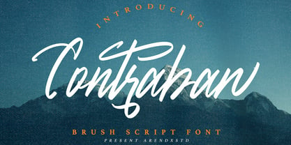 Introducing a Contraban Brush script fonts with sharp and beautiful letters that create fonts that are modern, tendy and elegant. Contraban came with opentype features such stylistic alternates, stylistic sets & ligatures good for logotype, poster, badge, book cover, tshirt design, packaging and any more. Features : • Character Set A-Z • Numerals & Punctuations (OpenType Standard) • Accents (Multilingual characters) • Ligature • Alternate
 - Herold by ParaType,
$30.00 The typeface was designed at ParaType (ParaGraph) in 1993 by Vladimir Yefimov based on Herold Reclameschrift by Heinz Hoffman of H. Berthold (Berlin), 1901, and Russian Herold typeface of the Berthold typefoundry (St. Petersburg). The bold style based on Herold Heavy of H. Berthold (Berlin), 1904, of the same designer. Advertising and headline typeface in Art Nouveau style.
 - Euripedes JNL by Jeff Levine,
$29.00 The Greek-influenced hand lettering on a 1930s WPA (Works Progress Administration) poster for the Federal Theater presentation of "Trojan Incident" inspired Euripedes JNL. The play was based on Homer and Euripedes, and was presented at the off-Broadway St. James Theatre (which opened in 1927 at 246 W. 44th Street on the site of the original Sardi's restaurant).
 - Oregon Street by Arendxstudio,
$15.00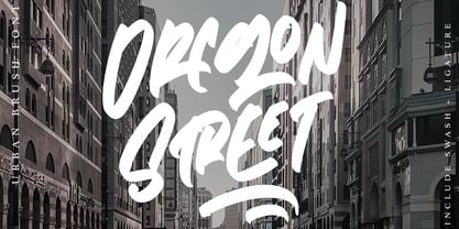 Oregon Street - Urban Brush Font with its distinctive character that can be easily implemented in your various design projects . Oregon Street came with opentype features such stylistic alternates, stylistic sets & ligatures good for logotype, poster, badge, book cover, tshirt design, packaging and any more. Features : • Character Set A-Z • Numerals & Punctuations (OpenType Standard) • Accents (Multilingual characters) • Ligature
 - Frenda by Blankids,
$17.00 Introducing a new monoline layered font family called Frenda font. Frenda inspired by 80's music poster, automotive poster, funk music poster. Frenda came with opentype features you can mix and match with as you like and many choices of alternative character. Frenda good for logotype, poster, badge, book cover, tshirt design, packaging and any more.
 - Fairground by Monotype,
$15.99 Fairground was created by calligrapher Rachel Yallop using a vintage nib and ink. This gives it a light flourishing feel, combining the formal penmanship of calligraphy with something a little more informal at the same time. It’s a delicate font with a full range of upper and lowercase alternate characters. Oh, and it has ligatures too!
 - Subjective by Arendxstudio,
$15.00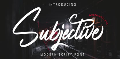 Introducing a Subjective Modern script fonts with sharp and beautiful letters that create fonts that are modern, tendy and elegant. Subjective came with opentype features such stylistic alternates, stylistic sets & ligatures good for logotype, poster, badge, book cover, tshirt design, packaging and any more. Features : • Character Set A-Z • Numerals & Punctuations (OpenType Standard) • Accents (Multilingual characters) • Ligature • Alternate
 - Jansta by Vishnu Sathyan,
$12.00 A pixel font designed to add a retro, digital feel to your projects. Inspired by classic video game fonts, Jansta's precise and clean pixel design creates a unique aesthetic that's perfect for any project that requires a futuristic or vintage look. Its versatility and readability make it a great choice for both print and digital designs.
 - Awe by Dawnland,
$13.00 An awe inspiring nightmarish font for use wherever you need to add unease or fear to your artwork. The main focus and usage of AweX are headlines, posters for event graphics and music/media/game packaging. AweX was revised 2012 and now hold a full character set of basic english/latin letters and west european diacritics!
 - House Doodles by Outside the Line,
$19.00 Little houses, little houses and none are the same. Cute cottages, beautiful bungalows, homey homes and darling dwellings to use to make ads, flyers, invitations for moving, change of address, open house parties, address stamps... Some have a lot of detail so use them at larger sizes. The less detailed for can be used in a smaller size.
 - AT Move Tremelo by André Toet Design,
$39.95 TREMELO a typeface based on a logotype (Microtel). We designed it as a complete capital alphabet. The original idea for the logotype font came from the products the firm produced. They provided the parts that go into hearing-aids. We thought the type should have some visual tremor in it. Concept/Art Direction/Design: André Toet © 2017
 - Barbary Coast by Solotype,
$19.95In one of our yearly type hunts, we came across the ancestor of this font, much wider and more decorative, with fine outside shading. Condition was poor so we did the obvious, cutting out the excess decoration and condensing the face optically. It reeks of dancing girls and drunken sailors and other colorful attributes of Old San Francisco. - Jackart by Arendxstudio,
$15.00 Introducing a Jackart Brush script fonts with sharp and beautiful letters that create fonts that are modern, tendy and elegant. Jackart came with opentype features such stylistic alternates, stylistic sets & ligatures good for logotype, poster, badge, book cover, tshirt design, packaging and any more. Features : • Character Set A-Z • Numerals & Punctuations (OpenType Standard) • Accents (Multilingual characters) • Ligature • Alternate
 - Polanix by Outerend,
$25.00 This unique geometric design will make your projects stand out from the crowd! If you're looking for a futuristic but with an edgy twist, "Polanix" could be the one. The interesting deformation of its variable version also works great with animation, game design and film/TV credits & titles as well as interface, app and web designs.
 - Orto by LetterPalette,
$20.00 Orto is a type family of sans serif fonts in eight weights. It's a humanist typeface with real cursive, containing both Roman and Italic styles. The letters are designed to look good on screen, they have a bit narrower proportions and simple shapes. Their structure is based on flat horizontal and vertical strokes, which are emphasized wherever possible. That’s where the name comes from: Orto is an abbreviation of the word orthogonal. Thanks to its narrow width, the typeface is less space-consuming and adapts well to the screens of smaller devices. It is legible in small sizes, thanks to the larger x-height. The characteristic details, like bent ends of diagonal strokes, stand out when used in larger sizes. Orto can be used equally good in print and its overall neutral look fits different contexts. However, its character is pretty recognizable. Orto contains Latin and Cyrillic script and covers six codepages: Latin 1, Latin 2, Cyrillic, Turkish, Windows Baltic and MacOS Roman. It has basic OpenType features like ligatures, oldstyle numerals, proportional and tabular lining figures, fractions, superiors, etc. Capital German sharp S shows up when the lowercase is typed between two uppercase letters, and the Contextual Alternates feature is turned on. The Stylistic Set 01 changes the shape of the Cyrillic b. The Stylistic Set 02 is a shortcut for using Serban Cyrillic alternatives that differ from Russian in cursive.
 - Chong Old Style by Monotype,
$29.99In the tradition of Goudy Old Style and Goudy Modern, Chong Wah drew Chong Old Style™ and Chong Modern™ as visually different – but complementary – designs. According to Chong Wah, “The extended family of typefaces started as a concept rather than a preconceived design. The concept is different sans serif type styles with a common underlying structure and a clear lineage to traditional serif designs. While there are similarities between the designs, each typeface was drawn as a separate entity.” Chong Old Style has the flavor of traditional old style designs without slavishly replicating the earlier design traits. It has the heft and color of an old style design but lacks the serifs and inclined stroke axis customarily seen in these typefaces. The result is a versatile suite of typefaces that deliver a straightforward message in large or small sizes. Chong Modern is a sans serif interpretation of the classic modern, or neoclassical, designs of Bodoni and Didot. More than a Bodoni without serifs, Chong Modern also has an elegant, Art Deco demeanor. This is a design that walks the line between traditional and contemporary with grace and aplomb. Chong Wah drew his Old Style and Modern designs in Light, Regular and Bold weights, adding an Extra Bold to the Old Style. All designs benefit from harmonizing italic counterparts. Both branches of the Chong family are also available as OpenType Pro fonts, allowing graphic communicators to take advantage of OpenType’s diverse capabilities. These fonts, in addition to providing for the automatic insertion of old style figures, ligatures and small caps, also offer an extended character set supporting most Central European and many Eastern European languages - Chong Modern by Monotype,
$29.99In the tradition of Goudy Old Style and Goudy Modern, Chong Wah drew Chong Old Style™ and Chong Modern™ as visually different – but complementary – designs. According to Chong Wah, “The extended family of typefaces started as a concept rather than a preconceived design. The concept is different sans serif type styles with a common underlying structure and a clear lineage to traditional serif designs. While there are similarities between the designs, each typeface was drawn as a separate entity.” Chong Old Style has the flavor of traditional old style designs without slavishly replicating the earlier design traits. It has the heft and color of an old style design but lacks the serifs and inclined stroke axis customarily seen in these typefaces. The result is a versatile suite of typefaces that deliver a straightforward message in large or small sizes. Chong Modern is a sans serif interpretation of the classic modern, or neoclassical, designs of Bodoni and Didot. More than a Bodoni without serifs, Chong Modern also has an elegant, Art Deco demeanor. This is a design that walks the line between traditional and contemporary with grace and aplomb. Chong Wah drew his Old Style and Modern designs in Light, Regular and Bold weights, adding an Extra Bold to the Old Style. All designs benefit from harmonizing italic counterparts. Both branches of the Chong family are also available as OpenType Pro fonts, allowing graphic communicators to take advantage of OpenType’s diverse capabilities. These fonts, in addition to providing for the automatic insertion of old style figures, ligatures and small caps, also offer an extended character set supporting most Central European and many Eastern European languages - Rockyeah by Majestype,
$19.00 Rockyeah is 3 style fonts: brush, serif and sans serif who have strong personalities and work very well in many design projects. - Rockyeah Brush made with fine brush pen with the fastest stroke movement. Comes with over 300 glyphs that will give you a vast possibility to play with each character. - Rockyeah Serif is an interpretation of Rockyeah brush. A serif font that focuses on legible, elegant and unique. With light and bold stroke combination this serif will give a modern-classic vibes on your design project. - Rockyeah Sans a geometric sans serif that focuses on legible, clean and useful for any project. This sans is an interpretation of Rockyeah Serif with the same caps height and bold stroke. This font is suitable for poster, tattoo, tees graphic, headline and etc :) Just play and rock it!
 - Rebrand by Latinotype,
$29.00 Rebrand is all about geometry, a typography that boosts confidence. However, contrary to pure, cold mathematics, this font seeks a more jovial and friendly face. The goal with Rebrand is to offer a Geometric Sans Serif font that can work in various instances, from symbols and titles, to text, and everything in between. It also creates a whole lot of personality, ideal for branding. There are two versions: Display, which is more fluid and dynamic with nine programmed weights for a wide array of intensity. This version also has various alternative characters and swashes. Text, which has the same attitude as Display, but is a little more serious with seven programmed weights to provide distinctive extremes and subtle variations among the mid-tones. Both cover basic Cyrillic and come in small caps. Both create one phenomenal typography: Rebrand.
 - Lamaesa by Carlos Maeso González,
$15.90 Lamaesa is a versatile and original design sans serif typeface. Designed to be used primarily on medium and large point sizes. Designed so you do not get tired of reading it, but at the same time, so that you notice its particularity. Oriented for use in headlines and continuous text, with a solid appearance, but with a slight aroma of handwriting, which gives it an ambivalent and original character. It is perfect for magazines, company letters, websites, advertisements, restaurant menus, and any support and function where it is essential to attract attention in an elegant and non-abusive way. Basic Latin characters. It consists of 217 glyphs (ISO 8859-15): uppercase, lowercase, numbers, currency symbols, and special characters. It consists of six fonts: light, normal and bold as well as their oblique equivalents. Carlos Maeso González is the designer of the typeface “Lamaesa”.
 - Secca Soft by astype,
$42.00 Secca Soft is the rounded sister of Secca font family. With its workhorse qualities, Secca Soft is perfectly suited for a wide range of applications - especially where legibility and economy are important factors. It comes with a wide language support and many typographic features and extras. The family comes in nine weights from Thin to Ultra Black - each with italics, small caps and italic small caps. While the weights from Light to Bold perform well in text sizes, the more extreme styles give extra freedom for Headlines & Signage. For setting tables and charts, Secca Soft offers tabular figures, fractions, currency signs and mathematic operators which share the same fixed width throughout the entire range of weights. This special feature is called "weight duplexing" and is a time saver for designers of annual reports and other figure-heavy texts.
 - Thorben by Studio Buchanan,
$18.00 The old Norse legend of Thorben Odinson is a cautionary tale. And this typeface, like the nebulous kingdom he ruled, is something of a cloudy concoction. Thorben the typeface is something of an inspiration-hybrid, pulling aspects from multiple sources and combining them into a typeface that strangely seems to work (or not – depending on your point of view). What started as a redrawing of some old carvings (on a castle wall in deepest, darkest Suffolk), is now something entirely different. Part Nouveau curves and Celtic script, topped with a few sprinkles of modernism, darkness and some quirky ideas – Thorben absorbs it all, creating a display face that feels antiquated and current at the same time. Each style also comes pre-loaded with a handful of pictograms and icons perfect for adorning your designs with extra Thorben-ness.
 - Rawson by Latinotype,
$45.00 Designed by Alfonso García and Latinotype Team. Rawson is inspired by early humanist sans-serif English typefaces. We have added a bit of Johnston, a bit of Gill and a lot of Latinotype to the font. Rawson is an elegant font—but definitely not a black tie one—with the strength of a geometric sans but as friendly as a humanist typeface. This mixture, though not capricious, gives the font a ‘classic’ personality and a modern look at the same time. Rawson is a typeface with a large x-height, open counterforms and classical ductus. The font is well-suited for branding, signage, packaging and short text. Rawson has a 778-character set that supports 219 languages and includes alternative characters, discretionary ligatures, small caps, a variety of figures and fractions—a wide range of typographic tools to meet different design needs.