10,000 search results
(0.039 seconds)
- Flat10 Antique by Dharma Type,
$9.99 This 8-bit pixel font is designed with respect for 80s game designers and the pixel font pioneers in middle 90s. Use at size 10 pixels or multiples of 10 with anti-alias off is recommended. List of our Pixel Font Project. ·Flat10 Antique ·Flat10 Artdeco ·Flat10 Arts&Crafts ·Flat10 fraktur ·Flat10 Holy ·Flat10 Holly ·Flat10 Segments ·Flat10 Stencil ·Flat20 Gothic ·Flat20 Headline ·Flat20 Hippies ·Flat20 Streamer ·Behrensmeyer Vigesimals ·Civilite Vigesimals
 - Sunkids by Wacaksara co,
$18.00 Sunkids is a bold connected script font inspired by the spirit of sports and the Olympic Games. This font is great for your next creative project such as logos, printed quotes, invitations, cards, product packaging, headers, Logotype, Letterhead, Poster, Apparel Design, Label, and etc. Sunkids comes with uppercase, lowercase, numerals, accents (Multilingual characters), punctuations and so many variations on each character include OpenType alternates, PUA encoded and common ligatures.
 - Mikhaloo by Letterara,
$12.00 Mikhaloo is a bold, playful, and fun display font. Whether you use it for cartoon-related designs, children's games, or just any creation that requires a lovely touch, this font will be an amazing choice, especially when combined with bright colors. Use it to make your ideas more realistic and create spectacular designs! This font is PUA encoded which means you can access all the beautiful glyphs with ease!
 - WORKSHOP Marker by Posterizer KG,
$19.00 WORKSHOP Marker is a handwritten font with a casual and modern look. You can use the alternates and ligatures to give your design a realistic, hand painted look. If you find a single repeating glyph, you can change that by toggling between Stylistic Alternates. There are Cyrillic glyphs and more then 100 playful Dingbats in the same style. WORKSHOP Marker is the perfect choice for all imaginative, playful and beautiful things.
 - Flat10 Arts And Crafts by Dharma Type,
$9.99 This 8-bit pixel font is designed with respect for 80s game designers and the pixel font pioneers in middle 90s. Use at size 10 pixels or multiples of 10 and anti-alias off is recommended. List of our Pixel Font Project. ·Flat10 Antique ·Flat10 Artdeco ·Flat10 Arts&Crafts ·Flat10 fraktur ·Flat10 Holy ·Flat10 Holly ·Flat10 Segments ·Flat10 Stencil ·Flat20 Gothic ·Flat20 Headline ·Flat20 Hippies ·Flat20 Streamer ·Behrensmeyer Vigesimals ·Civilite Vigesimals
 - Simple Christmas by Stefani Letter,
$12.00 Simple Christmas is a bold, playful, and fun display font. Whether you use it for cartoon-related designs, children's games, or just any creation that requires a lovely touch, this font will be an amazing choice, especially when combined with bright colors. Use it to make your ideas more realistic and create spectacular designs! This font is PUA encoded which means you can access all the beautiful glyphs with ease!
 - Hearty Chintya by Attype Studio,
$10.00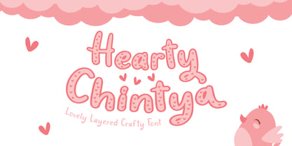 Hearty Chintya is a Lovely Layered Crafty font with stylistic set. Combine Hearty Chintya with display & outline version to get amazing 3D letterform! Fall in love with its incredibly versatile style and use it to create spectacular designs! Hearty Chintya is perfect for branding, logo, invitation, quotes, apparel design, product packaging, merchandise, game titles, cute style design, Book/Cover Title and more. What's Included : - Stylistic Set character - Multilingual Support
 - Donut Catchy by EmbunStudio2018,
$9.00 You came to the right place, if you need a Bold Clean Script font to make your project perfect such a logo design project, poster design, brand identity, heading, wedding, greeting cards, invitation and more this script handwritten font is into it ! I Created this font for social media need first, but i think this logo is great for corporate branding or logo design project too and boom ! Of Course !
 - Viyona by Attype Studio,
$13.00 Viyona is a Script Vintage font with stylistic set and alternates. Combine with Viyona - Extrude to get 3D character style! Fall in love with its incredibly versatile style and use it to create spectacular designs! Viyona is perfect for branding, logo, invitation, quotes, apparel design, product packaging, merchandise, game titles, cute style design, Book/Cover Title and more. What's Included : - Ending Swash - Multilingual Support Hope you enjoy with our font!
 - Brocks by Par Défaut,
$9.00Square in appearance but with soft vertices, Brocks is composed of more than 400 characters. From Latin Pro for multiple language usable. The latin alphabet is available, for uppercase and lowercase, in numerator, denominator and ordinal version. The same for the numbers with fraction features until 10 figures on each side. Exist in Light, Regular and Bold weights, in Right and Left slant version. All of this available in Variable version. - Nolagert by Oleg Gert,
$30.00 The Nolagert display san serif font also has a traditional and at the same time modern, playful and elegant look. Font Nolagert is an amazing creation that combines two cultural eras: I was inspired by the typography traditions of the Soviet Union of the 60s and refracted by modern requirements. It is a kind of bridge between the past and the present, combining classic elegance and modern playfulness.
 - Fugel by Attype Studio,
$15.00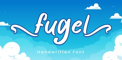 Fugel is a delicate and incredibly distinct handwritten font with beginning & ending swashes. Fall in love with its incredibly versatile style and use it to create spectacular designs! Fugel is perfect for branding, logo, invitation, stationery, social media post, product packaging, merchandise, blog design, game titles, cute style design, Book/Cover Title and more. What's Included : - Fugel.otf - Beginning & Ending Swash - Multilingual Support --- Hope you enjoy with our font! Attype Studio
 - Moliantha by Attype Studio,
$18.00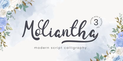 Moliantha is a delicate and incredibly distinct handwritten font with 3 stylistic set. Fall in love with its incredibly versatile style and use it to create spectacular designs! Moliantha is perfect for branding, logo, invitation, stationery, social media post, product packaging, merchandise, blog design, game titles, cute style design, Book/Cover Title and more. What's Included : - ligatures - Beginning & Ending Swash - Multilingual Support --- Hope you enjoy with our font! Attype Studio
 - Flat20 Gothic by Dharma Type,
$14.99 This 8-bit pixel font is designed with respect for 80s game designers and the pixel font pioneers in middle 90s. Use at size 20 pixels or multiples of 20 with anti-alias off is recommended. List of our Pixel Font Project. ·Flat10 Antique ·Flat10 Artdeco ·Flat10 Arts&Crafts ·Flat10 fraktur ·Flat10 Holy ·Flat10 Holly ·Flat10 Segments ·Flat10 Stencil ·Flat20 Gothic ·Flat20 Headline ·Flat20 Hippies ·Flat20 Streamer ·Behrensmeyer Vigesimals ·Civilite Vigesimals
 - Winkell by Paavola Type Studio,
$10.00 Winkell family is a futuristic all caps four width opentype™ font family of 16 fonts featuring multilanguage support. Winkell is heavily inspired by dystopian futuristic settings in science fiction especially subgenres like cyberpunk and other futuristic visuals. Simple all caps display design based on straight forms connected by 45° rounded angles. Winkell Mix+Match Letters™ system allows you to mix letters from same weight but different widths.
 - Outhouse by Arendxstudio,
$18.00 Outhouse is Handwritten marker font that looks neat and nice to look at, so it will be suitable to use for your design projects Outhouse came with opentype features such stylistic alternates, stylistic sets & ligatures good for logotype, poster, badge, book cover, tshirt design, packaging and any more. Features : • Character Set A-Z • Numerals & Punctuations (OpenType Standard) • Accents (Multilingual characters) • Ligature There it is! I really hope you enjoy it .
 - PR Bramble Wood 2 by PR Fonts,
$15.00 This font is a collection of spiraling vines with thorns. This set is heavier than BrambleWood 1, more like the thorns that encased Sleeping Beauty’s castle. Adjacent letters will provide left and right versions of the same design, and shift will access the inverted version. Combines well with: PR Bramble Wood 1, PR Hallow Doodles 01, PR Hallow Doodles 02, PR Cauldron, PR Swirlies 01, PR Swirlies 05.
 - Graphen by Picador,
$24.00 Graphen family is a hand drawn typeface with 5 different weights. This font contains script that replaces glyphs with their alternates. It is based on checking the same glyphs in close range - not on a random appearance. Every weight was designed with attention to detail, so it can be used in small sizes and even on big posters. Weights include different features, such as dingbats or old style figures.
 - Rocinante Titling by XO Type Co,
$40.00 Rocinante Titling is a study in interior and exterior tension, with tightly-packed interiors and unexpected lightwells contrasting generous letterspacing. 5 weights and obliques on the same weight range as Havelock Titling, the family is a contrasting partner meant for combination. It’s made for creating contrast and tension in your work. Here’s a downloadable PDF specimen, and here's more about the process of getting from Havelock to Rocinante.
 - Stonehill by Great Scott,
$22.00 Stonehill is a bold handpainted sans serif typeface for display or packaging use. Stonehill has 3 glyphs for each letter and with contextual alternates activated in apps that supports this it will cycle thru these alternates to keep the same glyphs from repeating too much. Or, you can always pick and choose from the alternates manually to keep it fresh! Stonehill is available in two cuts - regular and oblique.
 - WL Lunatrix by Writ Large,
$12.00 Lunatrix is a conceptual type face for futuristic or fantastic treatments. Ideal for suggesting strange new worlds of science-fiction, it can also evoke a land of fantasy or even hint at the occult. In its lighter weights, Lunatrix is well suited for applications such as posters, album covers, video games, and graphic novels, while in its heavier weights, it’s appropriate for titling and more complex type treatments.
 - Presser by Konstantine Studio,
$9.00 80s. , 90s, y2k, sometimes we just wonder, "what year is it today?" everything looks like we're going backward (in a good way though, calm down). Since luck is a form of preparation that meets a chance, again, we came up prepared. Introducing PRESSER. A new sans-serif family with the diverse vibes of nostalgia and modernism in one shot. ps: it's WIDE, like seriously wide, extended. We warned you.
 - Santanelli by Pisto Casero,
$19.00 Santanelli is a rounded all caps display typeface. It is intended to be used in posters, editorial headlines and logotypes. It comes in three weights: Thin, Medium and Bold. Each letter has been designed with two different styles or flavors: decorative and clean. You can access each of them by typing uppercase and lowercase respectively. These two styles fit perfectly when combined within the same word or message.
 - Crystal by Cuda Wianki,
$30.00 Crystal is a very trendy two font system that could be layered to give You multiple possibilities in designing. When You use it with gradient it gives a faceted 3-D effect. What is more it can be outlined that gives an additional industrial look. Both fonts contains the same metricts so using them is so simple-just copy & paste in place in different layers and then play with colors, gradients, outlines as You like :) Crystal is great for headlines and logotypes.
 - John 315 - Unknown license

- Fancy Dan by Solotype,
$19.95We had a dozen or so letters of this of this, picked up at the flea market in Vienna. The rest came from our imagination. - Itchy Handwriting by Gustav & Brun,
$10.00 Let’s be creative and have fun at the same time! With the new Itchy Handwriting, you will make your friends smile and your foes shake.
 - Iris Hand by Ingo,
$48.00 The ballpoint pen woman’s handwriting As the name suggests — the Iris’ Hand is a woman’s personal handwriting, written with a ballpoint pen. Iris’ Hand is an amazing font — almost indistinguishable from “real” handwriting. Thanks to the over 200 different ligatures and stylistic alternates the typeface is extremely lively and varied. The ballpoint pen has its own characteristics, which are clearly expressed in this font. The stroke is not always uniformly thick. Sometimes only a delicate, thin line is created. Often it breaks off suddenly and leaves a gap. In addition to the normal version, there is also a light and a bold version. Handwriting is sometimes written more or less slanted. So does Iris’ Hand. The normal version is only slightly slanted. But there is also an oblique version that is significantly more inclined by 20°, which makes the script appear more regular and somehow feminine. The Iris’ Hand is also available as a variable font!
 - Twine by Wilton Foundry,
$29.00 By twisting and weaving separate strands of rope together, a stronger TWINE is created. The distinctive “valleys” that give the twine its twisted and wavy appearance is the result of the twining process. Similarly, TWINE the font, is an exaggerated representation of the calligrapher’s individual pen strokes that create a cohesive character which is enhanced with the stencil. Unlike other stencils, TWINE emphasizes calligraphic strokes, so you will find it very legible even in small point sizes. Check it out! Furthermore, twine is inspired by Plantin, an old-style serif typeface named after the printer Christophe Plantin, which is based on the 16th century Gros Cicero face cut by Robert Granjon. Twine is a great choice when you need a font that is timeless, contemporary and distinctive. Perfect for Advertising, Corporate identities and Packaging design, Museum display, Technology, Hospitality, Travel, and Retail applications. Twine is available in TWINE Regular, TWINE Italic, TWINE Bold, TWINE Bold Italic. It is a Stencil that is Distinctive, Contemporary, and Timeless.
 - Revla Slab by Eclectotype,
$40.00 The Revla family just keeps expanding! This is Revla Slab. It has the same exuberant charm as its siblings ( Revla Sans and Revla Serif ) with a touch more chunk. OpenType contextual alternates make for text that is lively and bouncy, without the monotony of obviously repeating letterforms. It’s shamelessly fun, but pretty serious at the same time. The range of weights can be used to maintain an even colour across different sizes - use lighter weights for bigger sizes and vice versa. OpenType features include automatic fractions, ordinals, contextual alternates (which along with the pseudo-randomness, help maintain a nice tight fit with minimal glyph collisions), standard and discretionary ligatures (OK, only one discretionary ligature, but it’s a belter!), and case-sensitve forms. Obviously, in sharing a common skeleton, it will work well with other members of the Revla Superfamily, particularly Revla Sans.
 - Altivo by Kostic,
$40.00 Altivo is a proper workhorse sans serif. Sixteen OpenType fonts in eight weights (with true Italics) range from Thin to Ultra. Meticulous care was taken to ensure high legibility in text sizes on the screen. The typeface is designed to have wide proportions, generous x-height, loose spacing, ink traps, large apertures and low stroke contrast. Altivo’s ink traps are not only a functional design feature, they also look interesting and lend character to the typeface in headlines. True Italics, small caps and multiple sets of figures, as well as a complete set of lowercase superscript were all included in the family to accommodate high typographic standards. If you need to pair it with a serif font, you can’t go wrong with Chiavettieri, since both typefaces were made with the same basic proportions, and their tabular figures are the same width.
 - FS Joey Paneuropean by Fontsmith,
$90.00Kangaroo FS Joey was the offspring of a project with Rudd Studio to develop a logotype for an online streaming TV service, in 2008. While under wraps, the secret project was code-named Kangaroo. The logotype led to a second project, to design a corporate typeface for the service. It was the first big project Fernando Mello had worked on with Jason Smith. “Like any designer who just joined a team, I was very excited about it, drawing and sketching lots of ideas. I remember Jason and I experimenting with lots of possibilities, for both the logo and the typeface.” Online As the font for a Spotify-style, internet-based service, FS Joey needed to be highly legible on-screen, including at very small sizes. There had to be a range of weights, and they’d have to work well in print, too. It was also important that it felt corporate, not too quirky, while still having a strong character of its own. Quirkiest “We designed three weights specifically for use on the Web,” says Jason Smith. “There was the usual fight between me and my team. I wanted at least one identifiable letter that was a quirk. As always I went straight for the lowercase ‘g’, and it was drawn numerous times with lots of variation. I got the quirkiest one accepted by the client.” But, later in 2009, the Competition Commission blocked Project Kangaroo, and Fontsmith were left with a couple of weights of an as yet unused font. From Kangaroo, Joey was born. A favourite “Straight away, people started to notice the typeface,” says Jason. “I can take the credit for pushing the art direction and standing up for the quirks. But it was Fernando who was the key to pulling it all together and adding his own distinct flavour. Now it’s one of my favourite designs in our library.” Fresh and friendly, geometric and energetic, Joey is available in five weights, all with italics, all finely-tuned for both screen and print. - FS Joey by Fontsmith,
$80.00 Kangaroo FS Joey was the offspring of a project with Rudd Studio to develop a logotype for an online streaming TV service, in 2008. While under wraps, the secret project was code-named Kangaroo. The logotype led to a second project, to design a corporate typeface for the service. It was the first big project Fernando Mello had worked on with Jason Smith. “Like any designer who just joined a team, I was very excited about it, drawing and sketching lots of ideas. I remember Jason and I experimenting with lots of possibilities, for both the logo and the typeface.” Online As the font for a Spotify-style, internet-based service, FS Joey needed to be highly legible on-screen, including at very small sizes. There had to be a range of weights, and they’d have to work well in print, too. It was also important that it felt corporate, not too quirky, while still having a strong character of its own. Quirkiest “We designed three weights specifically for use on the Web,” says Jason Smith. “There was the usual fight between me and my team. I wanted at least one identifiable letter that was a quirk. As always I went straight for the lowercase ‘g’, and it was drawn numerous times with lots of variation. I got the quirkiest one accepted by the client.” But, later in 2009, the Competition Commission blocked Project Kangaroo, and Fontsmith were left with a couple of weights of an as yet unused font. From Kangaroo, Joey was born. A favourite “Straight away, people started to notice the typeface,” says Jason. “I can take the credit for pushing the art direction and standing up for the quirks. But it was Fernando who was the key to pulling it all together and adding his own distinct flavour. Now it’s one of my favourite designs in our library.” Fresh and friendly, geometric and energetic, Joey is available in five weights, all with italics, all finely-tuned for both screen and print.
 - Edgar No 9 by Type Innovations,
$39.00 Edgar No. 9 is an original design by Alex Kaczun. Edgar No. 9 is a derivative work based on his Big Boy typeface series. It was designed specifically for display headlines, logotype, branding and similar applications. Primarily a display, this extremely versatile font has generous proportions, large counters and loose fitting which also allow the font to work well across a wide range of text sizes. Edgar No. 9 is a heavy baroque slab serif and although it shares the underling skeleton of 'Big Boy', it is a much more compact in overall proportions and spacing. A handsome bold headline font that works well in text as well as display sizes—ideally suited for publications and advertising. Alex plans to expand the font series to include a large range of weights along with corresponding italics numbering 1 thru 9, as well as, true small capitals and old style figures. Distressed version(s) will also be available in upcoming releases. Stay tuned, more to come soon. The large Pro font character set supports most Central European and many Eastern European languages.variations to expand this 'hip' new font series. Groovin' baby.
 - Watermint Script by Mans Greback,
$79.00 Watermint Script is a formal typeface that epitomizes the essence of elegance and sophistication. Envisioned for formal settings, its calligraphic strokes evoke a sense of classic beauty, making it an ideal choice for invitations or logotypes that demand a touch of class. Watermint Script is a harmonious blend of cute and lovely, wrapped in a feminine and romantic design. Its light and fresh appearance breathes life into each word, offering a clean and flawless presentation. The font's perfection lies in its attention to detail, with each character exuding a classy aura that enhances the overall visual experience. The font is built with advanced OpenType functionality and guaranteed top-notch quality, containing stylistic and contextual alternates, ligatures and more automatic and manual features; all to give you full control and customizability. It has extensive lingual support, covering all Latin-based languages, from North Europa to South Africa, from America to South-East Asia. It contains all characters and symbols you'll ever need, including all punctuation and numbers. Designed by Mans Greback, Watermint Script is a testament to his commitment to creating fonts that are not just tools of communication, but artworks that enrich the visual landscape.
 - VLNL Beatbox by VetteLetters,
$30.00 VLNL Beatbox is a solid tech heavy straight stencil-face with a lot of character. It was originally designed as a logo for dj Markus Schultz back in 2004, who rejected it. His management couldn't read it, or thought people wouldn’t be able to read it. But Chef Donald DBXL found the concept interesting enough to finish it and has used it in many projects since. It was the identity font for the Battle of Amsterdam, a talent showcase in beat boxing and other skills. Beatboxing is a style of hiphop music (beats) made with the mouth and a microphone. A box is a handy container to store stuff. Like food, or fonts. We use a lot of boxes at the VetteLetters office. VLNL Beatbox is best deployed big, like in logos or headlines. Or flyers, album covers, posters and signage. As a display and headline typeface it’s got a lot of character. We could definitely see it painted on the side of a tank, or an airplane. It’s heavy, but not at all dangerous. Use it without risk. VLNL Beatbox comes in two variations; Regular and Small (smallcaps)
 - Marujo by PintassilgoPrints,
$15.00 Marujo is a highly decorative typeface inspired by painted pieces of Arthur Bispo do Rosário, a striking Brazilian artist who lived for 50 years in a psychiatric institution. Besides its spirited Regular and Light cuts, Marujo family brings nifty eye-catching variations adorned with dots and stripes. It also brings complementary fonts to spice things up even more: there are 2 shadow options and yet a picture font packed with doodles, mostly on nautical subjects (which are strongly present on Bispo do Rosário, a former seaman apprentice.) Bispo do Rosário's works employs a multitude of materials and are often very intricate. Words are everywhere, painted or embroidered at most. He produced a vast amount of works, and is now - posthumously - widely recognized in Brazilian art scene. The psychiatric institution in which he lived is now a museum dedicated exclusively to his work. Marujo draws inspiration not only from Bispo's works, but also from this man's potency, a persistent man who produced amazing art locked in such a tough environment for a life-long. Marujo fonts are positively adventurous and will safely navigate through a sea of feelings, reaching free spirits everywhere. To navigate is precise...
 - EraMax 123 by Our House Graphics,
$15.00 EraMax 123 is a multi-layered display geometric sans serif, meant to be set BIG, for large, colourful statements. It's the perfect face for packaging, posters & branding, where a strong, colourful voice is needed... Did I mention posters? The "Max" in EraMax comes from the ultra bold weight, but also, and mainly as a tip of the hat to Peter Max, the designer and artist, known for creating so many images which have come to be emblematic of the sixties and seventies. The bold gradient effects in some of his posters were the inspiration behind the dotted and striped layers. This font's vintage flavour truly stand out in a retro setting, but also has a modern flavour that lends it the flexibility to work well in a more contemporary context. This is the second of what is to be an extended family of typefaces based on the original hand painted signage found in the T. H. & B Railway station in Hamilton Ontario, a classic Art Moderne building, designed by the New York architectural firm of Fellheimer and Wagner for the Toronto Hamilton and Buffalo Railway line and completed in 1933.
 - Scripps College Old Style by Monotype,
$49.00The story of Scripps College Old Style is a heart-warming and inspiring chronicle about a young librarian, a handful of students, a wealthy grandmother, a dedicated educator -- and two eminent American type designers. The story begins in 1938, when Dorothy Drake, the newly hired librarian at Scripps College, a small women's college in southern California, became an impromptu dinner companion of the American type designer Fred Goudy. By the 1990s, the original fonts that Goudy had created for Scripps College in the 1940s had become prized -- but they were seldom-used antiques. Scripps needed digital versions of the metal fonts. This goal posed two immediate challenges: finding a designer familiar with letterpress printing who was skilled at creating digital fonts, and locating the money to commission the designer's services. The first challenge was the easiest to conquer. Sumner Stone was my first and only choice," recalls Kitty Maryatt, the current curator of the Scripps College Press. "I knew he had letterpress experience, was an accomplished calligrapher, and that his typeface designs were simply exquisite. The choice was easy."The second challenge was more difficult. It took the dedication, hard work and tenacity of Maryatt to bring the beautiful Goudy designs into the twenty-first century. While Stone was eager to begin work on the project, the college had no more money for new typeface designs in the 1990s than it did in the1930s. Years of lobbying, cajoling and letter writing were necessary to obtain the college's approval for the design project. Once she had the necessary funding, the design brief posed yet a third challenge. Goudy had provided two sizes of type to the Press: 14 point and 16 point. Which would serve as the foundation for Stone's work? In addition, the Goudy fonts were quite worn. Should Stone use printed samples as his design master, or base his work on the original Goudy renderings? The 14-point master drawings were the ultimate choice, with the stipulation that the finished fonts would provide both a seamless transition from the worn metal versions and a faithful representation of the original Goudy designs. Once the budget and design brief were established, the process of converting the original Goudy drawings into digital fonts took just a little over two months. Stone delivered finished products to Scripps in the fall of 1997. The first official use of the fonts was to set an announcement for a lecture by Stone at Scripps in February of 1998. But the story is not quite finished. Maryatt was so pleased with the new digital fonts, she wanted to share them with the graphic design community. At Stone's suggestion, she contacted Monotype Imaging with the hope that the company would add the new designs to its library. An easy decision! Now Monotype Imaging is part of the story. We are proud to announce the release of Scripps College Old Style as a Monotype Classic font. The once exclusive font of metal type is now available in digital form for designers around the world. " - Lemon Press by Attype Studio,
$7.00 Lemon Press is display font of fresh lemon, come up with two font regular and display. It is suitable for any summer event! Lemon Press is perfect for branding, logo, invitation, stationery, social media post, product packaging, merchandise, blog design, game titles, cute style designs, Book/Cover Titles and more. Multilingual Support included for Afrikaans, Albanian, Catalan, Danish, Dutch, English, Estonian, Finnish, French, German, Icelandic, Italian, Norwegian, Portuguese, Spanish, Swedish, Zulu. Hope you enjoy with our font! Attype Studio
