10,000 search results
(0.057 seconds)
- Bandes by Sealoung,
$20.00 Bandes is a bold, thick lettered, retro styled display font. Whether you use it for cartoon related designs, children games or just any creation that requires a lovely touch, this font will be an amazing choice.
 - Galaxia by Mevstory Studio,
$25.00 Galaxia created by Muhammad Afif Ersya is a futuristic modern font that features characters, multilingual, numbers & punctuation. It’s well suited for use in the tech & gaming space for logos, titles, packaging, web design, apps & much more.
 - Factory Heroes by Ali Hamidi,
$10.00 Factory Heroes is a cool, playful and friendly display font. Whether you use it for cartoon related designs, children games or just any creation that requires a lovely touch, this font will be an amazing choice.
 - Amazingly Beautiful by Ali Hamidi,
$10.00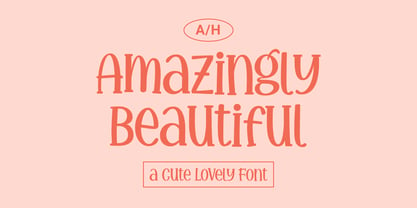 Amazingly Beautiful is a cute, quirky and whimsical display font. Whether you use it for cartoon related designs, children games or just any creation that requires a lovely touch, this font will be an amazing choice.
 - Eterea LC by Corradine Fonts,
$60.00 Eterea LC (Lower Case) is based in Eterea using the same Capitals but changing the lower case set. You can use this version of Eterea to give a more readable and soft aspect to your work.
 - Arizona Futur by Fonts of Chaos,
$10.00 Hello. Arizona Futur is a pixel font with little pixel guys. Easy to use to make cool artworks. The little guys have the same size than the alphabet. So you can mix the words with illustration.
 - Shifty Notes by Ali Hamidi,
$10.00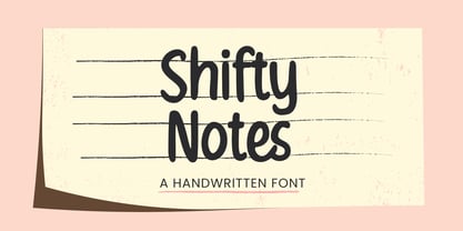 Shifty Notes is a cute and simple lettered handwritten font. Whether you use it for cartoon related designs, children games or just any creation that requires a lovely touch, this font will be an amazing choice.
 - Brough by OtterType,
$19.00 Brough is a carefully crafted bold sans serif font. You can use it for a variety of design projects like posters, business cards, invitations, games, covers, social media posts, quote photos, branding, editorials, and much more.
 - PXL3287 by BW90,
$25.00 PXL3287 is pixel art font inspired by '80s space and sci-fi cartoons and arcade games. It contains more than 220 glyphs (capitals, lower-case letters, numbers, plus many other characters) and supports many european languages.
 - Snowy Owl by Ali Hamidi,
$10.00 Snowy Owl is a cute, joyful and fun display font. Whether you use it for cartoon related designs, children games or just any creation that requires a lovely touch, this font will be an amazing choice.
 - La Quinta by Jonahfonts,
$42.00La Quinta is a display font for some small text and logo applications as well as branding, invitations, stationery, packaging, fliers, gaming texts and book jackets. Plus many other applications at the discretion of the designer. - Darksame by Alit Design,
$23.00 "DARK SAME" is a unique and versatile font that combines the striking and bold elements of blackletter with the elegant and refined features of a serif font. This font is perfect for anyone looking to add a touch of sophistication and style to their design projects. With over 701 characters, "DARK SAME" offers support for PUA Unicode and multilingual use. Its extensive range of alternate glyphs, ligatures, and swashes allow for endless creative possibilities and customization. The font's classic modern and beauty dark style makes it an excellent choice for various design projects, including branding, logos, invitations, book covers, posters, and more. "DARK SAME" will add a touch of timeless elegance to any project and will make your designs stand out from the crowd. Overall, "DARK SAME" is a must-have font for anyone looking for a versatile and sophisticated typeface that combines the best of both worlds: the boldness of blackletter and the elegance of a serif font. Language Support : Latin, Basic, Western European, Central European, South European,Vietnamese. In order to use the beautiful swashes, you need a program that supports OpenType features such as Adobe Illustrator CS, Adobe Photoshop CC, Adobe Indesign and Corel Draw. but if your software doesn't have Glyphs panel, you can install additional swashes font files.
 - Alterglam by Popskraft,
$18.00 Alterglam is one of my all time favorite fonts, although I didn't think so at first. The font appeared as a modification of my other default font. But over time, the font turned into an independent work. Moreover, the font began to live its own life and constantly demanded attention. So at the same time the Alterglam font is the most thoughtful and polished font in my collection. It is my pleasure to present this wonderful font set for exquisite designs. In the set there are 20 font sizes, which provides a rich typography. If you need a strict, but at the same time artistic font, Alterglam is the font of your choice.
 - Sunchilla by Hydric Design,
$8.00 Hi there! Hydric Design proudly present the Sunchilla Script font, inspired by The Day of the Dead is a Mexican holiday celebrated throughout Mexico, in particular the Central and South regions, and by people of Mexican heritage elsewhere called "Dia De Muertos" design with a touch of Sweet, Unique and Fun style. Sunnchilla Script font is made in a handwriting style so it is suitable for use in product design and display titles. Sunchilla Script font are included in the display font category so can be used for any designs that have a cheerful, elegant and sweet impression. and also will be very suitable when used on titles, logos, product posters, websites, menu books, books, and many designs that can be explored using document fonts. it will looks very beautiful because it will easy to remember and very easy to use.
 - Gill Display Compressed by ITC,
$29.99The successful Gill Sans® was designed by the English artist and type designer Eric Gill and issued by Monotype in 1928 to 1930. The roots of Gill Sans can be traced to the typeface that Gill's teacher, Edward Johnston, designed for the signage of the London Underground Railway in 1918. Gill´s alphabet is more classical in proportion and contains what have become known as his signature flared capital R and eyeglass lowercase g. Gill Sans is a humanist sans serif with some geometric touches in its structures. It also has a distinctly British feel. Legible and modern though sometimes cheerfully idiosyncratic, the lighter weights work for text, and the bolder weights make for compelling display typography. Gill Sans is also available as Value Pack for Macintosh, PC or as Hybrid CD with both platforms. - Golem by Comicraft,
$19.00 Trolls are lurking under each and every river crossing. The earth is shaking as Ogres stomp across the land, spiked clubs in hand. Swordsmen and Sorcerers are waging war on one another even as the pure and young and stout of heart search for the talisman which will restore harmony once more. Are you under the spell of some wizard's magickal incantation or are you just looking for exactly the right typestyle for your J.R.R. Tolkien Convention newsletter? Regardless, an ancient curse has been lifted and the Talmudic Legend of the Clay Beast they call GOLEM has been restored to his former majesty. The shapeless mass is no longer one of unfinished substance, no longer a body without a soul. The Homunculus that was once Comicraft's Golem has had a spiritual awakening and is now available with the crinkly bits smoothed off.
 - Panorama SG by Spiece Graphics,
$39.00 Here is a profoundly delicate and graceful design that has its roots in art deco fashion. This elegant typeface is based on an old 1930s lettering style popularized by Carl Holmes in his wonderful book on the subject. Somewhat condensed with a very tall lowercase, Panorama carries itself beautifully. It is similar to such classics as Stellar and Optima with stems flaring slightly at the ends. Panorama has a great number of alternate capital, small capital, and lowercase characters including two sets of alternate figures. Panorama, Panorama Alts, and Panorama SC are also available in the OpenType Std format. Some new characters have been added to these OpenType versions. Advanced features currently work in Adobe Creative Suite InDesign, Creative Suite Illustrator, and Quark XPress 7. Check for OpenType advanced feature support in other applications as it gradually becomes available with upgrades.
 - Hysteria Rollers by Din Studio,
$20.00 Hi, Everyone! Looking for a font that will make your branding stand out? Do you sometimes have an appetite for a bit more wholesome typography? Looking for a fabulous, stylish, and adventure font? We've got what you want. Hysteria Rollers - A Sans Script Font Duo Hysteria Rollers is a fantastic font duo. An uppercase sans serif font is accompanied by a gorgeous handcrafted script brush font that works together in perfect harmony. Designed primarily as a captivating font to add the right amount of modernity and style, This font duo is an excellent choice to ensure a great font match for your designs and projects! Our font always includes Multilingual Support to make your branding reach a global audience. Features: Ligatures Alternates Stylistic Set Swashes PUA Encoded Numerals and Punctuation Thank you for downloading premium fonts from Din Studio
 - Gill Sans MT Greek by Monotype,
$67.99The successful Gill Sans® was designed by the English artist and type designer Eric Gill and issued by Monotype in 1928 to 1930. The roots of Gill Sans can be traced to the typeface that Gill's teacher, Edward Johnston, designed for the signage of the London Underground Railway in 1918. Gill´s alphabet is more classical in proportion and contains what have become known as his signature flared capital R and eyeglass lowercase g. Gill Sans is a humanist sans serif with some geometric touches in its structures. It also has a distinctly British feel. Legible and modern though sometimes cheerfully idiosyncratic, the lighter weights work for text, and the bolder weights make for compelling display typography. Gill Sans is also available as Value Pack for Macintosh, PC or as Hybrid CD with both platforms. - Mario by Tipo Pèpel,
$22.00 Once upon a time, Mestre Patau, the «Black» magician, concerned about children´s typefaces historical ugliness, decided to settle the matter and using his vector powers, made letters embellished to be used in that stories so that they were according with the great genius all children have inside. Well done face but happy, goodness is not incompatible with joy. A solid construction, smooth, rounded, vibrant, generous curves and even more generous x-height and general proportions, give to the letter the vitality and freshness needed for use in projects where formality is not a requirement. Naughty but welldone, although not heeding the overshoots or the formal alignments, no symmetry in the horns is, despite this, or because of it, a fresh, cheerful but perfectly legible type. A full menu of freshness in your tales and stories!
 - Gill Kayo Condensed by ITC,
$40.99The successful Gill Sans® was designed by the English artist and type designer Eric Gill and issued by Monotype in 1928 to 1930. The roots of Gill Sans can be traced to the typeface that Gill's teacher, Edward Johnston, designed for the signage of the London Underground Railway in 1918. Gill´s alphabet is more classical in proportion and contains what have become known as his signature flared capital R and eyeglass lowercase g. Gill Sans is a humanist sans serif with some geometric touches in its structures. It also has a distinctly British feel. Legible and modern though sometimes cheerfully idiosyncratic, the lighter weights work for text, and the bolder weights make for compelling display typography. Gill Sans is also available as Value Pack for Macintosh, PC or as Hybrid CD with both platforms. - Just Pixo by Latinotype,
$29.00 Inspired by the streets of Brazil, Just Pixo is a display typeface that mimics pixação, Brazilian graffiti. In his book Pixação: São Paulo Signature, François Chastanet says, “This alphabet, with its vertical inscriptions axis, is to be directly classified in the king-size, monumental category; the systematic use of capitals, meticulously aligned and justified, their extreme verticality, are symptomatic of this architectural dimension”. As such, we designed Just Pixo for monumental type sizes and vertical alignments—a family with seven weights, alternate glyphs, multiple ligatures and is provided as a Variable Font too. Unique decorative serif capitals and lowercase sans serif versions make Just Pixo the perfect option for large displays, strong headlines, urban logos, and contemporary concepts. Despite its controversial use on the streets, this often politically charged style will typeface will take your next project to the next level.
 - Gill Sans MT WGL by Monotype,
$92.99The successful Gill Sans® was designed by the English artist and type designer Eric Gill and issued by Monotype in 1928 to 1930. The roots of Gill Sans can be traced to the typeface that Gill's teacher, Edward Johnston, designed for the signage of the London Underground Railway in 1918. Gill´s alphabet is more classical in proportion and contains what have become known as his signature flared capital R and eyeglass lowercase g. Gill Sans is a humanist sans serif with some geometric touches in its structures. It also has a distinctly British feel. Legible and modern though sometimes cheerfully idiosyncratic, the lighter weights work for text, and the bolder weights make for compelling display typography. Gill Sans is also available as Value Pack for Macintosh, PC or as Hybrid CD with both platforms. - Gill Sans MT Cyrillic by Monotype,
$67.99The successful Gill Sans® was designed by the English artist and type designer Eric Gill and issued by Monotype in 1928 to 1930. The roots of Gill Sans can be traced to the typeface that Gill's teacher, Edward Johnston, designed for the signage of the London Underground Railway in 1918. Gill´s alphabet is more classical in proportion and contains what have become known as his signature flared capital R and eyeglass lowercase g. Gill Sans is a humanist sans serif with some geometric touches in its structures. It also has a distinctly British feel. Legible and modern though sometimes cheerfully idiosyncratic, the lighter weights work for text, and the bolder weights make for compelling display typography. Gill Sans is also available as Value Pack for Macintosh, PC or as Hybrid CD with both platforms. - Mister Arigato by Colllab Studio,
$19.00 "Hi there, thank you for passing by. Colllab Studio here. We crafted best collection of typefaces in a variety of styles to keep you covered for any project that comes your way! Mister Arigato is a modern, unique calligraphy font inspired by traditional Japanese and Korean brush lettering. It gives you that little extra something you always been looking for. We do more than just type, we help you show how much you care in your most precious brand. This font is a great option for any project that involves sending letters as a decorative piece of artwork (attach it to a mug, or place on a greetings card), or for use for branding purposes(headline, logo, etc.). Though it is not double-width, the letters easily tailor to any word-spacing. A Million Thanks www.colllabstudio.com
 - Uni Sans by Fontfabric,
$29.00 Important! There is a whole new redesigned version (remake) of Uni Sans called Uni Neue . The Uni Sans font family includes 14 weights - seven uprights with seven italics. It is characterized by excellent legibility in both - web & print design areas, well-finished geometric designs, optimized kerning, excellent web-font performance and legibility etc. Inspired by the classic grotesque strong typefaces like DIN and Dax - Uni Sans has his own unique style in expressed perfect softened geometric forms. The font family is most suitable for headlines of all sizes, as well as for text blocks that come in both maximum and minimum variations. Uni Sans font styles are applicable for any type of graphic design in web, print, motion graphics etc and perfect for t-shirts and other items like posters, logos. PDF Specimen also available - click here .
 - Gill Sans MT Infant by Monotype,
$43.99The successful Gill Sans® was designed by the English artist and type designer Eric Gill and issued by Monotype in 1928 to 1930. The roots of Gill Sans can be traced to the typeface that Gill's teacher, Edward Johnston, designed for the signage of the London Underground Railway in 1918. Gill´s alphabet is more classical in proportion and contains what have become known as his signature flared capital R and eyeglass lowercase g. Gill Sans is a humanist sans serif with some geometric touches in its structures. It also has a distinctly British feel. Legible and modern though sometimes cheerfully idiosyncratic, the lighter weights work for text, and the bolder weights make for compelling display typography. Gill Sans is also available as Value Pack for Macintosh, PC or as Hybrid CD with both platforms. - Adrim by Kaer,
$18.00 Hi there! I'm happy to present you my new font! Adrim is a modern symbols and lines display font. Each uppercase character have a unique pattern with moon, stars and leaves. Here are also clear font option. It is perfect to use in any vintage logos, branding, flyers, product packaging, romantic stationery, ecology posters, astrology blog design, holiday invitations. What you will get: * Pattern and Clean styles * Uppercase and lowercase * Numbers * Symbols * Ligatures * Punctuation * Multilingual support If Adrim font family is not ok, please check out Avery https://www.myfonts.com/fonts/kaer/avery/ I hope you enjoy this font. Follow my shop to receive updates of products and the very hottest news! If you have any question or issue, please contact me: kaer.pro@gmail.com Please request to add additional characters and glyphs if you need! Thank you!
 - Martin Luther by Harald Geisler,
$59.00 ❧ Useful links: Luther’s Manuscripts at the UNESCO Memory of the World at Google Arts and Culture Martin Luther font on Kickstarter (with Film about the creation) Each letter of the Martin Luther font is strictly based on original samples found in Martin Luther’s 500 year old handwritten manuscripts. Letters that occur more often for example vowels have two or more different versions stored in the font. (➶ Figure 4) These alternative forms are exchanged automatically by the font as you type, and create a vivid look that comes close to actual handwriting. The font avoids that two identical letters are placed next to each other like, for example the two “o” in the word “look”. ➸ What Historic Sources is the Font based on? Two historic documents were used to base the font on. The notes Luther took before giving his speech in Worms in 1521 and a 6 page letter he wrote immediately after to Emperor Charles V., summarising his speech (➶ Figure 2). Both documents have been added to the UNESCO “Memory of the World” and can be seen at the Google Arts and Culture website. ➸ The Creation of a Handwriting Font The creation of a handwriting font is very different from the creation of a regular font. Harald Geisler has specialised in recreating handwriting in preceding projects with Albert Einstein’s, Sigmund Freud’s and his own handwriting. His experience working with Archives and Museums has gone into this project. First Geisler analyses the movement in the writing to understand how each letter is drawn. This involves partially learning how to write like a person. In this process not the outlines of the sample are reproduced but the original movement path of the handwriting (➶ Figure 3). In a second step width and contrast is added to reproduce Martin Luther’s characteristic impetus and the writing tools used at the time. (Link: Youtube Playlist showcasing the creation of individual letters) How about signs that can’t be found in archives? Some Glyphs can not be found in 500 year old manuscripts, for example the @-sign. Towards the end of the creation one collects a profund amount of details about how a writer moves on paper and addresses certain tasks moving the pen. Keeping this knowledge in mind an improvisation can be based on similar letter forms. For example the @ sign is based on of the movement of a lowercase a and parenthesis. ➸ Features of the Martin Luther font ❶ Extensive Documentation of the creation of the font, including high quality reproduction of the used manuscripts. ❷ Additional texts from Historian Dr. Henning Jürgens and Palaeographer (and Luther handwriting expert) Prof. Ulrich Bubenheimer ❸ Alternating Letters - in handwriting every word looks a bit different. To avoid that two identical letterforms are placed next to each other (for example in the word look) the font actively changes between different versions of letters as you type. ❹ Ligatures - characteristic writing forms when two letters are combined (for example “ct”) (➶ Figure 5) ❺ Terminal Letterforms - renders a special letterform when letter is at the end of a word. (➶ Figure 8) ❻ ‘’’Initial and Medial Letterforms''' - some letterforms are different when placed in the beginning or middle of a word, for example the lowercase s. ❼ Luther Rose - is a seal Luther used to authorise his correspondence. Today it is a widely recognized symbol for Luther. When you enter the numbers of Luthers year of birth and death 14831546 using the Martin Luther PRO font, it will render a stylised version of the Luther Rose. (➶ Figure 7) ❽ Historic letter-forms - letter-forms that are specific to medieval writing around 1500. For example the long-s or h with a loop at the bottom. (➶ Figure 6) ⚑ Multi language support - see the technical information tab for a full list of supported languages. (➶ Figure 11) ➸ The different Styles explained ❋ Martin Luther PRO - this includes all features listed above and is geared towards writing texts that are more readable today. It features alternating letters to create a natural handwriting look as well as two stylistic sets accessible through the OpenType menu. Historic forms are available through the glyph picker. ❋ Martin Luther Historic - this font creates a historically correct reproduction (i.e. with long-s) of Luther’s medieval latin handwriting. It features alternating letters to create a natural handwriting look as well as two stylistic sets accessible through the OpenType menu. ❋ Martin Luther Expert-1 - Dedicated access to the first set of letters only. ❋ Martin Luther Expert-2 - Dedicated access to the second set of letters only. ❈❈❈ Family Pack - recieve all fonts at a discounted price. ❈❈❈ ➸ Kickstarter The creation and development of the Martin Luther font was financed by 500 supporters on ➸Kickstarter.
 - Beauchef by Latinotype,
$26.00 Beauchef is a sans serif typeface originally created to meet the needs of Centro de Modelamiento Matemático de la Universidad de Chile (University of Chile Center for Mathematical Modeling). Beauchef is a typeface with rough strokes that features subtle optical compensation and does not strictly follow the laws of perception. This typeface might not be too cheerful, but shows a very particular idiosyncrasy of form. Beauchef is as tough as advanced mathematics; however, it is as legible and exact as numbers themselves. This is an avant-garde typeface that resembles the development of mathematics, but at the same time it is as conservative, calm and respectful as clients who require its services. Beauchef is so astonishing as mathematical formulas that mathematicians work with, but at the same time it is as humble as resulting figures.
 - Kade by Re-Type,
$45.00 Kade is a display/semi display sans family of fonts based on vernacular lettering photographed over the last ten years in and around the harbors of Amsterdam and Rotterdam. Hence the name Kade that translates into English as ‘quay’, also the name of its designer. Kade grew slowly from many different ideas and elements. The letters reflects the industrial method in which they are cut for the side of ships from large steel plates. Frequently subtleties of curves are compromised due to the cutting tools and the fact engineers are in control. Kade’s italics have an experimental character and were produced in an unorthodox manner by rotating 8 degrees, rather than slanting the roman characters, a method sometimes employed in shipyards. Kade constructed character is ideal for contemporary editorial works, architecture magazines, museums communication and posters. The six distinct styles are published in OpenType format, featuring small caps and four sets of numbers (proportional old style, tabular old style, proportional lining and tabular lining), as well as matching currency symbols and a complete set of fractions.
 - Bonnet Grotesque Nr by astype,
$42.00 Since the release of Wood Bonnet Grotesque No.4 the font became popular for packaging and adverts. But the font styles were limited to one worn and one clean font in a medium weight only. Bonnet Grotesque Nr [Narrow] will fill this gap. It’s based on Wood Bonnet Grotesque No.4 but slightly modernized with sharp corners. Some letters need more space now – so tracking is not the same. The Medium family style shares the same weight as the wood font version.
 - Dez Yinznat Stencil by Dezcom,
$35.00 Dez Yinznat Stencil is a condensed stencil sans serif inspired by the industrial city of Pittsburgh, PA USA. Stencil type was often used in the steel mills, scrap metal yards, railroads, warehouses, and other industrial institutions of Pittsburgh and is almost a signature for the City. The name comes from combining two colloquial expressions common to Pittsburgh. “Yinz” is used there like "Y'all" is used in Southern States. "n'at" or sometimes "N@" is used to replace “and that” when ending a phrase. This font is dedicated to the hard-working people who made Pittsburgh what it is, N@. High-tech subjects can also find a friend in Dez Yinz'nat.
 - MultiType Gamer by Cyanotype,
$- MultiType Gamer, an all caps typeface focused in display purposes. 24 styles with retro gaming vibes. This is the second release of an expanding multiverse of mixable fonts. The whole family of typefaces has been designed to work at big sizes and display purposes such as branding, headlines, thumbnails, posters and animations. You can swap between the three additional alternate sets through all the styles to add diversity to your composition, even in Cyrillic. MultiType Gamer is inspired by fonts from video games, arcades and variable fonts. Have fun mixing all the styles in your projects.
 - Quwen King by Product Type,
$17.00 Who says design has to be boring? The Quwen King font is the secret key to bringing power, glitz, and gaming style to any of your projects. Quwen King is the perfect solution for projects that require a unique touch. From powerful movie displays to exciting games and stunning streaming events, this font captivates and dominates in a variety of languages. With Quwen King, you don't just get a font, you get the tools to bring creativity, charm, and fun to your designs. Enhance your projects with Quwen King Font now, and enjoy amazing results that will make your designs stand out!
 - PIXymbols DecoGlass by Page Studio Graphics,
$25.00The PIXymbols™DecoGlass font is designed to create black (or single color), and two-color titles, initials as well as decorative characters. It is available in a choice of two weights. Each package includes a document showing the character sets and key codes for the fonts. The font packages include both TrueType and PostScript versions, and are available in either PC/Win or Macintosh format. In order to avoid serious problems, be sure not to install the same fonts in both TrueType and PostScript on the same computer. The font offers opportunities for various color treatments in your application programs. - Nouveau LX Expanded by Vanarchiv,
$31.00 The original design came from Berthold Herold typeface, designed by Hermann Hoffmann during 1913 (Art Nouveau style) in Germany. This project started from flyer printed during 1947 with movable type, the specimen was scanned as a source to development some of the uppercase letterforms. However the most unusual and tricky element from this sample is the leg from the uppercase (R) which is different from the original Herold design, until now I didn’t found where this version originally came from. This expanded version only contain the bold weight, however there are also stencil (Nouveau LX Stencil) and condensed version (Nouveau LX) available.
 - Nouveau LX by Vanarchiv,
$27.00 The original design came from Berthold Herold typeface, designed by Hermann Hoffmann during 1913 (Art Nouveau style) in Germany. This project started from flyer printed during 1947 with movable type, the specimen was scanned as a source to development some of the uppercase letterforms. However the most unusual and tricky element from this sample is the leg from the uppercase (R) which is different from the original Herold design, until now I didn’t found where this version originally came from. This font family only contain the bold weight, but there are also a stencil and expanded versions available.
 - Typrighter V1 by Jadugar Design Studio,
$75.00 Here is a revolution in typewriter fonts.......typrighter.......yes! typrighter V1 and typrighter V2.....We applied Contextual Substitutions feature in Fontlab with 6 different alternative of each letter (standard English alphabets). No more repeating same contours of letters which a typical typewriter fonts does......a next same letter replaces itself automatically to 6 variations to give you real typewriter text flowing out of your computer keyboard...... Please watch a short demo and enjoy the open type features in word, illustrator and Photoshop.... https://www.youtube.com/watch?v=HMM98Wmb_sg The basic version is bold version but does not have Contextual Substitutions option.
 - Linotype Killer by Linotype,
$29.99Linotype Killer is part of the Take Type Library, selected from the contestants of Linotype’s International Digital Type Design Contests from 1994 and 1997. Designed by German artist Andre Nossek, the font seems to describe the Technosound of the 1990s with its electronically produced sights and sounds. It represents repetition, mass production and conformity. The alphabet consists exclusively of capital letters, all based on a rectangular form, all of the same height, and, with the exception of the I’, all of the same width. The cool and distant Linotype Killer is best suited to short headlines.