10,000 search results
(0.023 seconds)
- Le Mans Classic by Kazer Studio,
$6.00 LE MANS - CLASSIC is a font inspired by vintage motorsport racing. In particular, advertising posters from the 70's. This time period was important as it showcased not only the cars that changed but also the illustrative styles & typography. Features: Offered in 2 Styles - Regular & Compressed Extensive Language support Specialised Kerning on all character combinations Designed by KAZER STUDIO
 - Tin Stencil JNL by Jeff Levine,
$29.00 Tin Stencil JNL was modeled from examples of an antique metal stencil letter and number set.
 - Mixed Tape Rough by Ksenia Belobrova,
$29.00 Mixed Tape Rough is a simplified version of the Mixed Tape font family. It’s a rough calligraphic font duo which includes 2 Styles: Regular and Capitals. It doesn’t have as many alternates as Mixed Tape and supports more languages. Mixed Tape Rough is a dynamic calligraphic font so it can be used for posters, t-shirts, menus, packaging, headlines, etc.
 - DIN 1451 Engschrift by URW Type Foundry,
$35.99 - Mini Pics Zafrica by NicePrice Font Collection,
$4.99 - Mini Pics Digidings by NicePrice Font Collection,
$4.99 - FF DIN Round by FontFont,
$93.99 This welcome addition to FontFont’s most popular family brings a softness to FF DIN’s simplicity and industrial sterility. FF DIN Round is more than a “search-and-replace” rounded version of its predecessor. Albert-Jan Pool and his team redrew each letterform to maintain the structure of the original. This ensures FF DIN and FF DIN Round will work well together in logos, slogans, price tags, etc. as compatible parts of advertising campaigns and corporate identities. FF DIN Round is not only a good companion to FF DIN, its smooth and friendly curves make it work on its own for branding strategies for family cars, bikes, household appliances, sportswear, shoes, or medical products. It’s also very legible on screen. This FontFont is a member of the FF DIN super family, which also includes FF DIN.
 - Mini Pics Directional by NicePrice Font Collection,
$4.99 - Mini Pics Confetti by NicePrice Font Collection,
$4.99 - FF DIN Arabic by FontFont,
$85.99
- DIN Mittel EF by Elsner+Flake,
$35.00The typeface DIN Mittel, offered by Elsner+Flake, is based on the DIN 1451 used in Germany since 1931. The DIN 1451 which was primarily seen in the areas of technology and traffic had to adhere to the so-called DIN Norms. Variations of the DIN 1451 are also employed in Austria, Eastern Europe, Greece and the Near East. With its new release Elsner+Flake has expanded the DIN Mittel with the characters EuropaPlus and Cyrillic. - FF DIN Paneuropean by FontFont,
$92.99 FF DIN: the famous, faithful and first revival of DIN 1451. FF DIN originates in the lettering models from the German standard DIN 1451, and is considered the perfect standard typeface due to methodical and engineered design. FF DIN Variable offers you more FF DIN than ever before. Pushing font technology to its limits, Variable fonts provide creatives a tool to dial in hyper specific variations which thrive in any design space. FF DIN Variable take bold steps in engineering, which the typefaces behaviour which brings in FF DIN’s technical look-and-feel into the smooth and almost organic world of Variable Fonts. Available in both upright and italic styles, there is a lot more FF DIN to discover with new era of type technology. FF DIN Italic is a sloped roman style, however it is optically corrected – slightly thinner, slightly narrower. As a result, FF DIN Italic stands out subtly. FF DIN Variable stays faithful to its parent’s DNA, the utmost care was taken to ensure that the new instances of FF DIN Variable remained consistent with all the well-known weights. Precision is the mantra of FF DIN, the FF DIN Variable is no exception to this design philosophy. Produce exquisitely fine-tuned typography and expressive animated headlines for any design. Infinite styles, intelligent, and powerful.
 - DIN Next Decorative by Monotype,
$40.99 This four-piece family is the DIN design, but not as you know it. The famously, crisp, clean and precise typeface has been given a textured update that's reminiscent of rusted metal, or rubber stamps. Underneath this lies the same sturdy, geometric shapes that have allowed DIN to stand the test of time, but with a new sense of tangibility. “This kind of treatment is more about creating a feeling or a mood that goes beyond the communication of the words themselves,” explains Monotype Studio director Tom Rickner. “I think it expands the repertoire of what DIN Next can express.” Designed for display, these four typefaces – DIN Next Rust, DIN Next Shadow, DIN Next Slab Rust and DIN Next Stencil Rust – show a new side of DIN Next's personality, as if the surface of each letterform has been gradually worn away over the years.
 - Mini Pics Borderline by NicePrice Font Collection,
$4.99 - Main Feature JNL by Jeff Levine,
$29.00 Main Feature JNL is patterned after the plastic letters found on theater marquees. As an extra bonus, the | (bar) key has the phrase "double feature", the ^ (ascii circumflex) has the word "and" and the ~ (ascii tilde) has the phrase "with" for anyone doing a theater marquee mock-up.
 - Intellecta Mixed Script by Intellecta Design,
$23.90a rough style script font - FF DIN Slab by FontFont,
$50.99 FF DIN: the famous, faithful and first revival of DIN 1451. FF DIN originates in the lettering models from the German standard DIN 1451, and is considered the perfect standard typeface due to methodical and engineered design. FF DIN Slab is a robust compliment to the FF DIN family. Designed by Antonia Cornelius and Albert-Jan Pool, it offer designers tools to create greater rhythm and design depth. FF DIN Slab’s proportions have been meticulously aligned with its Sans origins, offering the perfect balance between positive and negative space. The serifs are assertive, sturdy and balanced, they are engineered to emphasis a strong horizontal flow through text, a grounded utility and assurance in headlines. The result of this attention to detail is a typeface that harmonizes beautifully with other FF DIN styles. Pushing font technology to its limits, FF DIN Slab is also available as a Variable font. Allowing creatives to design hyper specific variations which thrive in any design space, and even seamlessly animate movement from one state to the next. FF DIN Slab distinctively carries on its parent’s DNA, speaks the same native language — but with a strong peculiar dialect. It expands the DIN family worthily — independent but integrated — and opens totally new possibilities of uses with the whole DIN family.
 - Mixed Messages JNL by Jeff Levine,
$29.00Mixed Messages JNL brings back a favorite old theme... mixing up various letters and numbers from different fonts to create a printed message that resembles a ransom note or a collage of type with many styles of lettering. - DIN Neuzeit Grotesk by Linotype,
$40.99 The German Standards Committee suggested the light Neuzeit-Grotesk’ font in 1970 for use in official signage, traffic directional systems, etc. The typeface had been designed by Wilhelm Pischner and appeared with the font foundry D. Stempel in 1928. The font Neuzeit Grotesk was once the standard in the print industry, as a timeless typeface with no real distinguishing features. Like other typefaces of the 1920s, DIN Neuzeit Grotesk reflects the philosophy of the times, Form is Function.’
 - DIN 2014 Rounded by ParaType,
$40.00 DIN 2014 Rounded is an extension of the industrial sans serif DIN 2014. It combines the softness and friendliness of the rounded endings with the seriousness and stability of the original typeface. Not a typical childish rounded font. DIN 2014 Rounded works well for medical or architectural topics, headings on the web or in periodicals, brand identity, packaging, and, thanks to the DIN proportions, for signage. DIN 2014 Rounded includes six styles ranging from extra light to extra bold, corresponding to the upright styles of DIN 2014, as well as a variable version. The typeface supports all European languages based on Latin, Cyrillic, and Asian Cyrillic (Tatar, Kazakh, Kyrgyz and other languages). Isabella Chaeva and Alexander Lubovenko worked on the rounded version. The typeface was released by Paratype in 2021.
 - Narrow Minded JNL by Jeff Levine,
$29.00 In the days of hand lettering, a common philosophy was "the problem creates the solution". Often times the layout artist would have to adapt the lettering style to fit the amount of copy on a line. A perfect example is during the early 1900s, when popular sheet music of the time almost seemed to be competing for how many words could be used within a song's a title. One such piece of sheet music offered up the tall, condensed and variable-width lettering found within Narrow Minded JNL.
 - DIN 17 SB by Scangraphic Digital Type Collection,
$26.00Since the release of these fonts most typefaces in the Scangraphic Type Collection appear in two versions. One is designed specifically for headline typesetting (SH: Scangraphic Headline Types) and one specifically for text typesetting (SB Scangraphic Bodytypes). The most obvious differentiation can be found in the spacing. That of the Bodytypes is adjusted for readability. That of the Headline Types is decidedly more narrow in order to do justice to the requirements of headline typesetting. The kerning tables, as well, have been individualized for each of these type varieties. In addition to the adjustment of spacing, there are also adjustments in the design. For the Bodytypes, fine spaces were created which prevented the smear effect on acute angles in small typesizes. For a number of Bodytypes, hairlines and serifs were thickened or the whole typeface was adjusted to meet the optical requirements for setting type in small sizes. For the German lower-case diacritical marks, all Headline Types complements contain alternative integrated accents which allow the compact setting of lower-case headlines. - Mini Pics Doohickies by NicePrice Font Collection,
$4.99 - Sign Man JNL by Jeff Levine,
$29.00Sign Man JNL is a reworking of Sign Shop JNL, with a lighter font weight and a number of changed characters (including extended horizontal crossbars on the B,E,F,H,K,P and R). - Mon de Tresor by Reyrey Blue Std,
$14.00 Mon De Tresor is an elegant and thin lettered sans serif font. Perfect for editorial projects, Logo design, Clothing Branding, product packaging, magazine headers, or simply as a stylish text overlay to any background image. It will add a luxury spark to any design project that you wish to create! Includes: Uppercase and Lowercase Ligatures Stylistic Alternate
 - Ice Cream Man by Hanoded,
$10.00 I was listening to an old Van Halen album when I made this font. I named it after one of my favorites: ‘Ice Cream Man’. Ice Cream Man is a happy, sloppy, wobbly kids font. Use it for your book covers, posters and ice cream packaging!
 - DIN Next Stencil by Monotype,
$56.99 The DIN Next™ Stencil suite of designs is DIN with an attitude. It’s even more industrial strength than the original. DIN Next Stencil’s seven roman weights are perfect for projects that require a mechanized, military, or commercial vibe. If you’re looking to create commanding display typography, be it in advertising, apparel, packaging, posters, signage, wayfinding – or crash dummy name tags, DIN Next Stencil can be the perfect typographic enhancement. Based on Akira Kobayshi’s DIN Next with stenciling by Sabina Chipară, the wide range of weights and large complement of diacritical and international characters – including those for Cyrillic and Greek – further expand the design’s capabilities. The DIN Next Stencil fonts are powerful tools in their own right – and provide a distinctive supplement to the DIN Next typographic palette.
 - LP Hand Eins by URW Type Foundry,
$19.99 LP Hand Eins is a typeface designed by German type designer Peter Langpeter. LP has been running his own design studio since 1995, working as a typeface and logo designer, as a calligrapher, cartographer and illustrator. During this time LP created a large number of excellent new typeface designs. LP Hand Eins is well-suited for plenty of applications, e.g. personal correspondence, invitations, greeting cards etc.
 - Calligraphia Latina Mixed by Intellecta Design,
$22.90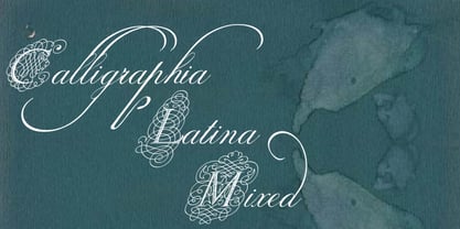
- DIN Next Rounded by Monotype,
$56.99 The name DIN refers to the Deutsches Institut für Normung (in English, the German Institute for Standardization). The typeface began life as the DIN Institute's standard no. DIN 1451, published in 1931. It contained several models of standard alphabets for mechanically engraved lettering, hand-lettering, lettering stencils and printing types. These were to be used in the areas of signage, traffic signs, wayfinding, lettering on technical drawings and technical documentation. Rooted in earlier designs for Germany's railway companies, the alphabets were based on geometric shapes in order to be easily reproducible using compass and ruler. In post-1945 West Germany, the DIN alphabets were widely used, for instance on most road signs. They became available as fonts that were appreciated by designers for their industrial, somewhat quirky and “non-typographic” look and feel. From the 1990s onwards, more refined versions became available for use in book and magazine typography. DIN Next is a typographically corrected and expanded version of this quintessential 20th-century design. DIN Next Rounded is its softer, friendlier version.
 - Mix String Cheese by Mix Fonts,
$13.00 Flexi. Bendy. Stringy. Rubbery. Introducing Mix String Cheese – the ultimate handwritten font for adding personality and playfulness to your designs. This font is perfect for logos, titles, and packaging design, and comes with a full range of characters including uppercase letters, punctuation, numbers, and special symbols and accents. Mix String Cheese is a versatile font that is sure to bring fun and creativity to all of your projects. Don’t settle for boring, generic fonts – add some flavor to your designs with Mix String Cheese.
 - Mint And Sage by Attract Studio,
$18.00 Mint And Sage is a nostalgic typeface modernized from the old style serifs of the sixties and seventies. With soft serifs suitable for many projects: invitations, postcards, posters, books, advertisements, websites, blog headers, logos, branding, magazines, fashion, photography, editorial design and many others. Typeface Features: - 3 Font Weights (Regular, Outline & Extrude) - Numerals & Punctuation - Stylistic Alternates & Ligatures - PUA Encoded Characters.
 - EF DIN 1451 by Elsner+Flake,
$35.00 - DIN 2014 Stencil by ParaType,
$30.00DIN 2014 Stencil is a stencil version of DIN 2014 typeface inspired by signage, data plates and stencilled building inscriptions. The typeface has a pronounced industrial spirit and can be used in the most rigorous conditions. DIN 2014 Stencil family consists of 18 styles which include six weights (corresponding to DIN 2014) with three grades of 'stencilness' for each weight. The typeface was designed by Vasily Biryukov and released by Paratype in 2017. - Heart Of Mine by Epiclinez,
$18.00 Heart Of Mine is a fun and cute handwritten font that allows you to add an adorable touch to your projects. This font is perfect for the Valentine's Day season, but also for any other time of the year when you want to add a little love and warmth to your writing. So what’s included : Basic Latin Uppercase and Lowercase Numbers, symbols, and punctuations Multilingual Support. Simple Installations works on PC & Mac
 - Old Man Eloquent by Three Islands Press,
$29.00 John Quincy Adams, sixth President of the United States, didn't hit his stride until he'd left that lofty office. It was during his many years in Congress that he assured his legacy, not least because of his long, masterful oratory opposing slavery. His speeches, in fact, won him the nickname "Old Man Eloquent." So when I decided to simulate Adams's penmanship in his legendary diary (which he kept for nearly 70 years), it seemed fitting to call the font by that name. I focused on his handwriting from about 1810, when he was Ambassador to Russia, but also consulted pages from later years. Old Man Eloquent has both regular and bold weights. The OpenType version has more than 450 glyphs, including alternate uppercase characters, old-style and lining figures, and numerous ligatures; all formats contain several common (English) words.
 - Mon Petit Cahier by Hanoded,
$15.00 My family and I are stuck in quarantine for a week; my eldest son tested positive for Covid19 (but everyone else tested negative), so we can’t go out. That means that the kids follow classes online. I noticed their notebooks and suddenly realised that a notebook used to be called a ‘cahier’, which is a French word meaning the exact same thing. I guess it sounded sophisticated at the time. Mon Petit Cahier (meaning: My Little Notebook) is a handmade script font. It is not meant to be awe-inspiring, nor do you want to use it for headlines or posters. It is a nice little font that feels at home wherever an unobtrusive script is needed. Comes with all the diacritics you want and a set of cool double letter ligatures.
 - Mini Pics International by NicePrice Font Collection,
$4.99 - Tin Lizzie JNL by Jeff Levine,
$29.00 One of the most unusual sets of antique stencils spotted for sale online comprises a set of twenty-four classic logos of early 20th Century automobile companies. For whatever purpose that is now lost to time, these stencils represented the logos of many of America's finest auto manufacturers; most now just historical memories. The logos were painstakingly redrawn, maintaining the distinctive look of the hand made cutting, although it was an exacting process - some of the images were taken at an angle, and a bit of artistic license had to be used as a compensatory factor. It is to be noted that any and all of the logos presented in this font are the intellectual property of the companies, successors or assignees that may still hold the rights to these symbols. No endorsements by such corporate entities are either expressed or implied. Additionally, it is advised that any use of these logos be restricted to historical or hobby purposes, and they should not be used in a way that would construe any authorized reproduction of the logos in a commercial fashion.
 - MGN Edinson Monospace by Morgana Studio,
$17.50 MGN Edinson is a modern typeface that is both stylish and versatile. This font is perfect for creating a sleek and contemporary design that will appeal to today's audiences. It has a minimalist design that is clean and easy to read, making it an ideal choice for modern digital applications. MGN Edinson is a monospace font that features a consistent width for each character, giving it a uniform look that adds to its modern aesthetic. Our new product, a cutting-edge mobile app, uses MGN Edinson font to give it a modern and professional look. The app features a sleek and intuitive design with a focus on user experience. The modern type of MGN Edinson font adds to the overall design of the app, creating a seamless and cohesive user interface. The monospace font is particularly useful for displaying data and statistics in a clear and organized way. The use of MGN Edinson font adds a touch of sophistication to the product, making it the perfect choice for users who demand high-quality design and functionality.