4,378 search results
(0.019 seconds)
- f2 Tecnocratica - Personal use only

- Tabaiba wild ffp - Personal use only

- Urban Tags by Tomatstudio,
$15.00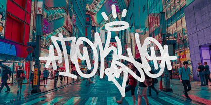 Inspired from tagging graffiti marker in the streets and my real experiences in graffiti scenes, Urban Tags comes with iconic rounded tip marker, this style often used by several graffiti artist around the world because the style is very unique, very fun to write in markers. Perfect if you want realistic Street art style or hip hop for your designs, poster, props etc. Because this is real graffiti fonts, "urban Tags" is different like other fonts, the space letter is shorter, for perfect result the Kerning you can adjust manually, because it's impossible to setting kerning like other regular fonts. I put extra glyphs for make the fonts looks more street art, use "åß∂ƒ©˙∆˚¬Ω≈ç" you can see in the preview.
 - Yseult by Scholtz Fonts,
$9.00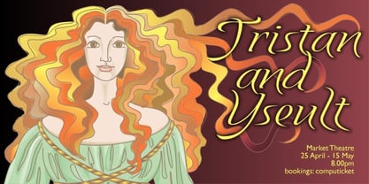 Yseult is a ultra-romantic, elegant handwritten font, reminiscent of pre-Raphaelite beauties and classical paintings. It refers to the opera Tristan und Isolde (also spelt as Yseul, Isolda etc.) in three acts by Richard Wagner. The opera was based largely on the romance by Gottfried von Strassburg. Its design was influenced by Genevieve and, less directly, by Silver Dagger. Suggestions for use: - wedding stationery - greeting cards - valentines day media - beauty product media - lingerie tags - women's magazine pages - classical music media - theatre posters The font is fully professional: carefully letterspaced and kerned. It contains over 235 characters - (upper and lower case characters, punctuation, numerals, symbols and accented characters are present). (It has all the accented characters used in the major European languages).
 - TwentyFourNinetyOne by steve mehallo,
$19.91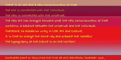 TwentyFourNinetyOne [2491] is a reinterpretation of the alphabet of 1919 by Theo van Doesburg; the original a true rendering of the thinking of the Dutch-based art movement “de Stijl.” Jump forward to 1980 and prop lettering used on the Buck Rogers in the 25th Century television series; a vernacular typeface that was a utilitarian mix of geometry and pixel-based forms, used to symbolize the futuristic universe of 2491. At times it would appear on spaceships, laser guns, signage at space ports or in one episode, a Spandex tapestry. It only seemed logical to combine and rethink the letterforms, add ligatures + other extras, and see what the results would be. Futuristic, fun and bold to read! 2491: In the future, all type will look like this.
 - Bonhomme Richard by Three Islands Press,
$39.00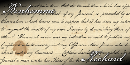 Bonhomme Richard evokes the cursive penmanship of Chevalier John Paul Jones (1747–1792), celebrated Continental Navy commander during the American Revolution, in letters from the late 18th century. The font’s name comes from Jones’s famous frigate, lost during his victorious engagement with the British in the Battle of Flamborough Head in 1779. During this battle Jones is said to have exclaimed, when urged to surrender, “I have not yet begun to fight!” (In fact, his likely words were, “I may sink, but I’ll be damned if I strike!” – i.e., surrender.) A legible script, Bonhomme Richard has an elegance about it while also conjuring the colonial era of its source material. Use to simulate historical handwriting in film props, games, formal invitations, product labels, and the like.
 - Monarky by YXType,
$22.00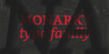 Monark family is designed with legibility and wide language support in mind. Rooted in Fyodor Dostoevsky's Crime and Punishment, it captures the anguish & distortion atmosphere and suppresses them into ruthless letterforms. Top-heavy stems, heavy serifs, and low-contrast forms are all extractions of Dostoevsky's dilemma. Rest assure this typeface would bring you all the needs for advanced typography with true small caps with symbols, 4 styles of figures, support for inferior/superiors, and more than 200 Latin languages. Features: • Support for 200+ Latin languages • Low contrast with unique details • Unique Italic letterforms • Small caps with symbols • Arbitrary and pre-defined fractions • Support for superscript & subscript in normal & scientific alignments • Proportional lining, proportional old-style, tabular lining, tabular old-style
 - Rabbits by Piñata,
$9.00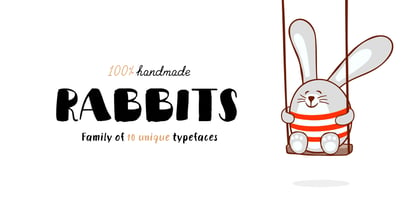 Rabbits is a super emotional hand-written font family that unites 10 different fonts. We’ve united these fonts with one common theme - childhood. Use these fonts to create any products for kids — children’s books layouts, mobile applications for children, as well as nursery interior design. We’ve given each rabbit a unique name. The names are arranged as the first 10 letters of the Latin alphabet: A — April, B — Bro, C — Chili, D — Dummy, E — Elf, F — Fatso, G— Goody, H — Hyper, I — Idol, J — Junior. Each rabbit has its own character, and you’ll definitely like Rabbits because of that. We’ve used an individual writing tool for every font. All the fonts were created on paper first and then digitized. Now, what’s your favorite rabbit?
 - Gaudeamus by Znakomesto,
$35.00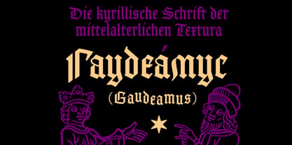 Gaudeamus is a Cyrillic face of medieval Gothic textura inspired of incunabulum artworks. Recommended for a historical and cultural context, but it goes well beyond. Suitable for music, books, fashion, catering, packaging and more. Works for long paragraphs and short sentences. Features: — 7 Stylistic sets; two of which are text preformats to the commons of the Middle Ages and Early Modern historical periods. — Sets of Ordinal and Superscript characters for French, Portuguese, Spanish typesetting. — Localized letterforms for Bulgarian and Serbian. — Localized diacritics for Polish and Romanian. — Support typesetting in Russian pre-reform orthography. — Support typesetting in Middle English orthography. — Case sensitive characters for greater consistency with uppercase letters. — Set of Roman Numerals. — Standard and Discretional ligatures. — 530 glyphs; 40 languages support.
 - Perspective Sans by Bülent Yüksel,
$29.00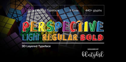 The font primarily had a strong body. Family has a four layered experience. All and in harmony. This font has a strong personality, that makes it perfect for use in headline sizes. Also use for print, motion graphics, logo design, packaging design, t-shirts and more. By using layers, you can design different colors and sizes by repositioning lights and shadows. This will allow you to take your designs to the next level. Using this unique font, you'll have a lot of fun and produce beautiful materials. You can contact me at buyuksel@hotmail.com, pre-purchase and post-purchase with questions and for technical support. There is nothing as satisfying as to do a good quality and properly job. You can enjoy using it.
 - Memorandum SG by Spiece Graphics,
$39.00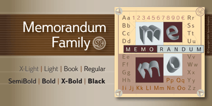 Here is an extremely efficient and uncluttered typeface that you can use in a variety of situations. Memorandum’s orderly and methodical nature makes it a natural for long blocks of text, for captions, or for corporate slogans. Try using this typeface where space is limited and legibility is a big concern. And Memorandum is great for constructing tables and charts for business presentations, too. Memorandum is now available in the OpenType Std format. Expanded pre-built fractions, numerators, denominators, and stylistic alternates are now combined in each style. These advanced features work in current versions of Adobe Creative Suite InDesign, Creative Suite Illustrator, and Quark XPress. Check for OpenType advanced feature support in other applications as it gradually becomes available with upgrades.
 - "Black Metal Logos" isn't a specific font you'll find pre-made in font libraries, but rather it encapsulates a unique and intense style of typographic design deeply rooted in the black metal music sc...
- Prussian Brew Offset is a distinct typeface that beautifully merges historical essence with contemporary design flair. Crafted by Apostrophic Labs, renowned for their eclectic and often experimental ...
- Martin Luther by Harald Geisler,
$59.00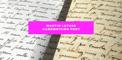 ❧ Useful links: Luther’s Manuscripts at the UNESCO Memory of the World at Google Arts and Culture Martin Luther font on Kickstarter (with Film about the creation) Each letter of the Martin Luther font is strictly based on original samples found in Martin Luther’s 500 year old handwritten manuscripts. Letters that occur more often for example vowels have two or more different versions stored in the font. (➶ Figure 4) These alternative forms are exchanged automatically by the font as you type, and create a vivid look that comes close to actual handwriting. The font avoids that two identical letters are placed next to each other like, for example the two “o” in the word “look”. ➸ What Historic Sources is the Font based on? Two historic documents were used to base the font on. The notes Luther took before giving his speech in Worms in 1521 and a 6 page letter he wrote immediately after to Emperor Charles V., summarising his speech (➶ Figure 2). Both documents have been added to the UNESCO “Memory of the World” and can be seen at the Google Arts and Culture website. ➸ The Creation of a Handwriting Font The creation of a handwriting font is very different from the creation of a regular font. Harald Geisler has specialised in recreating handwriting in preceding projects with Albert Einstein’s, Sigmund Freud’s and his own handwriting. His experience working with Archives and Museums has gone into this project. First Geisler analyses the movement in the writing to understand how each letter is drawn. This involves partially learning how to write like a person. In this process not the outlines of the sample are reproduced but the original movement path of the handwriting (➶ Figure 3). In a second step width and contrast is added to reproduce Martin Luther’s characteristic impetus and the writing tools used at the time. (Link: Youtube Playlist showcasing the creation of individual letters) How about signs that can’t be found in archives? Some Glyphs can not be found in 500 year old manuscripts, for example the @-sign. Towards the end of the creation one collects a profund amount of details about how a writer moves on paper and addresses certain tasks moving the pen. Keeping this knowledge in mind an improvisation can be based on similar letter forms. For example the @ sign is based on of the movement of a lowercase a and parenthesis. ➸ Features of the Martin Luther font ❶ Extensive Documentation of the creation of the font, including high quality reproduction of the used manuscripts. ❷ Additional texts from Historian Dr. Henning Jürgens and Palaeographer (and Luther handwriting expert) Prof. Ulrich Bubenheimer ❸ Alternating Letters - in handwriting every word looks a bit different. To avoid that two identical letterforms are placed next to each other (for example in the word look) the font actively changes between different versions of letters as you type. ❹ Ligatures - characteristic writing forms when two letters are combined (for example “ct”) (➶ Figure 5) ❺ Terminal Letterforms - renders a special letterform when letter is at the end of a word. (➶ Figure 8) ❻ ‘’’Initial and Medial Letterforms''' - some letterforms are different when placed in the beginning or middle of a word, for example the lowercase s. ❼ Luther Rose - is a seal Luther used to authorise his correspondence. Today it is a widely recognized symbol for Luther. When you enter the numbers of Luthers year of birth and death 14831546 using the Martin Luther PRO font, it will render a stylised version of the Luther Rose. (➶ Figure 7) ❽ Historic letter-forms - letter-forms that are specific to medieval writing around 1500. For example the long-s or h with a loop at the bottom. (➶ Figure 6) ⚑ Multi language support - see the technical information tab for a full list of supported languages. (➶ Figure 11) ➸ The different Styles explained ❋ Martin Luther PRO - this includes all features listed above and is geared towards writing texts that are more readable today. It features alternating letters to create a natural handwriting look as well as two stylistic sets accessible through the OpenType menu. Historic forms are available through the glyph picker. ❋ Martin Luther Historic - this font creates a historically correct reproduction (i.e. with long-s) of Luther’s medieval latin handwriting. It features alternating letters to create a natural handwriting look as well as two stylistic sets accessible through the OpenType menu. ❋ Martin Luther Expert-1 - Dedicated access to the first set of letters only. ❋ Martin Luther Expert-2 - Dedicated access to the second set of letters only. ❈❈❈ Family Pack - recieve all fonts at a discounted price. ❈❈❈ ➸ Kickstarter The creation and development of the Martin Luther font was financed by 500 supporters on ➸Kickstarter.
 - Avenir Next Paneuropean by Linotype,
$99.00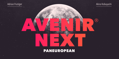 Avenir Next Paneuropean is a new take on a classic face—it’s the result of a project whose goal was to take a beautifully designed sans and update it so that its technical standards surpass the status quo, leaving us with a truly superior sans family. This family is not only an update though, in fact it is the expansion of the original concept that takes the Avenir Next design to the next level. In addition to the standard styles ranging from UltraLight to Heavy, this 56-font collection offers condensed and semi condensed faces that rival any other sans on the market in on and off—screen readability at any size alongside heavy weights that would make excellent display faces in their own right and have the ability to pair well with so many contemporary serif body types. Overall, the family’s design is clean, straightforward and works brilliantly for blocks of copy and headlines alike. Akira Kobayashi worked alongside Avenir’s esteemed creator Adrian Frutiger to bring Avenir Next Pro to life. It was Akira’s ability to bring his own finesse and ideas for expansion into the project while remaining true to Frutiger’s original intent, that makes this not just a modern typeface, but one ahead of its time. Complete your designs with these perfect pairings: Dante™, Joanna® Nova, Kairos™, Menhart™, Soho® and ITC New Veljovic®.
 - Ambroise Std by Typofonderie,
$59.00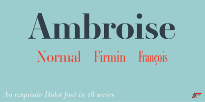 An exquisite Didot font in 18 series Ambroise is a contemporary interpretation of various typefaces belonging to Didot’s late style, conceived circa 1830, including the original forms of g, y, &; and to a lesser extent, k. These unique glyphs are found in Gras Vibert, cut by Michel Vibert. Vibert was the appointed punchcutter of the Didot family during this period. It is the Heavy, whom sources were surest that Jean François Porchez has been used as the basis for the design of the typeface family. In the second half of the 19th century, it was usual to find fat Didots in several widths in the catalogs of French type foundries. These same typefaces continued to be offered until the demise of the big French foundries in the 1960s. Ambroise attempts to reproduce more of what we see printed on paper in the 19th century; a more accurate representation of Didot punches. So, the unbracketed serifs are not truly square straight-line forms but use tiny transitional curves instead. The result on the page appears softer and less straight, particularly in larger sizes. The illustrious Didot family of type founders and printers Every variation of the typeface carries a name in homage to a member of the illustrious Didot family of type founders and printers. The condensed variant is called Ambroise Firmin. The extra-condensed is called Ambroise François. Ambroise Pro brought back to life: fifteen years in the making! Club des directeurs artistiques, 48e palmarès Bukva:raz 2001
 - Trump Script by Canada Type,
$29.95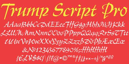 One of the earliest fonts published by Canada Type was Tiger Script, Phil Rutter's digitization of Jaguar, Georg Trump's 1967 wild calligraphic brush face. In 2010, when the font was revisited for an update, it was shown that it too light for applications under 24 pt, and too irregular for applications over 64 pt. So the face was redigitized from scratch. This new digitization brings a more seamless contour and a much steadier stroke, and much better outlines for use at both extremes of scaling. Language support was also greatly expanded, and many alternates and ligatures were added to the redigitized character set. The name was also changed to Trump Script, to better reflect the origins of the design. Trump Script is a master calligrapher's hand producing very uncommon jolts and bursts of sharpness. It showcases some of the most suprising letter forms ever drawn, like the very unique treatments of B, K, W, Y and Z. In the lowercase one can see the cattiest g ever made, and some of the wildest shapes in the f, j, p, y and z. Trump Script comes in all popular formats. The TrueType and PostScript packages are comprised of two fonts. The OpenType version, Trump Script Pro, combines both fonts into one, and includes features for intelligent substitution in software that supports advanced typography. Language support includes Western, Central and Eastern European character sets, as well as Baltic, Esperanto, Maltese, Turkish, and Celtic/Welsh languages.
 - Enocenta by insigne,
$22.00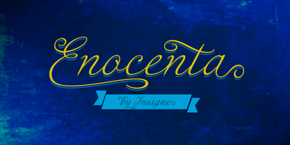 Enocenta is fully featured script face. Like a wild, untamed beauty in the moonlight, Enocentaís flowing calligraphy dances across the page. This contemporary typeface is not slavishly devoted to convention, and instead it defies it repeatedly. The face has bit more character than most high contrast script faces and attracts your readers eye. This spicy and flavorful collaboration between Jeremy Dooley and Cecilia Marina Pezoa. Enocenta is a five weight script typeface that offers a variety of options for you to design beautiful things. Enocenta is friendly and warm, and it's hairline weight is simple and clean while its bold is strong and draws attention. Its contemporary appearance is right home on the web or wherever your canvas may be, whether that is packaging, magazines and invitations. It's also a fantastic choice for branding and can be quickly converted into a distinctive logo when applying its options to customize the look and feel so the brand is unique. Enocenta is packed with alternates, swashes, ligatures, and also other techy perks. To discover its complete feature set, please use it with software that supports OpenType options for sophisticated typography. There are a number of purchase options for the face. The Pro fonts are loaded with the full set of alternates, ligatures and ornaments. The Standard types are contain no decorative alternates but are an affordable starting point for designers that don't need the full features.
 - Soho by Monotype,
$29.99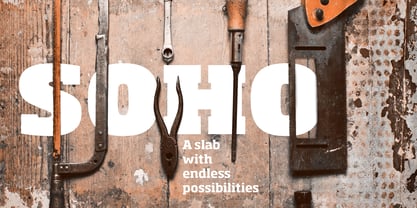 Soho is the latest addition to the growing range of typefaces from Sebastian Lester. This grand opus of a project resulted in a typeface that comprises nine weights and five widths of precision engineered OpenType. 40 fonts, 32,668 characters and 24 OpenType features. Hot on the heels of the popular Neo Sans and Neo Tech range, and his first typeface release Scene, Soho represents three years of work by Lester. As a type designer I'm preoccupied with finding ways in which I can address modern problems like good legibility in modern media, and create fonts that work precisely and efficiently in the most technically demanding of corporate and publishing environments." Slab serif typefaces are enjoying something of a renaissance, offering versatility whether for corporate identity, product branding, text or display use. With 40 weights to choose from Soho gives designers endless possibilities from the ultra chic lines conveyed by the lighter weights to the rock solid statement made by the heavier weights. Soho is cross-platform compatible. The Pro version provides extended language support for Central European languages. Used in conjunction with software applications that support OpenType many useful features like "stylistic sets" can be leveraged -- in which a wide variety of alternative characters can be introduced at the click of a mouse button giving one font several "tones of voice" from conservative to cutting edge. The wide range of glyphs includes ligatures and small caps."
 - Renata by Laura Worthington,
$25.00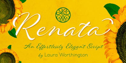 Both casual and upscale, Renata features inviting. languorous letterforms, stroked by the hand of an experienced calligrapher with a small brush-tipped pen. Renata is quite readable thanks to its high x-height and spacious connecting strokes. It also looks exceptionally natural – every lowercase letter includes an alternate of each letter and a beginning, ending, and an “isolated” form (useful for settings like “mar y sol,” “o sole mio”; lettered lists; and creative uses like wordmarks). Renata features 119 swashes for a custom look and feel. See what’s included! http://bit.ly/2fQYX6B This font has been specially coded for access of all the swashes, alternates and ornaments without the need for professional design software! Info and instructions here: http://lauraworthingtontype.com/faqs/
 - Arquitecta by Latinotype,
$26.00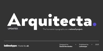 Arquitecta. The humanist typography as a rational project. Since the experimentation from the Bauhaus through modern sans history we looked for a new mix to construct a rational geometric typeface with humanist proportions suitable for text layout and continuous reading. Inspired by American & European hand lettering from the first half of the past century, Arquitecta finds his own space as a great alternative for paragraphs in front of classics like Futura, Kabel or Avant Garde. The family contains 8 upright romans and 8 italics with the following features: - European accents, Old Style Numbers, Numerators & Fractions. - Ink traps to avoid press impressing spots & hinting optimized. - Small X-height with accentuated ascenders y descenders. Upgrade Mar 2023: Contours were corrected and the set was extended to the current Latinotype.
 - Space Race by Comicraft,
$19.00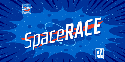 Attention Space Rangers -- the Race into Space is on again! Science Fiction long ago became Science Fact and scientists are looking Beyond Earth, Beyond the Moon to Mars, Infinity -- and BEYOND! Comicraft’s Ace Rocket Scientist and Secret Weapon, John “Buzz” Roshell has spent years in our Underground Laboratory developing Accelerated Font Technology for the Space Age in which we live. SPACE RACE has curved contours and a sleek fuselage that will ensure our Rangers will be the FIRST WOMEN (and MEN) on planets in this Solar System and those of other stars! Now available for less than the cost of powdered astronaut ice cream. Space Race has been expanded into Hyperspace Race, a forty-weight family with a variable font.
 - ITC Clearface by ITC,
$45.99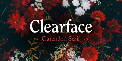 The Clearface types were originally designed by Morris Fuller Benton in 1907. Their forms expressed the Zeitgeist of the turn of the 20th century; typical and distinguishing characteristics are the forms of the a" and the "k." The ATF version did not include an accompanying Italic. In 1978, ITC's Victor Caruso was licensed by ATF to develop a new serif typeface and matching italic based on the forms of Clearface. The result was ITC Clearface, a serif typeface with marked stroke contrast and italic weights. The teardrop-formed endings of the lowercase a, c and f (also found in Caslon) define the character of the face. The type's design is also distinguished by its small -- almost slab -- serifs, a large x-height, and little stroke contrast. ITC Clearface, with its historical touch, is good for both texts and headlines, but its slightly condensed nature performs at its best when it is allowed its space.
 - Brexit by Cafe.no,
$48.00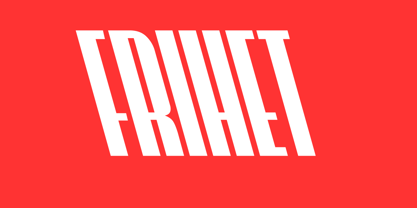 Brexit now has its own typeface. Brexit the type family is made for being slanted one way or another, to offer stylistic choices and expressions, like for or against, or remain or leave. Because Brexit is international, the letters are made to support many languages. The name is given to mark the British withdrawal from the European union. Brexit is an elongated display typeface in three styles. It is a sans serif with contrasts in stroke and shape. Brexit supports languages with latin characters and ligatures as well as Greek and Cyrillic. The italic and contra italic are extremes that can be used to contrast each other or versus a standing regular. Sometimes complex concepts are best communicated in single words, and the typeface Brexit is made for that and more. The typeface works well for clear messages, shop displays, poster work, menus, signage and other purposes where you want to have impact.
 - Spannerz by MKGD,
$13.00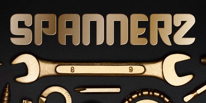 Spannerz is a font that is a bit of a chimera. It has the rather machined appearance of tools, particularly wrenches, from which it takes it's name, but it also possesses the characteristics of fonts used for science fiction, early era computers, and an unusual 1970's feel found in its soft, somewhat bloated, outer edges. Spannerz has a glyph count of 398 and supports the following languages Afrikaans, Albanian, Asu, Basque, Bemba, Bena, Bosnian, Catalan, Chiga, Colognian, Cornish, Croatian, Czech, Danish, Embu, English, Esperanto, Estonian, Faroese, Filipino, Finnish, French, Friulian, Galician, German, Gusii, Hungarian, Icelandic, Indonesian, Irish, Italian, Kabuverdianu, Kalaallisut, Kalenjin, Kamba, Kikuyu, Kinyarwanda, Latvian, Lithuanian, Low German, Lower Sorbian, Luo, Luxembourgish, Luyia, Machame, Makhuwa-Meetto, Makonde, Malagasy, Malay, Maltese, Manx, Meru, Morisyen, North Ndebele, Norwegian Bokmål, Norwegian Nynorsk, Nyankole, Oromo, Polish, Portuguese, Romanian, Romansh, Rombo, Rundi, Rwa, Samburu, Sango, Sangu, Scottish Gaelic, Sena, Shambala, Shona, Slovak, Slovenian, Soga, Somali, Spanish, Swahili, Swedish, Swiss German, Taita, Teso, Turkmen, Upper Sorbian, Vunjo, Walser, Zulu
 - Alta California by steve mehallo,
$18.80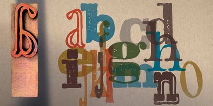 Alta California became designer steve mehallo's "vector-based artist's response" to the early Apple Macintosh bitmapped font San Francisco. Alta California was developed using "sampled" wood type and letters from numerous historical sources. The name comes from the Alta California newspaper, the first daily published in California, one of a dubious Barbary Coast nature, a sheet that shaped the bias of San Franciscans and attracted its own grade of reporters, including a printing specialist who went under the nom de plume Mark Twain. Alta California's edges were meticulously redrafted by hand, with letterpress-inspired fallout and 19th century pointing hands. The final collection of rough hewn letters jump, dive, fall, zag and zig. Alta California looks great on greeting cards, food packaging, as retail signage for boutiques, vintage stores or at D.I.Y. sales, on band posters or club cards, in and around historical quarters, or for use on any ransom note that needs to evoke a wild west look and feel.
 - Rough Print JNL by Jeff Levine,
$29.00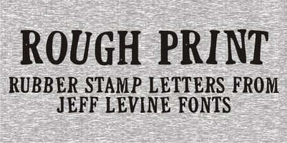 The Superior Marking Equipment Company was originally located in Chicago, Illinois and over the years produced a line of both commercial and toy rubber stamp printing sets which were used for making signs, posters, tickets and other printed items. Rough Print JNL reproduces the scanned images printed from one of the toy rubber stamp sets. The sample characters were smaller than one half inch in height and were further reduced during scanning. This gives the end result of a typeface which looks like rubber stamp imprints at small sizes, and very angular, distorted, somewhat grunge type when printed at larger sizes. There is a limited character set consisting of alphabet, numerals, some punctuation and currency symbols. No kerning was added to keep the hand-made appeal. Rough Print JNL is an all caps font with the letters and numbers jogged randomly on both the caps and lower case keystrokes. For a similar design with lower case, Amateur Printer JNL is recommended.
 - Mocking by Sohel Studio,
$16.00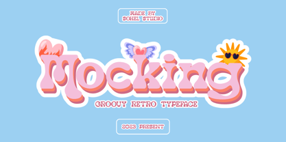 Mocking – Retro Groovy Font With A Childish Touch . Font is the perfect choice for projects that need a playful and quirky touch. Inspired by the groovy era of the 1960s and 70s, this font combines a fun and childish style with a hint of nostalgia. It features bouncy curves and playful swashes that will make any design stand out. With uppercase and lowercase letters, numbers, and punctuation marks, as well as several alternates and international characters, the Groovy Font is a versatile choice for a variety of projects. Whether you're creating posters for a music festival, designing a retro-themed event, or simply adding a touch of whimsy to your designs, the Groovy Font is sure to bring a smile to your audience's face. Mocking Features: · Uppercase & Lowercase · Alternates · Numerals & Punctuation · Accented characters · Multilingual Support · Unicode PUA Encoded So add a touch of groovy style to your next project with Mocking Font! If you want the SVG version please contact me. Thanks and have a wonderful day .
 - Technical Stencil VP by VP Type,
$24.00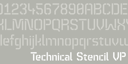 Technical Stencil VP is the stenciled version of Technical Standard VP and the two typefaces can be used either on their own or together seamlessly. The initial inspiration for their design came from examining the various types of precisely machined labels on tools from cameras to cars, which need to be perfectly legible at all sizes. The unique streamlined look such processes achieve was carefully reinterpreted and the resulting fonts are at the same time robust and stylish, both universal and unique. Technical Stencil VP includes ten distinct styles, offering great versatility. All styles in this family include an extensive Latin character set, the Greek alphabet, multiple sets of numerals, a large set of punctuation marks, and other symbols. With 1120 glyphs in each style, it guarantees full support for all Latin languages. To make the family even more powerful, twenty OpenType features are included, such as multiple vertical positions, diagonal fractional forms, optional slashed zeros, separate old-style and lining figures, small capitals, and contextual alternates.
 - Retail Packaging JNL by Jeff Levine,
$29.00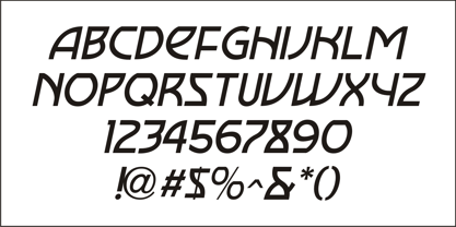 The retail storage box for a vintage metal numbering stamp manufactured by the American Numbering Machine Company had its brand name hand lettered in an Art Nouveau style that most likely went back to the 1920s, as the company was in existence from 1908 to around 1971. Numbering machines were used in offices, schools, libraries, and anywhere a series of numbers needed to be marked onto printed items. Similar to what was called a ‘crash numberer’ used in letterpress shops, the machines could be set to do a run of digits [for example: 4000, 4001, 4002] or repeat numbers for forms used as carbon copies. As computers took over most forms of printing, the use of numbering machines dwindled, but they are still available. The American Numbering Machine Company was one of several Brooklyn, New York companies that specialized in the manufacture of these machines. Retail Packaging JNL replicates the lettering from their packaging, and is available in both regular and oblique versions.
 - Sella Sionisa by Gatype,
$12.00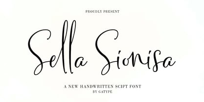 Sella Sionisa is an elegant smooth script font. With bold contrasting strokes, a playful character with a bit of binder and alternatives. To give you extra creative work. This font is great for logo esigns, Social Media, Movie Titles, Book Titles, short text even long text fonts and is great for your secondary text fonts. Create stunning masterpieces with the Sella Sionisa font. contains a full set of lowercase and uppercase letters, a wide variety of punctuation marks, numbers, and multilingual support. Alternative characters are divided into several Open Type features such as ,Alternative Style. The Open Type feature can be accessed using intelligent Open Type programs such as Adobe Illustrator, Adobe InDesign, Adobe Photoshop version of Corel Draw X, and Microsoft Word. And this Font has provided PUA unicode (custom coded font). so that all alternative characters can be easily accessed in full by a craftsman or designer. Thank you for your purchase.
 - Rondey by Craft Supply Co,
$20.00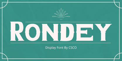 Introducing Rondey – Display Font A Bold Serif with a Twist Rondey is a captivating Display Font that combines bold serifs with a unique twist, making it ideal for display purposes. Display Elegance Rondey’s design exudes an elegant charm that’s perfect for grabbing attention in various display contexts. Versatility for Diverse Projects Moving beyond its captivating elegance, Rondey’s versatility shines through, allowing it to seamlessly complement a wide range of creative projects. Captivating and Memorable Rondey ensures that your content is not only captivating but also memorable. It leaves a lasting and distinctive impression that sets it apart. In Conclusion In summary, Rondey – Display Font is a font designed to captivate in the world of display typography. Its unique twist on bold serifs adds an elegant touch to your projects. Whether it’s for branding, posters, or a myriad of creative endeavors, Rondey’s versatile and captivating design caters to a broad readership, ensuring your content leaves a memorable and distinctive mark.
 - Bodoni by Linotype,
$29.99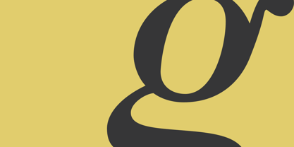 Giambattista Bodoni (1740–1813) was called the King of Printers and the Bodoni font owes its creation in 1767 to his masterful cutting techniques. Predecessors in a similar style were the typefaces of Pierre Simon Fournier (1712–1768) and the Didot family (1689-1836). The Bodoni font distinguishes itself through the strength of its characters and embodies the rational thinking of the Enlightenment. The new typefaces displaced the Old Face and Transitional styles and was the most popular typeface until the mid-19th century. Bodoni’s influence on typography was dominant until the end of the 19th century and, even today, inspires new creations. Working with this font requires care, as the strong emphasis of the vertical strokes and the marked contrast between the fine and thick lines lessens Bodoni’s legibility, and the font is therefore better in larger print with generous spacing. The Bodoni of Morris F. Benton appeared in 1911 with American Type Founders.
 - Reliant by Intellecta Design,
$32.90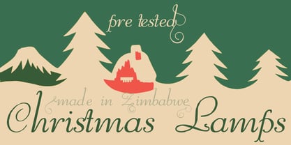 Reliant is a free interpretation of the classic design from fonts "BernhardSchoenschrift", originally designed by Lucien Bernhard and "Liberty", designed by W.T. Sniffin for ATF in 1927, following the original designs from Lucien Bernhard. This enhanced OpenType version has complete sets in Greek and Latin alphabet with Central European, Vietnamese, Baltic and Turkish complete resources with all diacritic signs and punctuation marks plus extra characters belonging this ranges. A Cyrillic alphabet completes the font, and we thanks to Dmitry Greshnev from Green Type. He help us to fix our original Cyrillic alphabet to the Cyrillic readers. We added a extensive set of ligatures (stylistic and contextual alternates plus discretionary ligatures) providing a lot of letterform variations that make your design really special, plus swashes and tails ornaments (to artistic increase any letter of this font) more fractions and number ligatures (a strange idea from Iza W). Over 800 glyphs which you have total access using software such as InDesign, Illustrator, QuarkXpress and others.
 - Mogetson by Gatype,
$12.00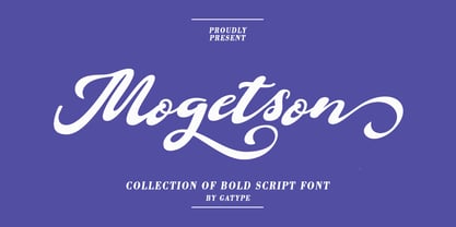 Mogetson is a cursive script font. With bold contrasting strokes, a playful character with a bit of binder and alternatives. To give you some extra creative work.. This font is great for logo designs, Social Media, Movie Titles, Book Titles, short text even long text fonts and is great for your secondary text fonts with sans or serif. Create stunning masterpieces. mogetson fonts contains a full set of lowercase and uppercase letters, a wide variety of punctuation marks, numbers, and multilingual support. Alternative characters are divided into several Open Type features such as ,Alternative Style. The Open Type feature can be accessed using intelligent Open Type programs such as Adobe Illustrator, Adobe InDesign, Adobe Photoshop version of Corel Draw X, and Microsoft Word. And this Font has provided PUA unicode (custom coded font). so that all alternative characters can be easily accessed in full by a craftsman or designer. Thank you for your purchase.
 - Movie Script by Wiescher Design,
$39.50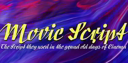 Movie Script is the script that was used in German movie-brochures. Those were small four page leaflets with a lot of sepia-colored pictures about the movie one was about to see. Today those things are collectors items. The script was also used on those hand-painted posters above the cinema entrance. I cleaned up the old script and made it just a little bit more readable, but overall I left it as it was. Of course I added the necessary glyphs for today's world, like Euro and so on. When I was a kid, my grandfather gave me 1 German Mark and I could go to the movies matinee, that was around 10:30 in the morning, the entrance cost something like 60 Pfennig and the rest was for peanuts and a drink. Still today I love my grandfather for that, movies introduced the world to me (no TV then). Your grandfather-loving designer Gert Wiescher
 - Favio by Anastasia Kuznetsova,
$17.00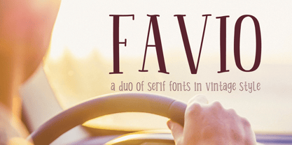 I present to you an elegant, playful and very harmonious duo of serif fonts "Favio", inspired by ancient printed texts. It looks great on its own as part of a minimalist design. Play with letters to get different effects. The font "Favio" is guaranteed to give your text an individual and very attractive look. Great for branding, wedding invitations, packaging, quotes and labels. And it is also a bold choice of typography for the design of logos, album covers, illustrations, children's books, posters and much more. Font Features: - A-Z; a-z character set; - 1 language (English); - numbers and punctuation marks, symbols. Fonts can be opened and used in any software that can read standard fonts, even in MS Word. No special software is required to get started. It is recommended to use it in Adobe Illustrator or Adobe Photoshop. Made with love and magic ♡ Thank you for reading it, and do not hesitate to send me a message if you have any questions! ~ Anastasia
 - KT Quantum by Kotivoro Lab,
$11.00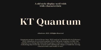 KT Quantum is a Display Serif Typeface with 8 weight from Thin to Extrablack. Quantum adapted from 1911 old style serif typeface, Our mindset is to bring this historical typeface to this era, which is we have to redrawing that from the scratch and refining the shape to build the strong characteristic and make it ours. KT Quantum have total 434 glyphs and 203 language support. Quantum support latin basic, latin-1 supplement, latin extended A-B, Spacing modifier letters, and combining diacritical marks. This typeface have a bold characteristic with masculine and feminine effect in the same time, that's make this typeface suitable for your Headline and sub-headline, we don't recommended to use it as body text in small size, because it has a very large contrast and reduce the legibility and readability Whats Include: Webfont is available if you purchase the webfont option and we will send the file direct to download it. Enjoy & Happy Creating We're Here Tapinkco@gmail.com
 - Flefixx by Sun Young Oh,
$54.00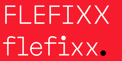 Flefixx is a typeface designed to support a project "Flefixx", an idiosyncratic visual language and typeface system that unfolds narratives based on common combinations of letters. In this visual language, just as individual letters come together like puzzle pieces to form different meanings or words based on combinations, the typeface is also constructed from fragmentary elements, each playing a distinct role as if they are individual pieces. The intentional exposure of the intersections of these fragments emphasizes the typeface's creation through interconnected elements. Furthermore, diacritics and dots are strategically positioned as ornaments, enhancing their presence within the gaps between letters. This concept aligns with the theme of composition and connectivity among fragments, allowing strong rhythmic patterns to emerge as letters and symbols blend in a paragraph. Additionally, the prominent and bold punctuation marks serve to provide pauses and clarity within sentences that incorporate both letters and the visual language. They contribute to articulating sentence structure amidst the dynamic flow of sentences with combined characters and visuals.
 - Cervantes by Gatype,
$12.00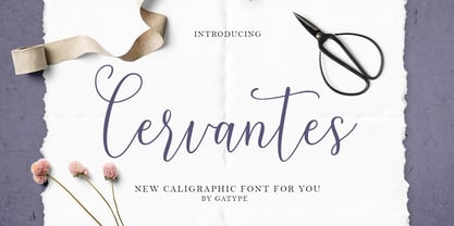 Cervantes is a beautiful modern calligraphy typeface, I hope you will be interested in this font, if you want to use it for your work. This font can be used easily and simply because there are many features in it. contains a full set of lowercase and uppercase letters, a wide variety of punctuation marks, numbers, and multilingual support. Cervantes would be perfect for invitations, logo & branding, photography, advertising, watermarks, social media posts, product packaging, product designs, labels, wedding designs, stationery, special events, or anything that needs a handwritten feel. Cervantes comes with 353 glyphs. Alternate characters are divided into several Open Type features such as ,Alternative Style. The Open Type feature can be accessed using intelligent Open Type programs such as Adobe Illustrator, Adobe InDesign, Adobe Photoshop version of Corel Draw X, and Microsoft Word. And this Font has provided PUA unicode (custom coded font). so that all alternative characters can be easily accessed in full by a craftsman or designer. Thank you for your purchase.

