4,378 search results
(0.026 seconds)
- Fat Albert BT by Bitstream,
$50.99 Ray Cruz releases another typeface family, this time inspired by 1970's pop culture. Fat Albert Regular, Outline and Shadow are bold poster types that evoke the fun and funk of an era gone by. Go on bro, get Fat Albert and get down.
 - Nouveau Boutique JNL by Jeff Levine,
$29.00 A light and playful sans serif type design with Art Nouveau influences was called “Tasso” within the pages of the 1893 edition of the Barnhart Bros. & Spindler type specimen book. This is now available as Nouveau Boutique JNL in both regular and oblique versions.
 - Microphone Check by IKIIKOWRK,
$19.00 Proudly present Microphone Check - Marker Type, created by ikiiko Microphone Check is inspired by the bold and expressive signature strokes of the 90s street hip hop movement. In that era, freestyle marking was a method of self-expression that was closely associated with the underground graffiti scene. This typeface perfectly encapsulates the vitality, attitude and resilience of life on the streets. Sharp lines with bold, bold bodies characterize this type of marker, allowing for substantial fills and bright colors to stand out on any surface. It gave them the opportunity to express their originality and creativity while leaving their mark on the urban environment. This type is very suitable for making a street wear brand, book cover, movie title, magazine layout, poster, quotes, or simply as a stylish text overlay to any background image. What's Included? Uppercase & Lowercase Numbers & Punctuation Alternates & Ligature Multilingual Support Works on PC & Mac
 - Cowgirl by By Meg Burk,
$25.00 An uppercase font that has versatile character. Got a story to tell? Cowgirl can help you tell it. Includes western-themed vector illustrations handmade by Meg Burk. I grew up spending almost every family vacation as a road trip across the southwestern US. In these adventures, I fell in love with learning about the nature around us; deserts, mountains, plains, piñon trees, rainbow trout, black bears, eagles, and more. I fell into freezing cold white water rapids, explored long-abandoned cliff dwellings, camped under the Milky Way, saw old cave markings, stone markings, preserved art, and read many a many old map legends. These memories are visceral and the inspiration that I get from them permeates my every day. Take a piece of these stories with you and use them in your designs, too. Handmade, meant to last a lifetime and inspire others for decades to come.
 - Raljon by Mmarkk,
$22.22 Raljon is a display typeface created by designer and lettering artist Mark Robinson. It is a collaboration between the Mmarkk and Teen-Beat Graphica visual design studios. This single font was created over a period of five years. Mark took great care in finessing each character and making sure that each character would stand on its own and yet simultaneously, be an integral part of the whole. The typeface is inspired by Gothic letterforms, horror novels, speed metal bands of the 1980s, techno and electronic music of the 1990s, and Washington, DC football teams whose stadiums lie in the Maryland suburbs. While it doesn’t have multiple weights, Raljon does have a deep depth and breadth. It has a seemingly endless amount of alternate characters and ligatures. There are nine letter Ms, eight letter As and Fs, seven Rs and Ts, and the list goes on. Even the figures have alternates.
 - Antoinette Monogrammes by Dharma Type,
$19.99 Antoinette Monogrammes is a monogram font based on old embroideries in the early 20th century by Janon Co. This font includes Upright script capitals and Normal slanted script capitals and 24 fancy frames. By combining each letters and frames, you can make your own monogram. And Every letters and frames were added handwritten effect to make warm and handcrafted impression. How about making monogram for wedding card, scrap book, stamp, logo? Upright script capitals can be accessed by typing Uppercase keys(A, B, C ....) and Slanted script capitals by lowercase key(a, b, c ...). Frames are 0-9 and exclamation mark(!), at mark(@), number sign(#), dollar($), percent(%), ascii circumflex(^), ampersand(&), asterisk(*), left and right brackets(()), period(.), comma(,), less and greater(). You need to arrange and set the position manually to finish making monograms. Please use graphic applications such as adobe illustrator or photoshop but not microsoft word.
 - Acarau Display by Tipogra Fio,
$30.00 Acarau is a 6 fonts display typeface with high reverse contrast—since from Roman capitals and calligraphy, usually Latin alphabet letters have thiner horizontal steams and thicker verticals, these features being optical or visual—quite adequate for logos, headlines and posters. Moreover, the style of the typeface is inspired by Italics form factor: lowercase letters having less strokes to make their shapes; A has one story; E has one stroke shape, such as K, G, Y and Z; F has a descent. To give it more calligraphic feeling, there is contrast for uppercases as well, this is very perceived by the diagonal letters like A, K, M, N, V, W, X, Y and Z. J also has a descent. Q and R have natural swashes, but they have alternates in case the costumer want to go for more usual forms—including accent marked letters. Acarau is a 12 months project, the contrast for uppercases were increasing as the process was made. In the middle it is found suitable blend the letter shapes with the history of Brazilian music from the 70’s and 80’s, since the font has a tropical, warm, spicy and nostalgic feeling. Songs from bands and singers that emerged on Rio de Janeiro like Paralamas do Sucesso, Cazuza, Lulu Santos and Kid Abelha bring the beach accent and rhythm that this font has. OpenType features complement the set, which has Multi-Lingual support for a comprehensive Latin set, including Vietnamese—meaning more than 640 glyphs: Case-Sensitive forms, so symbols can properly align to uppercase letters; Ligatures, to better reading for z_y and L_I, and style for s_s, w_w_w; also for ease arrows and punctuation typing; Stylistic Set 1: two story a—including accent marked letters; Stylistic Set 2: two story g—including accent marked letters; Stylistic Set 3: diagonal (usual) z—including accent marked letters; Stylistic Set 4: flower i and j dots; Contextual alternates; Terminal forms, for R and Q; Ordinals.
 - Range Sans by Eclectotype,
$36.00 This is Range Sans, the sans-serif counterpart to Range Serif . It can be categorized as a grotesque, with the idiosyncratic angular details from the serif family making themselves known in the arches and bowls of the lower case. The range of weights is larger than Range Serif, with two more weights at the lighter end of the spectrum. The weights from light to black correspond to their seriffed sisters, so can be interchanged with them freely while maintaining a similar text color and vertical metrics. This is useful for adding emphasis; Range Sans is deliberately lacking an italic, but the italics from Range Serif work better than you might expect in running text, particularly for the light and regular weights. Range Sans has a contemporary, somewhat geometric look that lends itself to uses such as corporate identities, minimalist graphic design, and logos. The middle weights do work well in running text, however, with the angled details being less noticeable at small sizes. Designed for demanding typography, supporting most Latin-based languages, Range Sans is equipped with true small caps for all weights, an array of numeral styles (proportional- and tabular- lining and oldstyle figures, small cap figures, numerators, denominators, superscripts and subscripts/scientific inferiors), automatic fractions, a set of useful arrows, case-sensitive forms, and a range of currency symbols including recent additions: Turkish Lira, Indian Rupee and Russian Ruble.
 - Sweet Square by Sweet,
$39.00The Engraver’s Square Gothic—like its rounder cousin, the engraver’s sans serif, Sweet® Sans,has been one of the more widely used stationer’s lettering styles since about 1900. Its minimal forms, made without curves, were popularized long ago by bankers and others seeking a serious, established feel to their stationery. One might argue that the design is a possible precursor to Morris Fuller Benton’s Bank Gothic® typeface. Sweet® Square is based on antique engraver’s lettering templates called “masterplates.” Professional stationers use a pantograph to manually transfer letters from these masterplates to a piece of copper or steel that is then etched to serve as a plate or die. This demanding technique is rare today given that most engravers now use a photographic process to make plates, where just about any font will do. But the lettering styles engravers popularized during the first half of the twentieth century remain both familiar and appealing. Referencing various masterplates, Mark van Bronkhorst has drawn Sweet Square in nine weights. The sources offered just uppercase, small caps, and figures, yet similar, condensed examples had a lowercase, making it possible to interpret a full character set for Sweet Square. Italics were also added to give the family greater versatility. The fonts are available as basic, “Standard” character sets, and as “Pro” character sets offering special characters, a variety of typographic features, and full support for Western and Central European languages. Sweet Square gives new life to an uncommon class of typeface: an early twentieth-century commercial invention that brings a singular verve to modern design. Its unique style is as useful as it is novel. Bank Gothic is a registered trademark of Grosse Pointe Group LLC. - Sweet Sans by Sweet,
$59.00 The engraver’s sans serif—strikingly similar to drafting alphabets of the early 1900s—has been one of the most widely used stationer’s lettering styles since about 1900. Its open, simple forms offer legibility at very small sizes. While there are digital fonts based on this style (such as Burin Sans™ and Sackers Gothic™, among others), few offer the range of styles and weights possible, with the versatility designers perhaps expect from digital type families. Sweet Sans fills that void. The family is based on antique engraver’s lettering templates called “masterplates.” Professional stationers use a pantograph to manually transfer letters from these masterplates to a piece of copper or steel that is then etched to serve as a plate or die. This demanding technique is rare today given that most engravers now use a photographic process to make plates, where just about any font will do. But the lettering styles engravers popularized during the first half of the twentieth century—especially the engraver’s sans—are still quite familiar and appealing. Referencing various masterplates—which typically offer the alphabet, figures, an ampersand, and little else—Mark van Bronkhorst has drawn a comprehensive toolkit of nine weights, each offering upper- and lowercase forms, small caps, true italics, arbitrary fractions, and various figure sets designed to harmonize with text, small caps, and all-caps. The fonts are available as basic, Standard character sets, and as Pro character sets offering a variety of typographic features and full support for Western and Central European languages. Though rich in history, Sweet Sans is made for contemporary use. It is a handsome and functional tribute to the spirit of unsung craftsmanship. Burin Sans and Sackers Gothic are trademarks of Monotype Imaging.
 - Cantoni by Debi Sementelli Type Foundry,
$59.99 I have a new baby sister! Check her out in her crib: Cinque Donne The Cantoni Font family is a hand lettered font with a variety of standard and alternate characters that play together well. And with a total of 1265 glyphs, you can play for as long as you like. Now Cantoni and Cantoni Pro also come in BOLD! Additional features include: Roman numerals, Fractions, Ordinals, Ornate and Old Style numbers, Greek symbols, a set of Flourishes, Ornaments and DIY Wedding Words and Images. It also includes Western and Central European, Romanian and Turkish language support. Named after my large Italian family, the unique variety of letters based on my own fluid upright style of brush lettering, reminds me of every family I know. There are creative and conservative siblings, crazy in a good way cousins, affable aunts and corny joke telling uncles who somehow come together and form one cohesive unit. In the same way, using the Open Type features to insert a “wild t”, begin a name with a “flashy f” or end a word with a “rambling r”, the font comes to life. The party starts. The fun begins. And soon they're all laughing and dancing up and down the baseline. Like a family gathering to celebrate a special occasion, there is a palpable sense of joy expressed through the letters and images, not unlike the sharing of good food, memorable stories and lots of laughter. While Cantoni Basic gets the party started, the Cantoni Font Family Total Design offers a complete package of options for your unique creations. On behalf of the whole Cantoni family, thanks for joining in the fun. I'll see you on the dance floor. Enjoy! Debi Check out my other script fonts Belluccia and Dom Loves Mary offered through the Correspondence Ink Foundry here at MyFonts!
 - MMC Insignia by MMC-TypEngine,
$30.00 MMC Insignia, is an Iconic & Emblematic Neogothic Geometric Capitals Display… Assembled by Trivial Squares and Diagonals Symbols Pattern from a puzzled grid Aftermath!! Includes Stylistic Alternates!! +Extra Monospaced Figures. In 22 styles, with Obliques, both for single display and layer Typesetting, plus OpenType Features & Bonus Blocks Fonts! MMC Insignia is a Small Caps Typeface, which default lowercases character set is included in the Pro family, its cursive version, apart from it, has also Exclusive Stylistic Alternates… Its atmosphere stands by on both Corporative to Decorative, Modern, Fashion, Federalist, Bohemian, Romantic, Ludic, Treasured Look, Etc. This Display font-family is the result of the repeated applications of this unique infamous Icon or Symbol, of two counterpointed triangles, implicit as hourglasses, in order to compose an innovative and unprecedented typographic pattern and modulation concept through the letterforms, in an extremely Geometric style. The Graphic Sign used throughout this type, is a remarkable trend used already in Logos of different businesses, whose most famous case refers to a famous International Bank, which doesn’t need to be mentioned, as it is instantly associated! This characteristic innovation was the main motivation while creating this type. Usage Suggestions: Type Fancy Titling texts, Display Remarkable Logos, Branding Projects, Labels, Emblems, Fashion Patterns, or in everything Noble and designed for Excellence as a type of Insignia, or distinguished marks and attributes of Royalty and Power!! That’s also forwardly, the reason why it was named MMC Insignia… TIPS: 1-Combine styles into innumerous possibilities of Chromatic Typesetting, by ‘central pasting’ layers… You may dislocate layers for improvisations! 2-USE BLOCK “FREE-STYLES” 1 & 2 also to add default 3D! Change 3D directions by switching Block 1 to Block 2, that way you can Zig-Zag words and lines. *Also shift the block layer up to bottom limit, it makes the 3D direction turn upside down. Greetings! André, MMC-TypEngine.
 - Supernett cn by FaceType,
$19.90 ›Hi! Please note you are visiting Old Supernett. We decided to upgrade it: more styles, more glyphs, more features, more everything! View New Supernett here: Supernett 2019› Georg from FaceType Supernett – a versatile hand drawn/handmade/handwritten font – is tailored for large font sizes but also impresses with an astounding legibility in small typesettings. Supernett is fairly condensed for space-saving headlines. The extensive character set supports Central and Eastern European as well as Western European languages. Each style contains more than 4700 glyphs to let the font look real hand-made. Three OpenType features are specially created to enhance this impression, with a maximum effect when applied to big type: Alternating Letters For a truly hand-drawn look, letters and numerics alternate randomly between three different variants → activate Contextual Alternates Rotating letters All glyphs rotate randomly and slightly around their own axis → activate OpenType Swashes Varying Baseline Shift Each single glyph moves individually up or down → activate OpenType Titling Alternates More OpenType Features: Case Sensitive Forms This feature shifts various punctuation marks to a position that works better with all caps typography → It is deployed when an app’s all-caps styling is applied Slashed Zero The problem with the numeral 0 is that it can look too much like O in some typefaces. This feature replaces every zero with a slashed zero → activate Zero with a Slash Fractions Substitutes figures separated by a slash by proper fraction glyphs. A date however, written like 10/12/2013 will remain unchanged → activate Fractions Stylistic Set 03 Choose between two different styles of bullet (•) → activate Stylistic Set 03 Stylistic Set 04 Choose between two different styles of Y → activate Stylistic Set 04 View other fonts from Georg Herold-Wildfellner: Sofa Serif | Sofa Sans | Mila Script Pro | Pinto | Supernett | Mr Moustache | Aeronaut | Ivory | Weingut
 - MHeiSung HKS by Monotype HK,
$523.99 M Hei Sung PRC is a monolinear style Simplified Chinese typeface. Monolinear font designs have little or no thick-thin contrast in the strokes, and modest design characteristics at entry, finial and transitional points of the strokes. The Monolinear category includes Hei (or Gothic) and Yuen typefaces.
 - Soft Press by Canada Type,
$24.95 This is the rounded, softer version of Canada Type's popular Press Gothic. Originally done in 2011 for a global publisher, this font has already seen plenty of magazine and book cover action, perhaps even more than the sharp condensed face that spawned it. And like Press Gothic, Soft Press comes with small caps and biform/unicase forms, in addition to the main upper/lowercase set. The extended language support covers a wide range, including Greek and Cyrillic, Turkish, Baltic, Central and Eastern European languages, Celtic/Welsh and Esperanto. The Pro version combines all three TrueType fonts into one OpenType-programmed font, taking advantage of class-based kerning, the small caps feature, and the stylistic alternates feature for the biform shapes.
 - Zaftig by Typeco,
$29.00Many current poster artists like to reference the graphic type styles that were popular in the ’60s and ’70s. Zaftig is a contemporary font that takes the geometric and blocky inspiration from that era but then steps off in a modern direction. At first glance, it may appear that the capitals of Zaftig all take up the same amount of space, but certain letters have been designed proportionally for a better flow. Zaftig contains the basic character set and will work for most European languages. If you like your OpenType fonts with more features, Typeco also offers Pro version of Zaftig that includes Tiling Alternates, Stylistic Alternates, Small Caps, Small Cap Figures, and support for most languages that use Latin, Central European, Cyrillic, and Greek scripts. - Grande Sans by Type Innovations,
$39.00 Say hello to Grande Sans—a geometric typeface that features highly stylized capitals with sharp corners, circular forms and generous proportions. Specifically created for visual impact—use Grande Sans when you want your words to stand out from the rest of the crowd. The concept is modern, futuristic and non-traditional. Perfect for display text, logos and headlines. The development of Grande Sans started in 1997, inspired by Alex Kaczun’s best selling grotesque font family called Contax Pro. Grande Sans is specifically introduced here as a black weight, but Alex plans to expand the design to include many weights, styles and alternative design treatments. Stay tuned! If you like Grande Sans—check out Alex Kaczun’s Decrypt fonts as well as all of Type Innovations fonts here.
 - Libertine by Canada Type,
$24.95 Taking its cue from the lettering of 1930s Dutch commercial artist Martin Meijer, Libertine is a script where expert calligraphy and total wrist control are on display. With strokes stopping and starting at very steep angles and extreme contrasts, every character is a high riff jolting from within a stunning epic that brands the message home. This is the rebel yell, the adrenaline of scripts. Libertine comes in three interchangeable fonts, each of which containing extended language support. The complete set comes with a fourth font that includes tons of alternates and ligatures and, more importantly, Libertine Pro, the 1160+ character behemoth that combines all four fonts for advanced typography environments, where automatic ligatures, stylistic alternates, and position-sensitive forms are seamlessly put to good use.
 - 1470 Sorbonne by GLC,
$21.00 This family was created inspired from the first font carved and cast in France, for the Sorbonne University’s printing workshop (Paris). The characters were drawn by Jean Heynlin, rector of the university - inspired from Pannartz’s - and in all probability was carved by Adolf Rusch. It has only one style, in one size (about 14 Didots points). We have added the U, J, W and Y, some accented characters and others not in use in the original, but the standard and historical ligatures and the numerous Latins abbreviations are these of the original font. The font is proposed in two choices : Basic Latin, MacTT & TTF, free for a private use, and “Pro”, TTF/OTF, available for standard basic Latin plus Central Europe, Baltic, Turkish, Croatian, Romanian, Celtic.
 - Bilgres by Azzam Ridhamalik,
$18.00 Introducing Bilgres, a hippie-themed font that combines strong and gentle shapes with rounded edges, giving it a unique and playful style. This bold and wide font is perfect for creating eye-catching designs that stand out, whether you're designing posters, album covers, logos, or social media graphics. With extensive multilingual character support, including Latin Pro, Bilgres is versatile and adaptable to all your design needs. If you're looking to create designs that are both hippie and modern, Bilgres is the font for you. Its distinct and playful style will elevate your designs to the next level, making them pop and catch the eye. Don't wait to try out Bilgres – purchase now and start creating stunning, hippie and groovy designs that will leave a lasting impression.
 - Wagner Round by Canada Type,
$24.95 This is the rounded, softer version of Canada Type's popular Wagner Grotesk. Originally done in 2011 for a global publisher, this font has already seen plenty of magazine and book cover action, perhaps even more than the sharp condensed face that spawned it. And like Wagner Grotesk, Wagner Round comes with small caps and biform/unicase forms, in addition to the main upper/lowercase set. The extended language support covers a wide range, including Greek and Cyrillic, Turkish, Baltic, Central and Eastern European languages, Celtic/Welsh and Esperanto. The Pro version combines all three TrueType fonts into one OpenType-programmed font, taking advantage of class-based kerning, the small caps feature, and the stylistic alternates feature for the biform shapes.
 - URW DIN by URW Type Foundry,
$49.99 The digital outline fonts, DIN 1451 Fette Engschrift and Fette Mittelschrift were created by URW in 1984 and are the basis for all DIN font families. Both typefaces were designed for the URW SIGNUS system and were mainly used for the production of traffic signs. They have since become so popular in other areas that we have developed a complete DIN font family with 48 styles in OpenType Pro: URW DIN. It is semi-condensed, which is unique among the DIN fonts, so it has a broad spectrum of typographic uses. Its large x-height makes it perfect for use in e-publishing (web, apps, e-Books etc) and its adjusted stroke width between the regular and bold weights enhances its quality and distinguishability in print.
 - Greenleaf by Oddsorts,
$39.00 Meet Greenleaf, a display family that blends elegant art deco details, extensive linguistic support, and technically innovative features to create a bold impression that’s ideal for branding, signage, packaging, invitations, and so much more. Greenleaf’s “Pro” fonts support over three hundred sixty languages to reach the broadest possible audience. Meanwhile, its decorative companions expand the family’s expressive potential. They effortlessly create banners, chains, frames, and patterns — and include chromatic fonts which can be set in two colors without layers or special design software. Download the user guide to see Greenleaf’s many features and discover how the fonts actively help you take advantage of all they have to offer. Enjoy! Greenleaf is a trademark of Charles Gibbons / Oddsorts and may be registered in certain jurisdictions.
 - Axion by Type Innovations,
$39.00 Axion is an original design by Alex Kaczun. It is a display font not intended for text use. It was designed specifically for display headlines, logotype, branding and similar applications. The entire font has an original look which is strong, dynamic, machine generated and can be widely used in publications and advertising. Axion is a futuristic, techno-looking and dynamic typeface with elements of machined-like parts containing sharp and rounded edges. This attractive display comes in roman with lower case and lining figures. The font is also available with true-drawn slant italics. Other design style variations include small capitals with old style figures. The large Pro font character set supports most Central European and many Eastern European languages.
 - Ekeras V2 by Type Innovations,
$39.00 Ekeras V2 Inline is an original design by Alex Kaczun. It is a display font not intended for text use. It was designed specifically for display headlines, logotype, branding and similar applications. Primarily a display, this extremely versatile font has generous proportions, large counters and loose fitting which also allow the font to work well across a wide range of text sizes. The entire font has an original look which is strong, dynamic, machine generated and can be widely used in publications and advertising. Ekeras is a futuristic, techno-looking and dynamic typeface with an appearance of machined-like parts with sharp and rounded edges. The large Pro font character set supports most Central European and many Eastern European languages.
 - HWT Lustig Elements by Hamilton Wood Type Collection,
$24.95 'Euclid. A New Type,' originally designed in the 1930s by modern American designer Alvin Lustig (1915-1955), has been revived as 'Lustig Elements' through a collaboration of designers Craig Welsh and Elaine Lustig Cohen. Only twelve letterforms from the original font design had been retained in archive material in the many decades since its initial development. Lustig Elements combines four simple, geometric shapes aligned to an underlying grid with letterform designs that hold true to the spirit of the original font. Lustig Elements initially came to life in 2015 as wood type cut at Hamilton Wood Type & Printing Museum. The digital version expands on the basic character set with a pro expanded latin character set, small caps and even an Inline variation.
 - Charter BT by Bitstream,
$50.99 Originally released in 1987, Charter incorporates three important features: compact set width to give economical copyfit; generous x-height to give readability at small point sizes; and sturdy open letterforms to give reliable reproduction at both typesetter and laser printer resolutions. The design brings a clarity and freshness to everyday documents, such as newsletters, textbooks, directories and technical manuals, where the reader’s concentration must not be interrupted by unfamiliar letterforms but where typographic dullness can itself impair comprehension. The Italic has cursive letterforms - so is instantly distinguishable, while being readable enough in its own right for continuous text. The Charter BT Pro Pack features 6 fonts: roman, italic, bold, bold italic, black, and black italic. The fonts include characters originally developed for expert sets, such as ligatures, ornaments, old style figures, small caps, and superiors. The Pro Pack fonts support Western, Central European, and Eastern European languages. OpenType fonts are a cross-platform font format. The same OpenType font can be installed on Mac OS X, Windows, Linux, and Unix systems. Mac OS X and Windows 2000, XP, and Vista have built-in support for OpenType. OpenType fonts also work on Linux, Unix, and earlier versions of Windows, where they are recognized as TrueType fonts. OpenType includes many more features than the standard TrueType and PostScript formats, including the ability to install the same font on different platforms, crucial for document portability. OpenType fonts boost productivity because graphic designers and business professionals do not have to wrestle with many different fonts. With OpenType, customers have larger character sets to work with and fewer font files to deal with.
 - Solantra by Stephen Rapp,
$44.00 Solantra is a solidly crafted handwritten script. I’ve long felt that beautiful writing is more pleasing to the eye than the more attention grabbing swashes and flourishes. That being said, both have their role in design and Solantra has a large slice of each. Solantra combines vintage style handwriting with all its quirks and English Roundhand of that same era. The result is a solid setting script filled with charm and personality. With default Adobe Illustrator settings for Ligatures and Contextual Alternates active, the vintage charm is in full display. Want to add more flair? There are loads of more embellished letters inside the full version. Solantro takes into account how scripts are actually written so that connections from letter to letter are more fluid and rhythmic than the average script font. In natural script/handwriting most letters end at the bottom right and move up to connect with the next. Some letters like o, v, and w, however; end at the top right. Rather than force these letters to dip down and go back up they should ideally connect from that upper right point. This is accomplished through a series of alternate letters and ligatures with extensive contextual feature programming. So, for example, you might get one version of a ligature in the middle of a word and a different one at the beginning or end of that word. Solantra also takes into account another often overlooked feature of natural handwriting. When you write you inevitably pick your pen up from the paper at times. This is often just to reposition the hand, but in the days of writing with dip pens this was also needed to attain a fresh supply of ink. Having these occasional breaks in connections makes the writing less static and more rhythmic. While the Basic versions are limited to a standard character set and several ligatures and alternates for better settings of text, the full pro versions contains 1292 glyphs and an abundance of features. Even with numbers there are options like Oldstyle numbers, fractions, and ordinals. Central European language support is included as well as some select ligatures that use accents. To see more on the technical aspects and instructions on using Solantra, please check out the user’s guide in the Gallery section. **Note: The Pro versions of Solantra which do not have the word “Basic” attached to the title, have everything in them. So if you license a Pro version there is no need to get the Basic versions.
 - Kaybuts by sugargliderz,
$44.00 Kaybuts consists of three styles: sans-serif, serif, and semi-serif, each of which includes italic typefaces. Thinner and thicker weights look best when handled in relatively large font sizes, such as eye catchers and headlines. The middle weight is best suited for smaller text. Incidentally, this typeface was designed under the influence of, or with Mary Shelley's novel Frankenstein: or The Modern Prometheus in mind.
 - Herbal Infusion by Supfonts,
$15.00 Herbal Infusion is a sweet, modern calligraphic font with ligatures. It is perfect for branding, wedding invitations and invitation cards and many more Font includes a full set of gorgeous uppercase and lowercase letters, numbers, a large selection of punctuation marks and ligatures. Includes: Regular Script Latin languages support Uppercase and lowercase Numbers and punctuation Ligatures Check out my blog: https://www.instagram.com/di.zigner pinterest.com/dmitriychirkov7 Enjoy
 - Monsieur des problemes by Woodcutter,
$55.00 The commercial typeface with its irregular appearance is an artistic expression,With uneven strokes and slightly chaotic shapes, it exudes authenticity and impression.Perfect for titles that capture attention and stand out from the crowd,Complete with accents and punctuation marks, it's ready to make your designs proud.This typography brings originality and freshness, an unmistakable style,A tribute to creativity that will make your projects worthwhile.
 - Linotype Cerny by Linotype,
$29.99Linotype Cerny is part of the Take Type Library, selected from the contestants of Linotype’s International Digital Type Design Contests of 1994 and 1997. Dutch artist Mark van Wageningen designed an alphabet consisting exclusively of capital letters. The font’s most distinguishing characteristic is its irregular outer contour, almost as though they were ripped out of paper. Linotype Cerny is intended exclusively for headlines in larger point sizes. - Hebrew Esther Tanach VF by Samtype,
$495.00 This is a font to build an Hebrew Bible (Tanach) or any Hebrew prayer book. This is a variable font with 5 styles! Hebrew Esther Tanach Variable has all Unicode Hebrew marks and others like ShevaNa, Dagesh Chazak, Qamats Katan, and Cholam Chaser. This font has a complex and exclusive Programmation of Opentype features. This font is very good to read even in small texts
 - Vermandois by Magpie Paper Works,
$68.00 Rough yet refined, kinetic and distinctive, the handdrawn Vermandois family mimics original calligraphy with exceptional accuracy. Perfect for correspondence, invitations, unique branding and display, Vermandois' connecting letters, caps and ink blots make a mark. Vermandois regular includes contextual ligatures and double-letter ligatures, alternate caps, preposition & title word glyphs, old style numerals, international support, currencies and fractions. VermandExtra includes 52 coordinating strokes, splashes and splatters.
 - Tenderly by Supfonts,
$15.00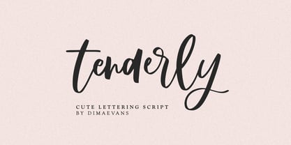 Tenderly it is a chic lettering font with exquisite accents. It is perfect for branding, wedding invitations and invitation cards and more. This font includes a full set of gorgeous uppercase and lowercase letters, numbers, a large selection of punctuation marks and ligatures. Includes: Regular Script Latin languages support Uppercase and lowercase Numbers and punctuation Ligatures Check out my blog: https://www.instagram.com/di.zigner/ pinterest.com/dmitriychirkov7 Enjoy
 - Life by Linotype,
$29.99Life was designed in 1964 by W. Bilz and marks the beginning of a new generation of newsprint fonts. The Ionic style had replaced Modern Face and was now replaced by this new innovative style, which mixed elements of Old Face, Transitional and Modern Face forms. Life’s characters are based on the forms of Times and are the result of a time of change and experimentation. - Rosegold by Supfonts,
$14.00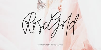 Rosegold it is a chic lettering font with exquisite accents. It is perfect for branding, wedding invitations and invitation cards and much more. This font includes a full set of gorgeous uppercase and lowercase letters, numbers, a large selection of punctuation marks & ligatures. Includes: Latin languages support Uppercase and lowercase Numbers and punctuation Ligatures Check out my blog: https://www.instagram.com/di.zigner pinterest.com/dmitriychirkov7 Enjoy
 - Magalith by Samtype,
$39.95 This hebrew typeface is inspired in prayer books from the beginning of the XX century. Even in this Std version You can apply modern hebrew marks like Kamats Katan, Sheva Na, Dagesh Chazak and Cholam Chaser. It's a classic style with the most modern of a digital font technology and a easy lecture. The Caption versions is ideal for small size of texts and footnotes.
 - MVB Sacre Bleu by MVB,
$39.00Mark van Bronkhorst’s MVB Sacre Bleu was inspired by an example of French handwriting from the 1930s. With a goal to keep the script as authentic as possible, the font includes a number of ligatures to avoid letterform repetition. The year it released, MVB Sacre Bleu was selected as one of Typographica’s Favorite Typefaces, where reviewer Joshua Lurie-Terrell deemed it “stylish, memorable, and decidedly unkitschy.” - Quickbrush by Trial by Cupcakes,
$29.00 Like its cousin Quickpen, Quickbrush is an unfussy, confidently jotted script, with lots of rich texture to recreate the skips and jumps that appear in brush pen lettering. Contextual alternates for lowercase letters mimic starting and ending marks, to make each word look truly written by hand. It’s a typeface you’ll reach for again and again, for any project that needs a casual, handwritten touch.