10,000 search results
(0.554 seconds)
- Soutkind by Sitintahitam,
$19.00 SOUTKIND is a display typeface with heavy bold style, inspired by pop culture in 80s century. Soutkind have a unique and fat forms. This font suitable for your design suh as packaging, poster, apparel, etc. SOUTKINDalso includes a set of some pop illustration. Extras allows you to develop awesome design with this font. Cheers! 🍻
 - Phinney Jenson by HiH,
$12.00 Phinney Jenson ML is a font with deep historical roots firmly planted in the fertile soil of the Italian Renaissance. Twenty years after Lorenzo Ghiberti finished his famous East Doors, the Gates of Paradise, of Santa Maria del Fiore in Florence and about fifteen years before Sandro Botticelli painted his “Birth of Venus,” a French printer by the name of Nicolas Jenson set up a small print shop in the powerful city-state of Venice. The fifteenth century marked the end of the plague and the rise of Venetian power, as the merchants of Venice controlled the lucrative trade of the eastern Mediterranean and sent their ships as far as London and even the Baltic. In 1470, Jenson introduced his Roman type with the printing of De Praeparatio Evangelica by Eusebuis. He continued to use his type for over 150 editions until he died in 1480. In 1890 a leader of the Arts & Crafts movement in England named William Morris founded Kelmscott Press. He was an admirer of Jenson’s Roman and drew his own somewhat darker version called GOLDEN, which he used for the hand-printing of limited editions on homemade paper, initiating the revival of fine printing in England. Morris' efforts came to the attention of Joseph Warren Phinney, manager of the Dickinson Type Foundry of Boston. Phinney requested permission to issue a commercial version, but Morris was philosophically opposed and flatly refused. So Phinney designed a commercial variation of Golden type and released it in 1893 as Jenson Oldstyle. Phinney Jenson is our version of Phinney’s version of Morris' version of Nicolas Jenson’s Roman. We selected a view of the Piazza San Marco in Venice for our gallery illustration of Phinney Jenson ML because most of the principal buildings on the Piazza were already standing when Jenson arrived in Vienna in 1470. The original Campanile was completed in 1173 (the 1912 replacement is partially visible on the left). The Basilica di San Marco was substantially complete by 1300. The Doge’s Palace (not in the photo, but next to the Basilica) was substantially complete by 1450. Even the Torre dell'Orologio (Clock Tower) may have been completed by 1470—certainly by 1500. Phinney Jenson ML has a "rough-and-ready" strength, suitable for headlines and short blocks of text. We have sought to preserve some of the crudeness of the nineteenth-century original. For comparison, see the more refined Centaur, Bruce Rogers's interpretation of Jenson Roman. Phinney Jenson ML has a strong presence that will help your documents stand out from the Times New Roman blizzard that threatens to cover us all. Phinney Jenson ML Features: 1. Glyphs for the 1252 Western Europe, 1250 Central Europe, the 1252 Turkish and the 1257 Baltic Code Pages. Accented glyphs for Cornish and Old Gaelic. Total of 393 glyphs. 400 kerning pairs. 2. OpenType GSUB layout features: onum, pnum, salt, liga, dlig, hisy and ornm. 3. Tabular (std), proportional (opt) & old-style numbers (opt). 5. CcNnOoSsZz-kreska available (salt).
 - Lapendos Stripes by Axara Creative,
$10.00 Introducing a new Lapendos Stripes. It comes with OpenType features such contextual alternates, stylistic alternates, stylistic sets, good for logotype, poster, badge, book cover, tshirt design, packaging and any more. This font is suitable for t-shirts, signage, logos, headlines, branding, packaging, etc. Accessible in the Adobe Illustrator, Adobe Photoshop, Adobe InDesign, even work on Microsoft Word. PUA Encoded Characters – Fully accessible without additional design software.
 - American Beauty by Bilberry Create,
$17.00 Meet my new AMERICAN BEAUTY calligraphy script. This handwritten script has been attentively written, with gentle curves to produce a font thats completely distinctive and original. Perfect for adding a elegant and unique touch to your lettering projects and branding Also with their help, you can create a Wedding lettering or beautiful frame for your home. Or just use for your small business, book covers, stationery, marketing, magazines and more. Zip included: - American Beauty OTF - American Beauty TTF - American Beauty MULTILINGUAL
 - Lonila by Rastype Studio,
$16.00 Lonila Retro Script Font with Underline is a font that is suitable for poster designs, book covers, weddings and other designs according to retro-style tastes. Lonila Retro Script Font with Underline is also equipped with multi-language. Tags
 - Frenxe Wonder by Maulana Creative,
$14.00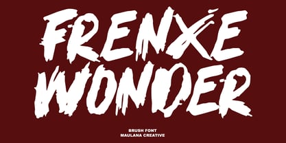 Give your designs an authentic handcrafted feel. “Frenxe Wonder Brush Font” is perfectly suited to signature, stationery, logo, typography quotes, magazine or book cover, website header, clothing, branding, packaging design and more. Thanks for use this font, Maulana Creative
 - Krysttal Spears by Maulana Creative,
$10.00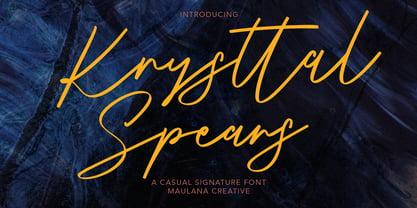 Krysttal Spears Casual Signature Font Give your designs an authentic handcrafted feel. Krysttal Spears Casual Signature Font is perfectly suited to logo, stationery, branding, typography quotes, magazine or book cover, website header, clothing, branding, packaging design, restaurant and more.
 - MC Wattels by Maulana Creative,
$15.00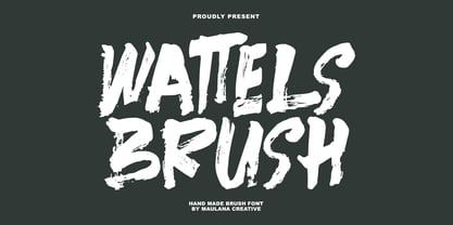 Give your designs an authentic handcrafted feel. “Wattels Brush Handmade Font” is perfectly suited to signature, stationery, logo, typography quotes, magazine or book cover, website header, clothing, branding, packaging design and more. Thanks for use this font, Maulana Creative
 - Bestons by Maulana Creative,
$15.00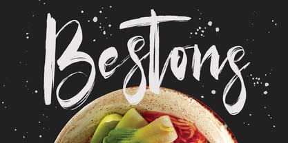 Give your designs an authentic brush handcrafted feel. Bestons Brush Font is perfectly suited to signature, stationery, logo, typography quotes, magazine or book cover, website header, flyer, clothing, branding, packaging design and more. Thanks for use this font. MaulanaCreative
 - Moriss Ward by Maulana Creative,
$14.00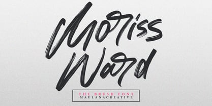 Give your designs an authentic brush handcrafted feel. "Moriss Ward" is perfectly suited to signature, stationery, logo, typography quotes, magazine or book cover, website header, flyer, clothing, branding, packaging design and more. Thanks for use this font. Maulana Creative
 - Collathives by Maulana Creative,
$14.00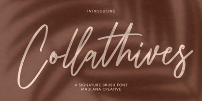 Give your designs an authentic handcrafted feel. Collathives Signature Brush Font is perfectly suited to logo, stationery, branding, typography quotes, magazine or book cover, website header, clothing, branding, packaging design, restaurant and more. Thanks for use this font ~ Maulana
 - Caslon Bold by ParaType,
$30.00 The Bitstream version of Caslon Bold of the American Type Founders, 1905. Based on William Caslon I’s first English Old Style typefaces of 1725. Caslon modeled his designs based on late 17th century Dutch types, but his artistic skills enabled him to improve those models, bringing a variety of forms and subtlety of details. Strokes in Caslon fonts are somewhat heavier than in earlier Old Style fonts, serifs are thicker and a bit stubby. Italic letters have uneven slope. A text set in Caslon looks legible and aesthetically appealing. Caslon is a favorite font of English printers for setting of classical literature. Cyrillic version was developed for ParaType in 2002 by Isay Slutsker and Manvel Shmavonyan.
 - Caslon 540 by ParaType,
$30.00 The Bitstream version of Caslon 540 of the American Type Founders, 1902. Based on William Caslon I's first English Old Style typefaces of 1725. Caslon modeled his designs based on late 17th century Dutch types, but his artistic skills enabled him to improve those models, bringing a variety of forms and subtlety of details. Strokes in Caslon fonts are somewhat heavier than in earlier Old Style fonts, serifs are thicker and a bit stubby. Italic letters have uneven slope. A text set in Caslon looks legible and aesthetically appealing. Caslon is a favorite font of English printers for setting of classical literature. Cyrillic version was developed for ParaType in 2002 by Isay Slutsker and Manvel Shmavonyan.
 - Anti Grotesk by 60 KILOS,
$20.00 Anti Grotesk is a personal and internal fight. It tries to build elements capable of building personality, message, and introspection through their own shapes. How to escape from trends being part of them, how to design not establishing commercial and economical interests. Why you started designing and why are you designing today, are some of the concepts that build the universe of Anti Grotesk.
 - STP Display Cyrillic by Sete Std,
$30.00 Its inspiration comes from the types without serifs, with features ranging from architecture to modernist design products. With generous shapes and counterforms, the type becomes showy wherever it is, masterfully fulfilling the purpose for which it was designed. Initially designed for a signaling project in the Brazilian city of Jaraguá do Sul, Santa Catarina, the STP Display was expanded to include the largest number of characters in the Cyrillic anda Latin alphabet. This helps to find solutions in cases where a large number of languages to communicate something is needed, such as to inform a specific place for a tourist or also a direction to follow for an employee in a company. The STP Display is a modular feature, developed with rounded corners and a design based on geometric elements, ideal for use in large sizes. Forms and counterforms, its main characteristics, bring prominence to any signaling project. The STP Display Cyrillic also has another version, the STP Stencil Cyrillic, and in addition to wayfinding projects, both can be used in architectural projects, advertising, packaging, posters, and others. With a complete Latin alphabet, STP Display Cyrillic covers over 90% of the supported languages, covering the whole American continent, East and West Europe and most of the countries of Africa, Asia and Oceania.
 - STP Display by Sete Std,
$30.00 Its inspiration comes from the types without serifs, with features ranging from architecture to modernist design products. With generous shapes and counterforms, the type becomes showy wherever it is, masterfully fulfilling the purpose for which it was designed. Initially designed for a signaling project in the Brazilian city of Jaraguá do Sul, Santa Catarina, the STP Display was expanded to include the largest number of characters in the Latin alphabet. This helps to find solutions in cases where a large number of languages to communicate something is needed, such as to inform a specific place for a tourist or also a direction to follow for an employee in a company. The STP Display is a modular feature, developed with rounded corners and a design based on geometric elements, ideal for use in large sizes. Forms and counterforms, its main characteristics, bring prominence to any signaling project. The STP Display also has another version, the STP Stencil, and in addition to wayfinding projects, both can be used in architectural projects, advertising, packaging, posters, and others. With a complete Latin alphabet, STP Display covers over 90% of the supported languages, covering the whole American continent, East and West Europe and most of the countries of Africa, Asia and Oceania.
 - Aldo Manuzio by RMU,
$30.00 This 1897 Schelter & Giesecke in-house design was carefully redrawn, extended and redesigned for modern usage. It is a remarkable font for book covers, film and video titles, ads and much more. This font contains a 'long s' and its ligatures which can be reached by the OTF historical feature and ligatures.
 - Kis Antiqua Now TH Pro by Elsner+Flake,
$99.00 In the course of the re-vitalization of its Typoart typeface inventory, Elsner+Flake decided in 2006 to offer the “Kis Antiqua” by Hildegard Korger, in a re-worked form and with an extended sortiment, as an OpenType Pro-version. After consultation with Hildegard Korger, Elsner+Flake tasked the Leipzig type designer Erhard Kaiser with the execution of the re-design and expansion of the sortiment. Detlef Schäfer writes in “Fotosatzschriften Type-Design+Schrifthersteller”, VEB Fachbuchverlag Leipzig, 1989: No other printing type has ever generated as far-reaching a controversy as this typeface which Jan Tschichold called the most beautiful of all the old Antiqua types. For a long time, it was thought to have been designed by Anton Janson. In 1720 a large number of the original types were displayed in the catalog of the „Ehrhardische Gycery“ (Ehrhardt Typefoundry) in Leipzig. Recently, thanks to the research performed by Beatrice Warde and especially György Haimann, it has been proven unambiguously that the originator of this typeface was Miklós (Nicholas) Tótfalusi Kis (pronounced Kisch) who was born in 1650 in the Hungarian town of Tótfal. His calvinistic church had sent him to the Netherlands to oversee the printing of a Hungarian language bible. He studied printing and punch cutting and earned special recognition for his Armenian and Hebrew types. Upon his return to Hungary, an emergency situation forced him to sell several of his matrice sets to the Ehrhardt Typefoundry in Leipzig. In Hungary he printed from his own typefaces, but religious tensions arose between him and one of his church elders. He died at an early age in 1702. The significant characteristics of the “Dutch Antiqua” by Kis are the larger body size, relatively small lower case letters and strong upper case letters, which show clearly defined contrasts in the stroke widths. The “Kis Antiqua” is less elegant than the Garamond, rather somewhat austere in a calvinistic way, but its expression is unique and full of tension. The upper and lower case serifs are only slightly concave, and the upper case O as well as the lower case o have, for the first time, a vertical axis. In the replica, sensitively and respectfully (responsibly) drawn by Hildegard Korger, these characteristics of this pleasantly readable and beautiful face have been well met. For Typoart it was clear that this typeface has to appear under its only true name “Kis Antiqua.” It will be used primarily in book design. Elsner+Flake added these two headline weights, which are available besides a separate font family Kis Antiqua Now TB Pro. Designer: Miklós (Nicholas) Tótfalusi Kis, 1686 Hildegard Korger, 1986-1988 Erhard Kaiser, 2008
 - Rullen by Inumocca,
$15.00 Rullen is A Retro typeface the 70s font style great choice for expressing a summer. The Typeface comes with Stylistic Set Exellent typeface to use for covering your Project, like Branding, Movie Title, Headline Letter, Bookcover or Book Content, Magazine cover, Poster, Quotes Lettering, Logos, and more your project design. - Unique glyphs - Multilingual Characters Support - UPPERCASE - Lowercase - Numeric - Symbol - Punctuation Character - Stylistic Set inumocca type Studio
 - Lusto by Inumocca,
$20.00 Lusto display typeface , come from mexican style and atmosphere. Bold, Powerfull and unique glyphs character. with some unique Alternates for covering your Project, like Branding, Movie Title, Headline Letter, Bookcover or Book Content, Magazine cover, Poster, Quotes Lettering, Logos, and more your project design. - Unique glyphs - Multilingual Characters - UPPERCASE - Lowercase - Numeric - Symbol - Punctuation Character - Ligature - Stylistic Alternates (ss01, ss02, ss03, ss04, ss05) inumocca type Studio
 - Marry Gold by Inumocca,
$16.00 MARRY GOLD is A Retro Display Typeface, Come from 70s Style. The Typeface comes with Stylistic Set and Ligature Combinations Exellent typeface to use for covering your Project, like Branding, Movie Title, Headline Letter, Bookcover or Book Content, Magazine cover, Poster, Quotes Lettering, Logos, and more your project design. - Unique glyphs - Multilingual Characters Support - UPPERCASE - Lowercase - Numeric - Symbol - Punctuation Character - Ligature - Stylistic Set (ss01 - ss06) inumocca type
 - EFCO Songster by Ilham Herry,
$20.00 Inspired by the Vintage Song Sheet Cover from the 19th Century. Thick n thin with a serif typeface, Comes with 2 style All-caps (Regular and Line Shade) and is also available with pair font and ornament extras. OpenType features support stylistic alternate characters to give a unique personality to the typography composition. Suitable for display needs such as signage, poster, logo, label, headline, cover design, etc
 - Patinas Stencil by Inumocca,
$13.00 Patinas Stencil Family come with 3 Style Moon Star , Reguler and Slant. Modern Urban Serif Font, Powerfull and has a great Character, Good Font to use for covering your Project, like Branding, Headline Letter, Flyer, Signage, Quotes, Poster Typography, Bookcover, Magazine cover, Poster, Quotes Lettering, Logos, and more your project design. - Unique glyphs - Multilingual Characters Support - UPPERCASE - Lowercase - Numeric - Symbol - Punctuation Character inumocca type Studio
 - SugarBoo by Inumocca,
$20.00 SugarBoo is A Reverse-Contrast letterform , Modern look, Fresh, eyecatching, strong character and power full. The Typeface comes with Stylistic Set Combinations Exellent typeface to use for covering your Project, like Branding, Movie Title, Headline Letter, Bookcover or Book Content, Magazine cover, Poster, Quotes Lettering, Logos, and more your project design. - Unique glyphs - Multilingual Characters Support - UPPERCASE - Lowercase - Numeric - Symbol - Punctuation Character - Stylistic Set inumocca type Studio
 - Square Technocrat by Mans Greback,
$39.00 Square Technocrat is a sharp, geometric font that embodies the essence of structure and modernity. Drawing inspiration from cube-like forms and contemporary architecture, this font family is perfect for designs that require a strong, stable presence. The Square Technocrat font family comes in five weights: Thin, Light, Regular, Bold, and Black, giving you a wide range of options for creating impactful designs that demand attention. The font is built with advanced OpenType functionality and has a guaranteed top-notch quality, containing stylistic and contextual alternates, ligatures, and more features; all to give you full control and customizability. It has extensive lingual support, covering all Latin-based languages, from Northern Europe to South Africa, from America to South-East Asia. It contains all characters and symbols you'll ever need, including all punctuation and numbers.
 - Glamour Absolute by Nicky Laatz,
$42.00 Introducing "Glamour Absolute" - A brand new "two-faced" bold serif with both modern and vintage curves. A Two-faced beauty : Modern or Vintage If you are going Vintage Retro : Access your OpenType features to access the large selection of alternate letters and ligatures, select the letters you like from the large variety to get the vintage look you are after. Vary between a light and heavy vintage look based on how many letters you alter. If you are going Modern Chic : Just type with regular letters :) Play with your letter spacing to add even more class to your designs. Due to its split personality , Glamour Absolute is a very versatile font, covering a wide range project types, from bold magazine imagery , to wedding invitations, to branding, poster design and so much more.
 - Romile by Nathatype,
$29.00 Looking for an elegant font? Romile is a elegant and bold serif font. It comes to be a single font all in uppercases. Thanks to the cursive and unique swirls at the end of some characters carries a sense of elegant looks. On the other hand, the weight of the font brings strength to any title or header you apply it to. Features: Stylistic Sets Ligatures Swashes Numerals and Punctuations PUA Encoded It can be used for many design projects, such as poster, logo, book cover, branding, heading, printed product, merchandise, quotes, social media campaign, etc. Get more inspiration about how to use it by seeing the font preview. Thank you for purchasing our fonts. Please don’t hesitate to contact us, if you have any further question or issues. We’re happy to help. Happy Designing.
 - Arando Script by Mans Greback,
$59.00 Arando Script is a retro script typeface. A perfected calligraphy with uniquely beautiful letterforms, Arando Script is a professional quality handwriting font family. Drawn and created by Mans Greback in 2022, it is perfect for a formal restaurant headline or feminine logotype design. Arando Script is provided in four styles: Regular, Bold, Italic and Bold Italic, which compliment each other and maximise your options and design experience. The font is built with advanced OpenType functionality and has a guaranteed top-notch quality, containing stylistic and contextual alternates, ligatures and more features; all to give you full control and customizability. It has extensive lingual support, covering all Latin-based languages, from Northern Europe to South Africa, from America to South-East Asia. It contains all characters and symbols you'll ever need, including all punctuation and numbers.
 - Solvetta by Grezline Studio,
$12.00 Solvetta is a light and charming handwritten font with a unique feel. It will add a bold feel to any design project! You can use Solvetta font to make a logo for branding, typography design, magazine or book cover, website header, product packaging, invitation, quotes, t-shirt design, label poster and more. Feature : - Multilingual Language - Works on PC & Mac - Simple installations - Accessible in the Adobe Illustrator, Adobe Photoshop, Adobe InDesign, even works on Microsoft Word.
 - ST Gaidar by ShimanovTypes,
$9.00 The font "Gaidar" named in the honour of Arkady Gaidar. He was a Soviet writer, whose stories were very popular among Soviet children, and a Red Army commander. He died in combat fighting with German nazis in 1941. Few generations of Soviet kids are raised on his books and a number of films were made based on his stories. This font inspired by posters, movie titles and book covers of this writer. The letterforms are bold and gnarly and comes in 2 styles: uppercase and small caps. It has LATIN and Extended Eastern Europe CYRILLIC letters. "ST-Gaidar" created for titles, poster design, web design, branding and packaging works, illustrations, badges and other typography works. Pls, don't use it for for typing large arrays of text. ST Gaidar supports 15+ languages: Belarusian, Bosnian, Bulgarian, Croatian, Dutch, English, German, Macedonian, Norwegian, Russian, Serbian, Swedish, Spanish, Slovenian, Ukrainian and probably others
 - Basmala by Afkari Studio,
$17.00 Basmala - An Arabic Style Typeface NEW Ramadhan and Islamic font, Basmala, is an Arabic-styled display typeface. This Islamic Ramadhan Arabic font is perfect for any graphic design related to the Islamic style. You will get an Arabic feel to every text you type using this font. Made with Latin characters so that it can be read internationally which does not have to be able to read Arabic characters This Islamic font is suitable for branding, product packaging, quotes, flyers, posters, logotype, apparel, T-shirt, Hoodie, book covers, movie title, advertising, and more. Features; - Uppercase, Lowercase, Number, and Punctuation - Special Alternates and ligatures - Works on PC & Mac - Simple installations - Accessible in Adobe Illustrator, Adobe Photoshop, Adobe InDesign, even work on Microsoft Word - Fully accessible without additional design software. - Mültîlíñgúãl Sùppört for; ä ö ü Ä Ö Ü ß ¿ ¡ Hope you enjoy our font and this font is useful font for your projects!
 - Saleha by Afkari Studio,
$19.00 Saleha - An Arabic Style Typeface NEW Ramadan and Islamic font, Saleha, is an Arabic-styled display typeface. This Islamic Ramadhan Arabic font is perfect for any graphic design related to the Islamic or Arabic style. You will get an Arabic feel to every text you type using this font. Made with Latin characters so that it can be read internationally which does not have to be able to read Arabic characters This Islamic font is suitable for branding, product packaging, quotes, flyers, posters, logotype, apparel, T-shirt, Hoodie, book covers, movie title, advertising, and more. Features; - Uppercase, Lowercase, Number, and Punctuation - Special Alternates and ligatures - Works on PC & Mac - Simple installations - Accessible in Adobe Illustrator, Adobe Photoshop, Adobe InDesign, even work on Microsoft Word - Fully accessible without additional design software. - Mültîlíñgúãl Sùppört for; ä ö ü Ä Ö Ü ß ¿ ¡ Hope you enjoy our font and this font is useful font for your projects!
 - Garden Script by Alpha Bento,
$10.00 Garden Script is a calligraphy font. This is a modern bold font style. Here you will get a beautiful modern font. This font is available in several modern swirls that can make your work look elegant, sweet and perfect. With this style, this font will be suitable for logos, branding projects, design of household appliances, product packaging, mugs, quotes, posters, shopping bags, logos, book covers, business cards, invitation cards, greeting cards, and all your other beautiful projects. Garden Script has 420+ glyphs included alternative, ligatures characters and various language support. You can use this font for your work very easily. Because there are many features in it. Contains a complete set of upper and lowercase letters, punctuation, numbers, ligatures, alternates and multilingual support. This font also includes several ligatures and alternative styles Set Stylistic For those of you who have software that is able to work OpenType (Corel Draw / Photoshop / Illustrator / InDesign). Thanks & Happy Designing!
 - CA Zentrum by Cape Arcona Type Foundry,
$40.00 CA Zentrum is a compelling mix of conciseness and pragmatism. Bold, distinct and original, contemporary and versatile. At a closer look, it reveals rounder reading-friendly forms. The choice of weights aims at an easy, straight forward use. A set of five well-balanced weights and three widths ranging from light to black and from condensed to wide. This variety ought to be enough to cover most needs without throwing the typographer into questions. The family’s glyph set supports over 100 Latin languages. With its blend of timelessness and modernity, the type-family is uniquely suited for modern corporate visual languages, websites, corporate design, editorial design and advertising. Careful spacing and a great choice of OpenType features make it especially well suited for text copy and/or editorial design.
 - Chalfont by Alan Meeks,
$45.00 The typeface was designed after seeing a photocopy of some News Gothic text where the ink had faded on the bottom of each character. As character recognition is generally based on the top half of a character, readability was never compromised. Rather like Antique Olive the characters have a top heavy look when viewed straight on, however, as most type is read at an angle with the top further away than the bottom this top heavy look is diminished.
 - Realtime by Juri Zaech,
$30.00 Information displays have an aesthetic of their own. Functional design where transmission of information is key — and best in real time. The Realtime typeface is not meant to recreate the appearance of those applications, instead it takes inspiration from them. The result is a technical yet friendly design with details that serve function and visual impact alike. As a monospaced typeface it lends itself to tabular designs, sturdy columns and tidy layouts. Nevertheless Realtime comes with a feature for setting continuous text — a proportional design employable through OpenType — it further comes in five weights, from light to black, and with a character set that covers over 200 latin languages. Please see the Realtime Type Specimen PDF in the gallery. A soft version of Realtime is available separately: Realtime Rounded. Its soft edges apply warmth to the otherwise rather technical appearance. Thanks for visiting!
 - Mothra by madeDeduk,
$15.00 Introducing MOTHRA use this font for any branding, product packaging, invitation, quotes, t-shirt, label, poster, logo etc. Feature Uppercase & Lowercase Number & Symbol International Glyphs Multilingual support Feel free to drop us a message any time and follow my shop for upcoming updates Shoot me on email at: dedukvic@gmail.com and find more previews on my Instagram here : https://www.instagram.com/acekelgondolayu/?hl=en Hope you enjoy it.
 - Big Bright by loryn ipsum,
$14.00 Meet Big Bright, a (very) tall sans serif inspired by some photo of a vintage mid-century furniture catalogue I saw on instagram. It's perfect for logos, headings and posters. Big Bright has a vintage edge yet and modern feel and can sway from soft and gentle to striking and bold depending on how it's styled. Hope you have big love for Big Bright
 - Happiness Mood by madeDeduk,
$12.00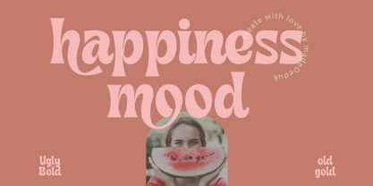 Introducing Happiness Mood Retro Fonts, comes with 2 styles clean and stamp style. Use this font for any branding, product packaging, invitation, quotes, t-shirt, label, poster, logo etc. Feature Uppercase & Lowercase Number & Symbol International Glyphs Multilingual support Feel free to drop us a message any time and follow my shop for upcoming updates Shoot me on email at: dedukvic@gmail.com Hope you enjoy it.
 - Lafonsa by Putracetol,
$24.00 Introducing "Lafonsa," a new serif font that combines stylistic typography with unique alphabet lettering and serif typography style. With a wide range of options, you can create stunning letter combinations for lettering. Lafonsa comes with open type features that offer a vast selection of alternates and end swashes to enhance your lettering. It is ideal for various purposes, including Logotype, heading, cover, poster, logos, quotes, product packaging, header, merchandise, social media & greeting cards, and many more. Additionally, Lafonsa supports multi-language use. To access Lafonsa's alternate glyphs, you will need a program that supports OpenType features such as Adobe Illustrator CS, Adobe Photoshop CC, Adobe InDesign, and Corel Draw. In the zip package, you will receive Lafonsa in otf, ttf, and woff formats, with features that include uppercase and lowercase letters, opentype alternates and ligatures, numbers, punctuation, symbols, and multilanguage support. Overall, Lafonsa is an excellent choice for anyone who wants to create stunning and unique designs, and it is perfect for all your design needs. Its versatility and high-quality design make it a valuable addition to any designer's toolkit.